10 Results
The results section has a function that is quite unique when compared to work students traditionally compose for other classes. An essay written for a conventional composition class has much of the body of the text dedicated to analysis, interpretation, and editorializing.
The results section, however, resists this practice in favor of two main functions:
SUMMARIZEILLUSTRATE
SUMMARIZE:
The act of summarizing raw data is, for many, more difficult than what is assumed. Summarizing does not mean to report raw data into the report’s results section with no analysis. At the other end of the spectrum, summarizing does not mean to interpret the data with the aim to discuss the report’s findings.
Summarizing does require some analysis. This includes observations that show trends in the data, anomalies, and connections made between initial predictions and results. Without discussion (which is saved for another section) results can demonstrate the relative accuracy of the initial predictions without interpretation on behalf of the writer.
To do this, the section must be well organized (often it is helpful to lay out both the text and visuals in a close approximation of the initial predictions), free of extraneous language, and focused on the clear and simple reporting of data. Let us look at three examples:
- The slope of economy was -0.7 (-0.9, -0.4) during the year 1800. During the year 1835, the economy slope was -0.7 (-0.9,-0.4). In 1850, (-0.9,-0.5) -0.7 was found for the slope of economy. A slope of -0.7 (-0.9, -0.5) was found in 1875 for economy. In 1900, a slope of -0.9 (-1.0, -0.7) was found for economy. The slope of economy in 1925 was -1.2 (-1.4, -1.0). For 1950, a slope of -1.0 (-1.2,-0.7) was found for economy. In 1975, a slope of (-1.2, -0.9) -1.1 was found. For the year 2000, a slope of -1.1 (-1.2, -0.9) was found, and (-0.9, -0.7) -0.8 was the slope found for 2015.
- Total percentage of land used agriculturally ranged from a minimum of 0.52% to a maximum of 82.43% averaged from 2010 to 2015, with a mean of 39.5+/- 21.9 (mean+/-sd) (Table 1). Mortality rate due to unclean water use ranged from 0.1 to 101 people in 2016 with a mean of 12.2+/- 20.6 (mean+/-sd) (Table 1). Multiple years had to be included, as there was not sufficient data in one specific year to line up the variables. In order to ensure the data would not be skewed to a large degree as a result of this, Figure 1 was created. Figure 1 shows the overall trend that the amount of agricultural land being used did not have too much variance between the years 2010 and 2015. Due to the low overall variance, it is justified for the average of the years 2010-2015 in agricultural land percentage to be used with 2016 data set for mortality due to unclean water use.
- We estimate that 52% (CrIs: 44-60%) (mean (95% credible intervals) of aquatic insect species are infected with Wolbachia versus 60% (58-63%) of terrestrial insects. These estimates come from the reduced database in which only one sample per species is included. The need for this reduced database arises because estimates from the full database may have been affected by targeted sampling of species known to have Wolbachia. Additionally, the removal of Culicidae from the reduced database does not appreciably alter our estimate of incidence in aquatic insects (52% versus 49%) (Figure 1). Estimates from the full database show 64% (58-70%) of aquatic insect species are infected with Wolbachia versus 70% (70-73%) of terrestrial insects (Figure 1). The exclusion of Culicidae reduced the estimate of incidence for aquatic insects in the full database from 64 to 47% (Figure 1).
Analysis:
Example 1 is a results section that is made almost entirely of the reporting of raw data. Whereas it does avoid interpretation of the data, it also avoids analysis. Remember, summary is not the recording of raw data.
As is discussed elsewhere, a helpful way to begin a results section is to discuss how it relates to earlier predictions or hypotheses, “…we hypothesized that X was positively related to Y.”
Example 2 does several things well. First, it is direct in its language and its reporting of relevant data (although not technically in passive voice, it could be improved by the addition of the acting subject). Next, it integrates quantitative data into the text. The purpose and importance of Quantitative data in the text will be discussed later in this chapter. Next, it uses analysis (not interpretation) to discuss elements of the data that may not be clear: “Multiple years had to be included, as there was not sufficient data in one specific year to line up the variables.” Finally, the opening of the second paragraph is a direct answer to a hypothesis from earlier in the report.
Example 3 begins with very direct and active language: “We estimate that…” It follows this with quantitative language and, similar to example 2, explanation of potential questions one might have when reviewing the data.
In many composition writing classes, this important practice challenges the writer to try and assess their own argument objectively. In doing this, the writer can become aware of potential rebuttals to their argument. If done in earnest, the argument can be qualified any number of ways to mitigate any potential objection. The use of this in the results section is likewise important to avoid unnecessary rebuttals.
ILLUSTRATE:
Chapter 6 does a thorough job of explaining data visualization. Instead of repeating much of this information, it is instead expected that you refer back to Chapter 6 for help.
However, there are elements that are worth repeating.
Incorporating quantitative data within the text is an important part of the results section. Much of the results section can be taken up by charts, tables, and any number of graphs, but it is important that not all of the information be presented this way. You should always discuss these types of guidelines with your instructor or publication for what is expected, but if all the data of a certain point being made can be expressed in one sentence, there is often no need for a corresponding graph. Redundancy is the enemy of a good writer.
On the topic of being redundant, it is often hard for writers to find the balance between explaining and/or referring to charts and graphs too much, and not quite enough. It is important that the use of data visualization is discussed more than simply in passing but not so much that it becomes superfluous.
When writing about a chart or graph, it is helpful to discuss key elements of it that will help the reader with their overall understanding. What should be avoided is a complete reporting of all the data contained within the graph: that is what the graph is for.
CAPTIONS
An important part of any data visualization is the caption that accompanies it. Reviewing chapter 6 of this text will give you a good model for how to properly format your captions. Captions should be as concise as you can make them while still being descriptive so that someone could look at only the figure and get a good sense of what the project is about without reading the full paper.
Let us look at one example:
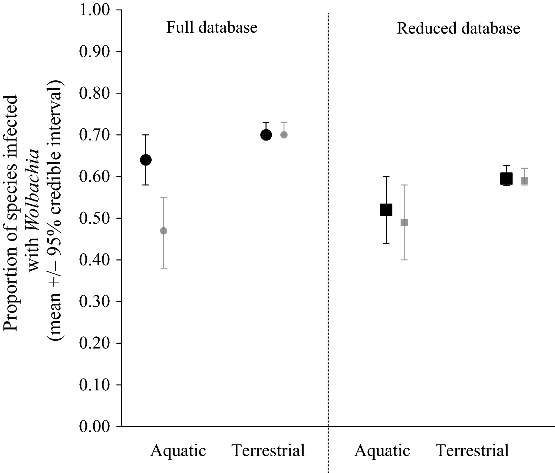
Figure 10.1: Mean (+/- 95% credible intervals) of Wolbachia incidence in aquatic versus terrestrial insects. Circles represent estimates from the full dataset. Squares represent estimates from the reduced database retaining only one sample per species (sample with the maximum number of screens). Black symbols include Culicidae. Gray symbols do not.
Analysis:
The figure itself is fine. Instead, the caption is what we are looking at.
First, charts, graphs, and tables should be numbered and placed in order. Notice that this figure, being the first in this chapter, is “Figure 1.”
Next, the “Figure 1” is in line with the rest of the caption. It is not placed above it on a separate line.
Next, the caption gives simple and direct explanation of what data is contained in the figure with no superfluous information.
Finally, the caption avoids the overly general, “Data from the study analyzed with a logistic regression.” Whereas that caption is not incorrect, it also adds nothing to the understanding of the figure.
Captions are a useful tool for every writer when it comes to data visualization. If used correctly, it can transmit great deals of information by way of illuminating the data contained within the corresponding visual.