5.9 Joining datasets
Of course, looking at total counts in each state is not the most helpful metric without taking population into account. To rectify this, let’s try joining some historical population data with our measles data.
First we need to import the population data.
#load csv of populations by state over time, changing some of the datatypes from default
hist_pop_by_state <-
  read_csv(
    "data/Historical_Population_by_State.csv",
    col_types = cols(ALASKA = col_double(), HAWAII = col_double())
  )
View(hist_pop_by_state)
As we saw in our measles data import, the presence of NAs makes it necessary to explicitly state that the Hawaii and Alaska columns contain numerical data.
5.9.1 Long vs Wide formats
For data to be considered “tidy,” it should be in what is called “long” format. Each column is a variable, each row is an observation, and each cell is a value. Our state population data is in “wide” format, which is often preferable for human-readability, but is less ideal for machine-readability.
We will use the package tidyr and the function pivot_longer to convert our population data to a long format, thus making it easier to join with our measles data.
Each column in our population dataset represents a state. To make it tidy we are going to reduce those to one column called State with the state names as the values of the column. We will then need to create a new column for population containing the current cell values. To remember that the population data is provided in 1000s of persons, we will call this new column pop1000.
pivot_longer() takes four principal arguments:
- the data
- cols are the names of the columns we use to fill the new values variable (or to drop).
- the names_to column variable we wish to create from the cols provided.
- the values_to column variable we wish to create and fill with values associated with the cols provided.
library(tidyr)
hist_pop_long <- hist_pop_by_state %>%
  pivot_longer(ALASKA:WYOMING,
               names_to = "State",
               values_to = "pop1000")

View(hist_pop_long)
Now our two datasets have similar structures, a column of state names, a column of years, and a column of values. Let’s join these two datasets by the state and year columns. Note that if both sets have the same column names, you do not need to specify anything in the by argument. We use a left join here which preserves all the rows in our measles dataset and adds the matching rows from the population dataset.
joined_df <- left_join(non_cumulative_year, hist_pop_long, by=c("State" = "State", "Year" = "DATE" ))

joined_df
## # A tibble: 4,210 x 4
## # Groups: State [56]
## State Year TotalCount pop1000
## <chr> <dbl> <dbl> <dbl>
## 1 ALABAMA 1909 1 2108
## 2 ALABAMA 1910 606 2150
## 3 ALABAMA 1911 587 2185
## 4 ALABAMA 1912 109 2217
## 5 ALABAMA 1913 7 2279
## 6 ALABAMA 1914 4 2336
## 7 ALABAMA 1915 2 2345
## 8 ALABAMA 1916 66 2359
## 9 ALABAMA 1917 5134 2361
## 10 ALABAMA 1918 1651 2343
## # … with 4,200 more rowsNow we can use our old friend mutate() to add a rate column calculated from the count and pop1000 columns.
#Add column for rate (per 1000) of measles
rate_by_year <- mutate(joined_df, rate = TotalCount / pop1000)
rate_by_year
## # A tibble: 4,210 x 5
## # Groups: State [56]
## State Year TotalCount pop1000 rate
## <chr> <dbl> <dbl> <dbl> <dbl>
## 1 ALABAMA 1909 1 2108 0.000474
## 2 ALABAMA 1910 606 2150 0.282
## 3 ALABAMA 1911 587 2185 0.269
## 4 ALABAMA 1912 109 2217 0.0492
## 5 ALABAMA 1913 7 2279 0.00307
## 6 ALABAMA 1914 4 2336 0.00171
## 7 ALABAMA 1915 2 2345 0.000853
## 8 ALABAMA 1916 66 2359 0.0280
## 9 ALABAMA 1917 5134 2361 2.17
## 10 ALABAMA 1918 1651 2343 0.705
## # … with 4,200 more rowsNow, let’s plot that data
rate_1963 <-
  rate_by_year %>%
  filter(Year == 1963) %>%
  ggplot(aes(x = State, y = rate)) +
  geom_bar(stat = "identity") +
  theme(axis.text.x = element_text(angle = 90))

rate_1963
## Warning: Removed 1 rows containing missing values (position_stack).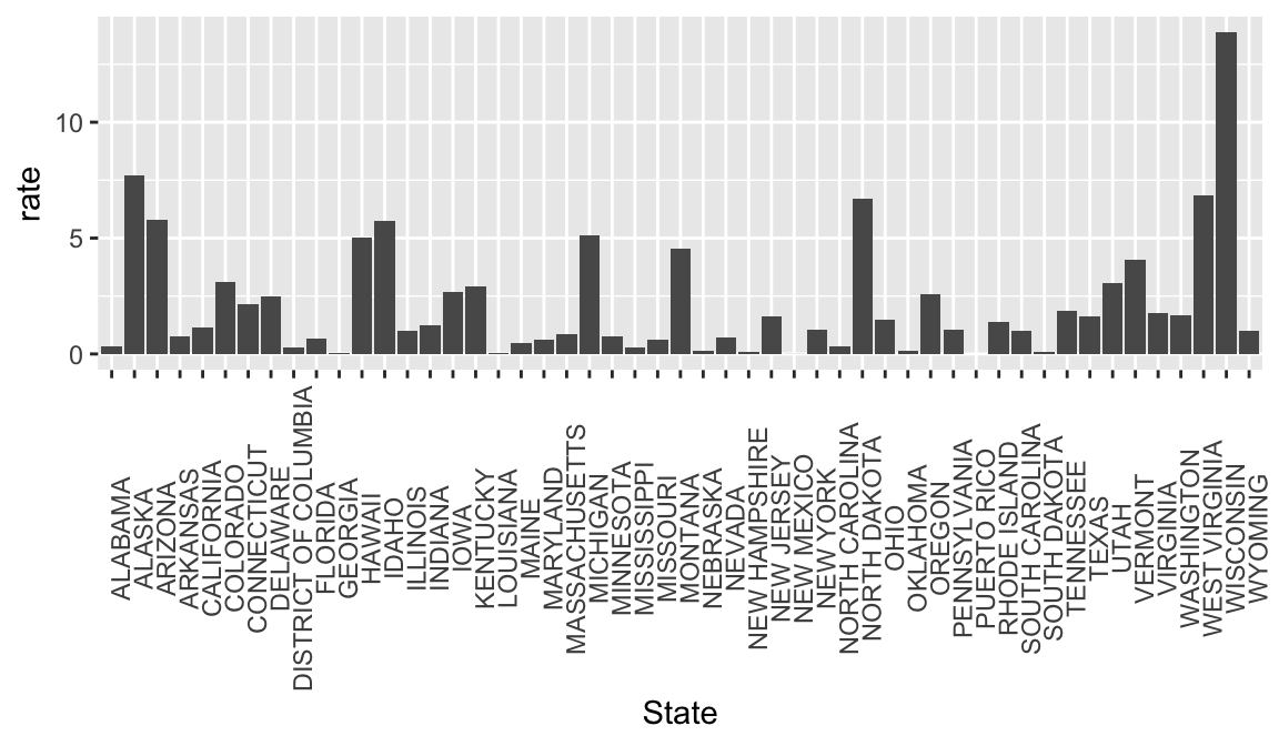
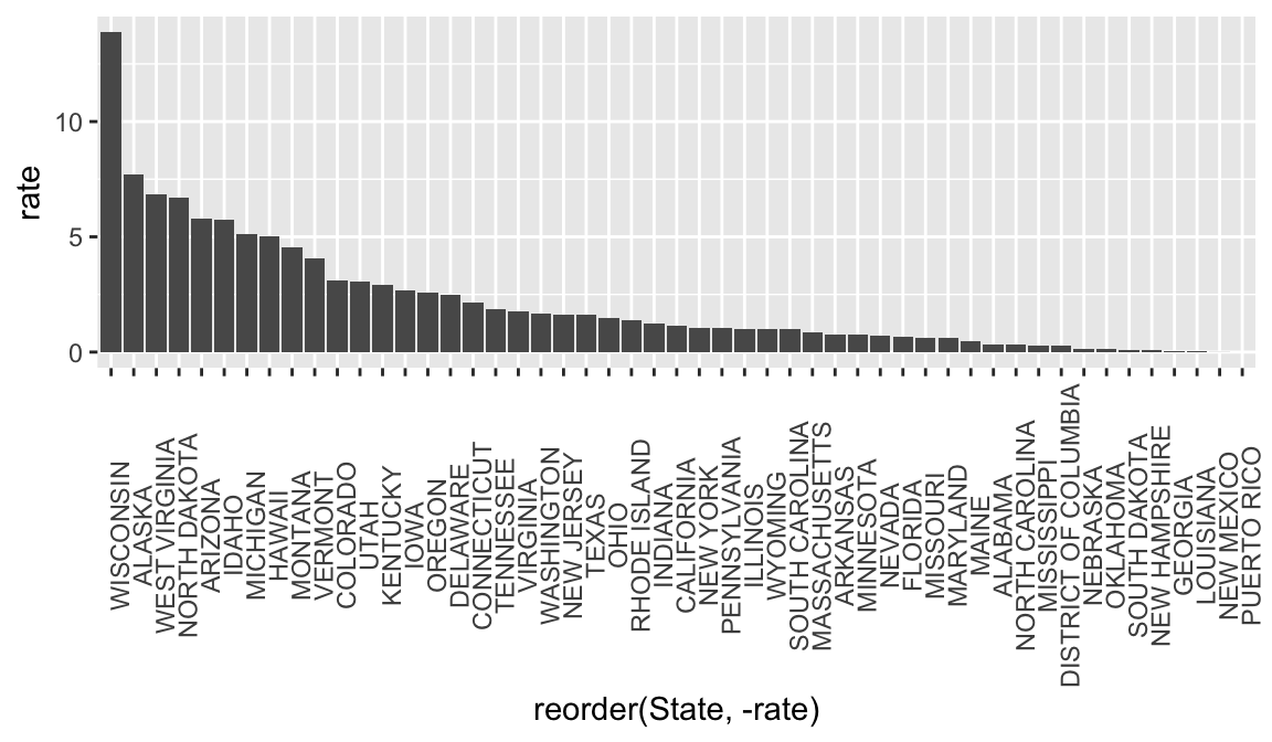
It can be helpful to look at bar graphs sorted
rate_1963 <-
  rate_by_year %>%
  filter(Year == 1963) %>%
  ggplot(aes(x = reorder(State, -rate), y = rate)) +
  geom_bar(stat = "identity") +
  theme(axis.text.x = element_text(angle = 90))

rate_1963
## Warning: Removed 1 rows containing missing values (position_stack).