5 Inputting the Data
Once the right type of the visualization for the specific data is chosen it is time to consider how to display the data. For example, should specific elements be included in the visualization that guide the viewer towards seeing patterns or relationships? On the flip side, are there actions that should be taken to dissuade the viewer from coming to inaccurate conclusions? The Gestalt Principles help to answer these questions. The word “gestalt” is German for “pattern” and together the Gestalt Principles explain how humans group variables and elements of a visualization (Reb & Cropanzano, 2007). Three gestalt principles, as summarized by Todorovic (2008), are worth mentioning as they are very applicable to creating data visualizations:
Gestalt Principle #1: Elements near each other are perceived as being grouped together.
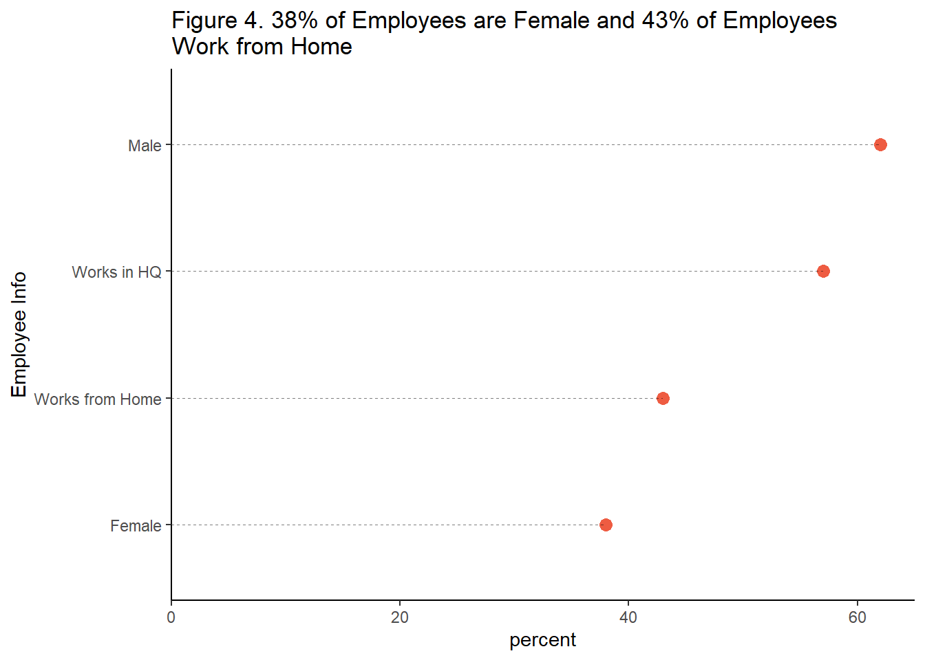
This is especially true if elements are located within the same closed region and if they are connected by other elements. While these may seem like obvious observations, it is easy to ignore these principles when creating data visualizations. For example, Figure 4 is aesthetically pleasing because the data points are in descending order. However, the grouping of the variables is not intuitive because the gender variables are separate from each other. A quick glance could lead to incorrect assumptions regarding a relationship between work location and gender. Viewers are better able to comprehend quantitative information when the relevant data is visually grouped into chunks (Shah, Mayer, Hegarty, 1999).

Gestalt Principle #2: Elements tend to be perceived as grouped together if they move together.
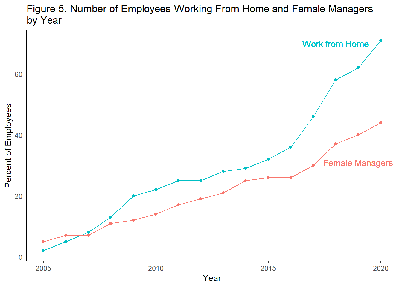
It may seem efficient to plot two unrelated variables on the same line chart in order to save space, as shown in Figure 5. However, doing so may lead the viewer to believe that these two variables are related in some way. Such an inference would be an example of correlation without causation. To ensure that no relationship is inferred, it would be best to plot these variables on separate graphs.

Gestalt Principle #3: Elements tend to be integrated into groups if they are similar to each other.
If variables should be perceived as grouped together, then it is appropriate to include visual cues to help the viewer make this association. Figure 6 shows a time series chart with true values for the past ten years and a one year forecast. Coloring is used to help the viewer immediately make the distinction between the true values and the forecasted (predicted) values.
Choosing Inclusive Colors: It is best practice to ensure that the key takeaways of your visualization can be discerned for those who have a color vision deficiency (CVD). Here are a few tips: 1.) Match non-CVD associated colors with those that are commonly associated with CVD. For example, red is a commonly associated with CVD, so match it with orange or blue (Shaffer, 2016). 2.) Arrange colors in your visualization by their lightness. This way, even if you are using some colors that are not CVD-friendly, the lightness helps to differentiate between them (Stone, 2018). 3.) Try to avoid using shades of the same color if possible. If you do use shading, do not to exceed more than four shades of the same color in a visualization. Accuracy in distinguishing between shades drops (for everybody) at five or more shades of the same color (Ware, 2013).
A final recommendation in regards to how to display the data is to ensure that the integrity of the data is preserved in the visualization. Put more elegantly, “show data variation, not design variation” (Tufte, 2001). For example, if the size of chart elements are used to show the growth of a variable, ensure that the element grows at the same rate of the actual data. In a similar fashion, the intervals used to show data points should remain consistent throughout the chart. It can be dangerous to truncate or vary axis intervals.
Key Takeaway #2: Ensure both that your data is displayed accurately, and that the way it is displayed guides the viewer to perceive it accurately.