6 Designing Data Visualizations
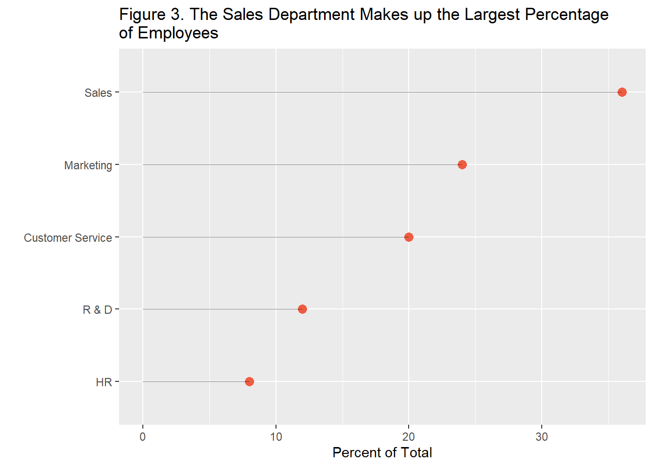
A common mistake of presenters is to forfeit the accuracy of interpretation in favor of eye-catching design elements. Take, for example, 3D graphics like the one in Figure 7 below. The graphic might draw attention to itself, but it now takes longer to understand what the data is saying as compared to the simple dot plot from Figure 3.
Figure 7. The Sales Department Makes up the Largest Percentage of Employees
You must enable Javascript to view this page properly.
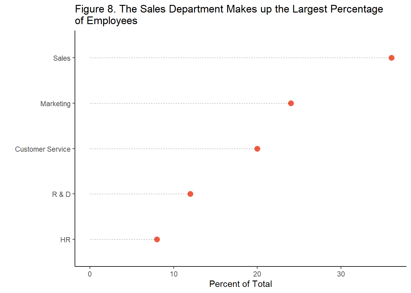
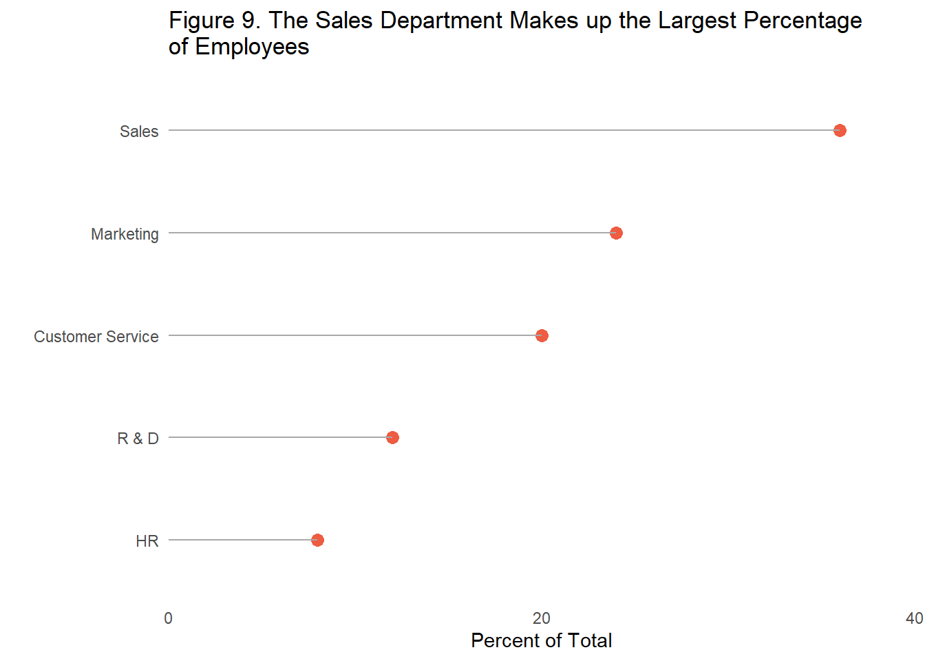
You may already be aware that you should avoid 3D graphics. However, there are still simple tweaks that could be made to the dot plot from Figure 3 to make information even faster to consume accurately. Most programs used for creating visualizations include grid lines by default. However, many visualization experts recommend removing any unnecessary lines and maximizing whitespace whenever possible (Tufte, 2001; Evergreen & Metzner, 2013). The dot charts below display the same information but Figure 3 includes unnecessary gridlines while Figure 8 does not, requiring slightly less cognitive demand in order to find the relevant information. Figure 9 takes this one step further by removing the borders and tick marks of the x and y axis and increasing the interval between reference values on the x axis, maximizing white space. Some research has found that the removal of tick marks and axis lines can be detrimental to data comprehension for some types of visualizations, such as line graphs (Gillan & Richman, 1994). In this case, your best judgement should be used based on the data to be displayed, it may make sense to find a middle ground between Figure 8 and 9. However, in general researchers agree that more white space is better.


The same goes for mapping geospatial information, something that may be common in organizations with offices spread throughout the country or world. Rather than opting for a satellite or road map (Figure 10), select as little extra color as possible for the data you need to display (Figure 11). This allows the viewer to quickly find the relevant data points and decreases the chances that a data point goes unseen.
Figure 10. New York City Branch Locations
Figure 11. New York City Branch Locations
Key Takeaway #3: Design conservatively, remove all unnecessary elements, and draw attention directly to the relevant data.