4 Choosing the Right Visualization
The ability for the audience, whether it be ourselves or the CEO, to comprehend complex information depends on the specific characteristics of the visualization (Tay, et al., 2017). Different types of graphics serve unique purposes and the same “garbage in, garbage out” motto that applies to survey design and regression model feature selection also applies to data visualizations. For example, take a moment to comprehend the data in Figures 1 and 2. Which Department has more employees, marketing or customer service?
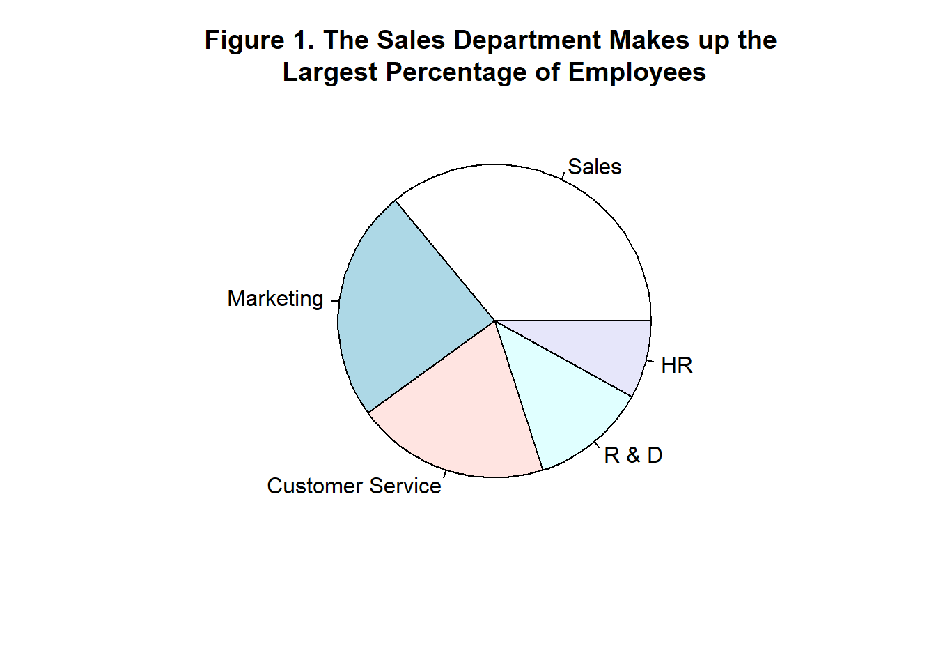
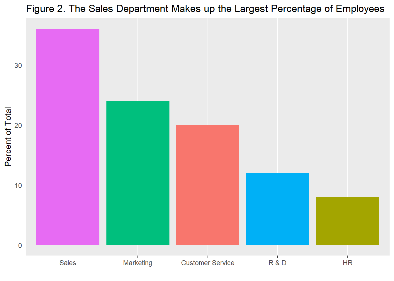
The human eye has a harder time accurately perceiving the differences in area and angle of the pie chart in Figure 1 than it does the differences in length for each variable on the bar chart in Figure 2. Research has found that humans perform the following tasks in order of most to least accurate (Cleveland & McGill, 1984):
- Position along a common scale
- Position along nonaligned scales
- Length, direction, and angle
- Area
- Volume and curvature
- Shading and color saturation
This explains why the bar chart in Figure 2 leads to faster and more accurate comprehension than the pie chart. According to these findings, an even more efficient way to convey the information in Figures 1 and 2 would be to use a dot chart such as Figure 3.
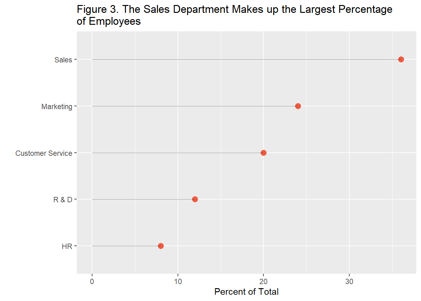
Here the eyes are quickly drawn to the data points themselves rather than being distracted by the extra lines, colors, and shading of the bar plot. This is principle number one of data visualization, select the visualization type that allows for the best combination of speed and accuracy in interpreting the data.
Key Takeaway #1: Select the visualization type that allows for the best combination of speed and accuracy in interpreting the data.