• 1 Background, Goals and Data
    • 1.1 Structure of the Addenda
    • 1.2 Software and Data
      • 1.2.1 Data
    • 1.3 Acknowledgements
  • 2 Air pollutant emissions trends (EPA)
  • 3 Distance from census tract centroid to closest TRI site
  • 4 tmap4
    • 4.1 Simple test
    • 4.2 Visual variables
    • 4.3 Constant visual variables
    • 4.4 Basemap
      • 4.4.1 Basemaps with rasters
  • 5 Spatial Interpolation
    • 5.1 Null Model of the Original Data
    • 5.2 Voronoi Polygon
      • 5.2.1 Cross-validation and relative performance
    • 5.3 Nearest Neighbor Interpolation
      • 5.3.1 Cross-validation and relative performance of the nearest neighbor model
    • 5.4 Inverse Distance Weighted (IDW)
      • 5.4.1 Using cross-validation and relative performance to guide inverse-distance weight choice
      • 5.4.2 IDW: trying other inverse distance powers
    • 5.5 Polynomials and Trend Surfaces
    • 5.6 Kriging
      • 5.6.1 Create a variogram.
      • 5.6.2 Fit the variogram based on visual interpretation
      • 5.6.3 Ordinary Kriging
    • 5.7 Exercises: Spatial Interpolation
  • 6 Terrain mapping, caves and water samples in a karst
    • 6.1 Creating a basemap from a DEM, using hillshade and terrain shading
    • 6.2 Using topographic basemap with contours
  • 7 PointBlue Penguin Study
    • 7.0.1 Interactive mapping of individual penguins abstracted from a big dataset
  • 8 Seabird Model
    • 8.1 Goals and basic methods of the analysis
    • 8.2 Exploratory data analysis
      • 8.2.1 Identifying the appropriate model using variance and mean comparisons
    • 8.3 Model black-footed albatross counts for July using a poisson-family glm
      • 8.3.1 Map the prediction
    • 8.4 Interpolation
  • 9 Time Series case studies
    • 9.1 Loney Meadow flux data
  • 10 Curve fitting
    • 10.1 Carbon flux data from Red Clover Valley
      • 10.1.1 Pairs plot
    • 10.2 Polynomial models
      • 10.2.1 poly 1
      • 10.2.2 poly 2
      • 10.2.3 poly 3
    • 10.3 Power law model
    • 10.4 Exponential model
    • 10.5 Growth and loss models in geomorphology: Gully data
    • 10.6 Log-transformed independent variables
    • 10.7 Nonlinear models
      • 10.7.1 Using nls for a rectangular hyperbola model, using the Michaelis-Menten equation
      • 10.7.2 Using the rate law to model hillslope erosion
  • 11 Atmospheric CO2 record from Mauna Loa, Hawaii
    • 11.1 Read the data
    • 11.2 Plot the time series
    • 11.3 Generalize the data
    • 11.4 Curve Fitting and Creating a Prediction
      • 11.4.1 Exponential model
      • 11.4.2 Power law model
      • 11.4.3 Second order polynomial
    • 11.5 Creating a time series object
  • 12 R Markdown and Bookdown
    • 12.1 R Markdown
      • 12.1.1 Markdown editing
      • 12.1.2 Display options in code chunks
      • 12.1.3 Numbered figures with text citations
    • 12.2 A template for multiple output formats
      • 12.2.1 The template
    • 12.3 Building a book with bookdown and YAML options
      • 12.3.1 Building a book
      • 12.3.2 Special characters and formatting limitations and challenges
    • 12.4 YAML files used to configure the book
      • 12.4.1 _output.yml
      • 12.4.2 index.Rmd
      • 12.4.3 _bookdown.yml
  • 13 Figures and Tables
    • 13.1 Figures
    • 13.2 Tables
      • 13.2.1 DT::datatable
      • 13.2.2 knitr::kable tables
      • 13.2.3 gt package
    • 13.3 Other tricks
  • 14 Building a Package on GitHub for Data and Code
    • 14.1 Git and GitHub
    • 14.2 Some notes on the RStudio process
    • 14.3 Data
      • 14.3.1 Raw data in extdata
      • 14.3.2 Binary data as rda files
    • 14.4 Code (functions)
  • References
  • Published with bookdown

Environmental Data Science Addenda

2 Air pollutant emissions trends (EPA)

The National Emissions Inventory (NEI) program of the US EPA is a detailed estimate of air emissions of criteria and hazardous air pollutants from a wide variety of air emissions sources. The inventory is released every three years based primarily upon data provided by state, local, and tribal air resources agencies for pollution sources they monitor, supplemented by data developed by the US EPA.

Air pollutant data were downloaded from https://www.epa.gov/air-emissions-inventories/air-pollutant-emissions-trends-data and provided in the igisci package.

Processing these data to create a free_y faceted graph (2.1) employs several data transformation methods we’ve looked at, and some we haven’t:

  • summarize_all gets means of all variables, though since we’re just using the totals, this just causes worksheets with multiple Total rows to merge into one; they’re actually the same value
  • pivot_longer is used twice, first to create columns for each pollutant, so the columns can be binded together, then later to create a facet graph where each pollutant becomes a parameter factor
  • bind_cols to combine a series of data frames with each having the same years (1990:2016) when data for all parameters were collected
  • A fix for dealing data not all being read in as numeric, needed for an entry error for the NH3 data, was developed by first reading in the Source Category column, then the yearly data values, setting col_types="numeric", then binding the columns
library(tidyverse); library(readxl); library(igisci)
dtaPath <- ex("airquality/Pollution by type US 1970 to 2016.xlsx")
YearColumn <- readxl::read_xlsx(dtaPath, sheet = "SO2", skip=2) %>%
  pivot_longer(cols=`1990`:`2016`, names_to="Year") %>%
  dplyr::select(Year) %>% mutate(Year=as.numeric(Year))
YearCol <- as.data.frame(unique(YearColumn$Year))
names(YearCol) = "Year"

getPollutant <- function(pollutant){
  thedata <- readxl::read_xlsx(dtaPath,sheet=pollutant,skip=2,
                               col_types="numeric") %>%
     dplyr::select(-`Source Category`)
  rowheaders <- readxl::read_xlsx(dtaPath,sheet=pollutant,skip=2) %>%
     dplyr::select(`Source Category`)
  bind_cols(rowheaders,thedata) %>%
     dplyr::select(`Source Category`,`1990`:`2016`) %>%
     filter(`Source Category`=="Total") %>%
     group_by(`Source Category`) %>%
     summarize_all(list(mean)) %>%
     pivot_longer(cols=`1990`:`2016`,names_to="Year",values_to=pollutant) %>%
     dplyr::select(pollutant)
}
SO2  <- getPollutant("SO2")
PM25 <- getPollutant("PM25Primary") %>% rename(PM25=PM25Primary)
PM10 <- getPollutant("PM10Primary") %>% rename(PM10=PM10Primary)
NOX  <- getPollutant("NOX")
CO   <- getPollutant("CO")
VOC  <- getPollutant("VOC")
NH3  <- getPollutant("NH3")
pollutants <- bind_cols(YearCol,CO,NOX,SO2,PM25,PM10,VOC,NH3)#

pollutant_long <- pollutants %>%
  pivot_longer(cols = CO:NH3, names_to="parameter", values_to="value")
p <- ggplot(data = pollutant_long, aes(x=Year, y=value)) + geom_line()
p + facet_grid(parameter ~ ., scales = "free_y")
Facet graph of air pollutants in the US, 1990-2016

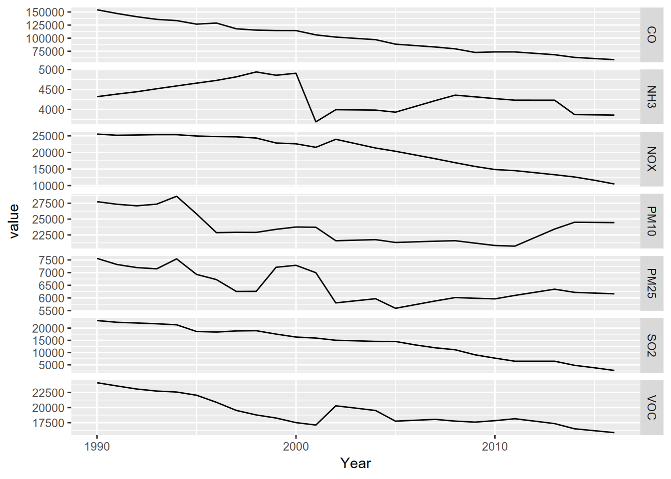
FIGURE 2.1: Facet graph of air pollutants in the US, 1990-2016