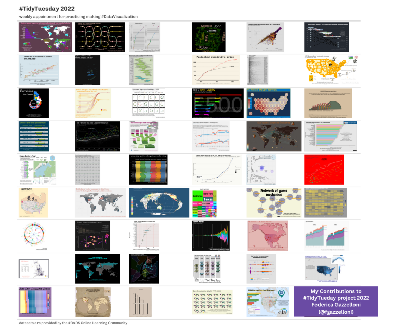
Here, I share a collection of Data Visualizations that I’ve made using R. The project is called #TidyTuesday and it is taken every week on Tuesday. Each week a new set of data is released which will brings a new chart, revealing different aspects of our world through data visualization. It’s a creative journey that transforms numbers and information into eye-catching maps.
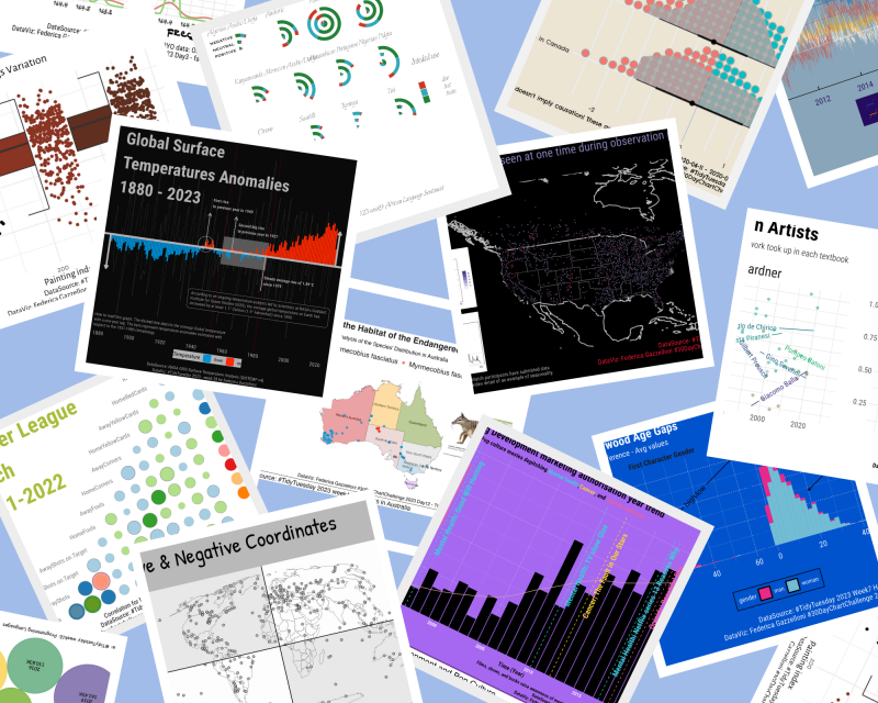
Explore this collection with me as we dive into different types of data that tell unique stories.

No matching items