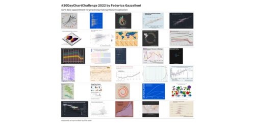
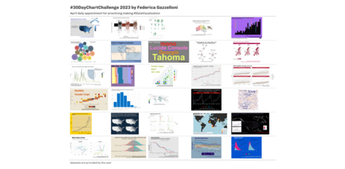
Here, I share a collection of charts that I’ve made using R. The project is called #30DayChartChallenge and it is taken every year in April. Each day brings a new chart, revealing different aspects of selected data through data visualization. It’s a creative journey that transforms numbers and information into eye-catching charts.
Explore this collection with me as we dive into charts that tell unique stories.

No matching items