13 Correlations
Have you ever heard someone say “that’s just correlation, not causation!” Well, even if you haven’t we’ll talk about both parts of that statement in this chapter. Yes, correlation isn’t causation, but it’s also an important part of figuring out if something causes something else. Let’s start with the definition of correlation, and we’ll talk about causation at the end.
13.1 Concepts
Correlation isn’t a terribly complicated phenomenon to understand, but it can be hard to explain in a single clear sentence. I’ll try though. Correlation describes a relationship between two things (generally two numeric variables) based on patterns of change, where a change is one is asscoaited wtih a change in the other.
Let’s start with an example that will probably be immediately intuitive. Height is correlated with weight. What does that mean? People that are taller typically weigh more, and people that are shorter typically weigh less. The two things are highly correlated, meaning that one can be used as a predictor of the other. Let’s look at the scatter plot below with some data for heights and weights
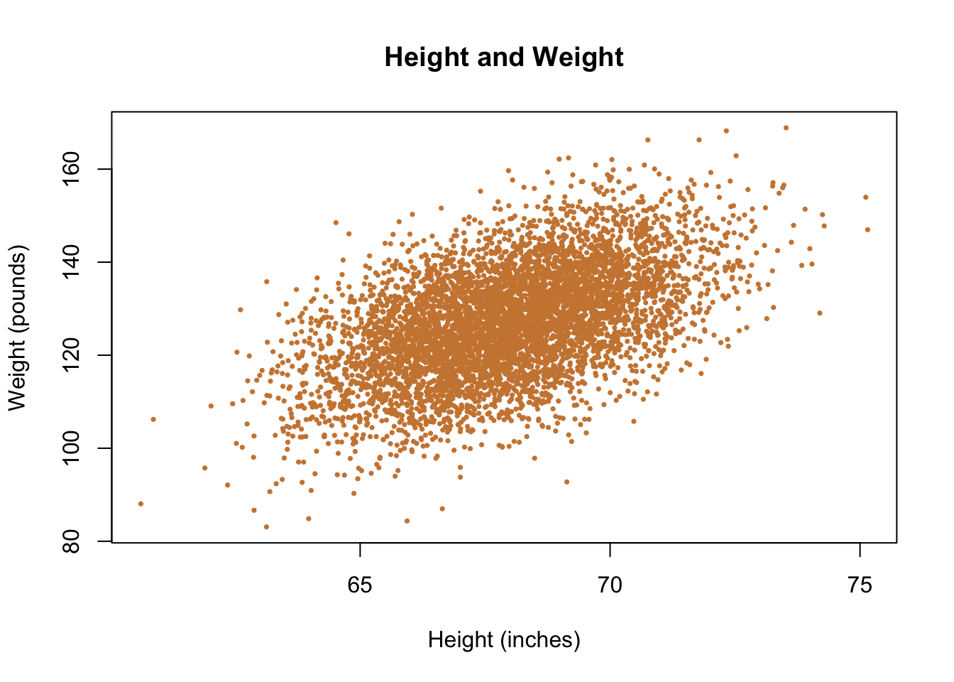
In the data, people that are taller typically weigh more, and those that weight less typically weigh less. There are exceptions. I highlight two individual points below in blue - they have essentially equivalent heights but have very different weights.

Does that mean that we can’t use height to predict weight? No. But we also have to acknowledge any single guess will be wrong. But if all you knew about a person was their height, you’d have more information to guess their weight than if you didn’t know how tall they were. It’s useful information, because the two things co-occur. Correlations just refer to the averages across the data. The fact that there are exceptions is important, but it doesn’t mean that in general the two things don’t go together.
Correlations are a simple measure that helps us to make better guesses, as indicated above.
What kind of guesses?
Imagine you’re walking down the street with a book under your arm, The Poppy War and you run into a friend. Your friend asks what you’re reading and say they’re looking for a new book, so do you think they would like it. You don’t know whether they’ll like the book yet, they haven’t read it yet. But you could try to learn something else to make a better prediction for whether they would like this particular book. So you ask them whether they’ve read and liked Game of Thrones, because you think that will be a good predictor for whether they like The Poppy War. The Poppy War has a lot of similarities with the Game of Thrones books/series, so you think if they liked X (Game of Thrones) they’re more likely to like Y (The Poppy War). Correlations are just about making better predictions.
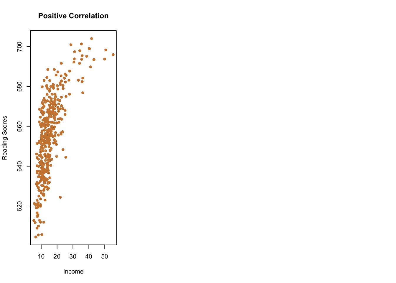
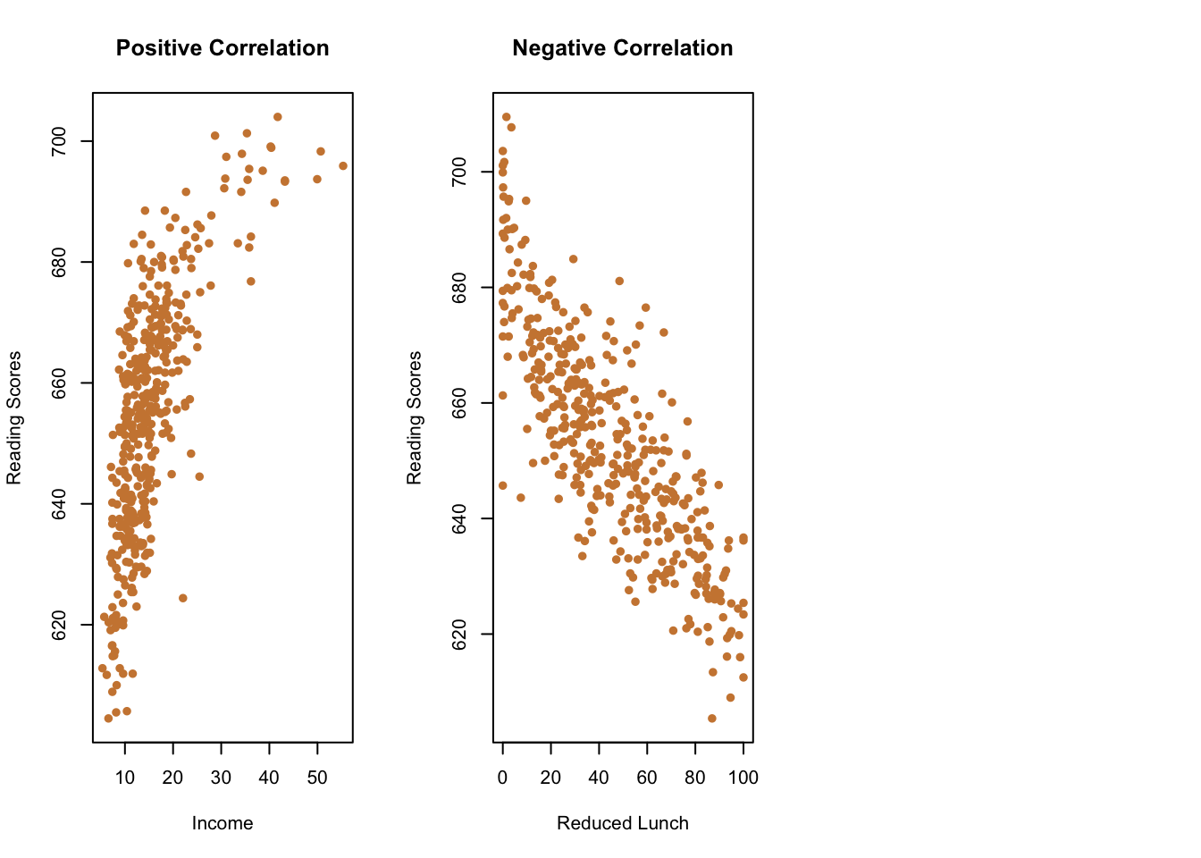
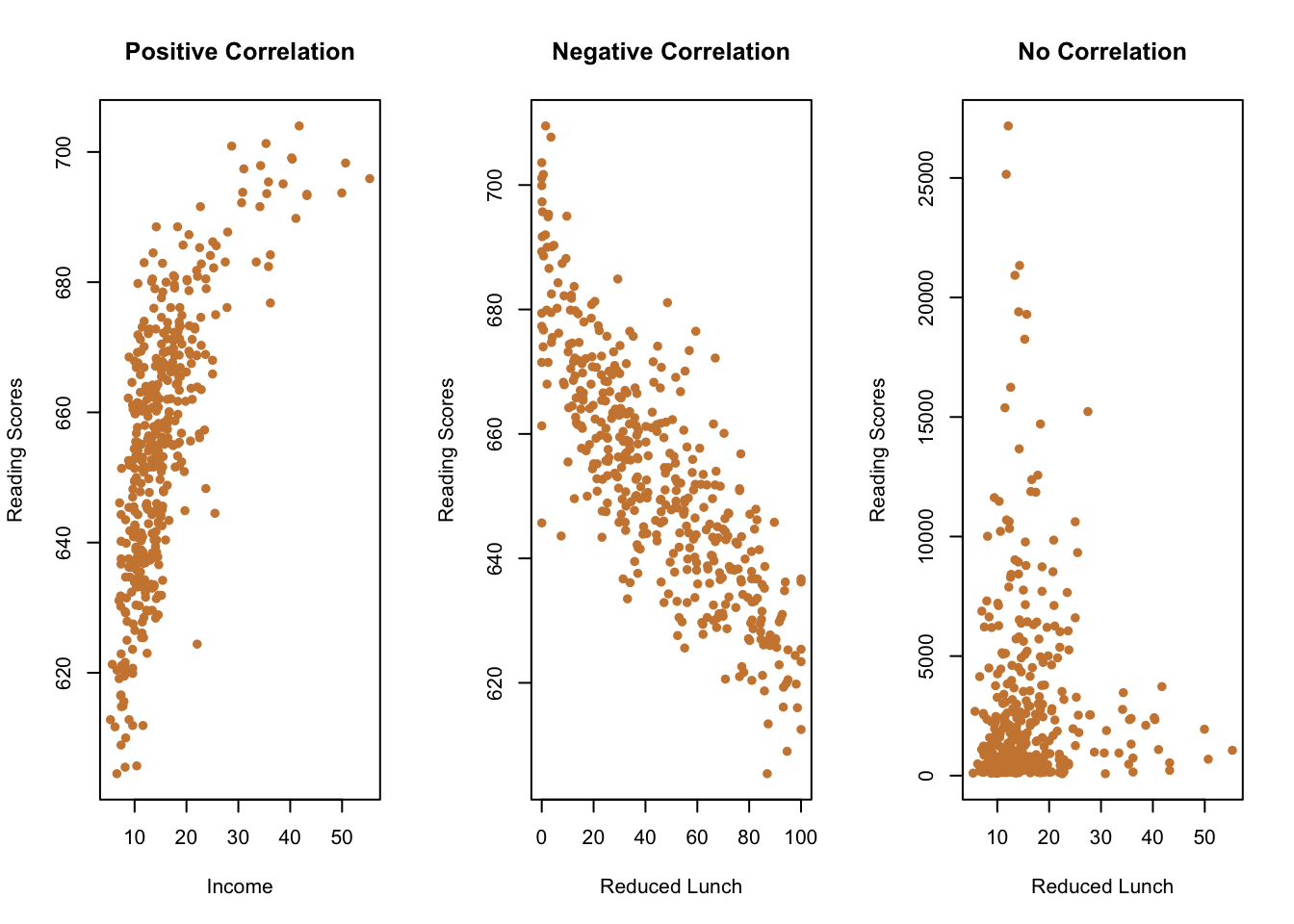
Let’s go through three examples quickly, using elementary schools in California.
Do you think schools that scored better (higher) on the state’s standardized reading test had higher or lower median parental incomes (i.e., were the parents richer)? Unsurprisingly, schools were parents were doing better financially did better on the test.
Okay, do you think schools that scored higher on the math test had more or fewer students that were receiving a free/reduced cost lunch (a common measure of poverty at a school)? You would probably predict they’d perform worse. So values that are higher for one variable (free lunches) would be lower for the other (math scores), and vice versa.
Last one. Do you think schools with more students had higher or lower median incomes? That’s something of a trick question, because they’re not correlated. Some richer schools had more students, and some had fewer. Knowing the median income of a school doesn’t help you predict the total number of students. You’ll see below that it’s lumpy data, but knowing the median income of a school really doesn’t help you guess whether the student body will be larger or smaller.
So that’s sort of a quick introduction to different types of correlation and the intuition of using it. Things can be positively correlated (higher values=higher values, lower values=lower values), they can be negatively correlated (higher values=lower values, lower values=higher values), and there can be no correlation higher values=???, lower values=???).
We can see whether and how things are correlated using scatter plots, like we’ve done above, but we can also understand it more formally by calculating the correlation coefficient.
13.1.1 Correlation Coefficient
A correlation coefficient is a single number that can range from 1 to -1, and can fall anywhere in between. What the correlation coefficient does is gives you a quick way of understanding the relationship between two things. A correlation of 1 means that two things are positively and perfectly correlated. Essentially, on a scatter plot they would form a straight line. If you know one variable you know the other one exactly, there’s no random noise. Such correlations are rare in the real world, but it’s a useful starting off point. We can also have things that are perfectly correlated and negative, which would have a correlation of -1.
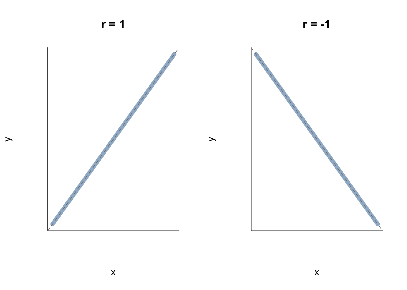
Again, we rarely observe things that are perfectly correlated in the negative direction. But those are the two extremes, and we see every combination between those two limits. The chart below will (hopefully) help you to visualize different correlations and their relative strength.
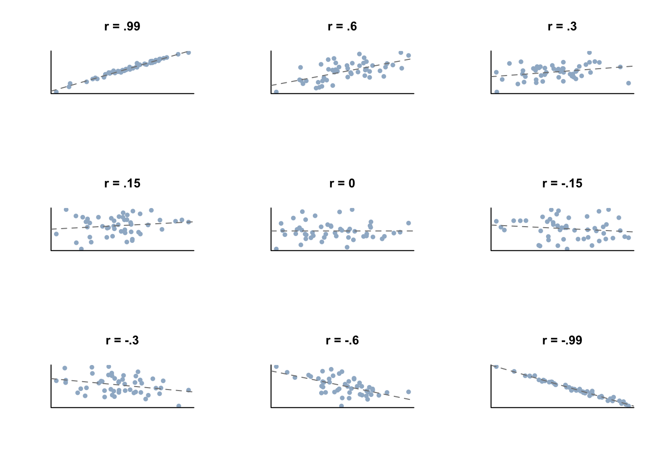
The larger the correlation coefficient is in absolute terms (closer to 1 or -1), the more helpful it is in making predictions when you only know one of the two measures.
How do we calculate the correlation coefficient? It’s worth understanding the underlying math that goes into calculating a correlation coefficient so that we don’t leave it as this magical numerical figure that is randomly generated.
13.1.1.1 Formula for Correlation Coefficient
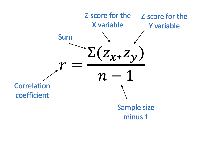
So that is the formula for calculating the correlation coefficient, which probably doesn’t make any sense right now. That’s fine, most mathematical formulas are Greek to me too. So we’ll break it down so you can understand exactly what all those different pieces are doing. The most important parts are the two z-scores on top.
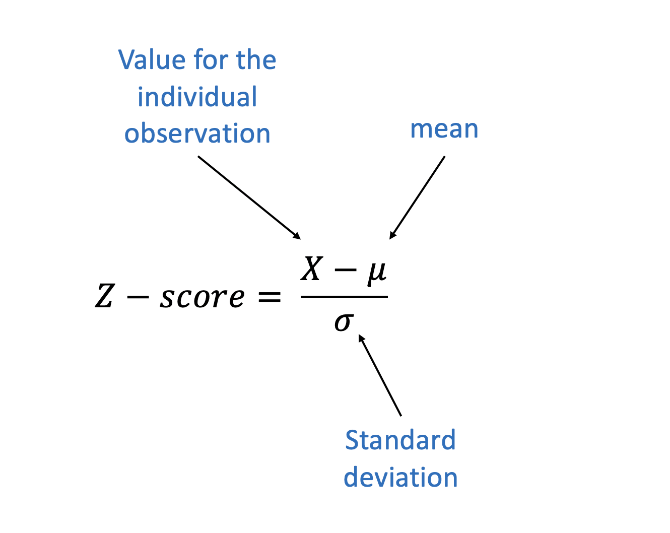
What’s a z-score? I’m glad you asked. A z-core refers to a measure after we’ve standardized it. Let’s go back to our example for height and weight to explain. Weight was measured in pounds, and height was measured in inches. So how do we compare those two different units? How many inches is worth a pound? Those are two totally different things.
Remember earlier we described a positive correlation as being a situation where one thing goes up (increases) and the other goes up (increases) too. But goes up from what? What does it mean for income and test scores to both increase in tandem.
But we get rid of those units. What we care about in calculating a correlation coefficient isn’t how many pounds or inches someone is, but how many standard deviations each value is from the mean. Remember, we can use the mean to measure the middle of our data, and the standard deviation to measure how spread out the data is from the mean. Let’s take 12 heights and weights to demonstrate.
| Index | Height | Weight |
|---|---|---|
| 1 | 65.78 | 113 |
| 2 | 71.52 | 136.5 |
| 3 | 69.4 | 153 |
| 4 | 68.22 | 142.3 |
| 5 | 67.79 | 144.3 |
| 6 | 68.7 | 123.3 |
| 7 | 69.8 | 141.5 |
| 8 | 70.01 | 136.5 |
| 9 | 67.9 | 112.4 |
| 10 | 66.78 | 120.7 |
| 11 | 66.49 | 127.5 |
| 12 | 67.62 | 114.1 |
So first we calculate the mean and standard deviations for both height and weight for those 12 numbers.
| Mean Height | 68.33 |
| Standard Deviation Height | 1.642941 |
| Mean Weight | 130.4 |
| Standard Deviation Weight | 13.78589 |
The mean for Weight is basically twice as large as height. The tallest person is fewer inches tall than the skinniest persons weight is in our data. That’s fine. What we want to know is how many standard deviations each figure in the data is from the mean, because that neutralizes the differences in units that we have. We’ll add two new columns with that information
Now we don’t have to worry about the fact that weights are typically twice what heights are. What we care about is the size of the z-scores we just calculated, which tell us how many standard deviations above or below the mean each individual observation is. If the value for height is above the mean, is the value for weight also above the mean? Do they change a similar number of standard deviations, or do they move in opposite directions?
Let’s go back to our formula.
Once we’ve calculated the zscores for each x varaible (Height) and the y variable (Weight), we multiply those figures for each individual observation. Once we multiply each set, we just add those values together. You don’t need to learn a lot of Greek to be good at data analysis, but you’ll see the E looking character that is used for sum. Sum, again, just means add all the values up. Once we have that sum, we just divide by the size of the sample (which in this case is 12) and we’ve got our correlation coefficient.
| Index | Height | Weight | HeightZ | WeightZ | HeightZxWeightZ |
|---|---|---|---|---|---|
| 1 | 65.78 | 113 | -1.553 | -1.264 | 1.963 |
| 2 | 71.52 | 136.5 | 1.936 | 0.4402 | 0.8522 |
| 3 | 69.4 | 153 | 0.6479 | 1.64 | 1.062 |
| 4 | 68.22 | 142.3 | -0.07168 | 0.8644 | -0.06195 |
| 5 | 67.79 | 144.3 | -0.3327 | 1.007 | -0.3349 |
| 6 | 68.7 | 123.3 | 0.2212 | -0.5163 | -0.1142 |
| 7 | 69.8 | 141.5 | 0.8933 | 0.8034 | 0.7177 |
| 8 | 70.01 | 136.5 | 1.023 | 0.4383 | 0.4483 |
| 9 | 67.9 | 112.4 | -0.2628 | -1.309 | 0.344 |
| 10 | 66.78 | 120.7 | -0.9446 | -0.7074 | 0.6682 |
| 11 | 66.49 | 127.5 | -1.124 | -0.2153 | 0.242 |
| 12 | 67.62 | 114.1 | -0.4328 | -1.181 | 0.511 |
The sum of the column HeightZxWeightZ is 6.297529, which divided by 12-1 equals .573. .573 is our correlation coefficient.
That was more math than I like to do, but it’s worth pulling back the veil. Just because R can do magic for us us doesn’t mean that it should be be mystical how the math works.
As height increases, weight increases too in general. Or more specifically, as the distance from the mean for height increases, the distance from the mean for weight increases too. I’ll give you the spell later, but calculating correlations in r just takes 3 letters.
13.1.2 Strength of Correlation
The correlation coefficient offers us a single number that describes the strength of association between two variables. And we know that it runs from 1, positive and perfect correlation, to -1, negative and perfect correlation. But how do we know if correlation is strong or not, if it isn’t perfect?
We have some general guidelines for that. The chart below breaks down some generally regarded cut points for the strength of correlation.
| Coefficient ‘r’ | Direction | Strength |
|---|---|---|
| 1 | Positive | Perfect |
| 0.81 - 0.99 | Positive | Very Strong |
| 0.61 - 0.80 | Positive | Strong |
| 0.41 - 0.60 | Positive | Moderate |
| 0.21 - 0.40 | Positive | Weak |
| 0.00 - 0.20 | Positive | Very weak |
| 0.00 - -0.20 | Negative | Very weak |
| -0.21 - -0.40 | Negative | Weak |
| -0.41 - -0.60 | Negative | Moderate |
| -0.61 - -0.80 | Negative | Strong |
| -0.81 - -0.99 | Negative | Very Strong |
| -1 | Negative | Perfect |
Like any cut points, these aren’t perfect. How much stronger of a correlation is there between two measures with an r of .79 vs .81? Not very much stronger, one doesn’t magically become embedded with the extra power of being “Very Strong” just by getting over that limit. It’s just a framework for evaluating the strength of different correlations.
And those cut points can be useful when evaluating the correlations between different sets of pairs. We can only calculate the correlation of two variables at a time, but we might be interested in what variable in our data has the strongest correlation with another variable of interest.
##     pop collegepct medinc medhomevalue     povpct
## 1 59867  0.1422215  50690       114300 0.17566972
## 2 38840  0.2934132  56455       157900 0.12037922
## 3  3940  0.2550111  68551       103100 0.05535055
## 4 71967  0.1582785  47770       168500 0.15947249
## 5 19891  0.1147808  45694        75400 0.14257457
## 6 13770  0.1908270  44602        89000 0.14125495
The data above is for counties in the United States, and has a set of measures relating to the demographics and economies of each county. Imagine that you’re a government official for a county, and you want to see your counties economy get stronger. To answer that question you get data on all of the counties in the US and try to figure out what are counties that have higher median incomes doing, because maybe there’s a lesson there you could apply to your county. You could test the correlations for each other variable with median income one by one, or you could look at them all together in what is called a correlation matrix.
##                      pop collegepct     medinc medhomevalue      povpct
## pop           1.00000000  0.3271464  0.2593433    0.3815824 -0.07296508
## collegepct    0.32714637  1.0000000  0.7023655    0.7273913 -0.43756053
## medinc        0.25934326  0.7023655  1.0000000    0.7166249 -0.74386673
## medhomevalue  0.38158240  0.7273913  0.7166249    1.0000000 -0.40043251
## povpct       -0.07296508 -0.4375605 -0.7438667   -0.4004325  1.00000000
That’s a lot of numbers! And it’s probably pretty confusing to look at initially. We’ll practice making similar tables that are a little better visually later, but for now let’s try to understand what that seemingly random collection of numbers is telling us.
Our data has 5 variables in it: pop (population); collegepct (percent college graduates); medinc (median income); medhomevalue (median price of homes); and povpct (percent of people in poverty.)
The names of each of those variables are displayed across the top of the table, and in the first column.
Each cell with a number is the correlation coefficient for the combination of the name of the row and the column. Let me demonstrate that by annotating what is displayed above by just looking at three of the numbers displayed.
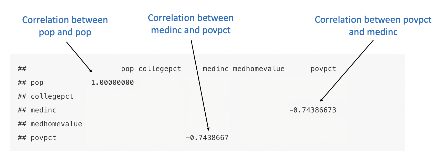
The first row is for population, and so is the first column. So what is the correlation between population and population? They’re exactly the same, they’re the same variable. So of course the correlation is perfect. It doesn’t actually mean anything, it’s included to create a break between the top and the bottom half of the chart.
The other two variables show the correlation between median income and poverty percent. It’s the same number, because whether we are correlating median income and poverty, or poverty and median income, they are the same.
And so what a correlation matrix shows us is the correlations between all of the variables in our data set, and more specifically it shows us them twice. You can work across any row to see all the correlations for one particular variable, or down any column.
A correlation matrix lets you compare the correlations for different variables at the same time. I hope all of that has been clear. If you’re wondering whether you understand what is being displayed in a correlation matrix you should be able to answer these questions: 1. what has the strongest correlation with collegepct, and what has the weakest correlation in the data.
For the first one you have to work across the entire row or column for college pct to find the largest number. For the other you should identify the number that is closest to 0.
Got your answer yet? medhomevalue has the strongest correlation with collegepct, and the correlation between povpct and pop is the weakest.
Okay, so we’ve got our correlation matrix and we know how to read it now. Let’s return to our question from above and figure out what is the strongest correlation with median income among counties. Let’s take a look at that chart again.
##                      pop collegepct     medinc medhomevalue      povpct
## pop           1.00000000  0.3271464  0.2593433    0.3815824 -0.07296508
## collegepct    0.32714637  1.0000000  0.7023655    0.7273913 -0.43756053
## medinc        0.25934326  0.7023655  1.0000000    0.7166249 -0.74386673
## medhomevalue  0.38158240  0.7273913  0.7166249    1.0000000 -0.40043251
## povpct       -0.07296508 -0.4375605 -0.7438667   -0.4004325  1.00000000
According to the chart above, the strongest correlation with median income is the percent of residents in poverty. Great, so to increase median incomes the best thing to do is reduce poverty? Maybe, but if we increased peoples median incomes we’d also probably see a reduction in poverty. Both those variables are measuring really similar things, but in slightly different ways. Essentially they’re both trying to understand how wealthy a community is, but one is oriented towards how rich the community is and the other towards how poor it is. They’re not perfectly correlated though, some communities with higher poverty rates have slightly higher or lower median incomes, but the two are strongly associated.
It’s useful to know there is a strong association between those two things, but it isn’t immediately clear how we use that knowledge to improve policy outcomes. This gets to the limitation of looking at correlations, just in and of themselves. They tell us something about the world (where there’s more poverty there’s typically lower median incomes) but it doesn’t tell us why that is true. It’s worth talking more about what correlation doesn’t and doesn’t tell us then.
13.1.3 Correlation and Causation

From the wonderful and nerdy xkcd comics
Correlation and causation are often intertwined. Way back in the chapter on Introduction to Research we talked about the goal of science to explain things, particularly the causes of things. The reason that a rock falls when dropped is because gravity causes it to go down.
Correlation is useful for making predictions, which beings to help us build causal arguments. But correlation and causation shouldn’t be overly confused. Height and weight are correlated, but does being taller cause you to weight more? Maybe, partially, because it gives your body more space to carry weight. But weighing more can also help you grow, which is why that the types of food available to societies predict differences in average height across countries. A body needs fuel to grow, and then that growth supports the addition of additional pounds. It’s all to say that the causation is complicated, even if it doesn’t change the fact about whether height and weight are correlated.
As one of my pre-law students once put it: correlation is necessary for causation to be present, but it’s not sufficient on its own.
There are three necessary criteria to assert causality (that A causes B):
- Co-variation
- Temporal Precedence
- Elimination of Extraneous Variables
Co-variation is what we’ve been measuring. As one variable moves, the other variable moves in unison. As we’ve discussed, parental incomes in high schools in California correlates with test scores.
Temporal precedence refers to the timing of the two variables. In order for A to cause B, A must precede B. I cause the TV to turn on by pushing a button, you wouldn’t say the TV turning on caused me to push a button. The measurement for parental income comes before the math tests here, so we do have temporal precedence in that example. The two variables, parental income and test scores were measured at the same time, but it’s unlikely that math scores helped parents to earn more (unless the state has introduced some sort of test reward system for parents).
So what about Extraneous Variables. We don’t just need to prove that income and math scores are correlated and that the income preceded the tests. We need to prove that nothing else could explain the relationship. Is the parental income really the cause of the scores, or is it the higher education of parents (which helps them earn more)? Is it because those parents could help their children with math homework at night, or because they could afford math camps in the summer? There are lots of things that would correlate with parental income, that would also correlate with school math scores. Until we can eliminate all of those possibilities, we can’t say for sure that parental income causes higher math scores.
These issues have arisen in the real world. A while back someone realized that children with more books in their home did better on reading tests. So nonprofits and schools started giving away books, to try and ensure every student would have books in their homes and thus and do better on tests.
What happened? Not much. The books didn’t make a difference, having parents that would read books to their children every night did, along with many other factors (having a consistent home to store them at, parents that could afford books, etc.). That’s why it’s important to eliminate every other possible explanation.
Let’s look at one more example. Homeschools students do better than those in public school. Great! Let’s home school everyone, right?
Well, home schooled students do better on average, but that’s probably related to the fact they have families with enough income for one parent to stay home and not work regularly and they have a parent that feels comfortable teaching (high education themselves). Just based off that, I’m guessing that shutting down public schools and sending everyone home wont send scores skyrocketing. But there is still a correlation between home schooling and scores, but it may not be causal.
This goes a long way to explaining why experiments are the gold standard in science.
One benefit of an experiment (if designed correctly) is that other confounding factors are randomized between the treatment and control group. So imagine we did an experiment to see if homeschooling improved kids scores. We’d take a random subsection of students, a combination of minority and white children, rich and poor, different types of parents, different previous test scores, and either have them continue in school or go to home school. At the end of a year or some time period we’d compare their scores, and we wouldn’t have to worry that there are systematic differences between the group doing one thing and another.
13.1.4 Spurious Correlations
So correlation is necessary for showing causation, but not sufficient. If I want to sell my new wonder drug that makes people lose weight, I need to show that people that take my wonder drug lose weight - that there is a correlation between weight lose and consumption of the drug. If I don’t show that, it’s going to be a hard sell.
But sometimes two things correlate and it doesn’t mean anything.
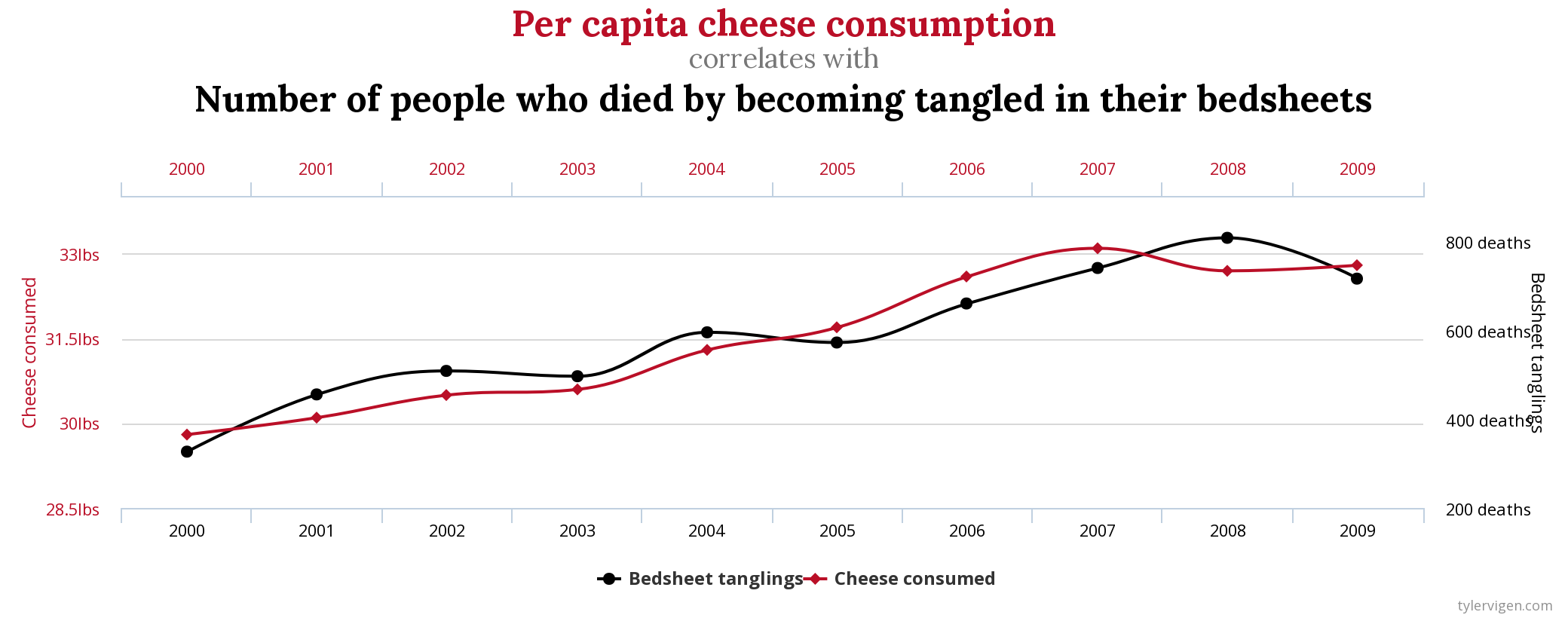
For instance, would you assume there was a relationship between eating cheese and the number of people that die from getting tangled in bed sheets? No? Well, good luck explaining to me why they correlate then!
Or what about the divorce rate in the State of Maine and per capita consumption of margarine?
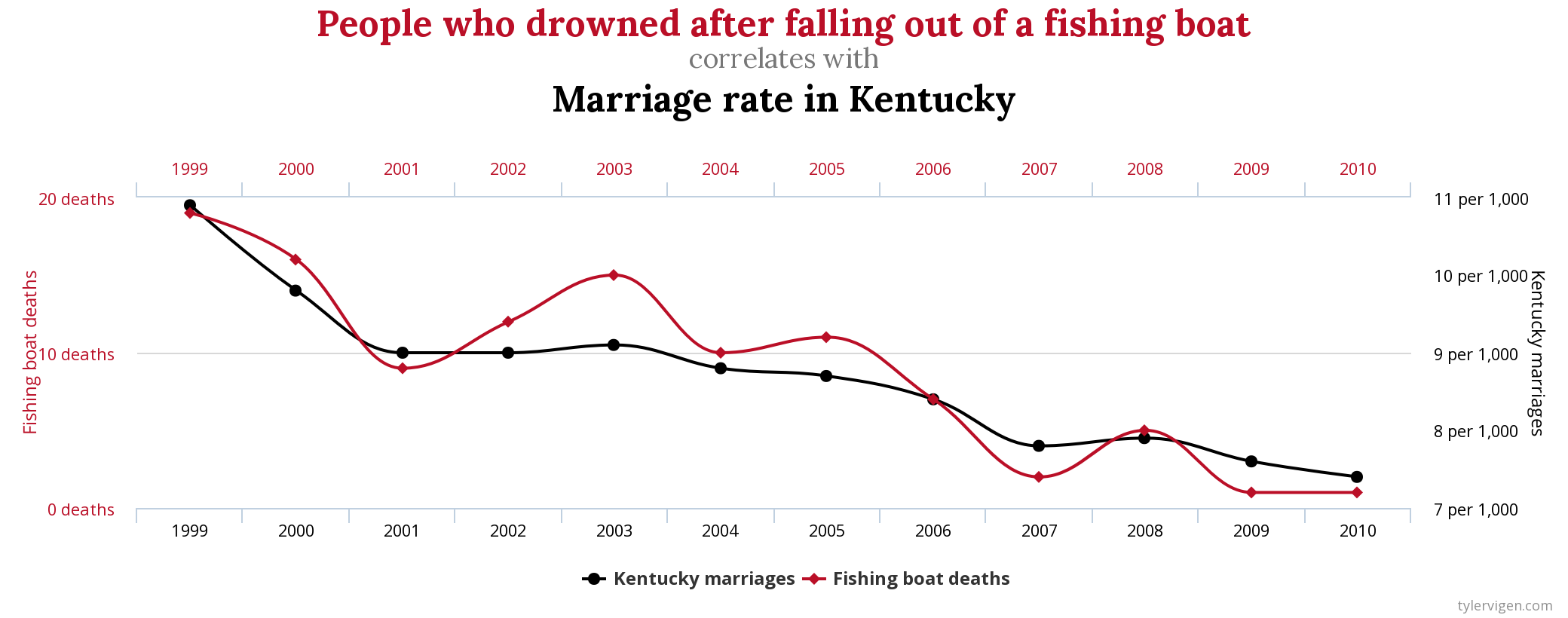
Those are all from the wonderful and wacky website of Tyler Vigen, where he’s investigated some of the weirder correlations that exist. Sometimes two things co-occur, and it’s just by random chance. We call those spurious correlations, for when two things correlate but there isn’t a causal relationship between them. Those are funny examples, but misunderstanding causation and correlation can have significant consequences. It is so critically important that a researcher think through any and every other explanation behind a correlation before declaring that one of the variables is causing the other one. It doesn’t not matter how strong the correlation is, it can be spurious if the two factors are not actually causing each other.
The growth of the anti-vax movement is actually driven in part by a spurious correlation.
Andrew Wakefield was part of a 1998 paper published in a leading journal that argued that the increasing rates of autism being diagnosed were linked to increasing levels of mercury in vaccines. I’m somewhat oversimplifying their argument, but it was based on a correlation between levels of mercury in vaccines and autism rates. The image below, from the original paper, shows how rates of autism (on the y-axis) increased rapidly after the beginning of the MMR vaccine.
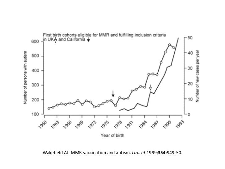
Is there a relationship between vaccines and autism, or mercury in vaccines and autism? No. But then why did rates of autism suddenly increase after the introduction of new vaccines? Doctors got better at diagnosing autism, which has always existed, but for centuries went undiagnosed and ignored. Wakefield failed to even consider alternative explanations for the link, and the anti-vax movement has continued to grow as a result of that mistake.
The original paper was retracted from the journal, the author Andrew Wakefiled lost his medical license, and significant scientific evidence has been produced disproving Wakefield’s conclusion. But a simple spurious correlation, which coincided with parents growing concern over a new and growing diagnoses in children, has caused irreparable damage to public health.
Which is again to emphasize, be careful with correlations. They can indicate important relationships, and are a good way to start exploring what is going on in your data. But they’re limited in what they can show without further evidence and should just be viewed as a beginning point.
13.2 Practice
Calculating the correlation coefficient between two variables in R is relatively straightforward. R will do all the steps we outlined above with the command cor().
Let’s start with crime rate data for US States. That data is already loaded into R, so we can call it in with the command data()
##        State Murder Assault UrbanPop Rape Region
## 1    Alabama   13.2     236       58 21.2  South
## 2     Alaska   10.0     263       48 44.5   West
## 3    Arizona    8.1     294       80 31.0   West
## 4   Arkansas    8.8     190       50 19.5  South
## 5 California    9.0     276       91 40.6   West
## 6   Colorado    7.9     204       78 38.7   West
To use the cor() command we need to tell it what two variables we want the correlation between. So if we want to see the correlation for Murder and Assault rates…
## [1] 0.8018733The correlation is .8, so very high and positive.
And for Murder and Rape…
## [1] 0.5635788A little lower, but still positive.
Just to summarize, to get the correlation between two variables we use the command cor()with the two variables we’re interested in inserted in the parentheses and separated by a comma.
We can only calculate correlation for two variables at a time, but we can also calculate for multiple pairs of variables simultaneously. For instance, if we insert the name of our data set into cor() it will automatically calculate the correlation for each pair of variables, like below…
One issue to keep in mid though is that you can only calculate a correlation for a numeric variable. What’s the correlation between the color of your shoes and height? You can’t calculate that because there’s no mean for the color of your shoes.
Similarly, if you want to produce a correlation matrix (like we just did) but there are non-numeric variables in the data, R will give you an error message. For instance, let’s read some data in about city economies and take a look at the top few lines.
city <- read.csv("https://raw.githubusercontent.com/ejvanholm/DataProjects/master/CityEconomy.csv")
head(city)
## PLACE STATE POP COLPCT MEDINC
## 1 Aaronsburg CDP (Centre County) Pennsylvania 494 0.1630695 54107
## 2 Abbeville city Alabama 2582 0.1487560 42877
## 3 Abbeville city Alabama 2582 0.1487560 42877
## 4 Abbeville city Alabama 2582 0.1487560 42877
## 5 Abbeville city Alabama 2582 0.1487560 42877
## 6 Abbeville city Louisiana 12286 0.1130653 36696
## MHMVAL MRENT
## 1 132100 777
## 2 85400 563
## 3 85400 563
## 4 85400 563
## 5 85400 563
## 6 86800 669We can calculate the correlation for population (POP) and median income (MEDINC), like so…
## [1] 0.04510574But we can’t produce a correlation matrix for the entire data set because PLACE and STATE are both non-numeric. What we can do to get around that though is create a new data set without those columns, and produce a correlation matrix for all the numeric columns. Only the variables named below will be in the new data set called “city2”.
##     POP    COLPCT MEDINC MHMVAL MRENT
## 1   494 0.1630695  54107 132100   777
## 2  2582 0.1487560  42877  85400   563
## 3  2582 0.1487560  42877  85400   563
## 4  2582 0.1487560  42877  85400   563
## 5  2582 0.1487560  42877  85400   563
## 6 12286 0.1130653 36696 86800 669## POP COLPCT MEDINC MHMVAL MRENT
## POP 1.00000000 0.1202971 0.04510574 0.0960454 0.1111621
## COLPCT 0.12029715 1.0000000 0.74555849 0.7042192 0.6494005
## MEDINC 0.04510574 0.7455585 1.00000000 0.7596826 0.7701802
## MHMVAL 0.09604540 0.7042192 0.75968258 1.0000000 0.7609890
## MRENT 0.11116206 0.6494005 0.77018019 0.7609890 1.0000000So that’s how to make a correlation matrix, but there are other more attractive ways to display the strength and direction of correlations across a data set in R. I discuss those below for anyone interested in learning more.
13.2.1 Advanced Practice
This advanced practice will combine visualization (graphing) and practice with correlations. One way to display or talk about the correlations present in your data is with a correlation matrix, as we just built above. But there are other ways to use them in a paper project.
These are examples of the types of things you can find by just googling how to do things in R. I googled “how to make cool correlation graphs in R”, found this website by James Marquez, and now reproduce some below.
We’ll use some new data for these next examples. The data below is from Switzerland and predictors of fertility in 1888. It’s a weird data set I know, but it’s all numeric and it has some interesting variables. We don’t need to worry too much about the data, but just focus on some pretty graphs below.
The first graph I’ll talk about is a variation on the traditional correlation matrix we’ve shown above. As we’ve discussed, the correlation coefficients are displayed twice for each pair of variables. That means that the same information is displayed twice, meaning that we could do something different with half that space. We need to install and load a package to create the following graph, which was discussed in the section on Polling.
swiss <- read.csv("https://raw.githubusercontent.com/ejvanholm/DataProjects/master/swiss.csv")
library(corrplot)
corrplot.mixed(cor(swiss), order="hclust", tl.col="black", tl.pos="lt")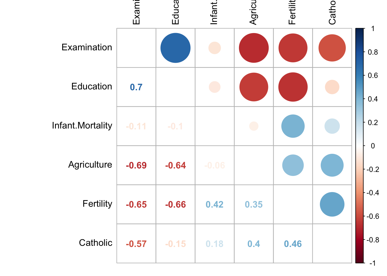
There’s a lot going on there, and it might be two artsy on some occasions. The correlation coefficients are displayed on the bottom half of the table, just like in the basic matrix, but the top half is instead circles with the size representing the strength of correlation. Blue indicates a positive correlation, and red is used for negative correlations. In addition, how dark the numbers are on the bottom is shaded based on the size of the correlation coefficient. That means not all of the data is as easy to read, but that is intentional because it tells you those hard to read numbers are smaller and thus less important. This graph really emphasizes which variables have stronger correlations. Too much? Maybe, but it’s more interesting than the black and white collection of numbers crammed together earlier.
One more, from a different package. This one is from the package corrr.
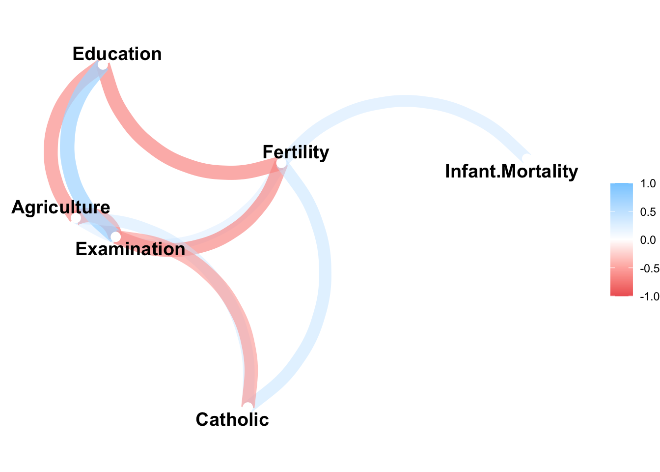
Not all of the variables in the data are displayed on that graph, only the ones with a correlation coefficient above the minimum set with the option min_cor. There I specified .35, so only those variables with a correlation above that figure are graphed. Similar to the first graph we made, negative correlations are displayed in red, and positive ones are in blue. Here there is a line between the names of different variables indicating that they are correlated. For instance, we can see that Infant.Mortality is correlated positively with Fertility because of the blue line, but Infant.Mortality is not correlated above .35 with Catholic because there is no line. It’s a minimalist way to display correlations, that again only emphasizes those variables that are associated above a certain point.
Those are just a few examples of some of the cool things you can do in R.