6 Trellis graphics
This is Chapter covers the core od Trellis graphics : useing R package lattice
Lattice is an add-on package that implements Trellis graphics (originally developed for S and S-PLUS) in R. It is a powerful and elegant high-level data visualization system, with an emphasis on multivariate data,that is sufficient for typical graphics needs, and is also flexible enough to handle most nonstandard requirements. This lab covers the basics of lattice and gives pointers to further resources.
6.1 Basic ideas:
lattice provides a high-level system for statistical graphics that is independent of traditional R graphics.
It is modeled on the Trellis suite in S-PLUS, and implements most of its features. In fact, lattice can be considered an implementation of the general principles of Trellis graphics (?).
It uses the grid package (?) as the underlying implementation engine, and thus inherits many of its features by default.
Trellis displays are defined by the type of graphic and the role different variables play in it. Each display type is associated with a corresponding high-level function (histogram, densityplot, etc.). Possible roles depend on the type of display, but typical ones are:
- primary variables: those that define the primary display (e.g., gcsescore in the previous examples).
- conditioning variables: divides data into subgroups, each of which are presented in a different panel (e.g., score in the last two examples).
- grouping variables: subgroups are contrasted within panels by superposing the corresponding displays (e.g., gender in the last example).
6.2 The following display types are available in lattice:
Function - Default Display histogram() - Histogram densityplot() - Kernel Density Plot qqmath() - Theoretical Quantile Plot qq() - Two-sample Quantile Plot stripplot() - Stripchart (Comparative 1-D Scatter Plots) bwplot() - Comparative Box-and-Whisker Plots dotplot() -Cleveland Dot Plot barchart() - Bar Plot xyplot() - Scatter Plot splom() - Scatter-Plot Matrix contourplot() - Contour Plot of Surfaces levelplot() - False Color Level Plot of Surfaces wireframe() - Three-dimensional Perspective Plot of Surfaces cloud() - Three-dimensional Scatter Plot parallel() - Parallel Coordinates Plot
We use the Chem97 dataset from the mlmRev package.The dataset records information on students appearing in the 1997 A-level chemistry examination in Britain. We are only interested in the following variables:
- score: point score in the A-level exam, with six possible values (0, 2, 4, 6, 8).
- gcsescore: average score in GCSE exams. This is a continuous score that may be used as a predictor of the A-level score.
- gender: gender of the student.
library(lattice)
library(mlmRev)
## Loading required package: lme4## Loading required package: Matrixdata(Chem97, package = "mlmRev")
head(Chem97)## lea school student score gender age gcsescore gcsecnt
## 1 1 1 1 4 F 3 6.625 0.3393157
## 2 1 1 2 10 F -3 7.625 1.3393157
## 3 1 1 3 10 F -4 7.250 0.9643157
## 4 1 1 4 10 F -2 7.500 1.2143157
## 5 1 1 5 8 F -1 6.444 0.1583157
## 6 1 1 6 10 F 4 7.750 1.4643157Using lattice, we can draw a histogram of all the gcsescore values using
histogram(~ gcsescore, data = Chem97)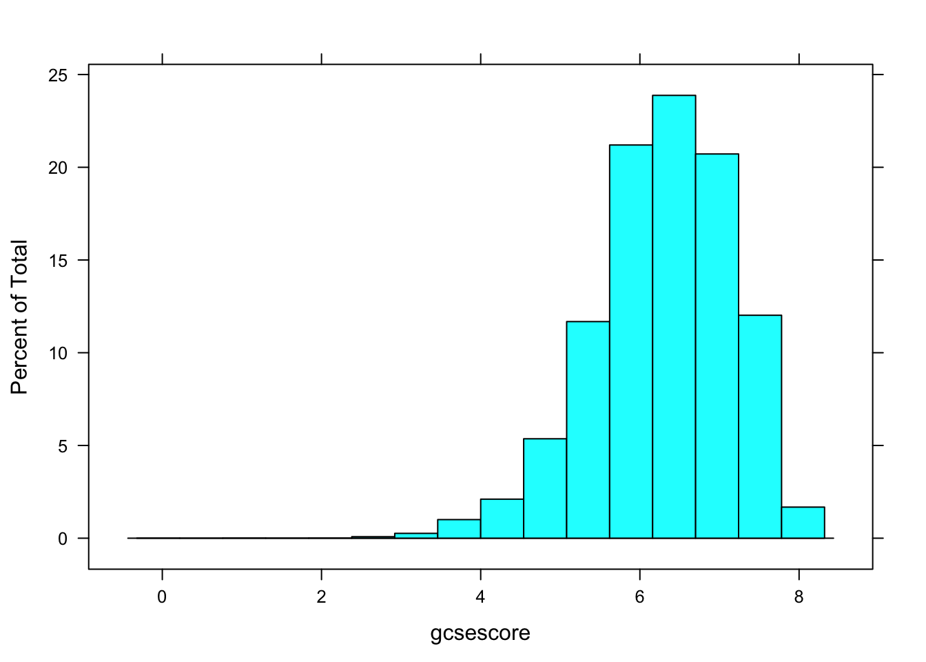
A more interesting display would be one where the distribution of gcsescore is compared across different subgroups, say those defined by the A-level exam score. This can be done using
histogram(~ gcsescore | factor(score), data = Chem97)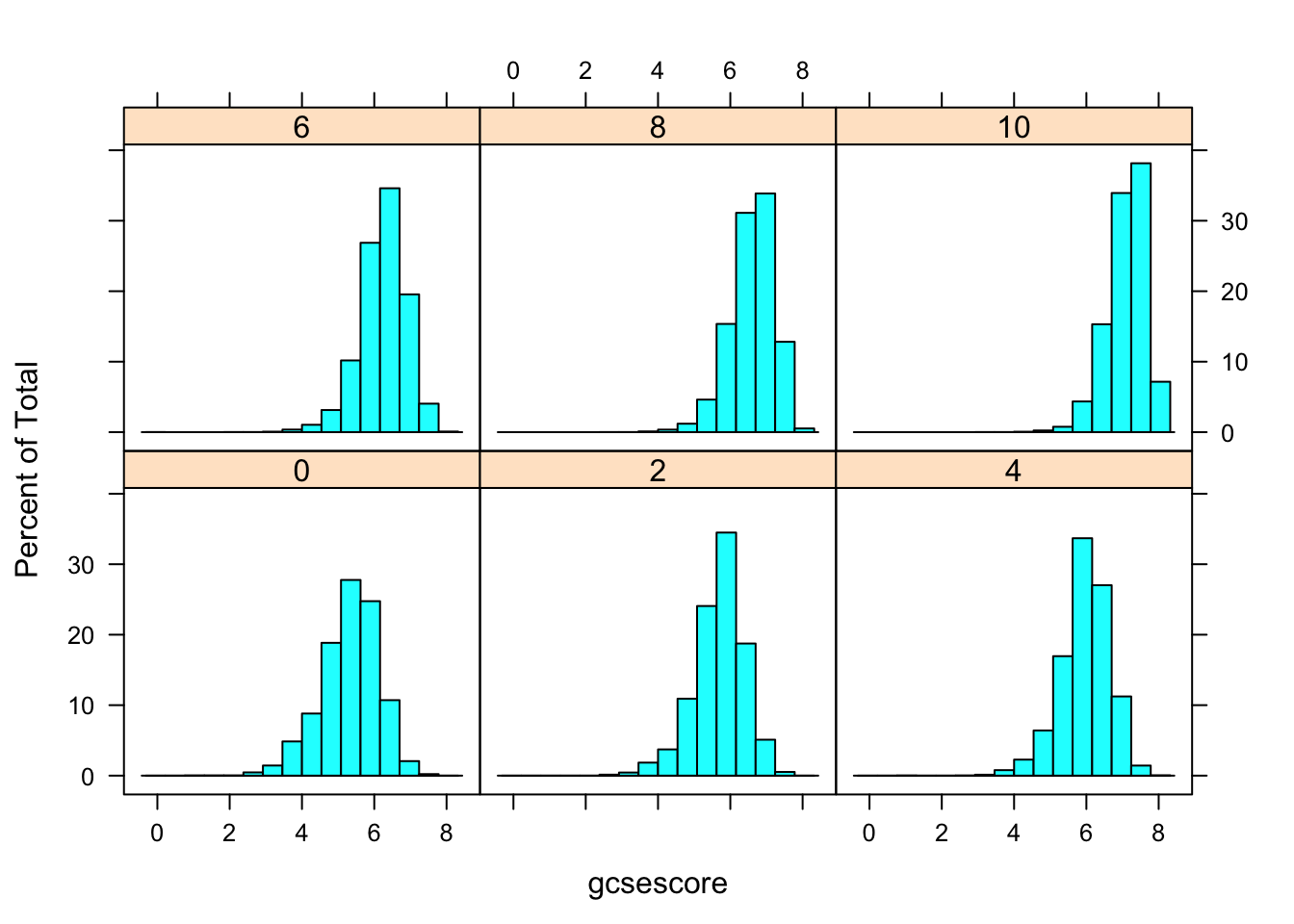
More effective comparison is enabled by direct superposition. This is hard to do with conventional histograms, but easier using kernel density estimates. In the following example, we use the same subgroups as before in the different panels, but additionally subdivide the gcsescore values by gender within each panel.
densityplot(~ gcsescore | factor(score), Chem97, groups = gender,
plot.points = FALSE, auto.key = TRUE)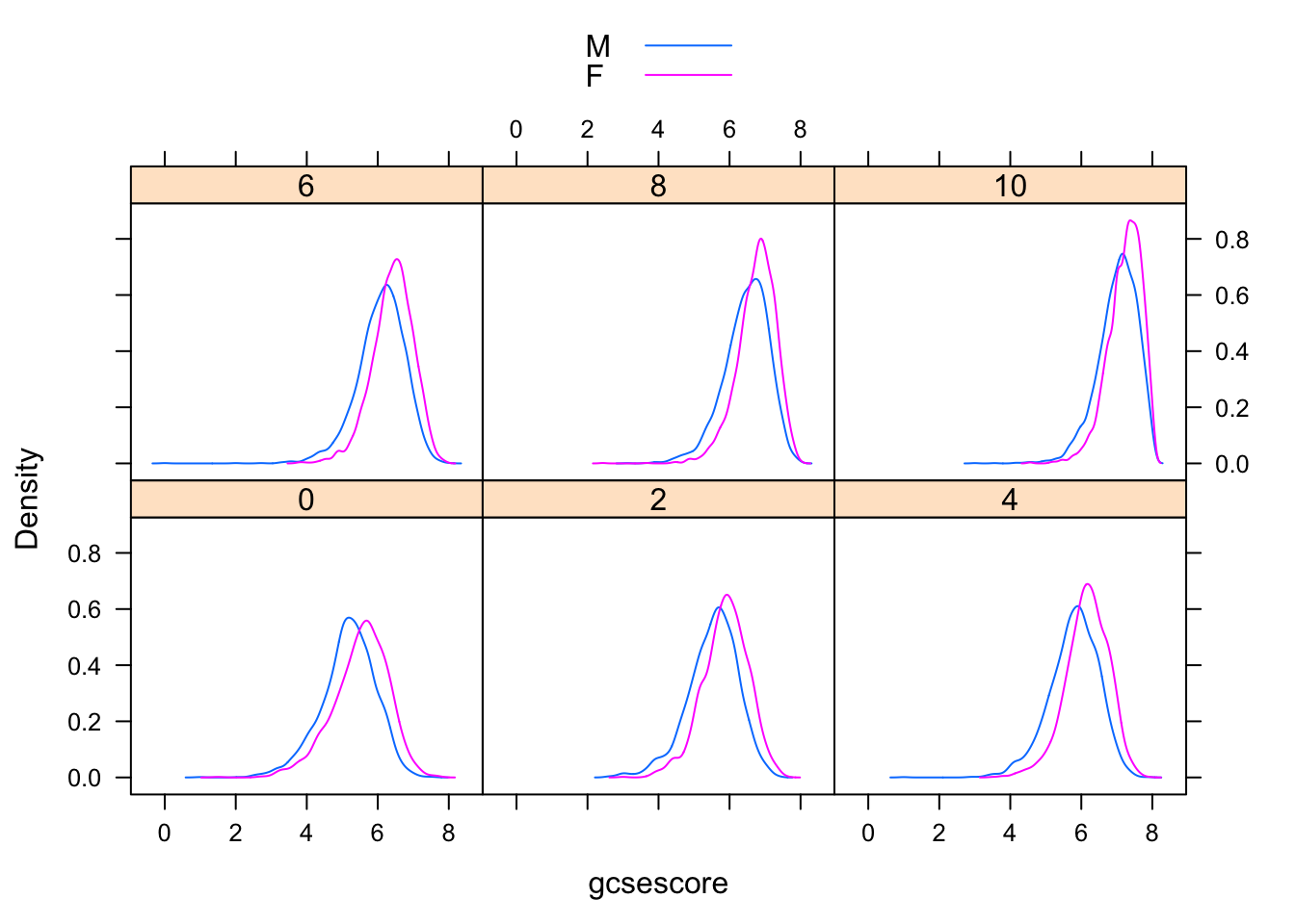
6.3 Visualizing univariate distributions
Several standard statistical graphics are intended to visualize the distribution of a continuous random variable. We have already seen histograms and density plots, which are both estimates of the probability density function. Another useful display is the normal Q-Q plot, which is related to the distribution function F(x) = P(X ≤ x). Normal Q-Q plots can be produced by the lattice function qqmath().
qqmath(~ gcsescore | factor(score), Chem97, groups = gender,
f.value = ppoints(100), auto.key = TRUE,
type = c("p", "g"), aspect = "xy")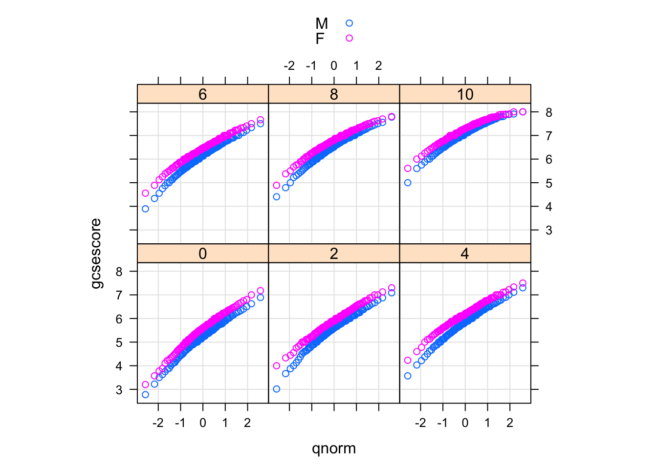
The type argument adds a common reference grid to each panel that makes it easier to see the upward shift in gcsescore across panels. The aspect argument automatically computes an aspect ratio.
6.4 Q-Q plot
Two-sample Q-Q plots compare quantiles of two samples (rather than one sample and a theoretical distribution). They can be produced by the lattice function qq(), with a formula that has two primary variables. In the formula y ~ x, y needs to be a factor with two levels, and the samples compared are the subsets of x for the two levels of y. For example, we can compare the distributions of gcsescore for males and females, conditioning on A-level score:
qq(gender ~ gcsescore | factor(score), Chem97,
f.value = ppoints(100), type = c("p", "g"), aspect = 1)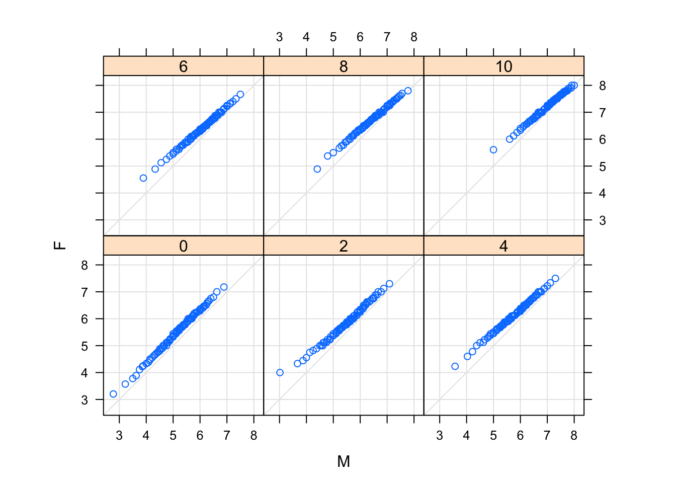
6.5 Box and whisker plot:
A well-known graphical design that allows comparison between an arbitrary number of samples is the comparative box-and-whisker plot. They are related to the Q-Q plot: the values compared are five “special” quantiles, the median, the first and third quartiles, and the extremes. More commonly, the extents of the “whiskers” are defined differently, and values outside plotted explicitly, so that heavier-than-normal tails tend to produce many points outside the extremes.
Box-and-whisker plots can be produced by the lattice function bwplot().
bwplot(factor(score) ~ gcsescore | gender, Chem97)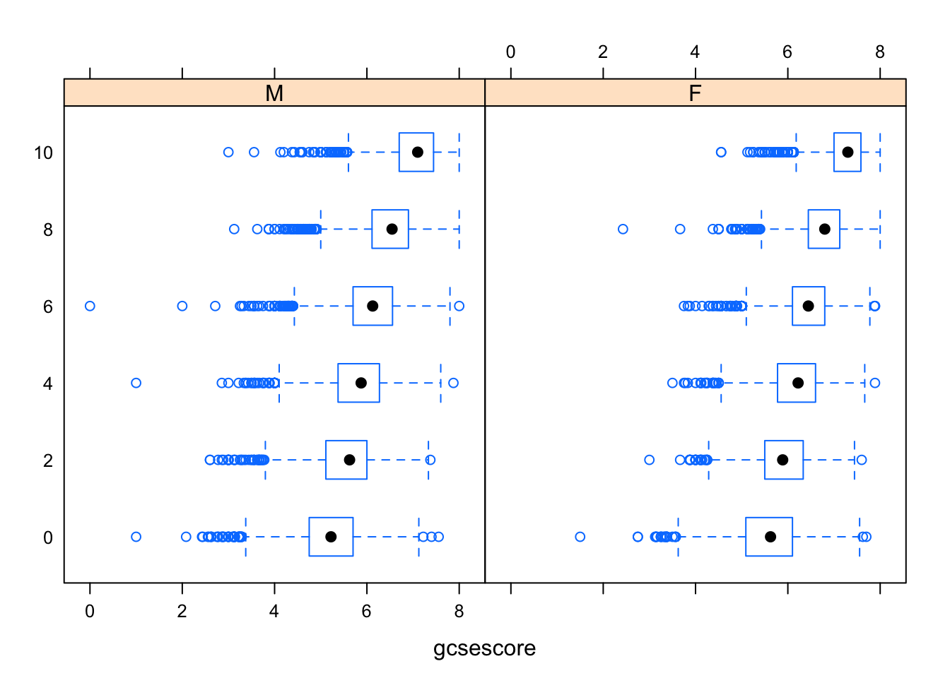
The same box-and-whisker plots can be displayed in a slightly different layout to emphasize a more subtle effect in the data: for example, the median gcsescore does not uniformly increase from left to right in the following plot, as one might have expected.
bwplot(gcsescore ~ gender | factor(score), Chem97, layout = c(6, 1))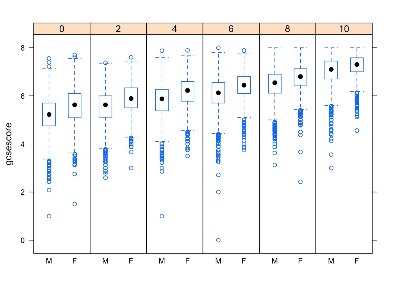
6.6 Strip plot:
For small samples, summarizing is often unnecessary, and simply plotting all the data reveals interesting features of the distribution. The following example, which uses the quakes dataset, plots depths of earthquake epicenters by magnitude.
stripplot(depth ~ factor(mag), data = quakes,
jitter.data = TRUE, alpha = 0.6,
main = "Depth of earthquake epicenters by magnitude",
xlab = "Magnitude (Richter)",
ylab = "Depth (km)")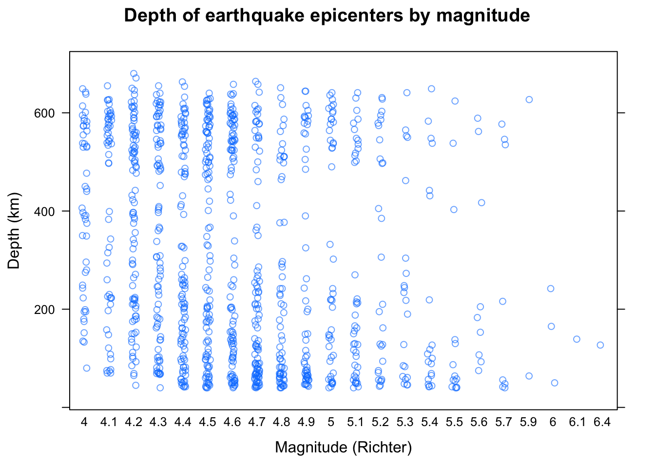
This is known as a strip plot of a 1-D scatter plot. Note the use of jittering and partial transparency to alleviate potential overplotting. The arguments xlab, ylab, and main have been used to add informative labels; this is possible in all high-level lattice functions.
6.7 Visualizing tabular data:
Tables form an important class of statistical data. Popular visualization methods designed for tables are bar charts and Cleveland dot plots.1 For illustration, we use the VADeaths dataset, which gives death rates in the U.S. state of Virginia in 1941 among different population subgroups. VADeaths is a matrix.
VADeaths## Rural Male Rural Female Urban Male Urban Female
## 50-54 11.7 8.7 15.4 8.4
## 55-59 18.1 11.7 24.3 13.6
## 60-64 26.9 20.3 37.0 19.3
## 65-69 41.0 30.9 54.6 35.1
## 70-74 66.0 54.3 71.1 50.0To use the lattice formula interface, we first need to convert it into a data frame.
VADeathsDF <- as.data.frame.table(VADeaths, responseName = "Rate")
VADeathsDF
## Var1 Var2 Rate
## 1 50-54 Rural Male 11.7
## 2 55-59 Rural Male 18.1
## 3 60-64 Rural Male 26.9
## 4 65-69 Rural Male 41.0
## 5 70-74 Rural Male 66.0
## 6 50-54 Rural Female 8.7
## 7 55-59 Rural Female 11.7
## 8 60-64 Rural Female 20.3
## 9 65-69 Rural Female 30.9
## 10 70-74 Rural Female 54.3
## 11 50-54 Urban Male 15.4
## 12 55-59 Urban Male 24.3
## 13 60-64 Urban Male 37.0
## 14 65-69 Urban Male 54.6
## 15 70-74 Urban Male 71.1
## 16 50-54 Urban Female 8.4
## 17 55-59 Urban Female 13.6
## 18 60-64 Urban Female 19.3
## 19 65-69 Urban Female 35.1
## 20 70-74 Urban Female 50.06.8 Barchart:
Bar charts are produced by the barchart() function, and Cleveland dot plots by dotplot(). Both allow a formula of the form y ~ x (plus additional conditioning and grouping variables), where one of x and y should be a factor.
A bar chart of the VADeathsDF data is produced by:
barchart(Var1 ~ Rate | Var2, VADeathsDF, layout = c(4, 1))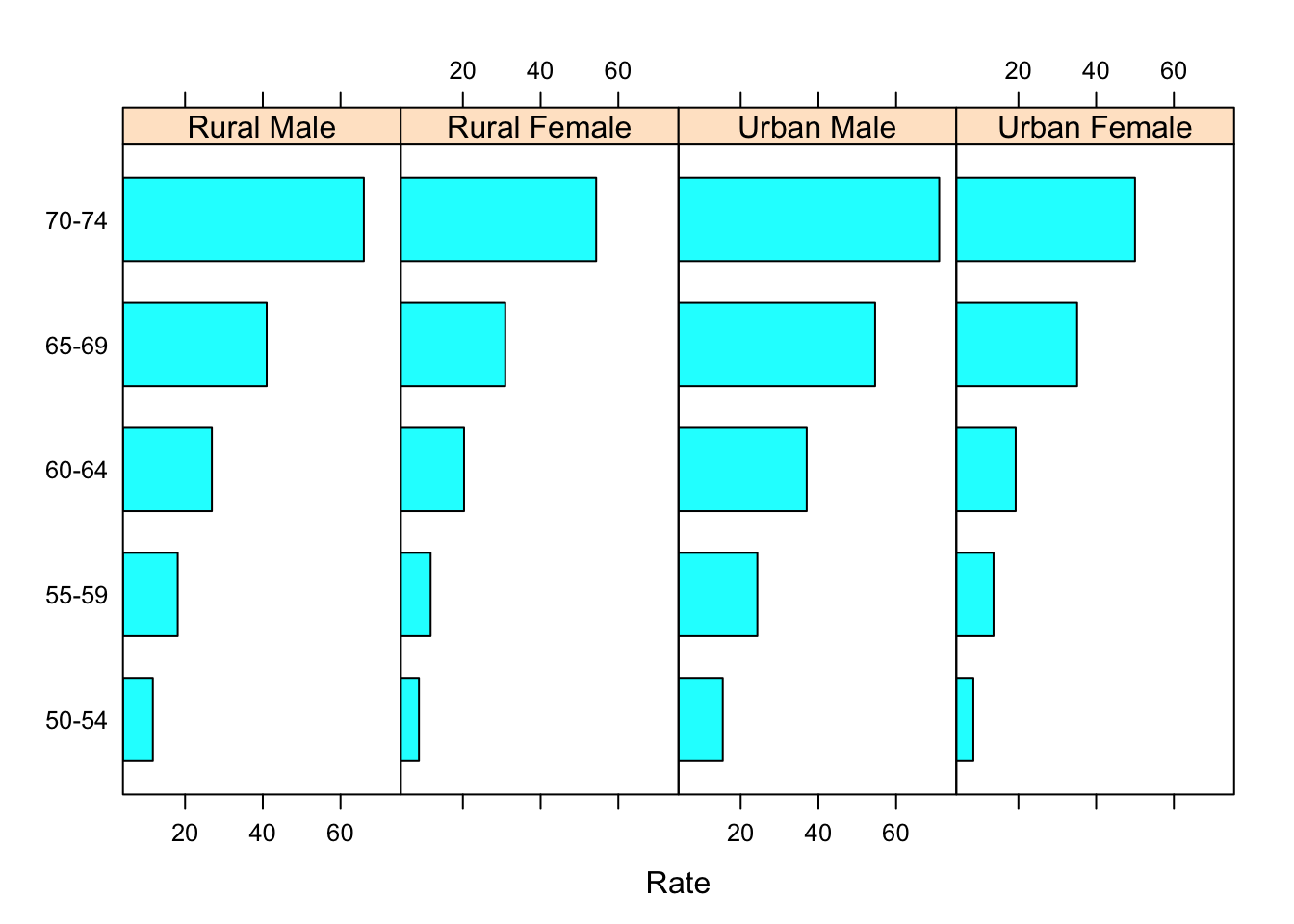
Making the areas proportional to the values they encode.
barchart(Var1 ~ Rate | Var2, VADeathsDF, layout = c(4, 1), origin = 0)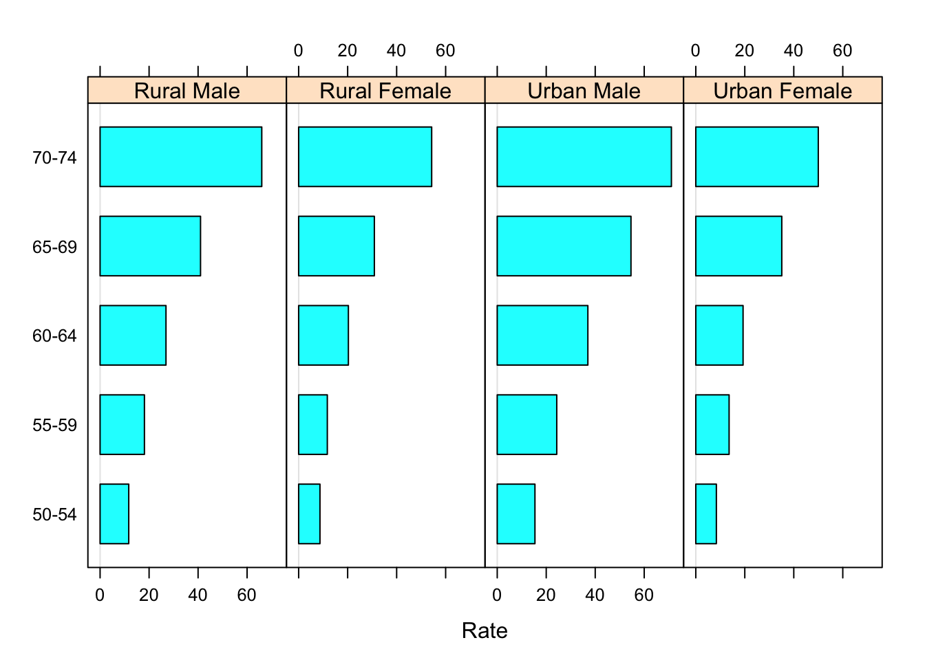
6.9 Dotplot:
A better design is to altogether forego the bars, which distract from the primary comparison of the endpoint positions, and instead use a dot plot.
dotplot(Var1 ~ Rate | Var2, VADeathsDF, layout = c(4, 1))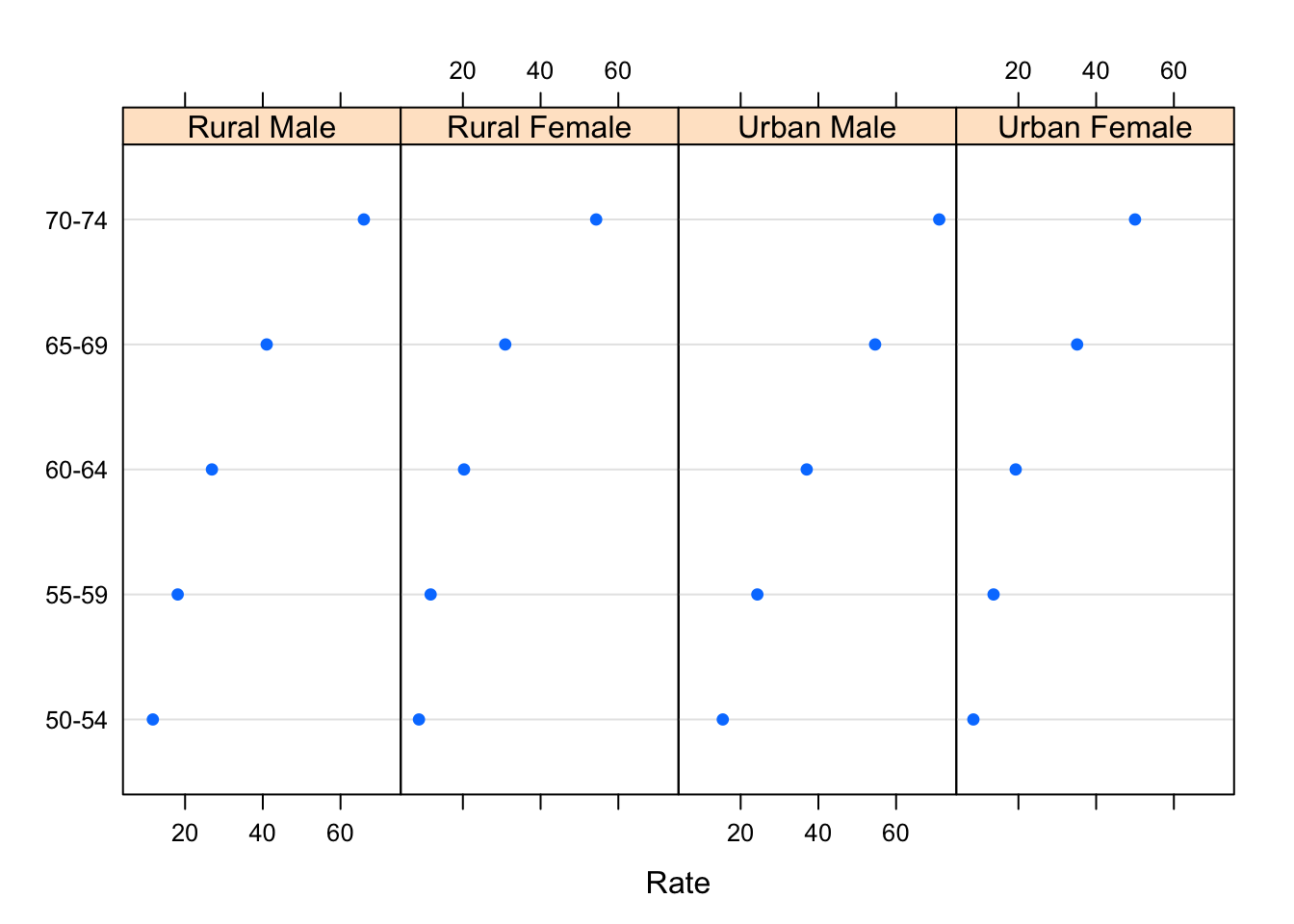
In this particular example, the display is more effective if we use Var2 as a grouping variable, and join the points within each group.
dotplot(Var1 ~ Rate, data = VADeathsDF, groups = Var2, type = "o",
auto.key = list(space = "right", points = TRUE, lines = TRUE))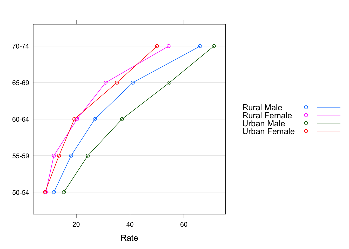
6.10 Generic functions and methods:
High-level lattice functions are actually generic functions, with specific methods doing the actual work. All the examples we have seen so far use the “formula” methods; that is, the method called when the first argument is a formula. Because barchart() and dotplot() are frequently used for multiway tables stored as arrays, lattice also includes suitable methods that bypass the conversion to a data frame that would be required otherwise. For example, an alternative to the last example is:
dotplot(VADeaths, type = "o",
auto.key = list(points = TRUE, lines = TRUE, space = "right"))
Methods available for a particular generic can be listed using:
methods(generic.function = "dotplot")## [1] dotplot.array* dotplot.coef.mer* dotplot.default* dotplot.formula*
## [5] dotplot.matrix* dotplot.numeric* dotplot.ranef.mer dotplot.table*
## see '?methods' for accessing help and source codeThe special features of the methods, if any, are described in their respective help pages; for example, ?dotplot.matrix for the example above.
6.11 Scatterplots and extensions:
Scatter plots are commonly used for continuous bivariate data, as well as for time-series data. We use the Earthquake data, which contains measurements recorded at various seismometer locations for 23 large earthquakes in western North America between 1940 and 1980. Our first example plots the maximum horizontal acceleration measured against distance of the measuring station from the epicenter.
data(Earthquake, package = "nlme")
xyplot(accel ~ distance, data = Earthquake)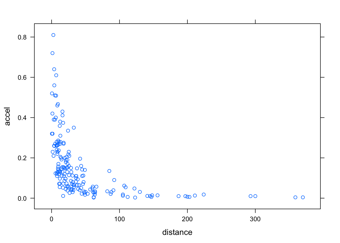
It is common to add a reference grid and some sort of smooth; for example,
xyplot(accel ~ distance, data = Earthquake, scales = list(log = TRUE),
type = c("p", "g", "smooth"), xlab = "Distance From Epicenter (km)",
ylab = "Maximum Horizontal Acceleration (g)")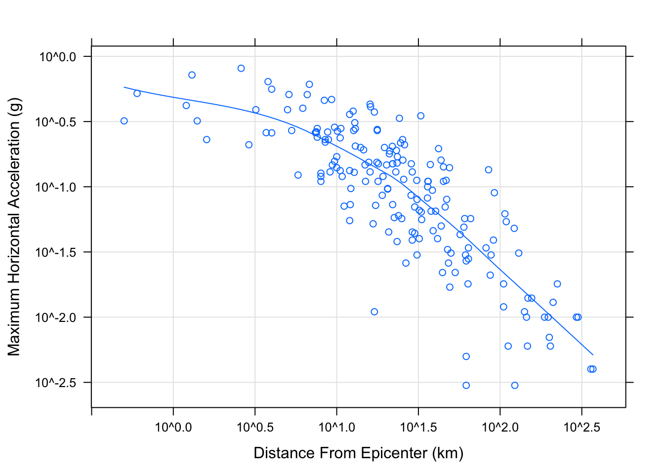
6.12 Shingles:
Conditioning by factors is possible with scatter plots as usual. It is also possible to condition on shingles, which are continuous analogues of factors, with levels defined by possibly overlapping intervals. Using the quakes dataset again, we can try to understand the three-dimensional distribution of earthquake epicenters by looking at a series of two-dimensional scatter plots.
Depth <- equal.count(quakes$depth, number=8, overlap=.1)
summary(Depth)
##
## Intervals:
## min max count
## 1 39.5 63.5 138
## 2 60.5 102.5 138
## 3 97.5 175.5 138
## 4 161.5 249.5 142
## 5 242.5 460.5 138
## 6 421.5 543.5 137
## 7 537.5 590.5 140
## 8 586.5 680.5 137
##
## Overlap between adjacent intervals:
## [1] 16 14 19 15 14 15 15xyplot(lat ~ long | Depth, data = quakes)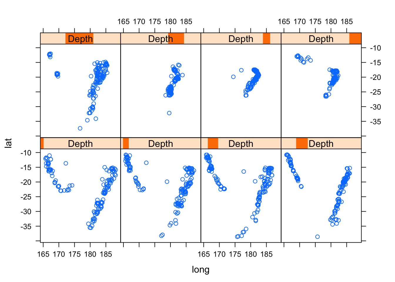
6.13 Trivariate displays:
Of course, for continuous trivariate data, it may be more effective to use a three-dimensional scatter plot.
cloud(depth ~ lat * long, data = quakes,
zlim = rev(range(quakes$depth)),
screen = list(z = 105, x = -70), panel.aspect = 0.75,
xlab = "Longitude", ylab = "Latitude", zlab = "Depth")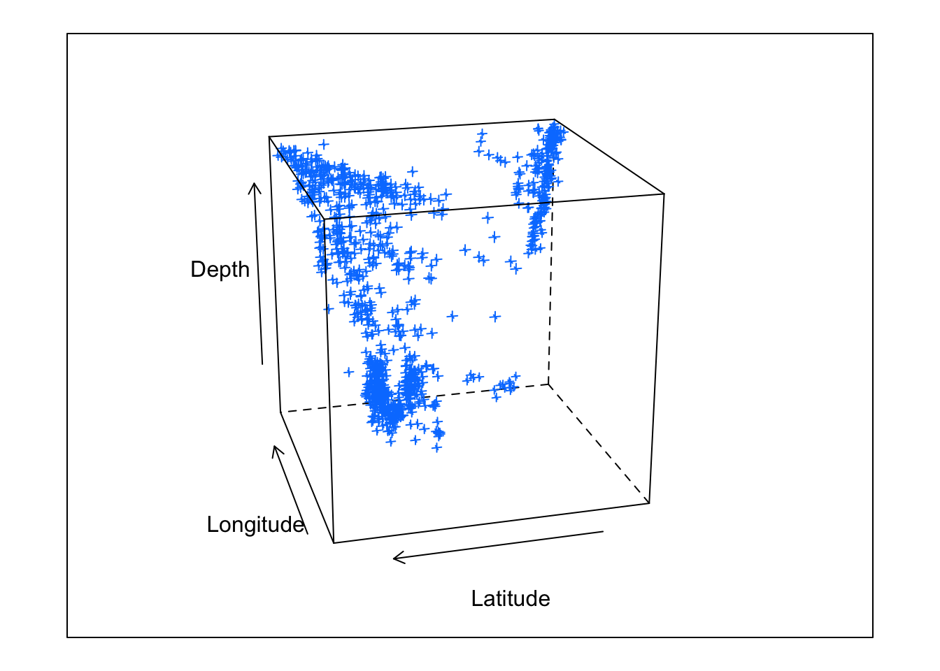
6.14 My Data Example
Water samples were collected on 6/6/18, 9/24/18, 12/17/18, 1/26/19 and ran on an autoanalyzer to determine NO3-N, NH4-N, PO4, and Chl-a concentrations across 8 tanks identified by treatments (control "A" or nutrient enriched "N"). Moreover this data was used in my master's thesis.
library(readr)
Porewater_data <- read_csv("~/Desktop/R folder/Bookdown/Porewater_data.csv")
head(Porewater_data, n=3)
## # A tibble: 3 x 7
## Tank Date `NO3 (uM)` `NH4 (uM)` `PO4 (uM)` `Conc of chl (ug/… Nutrient
## <dbl> <chr> <dbl> <dbl> <dbl> <dbl> <chr>
## 1 1 6/6/18 2.07 1.35 3.08 2.77 A
## 2 2 6/6/18 4.68 2.48 2.45 5.3 N
## 3 3 6/6/18 3.05 1.77 4.62 2.99 AHere I read in my porewater dataset and headed the first three lines.
6.14.1 Histogram
histogram(~ `NH4 (uM)`| Date, data = Porewater_data)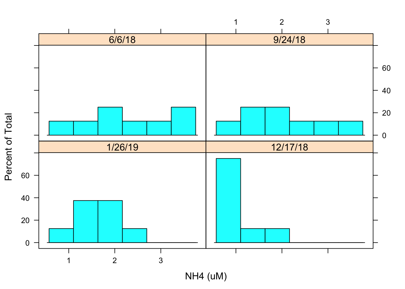
I then created a histogram to evaluate the distribution of NH4 concentrations by date. The histogram looks a little flat it may be best to transform the data.
6.14.2 Density Plot
densityplot(~ `NH4 (uM)`| Date, Porewater_data, groups = Nutrient,
plot.points = FALSE, auto.key = TRUE)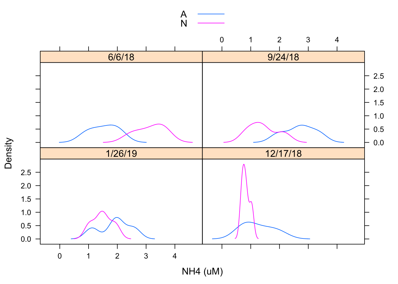
I created a density plot to evaluate the distribution of NH4 concentration by date and by treatment. It appears distributions may be similar but treatments may be having an effect
6.14.3 Normal Q-Q plot
qqmath(~ `NH4 (uM)`| Date, Porewater_data, groups = Nutrient,
f.value = ppoints(100), auto.key = TRUE)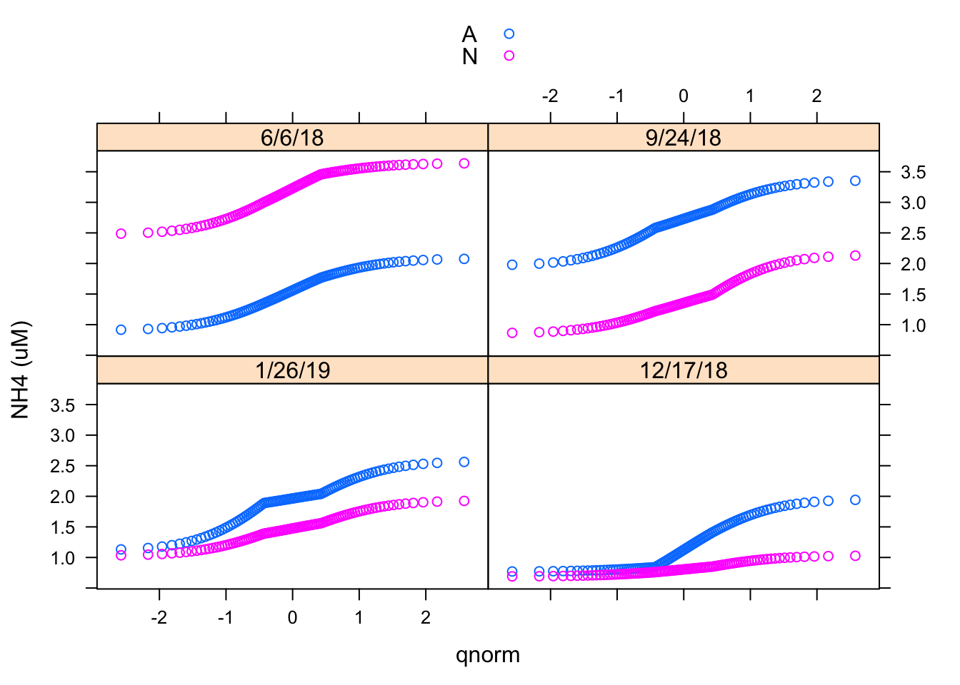 We have already seen histograms and density plots, which are both estimates of the probability density function. Another useful display is the normal Q-Q plot, which is related to the distribution function F(x) = P(X ≤ x). Here I made a Normal Q-Q plot using the qqmath() function.
6.14.4 Two-sample Q-Q plots
qq(Nutrient~`NH4 (uM)`| Date, Porewater_data,
f.value = ppoints(100), type = c("p", "g"), aspect = 1)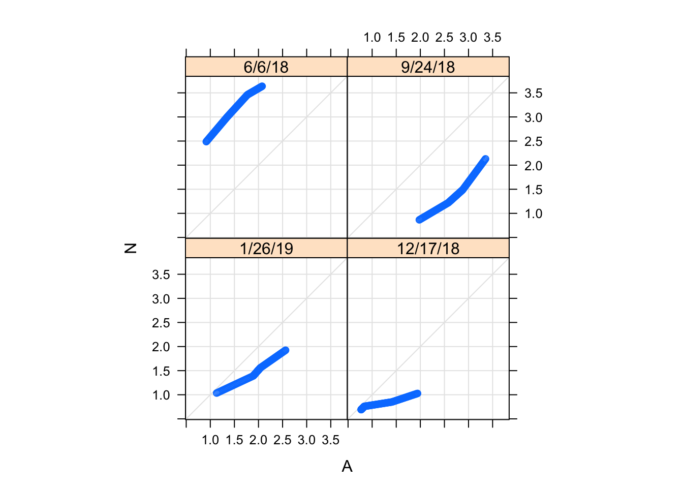 Two-sample Q-Q plots compare quantiles of two samples (rather than one sample and a theoretical distribution). They can be produced by the lattice function qq(), with a formula that has two primary variables. In the formula y ~ x, y needs to be a factor with two levels, and the samples compared are the subsets of x for the two levels of y. For example, we can compare the distributions of NH4 concentration for treatments (i.e., control (A) and nutrient enriched (N)).
6.14.5 Barchart
barchart(Nutrient ~ `NH4 (uM)` | Date, Porewater_data, layout = c(2, 2))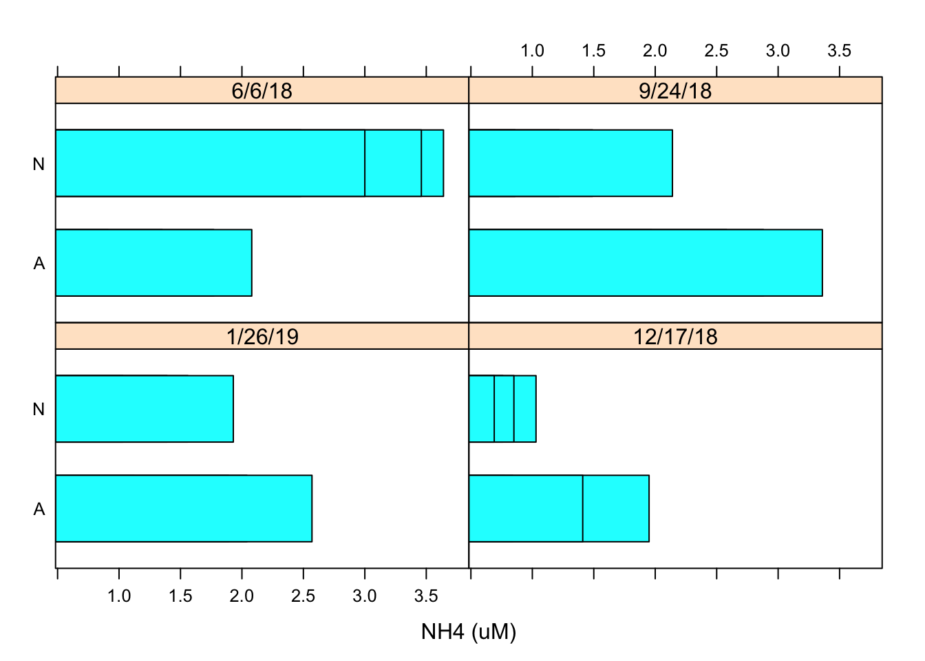 Using the similar data inputs I created a barchart using the barchart function and designated the layout as 2x2 using the layout argument.
6.14.6 Dotplot
dotplot(Nutrient ~ `NH4 (uM)` | Date, Porewater_data, layout = c(2, 2))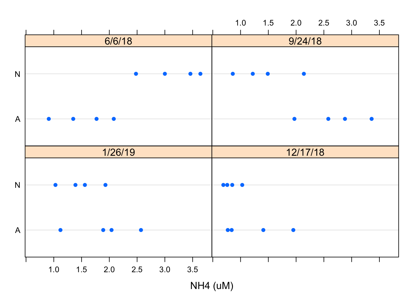 Using the similar data inputs I created a dotplot using the dotplot function and designated the layout as 2x2 using the layout argument. This is just another way to view the data but I prefer the the Barchart
6.14.7 Scatterplot
xyplot(`Conc of chl (ug/L)`~`NH4 (uM)` | Nutrient, Porewater_data, scales = list(log = TRUE),
type = c("p", "g", "smooth"), xlab = "log(NH4-N conc uM)",
ylab = "log(chl-a conc uM")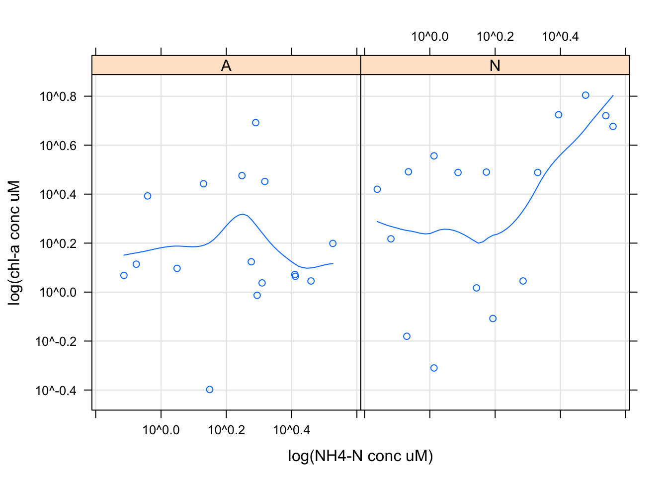
Scatter plots are commonly used for continuous bivariate data, here we looked at the relationship between chl-a concentration and NH4 concentrations by nutrient treatment using the xyplot function. I decided to scale this data using a log transformation using the scale argument. I then decided to add a regression line and x and y labels using the xlab and ylab arguments in ggplot