3 Basic R Graphics
This is Chapter covers the basics of graphics and plots of R and RStudio.
3.1 Anatomy of a plot:
A figure consists of a plot region surrounded by margins,customized by function (par).
par(usr=c(x.lo, x.hi, y.lo, y.hi))#Setting plot region par(mfrow=c(1,3)) #Multiple plots
3.2 Margins
To change margins you can use the function (mar) or (mai)
mar=c(3,3,2,1) mai=c(0.5,0.5,0.25,0.5)
3.3 Axes and tick marks
Listed below are functions to access axes and tick marks 1) axes 2) bty 3) lab 4) las 5) tck 6) xaxs/yaxs
3.4 Common plot options (arguments)
- cex: character size
- col: color
- pch: plotting symbols
- lty, lwd: line type
- log: lox scale axes
- xlab, ylab: x and y labels
- xlim, ylim: x and y variable range
3.5 My Data Example
Water samples were collected on 6/6/18, 9/24/18, 12/17/18, 1/26/19 and ran on an autoanalyzer to determine NO3-N, NH4-N, PO4, and Chl-a concentrations across 8 tanks identified by treatments (control "A" or nutrient enriched "N"). Moreover this data was used in my master's thesis.
library(readr)
Porewater_data <- read_csv("~/Desktop/R folder/Bookdown/Porewater_data.csv")
head(Porewater_data, n=3)
## # A tibble: 3 x 7
## Tank Date `NO3 (uM)` `NH4 (uM)` `PO4 (uM)` `Conc of chl (ug/… Nutrient
## <dbl> <chr> <dbl> <dbl> <dbl> <dbl> <chr>
## 1 1 6/6/18 2.07 1.35 3.08 2.77 A
## 2 2 6/6/18 4.68 2.48 2.45 5.3 N
## 3 3 6/6/18 3.05 1.77 4.62 2.99 AHere I read in my porewater dataset and headed the first three lines.
boxplot(Porewater_data$`Conc of chl (ug/L)`~ Porewater_data$Nutrient,
        col=terrain.colors(4),
        main= "Chl-a by treatment", col.main="red",
        xlab= "Treatment",
        ylab= "Chl-a concentration ug/L",
        col.lab="blue",
        cex.lab=1.5)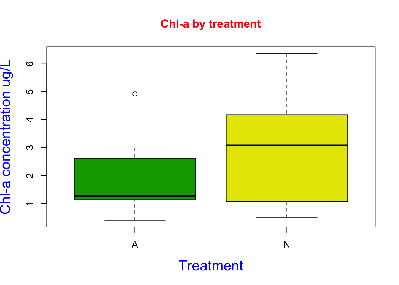
Here I created a boxplot using chl-a and treatment data. I used the col argument to designated the colors to terrain.color package. I added a title and axis labels using the main, xlab, and ylab arguments. I then changed the color of the labels using the col.main and col.lab argument. I then changed the font size of the labels using the cex.lab argument. Based on the figure we can see our treatment N increased chl-a concentrations.
plot(Porewater_data$`Conc of chl (ug/L)`~ Porewater_data$`NH4 (uM)`,
     col=3,
        main= "Chl-a by NH4-N", col.main="Brown",
        xlab= "Chl-a concentration ug/L",
        ylab= "NH4-N concentration uM",
        col.lab="blue",
        cex.lab=1.5)

fit1 <- lm (`Conc of chl (ug/L)` ~ `NH4 (uM)`, data = Porewater_data)
summary(fit1)
##
## Call:
## lm(formula = `Conc of chl (ug/L)` ~ `NH4 (uM)`, data = Porewater_data)
##
## Residuals:
## Min 1Q Median 3Q Max
## -2.0464 -1.3426 -0.1125 1.0466 3.1231
##
## Coefficients:
## Estimate Std. Error t value Pr(>|t|)
## (Intercept) 0.9841 0.6175 1.594 0.1215
## `NH4 (uM)` 0.7543 0.3133 2.408 0.0224 *
## ---
## Signif. codes: 0 '***' 0.001 '**' 0.01 '*' 0.05 '.' 0.1 ' ' 1
##
## Residual standard error: 1.493 on 30 degrees of freedom
## Multiple R-squared: 0.1619, Adjusted R-squared: 0.134
## F-statistic: 5.797 on 1 and 30 DF, p-value: 0.02241abline(fit1, lty = "dashed")
text(x =1.0, y = 5.5,labels="T = 2.408, p=0.0224")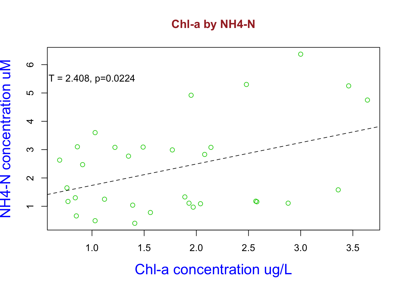 ** Here I used my dataset to look at the bivariate relationship between NH4-N and chl-a concentrations. Here I constructed a linear model and named it fit1. I then reviewed the statistics and it happens to be statistical significant. Increasing NH4 concentrations increases chl-a abundance. I add this the linear model regression line by using the abline argument and added the significant t and p values using the text argument**