Portfolio Risk Measures
Case Study
In this session, we will analyse the Dow Jones 30 stock prices over the period 1991-01-02 to 2000-12-29. The main objective is to apply the techniques we have learned in the lecture to construct a portfolio, compute portfolio losses, and quantify risk using Value-at-Risk (VaR) and Expected Shortfall (ES) measures.
We will continue using the QRM and qrmtools packages in R, which provide both the dataset and essential functions for risk modelling and portfolio analysis.
Data Overview
The DJ dataset contains daily closing prices of the \(30\) companies that form the Dow Jones Industrial Average over the selected period. To examine the available stocks, we load the data and list the constituent companies:
##  [1] "AA"   "AXP"  "T"    "BA"   "CAT"  "C"
##  [7] "KO"   "DD"   "EK"   "XOM"  "GE"   "GM"
## [13] "HWP"  "HD"   "HON"  "INTC" "IBM"  "IP"
## [19] "JPM"  "JNJ"  "MCD"  "MRK"  "MSFT" "MMM"
## [25] "MO"   "PG"   "SBC"  "UTX"  "WMT"  "DIS"
You select \(d\) out of \(30\) companies to form your portfolio. You also assign a number of shares for each selected company. This allows us to compute portfolio value and risk contributions from each stock.
Analysis Workflow
The main tasks in this session are as follows, with the confidence level for risk measures set to \(99\%\):
- Data Preparation and Visualisation
- Prepare the data set for your portfolio so that it can be analysed by
R. - Compute and plot the time series of log returns of your selected stocks.
- Create scatter plots of log return pairs using
pairs()to observe relationships among stocks.
- Prepare the data set for your portfolio so that it can be analysed by
- Portfolio Loss Calculation
- Construct a loss operator function that computes portfolio losses from log returns.
- Construct unbiased estimates for the mean vector and covariance matrix, which are essential for risk measurement.
- Risk Measures: VaR and ES
- Parametric (normal) approach: assumes returns are normally distributed.
- Empirical (historical) approach: uses actual observed losses without distributional assumptions.
Solution and Code
Data Preparation and Visualisation
We have already loaded QRM and qrmtools in the Case Study. Here we recall the data and check the stock symbols:
##  [1] "AA"   "AXP"  "T"    "BA"   "CAT"  "C"
##  [7] "KO"   "DD"   "EK"   "XOM"  "GE"   "GM"
## [13] "HWP"  "HD"   "HON"  "INTC" "IBM"  "IP"
## [19] "JPM"  "JNJ"  "MCD"  "MRK"  "MSFT" "MMM"
## [25] "MO"   "PG"   "SBC"  "UTX"  "WMT"  "DIS"
The Dow Jones 30 is a price-weighted index of 30 prominent companies listed on U.S. stock exchanges. You can find the current constituents at https://www.cnbc.com/dow-30/. Understanding the business sectors and correlations between your selected stocks is crucial for portfolio risk analysis, as:
- Stocks from the same sector tend to be more correlated (higher systematic risk).
- Diversification across sectors can reduce portfolio variance.
- Industry-specific shocks affect sector correlations during stress periods.
Select stocks and parameters
For this analysis, we construct a diversified portfolio across different sectors to demonstrate risk measurement concepts:
- General Electric (
GE): Industrial conglomerate (aerospace, power, renewable energy) - Intel (
INTC): Technology sector (semiconductors, processors) - Coca Cola (
KO): Consumer defensive sector (beverages, stable demand) - Johnson & Johnson (
JNJ): Healthcare sector (pharmaceuticals, medical devices)
This selection provides sector diversification, mixing cyclical (GE, INTC) with defensive (KO, JNJ) stocks.
Assigning \(1000\) shares to each, we can define the portfolio in R as follows:
stock.selection <- c("GE","INTC","KO","JNJ")  # Define the portfolio composition
lambda <- c(1000,1000,1000,1000)  # Number of shares per stock
Note: Equal shares ≠ equal weights! The actual portfolio weights depend on the stock prices, which we’ll calculate later.
Further we set the confidence level \(\alpha\) to 99%.
You can experiment with different stock selections and share allocations to observe how portfolio composition affects risk measures. For instance:
- Increasing allocation to defensive stocks (KO, JNJ) typically reduces portfolio volatility.
- Concentrating in one sector increases systematic risk exposure.
- The number of shares determines position sizing and capital allocation.
Prepare data: prices and log returns
We need log returns, which are standard in risk measurement.
Note: Returns are defined as value changes, therefore we will always have one observation less of returns than prices. To be able to put both next to another, we discard the first price observation after computing the return series. Thus, we define \[ r(t) = \log\frac{P(t)}{P(t-1)}, \quad t = 1,2, \dots \] and then we delete \(P(0)\).
# Extract selected stock prices
prices <- DJ[, stock.selection]
# Compute log prices
logprices <- log(prices) ## GMT
## GE INTC KO
## 1991-01-02 NA NA NA
## 1991-01-03 -0.022373178 0.000000000 -0.028011195
## 1991-01-04 -0.011377142 0.006496233 0.025243091
## 1991-01-07 -0.016130472 -0.009760244 -0.016761170
## 1991-01-08 0.009246033 -0.009771790 -0.008481921
## 1991-01-09 -0.002297868 0.009771790 -0.022994362
## JNJ
## 1991-01-02 NA
## 1991-01-03 -0.010771949
## 1991-01-04 -0.007246308
## 1991-01-07 -0.031389221
## 1991-01-08 0.009329814
## 1991-01-09 -0.024452647# diff() introduces NA in the first row; so we remove it
logreturns <- diff(logprices)[2:nrow(logprices), ] # Align prices/logprices to end-of-period dates
prices <- prices[2:(T+1),]
logprices <- logprices[2:(T+1),]
# Display the first 6 rows
head(prices)## GMT
## GE INTC KO JNJ
## 1991-01-03 4.5259 1.1968 9.6032 7.2298
## 1991-01-04 4.4747 1.2046 9.8487 7.1776
## 1991-01-07 4.4031 1.1929 9.6850 6.9558
## 1991-01-08 4.4440 1.1813 9.6032 7.0210
## 1991-01-09 4.4338 1.1929 9.3849 6.8514
## 1991-01-10 4.4338 1.2046 9.5486 7.0341## GMT
## GE INTC KO JNJ
## 1991-01-03 1.509816 0.1796513 2.262096 1.978211
## 1991-01-04 1.498439 0.1861476 2.287339 1.970965
## 1991-01-07 1.482309 0.1763873 2.270578 1.939576
## 1991-01-08 1.491555 0.1666155 2.262096 1.948906
## 1991-01-09 1.489257 0.1763873 2.239102 1.924453
## 1991-01-10 1.489257 0.1861476 2.256395 1.950770## GMT
## GE INTC KO
## 1991-01-03 -0.022373178 0.000000000 -0.028011195
## 1991-01-04 -0.011377142 0.006496233 0.025243091
## 1991-01-07 -0.016130472 -0.009760244 -0.016761170
## 1991-01-08 0.009246033 -0.009771790 -0.008481921
## 1991-01-09 -0.002297868 0.009771790 -0.022994362
## 1991-01-10 0.000000000 0.009760244 0.017292532
## JNJ
## 1991-01-03 -0.010771949
## 1991-01-04 -0.007246308
## 1991-01-07 -0.031389221
## 1991-01-08 0.009329814
## 1991-01-09 -0.024452647
## 1991-01-10 0.026316740Data visualization: Log prices
Visualizing price evolution helps identify trends, volatility regimes, and potential structural breaks in the data. Log prices are particularly useful as they show multiplicative changes on a linear scale.
# Plot time series of log prices.
plot(logprices[,1], type="l", ylim = range(logprices), lwd = 2,
     xlab = "Time", ylab = "Log Price",
     main = "Log prices of the selected DJ constituents")
lines(logprices[, 2], col = 2, lwd = 2)
lines(logprices[, 3], col = 3, lwd = 2)
lines(logprices[, 4], col = 4, lwd = 2)
legend("bottomright", legend = stock.selection, col=1:4, lty=1, lwd = 2, bty = "n")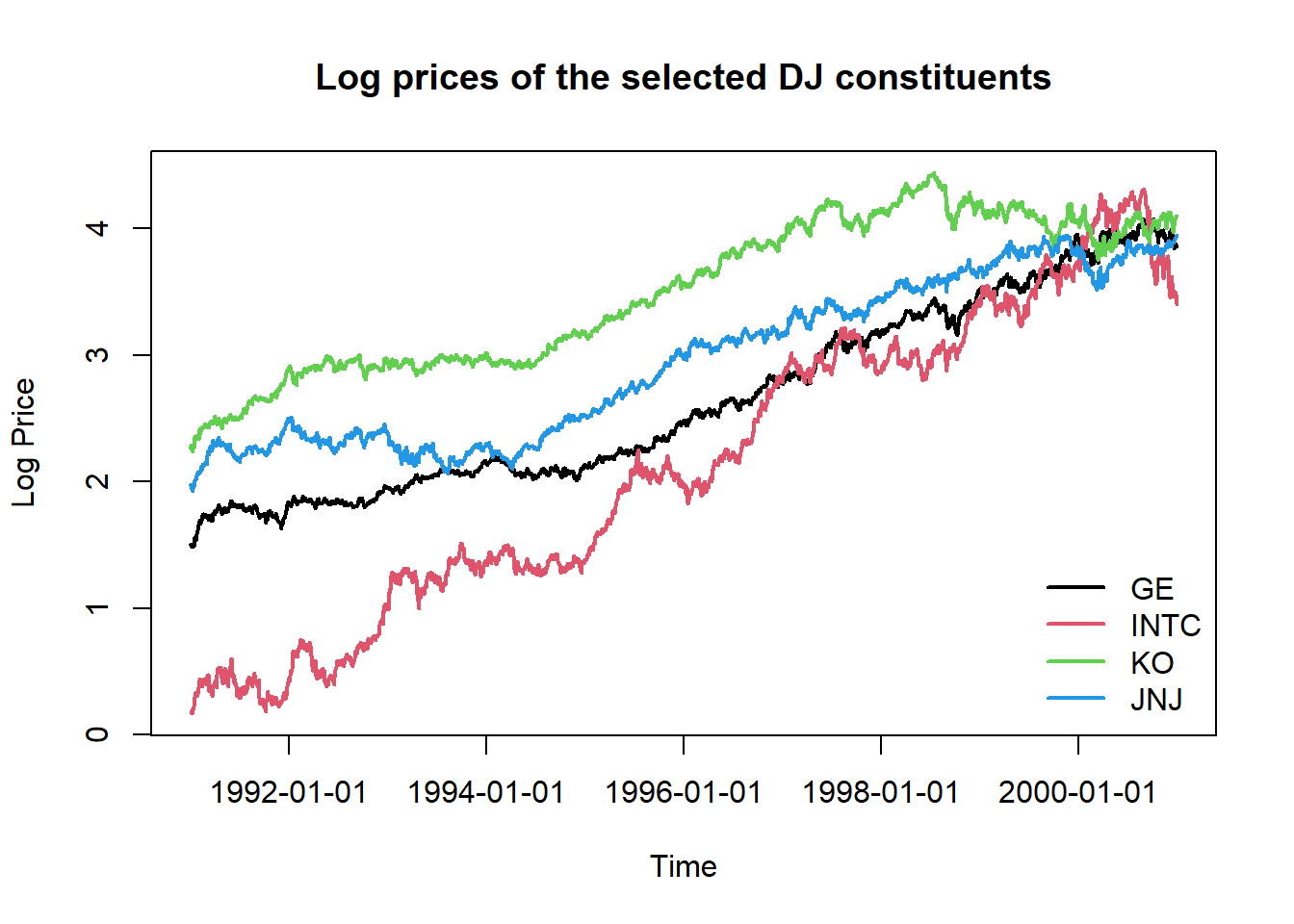
Interpretation Guide (including but not limited to):
- Parallel movements: Stocks moving together indicate positive correlation.
- Diverging paths: Different performance suggests diversification benefits.
- Volatility clusters: Periods of high/low variation often cluster together.
- Trend persistence: Long-term upward or downward movements in log prices.
Scatter plots of log returns
Pairwise scatter plots reveal the correlation structure of returns. The correlation coefficient measures linear dependence, but scatter plots can reveal non-linear relationships, outliers and tail dependence.
# Plot scatter plots of return pairs.
pairs(logreturns, pch = 19,
      cex = 0.8,                  # smaller point size
      col = rgb(0, 0, 0, 0.4), labels = stock.selection,
      gap = 0.3,                  # spacing between panels
      main = "Pairwise Log Return Relationships"
)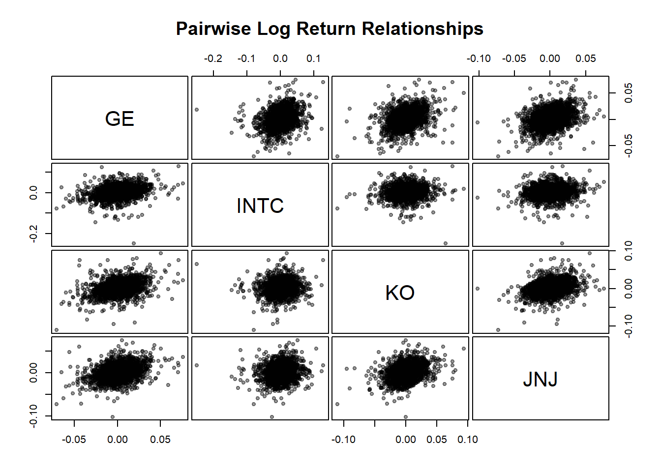
# Calculate and display correlation matrix
cor_matrix <- cor(logreturns)
print(round(cor_matrix, 3))
## GE INTC KO JNJ
## GE 1.000 0.279 0.375 0.351
## INTC 0.279 1.000 0.113 0.158
## KO 0.375 0.113 1.000 0.349
## JNJ 0.351 0.158 0.349 1.000## [1] 0.271## [1] 0.375## [1] 0.113Correlation Interpretation:
- Positive correlation (>0): Stocks tend to move in the same direction.
- Near-zero correlation: Little linear relationship (good for diversification).
- High correlation (>0.7): Limited diversification benefit.
- Outliers: Extreme points may indicate crisis periods or company-specific events.
Portfolio Loss Calculation
Portfolio weights determine the risk contribution of each asset. We calculate weights based on current (end-of-period) market values.
## [1] 189882.3## GMT
## GE INTC KO
## 2000-12-29 0.2496099 0.1580353 0.3185157
## JNJ
## 2000-12-29 0.2738391## [1] 1Define the loss operator function
The loss operator transforms returns into portfolio losses. This is the fundamental building block for risk measurement. We implement both exact and linearised versions:
- Exact (non-linear) formula: \(L_{t} = -V_{t}\sum_{i=1}^{N}w_{i} (e^{X_{t,i}}-1)\).
- Linearised approximation: \(L_{t} \approx -V_{t}\sum_{i=1}^{N}w_{i} \cdot X_{t,i}\).
The linearisation is valid for small returns (using the approximation \(e^{x} - 1 \approx x\) for small \(x\)).
Recall that there are three inputs required for defining a loss function lo.fn:
- log returns
x, as the risk factor changes, - portfolio weights
weights, and - portfolio value
value.
lo.fn <- function(x, weights, value, linear=FALSE){
  # x: a matrix or vector of N returns (risk factor changes).
  # weights: a vector of N weights.
  # value: a scalar representing the portfolio value.
  # linear: the default is nonlinear which means the function which calculated
  # the return factor (e.g. mk.returns() used a default log() (or some other
  # nonlinear) transform. Hence using exp(x) will reconvert the log() so the
  # summand will reflect actual changes in value.

  if (!is.vector(x) & !is.matrix(x)) {
    stop("x must be a vector or matrix of return observations")
  }

    N <- length(weights)
    T <- if (is.matrix(x)) nrow(x) else 1

    # Weights in a matrix
    weight.mat <- matrix(weights, nrow = T, ncol = N, byrow = TRUE)
    # Value contribution for each stock
    tmp.mat <- value * weight.mat

    # Calculate portfolio change
    summand <- if (linear) x * tmp.mat else (exp(x) - 1) * tmp.mat
  # We return a vector where each row is the change in value
  # summed across each of the risk changes on a single day.

  # By taking the negative, we convert the changes in value to losses.
    loss <- -rowSums(summand)
    return(loss)
}
Compute portfolio losses
Applying this function to find the (linearised) loss of the selected stocks over full sample period and on the first day.
## 1991-01-03
##   3276.365
# Losses of selected stocks on the first day, linearised
lo.fn(logreturns[1,], pf.weights, pf.value, linear=TRUE)## 1991-01-03
## 3314.653Mean and covariance estimation
Compute mean vector and unbiased covariance matrix of returns.
##           GE         INTC           KO
## 0.0009209655 0.0012754616 0.0007174242
##          JNJ
## 0.0007768039
The var() function in R uses \((n-1)\) as the denominator, which gives you an unbiased estimate of the population variance. If using other methods that divide by \(n\) instead, just multiply by \(\frac{T-1}{T}\) to get an unbiased estimator for the covariance matrix.
##                GE         INTC           KO
## GE   2.329777e-04 1.155796e-04 9.678202e-05
## INTC 1.155796e-04 7.381922e-04 5.182779e-05
## KO   9.678202e-05 5.182779e-05 2.858818e-04
## JNJ  8.787794e-05 7.038126e-05 9.674833e-05
##               JNJ
## GE   8.787794e-05
## INTC 7.038126e-05
## KO   9.674833e-05
## JNJ 2.689107e-04## [1] -165.7065# Portfolio loss variance
varloss <- pf.value^2 *(pf.weights %*% sigma.hat %*% t(pf.weights))
varloss## [,1]
## [1,] 5293938Risk Measures: VaR and ES
We estimate the Value-at-Risk (VaR) and Expected Shortfall (ES) of our portfolio under two frameworks:
Parametric (Normal) Approximation, assuming portfolio losses follow a normal distribution.
Empirical (Historical) Simulation, making no distributional assumptions but instead relying on the observed sample of losses.
Both methods are compared graphically to highlight differences in how each approach captures tail risk.
Normal Approximation
We begin with the parametric approach, which assumes that the portfolio losses are normally distributed. This method is computationally efficient and easy to interpret, but it can underestimate risk when the data exhibit heavy tails or skewness, as is often the case in real financial returns.
The mean and variance of the portfolio loss are given: \[ VaR_{\alpha} = \mu_L + \sigma_L \Phi^{-1}(\alpha), \qquad ES_{\alpha} = \mu_L + \sigma_L \frac{\phi(\Phi^{-1}(\alpha))}{1 - \alpha}. \]
##          [,1]
## [1,] 5186.885## [,1]
## [1,] 5966.567These estimates provide a baseline: they are quick to compute and often serve as a benchmark for more robust, non-parametric methods.
Empirical Simulation
The empirical approach (or historical simulation) avoids any assumptions about the shape of the loss distribution. Instead, it uses the empirical distribution function (EDF) derived from the actual observed losses.
This approach directly reflects the characteristics of the data, including asymmetry and fat tails, making it particularly useful in stress testing and risk management.
For example, when considering losses over the entire sample period, it is theoretically expected to follow some normal distribution. We can visually validate this assumption by creating a quantile-quantile (QQ) plot for the losses.
qqnorm(loss,
       main = "QQ Plot of Portfolio Losses",
       xlab = "Theoretical Quantiles",
       ylab = "Empirical Loss Quantiles",
       pch = 19, cex = 0.8,
       col = rgb(70/255,130/255,180/255, alpha = 0.5)
       )
qqline(loss, col = "red", lwd = 2)  # Add reference normal line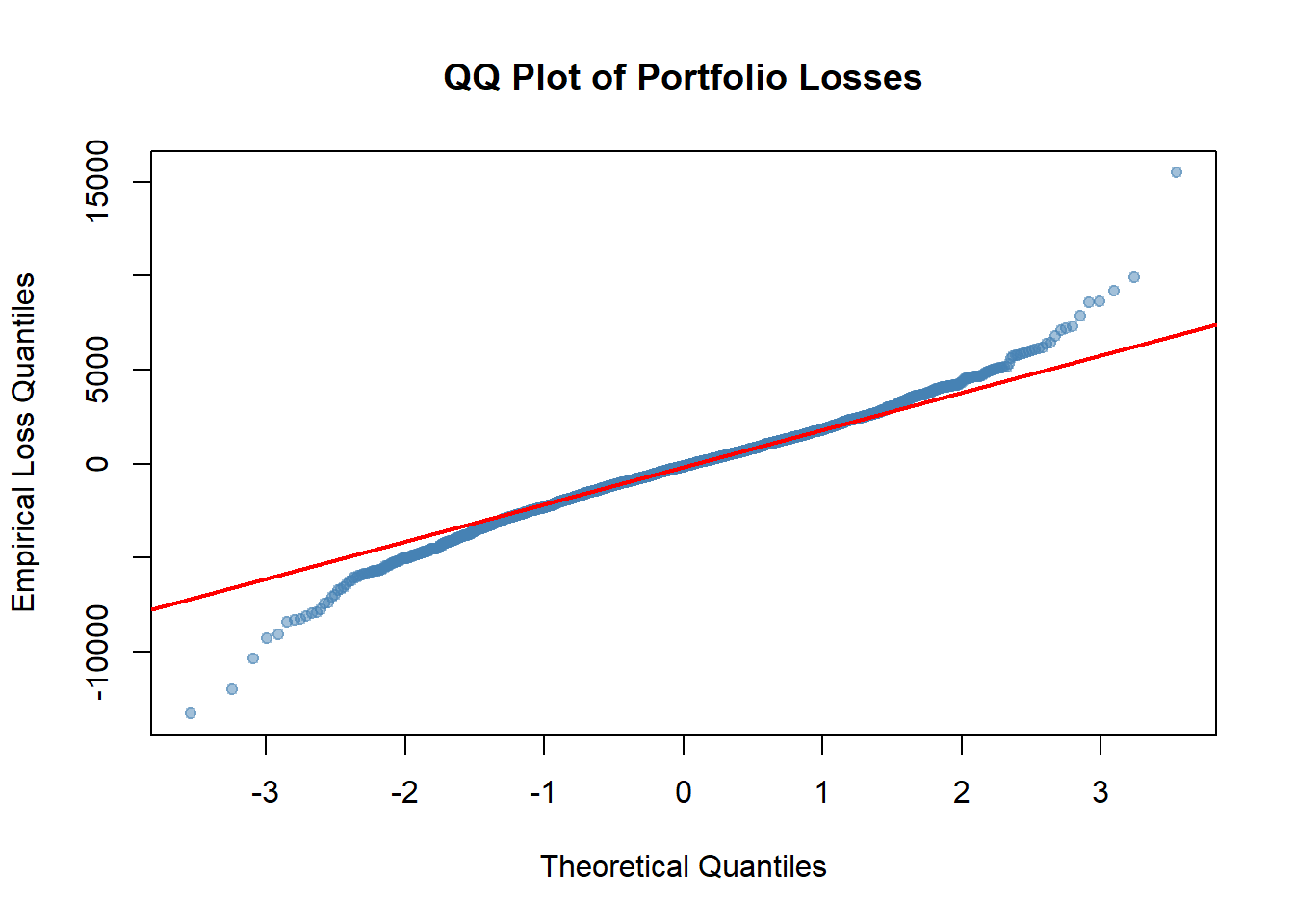
Q-Q Plot Interpretation (including but not limited to):
- Points following the red line indicate normality.
- Upper tail deviation (top-right): Losses are more extreme than normal predicts.
- Lower tail deviation (bottom-left): Gains are more extreme than normal predicts.
- S-shaped pattern: Indicates heavy tails (common in financial data).
If obvious patterns or evidence are reflected in the QQ plot, indicating significant deviations of losses from a normal distribution, it suggests that the empirical approach may yield more accurate tail estimates.
Now we compute the empirical (historical) VaR and ES directly from the observed losses.
##      99%
## 5171.709## [1] 7015.152Comparison and Visualisation
To compare both methods, we overlay the corresponding VaR and ES values on the histogram of empirical losses. This visualisation provides an intuitive sense of how each approach captures tail risk.
# Visual Comparison of Parametric vs Empirical Risk Measures
hist(loss, breaks = 100, prob = TRUE, border = "white",
     xlab = "Portfolio Loss",
     main = "Empirical vs Normal Approximation")

# Parametric (normal) VaR and ES
abline(v = VaR.normal, col = "steelblue", lty = 1, lwd = 3)  # heavier solid line
abline(v = ES.normal, col = "steelblue", lty = 2, lwd = 2)   # dashed

# Empirical (historical) VaR and ES
abline(v = VaR.hs, col = "tomato", lty = 1, lwd = 2)       # solid
abline(v = ES.hs, col = "tomato", lty = 2, lwd = 2)        # dashed

# Add legend
legend("topleft",
       legend = c(paste0(alpha*100, "% Normal VaR"),
                  paste0(alpha*100, "% Normal ES"),
                  paste0(alpha*100, "% Empirical VaR"),
                  paste0(alpha*100, "% Empirical ES")),
       col = c("steelblue","steelblue","tomato","tomato"),
lty = c(1,2,1,2), lwd = c(2,2,2,2), bty = "n") 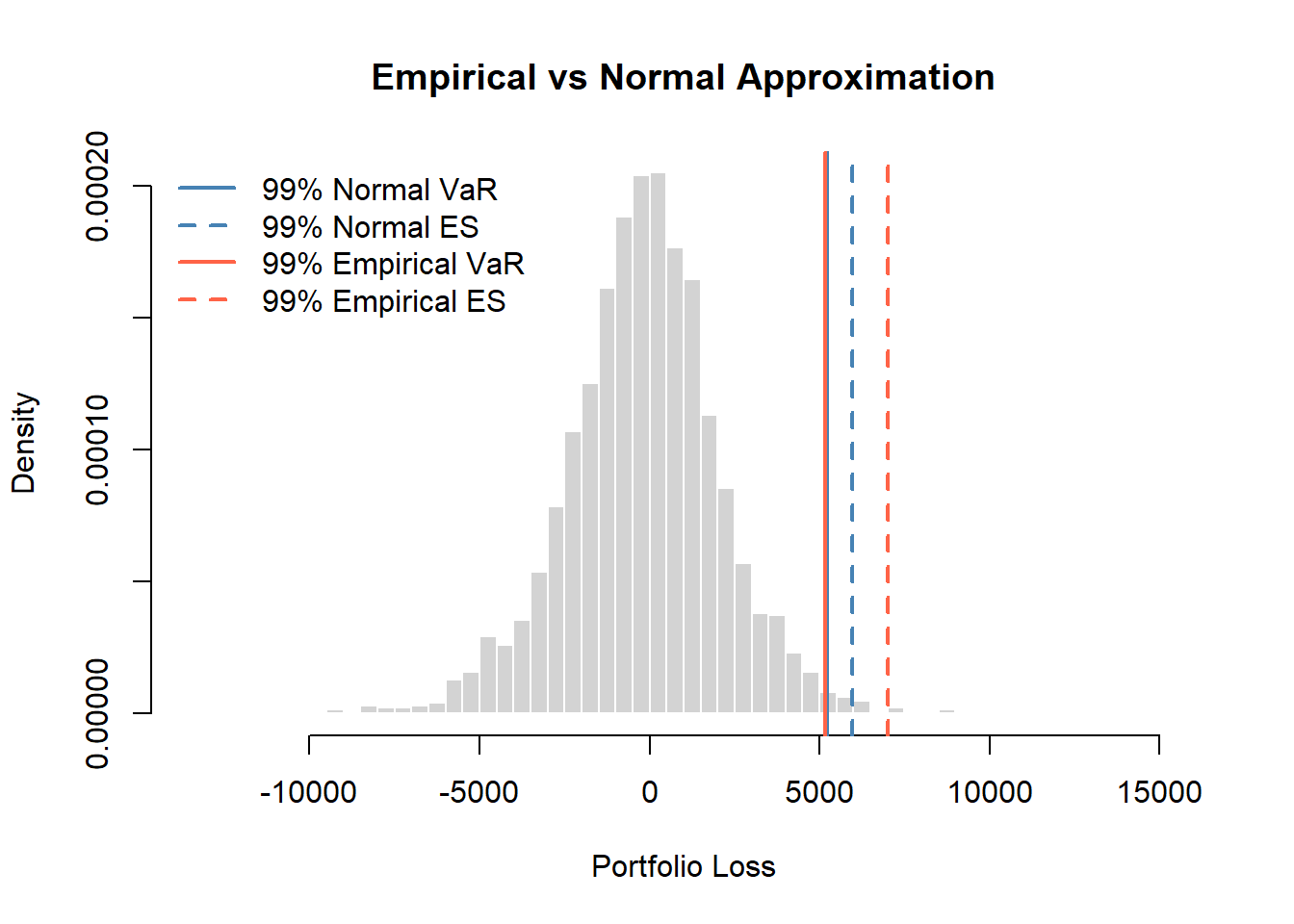
Key summary:
The two VaR estimates are nearly identical, suggesting the \(99\)th percentile is well-approximated by the normal distribution.
While the \(99\)th percentile itself is normal, the empirical ES is noticeably higher than the normal ES, indicating heavier tails beyond the VaR threshold.
The portfolio exhibits heavier tails in the extreme region (the worst 1% of outcomes).
VaR alone is misleading: It suggests normality is fine, but this masks tail risk.
ES provides critical information: Expected losses conditional on breaching VaR are roughly 25% higher than the normal model predicts.
This is a classic case demonstrating why ES is superior to VaR as a risk measure.