Chapter 8 Practical Sheets
8.1 Practical 1
In this practical, we will explore:
- How to fit a Gaussian GLM and compare it with a linear model.
- How to fit Gamma GLMs.
- How to extract various components from a fitted GLM and estimate its dispersion parameter.
We will work with data containing information on the taste and concentration of various chemical components of 30 matured cheddar cheeses from the LaTrobe Valley in Victoria, Australia. The dataset contains the following variables:
- Taste: the combined taste scores from several judges (presumably higher scores correspond to better taste); a numeric vector.
- Acetic: the concentration of acetic acid in the cheese (units unknown); a numeric vector.
- H2S: the concentration of hydrogen sulphide (units unknown); a numeric vector.
- Lactic: the concentration of lactic acid (units unknown): a numeric vector.
8.1.1 Load and visualise the data
Download the data file “cheese.csv” from the Ultra folder “Other Material/Term 2 Datasets” and place this file into your RStudio working directory. If you don’t know where your working directory is, you can run the command getwd() in the RStudio console. Alternatively, you can change your working directory using the option “Session/Set Working Directory” on the RStudio menu.
Then run the code below to load the data, inspect its contents, and plot all pairs of variables against each other.
From the plot above, which variables seem to have good linear correlations with Taste? To confirm your observation, use the cor function to compute the correlation matrix and check its value.
8.1.2 Gaussian GLM and linear model
From GLM theory, we know that the Gaussian GLM with identity link is equivalent to a linear model. In this part, we will fit a Gaussian GLM to the dataset and compare it with the linear model.
Fit the models
First, complete the code below to fit a linear model and print out the model summary.
Then we fit a Gaussian GLM with identity link to the dataset. Note that if you need any help, you can type ?glm and ?family in the RStudio console to read the documentation.
Check the summary of model2 and confirm that the two models have the same coefficients. Which variables have p-values less than 0.05?
Compare the models
In the summary of model1, we can find the estimations of the residual standard error, R-squared, and adjusted R-squared. We can use model2 to retrieve these values. For this part, you will need to use the following components of model2:
model2$fitted: the vector of predicted responses (i.e., the fitted means) for the data, \(\hat{\boldsymbol{y}} = \hat{\boldsymbol{\mu}} = (\hat{\mu}_1, \hat{\mu}_2, \ldots, \hat{\mu}_n)\);model2$df.residual: the residual degrees-of-freedom, \(n-p\);model2$df.null: the total degrees-of-freedom, \(n-1\).
Recall that:
- The residuals are \(y_i - \hat{\mu}_i\), for \(i = 1, 2, \ldots, n\).
- The residual standard error is the standard deviation of the residuals.
- \(\text{R-squared} = 1 - RSS/TSS\), where RSS is the residual sum of squares and TSS is the total sum of squares.
- \(\text{Adjusted R-squared} = 1 - \frac{RSS/df_{res}}{TSS/df_{tot}}\), where \(df_{res}\) is the residual degrees-of-freedom and \(df_{tot}\) is the total degrees-of-freedom.
Using the components of model2, compute for this model:
- The RSS;
- The residual standard error;
- The R-squared value;
- The adjusted R-squared value.
Confirm that the last three values are similar to those in the linear model’s summary.
Finally, implement Equation (2.18) to estimate the dispersion of model2. Confirm that your estimation is similar to the value in the model summary.
8.1.3 Gamma GLMs
For this dataset, the responses have positive real values. So we may use a Gamma GLM. Now fit the following models to the dataset:
- Gamma GLM with inverse link;
- Gamma GLM with log link.
Then implement Equation (2.19) to estimate the dispersion parameters of these models. Confirm that your estimations are similar (or very close) to those in the model summaries.
8.1.4 Fisher information matrices
It is known that under certain conditions, we have \(\text{Var}[\hat{\boldsymbol{\beta}}] = \boldsymbol{F}(\hat{\boldsymbol{\beta}})^{-1}\) asymptotically, where \(\hat{\boldsymbol{\beta}}\) is the estimated parameters and \(\boldsymbol{F}(\hat{\boldsymbol{\beta}})\) is their Fisher information matrix. Use this fact to estimate the Fisher information matrices for the Gaussian and Gamma GLMs fitted above.
Note that you can extract the parameter covariance matrix of a model (say model2) using summary(model2)$cov.scaled or vcov(model2). After extracting the covariance matrix, you should confirm that the diagonal of this matrix is equal to the square of the standard error column in the corresponding model summary.
If you have any time left, redo all the questions in this practical with the models that do not contain the intercept.
8.2 Practical 2
Predictive modelling of suicide data can help health administrations to identify patients at risk for suicide and provide risk-stratified interventions. In this practical, we consider data on the number of suicides in the Republic of Ireland from 1989 to 1998. We will learn how to model this data using the rescaled binomial GLM and the rescaled Poisson GLM.
8.2.1 Exploratory data analysis
The data frame irlsuicide can be found as part of the R package npmlreg. If you have not installed this package, you can install it by running install.packages("npmlreg") in your RStudio console. Then you can load the data and inspect it:
The dataset contains several variables, among which we are interested in the following:
- \(\texttt{Region}\): a categorical variable giving the name of each of 13 “health regions”.
- \(\texttt{ID}\): a labelling \(1, \dotsc, 13\) for \(\texttt{Region}\).
- \(\texttt{age}\): a categorical variable with levels: ‘1’ (0-29), ‘2’ (30-39), ‘3’ (40-59), ‘4’ (60+ years).
- \(\texttt{sex}\): a binary covariate for gender with levels ‘0’ (female) and ‘1’ (male).
- \(\texttt{pop}\): the population sizes (i.e., number of people in the same region with the same age level and sex).
- \(\texttt{death}\): response, number of suicides.
The data are, for each of the 13 regions, grouped by the covariates \(\texttt{age}\) and \(\texttt{sex}\). For instance, the first row of the data frame,
##   Region ID   pop death sex age  smr expected
## 1  Cork   1 31923     6   0   1 97.7    6.141
means that, from 1989 to 1998, there have been six suicides out of a (reference) population of 31,923 female inhabitants of the city of Cork in the age group 0–29. The data frame has a total of \(n = 13 \times 4 \times 2 = 104\) rows.
First, compute the death rates for each row and assign them into a new column in the data frame:
Then carry out some simple exploratory data analysis, such as boxplots of death rates as dependent on \(\texttt{age}\), \(\texttt{sex}\), or \(\texttt{Region}\).
8.2.2 Rescaled binomial logit model
We begin by modelling the death rates (\({\tt death/pop}\)) using a rescaled binomial logit GLM. In this model, the “success events” of the binomial distribution will be deaths, while the “failure events” will be non-deaths.
Fit the model. There are several ways to fit this model. You can look at the R help for \(\texttt{?glm}\), in particular the paragraphs under “Details” about \(\texttt{weights}\) and about the form of responses for binomial models. It’s fine if you don’t understand the R help, just continue to read on.
In the first method, we use proportions of success events (i.e., death rates) as our response and set the argument weights of glm to the number of trials (i.e., population size). Complete the code below to fit a rescaled binomial GLM with the logit link, the covariates \(\texttt{age}\) and \(\texttt{sex}\), using this method.
The second method to fit this model is to supply a two-column matrix as the response to the glm formula. The first column of this matrix contains the number of success events (i.e., number of deaths) and the second column contains the number of failure events (i.e., number of non-deaths). Complete the code below to compute the number of non-deaths and then fit the same model using this method. You should check that the summaries of the two fitted models are the same.
Interpret the model. Comment on the estimated values of the model parameters.
Include region IDs. Now attempt to include the factor \({\tt ID}\) as an additional covariate to glm1 (you can also include \(\texttt{Region}\) instead of \({\tt ID}\) since these two columns contain the same information). Are the regional indicators significant?
Make prediction. Finally, predict the “suicide probability” for a male resident of the city of Galway in the age class 40-59.
8.2.3 Rescaled Poisson model
Alternatively, one may model the death counts through a rescaled Poisson GLM such as the one in Exercise 5 of Chapter 2. You may want to review that exercise and work out the various model components for this specific dataset.
Fit the model. To fit this model, we can use \({\tt death}\) as the response variable and set the offset argument of glm to \(\log ({\tt pop})\) (i.e., \(\log n_i\) in the general GLM formula). Note that we don’t need the \({\tt weights}\) here. For more information, see the R help on the offset argument.
Complete the code below to fit the model using \(\texttt{age}\) and \(\texttt{sex}\) as covariates.
Include regions IDs and make prediction. Next, add again the regional indicators, and predict the suicide rate for the same resident as in question 8.2.2. Compare the results.
Estimate the dispersions. For both Poisson models fitted here, provide an estimate of the dispersion present in the data. Comment on the results.
8.2.4 Compare the models
Provide a \(3\times 3\) matrix scatter plot which features:
- The “raw” observed rates \({\tt death}/{\tt pop}\);
- The fitted death rates using the rescaled binomial GLM (with region IDs) in question 8.2.2;
- The fitted death rates using the rescaled Poisson GLM (with region IDs) in question 8.2.3.
Comment on the results. (Note that the fitted values of the binomial GLM are rates, while the fitted values of the Poisson GLM are counts.)
Methodologically, do you feel it is a generally sound approach to include a large number of regional indicators into models of this type? Discuss briefly.
If you have any time left, estimate the dispersion of glm1 and the 95% confidence interval of your prediction in question 8.2.2. (You may want to work out the general formula for estimating the dispersion parameter of this model first.)
8.3 Practical 3
In this practical, we shall apply some variants of the model in Exercise 4 of Chapter 3 to this season’s Premier League data. You may want to review that exercise to understand the model and how the design matrix can be constructed before starting this practical. Parts of this practical could be complicated. If you encounter an unfamiliar R function, try to read the R help, search online, or ask your AI how to use it.
8.3.1 Data
The results of all the current 2024-25 Premier League season of football games are available from the website https://www.football-data.co.uk/englandm.php in CSV format. A copy (downloaded 09:40 27th Feb 2025) is also on the Ultra folder “Other Material/Term 2 Datasets” in case of website issues.
First, download the data file E0.csv, load it into R and examine the data available:
We observe that this is a complex dataset with a large number of covariates for each match, including the teams, scoreline and various statistics about shots, fouls, offsides, etc. The full explanation of all variables is at https://www.football-data.co.uk/notes.txt. In this practical, we are only interested in the following variables: HomeTeam, AwayTeam, FTHG, FTAG, and FTR.
8.3.2 Bradley-Terry model
For this dataset, we would like to fit a simple model which predicts the probability of a home win. We will assign to each team \(j \in \{ 1, 2, \ldots, p \}\) a “strength” parameter, \(\beta_j\). Then, if team \(j\) plays at home and team \(k\) plays away on a match, we model the odds on a home win as:
\[ \frac{\pi}{1-\pi} = e^{\beta_j - \beta_k}. \]
This is called a Bradley-Terry model and is widely used for pairwise comparisons such as sporting encounters.
We can treat this as a logistic regression and use all the tools of GLMs as follows. For each game \(i\), let \(y_i=1\) if the home team wins and \(y_i=0\) if they do not win (lose or draw). Also let there be a covariate \(x_{ij}\) for each team \(j\), with:
\[\begin{equation} x_{ij} = \begin{cases} 0 & \text{if team $j$ did not play in game $i$} \\ +1 & \text{if team $j$ played at home in game $i$} \\ -1 & \text{if team $j$ played away in game $i$}. \end{cases} \tag{8.1} \end{equation}\]
The standard Bradley-Terry model corresponds to the GLM with:
- Linear predictor: \(\eta_i = \boldsymbol{\beta}^T \boldsymbol{x}_i = \beta_1 x_{i1} + \ldots + \beta_p x_{ip}\).
- Response function: \(\displaystyle h(\eta_i) = \frac{e^{\eta_i}}{1+e^{\eta_i}}\).
- Distributional assumption: \(y_i \,|\, \boldsymbol{x}_i, \boldsymbol{\beta} \sim \text{Bernoulli}(\pi_i)\), where \(\pi_i = h(\eta_i)\).
8.3.3 Construct the data matrix
The design matrix
The first challenge is to construct a design matrix representing the setup in Equation (8.1). In R, the design matrix can often be obtained automatically using the model.matrix function (see ?model.matrix for the help file). However, given the form of Equation (8.1), we will need a bit more work to create the correct design matrix.
Notice that the column HomeTeam contains the name of the home team for each game. We can convert this column into a matrix of indicator variables using:
Now do the same for the AwayTeam column:
and then combine both matrices to create a single matrix X with entries per Equation (8.1). Be sure to turn this into an R data frame so that the variables are named.
We can check the number of rows and columns in X to make sure they are correct (note that there are 20 teams in Premier League):
Optionally, we can pretty up the column names by removing the “HomeTeam” part at the start and then use the stringr package to replace the empty space in team names with a dot.
names(X) <- substring(names(X), 9)
library(stringr)
names(X) <- str_replace_all(names(X), c(" " = ".", "," = ""))
Finally, since we use indicator variables for factors in the model, we need to drop one team to avoid a singular solution (due to collinearity of indicators). We will drop the first team alphabetically, which is Arsenal:
The full data matrix
To construct the full data matrix, we need to create the response column and add it to the design matrix above. Now using the column FTR in the original dataset, create a vector y holding the home team win status (1 or 0). Note that home team win is 1, so both draw and away team win are 0.
Then combine this with X into a single data frame:
This is now the full data frame we can use to fit the model we want.
8.3.4 Fit and inspect the model
We fit the Bradley-Terry model in Section 8.3.2 via a logistic regression using the glm function in R and examine the model summary:
Now sort the coefficients and compare it to the league table https://www.premierleague.com/tables. Remember that Arsenal implicitly has coefficient 0.
Is there complete agreement? Can you think what might explain any differences?
8.3.5 Model home team advantage
It is often said that there is a “home team advantage”. How can we modify the standard Bradley-Terry model in Section 8.3.2 to model this? Fit this new model.
Does the new model suggest a home team advantage is detectable in this dataset?
8.3.6 Estimate the dispersion
What do you expect the dispersion parameter \(\phi\) to be under a logistic regression model (i.e., the theoretical value of the dispersion)?
Now obtain the “quick-and-dirty” dispersion estimates for the models fit1 and fit2. Are they overdispersed, about right, or underdispersed? Comment on your results.
8.3.7 Prediction and hypothesis testing
On 8th March 2025, Fulham will play away from home against Brighton. What is the probability of a draw or win for Fulham? (Note: do not place any wagers based on this model, which is far too simple to beat bookie’s odds!!)
At the end of a season, the bottom three teams in the Premier League table are relegated (i.e., dropped down into the lower division called the Championship). As of 27th February, they are Ipswich, Leicester, and Southampton. We are interested in testing the hypothesis that these teams are equally weak: that is, might \(\beta_\text{Ipswich} = \beta_\text{Leicester} = \beta_\text{Southampton}\)? Fit the model where these three teams have the same coefficient and apply a likelihood ratio test against the full model fit2. You can use the deviances to obtain the likelihood ratio statistic.
Hint: Under the null hypothesis, the linear predictor becomes:
\[ \begin{aligned} \eta_i &= \beta_\text{Ipswich} \, x_{i, \text{Ipswich}} + \beta_\text{Ipswich} \, x_{i, \text{Leicester}} + \beta_\text{Ipswich} \, x_{i, \text{Southampton}} + \dots \\ &= \beta_\text{Ipswich} \, ( x_{i, \text{Ipswich}} + x_{i, \text{Leicester}} + x_{i, \text{Southampton}} ) + \dots \end{aligned} \]
8.3.8 Plot the confidence region
In this part, we will construct a plot which shows the 95% confidence region for the strengths of Leicester and Man City jointly, using the model fit2 and the \((1-\alpha)\) Hessian CR method. Recall that this confidence region is:
\[ R^{H}_{1 - \alpha} = \left\{ \boldsymbol\beta : (\hat{\boldsymbol\beta} - \boldsymbol\beta)^T \, F(\hat{\boldsymbol\beta}) \, (\hat{\boldsymbol\beta} - \boldsymbol\beta) \leq \chi^{2}_{p,\alpha} \right\} \]
where \(\boldsymbol\beta = (\beta_\text{Leicester}, \beta_\text{Man.City})^T\).
First, compute the matrix \(F(\hat{\boldsymbol\beta})\).
Also get the MLEs \(\hat{\boldsymbol\beta}\) for these two teams.
Next, we need to define a new function that returns the square Mahalanobis distance \((\hat{\boldsymbol\beta} - \boldsymbol\beta)^T F(\hat{\boldsymbol\beta}) (\hat{\boldsymbol\beta} - \boldsymbol\beta)\) given any input \(\boldsymbol\beta = (\beta_\text{Leicester}, \beta_\text{Man.City})^T\).
To display the confidence region, we need to set up a grid covering the range of \(\boldsymbol\beta\) that we want to plot. From the MLEs and their standard errors, a grid covering values between [-5, 5] in both dimensions would enclose the confidence region. Use the seq function to create this grid. The range for Leicester’s dimension has been done for you.
We can now use the outer function to evaluate the square Mahalanobis distance over this grid.
Finally, we use the image function to colour the part we are interested in (those with HessCR value not greater than \(\chi^{2}_{p,\alpha}\)). We also use the points function to mark the location of the MLEs for reference.
If you have any time left, experiment with creating other models using the same data. For example, you can create a rescaled binomial model where the response is the number of goals scored by the home team (FTHG) and \(n\) is the total goals scored in the match (FTHG+FTAG).
8.4 Practical 4
This practical contains 2 parts:
- The first part involves some exploratory tasks using
ggplot, as well as some modelling tasks using generalised estimating equations, on a so far unseen dataset, the pupil extraversion data; - The second part involves modelling using linear mixed models on another dataset, the childweight data.
8.4.1 Part 1: Pupil extraversion data
8.4.1.1 Preliminaries
We consider a dataset aiming to explain pupil popularity as a function of some pupil- and class-level covariates (Hox, 2017). Specifically, this is a two-level scenario, with
- Lower level (level 1): pupils;
- Upper level (level 2): classes.
Data from \(n=100\) classes are available, with \(n_i\) pupils in each class, where \(\sum_{i=1}^{100} n_i = 2000\).
The outcome variable (on pupil level), is “pupil popularity” measured on a continuous scale ranging from 0 (very unpopular) to 10 (very popular) by a sociometric procedure.
Explanatory variables are available on both pupil and class levels:
- Pupil extraversion (pupil level), measured on a self-rating 10-point scale from 1 (min) to 10 (max);
- Pupil gender (pupil level), with values 0 (boy) and 1 (girl);
- Teacher experience (class level), in years, ranging from 2-25, integer-valued.
We initially load some useful R packages.
require(haven)    # to load the SPSS .sav file
require(ggplot2)  # used for production of graphs
require(gee)      # used to fit generalized estimating equations
You can download the data file “popular2.sav” from the Ultra folder “Other Material/Term 2 Datasets” and place it into your working directory, which you can identify via getwd() if required. Then you can load the dataset using:
Create a new data frame which only consists of the first six columns of pop.rawdata, and rename these to “pupil”, “class”, “extraversion”, “gender”, “experience”, “popularity”. (The variable names are self-explanatory given previous explanations.) Do make sure that the columns of your new data frame actually possess these names.
8.4.1.2 Exploratory analysis
We initially display the popularity variable via
Explain the relevance of this plot with view to the choice of the response distribution.
Next let’s look at the three predictor variables. Note that these are best displayed as counts. Is the shape of these distributions of relevance?
Use the following to plot popularity versus extraversion. Add a simple linear regression line to the plot.
Use the following code to produce a scatter plot of popularity versus extraversion coloured by class. Then add class-specific linear regression lines. (Hints: The variable class needs to be coded as a factor to enable the colour argument to recognize the clusters. Also, use se=FALSE in geom_smooth.)
8.4.1.3 Modelling
Fit marginal models for popularity versus extraversion (ignoring the other covariates) with independent, exchangeable, and unstructured working correlation matrix. Compare the results between each other, and to the simple linear model (which you may still need to fit if not done so yet). Inspect specifically the estimated dispersions and correlation matrices.
Which of these models would you deem most appropriate?
We add the estimated regression lines from the “exchangeable” and “unstructured” models to the original scatter plot with the least squares fit. Complete the provided code below in order to do this.
pred1  <- predict(pop.gee1)
frame1 <- unique(data.frame(extraversion=pop.data$extraversion, pred1=pred1))

...

ggplot(data = pop.data, aes(x = extraversion, y = popularity)) +
    geom_point(size = 1,alpha = .8) +
    geom_smooth(method = "lm", # to add regression line
                col = "red", size = 1, alpha = .8, se=FALSE) +
    geom_line(data=frame1, aes(x=extraversion, y=pred1), col="Blue")
    ...
Has the consideration of the error structure changed the fit a lot?
Repeat fitting the GEE models under the three variance specifications, but now including the additional covariates gender and experience. Interpret the results (but no need to draw plots).
8.4.2 Part 2: Childweight data
8.4.2.1 Preliminaries
The dataset under consideration is comprised of child weight for Asian children in a British community who were weighed up to four times, roughly between the ages of 6 weeks and 27 months. (It represents a random sample of data previously analyzed by Goldstein (1986) and Prosser, Rasbash, and Goldstein (1991)).
Let’s begin by loading some R packages which we are going to use.
You can download the data file “childweight.RData” from the Ultra folder “Other Material/Term 2 Datasets” and place it into your working directory. Then load it into your workspace via
We can inspect the data:
Here,
idis an index denoting individual children;ageis a standardized measure of age;weightis the children’s birthweight (in g);girlis an indicator for gender, taking 0 for boys and 1 for girls.
We check whether id is already a factor, and transform to a factor if that is not the case.
## [1] FALSE8.4.2.2 Exploratory analysis
As previously with other data sets, we firstly plot the data by visualising the linear relationship.
ggplot(data = childweight, aes(x = age, y = weight)) +
    geom_point(size = 1.2, alpha = .8) +
    geom_smooth(method = "lm", se = FALSE, col = "Red") +
    labs(title = "weight vs. age")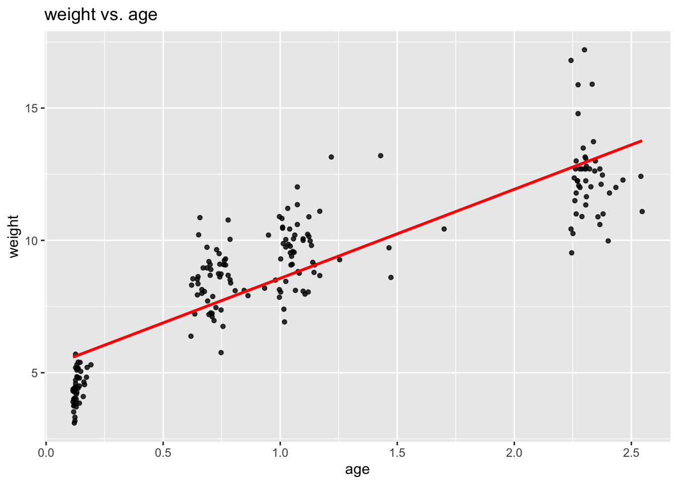
This unveils a noteworthy feature of these data: Unlike in most cases of longitudinal analysis where one has discrete categorical time values (i.e. 1, 2, 3, …), here time is not discrete but continuous with differing values between children. This feature, however, does not necessarily imply any methodological differences in the analysis.
We re-plot the relationship, this time inspecting group effects and the potential need for a two-level model:
ggplot(data = childweight, aes(x = age, y = weight, col= id)) +
    geom_point(size = 1.2, alpha = .8) +
    geom_smooth(method = "lm", se = FALSE) +
    theme(legend.position = "none") +
    labs(title = "weight vs. age", subtitle = "by cluster (id)")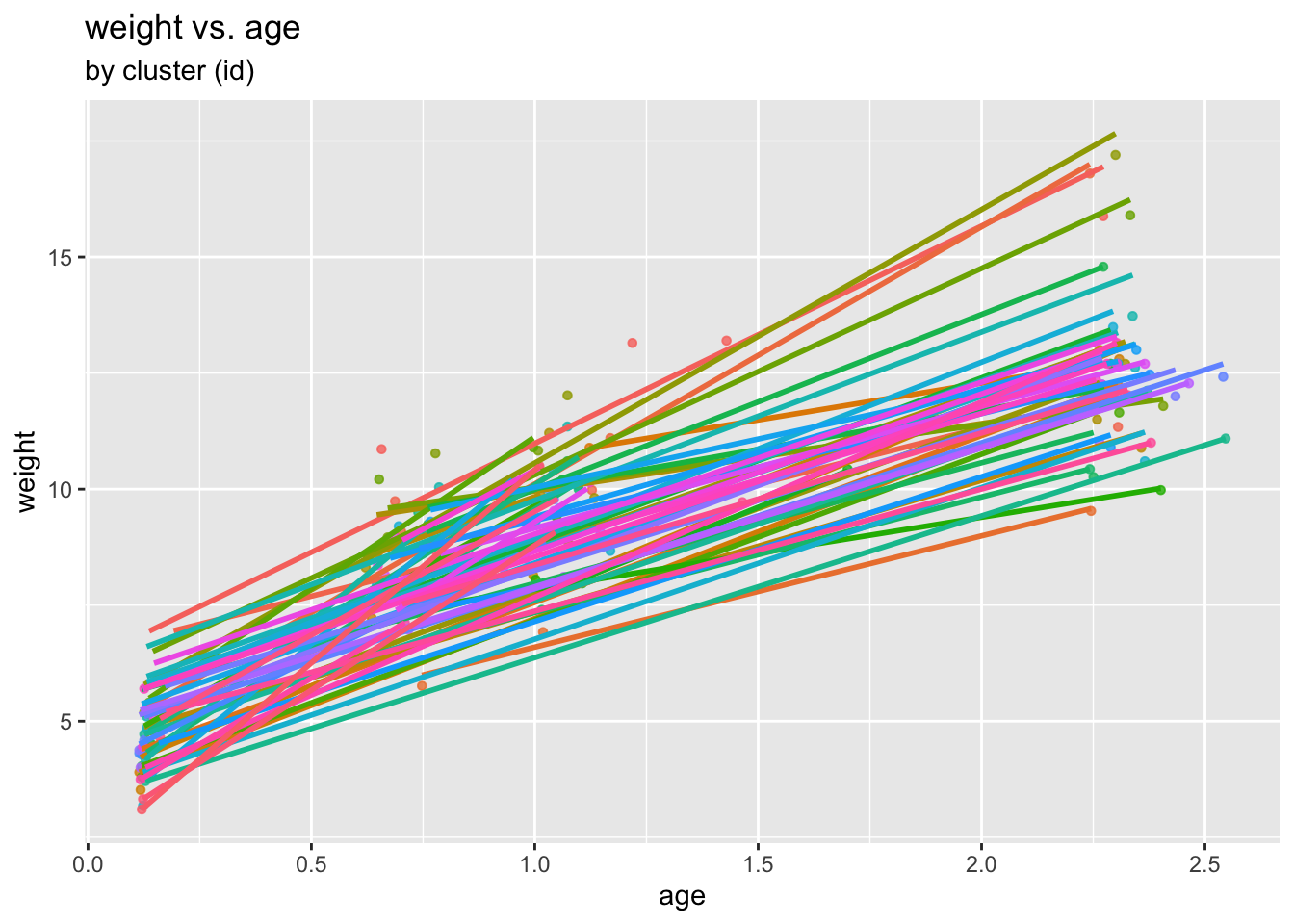
(Please note that all what has happened here is that, for visualization purposes, ggplot has fitted individual regression lines to each child. No overall model has been fitted yet. This is what we are doing next!)
8.4.2.3 Modelling
Fit now a linear mixed model, with fixed effects for age and girl, and random intercepts for child id’s.
Extract and visualize the fitted values of this random intercept model as well as the linear model fits:
childweight$pred1 <- predict(lmm1)

ggplot(childweight, aes(age, weight)) +
    geom_line(aes(y=pred1, col=id)) +
    geom_point(aes(age, weight, col=id)) +
    geom_smooth(method="lm", se=FALSE, col="Red") +
    ggtitle("Model lmm1", subtitle="random intercept-only") +
    xlab("age") +
    ylab("weight") +
    theme(legend.position="none")
Expand the previous model by now including a random slope for age.
Visualize the fitted values of this model:
Extract and inspect the variance-covariance matrix. Interpret this matrix in the light of the plot just produced.
The correlation value appears noteworthy – we consider therefore the random effects in more detail.
Use function ranef to obtain fitted (or better “predicted”) random effects. Then produce a scatter plot of random slopes versus random intercepts.
8.4.2.4 Diagnostics and model comparison
We have not talked much about residuals or diagnostics in the linear mixed model part of the lectures. However, since both random effects and outcomes are assumed normal, residual diagnostics can in principle be carried out in complete analogy to the usual linear model.
So we begin by inspecting the residuals of the random slope model.
In order to correct the non-linearity observed, include a quadratic term for age (but keeping the random slope for age only), and produce again a residual plot.
Inspect again the residuals vs fitted values.
Assess the significance of the quadratic term by
- considering the properties (t-value, p-value) of the “squared age” coefficient in the model summary;
- an appropriate likelihood ratio test executed using
anova. - a \(95\%\) confidence interval obtained using function
confint.
Now we check for normality of residuals as well as random effects of lmm3.
Begin with a QQ plots of residuals.
Now we turn to the random effects. Use function ranef applied on lmm3 to obtain the predicted random intercepts and slopes, and then apply qqnorm and qqline onto these.
Finally, we again look at the fitted curves of this model: