Chapter 5 Election data in R
Elections tend to create fascinating data sets. They are spatial in nature, comparable over time (i.e. the number of electorates roughly stays the same) - and more importantly they are consequential for all Australians.
Australia’s compulsory voting system is a remarkable feature of our Federation. Every three-ish years we all turn out at over 7,000 polling booths our local schools, churches, and community centres to cast a ballot and pick up an obligatory election dat sausage. The byproduct is a fascinating longitudinal and spatial data set.
The following code explores different R packages, election data sets, and statistical processes aimed at exploring and modelling federal elections in Australia.
One word of warning: I use the term electorates, divisions, and seats interchangeably throughout this chapter.
5.1 Getting started
Let’s load up some packages
#Load packages
library(ggparliament)
library(eechidna)
library(dplyr)
library(ggplot2)
library(readxl)
library(tidyr)
library(tidyverse)
library(purrr)
library(knitr)
library(broom)
library(absmapsdata)
library(rmarkdown)
library(bookdown)
Some phenonmenal Australia economists and statisticians have put together a handy election package called eechidna. It includes three main data sets for the most recent Australia federal election (2019).
fp19: first preference votes for candidates at each electorate
tpp19: two party preferred votes for candidates at each electorate
tcp19: two candidate preferred votes for candidates at each electorate
They’ve also gone to the trouble of aggregating some census data to the electorate level. This can be found with the abs2016 function.
data(fp19)
data(tpp19)
data(tcp19)
data(abs2016)

# Show the first few rows
#head(tpp16) %>% kable("simple")
#head(tcp16) %>% kable("simple")
DT::datatable(tpp19)DT::datatable(tcp19)5.2 Working with election maps
As noted in the introduction, elections are spatialin nature.
Not only does geography largely determine policy decisions, we see that many electorates vote for the same party (or even the same candidate) for decades. How electorate boundaries are drawn is a long story (see here, here, and here).
The summary version is the AEC carves up the population by state and territory, uses a wack formula to decide how many seats each state should be allocated, then draws maps to try and get a roughly equal number of people in each electorate. Oh… and did I mention for reasons that aren’t worth explaining that Tasmania has to have at least 5 seats? Our Federation is a funny thing. Anyhow, at time of writing this is how the breakdown of seats looks.
| State/Territory | Number of members of the House of Representatives |
|---|---|
| New South Wales | 47 |
| Victoria | 39 |
| Queensland | 30 |
| Western Australia | 15 |
| South Australia | 10 |
| Tasmania | 5 |
| Australian Capital Territory | 3 |
| Northern Territory | 2* |
| TOTAL | 151 |
Note: The NT doesn’t have the population to justify it’s second seat - and the AEC scheduled to dissolve it, but Parliament intervened in late 2020 and a bill was passed to make both seats were kept (creating 151 nationally).
CED_map <- ced2018 %>%
ggplot()+
geom_sf()+
labs(title="Electoral divisions in Australia",
subtitle = "It turns out we divide the country in very non-standard blocks",
caption = "Data: Australian Bureau of Statistics 2016",
x="",
y="",
fill="Median age") +
theme_minimal() +
theme(axis.ticks.x = element_blank(),axis.text.x = element_blank())+
theme(axis.ticks.y = element_blank(),axis.text.y = element_blank())+
theme(panel.grid.major = element_blank(), panel.grid.minor = element_blank())+
theme(legend.position = "right")+
theme(plot.title=element_text(face="bold",size=12))+
theme(plot.subtitle=element_text(size=11))+
theme(plot.caption=element_text(size=8))
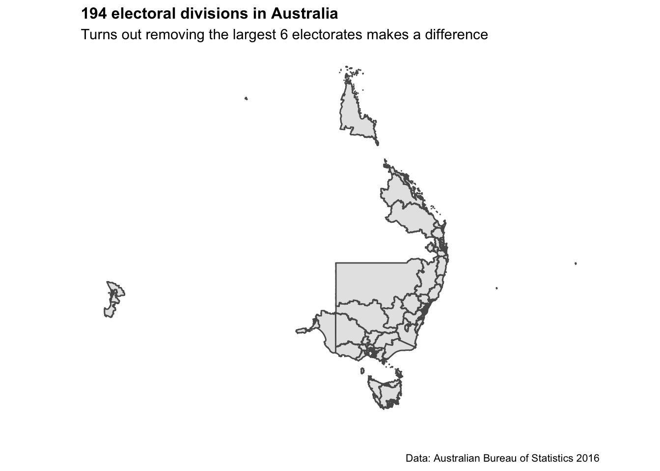
CED_map_remove_6 <- ced2018 %>%
dplyr::filter(!ced_code_2018 %in% c(506,701,404,511,321,317)) %>%
ggplot()+
geom_sf()+
labs(title="194 electoral divisions in Australia",
subtitle = "Turns out removing the largest 6 electorates makes a difference",
caption = "Data: Australian Bureau of Statistics 2016",
x="",
y="",
fill="Median age") +
theme_minimal() +
theme(axis.ticks.x = element_blank(),axis.text.x = element_blank())+
theme(axis.ticks.y = element_blank(),axis.text.y = element_blank())+
theme(panel.grid.major = element_blank(), panel.grid.minor = element_blank())+
theme(legend.position = "right")+
theme(plot.title=element_text(face="bold",size=12))+
theme(plot.subtitle=element_text(size=11))+
theme(plot.caption=element_text(size=8))
CED_map
CED_map_remove_6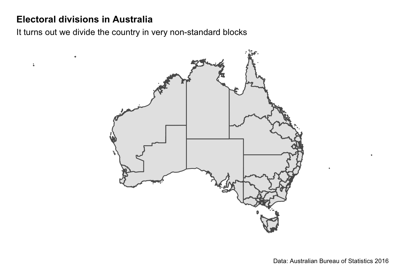
5.3 Answering some simple questions
Let’s start by answering a simple question: who won the election? For this we’ll need to use the two-candidate preferred data set (to make sure we capture all the minor parties that won seats).
who_won <- tcp19 %>%
  filter(Elected == "Y") %>%
  group_by(PartyNm) %>%
  tally() %>%
  arrange(desc(n))

# inspect
who_won %>% kable("simple")| PartyNm | n |
|---|---|
| LIBERAL PARTY | 133 |
| AUSTRALIAN LABOR PARTY | 131 |
| NATIONAL PARTY | 19 |
| INDEPENDENT | 5 |
| CENTRE ALLIANCE | 2 |
| KATTER’S AUSTRALIAN PARTY (KAP) | 2 |
| THE GREENS (VIC) | 2 |
Next up let’s see which candidates won with the smallest percentage of votes
who_won_least_votes_prop <- fp16 %>%
  filter(Elected == "Y") %>%
  arrange(Percent) %>%
  mutate(candidate_full_name = paste0(GivenNm, " ", Surname, " (", CandidateID, ")")) %>%
  dplyr::select(candidate_full_name, PartyNm, DivisionNm, Percent)

who_won_least_votes_prop %>% head %>% kable("simple")| candidate_full_name | PartyNm | DivisionNm | Percent |
|---|---|---|---|
| MICHAEL DANBY (28267) | AUSTRALIAN LABOR PARTY | MELBOURNE PORTS | 27.00 |
| CATHY O’TOOLE (28997) | AUSTRALIAN LABOR PARTY | HERBERT | 30.45 |
| JUSTINE ELLIOT (28987) | AUSTRALIAN LABOR PARTY | RICHMOND | 31.05 |
| TERRI BUTLER (28921) | AUSTRALIAN LABOR PARTY | GRIFFITH | 33.18 |
| STEVE GEORGANAS (29071) | AUSTRALIAN LABOR PARTY | HINDMARSH | 34.02 |
| CATHY MCGOWAN (23288) | INDEPENDENT | INDI | 34.76 |
This is really something. The relationship we’re seeing here seems to be these are the seats in which the ALP relies heavily on preference flows from the Greens or Independents to win. The electorate I grew up in is listed here (Richmond) - let’s look at how the votes were allocated.
Richmond_fp <- fp16 %>%
  filter(DivisionNm == "RICHMOND") %>%
  arrange(-Percent) %>%
  mutate(candidate_full_name = paste0(GivenNm, " ", Surname, " (", CandidateID, ")")) %>%
  dplyr::select(candidate_full_name, PartyNm, DivisionNm, Percent, OrdinaryVotes)

Richmond_fp %>% knitr::kable("simple")| candidate_full_name | PartyNm | DivisionNm | Percent | OrdinaryVotes |
|---|---|---|---|---|
| MATTHEW FRASER (29295) | NATIONAL PARTY | RICHMOND | 37.61 | 37006 |
| JUSTINE ELLIOT (28987) | AUSTRALIAN LABOR PARTY | RICHMOND | 31.05 | 30551 |
| DAWN WALKER (28783) | THE GREENS | RICHMOND | 20.44 | 20108 |
| NEIL GORDON SMITH (28349) | ONE NATION | RICHMOND | 6.26 | 6160 |
| ANGELA POLLARD (29290) | ANIMAL JUSTICE PARTY | RICHMOND | 3.14 | 3089 |
| RUSSELL KILARNEY (28785) | CHRISTIAN DEMOCRATIC PARTY | RICHMOND | 1.51 | 1484 |
Sure enough - the Greens certainly helped get the ALP across the line.
The interpretation that these seats are the most marginal is incorrect (e.g. imagine if ALP win 30% and the Greens win 30% - that is a pretty safe 10% margin assuming traditional preference flows). But - let’s investigate which seats are the most marginal.
who_won_smallest_margin <- tcp16 %>%
  filter(Elected == "Y") %>%
  mutate(percent_margin = 2*(Percent - 50), vote_margin = round(percent_margin * OrdinaryVotes / Percent)) %>%
  arrange(Percent) %>%
  mutate(candidate_full_name = paste0(GivenNm, " ", Surname, " (", CandidateID, ")")) %>%
  dplyr::select(candidate_full_name, PartyNm, DivisionNm, Percent, OrdinaryVotes, percent_margin, vote_margin)

# have a look
who_won_smallest_margin %>%
 head %>%
knitr::kable("simple")| candidate_full_name | PartyNm | DivisionNm | Percent | OrdinaryVotes | percent_margin | vote_margin |
|---|---|---|---|---|---|---|
| CATHY O’TOOLE (28997) | AUSTRALIAN LABOR PARTY | HERBERT | 50.02 | 44187 | 0.04 | 35 |
| STEVE GEORGANAS (29071) | AUSTRALIAN LABOR PARTY | HINDMARSH | 50.58 | 49586 | 1.16 | 1137 |
| MICHELLE LANDRY (28034) | LIBERAL PARTY | CAPRICORNIA | 50.63 | 44633 | 1.26 | 1111 |
| BERT VAN MANEN (28039) | LIBERAL PARTY | FORDE | 50.63 | 42486 | 1.26 | 1057 |
| ANNE ALY (28727) | AUSTRALIAN LABOR PARTY | COWAN | 50.68 | 41301 | 1.36 | 1108 |
| ANN SUDMALIS (28668) | LIBERAL PARTY | GILMORE | 50.73 | 52336 | 1.46 | 1506 |
Crikey. We see Cathy O’Toole got in with a 0.04% margin (just 35 votes!)
While we’re at it we better do the opposite and see who romped it by the largest margin.
who_won_largest_margin <- tcp16 %>%
  filter(Elected == "Y") %>%
  mutate(percent_margin = 2*(Percent - 50), vote_margin = round(percent_margin * OrdinaryVotes / Percent)) %>%
  arrange(desc(Percent)) %>%
  mutate(candidate_full_name = paste0(GivenNm, " ", Surname, " (", CandidateID, ")")) %>%
  dplyr::select(candidate_full_name, PartyNm, DivisionNm, Percent, OrdinaryVotes, percent_margin, vote_margin)

# Look at the data
 who_won_largest_margin %>%
 head %>%
knitr::kable("simple")| candidate_full_name | PartyNm | DivisionNm | Percent | OrdinaryVotes | percent_margin | vote_margin |
|---|---|---|---|---|---|---|
| ANDREW BROAD (28415) | NATIONAL PARTY | MALLEE | 71.32 | 62383 | 42.64 | 37297 |
| PAUL FLETCHER (28565) | LIBERAL PARTY | BRADFIELD | 71.04 | 66513 | 42.08 | 39398 |
| JULIE BISHOP (28746) | LIBERAL PARTY | CURTIN | 70.70 | 60631 | 41.40 | 35504 |
| SUSSAN LEY (28699) | LIBERAL PARTY | FARRER | 70.53 | 68114 | 41.06 | 39653 |
| JASON CLARE (28931) | AUSTRALIAN LABOR PARTY | BLAXLAND | 69.48 | 55507 | 38.96 | 31125 |
| BRENDAN O’CONNOR (28274) | AUSTRALIAN LABOR PARTY | GORTON | 69.45 | 68135 | 38.90 | 38163 |
Wowza. That’s really something. Some candidates won seats with a 30-40 percent margin - scooping up 70% of the two candidate preferred vote in the process!
who_won <- tcp16 %>%
  filter(Elected == "Y") %>%
  group_by(PartyNm, StateAb) %>%
  tally() %>%
  arrange(desc(n))

who_won_by_state <- spread(who_won,StateAb, n) %>% arrange(desc(NSW))

#View data set
who_won_by_state %>%
knitr::kable("simple")
5.4 Demographic analysis of voting trends
Now we’ve figured out how to work with election data - let’s link it up to some AUstralian demographic data. The eechidna package includes a cleaned set of census data from 2016 that has already been adjusted from ASGS boundaries to Commonwealth Electoral Divisions.
# Import the census data from the eechidna package
data(eechidna::abs2016)
head(abs2016)

# Join with two-party preferred voting data
data(tpp10)
election2016 <- left_join(abs2016, tpp10, by = "DivisionNm")
That’s what we want to see. 150 rows of data (one for each electorate) and over 80 columns of census variables.
A starting exploratory exercise is too see which of these variables are correlated with voting for one party or another. There’s some old narrative around LNP voters being rich, old, white, and somehow ‘upper class’ compared to the population at large. Let’s pick a few variables that roughly match with this criteria (Income, Age, English language speakers, and Bachelor educated) and chart it compared to LNP percentage of the vote.
# See relationship between personal income and Liberal/National support
ggplot(election2016, aes(x = MedianPersonalIncome, y = LNP_Percent)) + geom_point() + geom_smooth()
ggplot(election2016, aes(x = MedianAge, y = LNP_Percent)) + geom_jitter() + geom_smooth()
ggplot(election2016, aes(x = EnglishOnly, y = LNP_Percent)) + geom_jitter() + geom_smooth()
ggplot(election2016, aes(x = BachelorAbv, y = LNP_Percent)) + geom_jitter() + geom_smooth()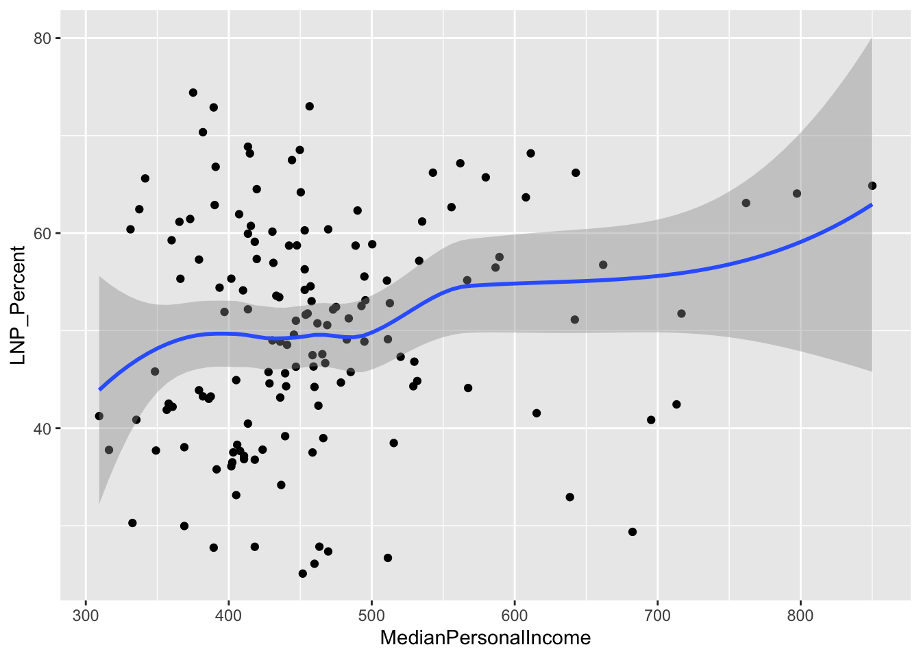
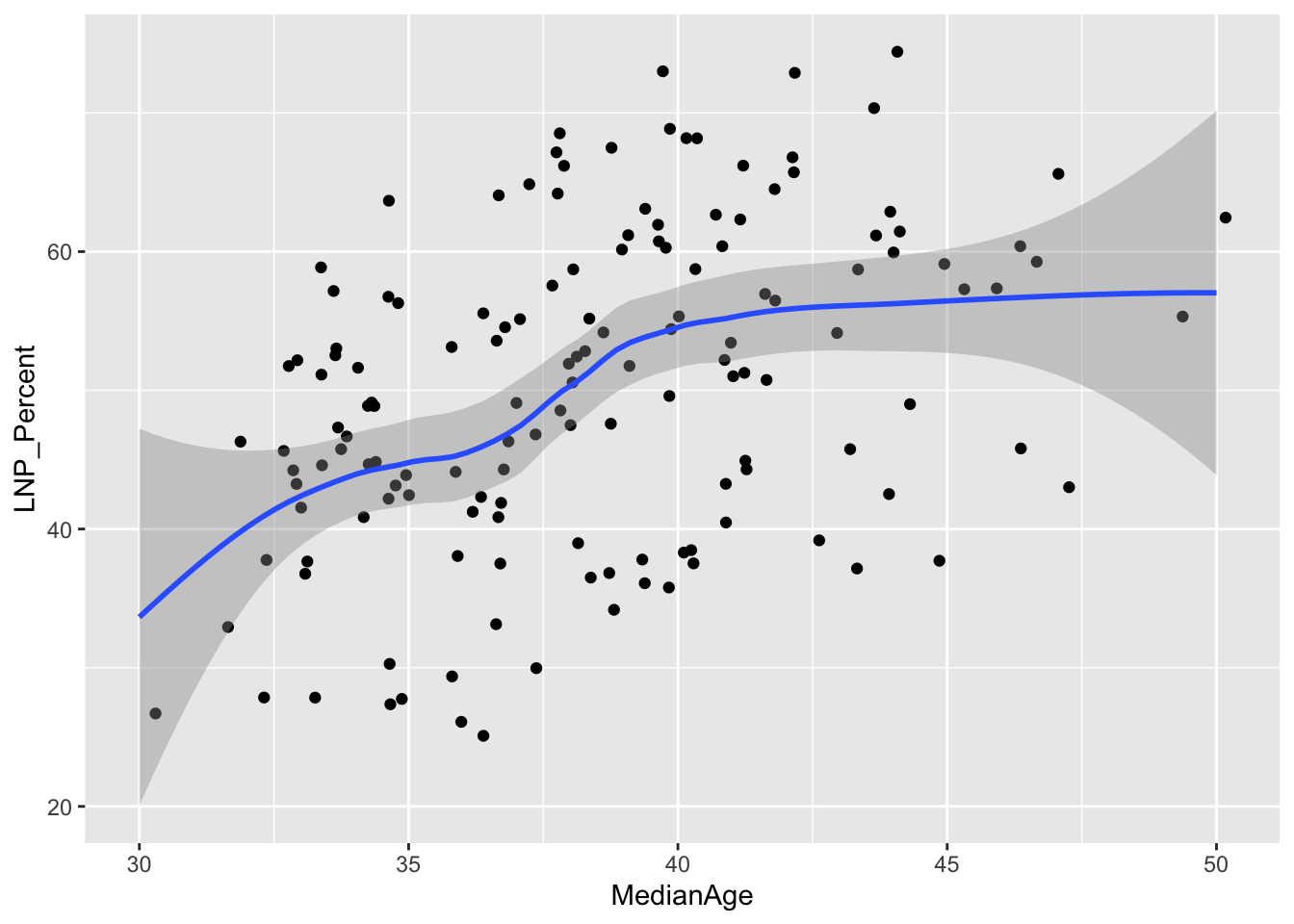
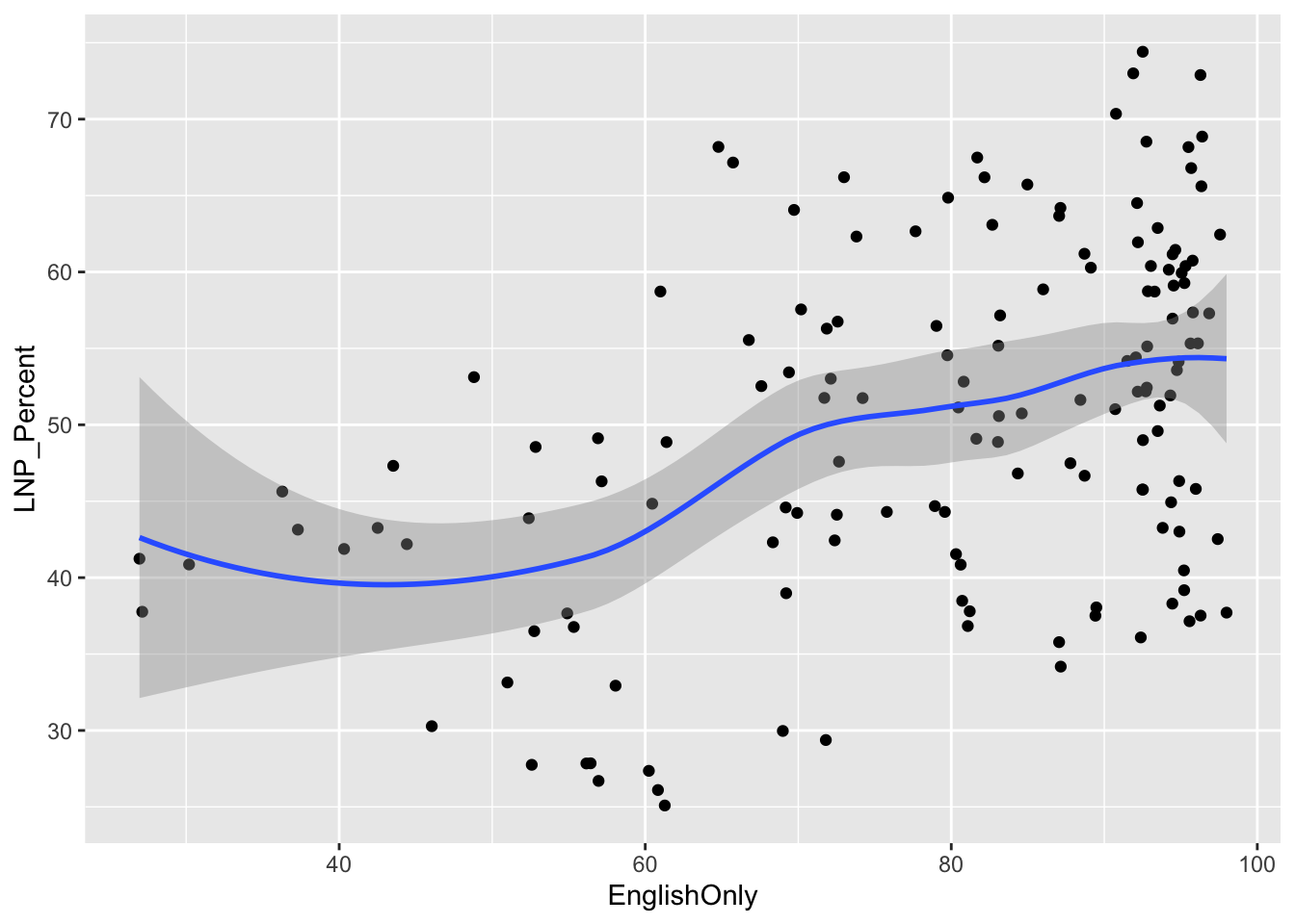
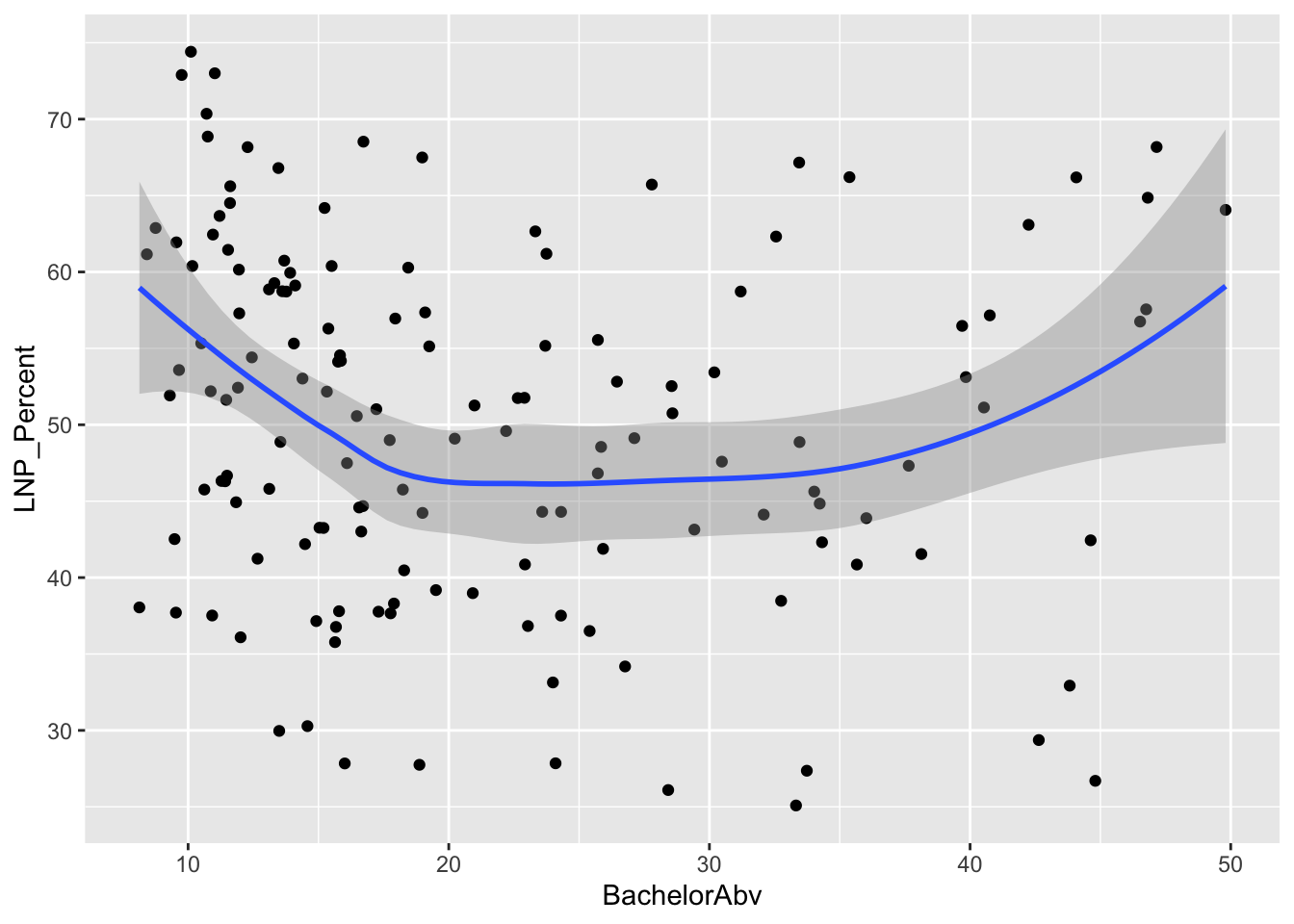
First impressions: Geez this data looks messy. Second impression: Maybe there’s a bit of a trend with age and income?
Let’s build a regression model to run all the 80 odd census variables in the abs2016 data set against the LNP_percent variable.
# We can use colnames(election2016) to get a big list of all the variables available

# Now we build the model
election_model <- lm(LNP_Percent~
                    Population+
                    Area+
                    Age00_04+
                    Age05_14+
                    Age15_19+
                    Age20_24+
                    Age25_34+
                    Age35_44+
                    Age45_54+
                    Age55_64+
                    Age65_74+
                    Age75_84+
                    Age85plus+
                    Anglican+
                    AusCitizen+
                    AverageHouseholdSize+
                    BachelorAbv+Born_Asia+
                    Born_MidEast+Born_SE_Europe+
                    Born_UK+
                    BornElsewhere+
                    Buddhism+
                    Catholic+
                    Christianity+
                    Couple_NoChild_House+Couple_WChild_House+
                    CurrentlyStudying+DeFacto+
                    DiffAddress+
                    DipCert+
                    EnglishOnly+
                    FamilyRatio+
                    Finance+
                    HighSchool+
                    Indigenous+
                    InternetAccess+
                    InternetUse+
                    Islam+
                    Judaism+
                    Laborer+
                    LFParticipation+
                    Married+
                    MedianAge+
                    MedianFamilyIncome+
                    MedianHouseholdIncome+
                    MedianLoanPay+
                    MedianPersonalIncome+
                    MedianRent+
                    Mortgage+
                    NoReligion+
                    OneParent_House+
                    Owned+
                    Professional+
                    PublicHousing+
                    Renting+
                    SocialServ+
                    SP_House+
                    Tradesperson+
                    Unemployed+
                    Volunteer,
                    data=election2016)

summary(election_model)
##
## Call:
## lm(formula = LNP_Percent ~ Population + Area + Age00_04 + Age05_14 +
## Age15_19 + Age20_24 + Age25_34 + Age35_44 + Age45_54 + Age55_64 +
## Age65_74 + Age75_84 + Age85plus + Anglican + AusCitizen +
## AverageHouseholdSize + BachelorAbv + Born_Asia + Born_MidEast +
## Born_SE_Europe + Born_UK + BornElsewhere + Buddhism + Catholic +
## Christianity + Couple_NoChild_House + Couple_WChild_House +
## CurrentlyStudying + DeFacto + DiffAddress + DipCert + EnglishOnly +
## FamilyRatio + Finance + HighSchool + Indigenous + InternetAccess +
## InternetUse + Islam + Judaism + Laborer + LFParticipation +
## Married + MedianAge + MedianFamilyIncome + MedianHouseholdIncome +
## MedianLoanPay + MedianPersonalIncome + MedianRent + Mortgage +
## NoReligion + OneParent_House + Owned + Professional + PublicHousing +
## Renting + SocialServ + SP_House + Tradesperson + Unemployed +
## Volunteer, data = election2016)
##
## Residuals:
## Min 1Q Median 3Q Max
## -8.6197 -2.5288 -0.2903 2.2118 10.0752
##
## Coefficients: (1 not defined because of singularities)
## Estimate Std. Error t value Pr(>|t|)
## (Intercept) -7.602e+03 1.198e+04 -0.634 0.52753
## Population 4.224e-05 5.045e-05 0.837 0.40468
## Area 6.359e-06 5.436e-06 1.170 0.24527
## Age00_04 7.063e+01 1.193e+02 0.592 0.55554
## Age05_14 7.280e+01 1.194e+02 0.609 0.54380
## Age15_19 7.215e+01 1.193e+02 0.605 0.54686
## Age20_24 6.383e+01 1.198e+02 0.533 0.59559
## Age25_34 7.265e+01 1.196e+02 0.607 0.54522
## Age35_44 6.830e+01 1.195e+02 0.572 0.56912
## Age45_54 6.964e+01 1.196e+02 0.582 0.56192
## Age55_64 7.224e+01 1.194e+02 0.605 0.54677
## Age65_74 7.915e+01 1.197e+02 0.661 0.51017
## Age75_84 7.583e+01 1.193e+02 0.635 0.52682
## Age85plus 6.974e+01 1.197e+02 0.582 0.56178
## Anglican 2.912e-01 3.954e-01 0.737 0.46338
## AusCitizen 1.679e-01 7.769e-01 0.216 0.82938
## AverageHouseholdSize -2.683e+01 1.673e+01 -1.604 0.11241
## BachelorAbv -3.045e+00 1.003e+00 -3.035 0.00318 **
## Born_Asia -3.451e-01 3.842e-01 -0.898 0.37151
## Born_MidEast 8.345e-01 1.256e+00 0.664 0.50832
## Born_SE_Europe -2.007e+00 1.479e+00 -1.357 0.17825
## Born_UK 6.477e-02 4.615e-01 0.140 0.88872
## BornElsewhere 6.542e-01 6.265e-01 1.044 0.29933
## Buddhism 6.375e-01 8.253e-01 0.772 0.44196
## Catholic -3.970e-01 3.754e-01 -1.058 0.29322
## Christianity 1.112e+00 6.283e-01 1.769 0.08038 .
## Couple_NoChild_House 3.345e+00 3.078e+00 1.087 0.28021
## Couple_WChild_House 3.762e+00 3.156e+00 1.192 0.23661
## CurrentlyStudying 2.597e+00 1.303e+00 1.993 0.04939 *
## DeFacto -7.035e+00 2.617e+00 -2.688 0.00862 **
## DiffAddress 9.320e-01 3.877e-01 2.404 0.01836 *
## DipCert -8.790e-01 7.296e-01 -1.205 0.23163
## EnglishOnly -1.316e-01 4.717e-01 -0.279 0.78095
## FamilyRatio 1.962e+01 4.994e+01 0.393 0.69543
## Finance 1.528e+00 9.060e-01 1.687 0.09523 .
## HighSchool 9.371e-01 4.683e-01 2.001 0.04854 *
## Indigenous 1.054e+00 4.781e-01 2.205 0.03013 *
## InternetAccess -9.364e-01 9.367e-01 -1.000 0.32028
## InternetUse NA NA NA NA
## Islam 2.894e-01 6.407e-01 0.452 0.65258
## Judaism 7.306e-01 7.474e-01 0.978 0.33105
## Laborer -2.925e-02 7.905e-01 -0.037 0.97057
## LFParticipation 2.926e+00 8.800e-01 3.325 0.00130 **
## Married -4.168e+00 1.890e+00 -2.205 0.03011 *
## MedianAge -7.214e-01 1.071e+00 -0.674 0.50218
## MedianFamilyIncome 2.146e-02 3.339e-02 0.643 0.52204
## MedianHouseholdIncome 2.879e-02 3.037e-02 0.948 0.34584
## MedianLoanPay -9.533e-03 1.336e-02 -0.713 0.47757
## MedianPersonalIncome -2.286e-02 5.907e-02 -0.387 0.69973
## MedianRent -4.070e-02 5.306e-02 -0.767 0.44514
## Mortgage 1.923e+00 1.741e+00 1.104 0.27264
## NoReligion 1.285e+00 6.365e-01 2.019 0.04658 *
## OneParent_House 2.164e-01 2.987e+00 0.072 0.94241
## Owned 1.488e+00 1.591e+00 0.935 0.35229
## Professional 7.449e-01 1.010e+00 0.737 0.46300
## PublicHousing -5.464e-01 6.280e-01 -0.870 0.38670
## Renting 2.068e+00 1.736e+00 1.192 0.23664
## SocialServ -3.356e-01 6.232e-01 -0.539 0.59155
## SP_House -1.034e+00 8.907e-01 -1.161 0.24895
## Tradesperson 6.347e-01 8.058e-01 0.788 0.43305
## Unemployed 2.815e-01 1.176e+00 0.239 0.81149
## Volunteer 7.346e-01 6.179e-01 1.189 0.23772
## ---
## Signif. codes: 0 '***' 0.001 '**' 0.01 '*' 0.05 '.' 0.1 ' ' 1
##
## Residual standard error: 4.933 on 86 degrees of freedom
## (3 observations deleted due to missingness)
## Multiple R-squared: 0.8911, Adjusted R-squared: 0.8151
## F-statistic: 11.73 on 60 and 86 DF, p-value: < 2.2e-16For the people that care about statistical fit and endogenous variables, you may have concerns (and rightly so) with the above approach. It’s pretty rough. Let’s run a basic check to see if the residuals are normally distributed.
hist(election_model$residuals, col="bisque", freq=FALSE, main=NA)
lines(density(election_model$residuals), col="red")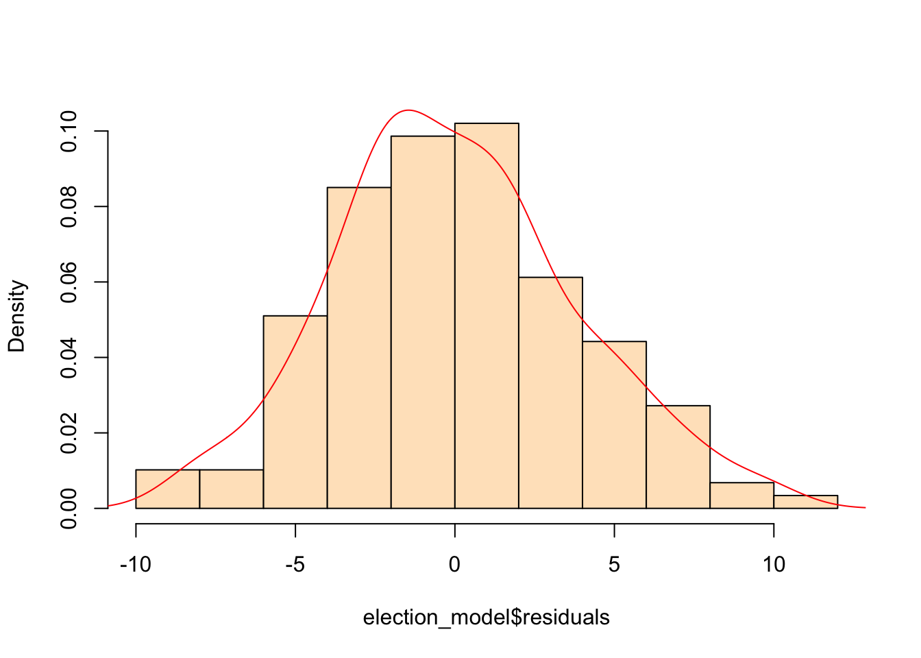
Hmm… that’s actually not too bad. Onwards.
We see now that only a handful of these variables in the table above are statistically significant. Running an updated (and leaner) model gives:
election_model_lean <- lm(LNP_Percent~
                          BachelorAbv+
                          CurrentlyStudying+
                          DeFacto+
                          DiffAddress+
                          Finance+HighSchool+
                          Indigenous+
                          LFParticipation+
                          Married+
                          NoReligion,
                          data=election2016)

summary(election_model_lean)ggplot(election2016, aes(x = BachelorAbv, y = LNP_Percent)) + geom_point() + geom_smooth()+theme_bw()
ggplot(election2016, aes(x = CurrentlyStudying, y = LNP_Percent)) + geom_jitter() + geom_smooth()+theme_bw()
ggplot(election2016, aes(x = DeFacto, y = LNP_Percent)) + geom_jitter() + geom_smooth()+theme_bw()
ggplot(election2016, aes(x = DiffAddress, y = LNP_Percent)) + geom_jitter() + geom_smooth()+theme_bw()
ggplot(election2016, aes(x = Finance, y = LNP_Percent)) + geom_jitter() + geom_smooth()+theme_bw()
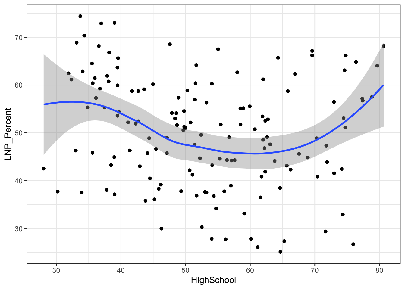
ggplot(election2016, aes(x = HighSchool, y = LNP_Percent)) + geom_jitter() + geom_smooth()+theme_bw()
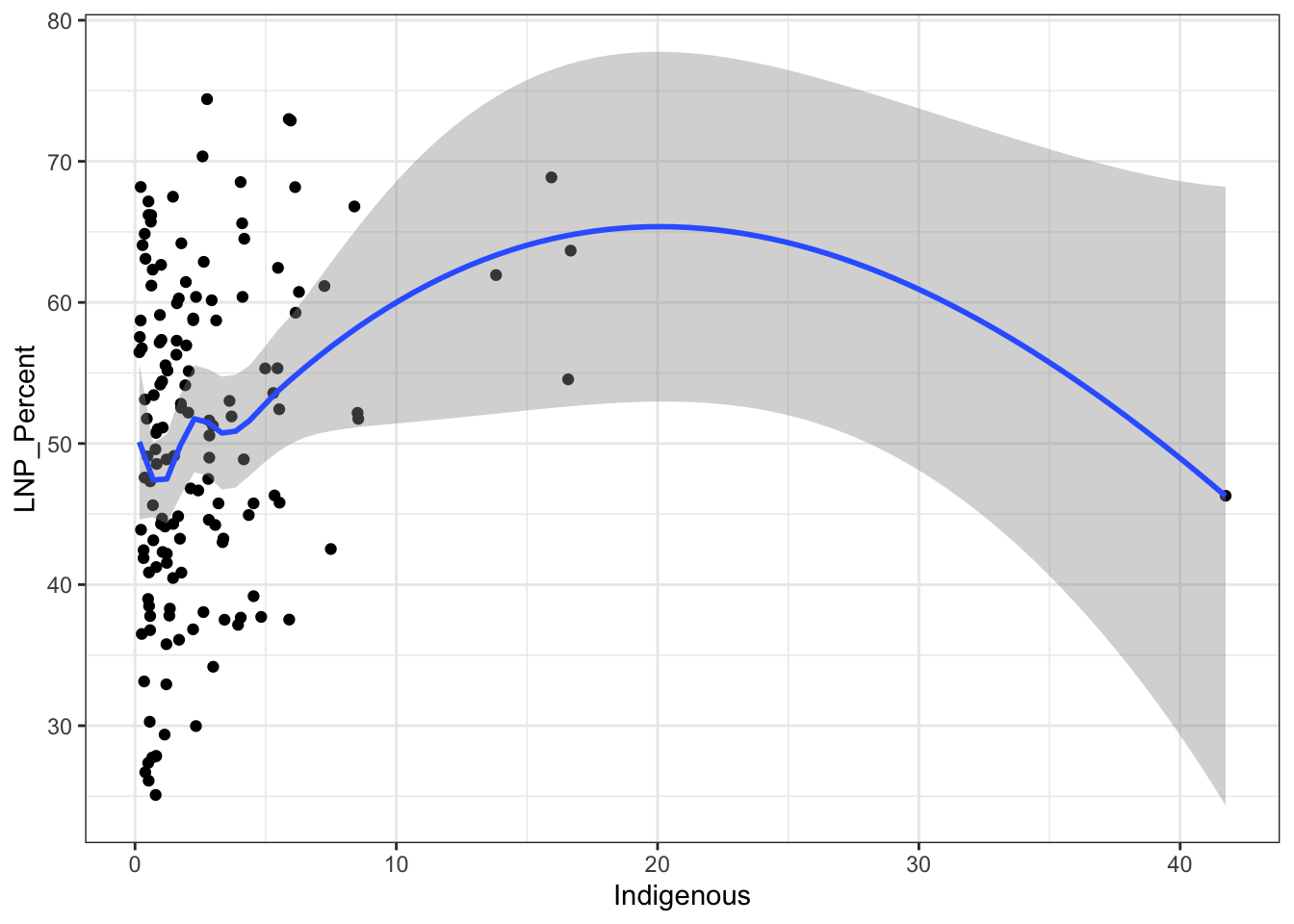
ggplot(election2016, aes(x = Indigenous, y = LNP_Percent)) + geom_jitter() + geom_smooth()+theme_bw()
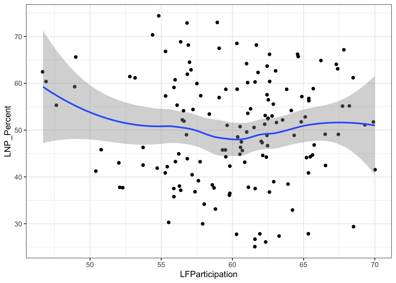
ggplot(election2016, aes(x = LFParticipation, y = LNP_Percent)) + geom_jitter() + geom_smooth()+theme_bw()
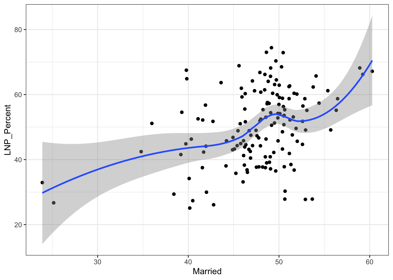
ggplot(election2016, aes(x = Married, y = LNP_Percent)) + geom_jitter() + geom_smooth()+theme_bw()
ggplot(election2016, aes(x = NoReligion, y = LNP_Percent)) + geom_jitter() + geom_smooth()+theme_bw()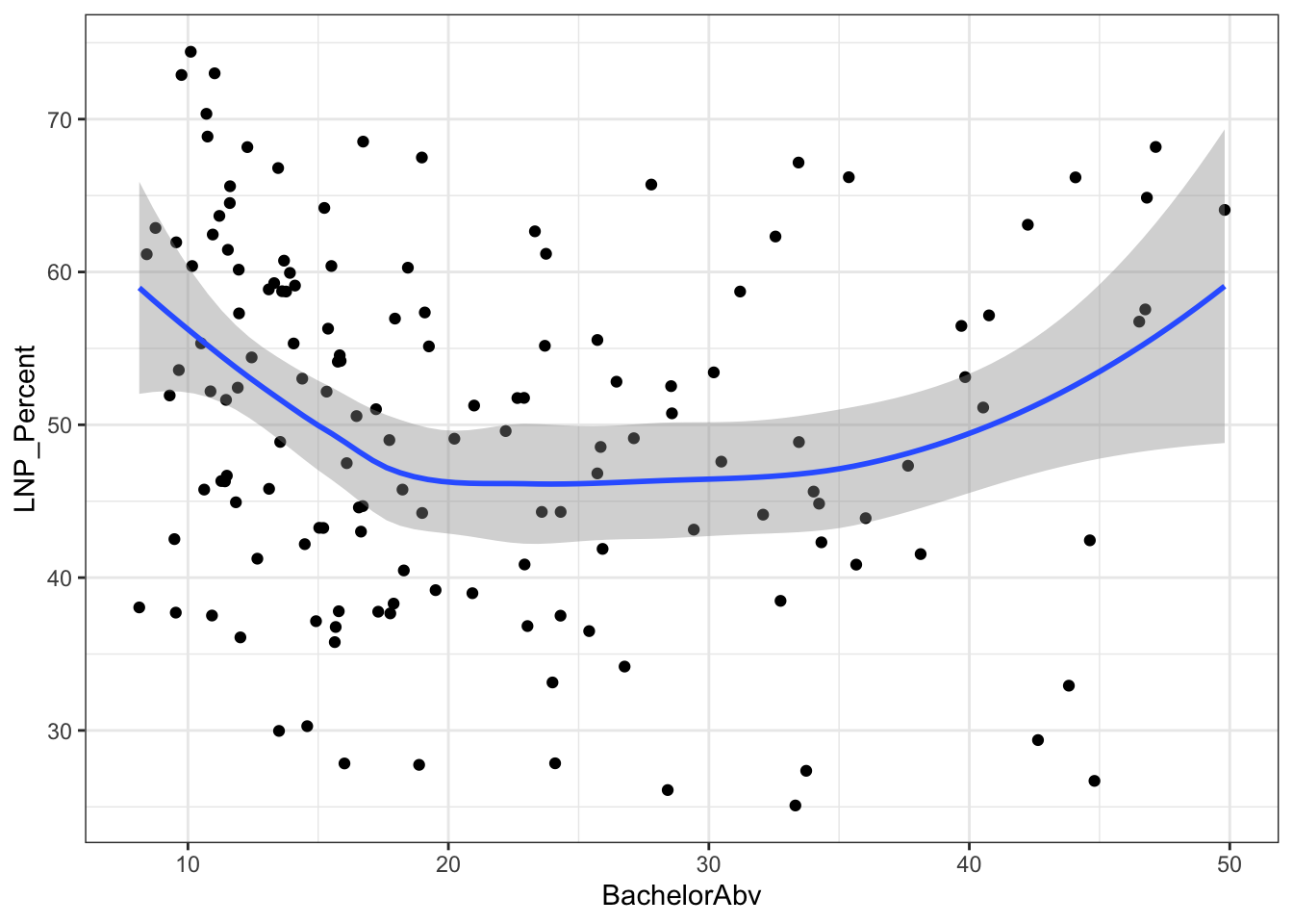
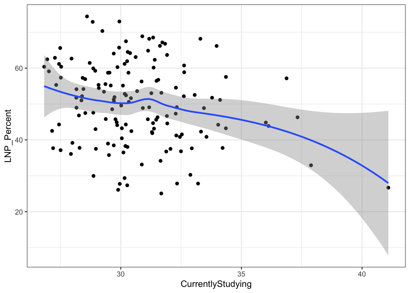
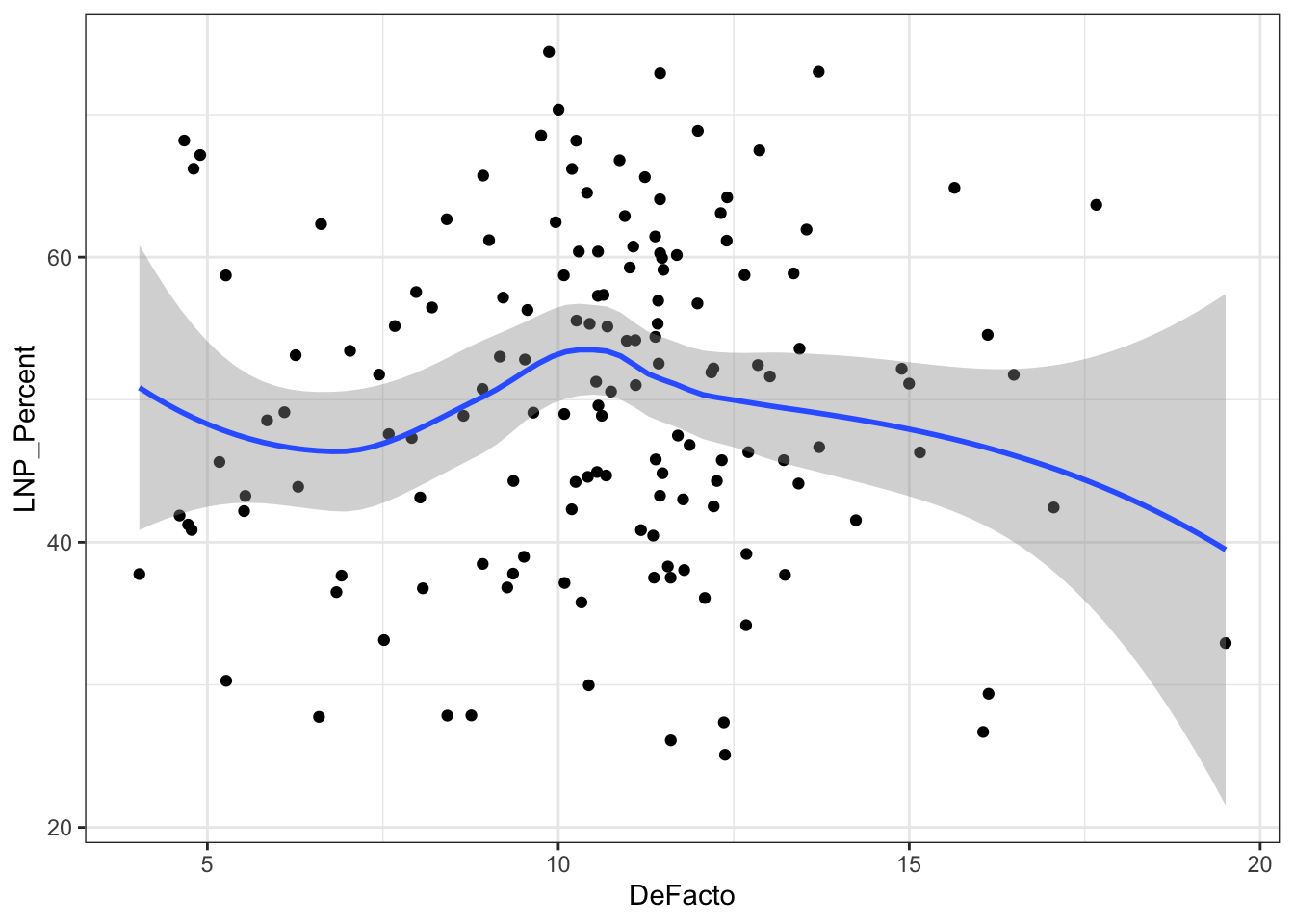
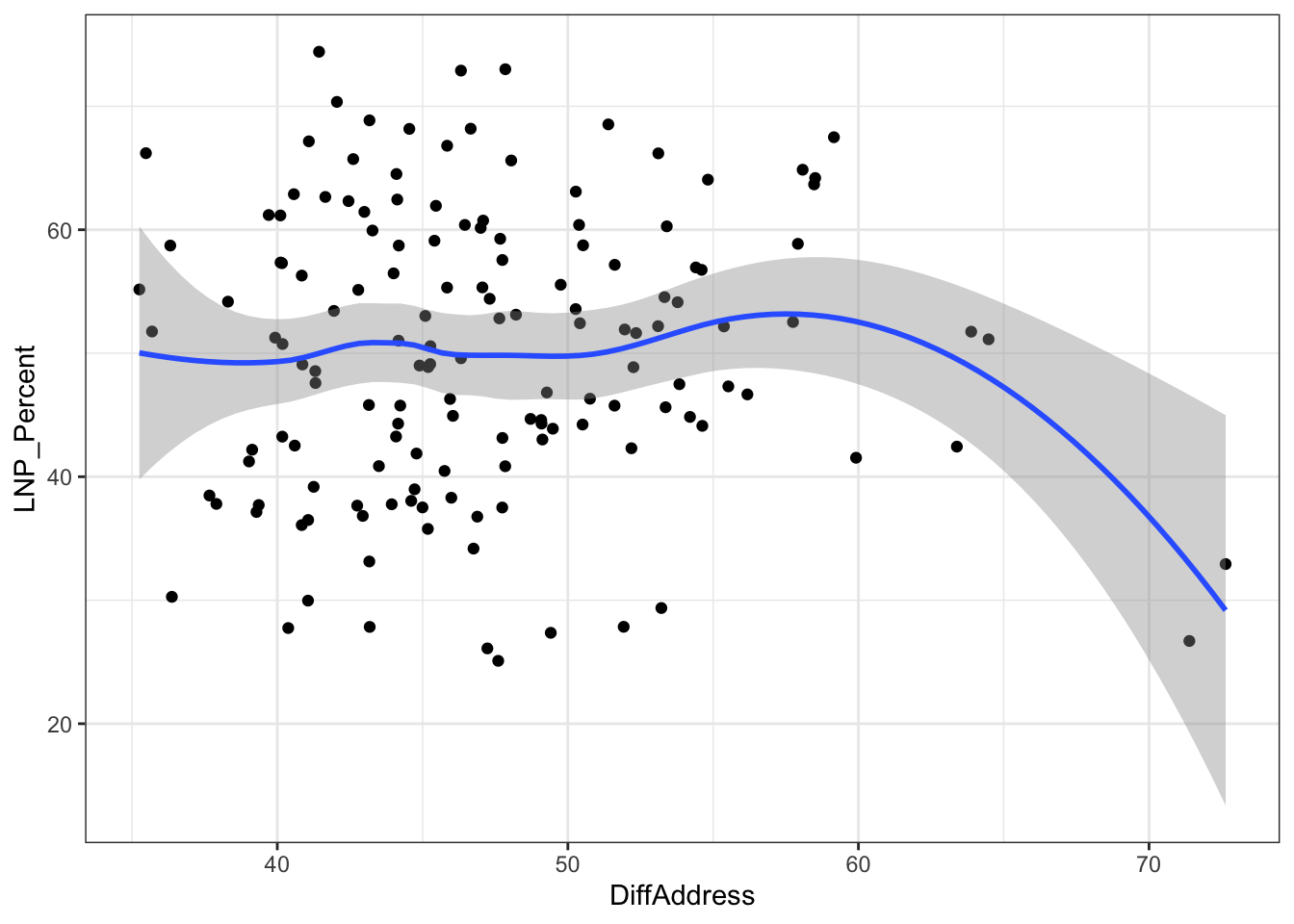
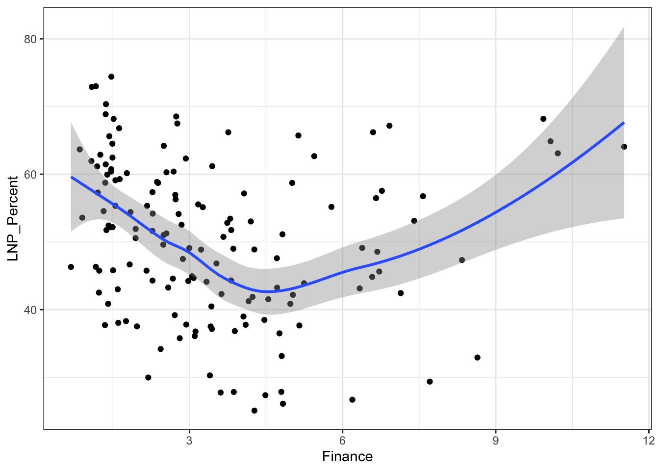
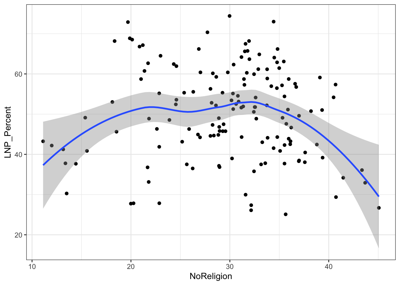
My main gripe with the above is that electorates are very different in size. Therefore trying to conclude any statistical relationship on an electorate level is prone to errors. Adding more data isn’t always the best method to solve what’s formally known as the Modifiable Area Unit Problem… but in this case it’s worth a try.
So here goes, let’s run the analysis above, this time using all 7,000 voting booths (and their local demographic data) as the data set rather than just the 150 electorates.
5.5 Exploring booth level data
The AEC maintains a handy spreadsheet of booth locations for recent federal elections. You can search for your local booth location (probably a school, church, or community center) in the table below.
What do these booths look like on a map? Let’s reuse the CED map above and plot a point for each booth location.
            ggplot()+
            geom_sf(data=ced2018)+
            geom_point(data=booths, aes(x=Longitude, y=Latitude),
                       colour="purple", size=1, alpha=0.3, inherit.aes=FALSE) +
            labs(title="Electoral divisions in Australia",
               subtitle = "It turns out we divide the country in very non-standard blocks",
               caption = "Data: Australian Bureau of Statistics 2016",
               x="",
               y="") +
            theme_minimal() +
            theme(axis.ticks.x = element_blank(),axis.text.x = element_blank())+
            theme(axis.ticks.y = element_blank(),axis.text.y = element_blank())+
            theme(panel.grid.major = element_blank(), panel.grid.minor = element_blank())+
            theme(legend.position = "right")+
            theme(plot.title=element_text(face="bold",size=12))+
            theme(plot.subtitle=element_text(size=11))+
            theme(plot.caption=element_text(size=8)) +
            xlim(c(112,157)) + ylim(c(-44,-11))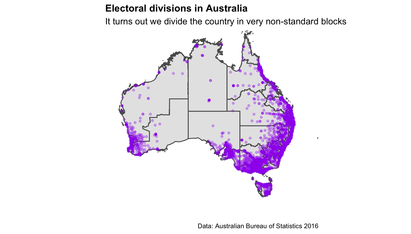
5.6 Winners and losers at each booth
Election results are provided at the resolution of polling place, but must be downloaded using the functions firstpref_pollingbooth_download, twoparty_pollingbooth_download or twocand_pollingbooth_download (depending on the vote type). We can use this information to color the points. The two files need to be merged. Both have a unique ID for the polling place that can be used to match the records. The two party preferred vote, a measure of preference between only the Australian Labor Party (ALP) and the Liberal/National Coalition (LNP), is downloaded using twoparty_pollingbooth_download. The preferred party is the one with the higher percentage, and we use this to colour the points indicating polling places.
This gives a richer look at the party preferences across the country. You can see that although the big rural electorates vote for LNP overall, some polling places would elect the ALP, e.g. western NSW around Broken Hill. This data would look far more interesting if the data also contained the minority parties, because there must be some polling places where the majority vote would be for a minor party, since there are some minor party representatives in the House.
## Error: `map` must have the columns `x`, `y`, and `id`The two candidate preferred vote (downloaded with twocand_pollingbooth_download) is a measure of preference between the two candidates who received the most votes through the division of preferences, where the winner has the higher percentage.
## Error: `map` must have the columns `x`, `y`, and `id`This map shows which party had the most support at each polling booth, and we see that support for minor parties are clustered in different regiond. An independent candidate has lots of support in the electorate of Indi (rural Victoria), One Nation party is backed by parts of rural Queesland, and other parties are popular in northern Queenaland and around Adelaide. Again we see the cities strongly support Labor.
```
5.7 Donkeys, dicks, and other informalities
In the 2016 Australian Federal Election, over 720,915 people (5.5% of all votes cast) voted informally. Of these, over half (377,585) had ‘no clear first preference,’ meaning their vote did not contribute to the campaign of any candidate.
I’ll be honest, informal votes absolutely fascinate me. Not only are there 8 types of informal votes (you can read all about the Australian Electoral Commission’s analysis here), but the rate of informal voting varies a tremendous amount by electorate.
Broadly, we can think of informal votes in two main buckets.
Protest votes
Stuff-ups
If we want to get particular about it, I like to subcategorise these buckets into:
Protest votes (voting against):
the democratic system,
their local selection of candidates on the ballot, or
the two most likely candidates for PM.
Stuff ups (people who):
filled in the form wrong but a clear preference was still made
stuffed up the form entirely and it wasn’t counted
This is the good bit:
The AEC works tirelessly to reduce stuff-ups on ballot papers (clear instructions and UI etc), but there isn’t much of a solution for protest votes. What’s interesting is you can track the ‘vibe’ of how consequential an election is by the proportion of protest votes.
Let’s pull some informal voting data from the AEC website.