Chapter 6 Charts
6.1 Getting started
There’s exceptional resources online for using the ggplot2 package to create production ready charts.
The R Graph Gallery is a great place to start, as is the visual storytelling blogs of The Economist and the BBC.
This chapter contains the code for some of my most used charts and visualisation techniques.
# Load in packages
library(ggridges)
library(ggplot2)
library(viridis)
library(readxl)
library(hrbrthemes)
library(dplyr)
library(stringr)
library(reshape)
library(tidyr)
library(lubridate)
6.2 Make the data tidy
Before making a chart ensure the data is “tidy” - meaning there is a new row for every changed variable. It also doesn’t hurt to remove NA’s for consistency (particularly in time series).
#Read in data
url <-"https://raw.githubusercontent.com/charlescoverdale/ggridges/master/2019_MEL_max_temp_daily.xlsx"

#Read in with read.xlsx
MEL_temp_daily <- openxlsx::read.xlsx(url)

#Remove last 2 characters to just be left with the day number
MEL_temp_daily$Day=substr(MEL_temp_daily$Day,1,nchar(MEL_temp_daily$Day)-2)

#Make a wide format long using the gather function
MEL_temp_daily <- MEL_temp_daily %>%
                     gather(Month,Temp,Jan:Dec)

MEL_temp_daily$Month<-factor(MEL_temp_daily$Month,levels=c("Jan", "Feb", "Mar", "Apr", "May", "Jun", "Jul", "Aug", "Sep", "Oct", "Nov", "Dec"))

#Add in a year
MEL_temp_daily["Year"]=2019

#Reorder
MEL_temp_daily <- MEL_temp_daily[,c(1,2,4,3)]

#Make a single data field using lubridate
MEL_temp_daily <- MEL_temp_daily %>% mutate(Date = make_date(Year, Month, Day))

#Drop the original date columns
MEL_temp_daily <- MEL_temp_daily %>% dplyr::select(Date, Temp) %>% drop_na()

#Add on a 7-day rolling average
MEL_temp_daily <- MEL_temp_daily %>% dplyr::mutate(Seven_day_rolling =
                                                  zoo::rollmean(Temp, k = 7, fill = NA),
                                                  Mean = mean(Temp))
#Drop NA's
#MEL_temp_daily <- MEL_temp_daily %>% drop_na()
6.3 Line plot
plot_MEL_temp <- ggplot(MEL_temp_daily)+
                          geom_line(aes(x = Date, y = Temp), col = "blue")+
                          geom_line(aes(x = Date, y = Mean), col = "orange")+
                          labs(title="Hot in the summer and cool in the winter",
                          subtitle = "Analysing temperature in Melbourne",
                          caption = "Data: Bureau of Meterology 2019",
                          x="",
                          y="Temperature °C") +

                          scale_y_continuous(labels = scales::comma)+
                          scale_x_date(date_breaks = "1 month",
                                       date_labels = "%b",
                                       limits = as.Date(c('2019-01-01','2019-12-14')))+

                          theme_minimal() +
                          theme(legend.position="bottom")+

                          theme(plot.title=element_text(face="bold",size=12))+
                          theme(plot.subtitle=element_text(size=11))+
                          theme(plot.caption=element_text(size=8))+

                          theme(axis.text=element_text(size=8))+
                          theme(panel.grid.minor = element_blank())+
                          theme(panel.grid.major.x = element_blank()) +

                          theme(axis.title.y =
                               element_text(margin = margin(t = 0, r = 10, b = 0, l = 0)))+

                          annotate(geom='curve',
                                   x=as.Date('2019-08-01'), y=23,
                                   xend=as.Date('2019-08-01'),yend=17,
                                   curvature=-0.5,arrow=arrow(length=unit(2,"mm")))+
                                   annotate(geom='text',x=as.Date('2019-07-15'),y=25,
                                   label="Below 20°C all winter")


plot_MEL_temp
6.4 Scatter plot
MEL_temp_Jan <- MEL_temp_daily %>% filter(MEL_temp_daily$Date<as.Date("2019-01-31"))

ggplot(MEL_temp_Jan)+
  geom_point(aes(x = Date, y = Temp), col = "purple")+
  labs(title="January is a hot one",
  subtitle = "Analysing temperature in Melbourne",
  caption = "Data: Bureau of Meterology 2019",
  x="",
  y="Temperature °C") +

  scale_y_continuous(labels = scales::comma)+
  scale_x_date(date_breaks = "1 week",
  date_labels = "%d-%b",
  limits = as.Date(c('2019-01-01','2019-01-31')))+

  theme_minimal() +
  theme(legend.position="bottom")+

  theme(plot.title=element_text(face="bold",size=12))+
  theme(plot.subtitle=element_text(size=11))+

  theme(plot.caption=element_text(size=8))+

  theme(axis.text=element_text(size=8))+#,margin=margin(0,0,30,0))+
  theme(panel.grid.minor = element_blank())+
  theme(panel.grid.major.x = element_blank())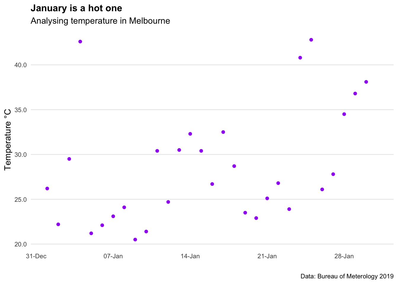
6.5 Bar chart
Year = c("2018", "2019", "2020", "2021")

Value = (c(100,300, 200, 500))

bar_data_single <- (cbind(Year, Value))

bar_data_single <- as.data.frame(bar_data_single)

bar_data_single$Value = as.integer(bar_data_single$Value)


ggplot(bar_data_single, aes(x = Year, y = Value, label=Value)) +
  geom_bar(stat='identity',fill="blue")+
  geom_text(size = 5,
            col="white",fontface="bold",
            position = position_stack(vjust = 0.5),
            label=scales::dollar(Value))+

  labs(title="Bar chart example",
                          subtitle = "Subtitle goes here",
                          caption = "Data: Made up from scratch",
                          x="",
                          y="") +

  theme_minimal() +

  theme(plot.title=element_text(face="bold",size=12))+
  theme(plot.subtitle=element_text(size=11))+
  theme(plot.caption=element_text(size=12))+

  theme(axis.text=element_text(size=12))+
  theme(panel.grid.minor = element_blank())+
  theme(panel.grid.major.x = element_blank())+
  theme(panel.grid.major.y = element_blank()) +

  theme(axis.title.y=element_blank(),
        axis.text.y=element_blank(),
        axis.ticks.y=element_blank())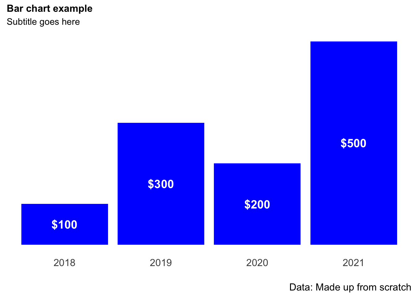
6.6 Stacked bar chart
Year = c("2019", "2019", "2019", "2019", "2020", "2020", "2020", "2020")

Quarter = c("Q1","Q2","Q3", "Q4","Q1","Q2","Q3", "Q4")

Value = (c(100,300,200,500,400,700,200,300))

bar_data <- (cbind(Year, Quarter, Value))

bar_data <- as.data.frame(bar_data)

bar_data$Value = as.integer(bar_data$Value)

bar_data_totals <- bar_data %>%
                            dplyr::group_by(Year) %>%
                            dplyr:: summarise(Total = sum(Value))


ggplot(bar_data, aes(x = Year, y = Value, fill = (Quarter), label=Value)) +
  geom_bar(position = position_stack(reverse=TRUE),stat='identity')+
  geom_text(size = 4,
            col="white",
            fontface="bold",
            position = position_stack(reverse=TRUE,vjust = 0.5),
            label=scales::dollar(Value))+
  geom_text(aes(Year, Total,
                label=scales::dollar(Total),
                fill = NULL,
                vjust=-0.5),
                fontface="bold",
                size=4,
                data = bar_data_totals)+

  scale_fill_brewer(palette = "Blues") +

  labs(title="Bar chart example",
                          subtitle = "Subtitle goes here",
                          caption = "Data: Made up from scratch",
                          x="",
                          y="Units") +

  theme_minimal() +

  theme(legend.position = "bottom")+
  theme(legend.title = element_blank())+

  theme(plot.title=element_text(face="bold",size=12))+
  theme(plot.subtitle=element_text(size=10))+
  theme(plot.caption=element_text(size=8))+


  theme(axis.text=element_text(size=10))+
  theme(panel.grid.minor = element_blank())+
  theme(panel.grid.major.x = element_blank())+
  theme(panel.grid.major.y = element_blank()) +

  scale_y_continuous(expand=c(0,0),limits=c(0,1800))+

  theme(axis.title.y=element_blank(),
        axis.text.y=element_blank(),
        axis.ticks.y=element_blank())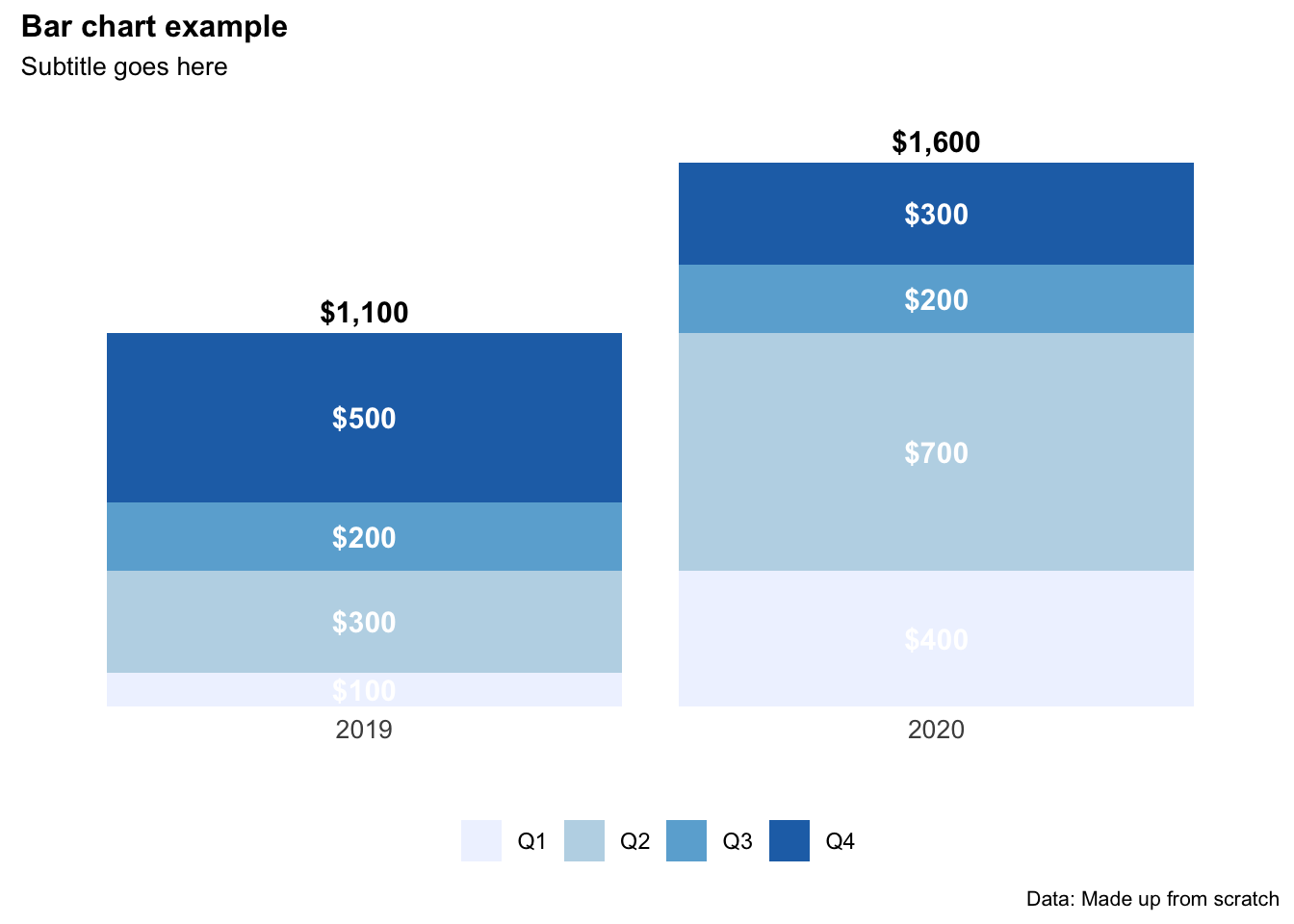
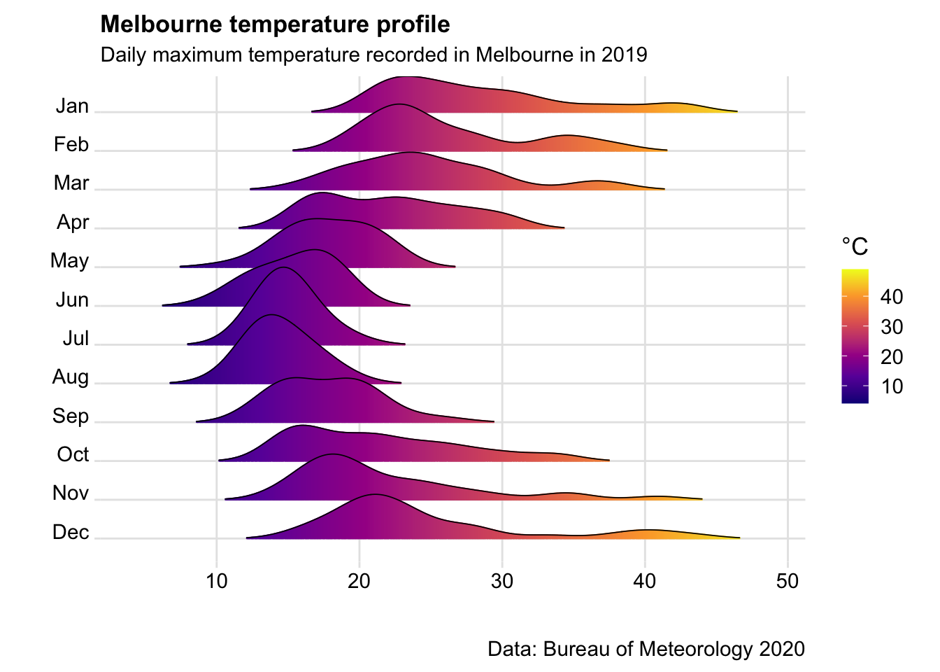
6.7 Ridge chart
Handy when working with climate variables. Particularly useful at showing the difference in range of multiples series (e.g. temperature by month).
# Import data
url <-"https://raw.githubusercontent.com/charlescoverdale/ggridges/master/2019_MEL_max_temp_daily.xlsx"

MEL_temp_daily <- openxlsx::read.xlsx(url)

# Remove last 2 characters to just be left with the day number
MEL_temp_daily$Day=substr(MEL_temp_daily$Day,1,nchar(MEL_temp_daily$Day)-2)

# Make a wide format long using the gather function
MEL_temp_daily <- MEL_temp_daily %>%
                     gather(Month,Temp,Jan:Dec)

MEL_temp_daily$Month<-factor(MEL_temp_daily$Month,levels=c("Jan", "Feb", "Mar", "Apr", "May", "Jun", "Jul", "Aug", "Sep", "Oct", "Nov", "Dec"))

# Plot
ggplot(MEL_temp_daily,
                               aes(x = Temp, y = Month, fill = stat(x))) +
                        geom_density_ridges_gradient(scale =2,
                                                     size=0.3,
                                                     rel_min_height = 0.01,
                                                     gradient_lwd = 1.) +
                        scale_y_discrete(limits = unique(rev(MEL_temp_daily$Month)))+
                        scale_fill_viridis_c(name = "°C", option = "C") +
                        labs(title = 'Melbourne temperature profile',
                        subtitle = 'Daily maximum temperature recorded in Melbourne in 2019',
                        caption = "Data: Bureau of Meteorology 2020") +
                        xlab(" ")+
                        ylab(" ")+
                        theme_ridges(font_size = 13, grid = TRUE)