6 Data Visualization with ggplot
A great resource for data visualuation in
Ris the R Graph Gallery. The examples and information below is a small sample ofRdata visualization basics.
6.1 ggplot
ggplot2 (referred to as ggplot) is a powerful graphics package that can be used to make very impressive data visualizations (see contributions to #TidyTueday on Twitter, for example). The following examples will make use of the Learning R Survey data, which has been partially processed (Chapters 2 and 3) and the palmerpenguins data set, as well as several of datasets included with R to show the basic principles of using ggplot. Then, we will put these basics together to make several beautiful visualizations.
6.2 Grammar of Graphics
The “gg” of ggplot refers to the “grammar of graphics”. For ggplot, this means a visualization must have specific elements to make a complete graphic, just as an utterance or written line must have specific elements to make a grammatically correct sentence.
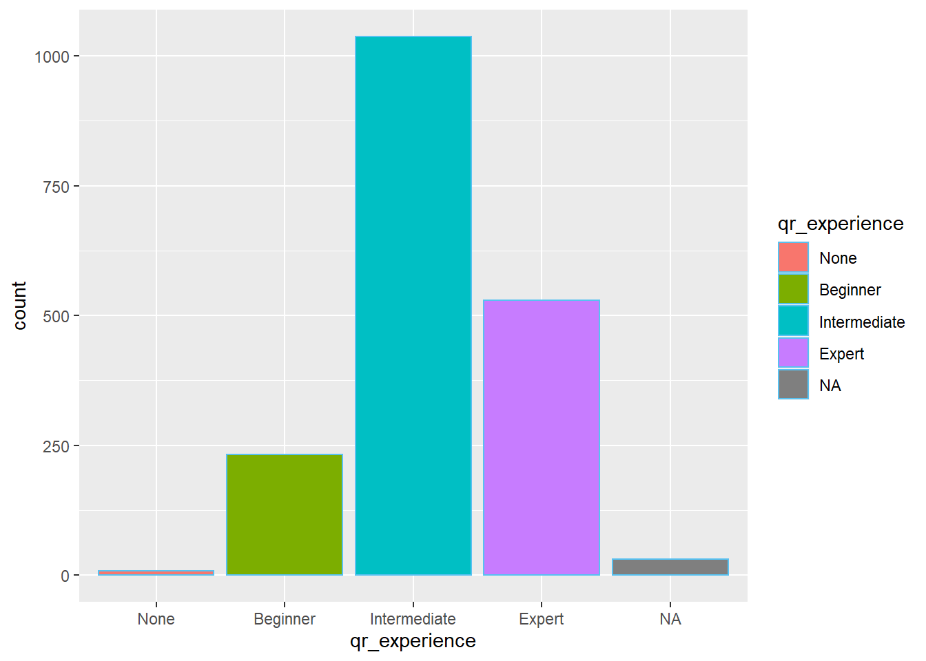
A simple plot contains the following elements:
ggplot(data=rsurvey)+       # reference to data
  geom_bar(                 # geometry - a shape
    aes(x= qr_experience,   # aesthetics - x, y, and color values
        fill=qr_experience)
  )
6.3 Data
There are several ways to refer to a data object in ggplot. You can call data within ggplot (e.g. ggplot(rsurvey) ) or you can call it outside of ggplot within a dplyr chain (e.g rsurvey %>% ggplot()). The advantage of this is you can easily manipulate data directly into ggplot without saving it as a data object:
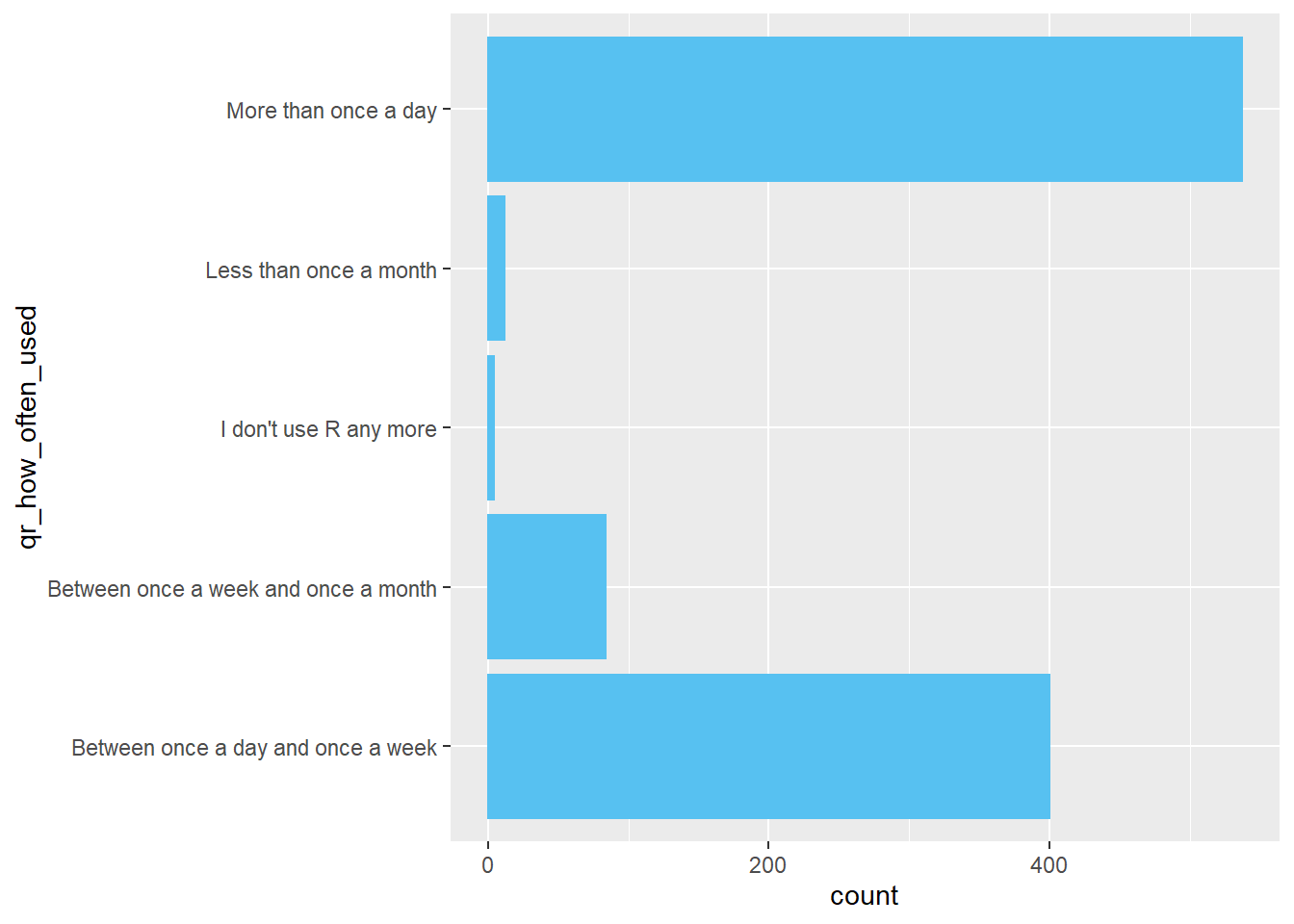
rsurvey %>% # data
  filter(qr_experience == "Intermediate") %>% #manipulation
  ggplot()+ #visualization
  coord_flip()+   # this makes the plot horizontal
  geom_bar(
    aes(x=qr_how_often_used)
  )
You can also call data for individual shapes. This would allow you to use different data objects to form your graphic, or to use the same data object but filter it to display different information. The following graphic demonstrates this.
Please note this graphic is for demonstration purposes only and does not represent a useful data visualization.
ggplot()+
  # data for beginners only - bar chart
  geom_bar(data=rsurvey %>%
             filter(qr_experience == "Beginner"),
             aes(x=age,
                 fill = qr_experience))+
  # data for experts - line chart
  geom_line(data=rsurvey %>%
             filter(qr_experience == "Expert"),
             aes(x=age,
                 color = qr_experience), stat="count")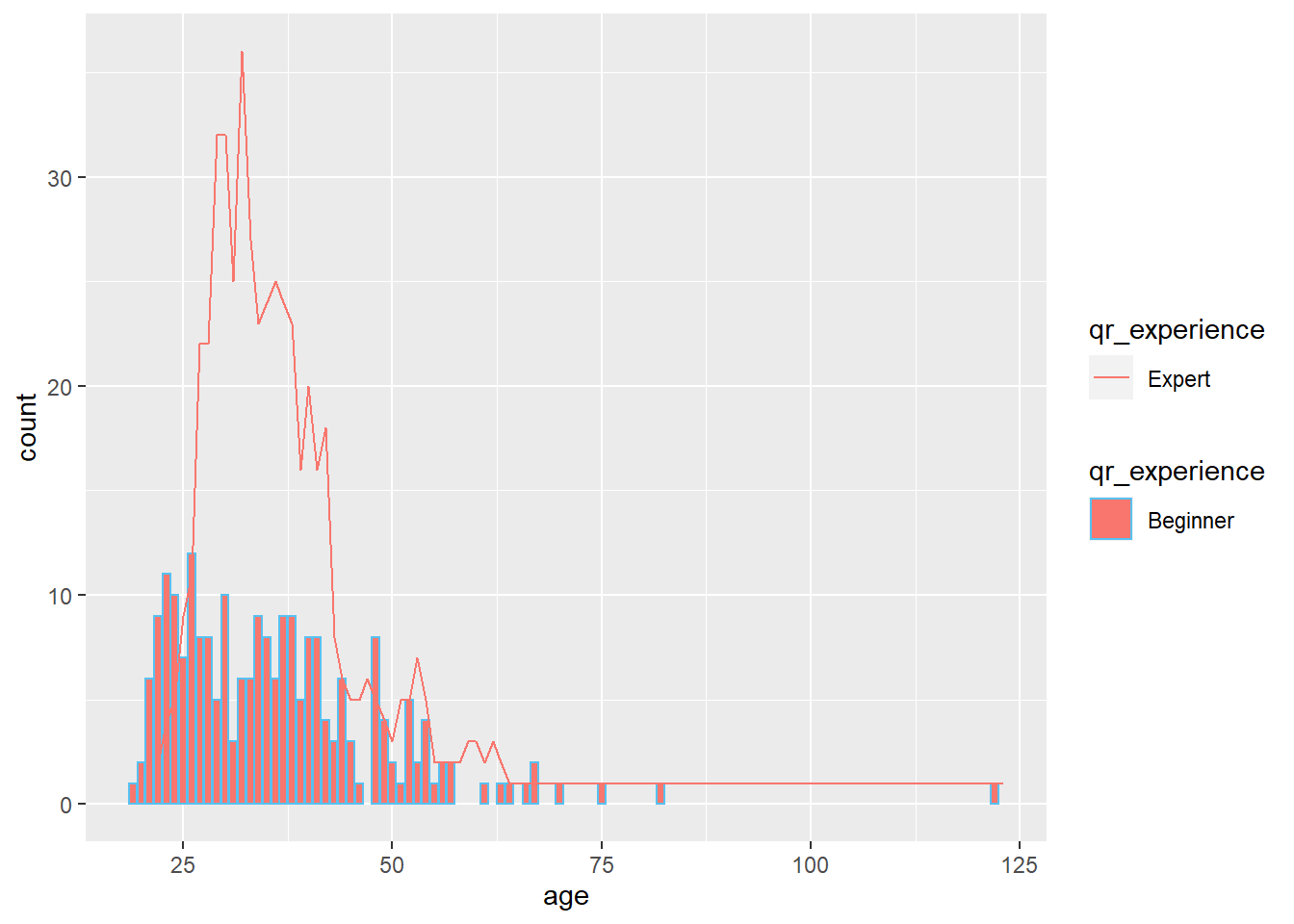
A note about
+Across the
Tidyverse, the%>%“pipe operator” is used to chain commands into simple codes. It stands for “and then”. However, inggplot, despite being part of the tidyverse, different elements are connected with the plus sign+.
6.4 Aesthetics
Aesthetics are the way you connect data to the elements inside the graphic. Aesthetics tell ggplot what should be on the x-axis, what should be on the y-axis, and what the colors should be.
Different geometries (shapes) may have different aesthetics, but x, y, and color/fill are the most common.
color=is used for:geom_point()- dots, circles, scatterplotsgeom_line()- line charts
fill=is used for:geom_col()/geom_bar()- column/bar chartsgeom_area()- area charts
Using color= or fill= to refer to a categorical variable (called a “discrete” variable in ggplot) allows you to separate the shape by that category. Here is an example with and without specifiying a color:
library(patchwork) # for combining two plots
(ggplot(penguins)+
  geom_bar(aes(x=species))+
    ggtitle(label = "No `fill =`"))+
(ggplot(penguins)+
  geom_bar(aes(x=species, fill=sex))+
       ggtitle(label = "fill = sex"))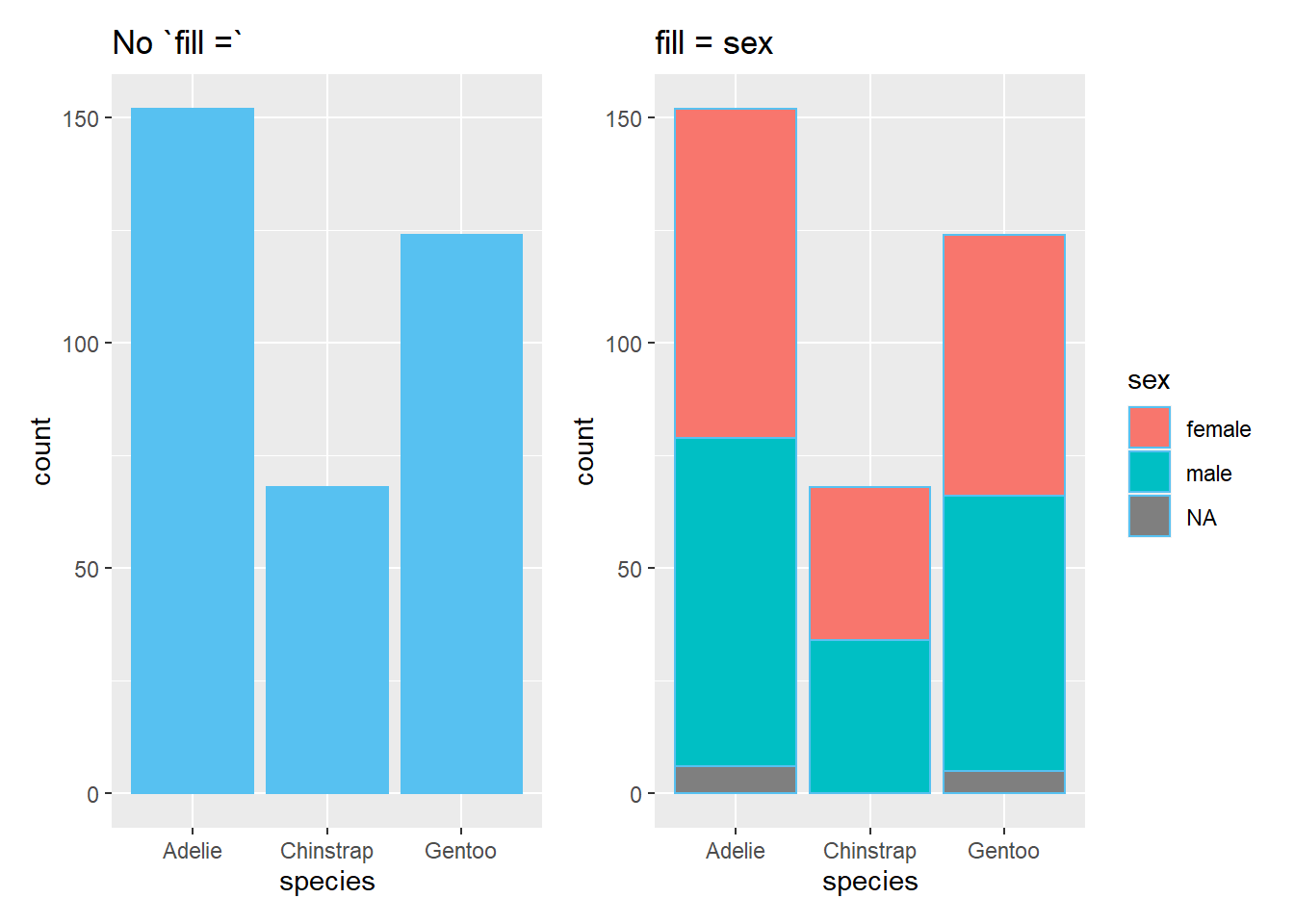
6.5 Geometries
Geometries are the different shapes one can make using ggplot. They all start with geom_ and can be stacked together by simply using +. The first geom is always first layer and any additional layers are stacked on top of it. (See [Lollipop Charts][Lollipop Charts] for an example.)
6.5.1 Bar Charts
You can make bar charts with either geom_bar() or geom_col().
6.5.1.1 geom_bar
geom_bar requires:
- an x-value and is useful if you are just getting **a count of the data*
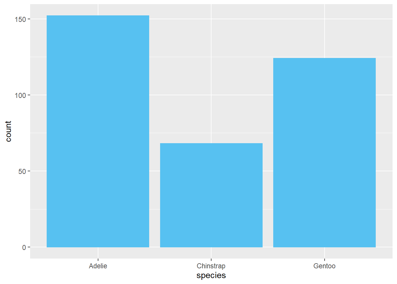
geom_bar may also have:
- a y-value and a
stat=value if you want to specify how the y-value data should be shownstat="identity"- gives a sum of all the values of ystat="summary"- gives a mean of the values of y
Compare:
(ggplot(penguins)+
  geom_bar(aes(x=species, y=bill_length_mm),
            stat = "identity")+
  labs(title='stat="identity" produces a sum'))+
(ggplot(penguins)+
  geom_bar(aes(x=species, y=bill_length_mm),
            stat = "summary")+
  labs(title='stat="summary" produces a mean'))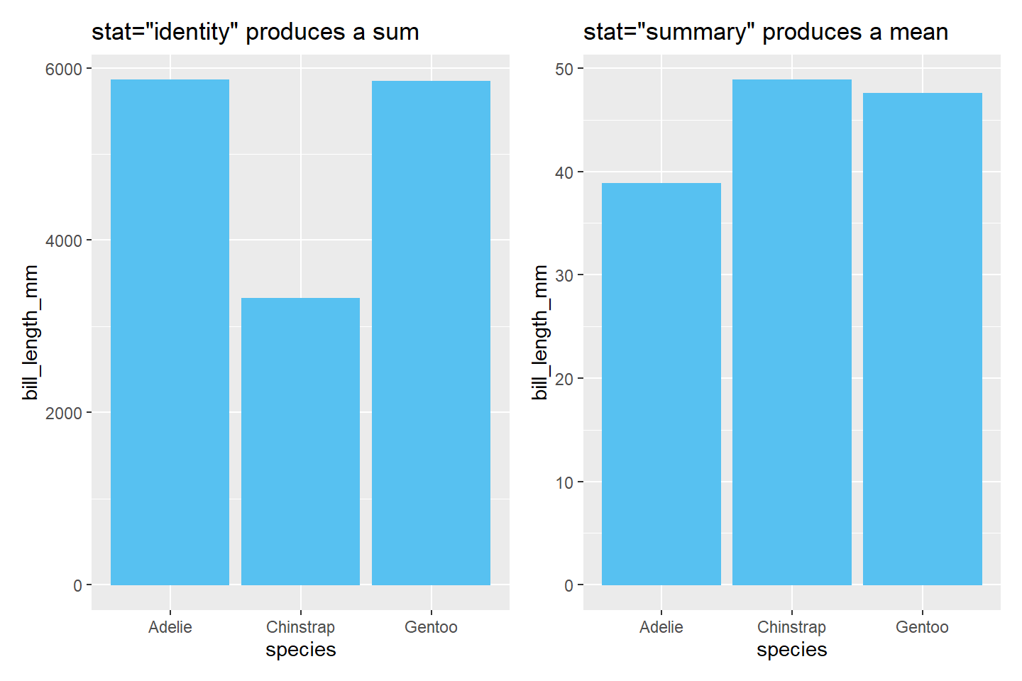
6.5.1.2 geom_col
geom_col requires x and y values. It does not use stat=.
penguins %>% # data
  group_by(species) %>% # manipulation
  summarize(avg = mean(bill_length_mm, na.rm=T)) %>% #manipulation
  ggplot()+
  geom_col(aes(x=species, y=avg))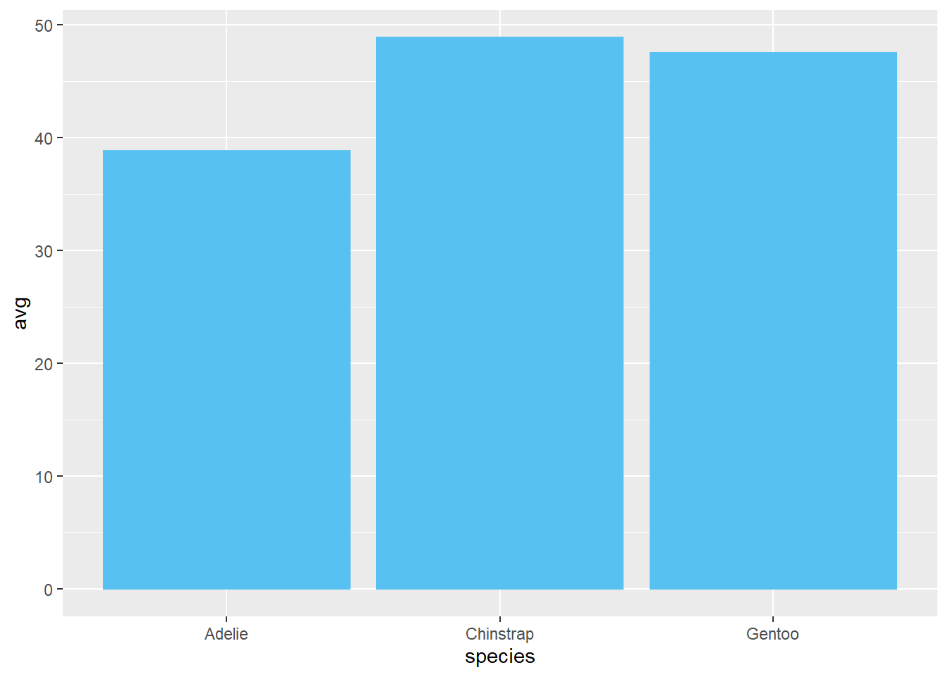
6.5.1.3 Horizontal Bar Chart
To make a horizontal bar chart, add coord_flip():
ggplot(penguins)+ # data
  geom_bar(aes(x=species, y=bill_length_mm), #bar chart
            stat = "summary")+
  coord_flip() # make it horizontal
## Warning: Removed 2 rows containing non-finite values
## (stat_summary).## No summary function supplied, defaulting to `mean_se()`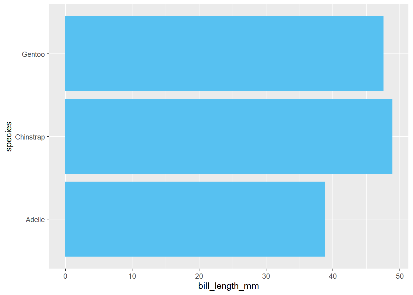
note: coord_flip() can be placed anywhere after ggplot()
6.5.1.4 Stacked Bar Chart
To make a stacked bar chart, include fill=
penguins %>% # data
  filter(!is.na(sex)) %>% # manipulation
ggplot()+ # ggplot
  geom_bar(aes(x=species, y=bill_length_mm,  # bar chart
               fill=sex), # separate by sex
            stat = "summary")
## No summary function supplied, defaulting to `mean_se()`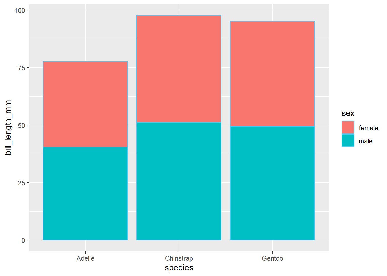
6.5.1.5 100% Stacked Bar Chart
To make a 100% stacked bar chart, include fill= and position="fill" after aes()
penguins %>% #data
  filter(!is.na(sex)) %>% #manipulation
ggplot()+
  geom_bar(aes(x=species, y=bill_length_mm, #bar chart
               fill=sex), # separate by sex
            stat = "summary",
           position="fill") # make it 100%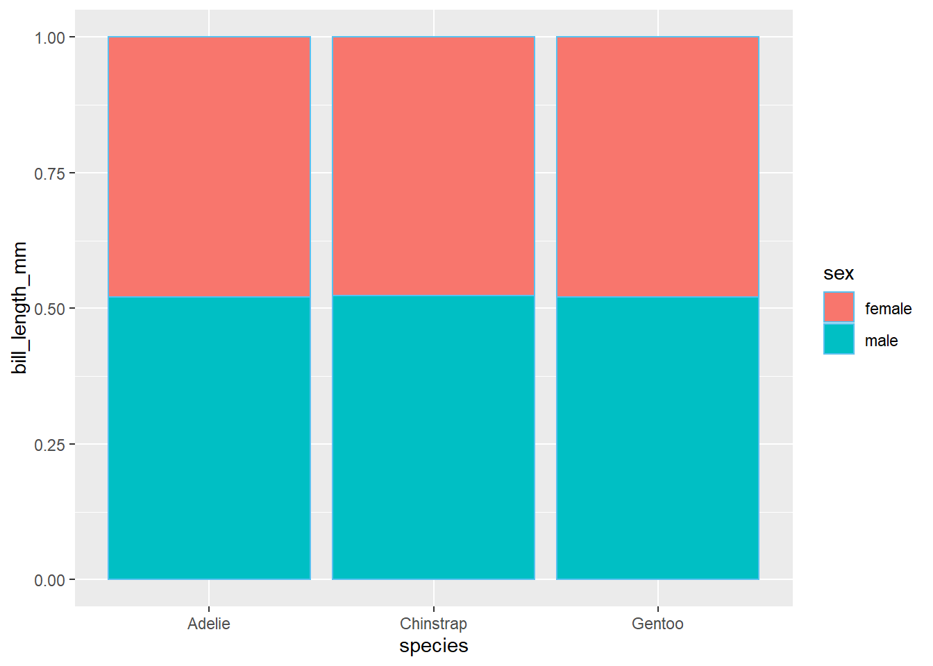
6.5.1.6 Side-by-Side Bar Chart
To make a side-by-side bar chart, include fill= and position="dodge" after aes()
penguins %>% # data
  filter(!is.na(sex)) %>% # manipulation
ggplot()+
  geom_bar(aes(x=species, y=bill_length_mm,
               fill=sex), # separate by category
            stat = "summary",
           position="dodge") # make it side-by-side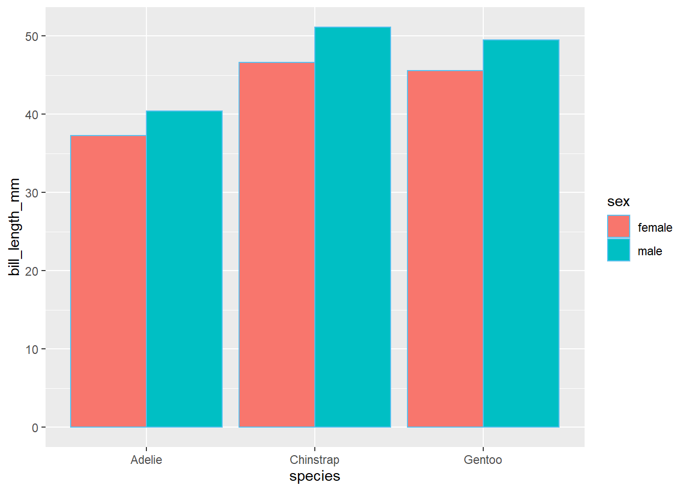
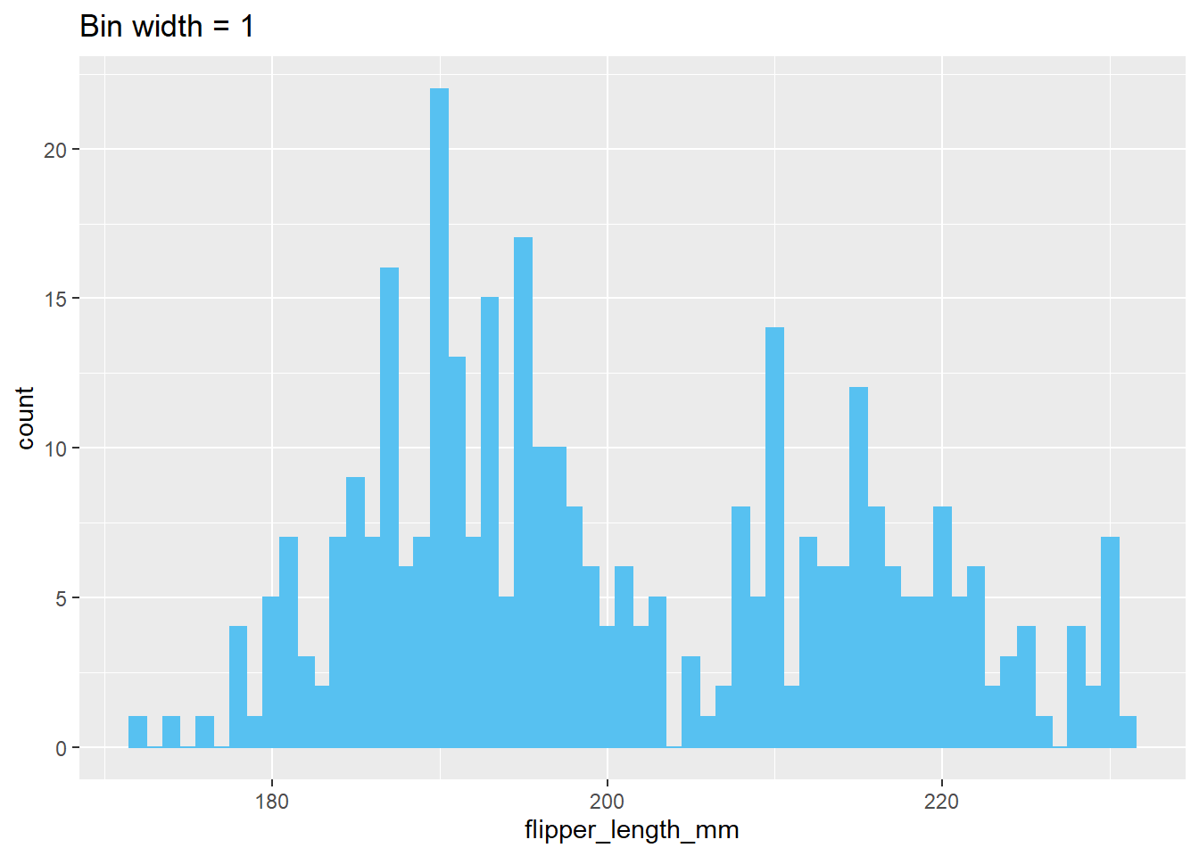
6.5.2 Histograms
Histograms can be made with geom_histogram. They only require an x-value. You can decide the bin width by adding binwidth= after aes()
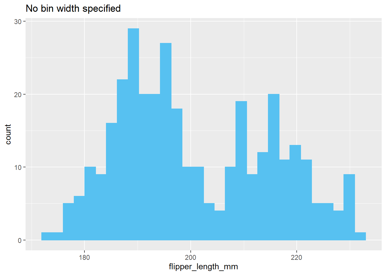
ggplot(penguins)+
  geom_histogram(aes(x=flipper_length_mm),
                 binwidth=10)+
  labs(title="Bin width = 10")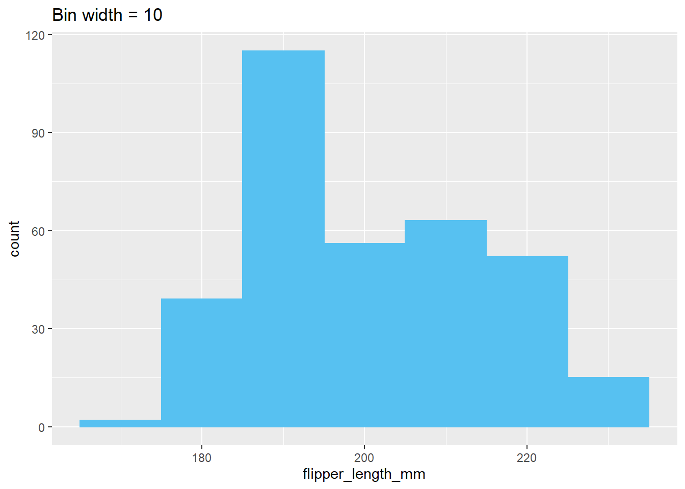
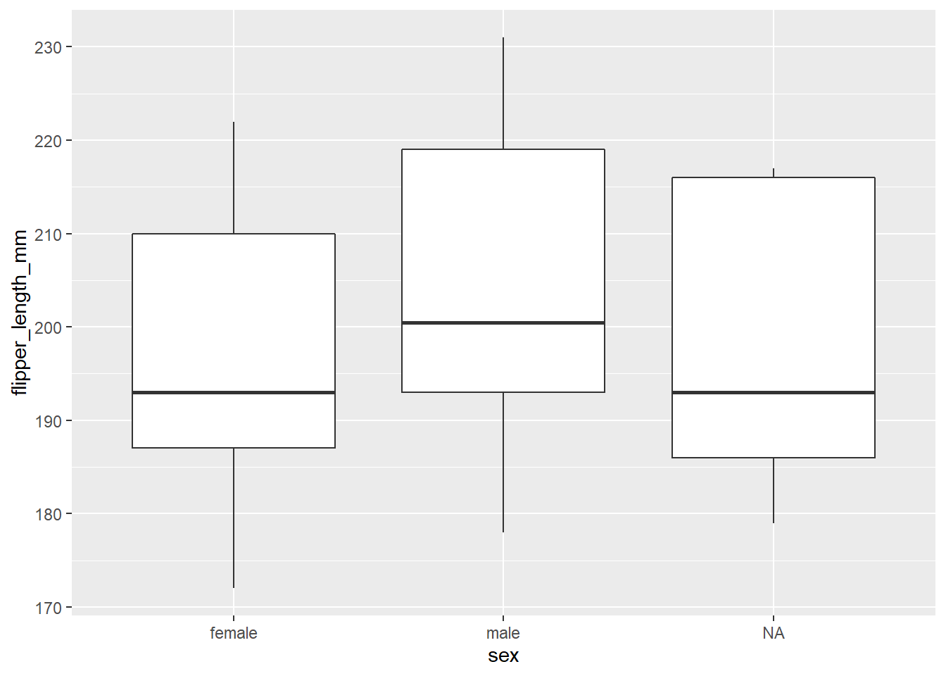
6.5.3 Boxplots
A boxplot uses geom_boxplot(). It requires x-values. Y-values are optional but useful if you want to compare multiple boxplots.
Note: Use coord_flip() to make it easier to read.
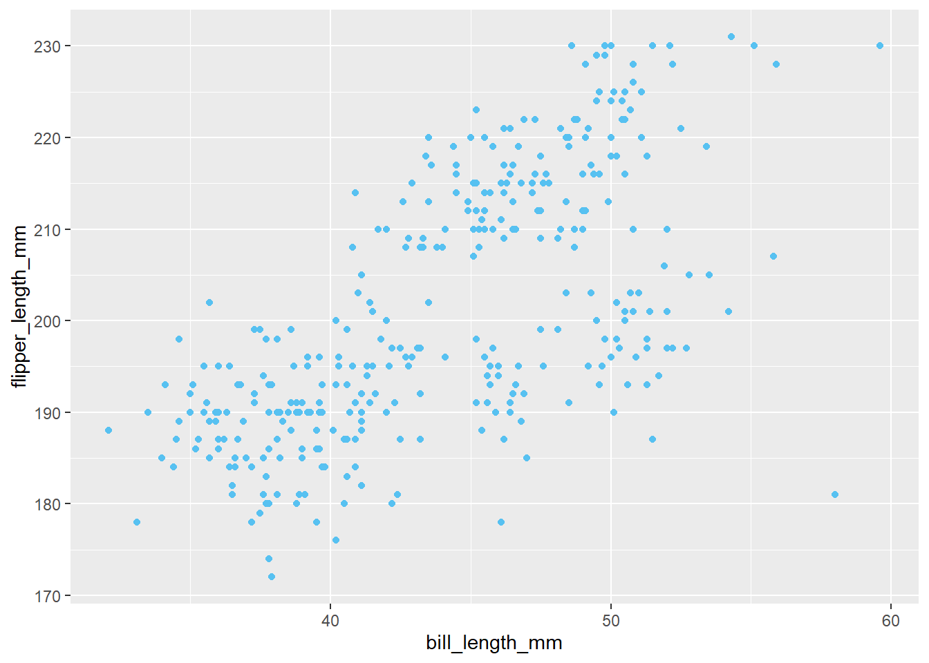
6.5.4 Scatterplots
We can use geom_point() for scatterplots. This requires x and y values, both continuous.
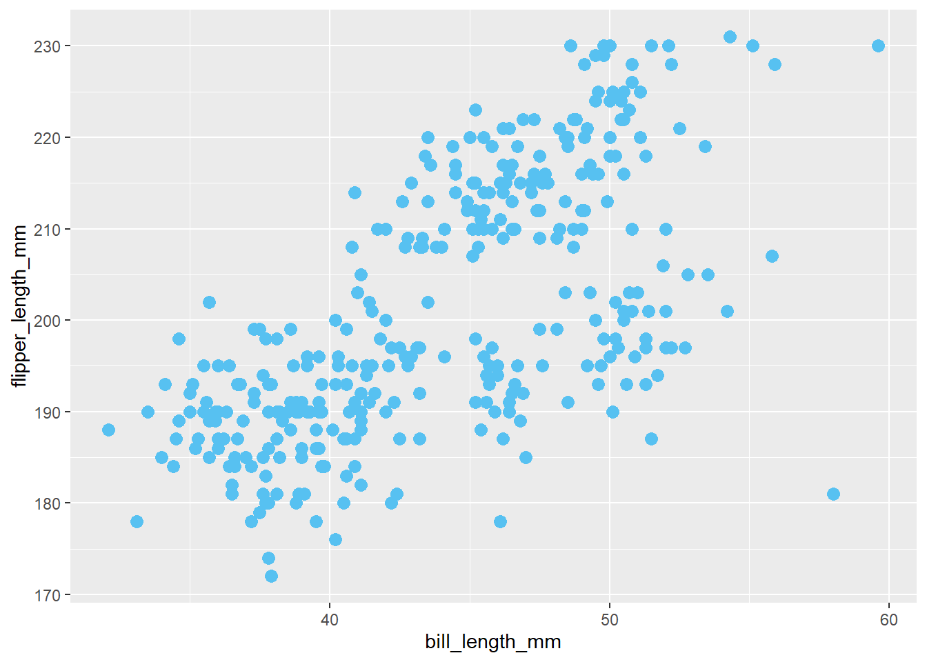
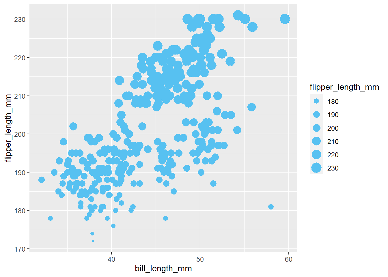
6.5.4.1 Point Size
Point size can be based on a single number or the data itself.
You can control overall point size by adding size= after aes():
You can make the values in the data also determine point size by using size= inside aes():
6.5.4.2 Point Color
You can differentiate the dots by adding color=
ggplot(penguins)+
  geom_point(aes(x=bill_length_mm, y=flipper_length_mm,
                 color=species))+
  labs(title="Color added")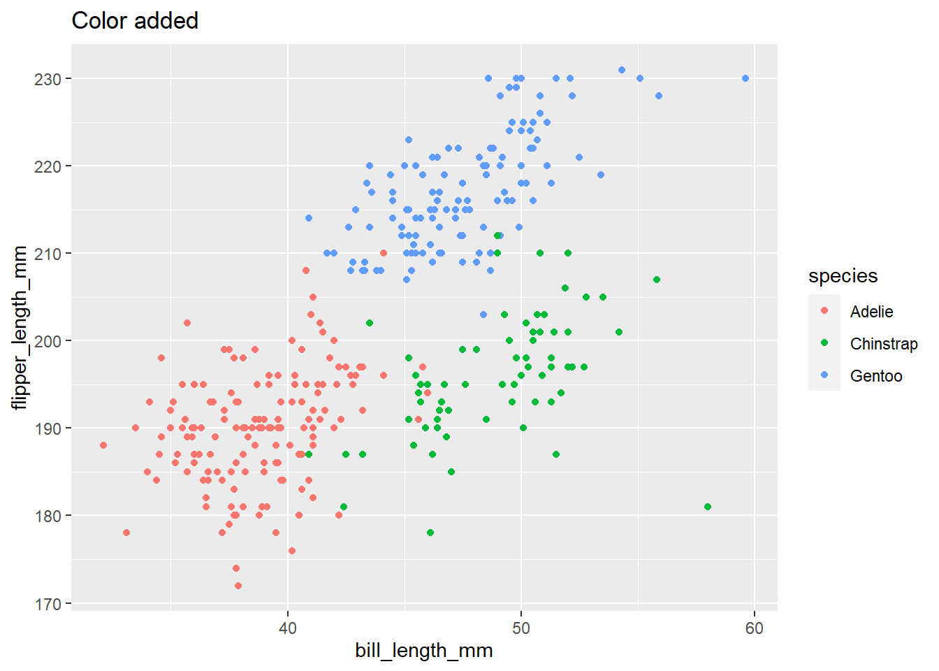
ggplot(penguins)+
  geom_point(aes(x=bill_length_mm, y=flipper_length_mm,
                 color=species,
                 size=flipper_length_mm), alpha=.6)+
  labs(title="Color and size based on data")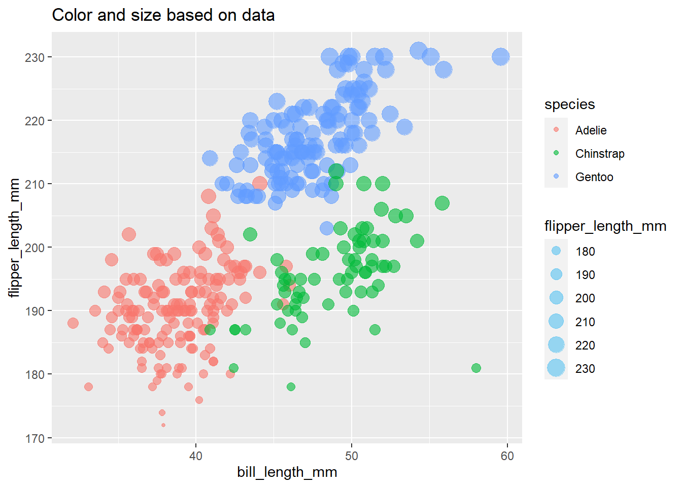
6.5.4.3 Shapes
Shapes are controlled like color and size. Inside aes() means that shapes are mapped to data. Outside aes() means there is one shape.
ggplot(penguins)+
  geom_point(aes(x=bill_length_mm,
                 y=flipper_length_mm,
                 shape=sex,
                 color=sex), size=5, alpha=.5)+
  labs(title="Shape and color controlled by data \nSize set outside aesthetics")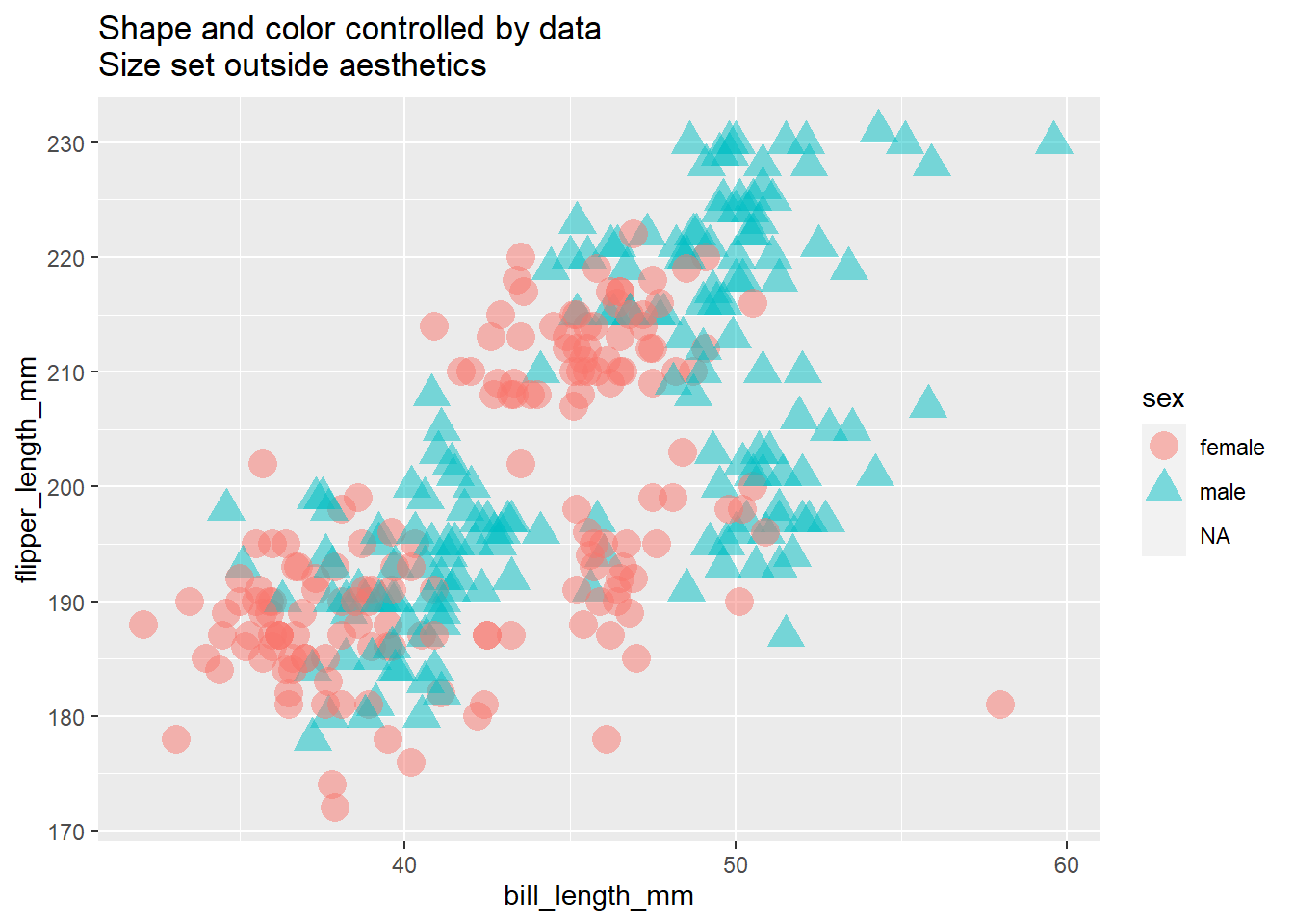
ggplot(penguins)+
  geom_point(aes(x=bill_length_mm, y=flipper_length_mm,
                 color=species),
             size=4, shape=3)+
  labs(title="Color controlled by data \nSize and shape set outside aesthetics")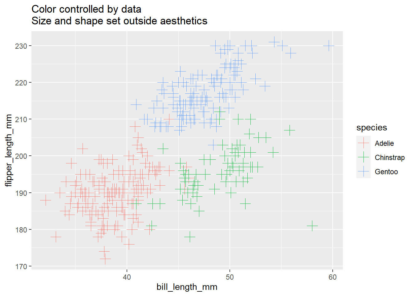
**A note on
alpha=
alphais called afteraes()to set the transparency of overlapping shapes. An alpha of0is complete transparency while an alpha of1is no transparency. An alpha of.5, set above, is 50% transparency.
6.5.4.4 Scatterplots for Categorical Variables
If you want to make a scatterplot for categorical variables, you will simply get a line of dots for each variable unless you use geom_jitter(), which adds random fluctuation in the variables.
Compare:
(ggplot(penguins)+
  geom_point(aes(x=bill_length_mm, y=species,
                 color=species))+
  labs(title="Using geom_point()")+
   theme(legend.position = "none"))+
  (ggplot(penguins)+
  geom_jitter(aes(x=bill_length_mm, y=species,
                 color=species))+
  labs(title="Using geom_jitter()")+
    theme(legend.position = "none"))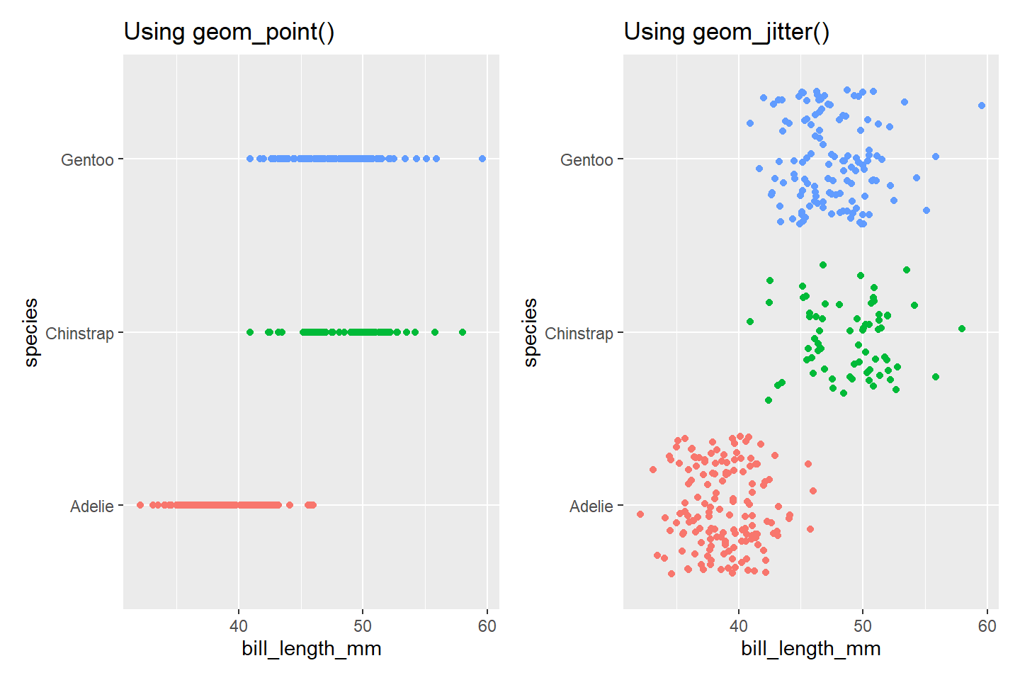
You can also use position_jitter(width = NULL, height = NULL, seed = NA) inside of geom_point() to achieve a similar effect.
6.5.5 Barbell Charts
Barbell charts compare plot two related variables with a dot and show the distance between them with a line.
You can combine geom_point() with geom_linerange() to make a simple lollipop chart. geom_linerange() should be called first, as it must go below the dots layer for its line ends to be hidden by the dot. First, we will summarize the penguin data and then compare.
The following code builds the graphic by combining different data layers and different geometry layers.
ggplot()+
  coord_flip()+
  geom_linerange(data=penguins %>%
                   group_by(species, sex) %>%
                   summarize(body_mass = mean(body_mass_g, na.rm=T)) %>%
                   drop_na(sex) %>%
                   pivot_wider(names_from = sex, values_from=body_mass),
    aes(x=species, ymin=male, ymax=female))+
  geom_point(data=penguins %>%
                  group_by(species, sex) %>%
                  summarize(body_mass = mean(body_mass_g, na.rm=T)) %>%
                  drop_na(sex),
             aes(x=species, y=body_mass, color=sex),
             size=5)
## `summarise()` regrouping output by 'species' (override with `.groups` argument)
## `summarise()` regrouping output by 'species' (override with `.groups` argument)
6.5.6 Line Charts
You can use geom_line() for line charts to display values over time.
geom_line() requires an additional group= aesthetic. If there should be only 1 line because there is only 1 time variable, then use group=1. If you want to split the lines based on another variable, use group=variable_name.
For the below example, we will use the AirPassengers data that comes with R and transform it into a dataframe following an example from StackOverflow
A line graph displaying a single line for year
data(AirPassengers)

airpassengers <- data.frame(AirPassengers, year = trunc(time(AirPassengers)),
month = month.abb[cycle(AirPassengers)])

airpassengers %>%
  group_by(year) %>%
  summarize(sum = sum(AirPassengers, na.rm=T)) %>%
  ggplot()+
  geom_line(aes(x=year, y=sum, group=1))
## `summarise()` ungrouping output (override with `.groups` argument)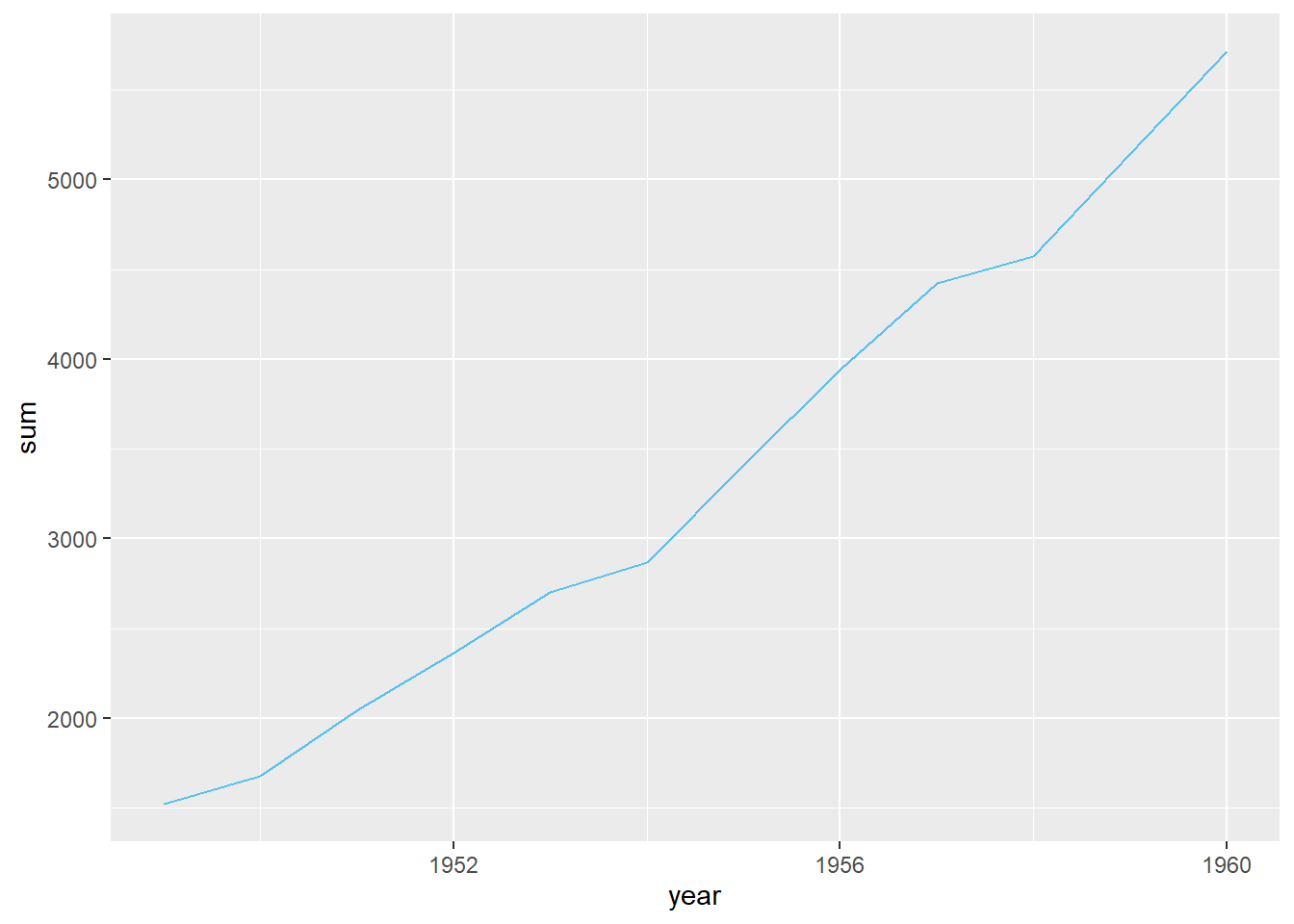
A line graph displaying 1 line per month
## Don't know how to automatically pick scale for object of type ts. Defaulting to continuous.
## Don't know how to automatically pick scale for object of type ts. Defaulting to continuous.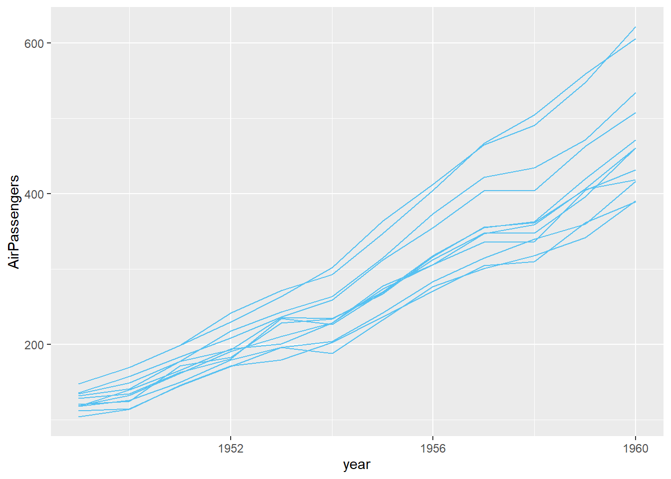 We can add labels to the ends of the line using
 geom_label() (see Labels) but the lines are very close together, so we will use ggrepel() instead. This gives the labels space and connects them with their lines.
library(ggrepel)
ggplot(airpassengers)+
geom_line(aes(x=year, y=AirPassengers, group=month))+
geom_label_repel(data=airpassengers %>% #use only the last year in the data set
filter(year == max(year)),
aes(x=year, y=AirPassengers, label=month))## Don't know how to automatically pick scale for object of type ts. Defaulting to continuous.
## Don't know how to automatically pick scale for object of type ts. Defaulting to continuous.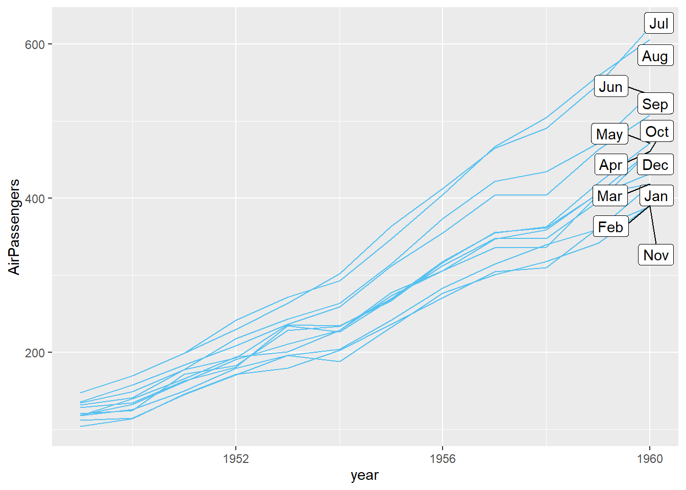
6.5.7 Colors
For colors related to values in a data set, see Aesthetics
You can change the color of all the chart elements of a geometry using fill= outside of aes(). Here, color is not mapped to the data, thus it is inside geom_col but not in aes(). You can use R color names (e.g. “blue”, “black”, “grey80”), hex values (e.g. “#cccccc” or “#a85001”, or RGB values (e.g. rgb(0, 155, 255)).
penguins %>%
  group_by(species) %>%
  summarize(avg = mean(bill_length_mm, na.rm=T)) %>%
  ggplot()+
  geom_col(aes(x=species, y=avg),
           fill="blue")
## `summarise()` ungrouping output (override with `.groups` argument)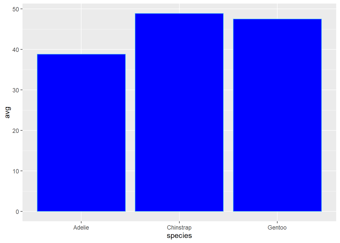
See here for a list of R color names.
You can also use other color palettes by installing viridis or hrbrmst themes
6.5.8 Labels
You can add labels with geom_label or geom_text. geom_text is just text and geom_label is text inside a rounded white box (this, of course, can be changed). Compare:
ggplot(rsurvey)+
  geom_bar(aes(x= qr_experience, fill=qr_experience))+
  geom_text(aes(x= qr_experience,
                label=..count..),
            stat='count', color="black")+
  labs(title="Using geom_text")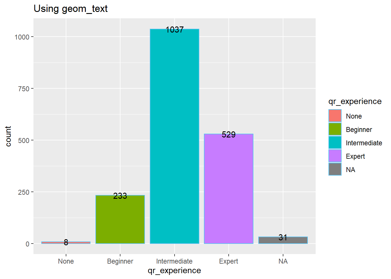
ggplot(rsurvey)+
  geom_bar(aes(x= qr_experience, fill=qr_experience))+
  geom_label(aes(x= qr_experience,
                label=..count..),
            stat='count')+
  labs(title="Using geom_label")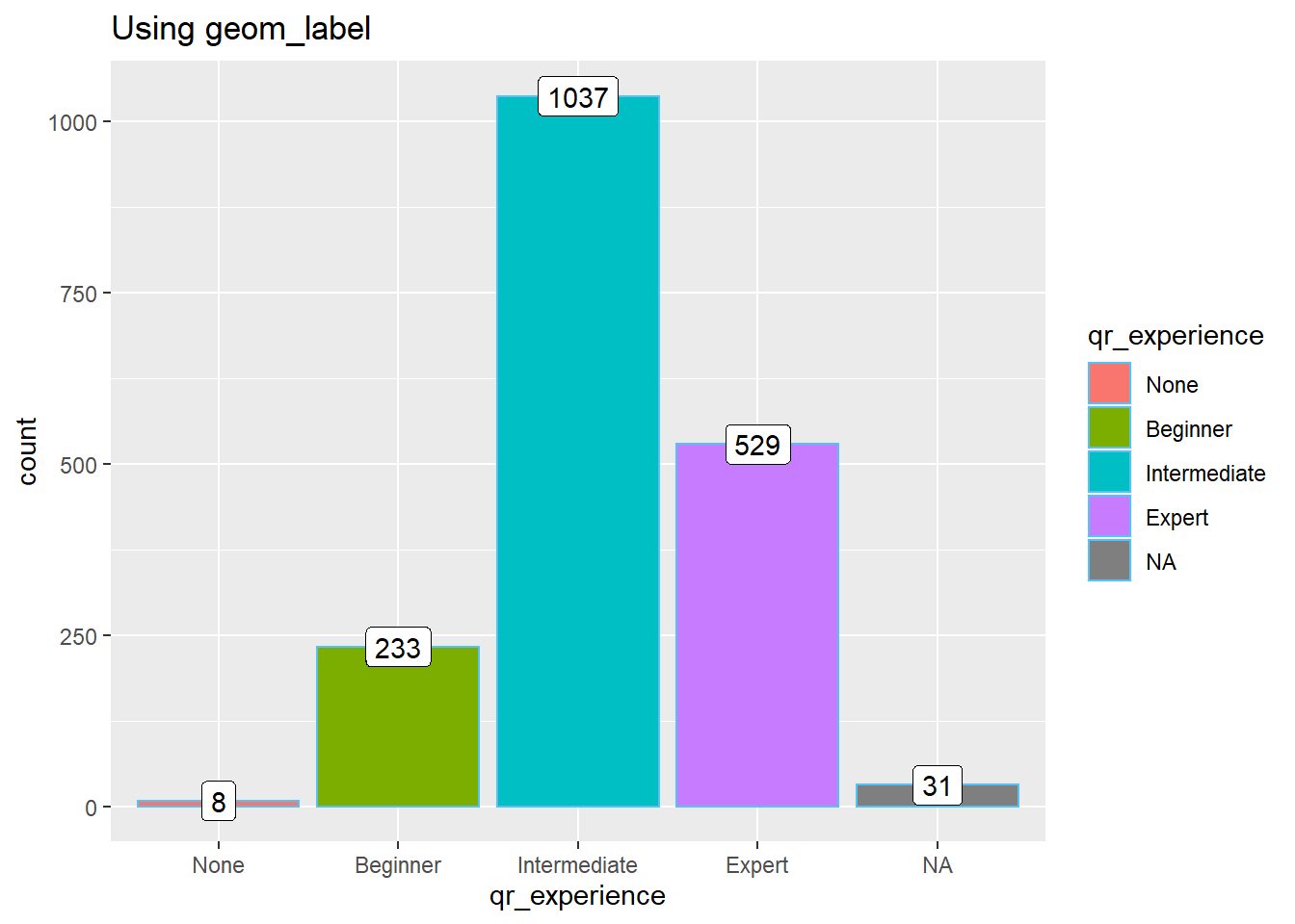
Note: Because there is no y value, these graphics use y=..count.. to get the total number and stat="count" to say you will use the sum in the aesthetic.
6.5.9 Multiple Plots
6.5.9.1 Faceting
You can break a graphic into multiple plots (or facets) using facet_wrap(~variable). Here is an example:
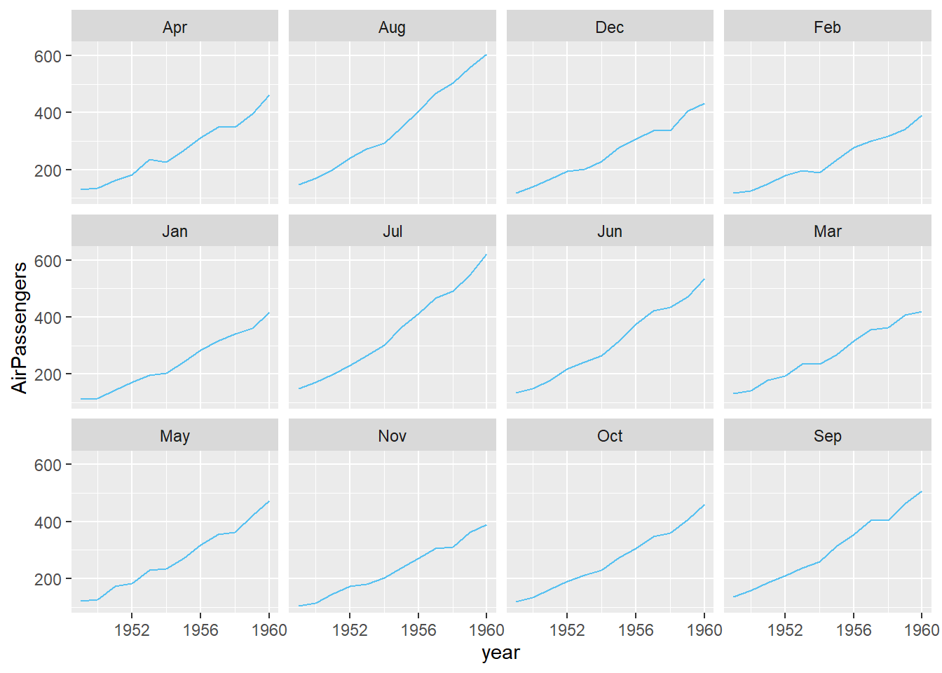
Note: The months are not in order. To put them in order, you would first need to use factor() inside a mutate() command.
You can control the number of rows/columns use nrow= or ncol=:
airpassengers %>%
  mutate(month = factor(month, levels=c(
    "Jan", "Feb", "Mar", "Apr", "May", "Jun", "Jul", "Aug", "Oct",
    "Nov", "Dec"
  ))) %>%
ggplot()+
  geom_line(aes(x=year, y=AirPassengers, group=month))+
  facet_wrap(~month, ncol=3)+
  labs(title="Months ordered and placed in 3 columns")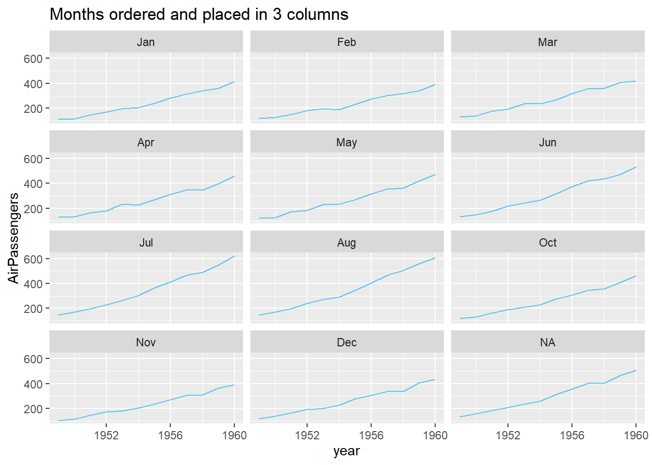
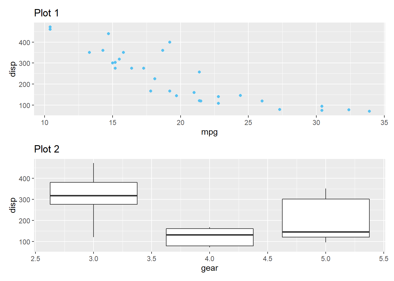
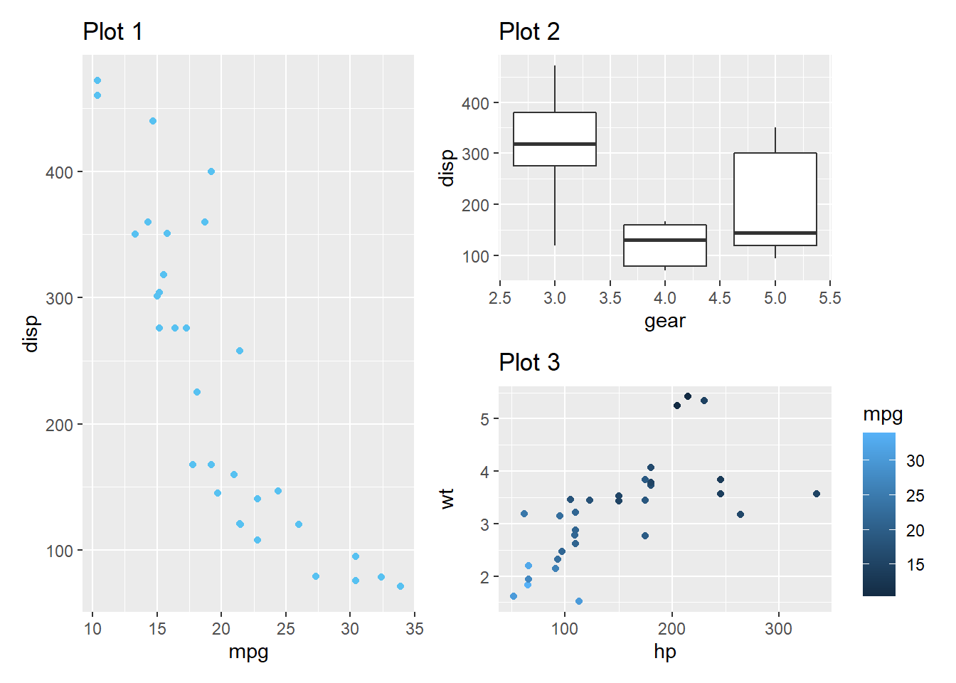
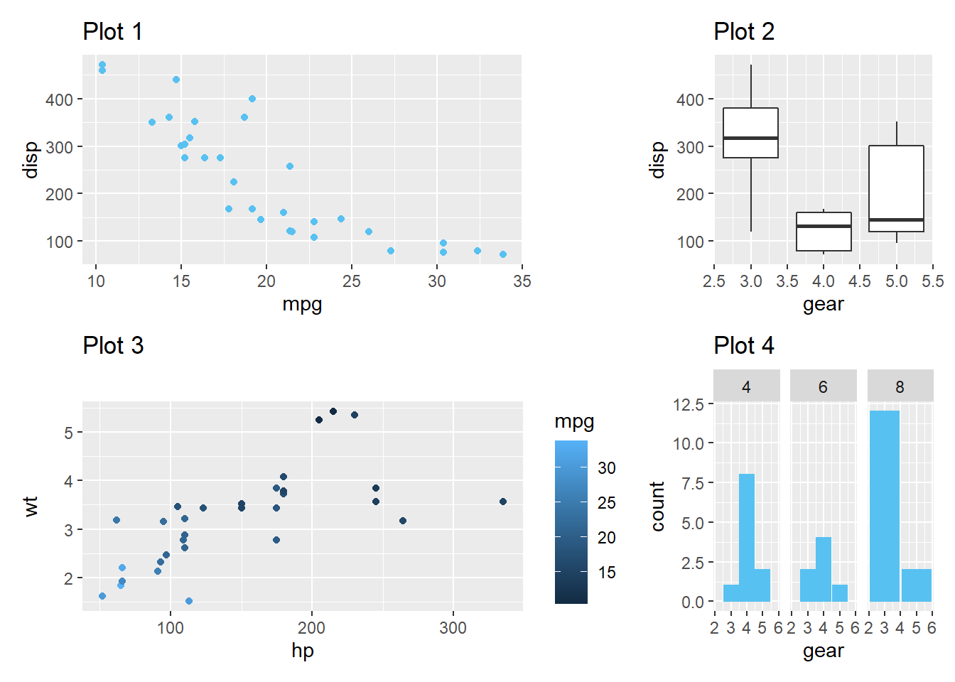
6.5.9.2 patchwork
You can also use the patchwork package to connect different plots using +, /, and |.
First, save your plots as data objects:
library(patchwork)

#example plots
p1 <- ggplot(mtcars) +
  geom_point(aes(mpg, disp)) +
  ggtitle('Plot 1')

p2 <- ggplot(mtcars) +
  geom_boxplot(aes(gear, disp, group = gear)) +
  ggtitle('Plot 2')

p3 <- ggplot(mtcars) +
  geom_point(aes(hp, wt, colour = mpg)) +
  ggtitle('Plot 3')

p4 <- ggplot(mtcars) +
  geom_bar(aes(gear)) +
  facet_wrap(~cyl) +
  ggtitle('Plot 4')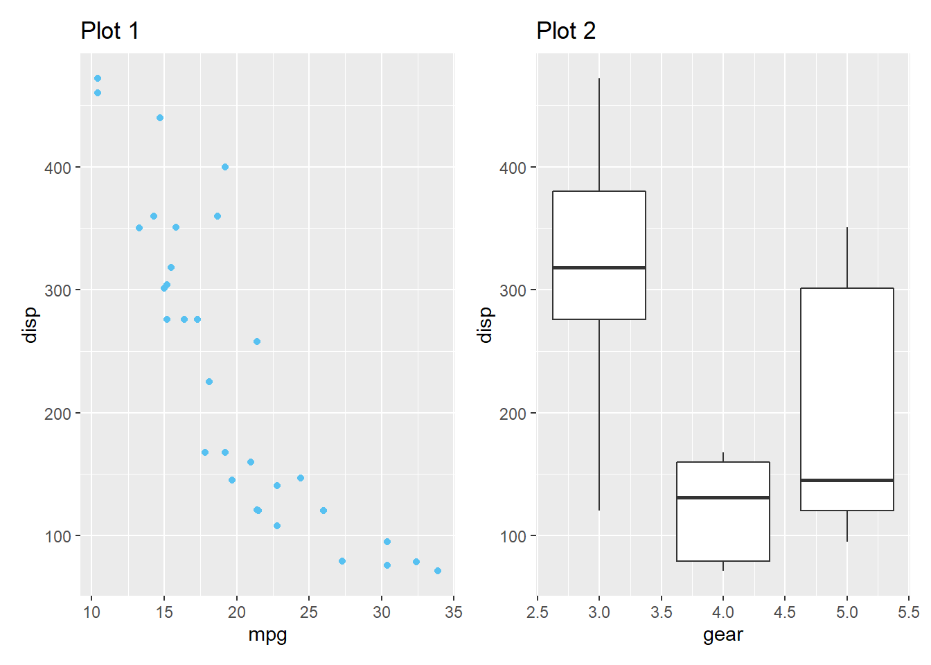
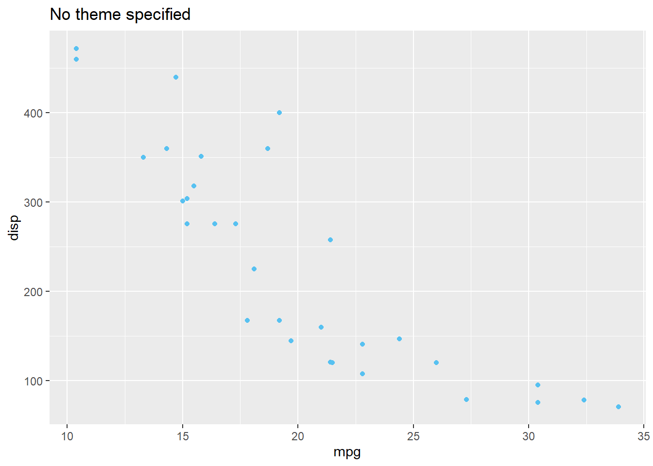
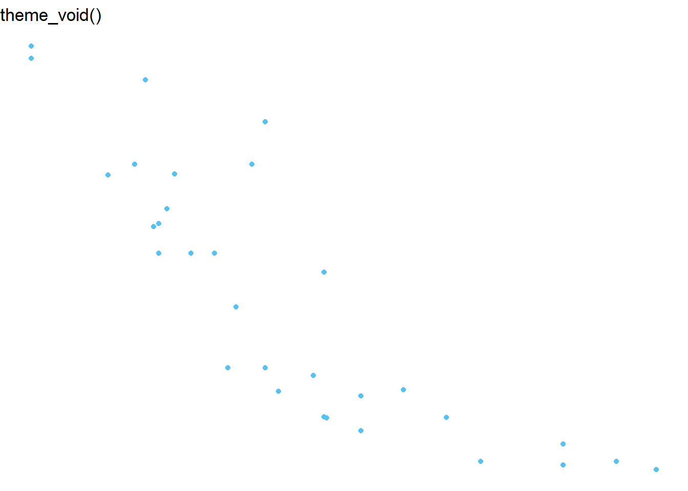
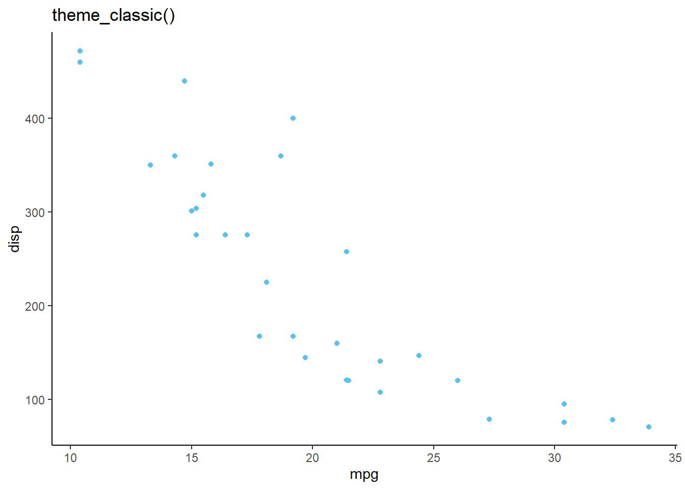
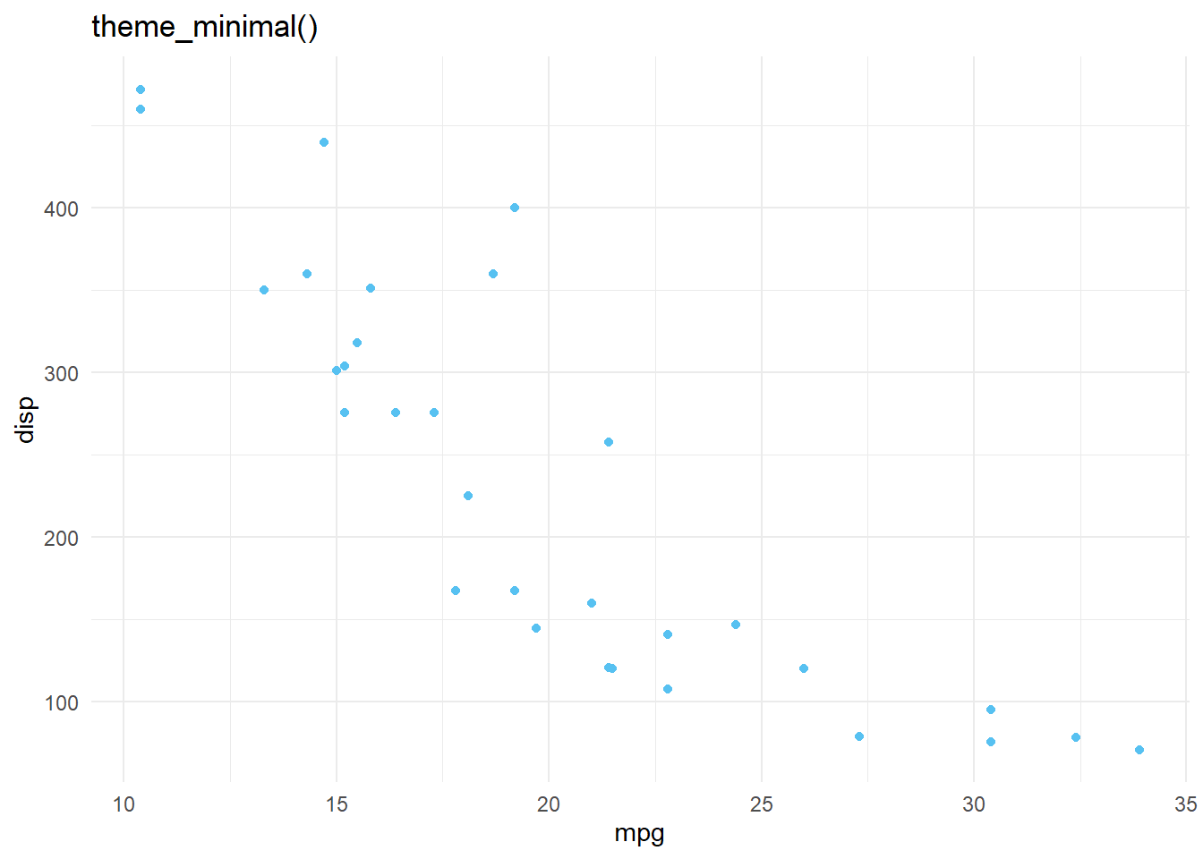
6.5.10 Themes
Themes control the overall look and feel of ggplot. If there is a specific theme, it is called using theme_name(). If you are modifying theme elements, you will use theme()
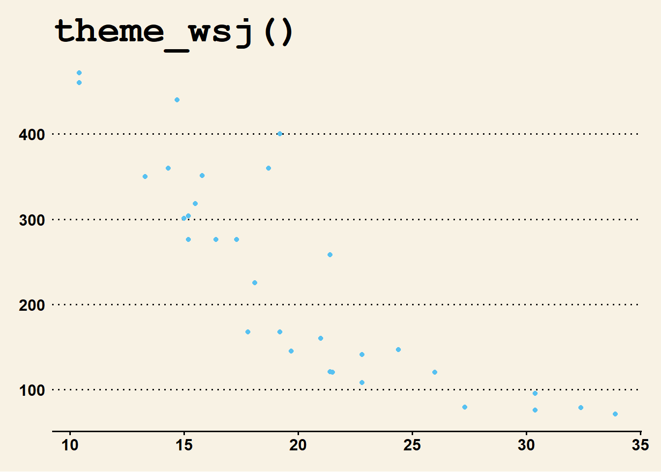
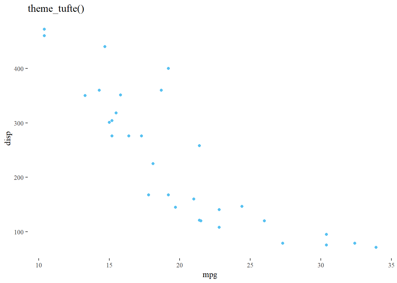
6.5.10.1 Pre-Installed Themes
Here are some examples:
6.5.10.2 ggthemes and other theme packages
ggthemes and hrbrthemes are two popular theme packages. Here are some examples:
6.5.10.2.1 ggthemes
See all themes and more at https://yutannihilation.github.io/allYourFigureAreBelongToUs/ggthemes/
6.5.10.2.2 hrbrthemes
library(hrbrthemes)

ggplot(mtcars) +
  geom_point(aes(mpg, disp)) +
  theme_modern_rc()+
  ggtitle('theme_modern_rc()')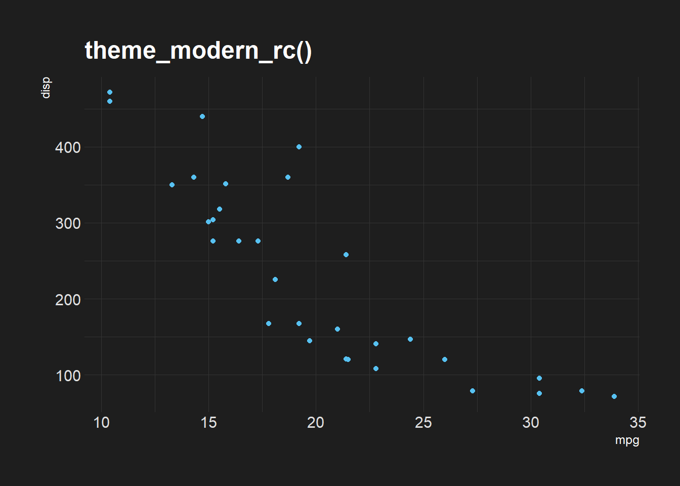
See more themes are color scales here: https://github.com/hrbrmstr/hrbrthemes
6.5.10.3 Controlling theme elements
If you simply want to remove lines, change the legend position, etc, you can use theme(). Here are two quick examples.
ggplot(mtcars) +
  geom_point(aes(mpg, disp, color=as.factor(gear)))+
  labs(title="No theming",
       color="Gears")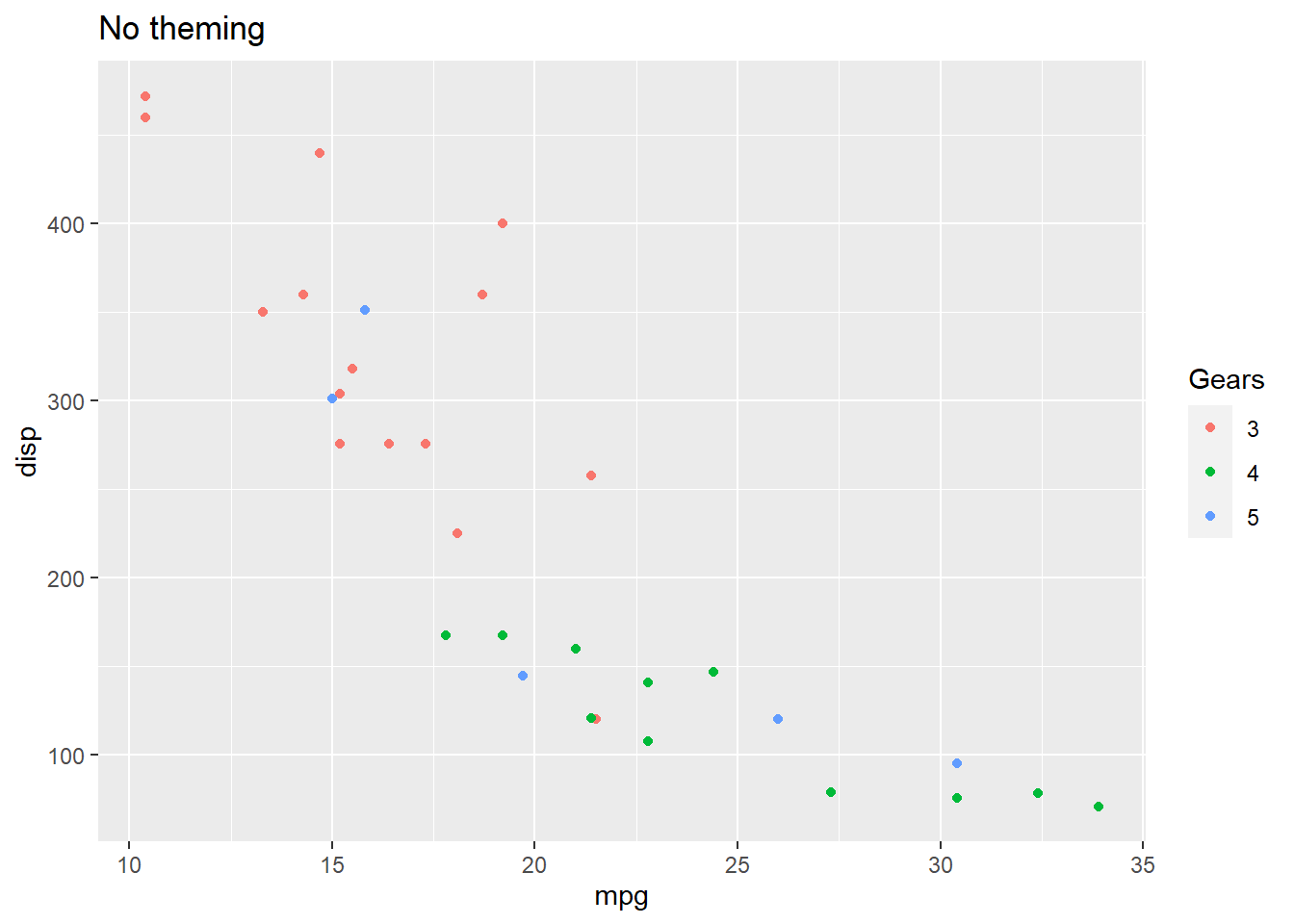
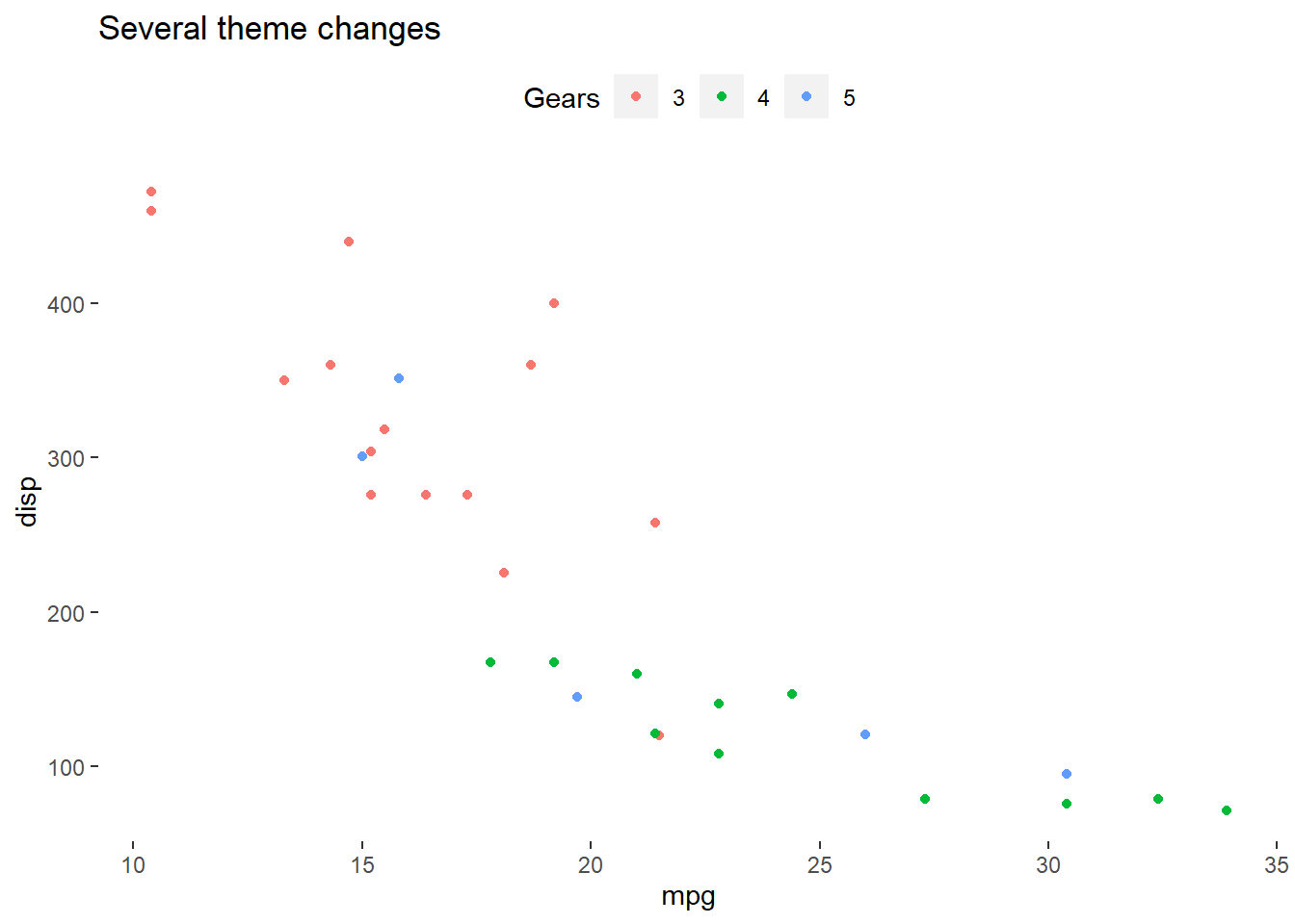
ggplot(mtcars) +
  geom_point(aes(mpg, disp, color=as.factor(gear)))+
  labs(title="Several theme changes",
       color="Gears")+
  theme(
    panel.background = element_blank(),
    legend.position = "top"
        )
There are a lot of ways you can customize a theme. See https://ggplot2.tidyverse.org/reference/theme.html.