5 Data Visualization in Base R
As was indicated by the title of this section, none of the functions in this section of the document require any external packages in order to be run.
We will begin this section by creating the data set that we will be working with. This data set will consist of a sample of 100 undergraduate students’ math and reading test scores. The test scores are on a scale of 0 to 100. Each individual has also been assigned to either the Paper Test format or the Electronic Test format in the TestFormat condition and either the Classroom setting or Home setting in the TestLocation condition. Using this data we will explore scatter plots, bar graphs, histograms, and box plots. The following lines of code create the data set and set up the data frames we will need:
set.seed(100)
MathGrade<-rnorm(n = 100, mean = 70, sd = 10)
set.seed(1000)
ReadingGrade<-rnorm(n = 100, mean = 65, sd = 13)
TestLocation<-c(rep("Classroom",50),rep("Home",50))
TestFormat<-c(rep("Paper",25),rep("Electronic",25),rep("Paper",25),rep("Electronic",25))
Data<-data.frame(MathGrade, ReadingGrade, TestLocation, TestFormat)

#Marginal Data Conditions
PaperTest<-Data[which(Data$TestFormat=="Paper"),]
ElectronicTest<-Data[which(Data$TestFormat=="Electronic"),]
Classroom<-Data[which(Data$TestLocation=="Classroom"),]
Home<-Data[which(Data$TestLocation=="Home"),]

#Cell Conditions
PaperTestHome<-Data[which(Data$TestFormat=="Paper" & Data$TestLocation=="Home"),]
PaperTestClassroom<-Data[which(Data$TestFormat=="Paper" & Data$TestLocation=="Classroom"),]
ElectronicTestHome<-Data[which(Data$TestFormat=="Electronic" & Data$TestLocation=="Home"),]
ElectronicTestClassroom<-Data[which(Data$TestFormat=="Electronic" & Data$TestLocation=="Classroom"),]
5.1 Scatter Plot
The first data visualization we will be working with is the scatter plot.
The following line of code creates a basic scatter plot using the plot() function.
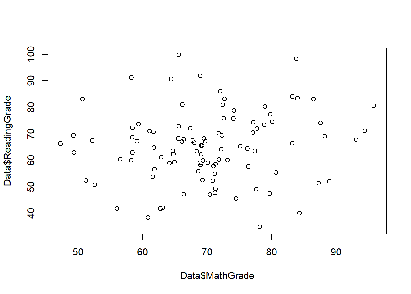
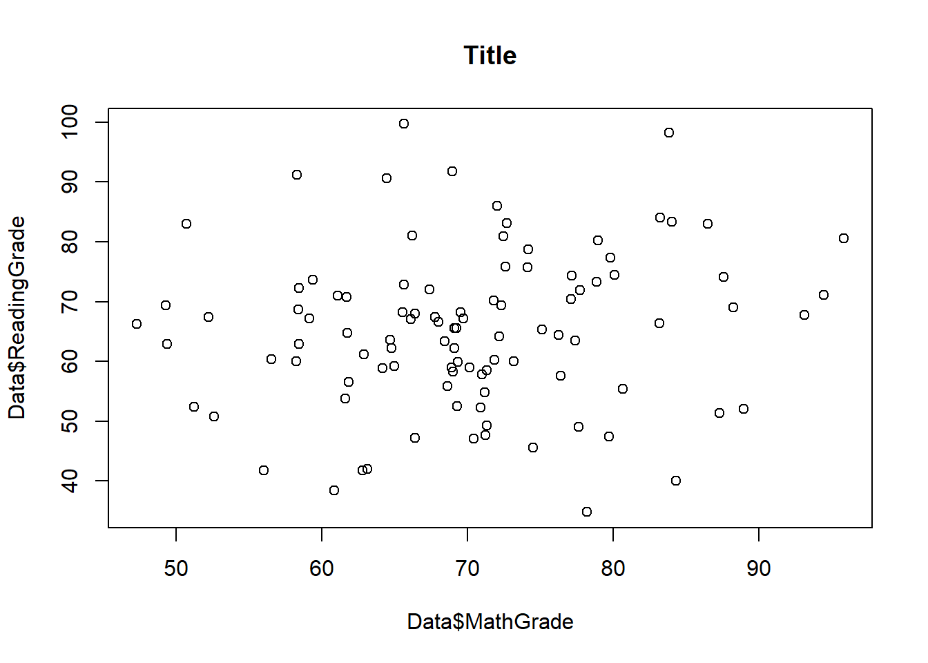
This is a very basic plot, and it is lacking a lot of the important details that most visualizations include. To make this a little nicer, lets begin with adding a title.
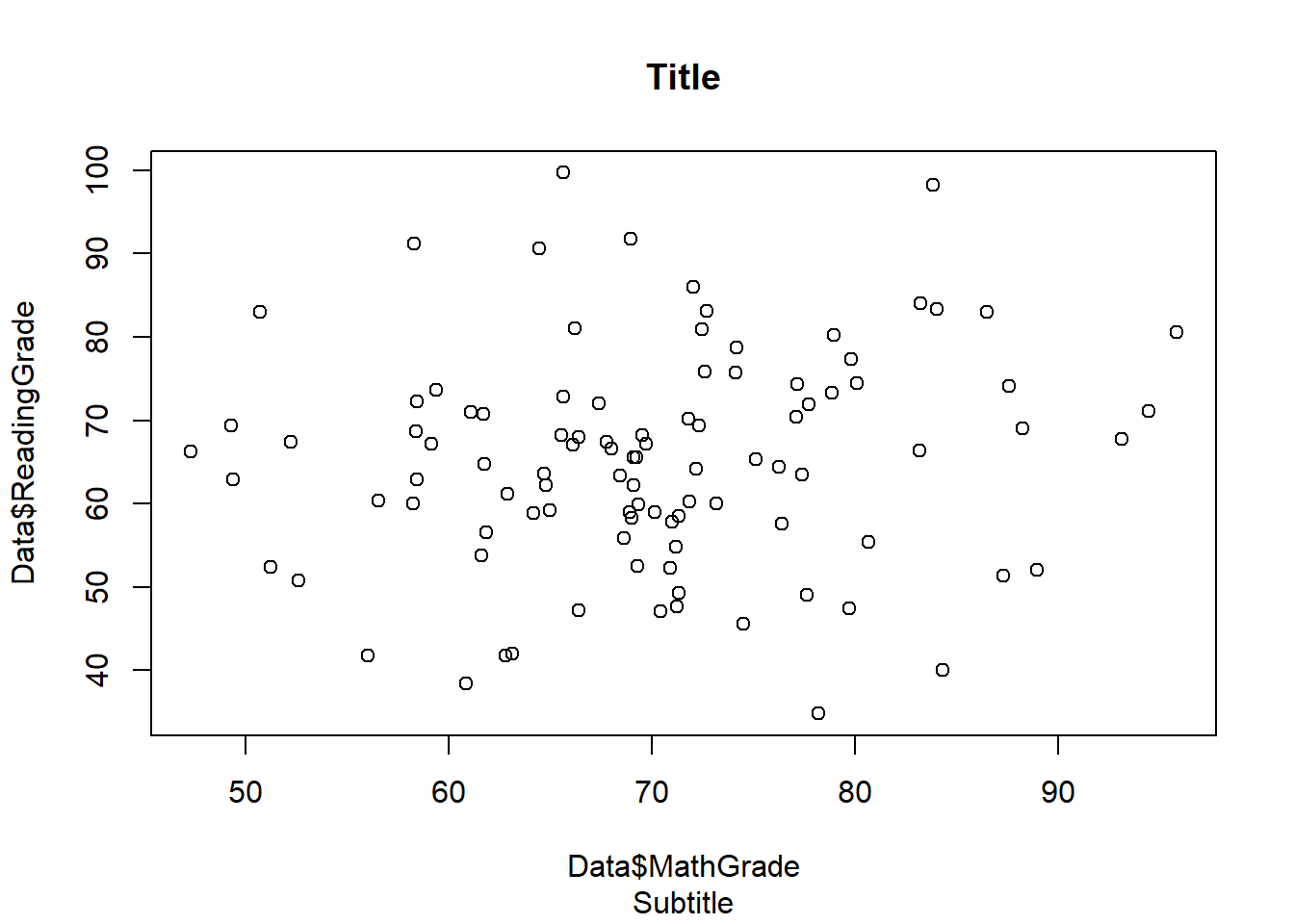
We can also add a subtitle to the graph as well.
Another adjustment we may want to make to the graph is changing the axis labels.
plot(Data$MathGrade,Data$ReadingGrade,main = "Title",sub = "Subtitle",
xlab = "x-axis", ylab = "y-axis")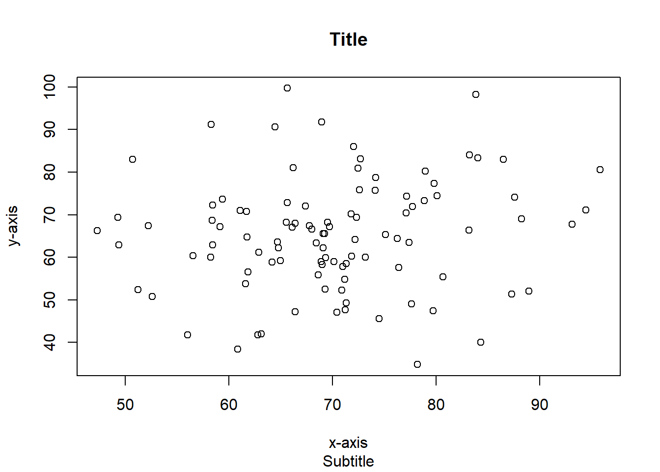
These can also be left blank by just putting xlab="" and lab="".
It may also be a good idea to change the axis ranges as well.
plot(Data$MathGrade,Data$ReadingGrade,main = "Title",sub = "Subtitle",
xlab = "x-axis", ylab = "y-axis",xlim = c(0,100),ylim = c(0,100))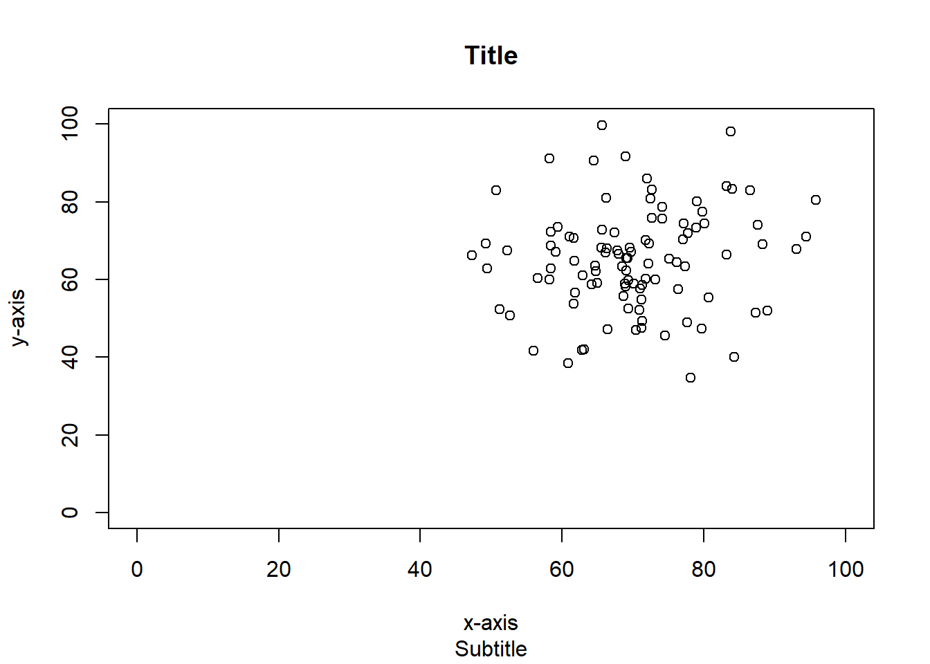
Depending on how you intend on using the graph, you may also decide to remove the border around it.
plot(Data$MathGrade,Data$ReadingGrade,main = "Title",sub = "Subtitle",
xlab = "x-axis", ylab = "y-axis",xlim = c(0,100),ylim = c(0,100),
frame.plot = F)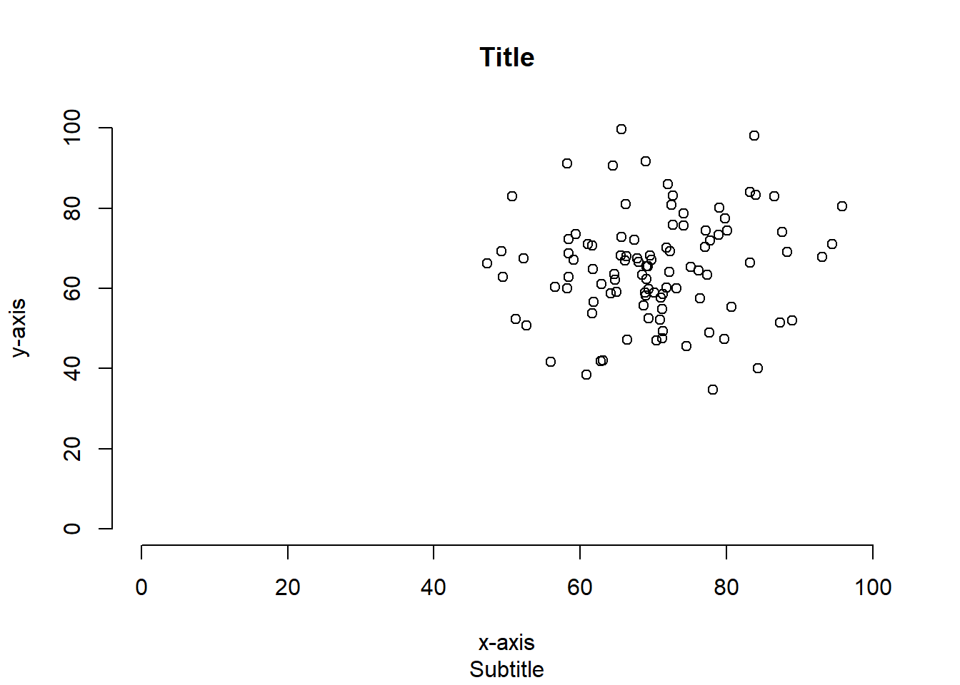
And maybe the axis scales as well.
plot(Data$MathGrade,Data$ReadingGrade,main = "Title",sub = "Subtitle",
xlab = "x-axis", ylab = "y-axis",xlim = c(0,100),ylim = c(0,100),
axes = F)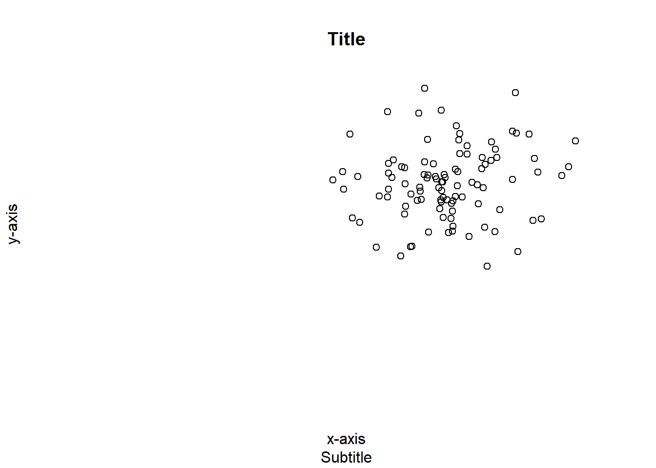
Now, using everything we have gone over so far in context.
plot(Data$MathGrade,Data$ReadingGrade,main = "Math Grade VS Reading Grade",
sub = "All conditions",xlab = "Math Grade", ylab = "Reading Grade",
xlim = c(0,100),ylim = c(0,100))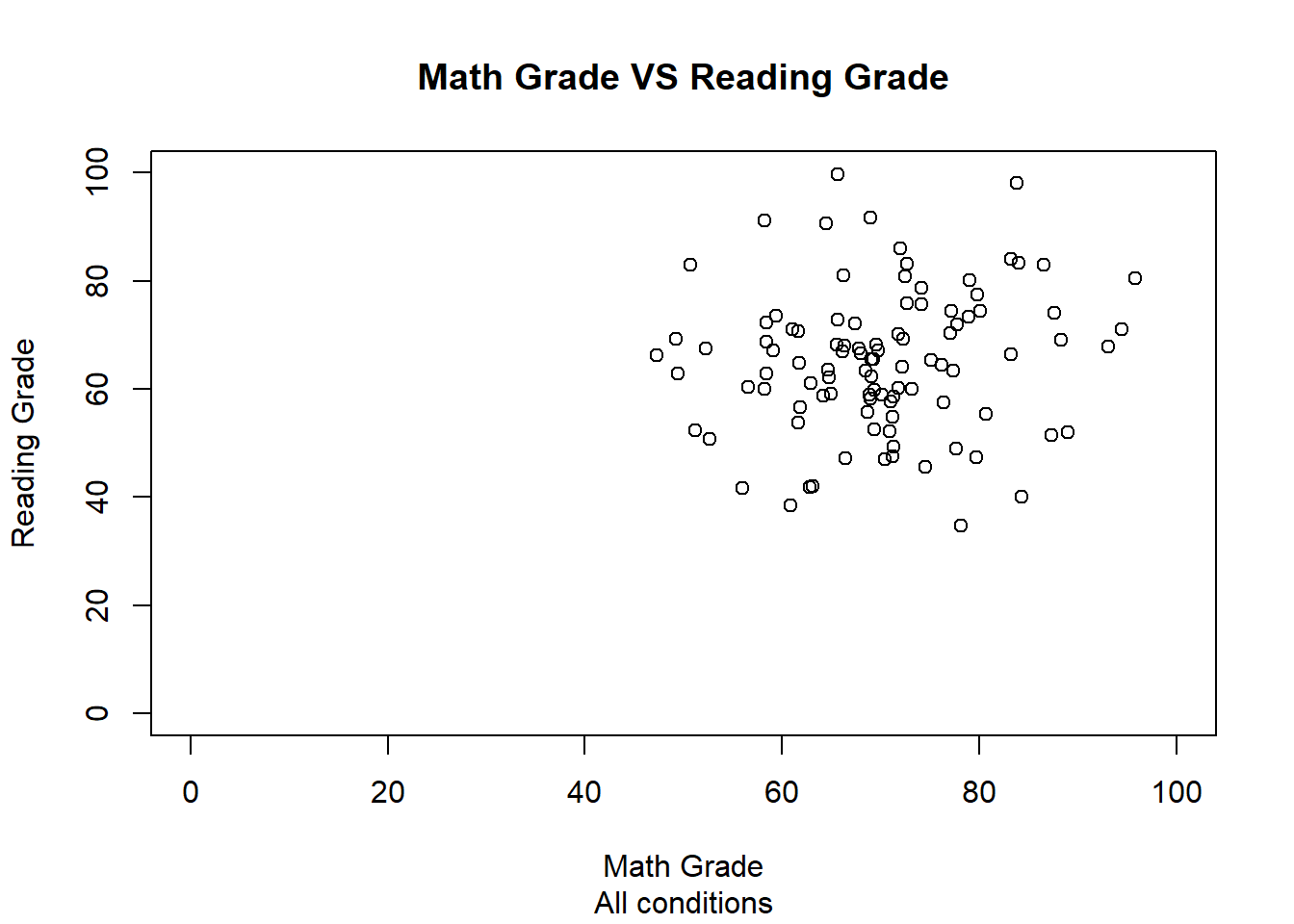
We can also plot our data based on the different groups we created earlier. The following four plots show the math vs reading scartter plots for each of our four marginal groups: Paper Test, Electronc Test, Classroom location, and Home location.
plot(PaperTest$MathGrade,PaperTest$ReadingGrade,main = "Math Grade VS Reading Grade",
sub = "Paper Test",xlab = "Math Grade", ylab = "Reading Grade",
xlim = c(0,100),ylim = c(0,100))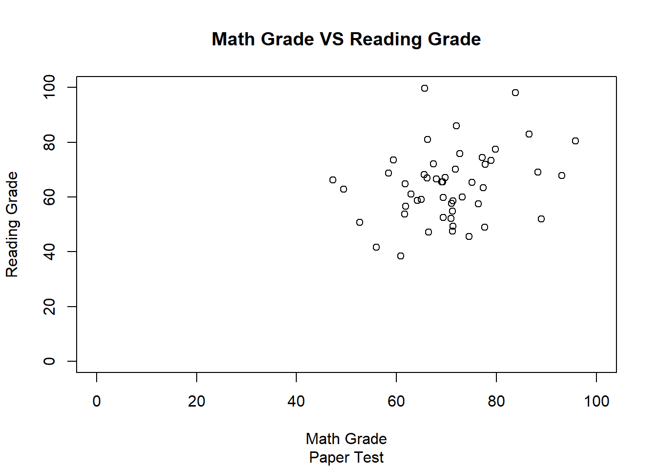
plot(ElectronicTest$MathGrade,ElectronicTest$ReadingGrade,
main = "Math Grade VS Reading Grade",sub = "Electronic Test",xlab = "Math Grade",
ylab = "Reading Grade",xlim = c(0,100),ylim = c(0,100))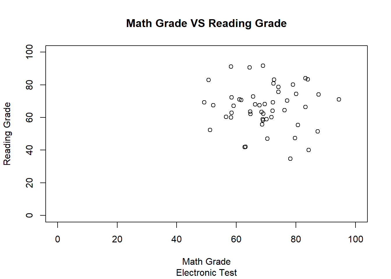
plot(Classroom$MathGrade,Classroom$ReadingGrade,main = "Math Grade VS Reading Grade",
sub = "Classroom",xlab = "Math Grade", ylab = "Reading Grade",
xlim = c(0,100),ylim = c(0,100))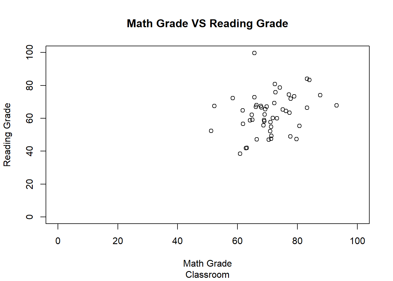
plot(Home$MathGrade,Home$ReadingGrade,main = "Math Grade VS Reading Grade",sub = "Home",
xlab = "Math Grade", ylab = "Reading Grade",xlim = c(0,100),ylim = c(0,100))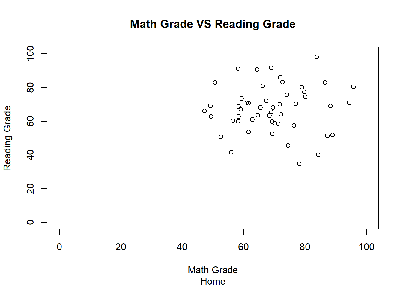
We can plot the opposing graphs (Paper and Electronc; Classroom and Home) side by side by setting the number of plots on the screen using the following code:
The first number sets the number of rows of graphs to be displayed and the second sets the number of columns.
Once you have set the number of graphs you want to appear at a time, you can create the graphs.
par(mfrow=c(1,2))
plot(PaperTest$MathGrade,PaperTest$ReadingGrade,main = "Math Grade VS Reading Grade",
sub = "Paper Test",xlab = "Math Grade", ylab = "Reading Grade",
xlim = c(0,100),ylim = c(0,100))
plot(ElectronicTest$MathGrade,ElectronicTest$ReadingGrade,
main = "Math Grade VS Reading Grade",sub = "Electronic Test",xlab = "Math Grade",
ylab = "Reading Grade",xlim = c(0,100),ylim = c(0,100))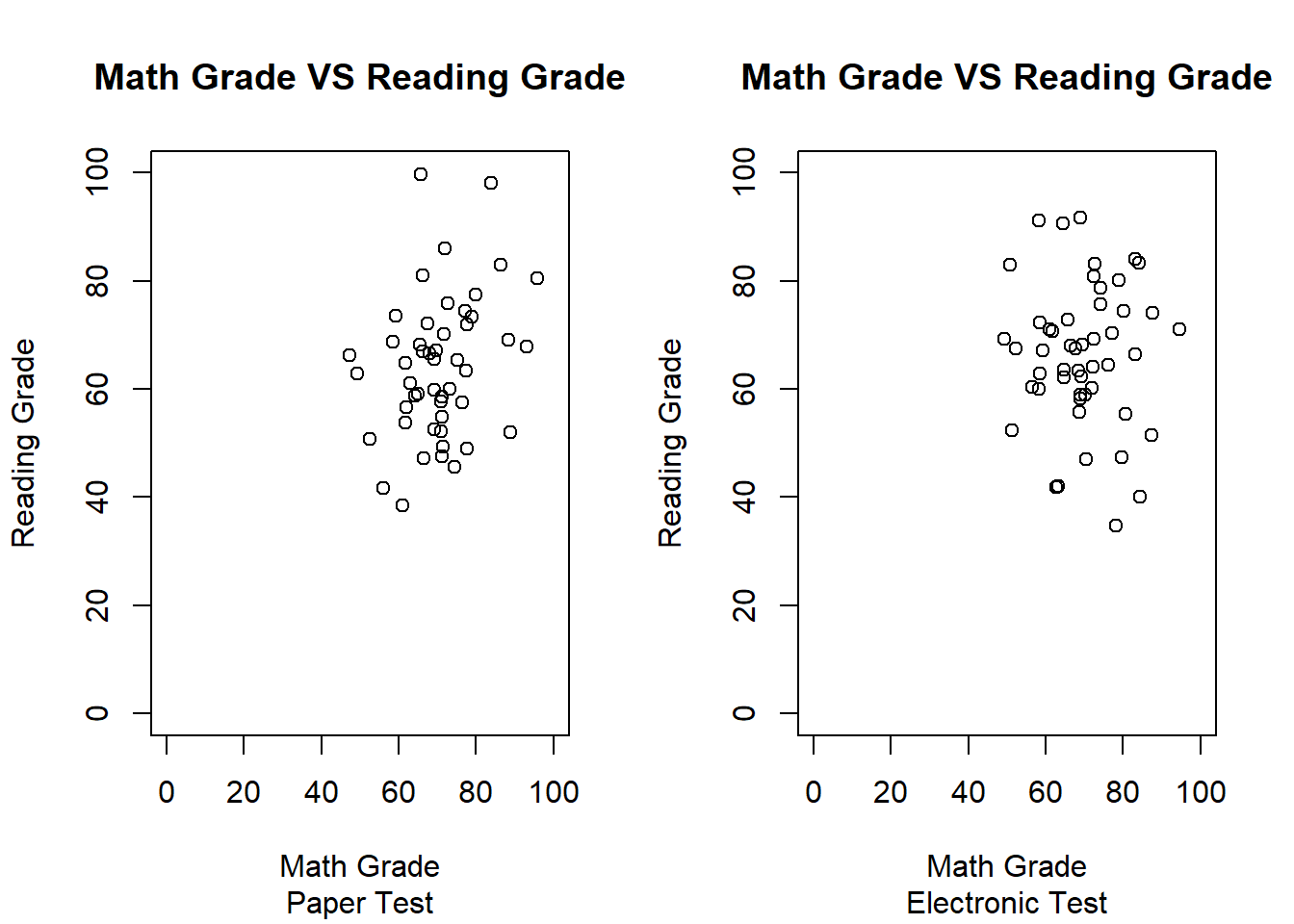
par(mfrow=c(1,2))
plot(Classroom$MathGrade,Classroom$ReadingGrade,main = "Math Grade VS Reading Grade",
sub = "In Classroom",xlab = "Math Grade", ylab = "Reading Grade",
xlim = c(0,100),ylim = c(0,100))
plot(Home$MathGrade,Home$ReadingGrade,main = "Math Grade VS Reading Grade",
sub = "At Home",xlab = "Math Grade", ylab = "Reading Grade",
xlim = c(0,100),ylim = c(0,100))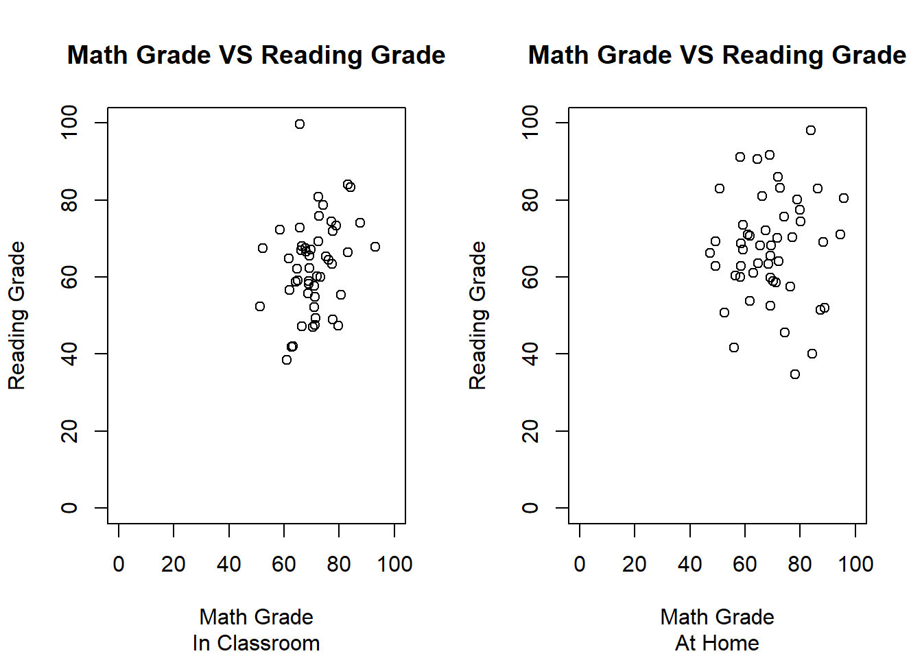
Running either of the next two lines resets the plots back to one per screen.
## null device
##           1
We can also plot different conditions on the same graph using the points function col= can be used to change the points colors and pch= can be used to change their shapes.
plot(PaperTest$MathGrade,PaperTest$ReadingGrade,main = "Math Grade VS Reading Grade",
sub = "Test Types",xlab = "Math Grade", ylab = "Reading Grade",
xlim = c(0,100),ylim = c(0,100))
points(ElectronicTest$MathGrade,ElectronicTest$ReadingGrade,col="blue",pch=2)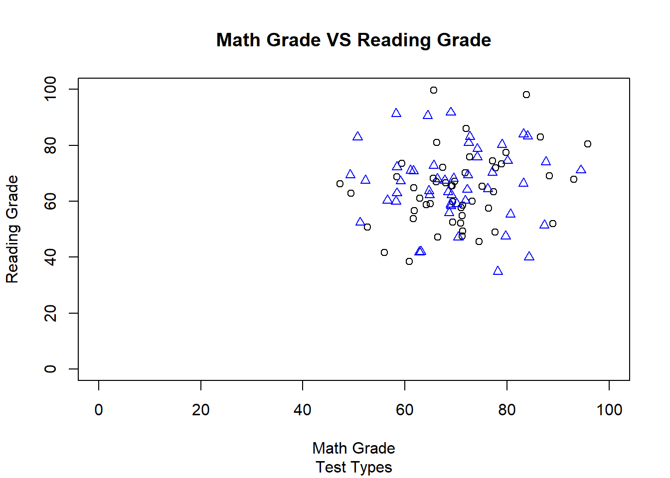
plot(Classroom$MathGrade,Classroom$ReadingGrade,main = "Math Grade VS Reading Grade",
sub = "Test Locations",xlab = "Math Grade", ylab = "Reading Grade",
xlim = c(0,100),ylim = c(0,100))
points(Home$MathGrade,Home$ReadingGrade,col="blue",pch=2)
Now that we are including multiple conditions on one plot, we might want to add a legend so we can ideantify which groups the colors and/or shapes indicate. This can be done using the legend function. The legend’s position can be changed by writing different locations such as: topleft, topright, bottomleft, and bottomright.
plot(PaperTest$MathGrade,PaperTest$ReadingGrade,main = "Math Grade VS Reading Grade",
     sub = "Test Types",xlab = "Math Grade", ylab = "Reading Grade",
     xlim = c(0,100),ylim = c(0,100))
points(ElectronicTest$MathGrade,ElectronicTest$ReadingGrade,col="blue",pch=2)
legend("topleft",legend=c("Paper Test","Electronic Test"),col=c("Black","Blue"),
       pch=c(1,2))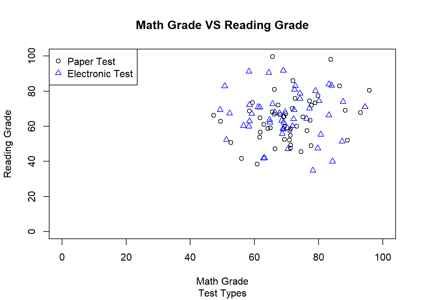
plot(Classroom$MathGrade,Classroom$ReadingGrade,main = "Math Grade VS Reading Grade",
     sub = "Test Locations",xlab = "Math Grade", ylab = "Reading Grade",
     xlim = c(0,100),ylim = c(0,100))
points(Home$MathGrade,Home$ReadingGrade,col="blue",pch=2)
legend("bottomleft",legend=c("Classroom","Home"),col=c("Black","Blue"),pch=c(1,2))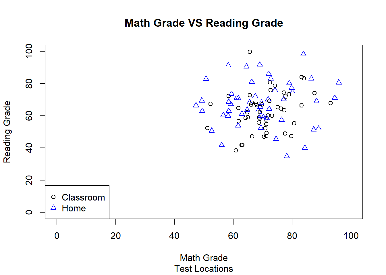
Finally, we can plot our four different condition combinations as seperate graphs.
par(mfrow=c(2,2))
plot(ElectronicTestClassroom$MathGrade,ElectronicTestClassroom$ReadingGrade,
     main = "Math Grade VS Reading Grade",sub = "Electronic/Classroom",xlab = "Math Grade",
     ylab = "Reading Grade",xlim = c(0,100),ylim = c(0,100))
plot(ElectronicTestHome$MathGrade,ElectronicTestHome$ReadingGrade,
     main = "Math Grade VS Reading Grade",sub = "Electronic/Home",xlab = "Math Grade",
     ylab = "Reading Grade",xlim = c(0,100),ylim = c(0,100))
plot(PaperTestClassroom$MathGrade,PaperTestClassroom$ReadingGrade,
     main = "Math Grade VS Reading Grade",sub = "Paper/Classroom",xlab = "Math Grade",
     ylab = "Reading Grade",xlim = c(0,100),ylim = c(0,100))
plot(PaperTestHome$MathGrade,PaperTestHome$ReadingGrade,
     main = "Math Grade VS Reading Grade",sub = "Paper/Home",xlab = "Math Grade",
     ylab = "Reading Grade",xlim = c(0,100),ylim = c(0,100))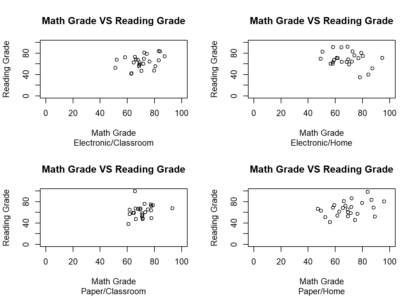
Or all on one graph with different point colors and shapes.
plot(ElectronicTestClassroom$MathGrade,ElectronicTestClassroom$ReadingGrade,
     main = "Math Grade VS Reading Grade",sub = "Test Locations",xlab = "Math Grade",
     ylab = "Reading Grade",xlim = c(0,100),ylim = c(0,100))
points(ElectronicTestHome$MathGrade,ElectronicTestHome$ReadingGrade,col="Blue",pch=2)
points(PaperTestClassroom$MathGrade,PaperTestClassroom$ReadingGrade,col="Orange",pch=3)
points(PaperTestHome$MathGrade,PaperTestHome$ReadingGrade,col="Red",pch=4)
legend("bottomleft",legend=c("Electronic/Classroom","Electronic/Home","Paper/Classroom",
                             "Paper/Home"),col=c("Black","Blue","Orange","Red"),pch=c(1,2,3,4))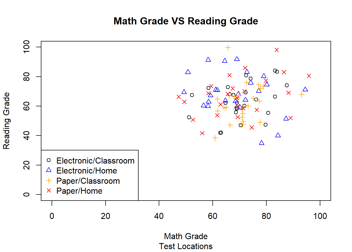
We can also add lines and text to any plot, which we will explore in the Histogram section.
5.2 Bar Graph
The next data visualization we will play with is the bar graph. However, before we can begin working with the barplot function and its arguments, we have to calculate the group means and create a new variable containing the group names to use when labeling our bars within the graphs. We will only be using the means for the math grades for these examples, but the same rules apply for the reading grade means as well.
mathmeanslocation<-c(mean(Home$MathGrade),mean(Classroom$MathGrade))
mathmeanstype<-c(mean(ElectronicTest$MathGrade),mean(PaperTest$MathGrade))
mathmeanstypelocation<-c(mean(ElectronicTestClassroom$MathGrade),
                         mean(ElectronicTestHome$MathGrade),
                         mean(PaperTestClassroom$MathGrade),
                         mean(PaperTestHome$MathGrade))

typelocationnameslong<-c("Electronic Test/Classrom","Electronic Test/Home",
                         "Paper Test/Classrom","Paper Test/Home")
typelocationnames<-c("Electronic Test","Electronic Test","Paper Test","Paper Test")
The following line of code creates a basic bar graph using the barplot() function.
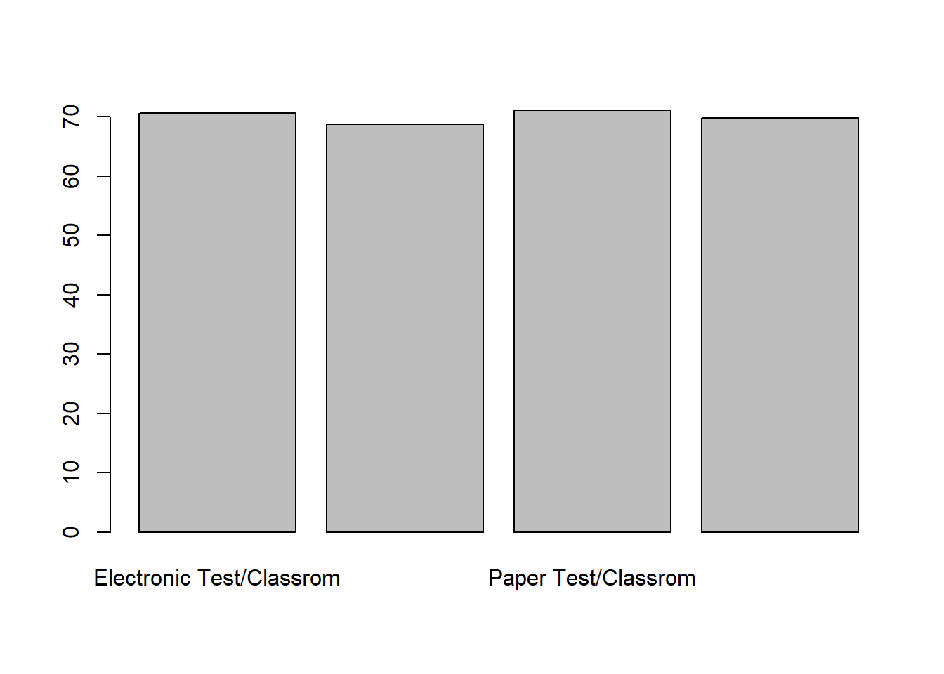
The default bar color is just white. We can change this using the col= arguement.
barplot(mathmeanstypelocation,names.arg = typelocationnameslong,
        col = c("Blue","Red","Blue","Red"))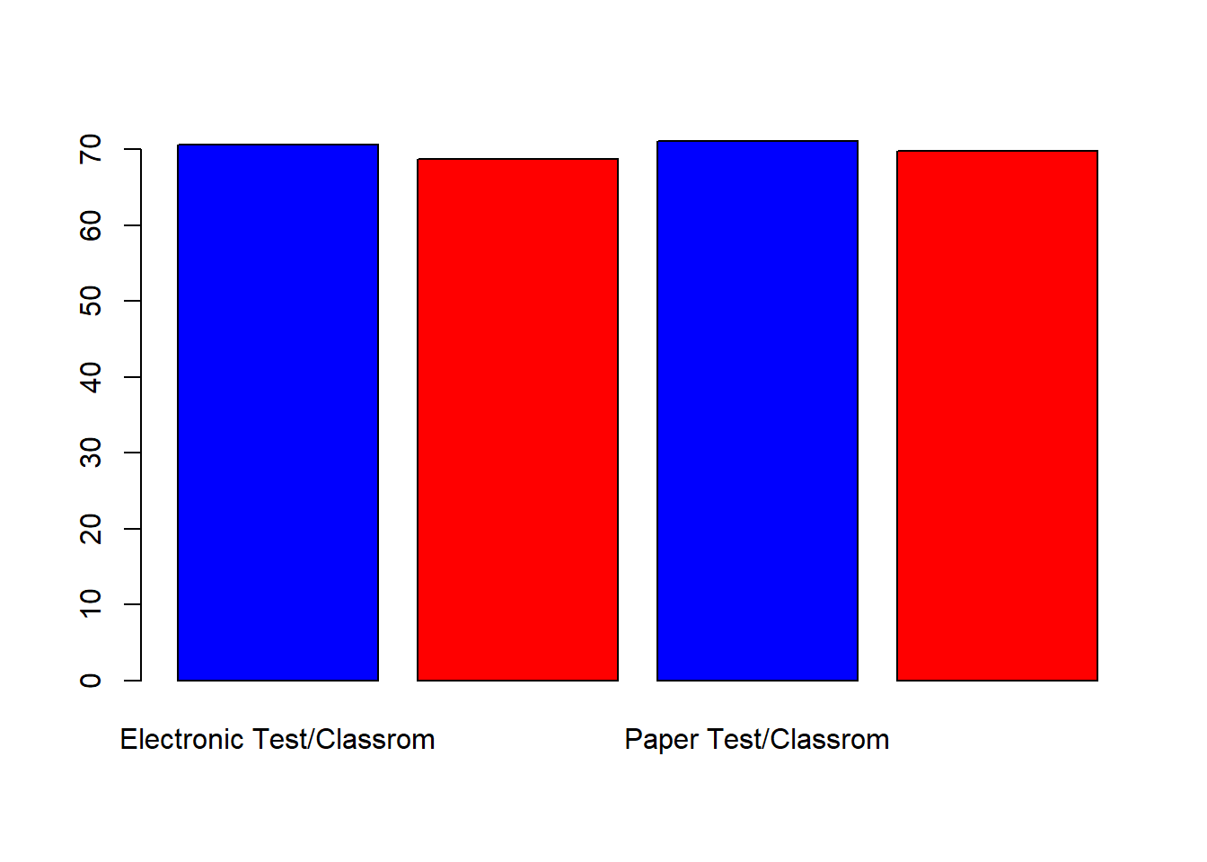
We should also add some labels to make it more clear what our graph is displaying.
barplot(mathmeanstypelocation,names.arg = typelocationnameslong,
        col = c("Blue","Red","Blue","Red"),main ="Math Grade Means",xlab ="Condition",
        ylab ="Mean Grade")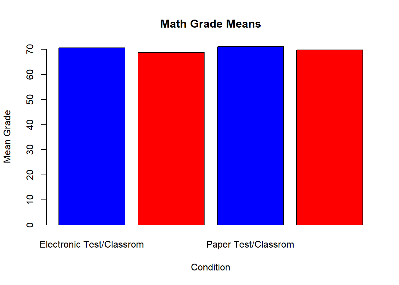
Sometimes a legend might also help. We have added one to the next graphy to help shorten the condition names.
barplot(mathmeanstypelocation,names.arg = typelocationnames,
        col = c("Blue","Red","Blue","Red"),main ="Math Grade Means",xlab ="Condition",
        ylab ="Mean Grade",legend=c("Classroom","Home"))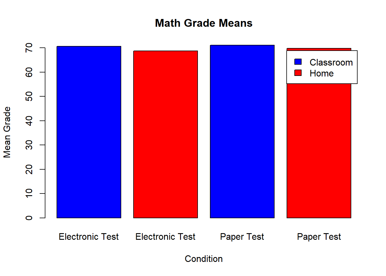
Unfortunately our new legend is covering some of our bar visuals. This can be fixed by changing the display window size or the y-axis limits.
barplot(mathmeanstypelocation,names.arg = typelocationnames,ylim=c(0,100),
        col = c("Blue","Red","Blue","Red"),main ="Math Grade Means",xlab ="Condition",
        ylab ="Mean Grade",legend=c("Classroom","Home"))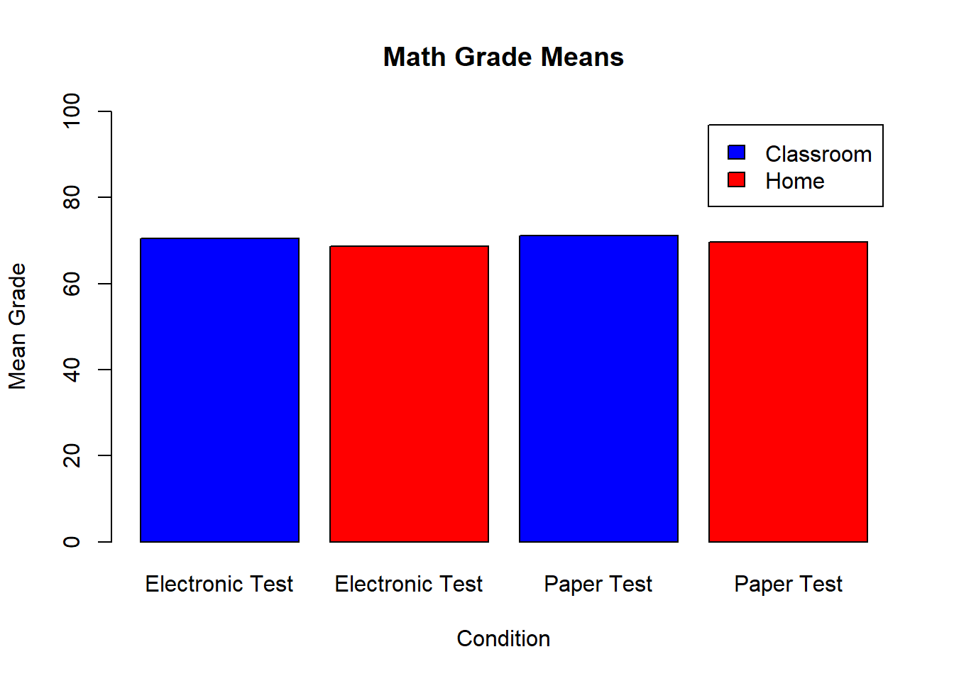
In some situations, you may want to change the orientation of the bar labels. Using the las= aregument you can keep the horizontal with las=1 or make them vertical with las=2.
barplot(mathmeanstypelocation,names.arg = typelocationnames,ylim=c(0,100),las=2,
        col = c("Blue","Red","Blue","Red"),main ="Math Grade Means",xlab ="Condition",
        ylab ="Mean Grade",legend=c("Classroom","Home"))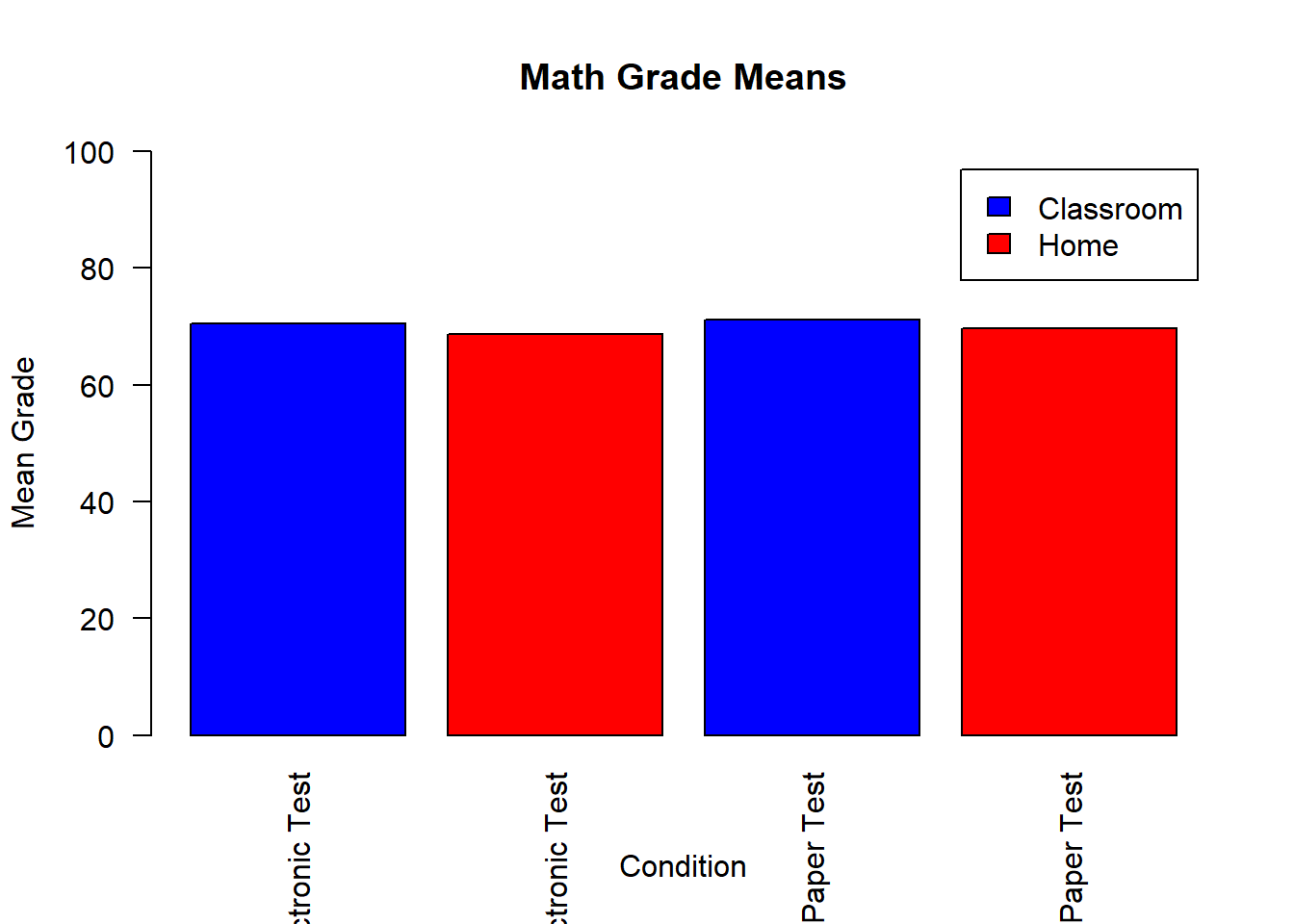
Finally we can change the spacing of the bars to make them closer together. Each of the numbers indicates how much space should be between that bar and the one to its right. The value of the first number does not impact the spacing because there is no bar to the left of the first bar. The spacing also increases very quickly, so begin with values below 1 and increase them by 0.1 units at a time.
barplot(mathmeanstypelocation,names.arg = typelocationnames,ylim=c(0,100),las=1,
        col = c("Blue","Red","Blue","Red"),main ="Math Grade Means",xlab ="Condition",
        ylab ="Mean Grade",legend=c("Classroom","Home"),space=c(0,0,.1,0))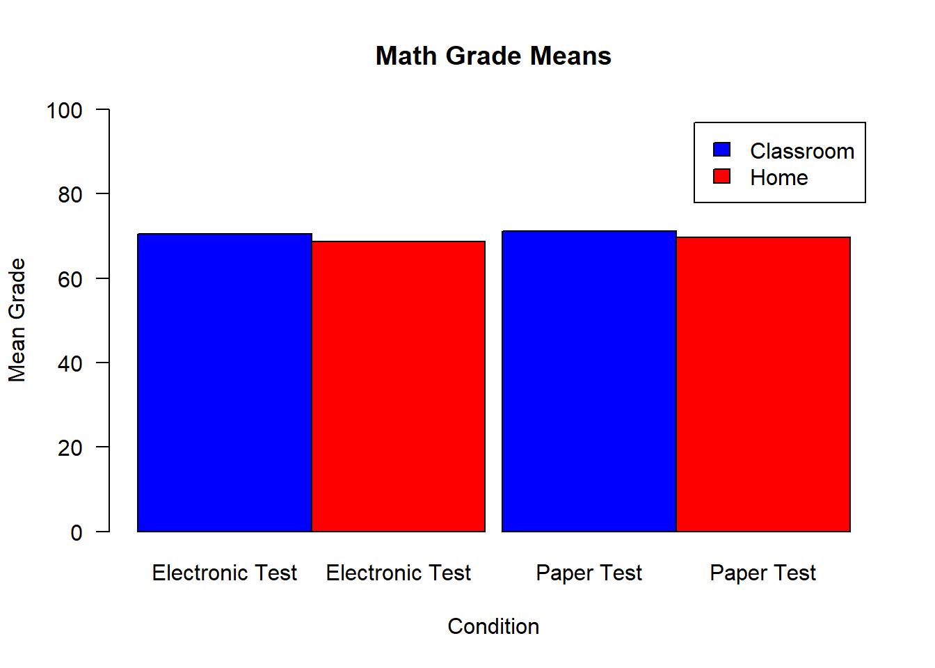
5.3 Histogram
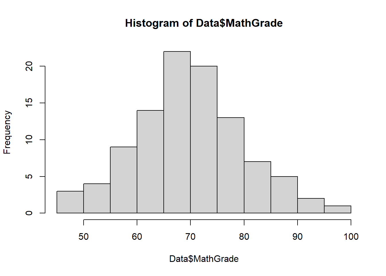
Next we will work with the hist() function and its arguments to create histograms.
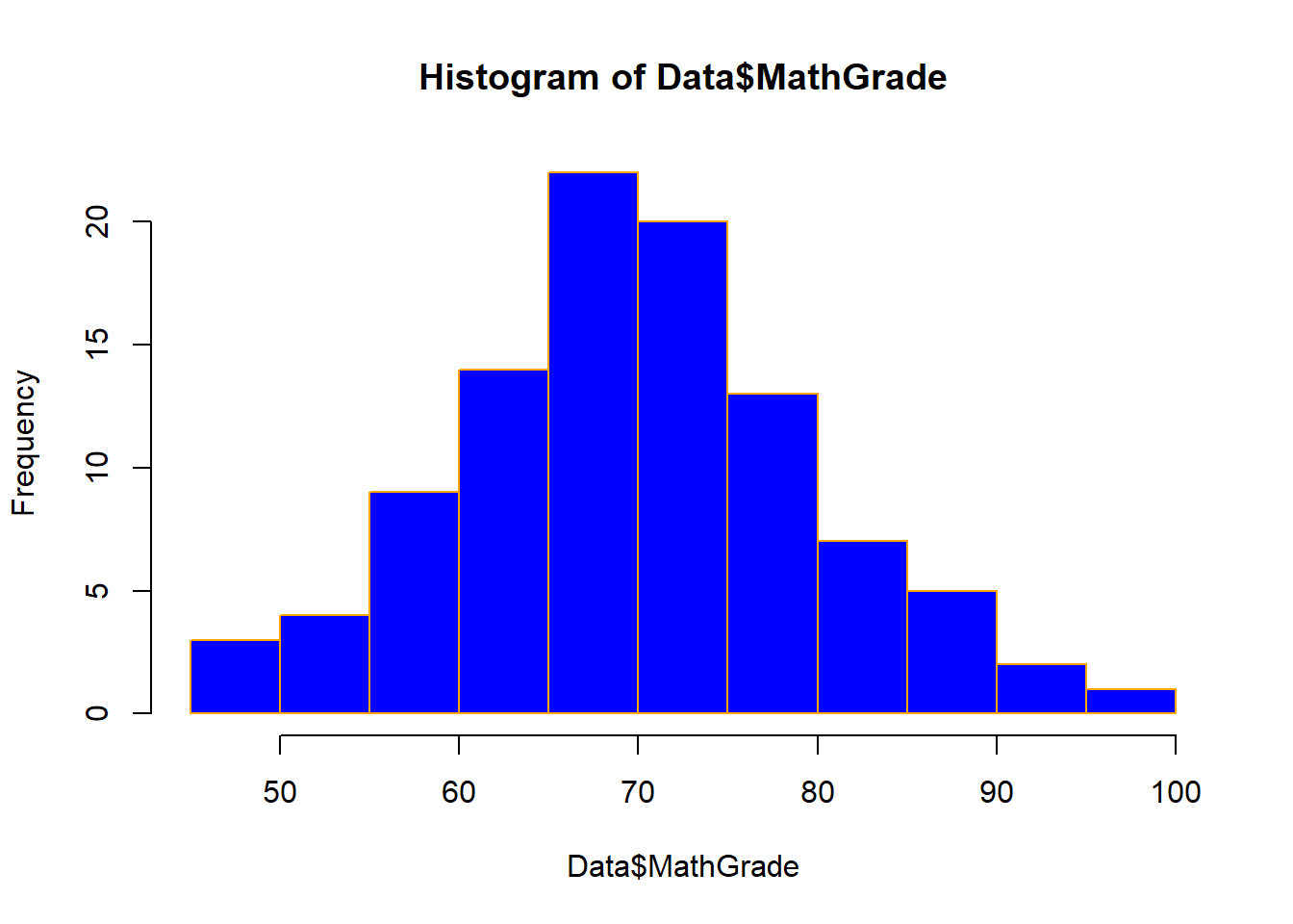
Here is a basic histogram of the math grades.
Just as we did in the bar graphs, we can also color in the bars and change the colors of the boarder around the bars.
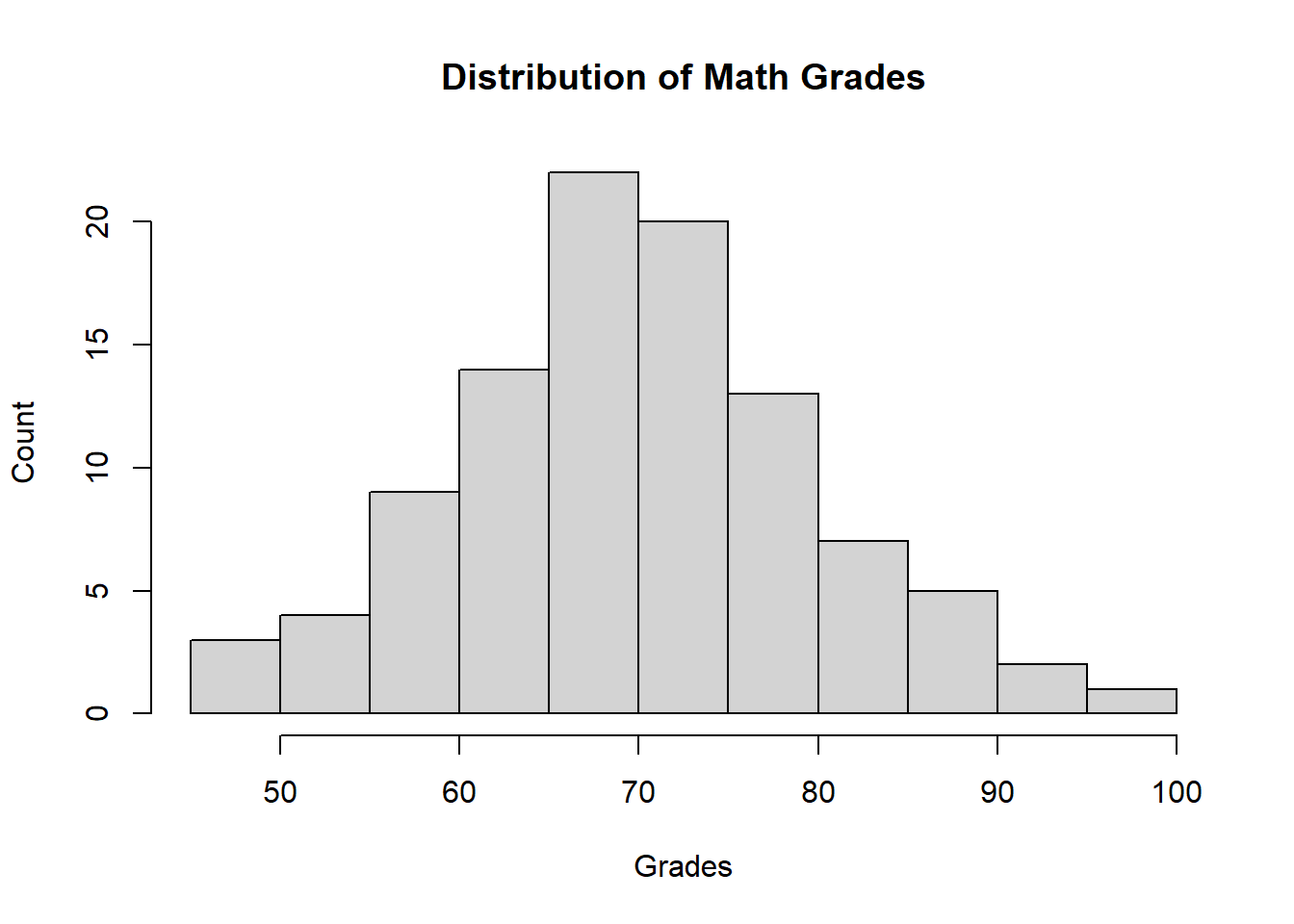
Similarly, like all other plots we can also add a title and labels.
And we can add limits to the two axes.
hist(Data$MathGrade,main = "Distribution of Math Grades",xlab = "Grades",
     ylab = "Count",xlim = c(0,100),ylim = c(0,25))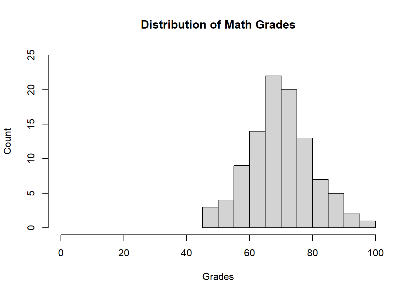
For any of the plots we create, including the bar and scatter plots, we have the option to add lines and text using the abline() and text() functions, respectively. For example here I can add lines on the x and y axis and some text.
hist(Data$MathGrade,main = "Distribution of Math Grades",xlab = "Grades",
     ylab = "Count",xlim = c(0,100),ylim = c(0,25))
abline(h = 22,col="Red")
abline(v = 30,col="Blue")
abline(a = 0,b = 1,col="Black")
text(x=28,y=15,labels = "Sometimes the lines and text are pointless")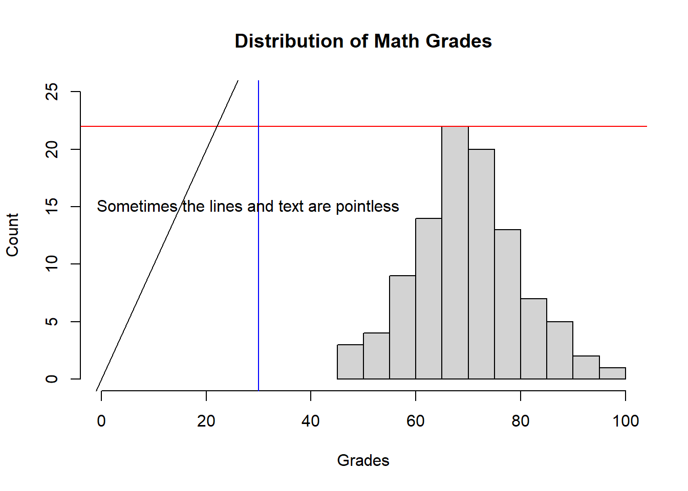
We can also change the color and size of the text by adding the col= and cex= arguments.
hist(Data$MathGrade,main = "Distribution of Math Grades",xlab = "Grades",
     ylab = "Count",xlim = c(0,100),ylim = c(0,25))
abline(h = 22,col="Red")
abline(v = 30,col="Blue")
abline(a = 0,b = 1,col="Black")
text(x=28,y=15,labels = "Sometimes the lines and text are pointless",
     col = "Blue",cex = 2)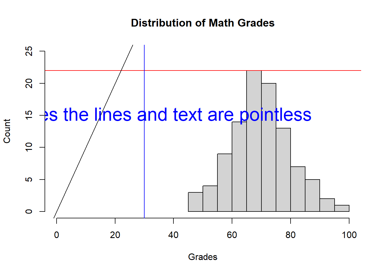
Once lines and text have been added to a plot, they cannot be removed. Luckily, simply rerunning the function to create the original plot will create a new clean version.
5.4 Box Plot
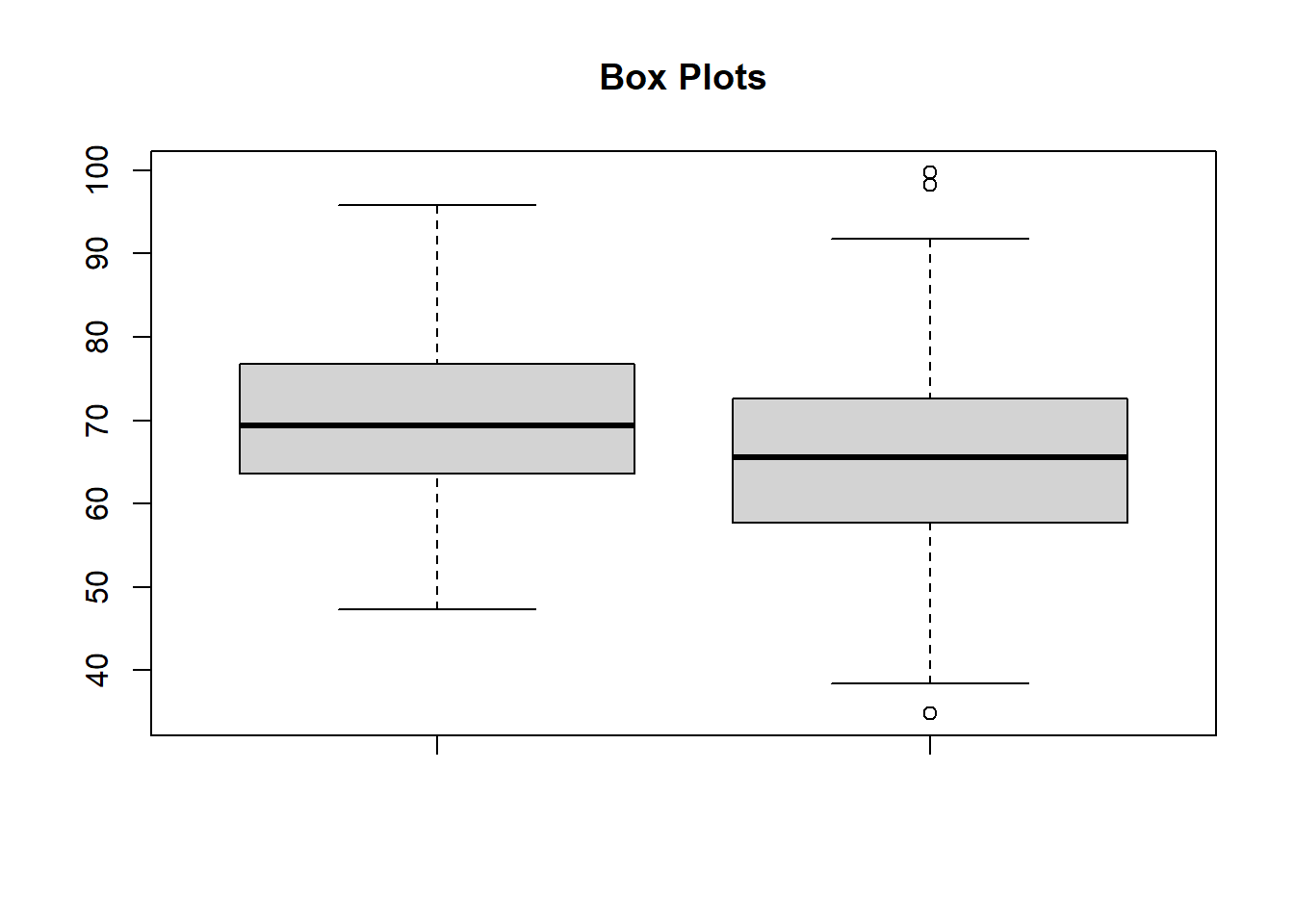
The final data visualization we will cover in this section is the box plot. We can make box plots for the math grades and reading grades using the boxplot() function.
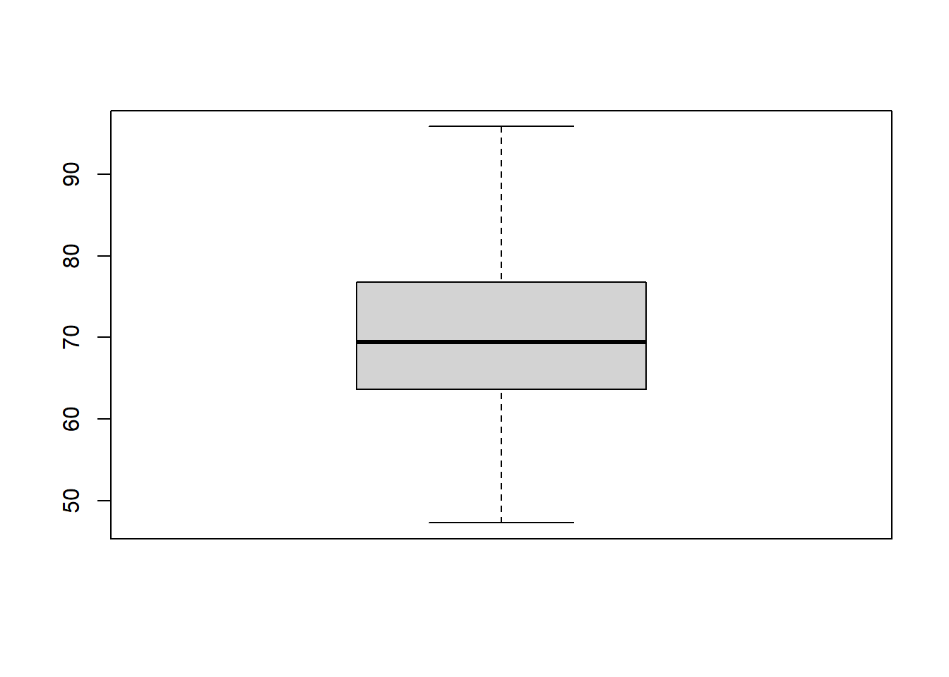
By including both data sets, we can plot both grade distributions at once.
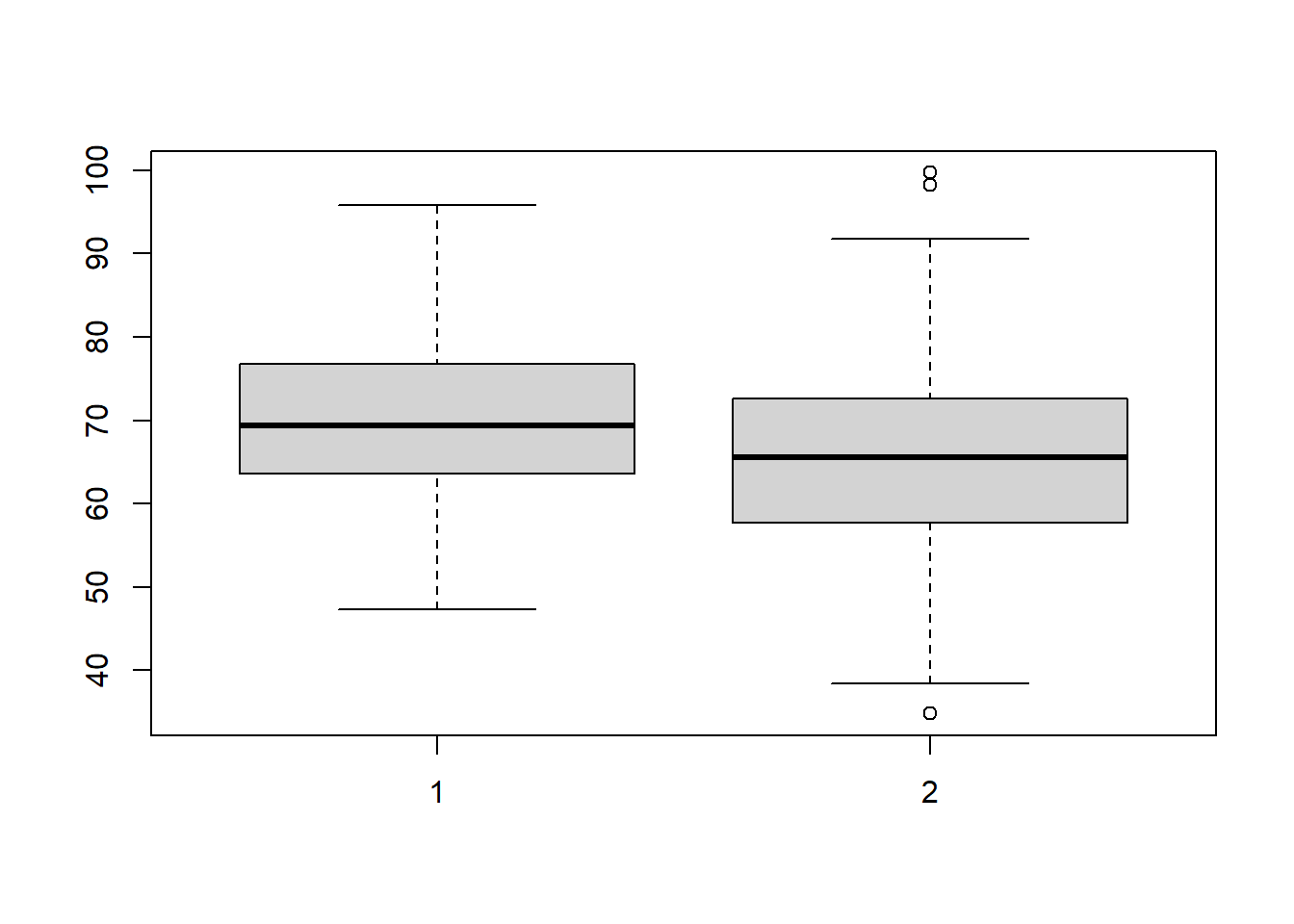
We can also give the plot a title using main=.
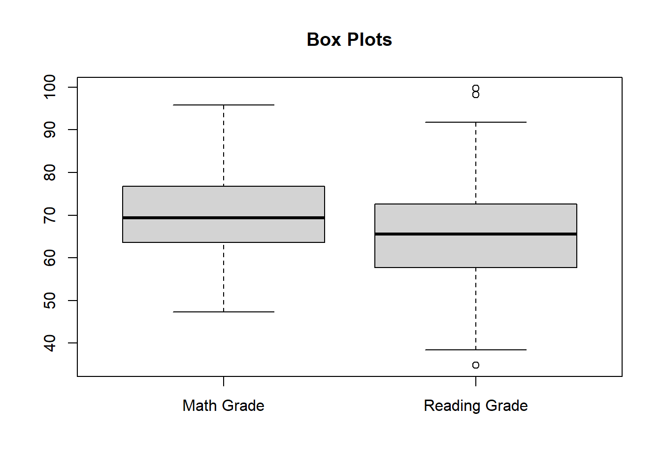
Each of the groups can also be given a label.
You can also notch the plots around their medians. The notches provide a rough guide for determining if there is a significance of difference of medians.
boxplot(Data$MathGrade,Data$ReadingGrade,main="Box Plots",
        names = c("Math Grade","Reading Grade"),notch = T)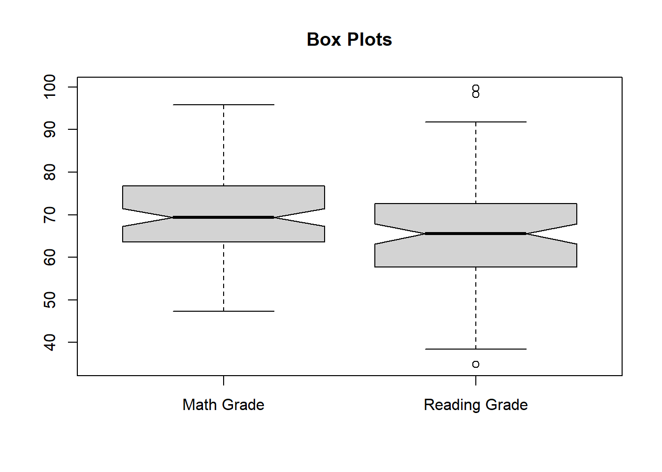
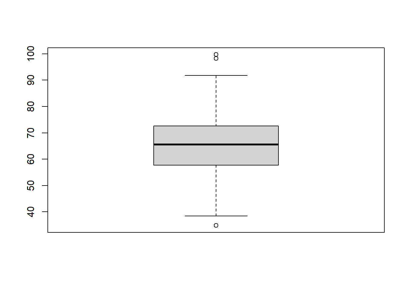
The box plot function can also remove points which it has indicated as outliers.
boxplot(Data$MathGrade,Data$ReadingGrade,main="Box Plots",
        names = c("Math Grade","Reading Grade"),outline = F)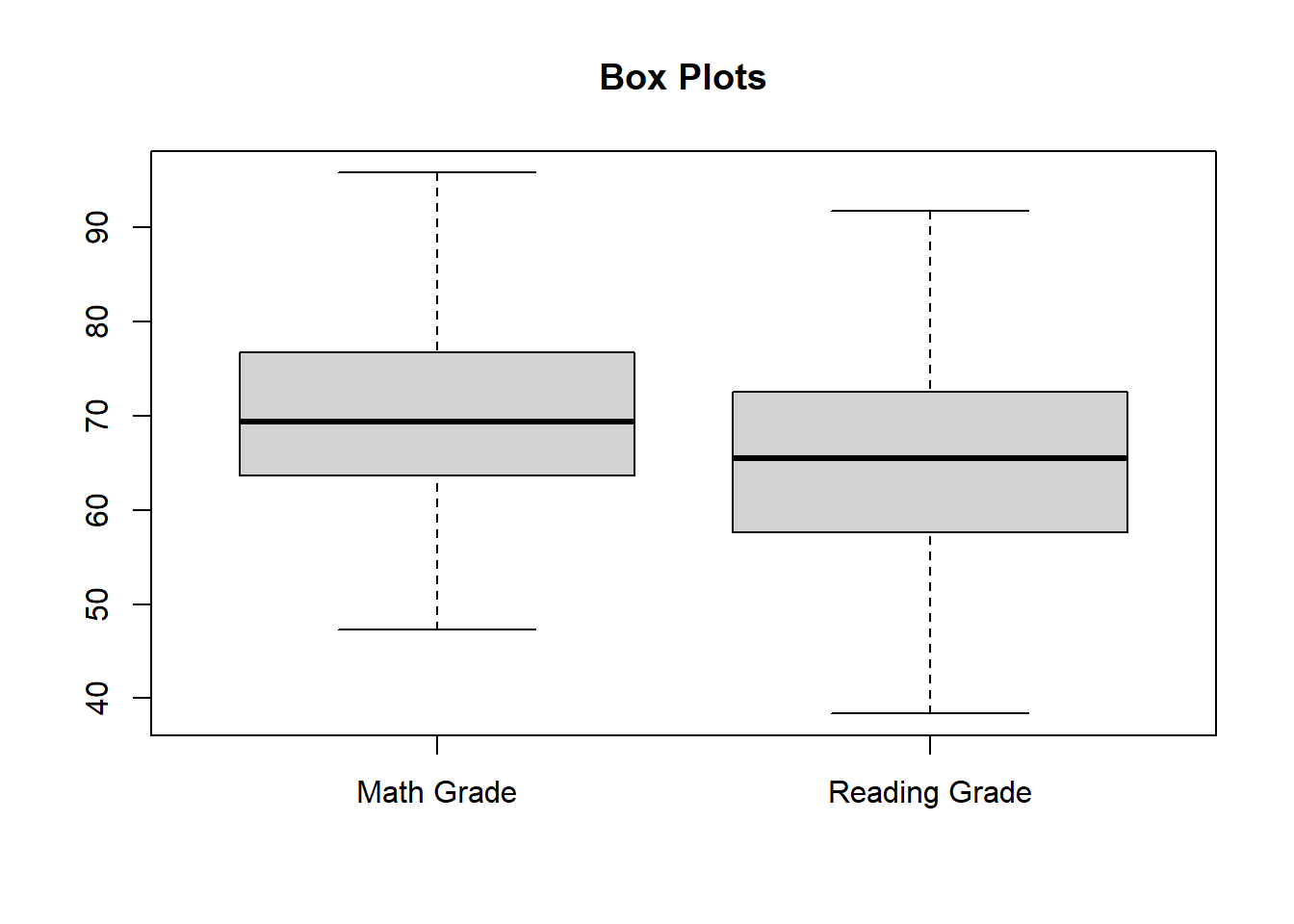
Just like the box plots, we can add color to the box plots as well.
boxplot(Data$MathGrade,Data$ReadingGrade,main="Box Plots",
        names = c("Math Grade","Reading Grade"),col = c("Red","Blue"))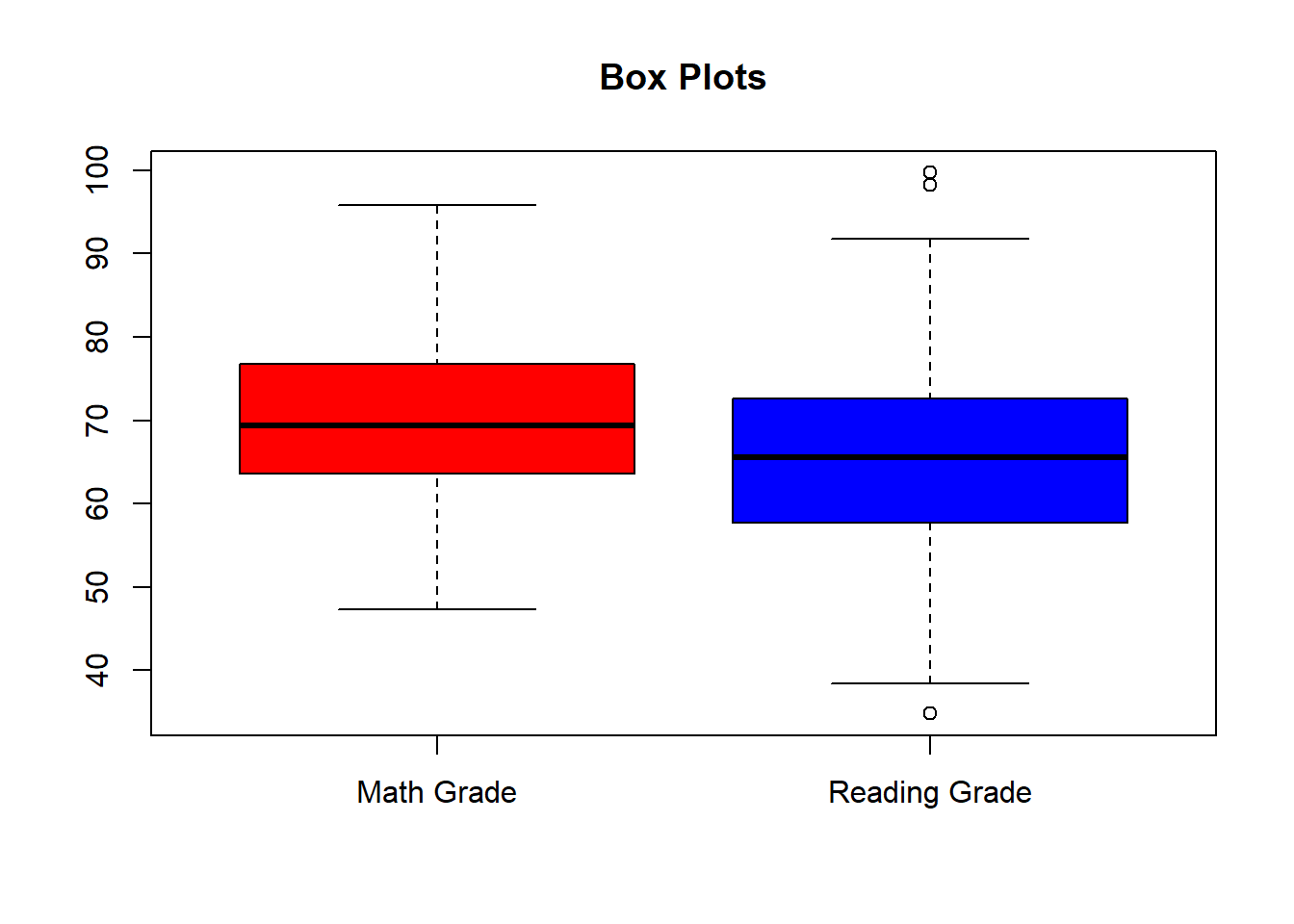
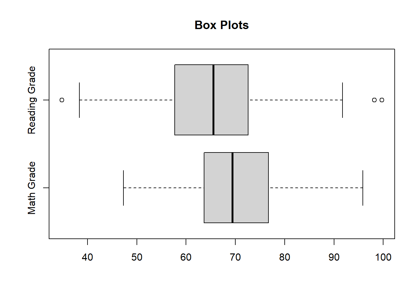
Finally, box plots also provide the option to turn the graph horizontally.
boxplot(Data$MathGrade,Data$ReadingGrade,main="Box Plots",
        names = c("Math Grade","Reading Grade"),horizontal = T)