Chapter 18 The data-generating process
In Section 9.4.2 we introduced a structure for a typical table of time series data:
| Date | Series | Value_1 | Value_2 | Value_3 |
|---|---|---|---|---|
| 2020-02-01 | “Virginia” | 33.57 | 29 | “friendly” |
| 2020-02-01 | “Idaho” | 0.22 | 18 | “hostile” |
| … | … | … | … | … |
index |
key |
|||
| [date] | [fctr] | [dbl] | [int] | [fctr] |
Here, the Date field contains values for regular time intervals on which data are recorded. The fields Value_1, Value_2, etc., contain the actual observed values. The Series field reports objects (here, U.S. states) for which data are reported.
Let’s make this setup both simpler and somewhat more general. For now, let’s drop the key field Series, and suppose we are dealing only with one time series. Let’s abstract from the Date field, and just label the sequence of time steps \(t = 1,2,\ldots,T\). Let’s suppose further we have only one sequence of data values \(y_1, y_2, \ldots, y_T\). Our abstracted data table now looks like:
| \(t\) | \(y\) |
|---|---|
| \(1\) | \(y_1\) |
| \(2\) | \(y_2\) |
| … | … |
| \(T\) | \(y_T\) |
Suppose we have a dataset structured in this way:
## # A tibble: 40 x 2
##        t     y
##    <int> <dbl>
##  1     1  16.1
##  2     2  18.6
##  3     3  15.5
##  4     4  22.8
##  5     5  19.0
##  6     6  15.5
##  7     7  19.5
##  8     8  20.2
##  9     9  19.7
## 10    10  17.1
## # … with 30 more rows
Given such a dataset, the challenge we confront is how best to explain the process by which the observed data were generated, and also to predict future values from this process that haven’t been observed yet.
To meet this challenge, the central step is to create a formal mathematical model of the data-generating process. To explain what that means, we’ll start with a simple example.
18.1 The white noise process
One of the simplest models of a process for generating these data is to treat them as white noise. We actually introduced this model previously, in Section 2.5.
In a white noise process, the data are generated as independent, identically distributed random draws from a fixed normal distribution. Formally, for \(t = 1, \ldots, T\),
\[y_t = \theta + \varepsilon_t\]
where \(\theta\) denotes the mean value of the process, and where \(\varepsilon_t \sim N(0, \sigma^2)\) is a random noise term. Here, the parameters \(\theta\) and \(\sigma^2\) are assumed to be constant. The values of these parameters are not directly observable. Instead, their values must be estimated based on the observed data, using established techniques of statistical estimation. Since the data we have are limited and noisy, these estimates will in general be only approximately correct. The issue for practical work is whether these approximations are close enough to be useful in our specific application.
Before we get into statistical estimation techniques, let’s take up a prior question: Why, or when, should we believe this model? What would make us think this model is a true — or at least, serviceably close-enough — representation of the underlying process that generated the observed data?
A reasonable approach is to evaluate whether the data “look like” what we would expect to see, if the model were true. If the white noise model were the true model of the data-generating process, then several observable features in the data should be apparent.
18.1.1 Stationarity
First, the process would be stationary. Formally, a stochastic process is stationary if its unconditional joint probability distribution does not change when shifted in time. There should be no discernible upward or downward trend over time, for example.
There are (of course) statistical tests for stationarity one can apply to a time series to estimate the likelihood that the series (more exactly: the underlying stochastic process that generated the series) is stationary. But before applying such tests, it’s a good idea to just plot the data and ask: do they look stationary?
library(ggplot2)
library(ggthemes)

p <- ggplot(y_tbl, aes(t, y)) + geom_point() + xlab(expression(t)) + ylab(expression(y[t])) + theme_clean()
p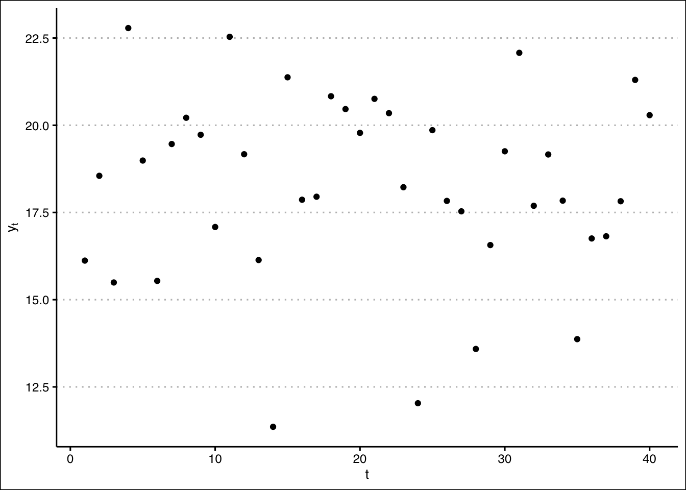
Just by visual inspection, there doesn’t seem to be much of a trend.
Fitting a linear model to the data and plotting the regression line reveals a very shallow downward trend:
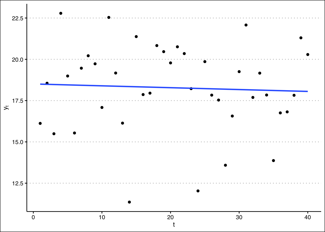
Hmmm. Is this trend “real”? Or did it just happen that, by random chance, the data later in the series happen to have slightly lower values on average than those generated earlier?
This question is very typical of those that arise in the challenge of model selection, i.e., of choosing the model that best explains the data generating process. It is sometimes difficult to tell whether a pattern we observe in our data corresponds to a real feature of the underlying process, or if the feature is instead a kind of illusion — one that just happened to emerge from the particular data we observe, due to random chance, but that would not necessarily be observed from another sample of data drawn from the same process.
18.1.2 No autocorrelation
Temperatures are assumed to be independent from one year to the next. In particular, there is no autocorrelation. Knowing that one year’s temperature was unusually high (say) provides no information about the likelihood that next year’s temperature will also be unusually high. Inter-annual climate cycles (e.g., due to \(El\ Ni\tilde{n}o\)) are ruled out.
Temperature variations around the long-run average are assumed to be identically distributed. This assumption rules out the possibility that variance is, say, greater when temperatures are higher than when they are lower. Nor do they grow over time.