Chapter 6 Jun 20–26: Unsupervised machine learning in R
This week, our goals are to…
Apply one unsupervised ML technique—k-means clustering—to a dataset.
Present and interpret results of k-means clustering analysis.
In this chapter, we will use the following methods to do clustering, an unsupervised machine learning method that helps us explore our data:
- Euclidean distance calculations
- K-means clustering
- Principal component analysis (PCA)
We will use the mtcars dataset to see some examples. Then, you will conduct an unsupervised analysis of your own in the assignment.
6.1 Sources and resources
The code and ideas used in this chapter were taken almost entirely from the following resource:
- K-means Cluster Analysis. UC Business Analytics R Programming Guide. https://uc-r.github.io/kmeans_clustering. – This resource was used to guide the import and prepare, calculating distance, and k-means sections of this chapter.
The following optional resources are related to this chapter’s content (you are not required to look at these):
Kaushik, S. An Introduction to Clustering and different methods of clustering. https://www.analyticsvidhya.com/blog/2016/11/an-introduction-to-clustering-and-different-methods-of-clustering/.
K-means clustering, from StatQuest with Josh Starmer. Video: https://youtu.be/4b5d3muPQmA.
Principal Component Analysis (PCA), Step-by-Step, from StatQuest with Josh Starmer. Video: https://youtu.be/FgakZw6K1QQ.
PCA main ideas in only 5 minutes!!!, from StatQuest with Josh Starmer. Video: https://youtu.be/HMOI_lkzW08.
Clustering tutorial in Google Colab, by Anshul Kumar. Short link: http://tinyurl.com/AnshulCluster1. Full link: https://colab.research.google.com/drive/1fDT9vQ1yMbDr7AczPB1xaaDCMl4ck7bd?usp=sharing#scrollTo=j98RD388gxUZ.
6.2 Import and prepare data
For the examples in this chapter, I will just use the mtcars dataset that is already built into R. However, we will still “import” this and give it a new name—df—so that it is easier to type. Please follow along with the steps below that show how to prepare the data.
df <- mtcarsNow, whenever we refer to df, the computer will know that we mean the mtcars data.
Run the following command in your own R console to see information about the data, if you wish:
?mtcarsNow you should see information about the mtcars dataset in the Viewer of R or RStudio.
And we can see all of the variable names, like we have done before:
names(df)## [1] "mpg" "cyl" "disp" "hp" "drat"
## [6] "wt" "qsec" "vs" "am" "gear"
## [11] "carb"Number of observations:
nrow(df)## [1] 32Remove missing observations:
df <- na.omit(df)Inspect some rows in the dataset:
head(df)## mpg cyl disp hp drat
## Mazda RX4 21.0 6 160 110 3.90
## Mazda RX4 Wag 21.0 6 160 110 3.90
## Datsun 710 22.8 4 108 93 3.85
## Hornet 4 Drive 21.4 6 258 110 3.08
## Hornet Sportabout 18.7 8 360 175 3.15
## Valiant 18.1 6 225 105 2.76
## wt qsec vs am gear
## Mazda RX4 2.620 16.46 0 1 4
## Mazda RX4 Wag 2.875 17.02 0 1 4
## Datsun 710 2.320 18.61 1 1 4
## Hornet 4 Drive 3.215 19.44 1 0 3
## Hornet Sportabout 3.440 17.02 0 0 3
## Valiant 3.460 20.22 1 0 3
## carb
## Mazda RX4 4
## Mazda RX4 Wag 4
## Datsun 710 1
## Hornet 4 Drive 1
## Hornet Sportabout 2
## Valiant 1Convert non-numeric variables to dummy (binary) variables, if necessary:
if (!require(fastDummies)) install.packages('fastDummies')
library(fastDummies)

df <- dummy_cols(df, remove_first_dummy = TRUE,  remove_selected_columns = TRUE)
There are no non-numeric variables in the mtcars data set, so the code above is not necessary to run in that case. For other data sets, the code above is useful.
Scale all variables in dataset and inspect again:
df <- scale(df)
head(df)
## mpg cyl
## Mazda RX4 0.1508848 -0.1049878
## Mazda RX4 Wag 0.1508848 -0.1049878
## Datsun 710 0.4495434 -1.2248578
## Hornet 4 Drive 0.2172534 -0.1049878
## Hornet Sportabout -0.2307345 1.0148821
## Valiant -0.3302874 -0.1049878
## disp hp
## Mazda RX4 -0.57061982 -0.5350928
## Mazda RX4 Wag -0.57061982 -0.5350928
## Datsun 710 -0.99018209 -0.7830405
## Hornet 4 Drive 0.22009369 -0.5350928
## Hornet Sportabout 1.04308123 0.4129422
## Valiant -0.04616698 -0.6080186
## drat wt
## Mazda RX4 0.5675137 -0.610399567
## Mazda RX4 Wag 0.5675137 -0.349785269
## Datsun 710 0.4739996 -0.917004624
## Hornet 4 Drive -0.9661175 -0.002299538
## Hornet Sportabout -0.8351978 0.227654255
## Valiant -1.5646078 0.248094592
## qsec vs
## Mazda RX4 -0.7771651 -0.8680278
## Mazda RX4 Wag -0.4637808 -0.8680278
## Datsun 710 0.4260068 1.1160357
## Hornet 4 Drive 0.8904872 1.1160357
## Hornet Sportabout -0.4637808 -0.8680278
## Valiant 1.3269868 1.1160357
## am gear
## Mazda RX4 1.1899014 0.4235542
## Mazda RX4 Wag 1.1899014 0.4235542
## Datsun 710 1.1899014 0.4235542
## Hornet 4 Drive -0.8141431 -0.9318192
## Hornet Sportabout -0.8141431 -0.9318192
## Valiant -0.8141431 -0.9318192
## carb
## Mazda RX4 0.7352031
## Mazda RX4 Wag 0.7352031
## Datsun 710 -1.1221521
## Hornet 4 Drive -1.1221521
## Hornet Sportabout -0.5030337
## Valiant -1.1221521The code above standardizes the dataset. This is the same as using the standardize function in the jtools package, for our purposes.
6.3 Calculating distance
6.3.1 Distances between physical objects – distance formula
You might recall from math class that you can use the distance formula— which is based on the Pythagorean Theorem—to calculate the distance between two plotted points on a graph, or two latitude and longitude locations.
You can review the distance formula here, if you wish (not required):
- The Distance Formula. Purplemath. https://www.purplemath.com/modules/distform.htm.
Now, imagine that instead of just x and y for each point you have plotted, you have three coordinates. Then you would add a term to the formula and you could still calculate the distance between the two points. Imagine that you have latitude, longitude, and height-from-ground measurements for two hot air balloons and you wanted to know the distance between them. Then, you could use the following formula to calculate how far apart they are:21
\[distance = \sqrt{(latitude_1-latitude_2)^2 + (longitude_1-longitude_2)^2 + (height_1-height_2)^2}\]
You can review the three-dimensional distance formula here, if you wish (not required):
- The Distance Formula in 3 Dimensions. Varsity Tutors. https://www.varsitytutors.com/hotmath/hotmath_help/topics/distance-formula-in-3d.
If we wanted, we could have a whole bunch of hot air balloons hovering in the air, all with their own three location coordinates. We could make a database of all of the hot air balloons. The database would be in a spreadsheet with each row representing a hot air balloon. There would be three columns, one for each type of location coordinate.
Here’s an example:
| Latitude (degrees north) | Longitude (degrees west) | Height-above-ground (meters) | |
|---|---|---|---|
| Balloon 1 | 42.3601 | 71.0589 | 100 |
| Balloon 2 | 42.3876 | 71.0995 | 200 |
| Balloon 3 | 42.3720 | 71.1075 | 205 |
| Balloon 4 | 42.2058 | 71.0348 | 158 |
| … | … | … | … |
Within the database above, we could calculate the distances between each pair of balloons.22 And we could say that maybe all of the balloons that are close to each other have passengers that have similar preferences as each other. That’s why they have all chosen to navigate to the same location. Based on these revealed preferences, maybe we could even identify a few groups and put each balloon into one of these groups. That’s what clustering is all about.
6.3.2 “Distances” between observations
In the hot air balloons, it is intuitive that we could calculate distances between items. But now imagine that you have a dataset like the mtcars dataset, which we prepared and inspected earlier in this chapter. Each row is a car and each column is an attribute that a car might have. We can pretend that these attributes for the cars are just like location measurements for the hot air balloons. Even though these car attributes are not physical locations that we can visualize, we can still use the distance formula to calculate a “distance” between any two objects. And maybe those distances will tell us something noteworthy about the relationship (or similarity or difference) between those two objects.
The “distance” we get between two observations in our data—between two cars, in this case—is called the euclidean distance when calculated using the distance formula above. There are other ways to calculate distance between two observations, but we will not discuss or use them in this chapter.23
6.3.3 Calculating distance in R
Please load the following packages to prepare to run unsupervised machine learning techniques in R on your computer:
if (!require(factoextra)) install.packages('factoextra')
library(factoextra)

if (!require(cluster)) install.packages('cluster')
library(cluster)
Also, make sure that your data is scaled or standardized, as demonstrated in the data preparation section of this chapter.
Now, we’ll have R calculate the distances for us between every pair of cars in our dataset:
distance <- get_dist(df)Above, all of the distances have been stored as the object distance. We can refer to distance any time we want, as we continue.
On your own computer, you can inspect the resulting matrix with the following code, in the console only (not in your code file):
View(as.matrix(distance))6.3.4 Visualizing distances between observations
Now we’ll visualize these distances that we just calculated. In the command below, change distance to the name of your own stored distances object and leave everything else as it is:
fviz_dist(distance, gradient = list(low = "#00AFBB", mid = "white", high = "#FC4E07"))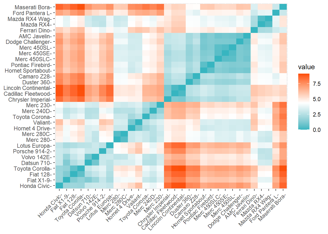
Interpretation:
- Each box corresponds to a pair of cars in our dataset.
- The color of that box tells us whether those two cars are “near” or “far” in distance to each other. Blue means close and red means far.
- The closest two cars can be is very close to 0.
- The farthest apart two cars can be is around 8.
The Maserati Bora and the Datsun 710 are two cars that are very “far” from each other. They are 7.3 distance units apart (which you can see if you run the View(as.matrix(distance)) command). Does that mean that they are pretty different from each other? Possibly yes.
The AMC Javelin and Hornet Sportabout are two cars that are very “close” to each other. They are 0.84 distance units apart (you can also see this in the matrix). Perhaps that means that they are very similar to each other.
6.3.5 Identifying minimum and maximum distances
We can also have the computer tell us the values and locations in the distance matrix of the closest and farthest pairs of observations. Note that even though the computer can help us do this, I still highly recommend that you run the View(as.matrix(distance)) command and inspect the results.
Below, we get the minimum24 and maximum distances in our saved distance matrix:
min(distance)## [1] 0.2956825max(distance)## [1] 8.480167The results above tell us that the two most similar cars (according to the variables in the dataset) are a distance of 0.296 apart. And the most different cars are 8.48 apart. Of course, now we might want to know which observations (cars) these numbers refer to.
This code identifies the specific observations that have the distances above:
which(as.matrix(distance)==min(distance), arr.ind = T)## row col
## Lincoln Continental 16 15
## Cadillac Fleetwood 15 16which(as.matrix(distance)==max(distance), arr.ind = T)## row col
## Maserati Bora 31 20
## Toyota Corolla 20 31The results above suggest that the Lincoln Continental and Cadillac Fleetwood are two cars that are very similar to each other. Meanwhile, the Maserati Bora and Toyota Corolla are two cars that are very different than each other. If we run the command View(as.matrix(distance)), we can see that the Lincoln Continental and Cadillac Fleetwood are indeed separated by a distance of only 0.296. And we also see that the Maserati Bora and Toyota Corolla have a much larger distance apart of 8.48.
6.4 K-means clustering
Now that we have reviewed some of the basic underlying concepts, we are ready to start clustering!
6.4.2 Two clusters
Now we will finally assign observations in our data to individual clusters. Before doing this, make sure that your data is scaled or standardized, as demonstrated in the data preparation section above. With the code below, we are instructing the computer to create two clusters and then assign each observation to one of those clusters:
k2 <- kmeans(df, centers = 2)Above, we created a new object called k2 which holds the clustering results. We created this kmeans clustering results object by using the function kmeans(...) in which we told it to use df as the data and we told it to make two centers, or clusters.
Let’s inspect the results by running k2 as a command:
k2## K-means clustering with 2 clusters of sizes 14, 18
##
## Cluster means:
## mpg cyl disp
## 1 -0.8280518 1.0148821 0.9874085
## 2 0.6440403 -0.7893528 -0.7679844
## hp drat wt
## 1 0.9119628 -0.6869112 0.7991807
## 2 -0.7093044 0.5342642 -0.6215850
## qsec vs am
## 1 -0.6024854 -0.8680278 -0.5278510
## 2 0.4685997 0.6751327 0.4105508
## gear carb
## 1 -0.5445697 0.4256439
## 2 0.4235542 -0.3310564
##
## Clustering vector:
## Mazda RX4 Mazda RX4 Wag
## 2 2
## Datsun 710 Hornet 4 Drive
## 2 2
## Hornet Sportabout Valiant
## 1 2
## Duster 360 Merc 240D
## 1 2
## Merc 230 Merc 280
## 2 2
## Merc 280C Merc 450SE
## 2 1
## Merc 450SL Merc 450SLC
## 1 1
## Cadillac Fleetwood Lincoln Continental
## 1 1
## Chrysler Imperial Fiat 128
## 1 2
## Honda Civic Toyota Corolla
## 2 2
## Toyota Corona Dodge Challenger
## 2 1
## AMC Javelin Camaro Z28
## 1 1
## Pontiac Firebird Fiat X1-9
## 1 2
## Porsche 914-2 Lotus Europa
## 2 2
## Ford Pantera L Ferrari Dino
## 1 2
## Maserati Bora Volvo 142E
## 1 2
##
## Within cluster sum of squares by cluster:
## [1] 64.93441 114.14693
## (between_SS / total_SS = 47.5 %)
##
## Available components:
##
## [1] "cluster" "centers"
## [3] "totss" "withinss"
## [5] "tot.withinss" "betweenss"
## [7] "size" "iter"
## [9] "ifault"The output above gives us a number of items:
- Cluster means: A list of the mean value of each variable in the dataset, for each of the two clusters. For example, the mean value of
mpgin cluster #2 is -0.83. - Clustering vector: A list of which cluster each observation in the dataset belongs to. For example, the car Toyota Corolla belongs to cluster #1.
- Sum-of-squares metrics: We will not discuss these in detail this week. But you can read more about this if you wish in the K-means Cluster Analysis25 reading.
You can run the following command to view the clusters assigned to each observation:
View(k2$cluster)The command above will open a Viewer window to show you just a single column of data, with the assigned clusters. The created k2 object has a property called cluster, which is where the cluster assignments are stored. That’s what we’re calling for above.
We can add these cluster assignments back to the original dataset if we wish, as follows:
k2.clusters.temp <- as.data.frame(k2$cluster)
df <- cbind(df,k2.clusters.temp)
In the code above, we’re making a new dataset called k2.clusters.temp, which only has a single column (variable) in it. This dataset temporarily holds the cluster assignments for us. Then, in the second line, we join together the original dataset, df, with the new dataset that only has the cluster assignments, k2.clusters.temp. The cbind function joins together datasets by including all of the columns from both provided datasets.
After that, we can run the View command on the entire dataset again (you can do this on your own computer):
View(df)Again, a Viewer window will appear and show you your original df dataset with the cluster assignments included as a column on the right side!
Here is a preview of the first ten observations (cars) and the clusters to which they have been assigned:
head(df[c("k2$cluster")], n=10)## k2$cluster
## Mazda RX4 2
## Mazda RX4 Wag 2
## Datsun 710 2
## Hornet 4 Drive 2
## Hornet Sportabout 1
## Valiant 2
## Duster 360 1
## Merc 240D 2
## Merc 230 2
## Merc 280 2Above, we can see that the Hornet Sportabout and the Duster 360 belong to cluster 1 while the other eight cars belong to cluster 2.
6.4.3 Visualizing two clusters with PCA
Now that we have split our data into two clusters, we can also visualize these clusters using the following command:
fviz_cluster(k2, data = df)## Registered S3 methods overwritten by 'broom':
## method from
## tidy.glht jtools
## tidy.summary.glht jtools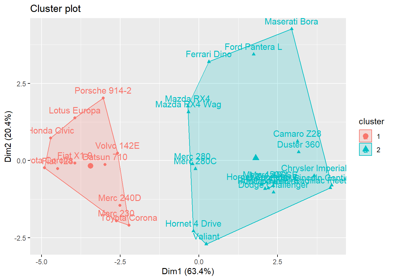
Above, we are using the fviz_cluster command and we are giving it the following arguments:
k2– This is the clustering object that we created before that we want to now visualize.df– This is the dataset, which we need to remind the computer about again.
Here is a description of what this visualization represents:
This provides a nice illustration of the clusters. If there are more than two dimensions (variables)
fviz_clusterwill perform principal component analysis (PCA) and plot the data points according to the first two principal components that explain the majority of the variance.26
It would be impossible to create a plot of all of the variables in df because we do not have enough axes in our plot for all of the variables. To get around this problem, the fviz_cluster function we used above reduces all of the independent variables into principal components, which are composite variables based on many of the independent variables. In the plot we see above, the first of these principal components, called Dim1 captures 61.8% of the variation in all of the variables in df. The second of the principal components is Dim2 and captures 22.1% of the variation in all of the variables in df. It is not necessary for you to fully understand PCA this week.
6.4.4 Visualizing clusters with standard scatterplots
If we do want to select just two variables and make a scatterplot (instead of using PCA), we can still do that. I will summarize but not fully explain this procedure, focusing only on the items that you need to modify when you do this with different data. There are many possible ways to do this, two of which are shown below. You can use whichever one is best for your situation and data.
6.4.4.1 Scatterplot version 1
Here is how you can adapt the code below for your own use:
df– change all instances ofdfto the name of the dataset that you are using.k2– change this to the name of the stored k-means object that you created before.mpg, hp– change these two variables to the names of the variables that you want to include in your own scatterplot.
if (!require(dplyr)) install.packages('dplyr')
library(dplyr)

if (!require(ggplot2)) install.packages('ggplot2')
library(ggplot2)
df %>%
  as_tibble() %>%
  mutate(cluster = k2$cluster,
         car = row.names(df)) %>%
  ggplot(aes(mpg, hp, color = factor(cluster), label = car)) +
  geom_text()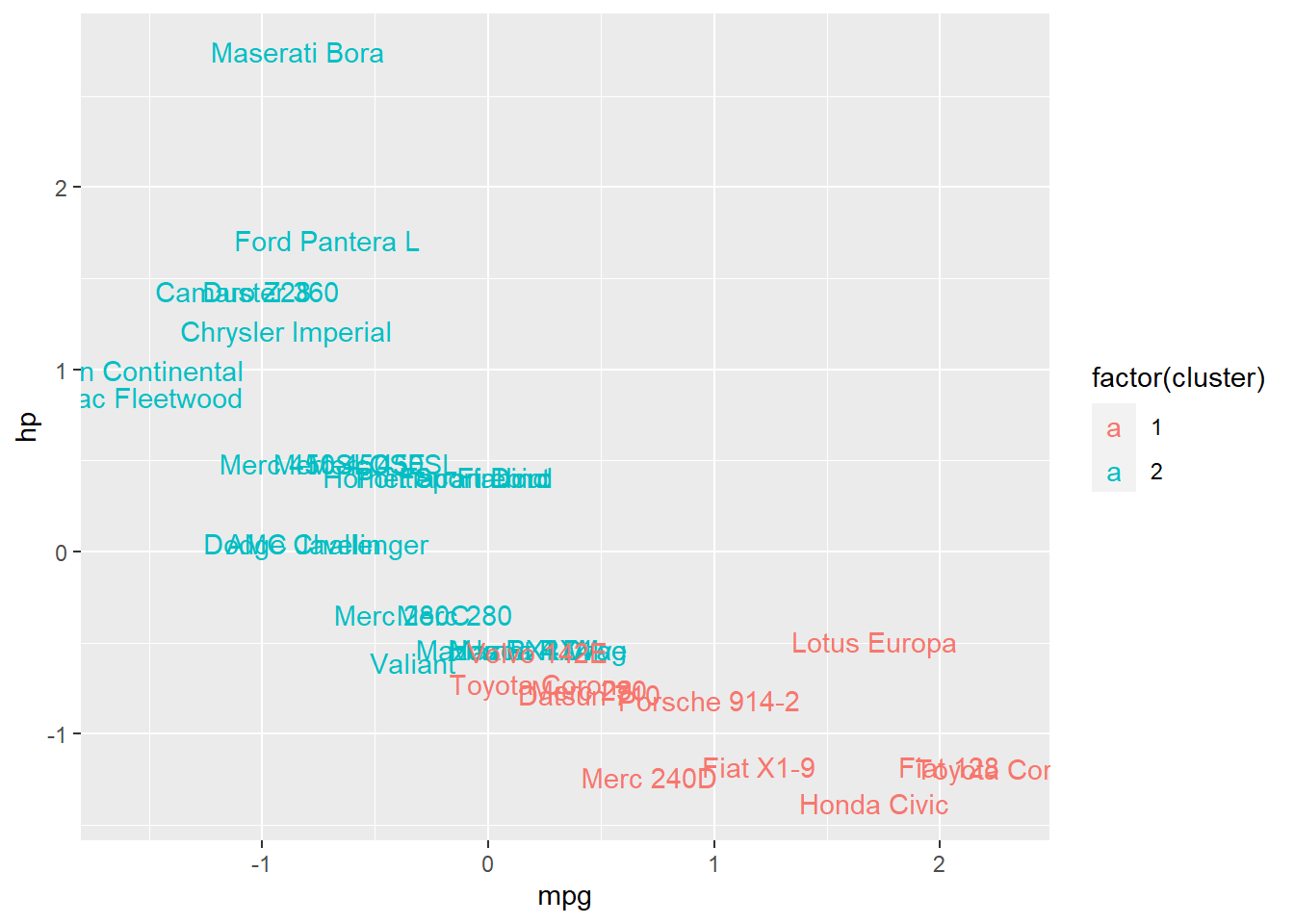
Above, we see an ordinary scatterplot showing hp plotted against mpg, with the following additions:
- Points have been replaced by the names of each observation (names of cars, in this situation).
- Each observation is colored according to its cluster membership.
The scatterplot shows us that overall, the clusters help us differentiate between cars pretty well, in this case at least!
6.4.4.2 Scatterplot version 2
This is a simpler scatterplot which does not include a label for each observation, which may be desirable if you do not have a need for labels or if you have a large number of observations (in which case labels would cause clutter).
First, we create a categorical variable identifying each observation’s cluster:
df$cluster <- as.factor(df$`k2$cluster`)Next, we make the scatterplot.
Here is how you can adapt the code below for your own use:
- Change
dfto the name of your data set. - Change
mpgto your desired X variable. - Change
hpto your desired Y variable. - Change
clusterto your variable that identifies each observation’s cluster (this might remain as being calledclusterif you use the code used above; you do not necessarily need to change this).
if (!require(ggplot2)) install.packages('ggplot2')
library(ggplot2)

ggplot(df,aes(mpg,hp,color=cluster))+geom_point()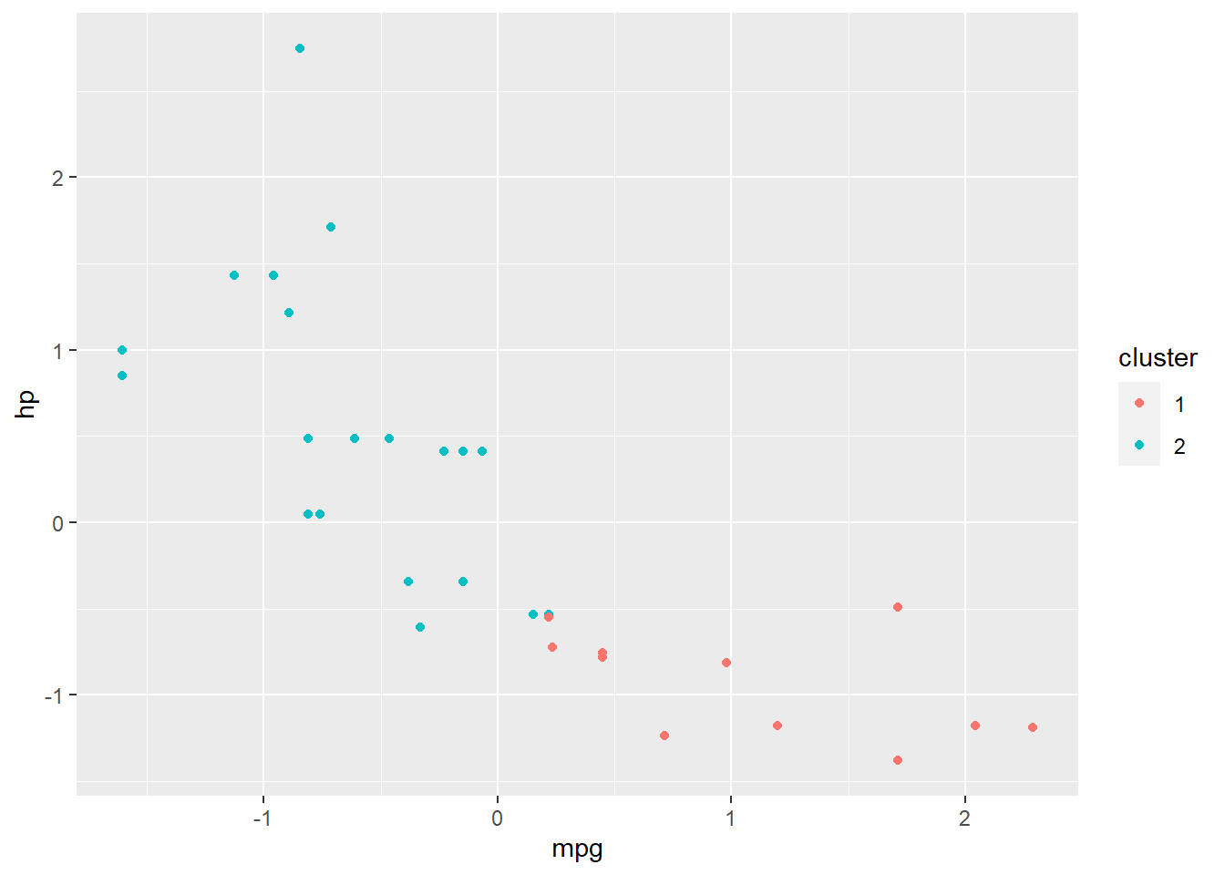
Above, you can see that we have a standard scatterplot with plotted points. Each point’s color is determined according to which cluster it belongs to (from the k-means clustering that we already conducted).
A slight modification to the scatterplot above is here:
ggplot(df,aes(jitter(mpg),jitter(hp),color=cluster))+geom_point()
The results are not shown, but you can run it on your own computer and see the result. The change we made is that we took both the X variable (mpg) and the Y (hp) variable and we changed them to jitter(mpg) and jitter(hp). This tells the computer to slightly modify where the dots (points) are plotted, such that you can more easily see dots that have the same coordinates as each other.
6.4.5 Visualize clustering results with box plots
A box plot might also be useful to help look at how our clusters might have split up our data.
Here is an example:
boxplot(mpg ~ cluster, data = df)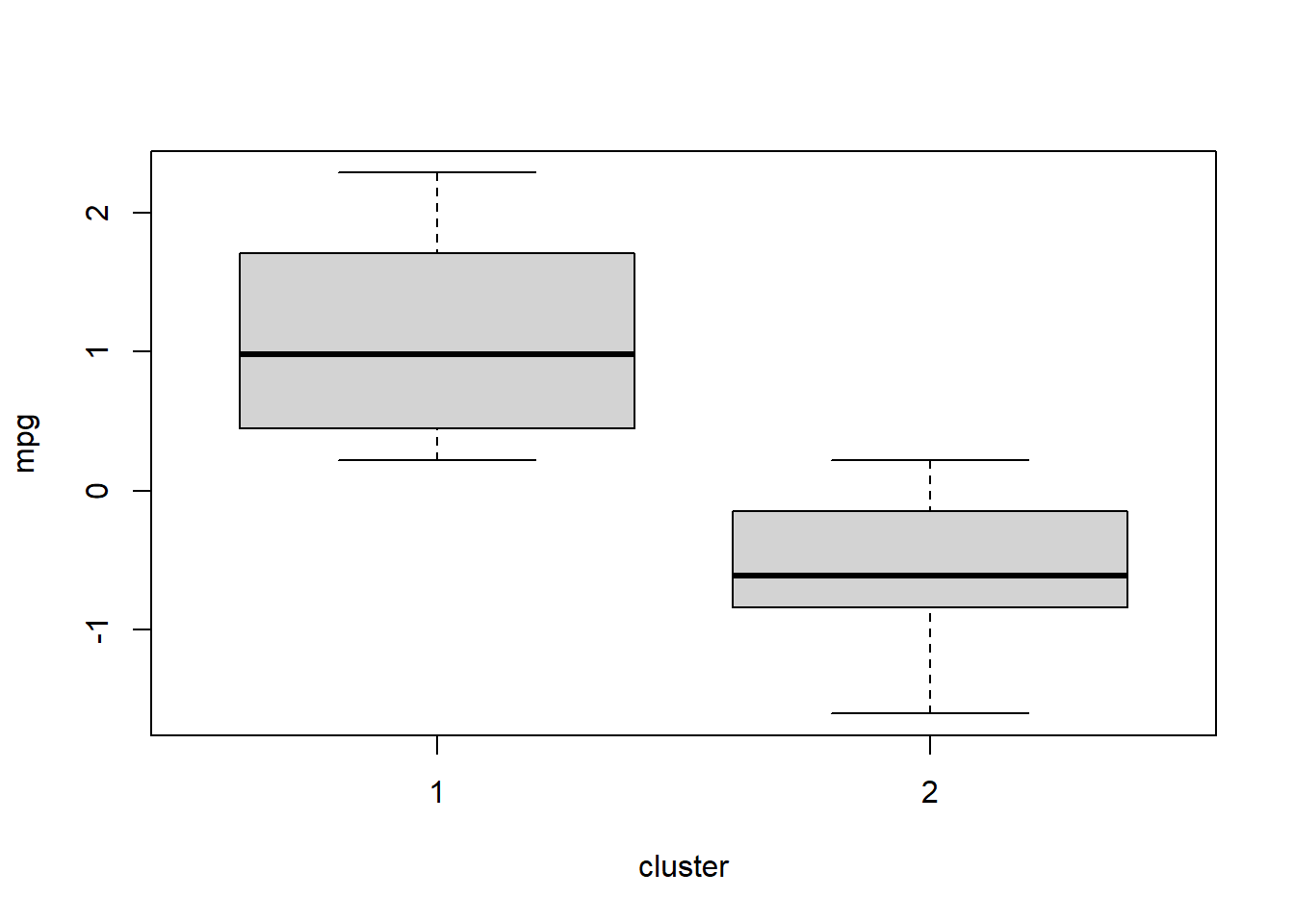
Above, we visualize the distribution of the variable mpg separately for the observations (cars, in this case) in each cluster.
We can repeat this with a different variable by changing mpg in the code to carb:
boxplot(carb ~ cluster, data = df)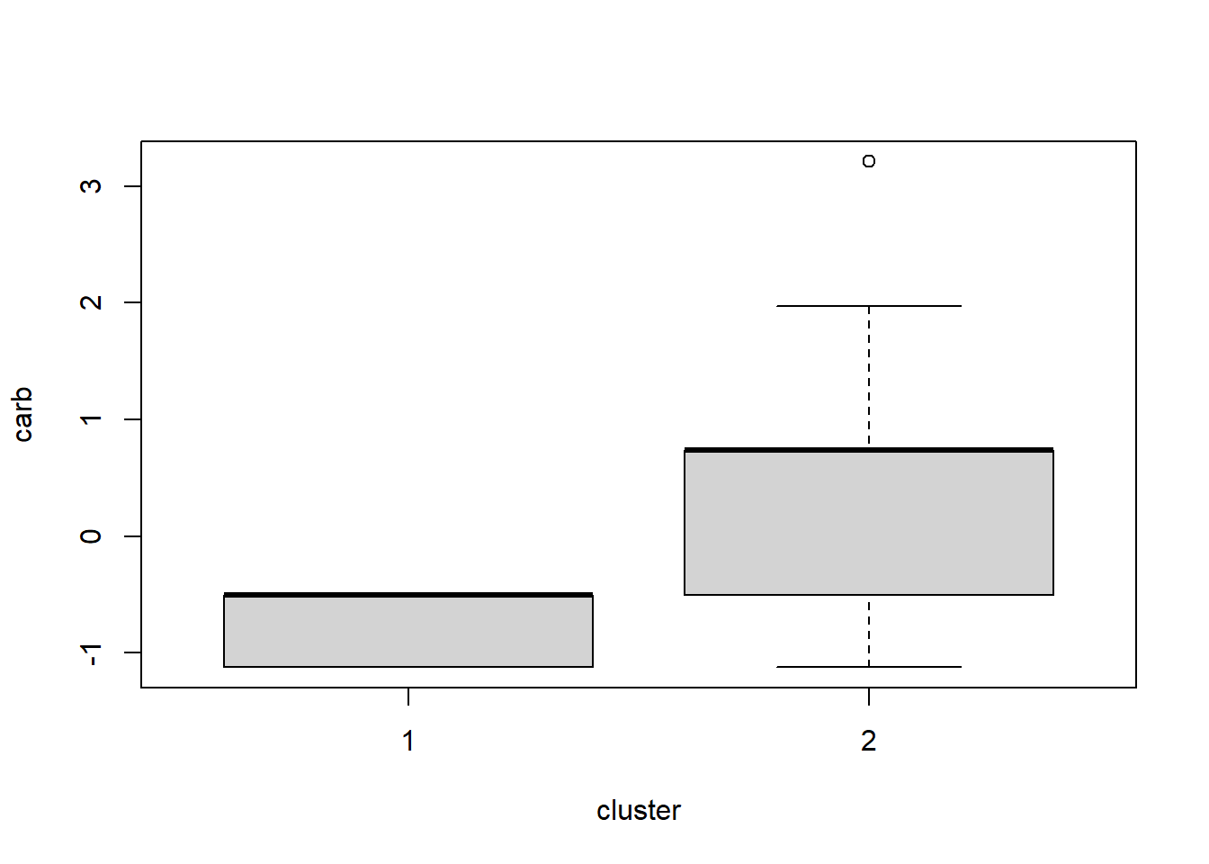
In the two plots above, we see that observations (cars, in this case) have fairly different mpg measurements when comparing clusters 1 and 2 (the only two clusters). But the carb measurements are not as different when comparing the two clusters. Box plots are a convenient way to quickly look across groups (clusters, in this case) within your data.
If you made more than two clusters, note that more than two boxes should appear!
6.4.6 “Visualize” cluster results with tables
Typically, scatter and box plots will be most useful. However, if you are using dummy (binary) variables, a simple table can often be the simplest way to inspect results and look for patterns.
Below, we make a two-way table with the dummy variable am and the cluster membership (saved as the variable cluster) of each observation:
with(df,table(am,cluster))## cluster
## am 1 2
## -0.814143075490065 12 7
## 1.18990141802394 2 11Above, we see at least a hint of some noteworthy patterns. Out of the 13 cars that have am coded as 127—meaning that they have manual transmission—11 of these cars belong to cluster 1 and only 2 of these cars belong to cluster 2. Cars with automatic transmission are more evenly spread out between the two clusters that were created.
If we had made three clusters instead of two, three columns would have appeared in the table above instead of two.
6.4.7 Three clusters – k-means
Below is all the code that you already saw above, but changed so that we make three clusters instead of two. The outputs are not shown but you can run it all in R on your own computer to see the results.
df <- mtcars
df <- scale(df)

k3 <- kmeans(df, centers = 3)

k3

View(k3$cluster)

df$k3.clusters <- as.numeric(k3$cluster)

View(df)

fviz_cluster(k3, data = df)


if (!require(tidyverse)) install.packages('tidyverse')
library(tidyverse)

if (!require(ggplot2)) install.packages('ggplot2')
library(ggplot2)

df %>%
  as_tibble() %>%
  mutate(cluster = k3$cluster,
         car = row.names(df)) %>%
  ggplot(aes(mpg, hp, color = factor(cluster), label = car)) +
  geom_text()
6.4.8 How many clusters are best? – elbow method
There are multiple ways to determine how many clusters are the best number to use when doing k-means clustering. We will learn just one of these methods, called the elbow method.
You can read about and find the code to execute other methods in the K-means Cluster Analysis28 reading, which is optional (not required).
One of the most important metrics of error in k-means clustering is the within-clusters sum of squares (WSS). This is a measure of how dispersed—or far apart—all of the data points within each cluster are.29 We don’t want them to be too far apart from each other. If the data points within a single cluster are too far apart from each other, maybe they should just be divided into two clusters. Looking at the WSS for many different numbers of clusters helps us decide on an optimal number of clusters to use.
The fviz_nbclust command below plots the WSS for many different numbers of clusters. Here is what we are giving to the fviz_nbclust function:
df– The dataset that we are using for clustering analysis.kmeans– The method of clustering that we are using.method = "wss"the error metric we want to use. In this case, we have specifiedwss, meaning the same WSS that is described above.
Once receiving these instructions, the fviz_nbclust function does the same k-means process that we did above for 2 and then 3 clusters. And then it does many more numbers of clusters. It records the WSS each time it does this. Then it plots the WSS against the number of clusters, as you can see below.
fviz_nbclust(df, kmeans, method = "wss")
You can see that when we get down to about four clusters, we are really not reducing the WSS much at all with each additional cluster we add. Four clusters might be optimal. You could also argue that 4 isn’t much better than 3, and 3 isn’t much better than 2! Two clusters might possibly be appropriate for this dataset.
This is called the “elbow method” of determining the optimal number of clusters because the curve is shaped like a human’s upper arm, elbow, and then lower arm. The optimal number of clusters lies in the elbow region of the curve, which in this case is in the range between 2 clusters and 4 clusters.
You have now reached the end of the new content for this week. Now it is time to get started on the assignment below.
6.5 Assignment
In this week’s assignment, you are required to answer all of the questions below, which relate to In this assignment, you will practice running unsupervised machine learning and k-means clustering on a dataset of your choice. You will also practice interpreting the results. Please show R code and R output for all questions that require you to do anything in R. It is recommended that you do your work in an RMarkdown file and then submit this assignment as an HTML, Word, or PDF file that is “knitted” through RStudio.
If you have data of your own, I strongly recommend that you use it this week. Unsupervised machine learning is a great way to learn new things about your own data. You can just do all of the tasks described below with your own data. Feel free to take help from instructors as you do this.
If you do want to use data provided by us (the instructors), you should again use the student-por.csv dataset that we have used before. This is in D2L, if you don’t already have it downloaded. You can also get it from here:
- UCI Machine Learning Repository. Center for Machine Learning and Intelligent Systems. https://archive.ics.uci.edu/ml/datasets/Student+Performance. Download the file student.zip. Then open the file student-por.csv to see the data; this is the file you should load into R.
Here’s how you can load the data into R and make sure all variables are numeric:
df_original <- read.csv("student-por.csv")

if (!require(fastDummies)) install.packages('fastDummies')
library(fastDummies)
df <- dummy_cols(df_original, remove_first_dummy = TRUE,  remove_selected_columns = TRUE)
6.5.1 Discussion board reply
Before you do the rest of this week’s assignment—related to unsupervised machine learning—we would like you to revisit the discussion forum from last week.
Task 1: Write a 100-word response or more to at least one discussion post written by a classmate of yours in the Week 5 discussion board.
6.5.2 Prepare your data
Now you will begin the process of analyzing your data using unsupervised machine learning. As a first step, you will prepare the data for further analysis and also practice using the distance formula by hand.
Task 2: Conduct all data preparation steps that you think are necessary for you to do to your data before you run distance calculations and k-means clustering analysis. Be sure to make all variables numeric that are not.
6.5.3 Practice calculating distances
In this part of the assignment, you will calculate a distance matrix for your data and identify observations that are “close” and “far” from each other.
Task 3: Calculate the distance between the following two points, called A and B:
| point | w coordinate | x coordinate | y coordinate | z coordinate |
|---|---|---|---|---|
| A | 8 | 7 | 6 | 5 |
| B | 4 | 3 | 2 | 1 |
Show all of your calculation work and the final answer. Remember that a coordinate is like a variable. A point is like an observation in your data set.
Task 4: Calculate a distance matrix for the data you are using for this assignment.
Task 5: In the viewer, look at the distance matrix you created. What are the highest and lowest distances that you can see between observations? You do not need to find the exact highest and lowest distances. Just after glancing at the matrix for a minute or two, what are the highest and lowest values you see? If you want, you can also use the code given earlier in the chapter to find the minimum and maximum distances, but you should also spend some time manually looking at the distance matrix in the viewer.
Task 6: Choose two observations (students, in the case of the student-por.csv data) in the data that are very “close” to each other in distance. Do they have similar final grades (choose a different outcome to look at if you’re using your own data)?
Task 7: Choose two observations in the data that are very “far” from each other in distance. Do they have different final grades (choose a different outcome to look at if you’re using your own data)?
Task 8: Make a visualization showing the distances between the observations. This visualization may not be useful if your data has a large number of observations. But still, see what happens when you try to make one!
6.5.4 k-means clustering
Now it’s time to make some clusters with our data! You will use k-means clustering, as demonstrated earlier in this chapter. However, we will change the order in which we do things a little bit, as you’ll see below.
Task 9: For the data you’re using for this assignment, start off by identifying the ideal number of clusters. Make a plot and use the “elbow method.”
Task 10: Create clusters in the data, using k-means clustering and the number of clusters that you found to be optimal.
Task 11: Add the clusters as a variable back into the original—unstandardized/unscaled—dataset.
Task 12: Inspect the dataset (now with the clusters added), using the View(df) command, replacing df with the name of your dataset. Pick a single cluster to focus on. Look at some of the observations that fall into that single cluster. In what ways are these observations similar or different? You may also want to look back at the unstandardized/unscaled version of the dataset to do this. The scatter and box plots that you are asked to make later in the assignment might help you answer this question.
Task 13: Make a visualization that uses PCA to plot your clusters.
It is good to have a sense for which variables are helping you create your clusters and which ones are not helping as much. The following tasks are meant to help you practice this process.
When you make the scatterplots in the following tasks, I recommend that you try making them with and without the jitter() option described in the chapter, to see which version helps you visualize your data the best.
Task 14: Choose two variables in the dataset that you feel are important in differentiating among observations. Make a scatterplot that plots these two variables for all observations and shows the separate clusters.30 How much do the clusters overlap, when looking at just these two variables? Ideally they should not overlap much. You can try multiple combinations of variables until you get two that don’t have much overlap in the clusters. These variables are fairly important in differentiating between observations.
Task 15: Choose two variables in the dataset that you feel are not that important in differentiating among observations. Make a scatterplot that plots these two variables for all observations and shows the separate clusters.31 How much do the clusters overlap, when looking at just these two variables? Ideally there should be some overlap. You can try multiple combinations of variables until you get two that have some overlap in the clusters. These variables are less important in differentiating between observations.
Task 16: Try to make a box plot that shows one of your data set’s variables that are different when comparing across clusters. If you are using a dummy (binary) variable, make a table instead of a box plot.
Task 17: Try to make a box plot that shows one of your data set’s variables that are similar when comparing across clusters. If you are using a dummy (binary) variable, make a table instead of a box plot.
6.5.5 Conclusions
Finally, you will practice drawing some conclusions this week from the analysis you have just completed in the previous tasks.
Task 18: What conclusions can you draw from the unsupervised analysis you just conducted?
Task 19: What did you learn about the data that was new?
Task 20: What did you already suspect about the data that was supported/confirmed?
6.5.6 Follow-up and submission
You have now reached the end of this week’s assignment. The tasks below will guide you through submission of the assignment and allow us to gather questions and feedback from you.
Task 21: Please write any questions you have this week (optional).
Task 22: Write any feedback you have about this week’s content/assignment or anything else at all (optional).
Task 23: Submit your final version of this assignment to the appropriate assignment drop-box in D2L.
This is example is just for illustrative purposes. In this example, we are pretending that the world is flat or that the balloons are in the same town. This wouldn’t work if the balloons were farther apart, because of the earth’s curvature.↩︎
We would have to convert all of the three metrics to the same units—like meters—first.↩︎
This article shows a few other ways to calculate distances: K-means Cluster Analysis. UC Business Analytics R Programming Guide. https://uc-r.github.io/kmeans_clustering.↩︎
This code appears to ignore the diagonal of zeroes in the
distancematrix.↩︎K-means Cluster Analysis. UC Business Analytics R Programming Guide. https://uc-r.github.io/kmeans_clustering.↩︎
K-means Cluster Analysis. UC Business Analytics R Programming Guide. https://uc-r.github.io/kmeans_clustering.↩︎
The 1 was changed to 1.19 after scaling the data.↩︎
K-means Cluster Analysis. UC Business Analytics R Programming Guide. https://uc-r.github.io/kmeans_clustering.↩︎
More specifically, WSS is calculated by taking the center coordinate of all points in a cluster and then seeing how far apart all points are from that center coordinate. It is not required for you to understand WSS with such a high level of detail.↩︎
You can use any one of the scatterplot options demonstrated earlier.↩︎
You can use any one of the scatterplot options demonstrated earlier.↩︎