Chapter 8 Laboratory 3: Water Quality
8.1 Introduction
In recent lectures, we have discussed hydrology – the physical processes governing where water is and how it moves through the environment. Understanding water quality is a critical component of hydrology. The purpose of this lab is for you to use open access hydrological data, in order to become familiar with how water quality is assessed. The focus of this lab will be on water quality assessments undertaken within Ontario, by multiple governmental organizations.
The main learning objective of this lab is for students to 1) become familiar with identify government sources of environmental information; 2) learn how to read and interpret water quality data (with a focus on phosphorus concentrations); and 3) understand the limits and shortcoming of our current water quality monitoring programs in Canada.
Common chemical properties often evaluated in studies of water quality include nutrient concentrations, pH, electrical conductivity, and hardness. Nutrients are elements – for example phosphorus (P), the focus of our assignment here – or nitrogen (N)-based compounds (e.g., such as nitrate NO3-) that are consumed by organisms and are required for growth and survival of plants and animals.
Phosphorus in particular, is an essential nutrient needed for plant growth. As a result, P is one of the most common fertilizers used by humans on Earth, for the purposes of agriculture. Yet while additional P is beneficial for plant growth and yield, too much P can be detrimental for water quality. For instance, excessive P that comes from agricultural run-off – i.e., the P in fertilizers that is not captured by plants, but instead washes into rivers, streams, lakes, and groundwater during rainstorms – can trigger enhanced eutrophication: the process by which freshwater bodies are starved of oxygen, due to excessive algae growth.
In this lab, we will evaluate the state of P concentrations in Ontario’s rivers, lakes, and groundwater. We will use three different data sources, to 1) evaluate how much P is in different freshwater systems in Ontario, 2) understand the strengths and limitations of water quality monitoring in Ontario.
Assignment 3 is 21 marks total – worth 15% of your final grade.
Please submit a pdf version of your assignment on Quercus under “Lab 3 submission”. Your lab 3 assignment is due by Friday November 6, 4:00 pm.
8.2 Procedure for Laboratory 3 - Part 1/3: Phosphorus concentrations in Ontario’s rivers
Part 1 data instructions: our first assessment will evaluate concentrations of P in four different streams/ rivers throughout Ontario.
Visit the Government of Ontario’s Provincial Stream Water Quality Monitoring Network Data portal.
Here, click on the “Stream water quality map” link.
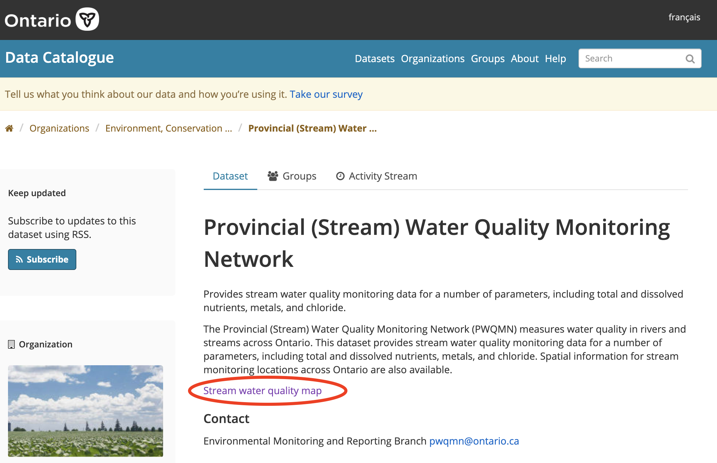
Figure 8.1: Government of Ontario’s Provincial Stream Water Quality Monitoring Network Data portal. Please click ‘Stream water quality map’.
- A map will open showing all of the sites where the Government of Ontario has water quality monitoring stations; some of these are active (in blue), while some are inactive (in gray).
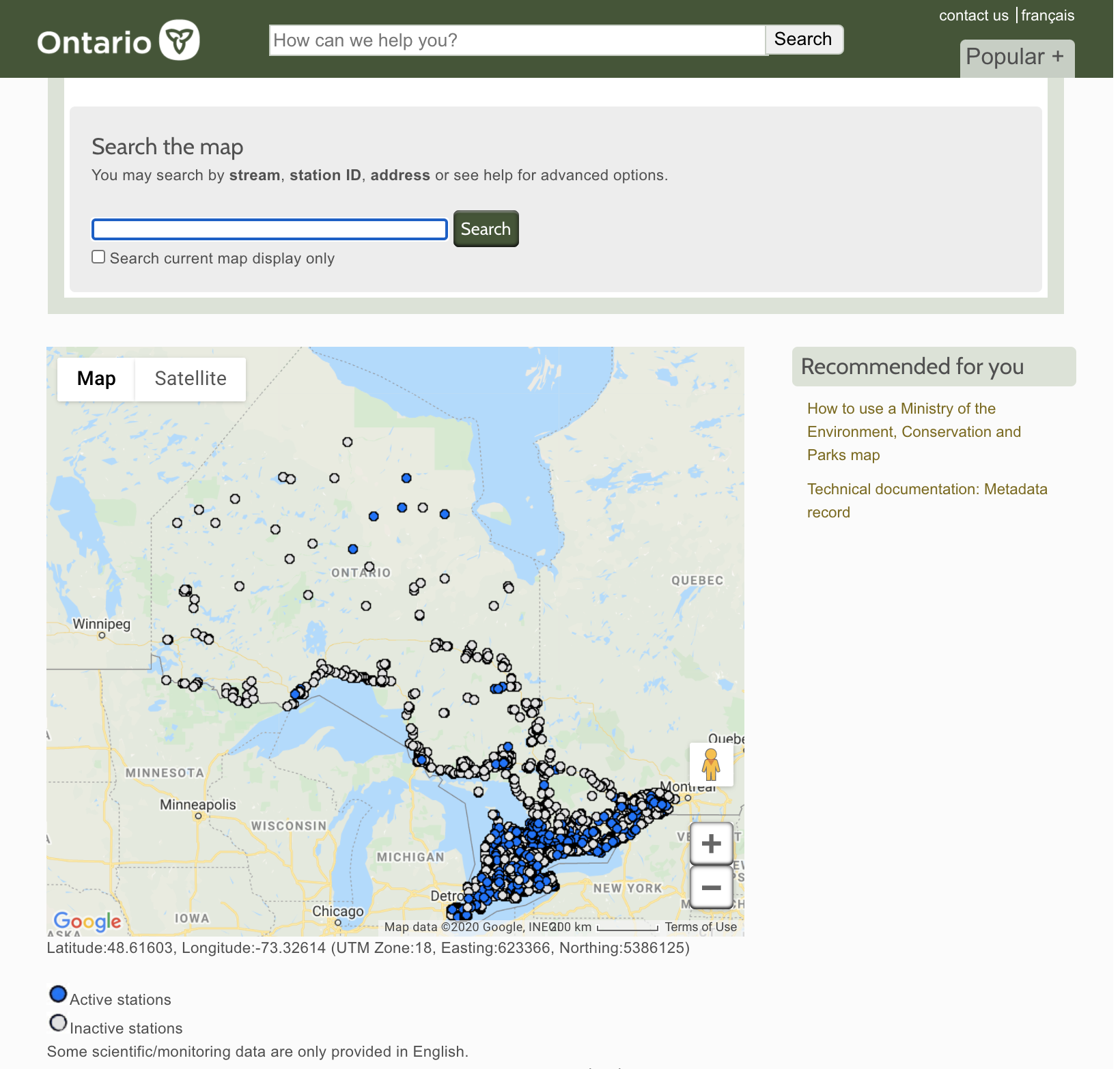
Figure 8.2: A map of Ontario’s water quality monitoring stations.
- Our analysis will entail locating the following four sites. To find these first three locations, scroll over the map. You will note that the Latitude and Longitude values at the bottom of the map change. Based on these values, locate the following three stations (it is easier if you copy and paste the ‘Station ID’ into the ‘Search the map’ search bar above), and add in the fourth based on your own interests:
The site closest to UTSC:
Station ID: 06009701102
Stream: Rouge River
Location: Twyn Rivers Dr, Scarborough
Latitude 43°48’39“N, Longitude 79°9’35”WA site close to densely population areas in the Greater Toronto Area:
Station ID: 06008301902
Stream: Humber River
First Year Sampled: 1979, Last Year Sampled: 2016
Latitude 43°39’5“N, Longitude 79°29’29”WA site close to “natural vegetation” in northern Ontario:
Station ID: 03013302302
Stream: South River
Location: Hwy 11, South River
Latitude 45°50’55“N, Longitude 79°22’47”WAn active site of your choosing.
For each of these stations individually, record the sampling information for each one (i.e., when is data available for).
Then, click on the “Phosphorus” tab at the top. This will bring up a graph of the P concentrations in this particular sampling site. Save these graphs. Note: You need to click on the red pin/locator icon on the map (see Figure 8.3) for a new interface to come up, and then select “Phosphorus”. From here, you can copy or save the map directly with a right click (see Figure 8.4).
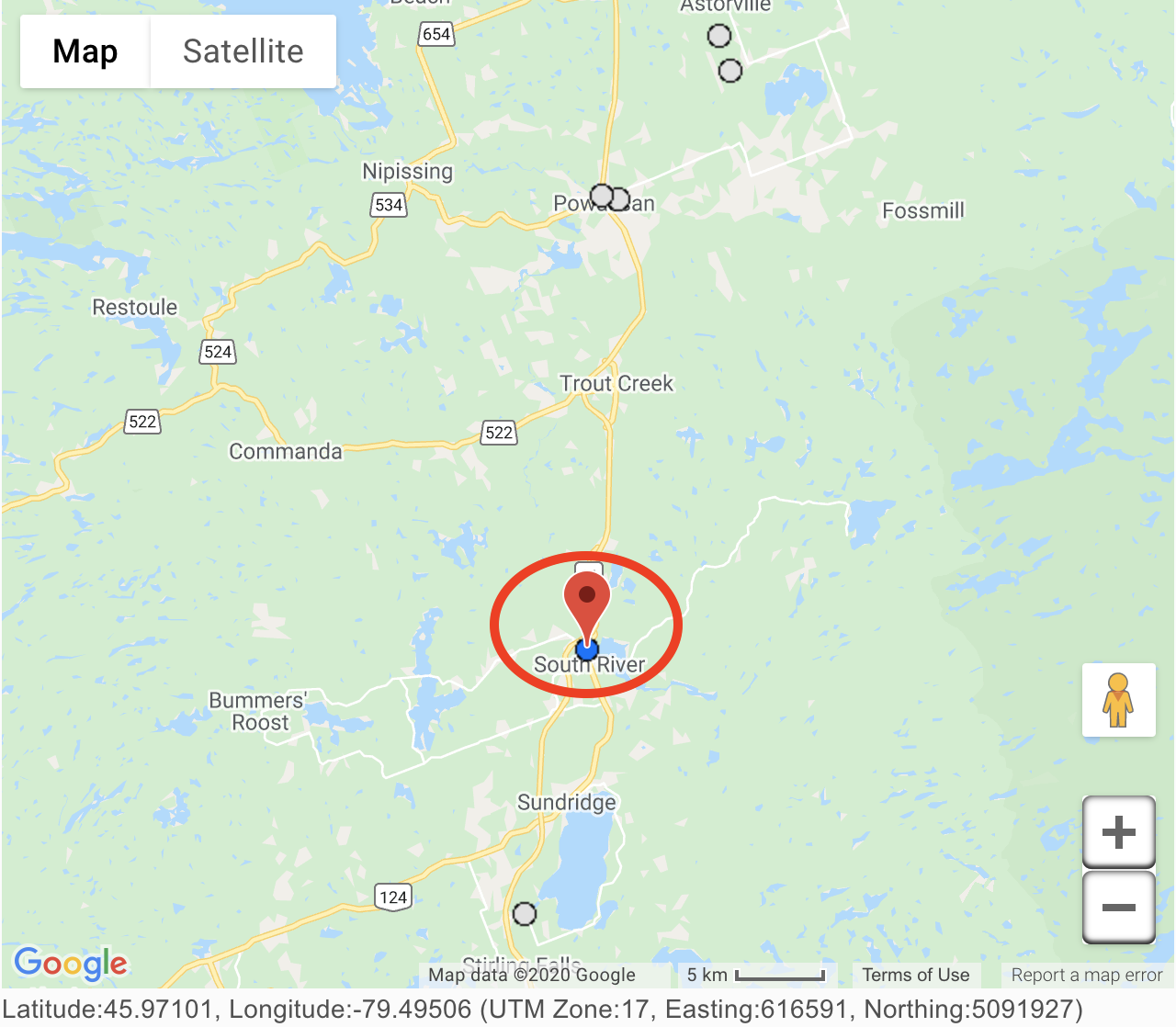
Figure 8.3: Please click on the red pin drop.
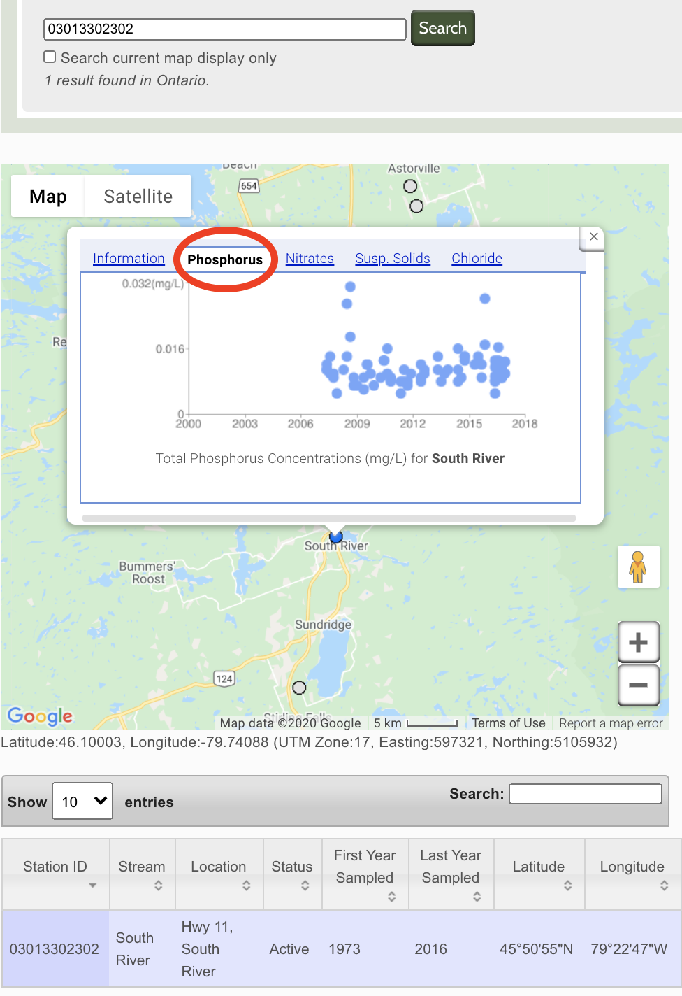
Figure 8.4: Select the ‘Phosphorus’ tab. You can then right click and select ‘Copy Image’, or ‘Save Image As…’
8.3 Part 1 Assignment Questions
Question 1.1: Create a table in Microsoft Word that presents the following information: 1) the station ID; 2) the Stream name; 3) Latitude and Longitude; and 4) First year sampled; and 5) Last year sampled. This data table also should include a brief (i.e., one- or two sentence) title. (1 mark).
Question 1.2: Create a 2x2 table in Microsoft Word. Within these four different cells, paste all four of your downloaded maps. (1 mark).
Question 1.3: Explain what these graphs are telling us, about how water quality and P concentrations differ among these different stations. What are the likely reasons for these differences? Your answer here should be roughly 7-8 sentences in length. (3 marks).
Question 1.4: Explain why you chose the fourth site. What was particularly interesting (either scientifically or personally) about this site? (0.5 mark)
8.4 Procedure for Laboratory 3 - Part 2/3: Phosphorus concentrations in Ontario’s lakes
Part 2 data instructions: our second assessment will evaluate concentrations of P in four different lakes throughout Ontario.
Visit the Government of Ontario water quality in local lakes data portal.
Here, click on the “interactive map” link.
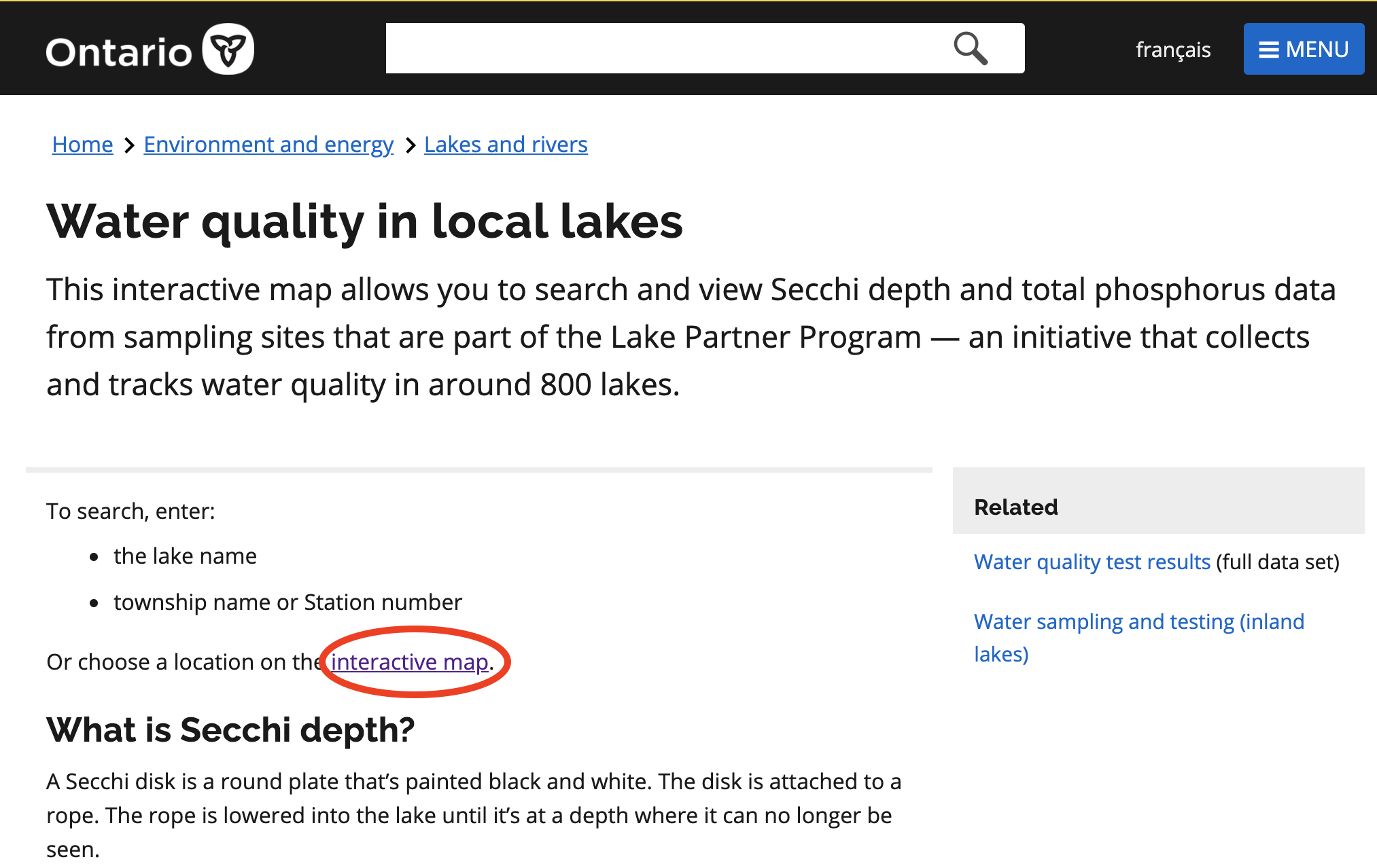
Figure 8.5: Government of Ontario water quality in local lakes data portal. Please click ‘interactive map’.
- A map will open showing all of the sites where the Government of Ontario has water quality monitoring stations on lakes (green dots).
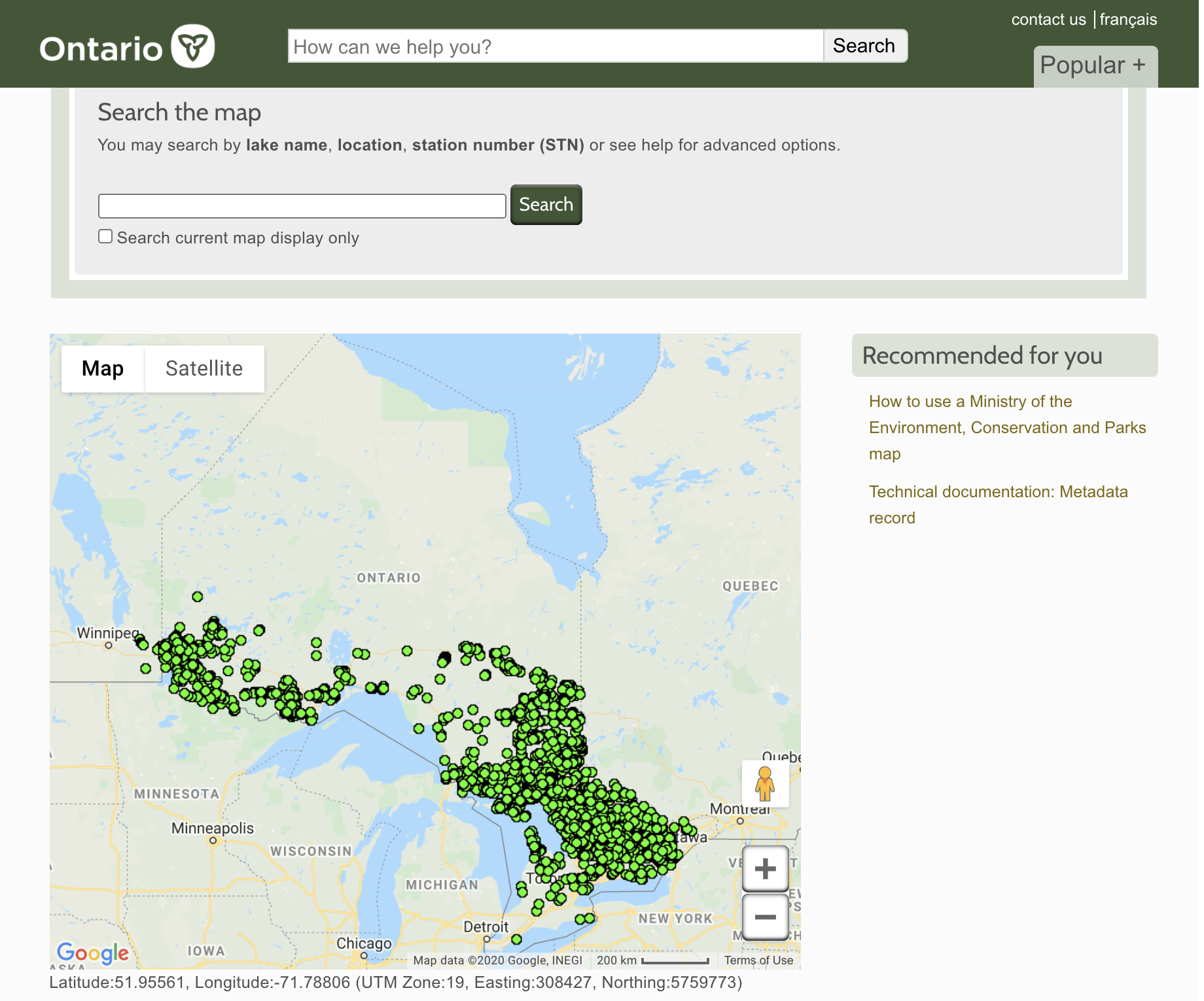
Figure 8.6: A map of Ontario’s water quality monitoring stations on lakes (green dots).
- Our analysis will entail locating the following four lake monitoring sites. To find these first three locations, scroll over the map. You will note that the Latitude and Longitude values at the bottom of the map change. Based on these values, locate the following three stations (it is easier if you copy and paste the lake name into the ‘Search the map’ search bar above, and then find its corresponding Site ID), and add in the fourth based on your own interests:
The Lake Ontario monitoring site closest to UTSC:
Ontario Lake, STN 7103, Site ID 1
Hillier Township
Scarborough Bluffs
Latitude **43°42’18“N** Longitude **79°14’1“W**A site within the densely populated downtown Toronto area:
Grenadier Pond, STN 7065, Site ID 3
Toronto Township
Latitude **43°38’26“N** Longitude **79°27’58“W**A site close to “natural vegetation” in central Ontario, nearby Algonquin Provincial Park:
Canisbay Lake, STN 726, Site ID 1
Canisbay Township
Interactive Chart and Data:
Latitude **45°34’32“N** Longitude **78°35’22“W**A lake monitoring site of your choosing.
- For each of these stations, individually click on the green dot. Then, click on the “Total Phosphorus Concentration” tab that is under the “Interactive Chart and Data” section.
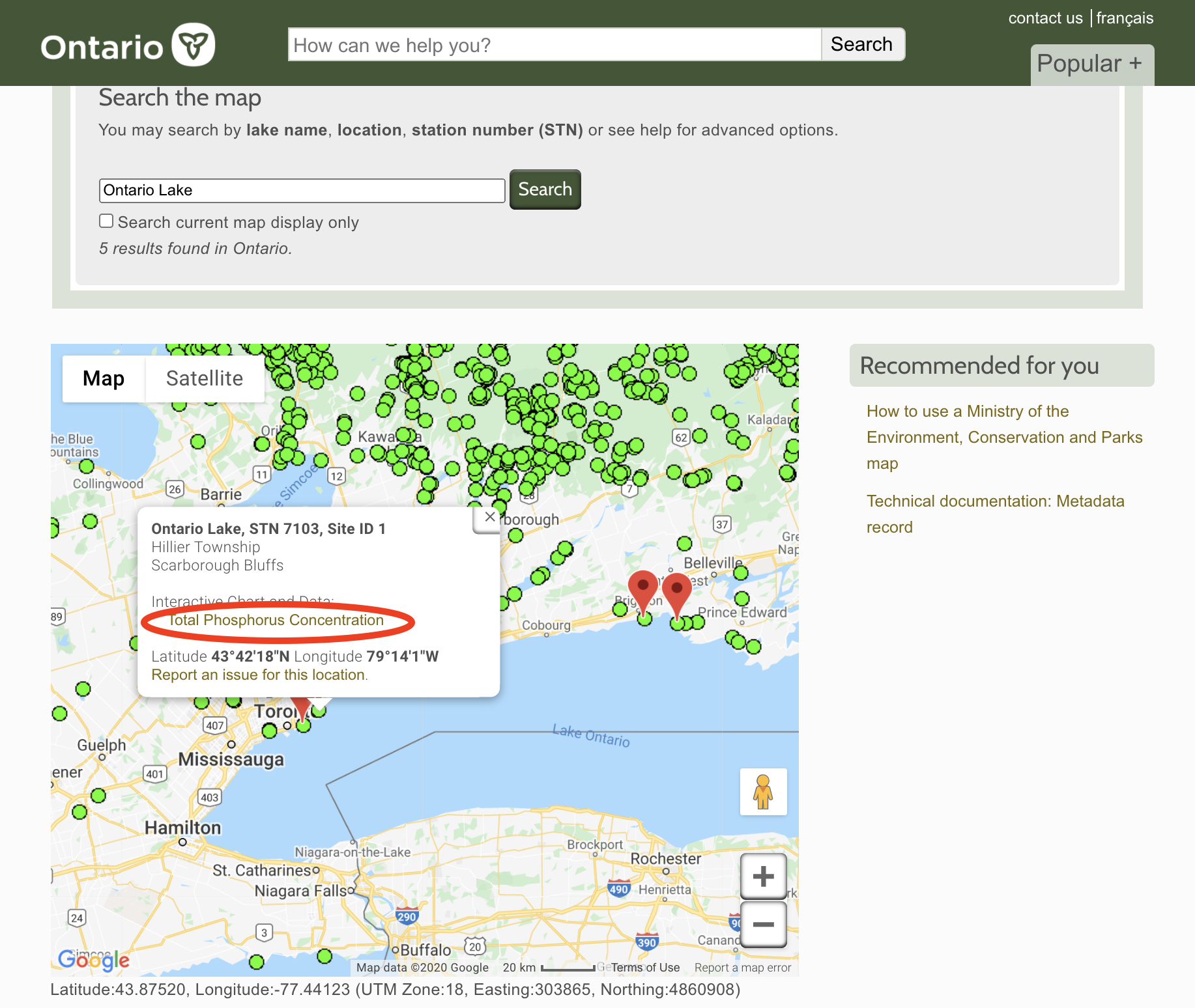
Figure 8.7: Select the ‘Total Phosphorus Concentration’ tab.
- These graphs may take a minute to load, so please be patient. However, a lavendar bar chart will appear with P data for that lake location. Save these graphs by taking a screen shot of them.
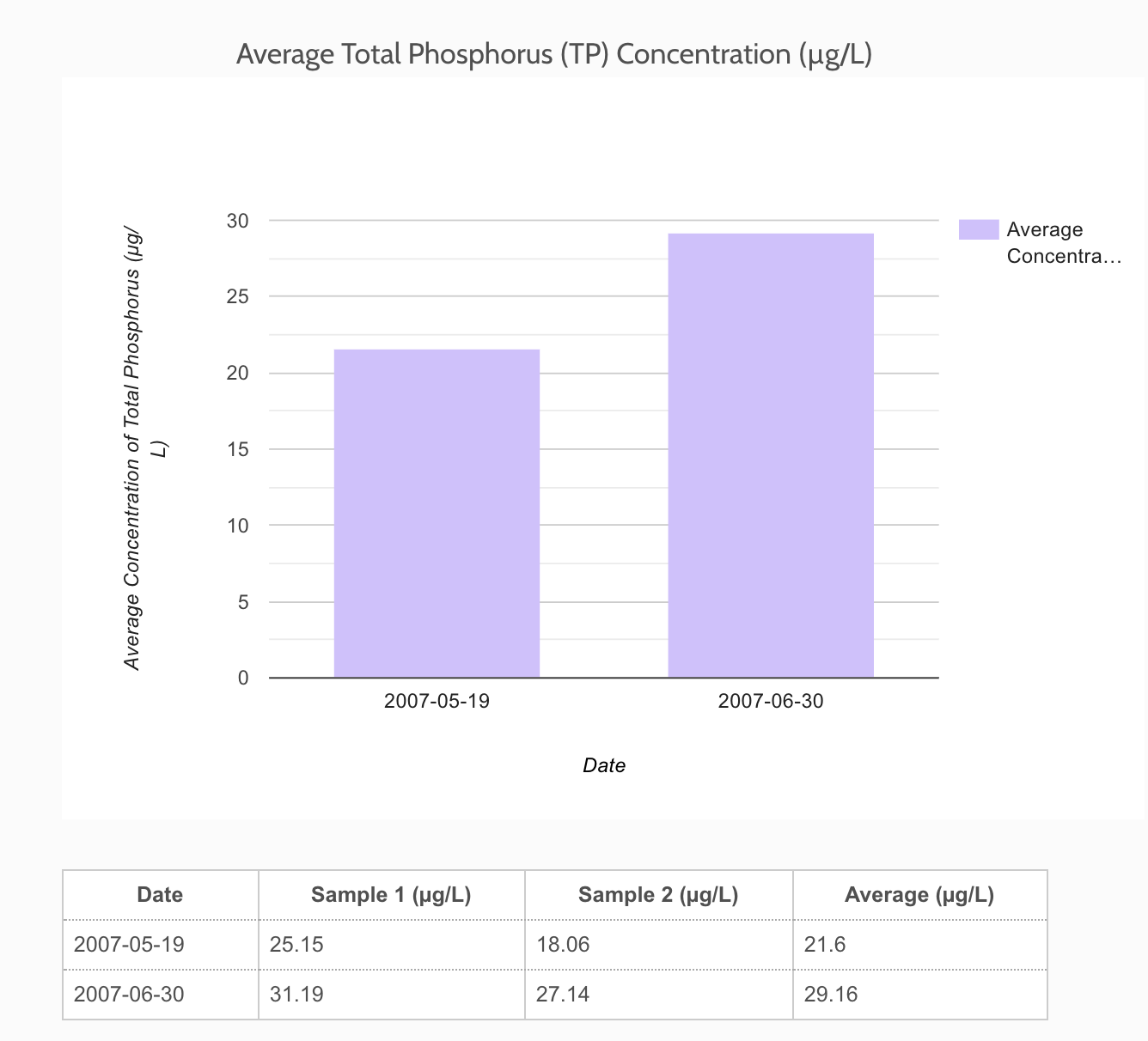
Figure 8.8: An example of what the bar plots look like.
- Note that you can scroll over the bars to reveal the actual values that were measured at that location. This information, and these graphs, will be used to answer the following questions.
8.5 Part 2 Assignment Questions
Question 2.1: Create a table in Microsoft Word that presents the following information: 1) the station ID; 2) the Lake name; 3) Latitude and Longitude; 4) the maximum P concentration observed in the data graph; and 5) the minimum P concentration observed in the data graph. This data table also should include a brief (i.e., one- or two sentence) title. (1 mark).
Question 2.2: Create a 2x2 table in Microsoft Word. Within these four different cells, paste all four of your screen-shot downloaded graphs. (1 mark).
Question 2.3: Explain what these graphs are telling us, about how water quality and P concentrations differ among these different lakes. What are the likely reasons for these differences? Your answer here should be roughly 7-8 sentences in length? (3 marks).
Question 2.4: Explain why you chose the fourth site. What was particularly interesting (either scientifically or personally) about this site? (0.5 mark).
Question 2.5: Across all four of these sites/ graphs/ sets of P data, which lake do you think has the most reliable information for P concentrations? In 4-5 sentences, why do you think this is the case? (2 marks)
8.6 Procedure for Laboratory 3 - Part 3/3: Phosphorus concentrations in Ontario’s rivers, streams, and lakes
Part 3 data instructions:
- Revisit both the stream water quality and lake water quality monitoring sites.
- Once there, revisit the first maps that are brought up when you click the links (i.e., at Step 2 in both the Part 1 Data Instructions, and Part 2 Data Instructions sections above).
- Take a screen shot of both maps, that present the stream and lake sampling sites across all of Ontario.
8.7 Part 3 Assignment Questions
Question 3.1: Create a 1x2 table in Microsoft Word. Within these two different cells, paste both of these screen-shot downloaded graphs. Provide a title for this figure that explains what is being shown in each cell, in as much detail as you can generate. (1 mark).
Question 3.2: Focusing on the stream water quality site map, how are these sampling sites generally distributed across Ontario? In other words, what is the spatial distribution of sampling sites in the province? What are some notable things that “jump” out at you? Your answer should be approximately 4-5 sentences in length. (2 marks).
Question 3.3: Focusing on the lake water quality site map, how are these sampling sites generally distributed across Ontario? What is the spatial distribution of sampling sites in the province? What are some notable things that “jump” out at you? Your answer should be approximately 4-5 sentences in length. (2 marks).
Question 3.4: Based on these maps, what can we say about how sound our understanding of water quality is likely to be, in different parts of Ontario? Your answer should be approximately 3-4 sentences in length. (1.5 marks).
Question 3.5: Why do you think these discrepancies in the spatial coverage of water quality monitoring stations exist across Ontario? Your answer should be approximately 3-4 sentences in length. (1.5 marks).