E Tips on Presenting Graphs
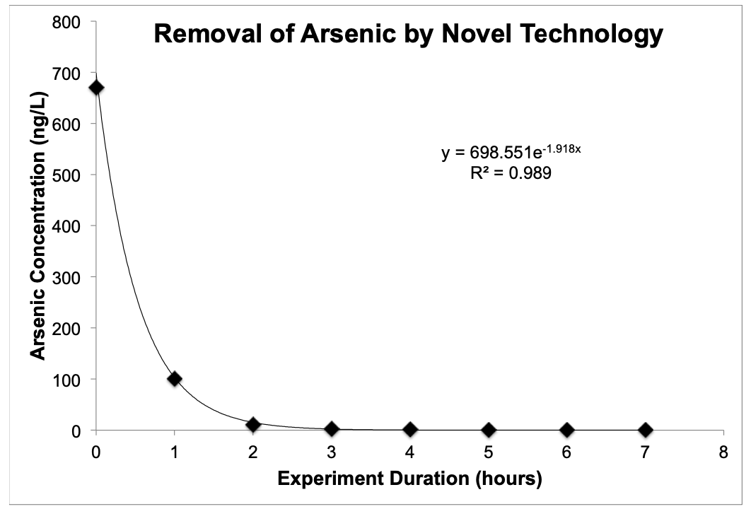
Figure E.1: An example of a nice presentation of data in a graph (data is made up). Every figure should include an informative figure caption.
Key presentation points: - Fonts are large enough to easily read - Graphic has a descriptive title that does not include the word “versus”. - Axes are labeled and include units of measure. - The stupid horizontal lines that are default in Excel are removed. - Equations are included and clearly labeled.