F Tips on Presenting Tables
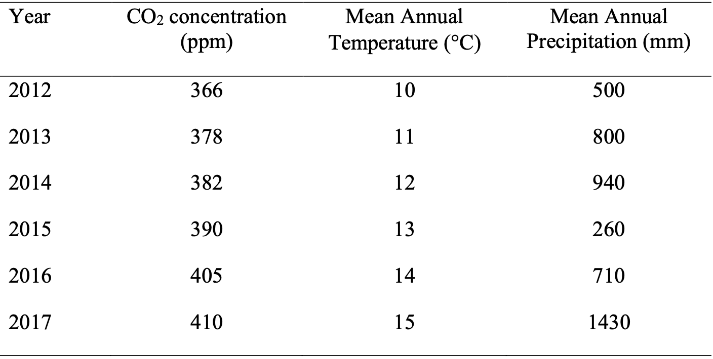
Below is an example of a nice presentation of data in a table (data is made up):

Key presentation points:
- Borders are removed and then only re-added top top, bottom, and below titles.
- Data, except year data in the left-most column are centred.
- Some white space exists.
- Data titles clearly show units.
- Columns have relatively equal widths, where possible.