Chapter 2 Four Motivating Datasets
This chapter aims to whet the appetite for modern surrogate modeling technology by introducing four challenging real-data settings. Each comes with a brief description of the data and application and a cursory exploratory analysis. Domains span aeronautics, groundwater remediation, satellite orbit and positioning, and cosmology. A small taste of “methods-in-action” is offered, focused on one or more of the typical goals in each setting. Together, these data and domains exhibit features spanning many of the hottest topics in surrogate modeling.
For example, settings may involve limited or no field data on complicated physical processes, which in turn must be evaluated with computationally expensive simulation. Simulations might require evaluation on supercomputers to produce data on a scale adequate for conventional analysis. Goals might range from understanding, to optimization, sensitivity analysis and/or uncertainty quantification (UQ). In each case, a pointer to the data files or archive is provided, or a description of how to build libraries (and run them) to create new data from live simulations.
These data sets, or their underlying processes, will be revisited throughout the book to motivate and illustrate methods. Most early examples in subsequent chapters are toy in nature, synthetically crafted to offer a controlled look at particular aspects of novel techniques, at times combining several ideas interlocked in a complex weave. By contrast, the motivating datasets introduced here serve as anchors to the real world, and as delicious treats rewarding triumph over a long slog of arduous development and implementation.
2.1 Rocket booster dynamics
Before the space shuttle program was terminated, the National Aeronautics and Space Administration (NASA) proposed a re-usable rocket booster that could be recovered after depositing its payload into orbit. One project was called the Langley Glide-Back Booster (LGBB). The idea was to have the LGBB glide back to Earth and be cheaply refurbished, rather than simply plummeting into the ocean and becoming scrap metal. Before building prototypes, at enormous expense to taxpayers, NASA designed a computer simulation to explore the dynamics of the booster in a variety of synthesized environments and design configurations. Simulations entailed solving computational fluid dynamics (CFD) systems of differential equations, and the primary study regime focused on dynamics upon re-entry into the atmosphere.
More on the simulations, models, and other details can be found in several publications (Rogers et al. 2003; Pamadi, Tartabini, and Starr 2004; Pamadi et al. 2004). The brief description here is a caricature by comparison, but the data and properties revealed lack no degree of realism or intricacy. The simulator had three inputs which describe configuration of the booster at re-entry: speed (mach), angle of attack (alpha) and side-slip angle (beta). The simulator utilized an Euler solver via Cart3D and, for each input setting, provided six aeronautically relevant outputs describing forces exerted on the rocket in that configuration: lift, drag, pitching moment, side-force, yaw and roll. Circa late 1990s, when LGBB simulations were first being performed, and refined, each input configuration took between five and 20 hours of wall-clock time to evaluate. Larger experimental designs (i.e., comprising many triples of inputs) required substantial effort to distribute over nodes of the Columbia supercomputer.
To build intuition visually, imagine the solver “flying” a virtual rocket booster through a mesh, and forces accumulating at the boundary between booster and mesh. Figure 2.1 shows a virtual rocket booster flying through a mesh customized for subsonic (mach < 1) cases.
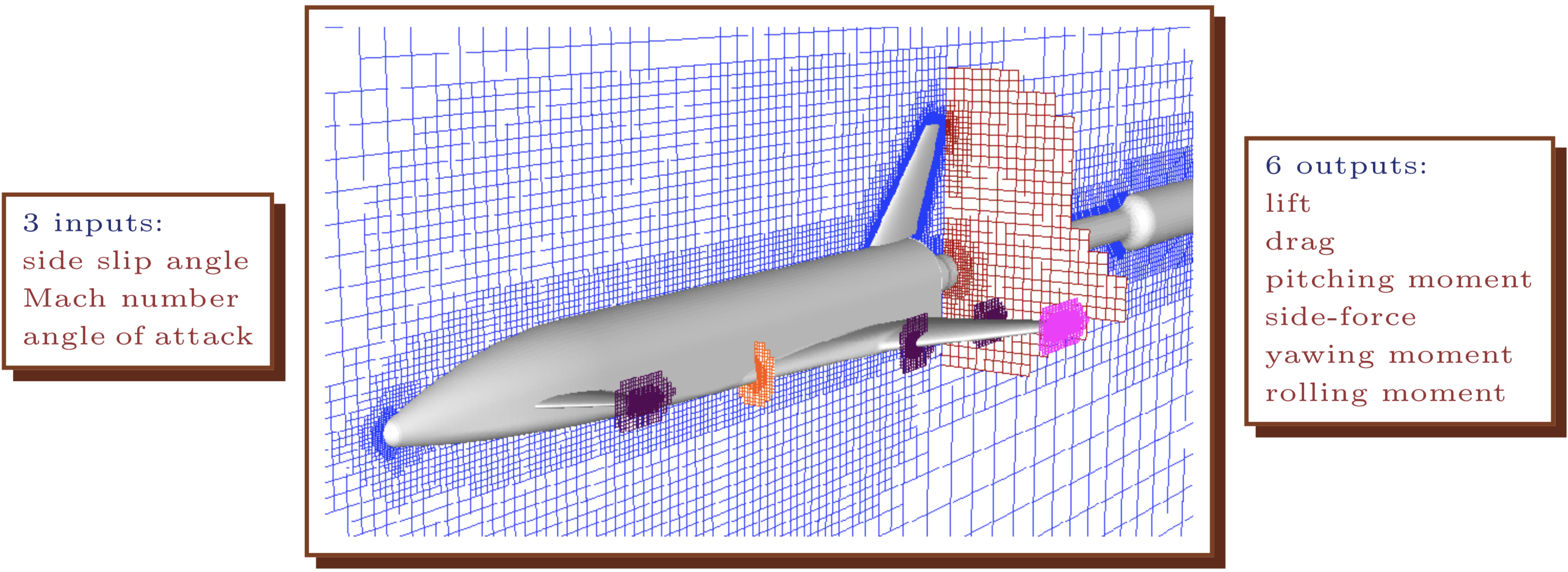
FIGURE 2.1: Drawing of the LGBB computational fluid dynamics computer model simulation. Adapted from Rogers et al. (2003); used with permission from the authors.
2.1.1 Data
There are two historical versions of the LGBB data, and one “surrogate” version, recording collections of input–output pairs gathered on various input designs and under a cascade of improvements to meshes used by the underlying Cart3D solver. The first, oldest version of the data was derived from a less reliable code implementing the solver. That code was evaluated on hand-designed input configuration grids built-up in batches, each offering a refinement on certain locales of interest in the input space. Researchers at NASA determined, on the basis of visualizations and regressions performed along the way, that denser sampling was required in order to adequately characterize input–output relationships in particular regions. For example, several batches emphasized the region nearby the sound barrier, transitioning between subsonic and supersonic regimes (at mach=1).
## [1] "mach"  "alpha" "beta"  "lift"  "drag"  "pitch" "side"  "yaw"
## [9] "roll"## [1] 3167Observe that inputs reside in the first three columns, with six outputs in subsequent columns. All together these data record results from 3167 simulations. Figure 2.2 provides a 2d visual of the first lift response after projecting over the third input beta. Simple linear interpolation via the akima library on CRAN (Akima et al. 2016) provides a degree of smoothing onto a regular grid for image plots. Lighter/whiter colors are higher values. Dots indicate the location of inputs.
library(akima)
g <- interp(lgbb1$mach, lgbb1$alpha, lgbb1$lift, dupl="mean")
image(g, col=heat.colors(128), xlab="mach", ylab="alpha")
points(lgbb1$mach, lgbb1$alpha, cex=0.25, pch=18)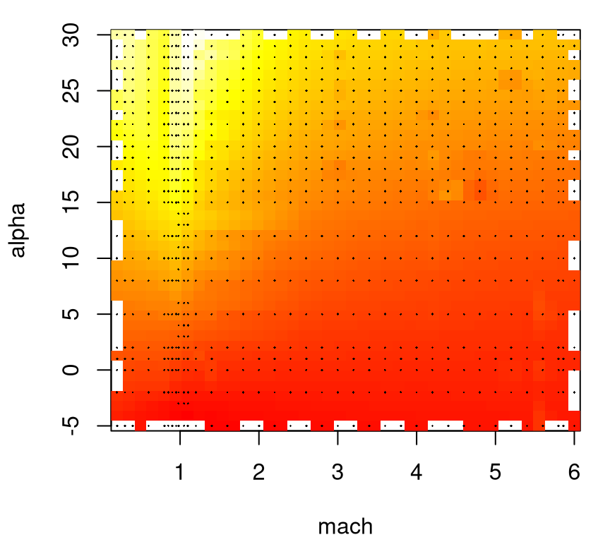
FIGURE 2.2: Heat plot of the lift response projecting over side-slip angle with design indicated by dots.
Projecting over beta tarnishes the utility of this visualization; however, note that this coordinate has relatively few unique values.
##  mach alpha  beta
##    37    33     6
Focused sampling at the sound barrier (mach=1) for large angles of attack (alpha), where the response is interesting, is readily evident in the figure. But working with grids has its drawbacks. Despite a relatively large number (3167) of rows in these data, observations are only obtained for a few dozen unique mach and alpha values, which may challenge extrapolation or visualization along lower-dimensional slices.
Numerical stability is also a concern. To illustrate both grid and numerical drawbacks, consider a subset of these data where alpha == 1. Two variations on that slice are shown in Figure 2.3, one based on beta == 0 in solid-black and another where beta != 0 in dashed-red.
a1b0 <- which(lgbb1$alpha == 1 & lgbb1$beta == 0)
a1bn0 <- which(lgbb1$alpha == 1 & lgbb1$beta != 0)
a1b0 <- a1b0[order(lgbb1$mach[a1b0])]
a1bn0 <- a1bn0[order(lgbb1$mach[a1bn0])]
plot(lgbb1$mach[a1b0], lgbb1$lift[a1b0], type="l", xlab="mach",
  ylab="lift", ylim=range(lgbb1$lift[c(a1b0, a1bn0)]), lwd=2)
lines(lgbb1$mach[a1bn0], lgbb1$lift[a1bn0], col=2, lty=2, lwd=2)
text(4, 0.3, paste("length(a1b0) =", length(a1b0)))
text(4, 0.25, paste("length(a1bn0) =", length(a1bn0)))
legend("topright", c("beta = 0", "beta != 0"), col=1:2, lty=1:2, lwd=2)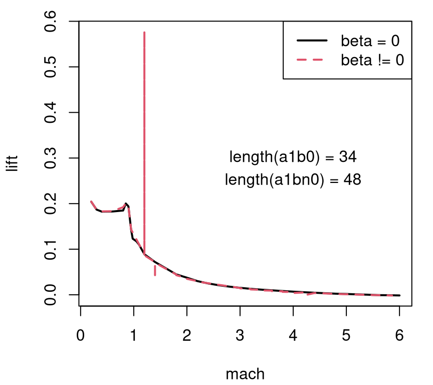
FIGURE 2.3: Lift slice with angle of attack fixed at one and side-slip angle fixed at zero (solid-black) and pooled over nonzero settings (dashed-red). Counts of grid locations provided as overlayed text.
Clearly there are some issues with lift outputs when beta != 0. Also note the relatively low resolution, with each “curve” being traced out by just a handful of values – fewer than fifty in both cases. Consequently the input–output relationship looks blocky in the subsonic region (mach < 1). A second iteration on the experiment attempted to address all three issues simultaneously: a) an adaptive design without gridding; b) better numerics (improvements to Cart3D); and c) paired with an ability to back-out a high resolution surface, smoothing out the gaps, based on relatively few total simulations.
2.1.2 Sequential design and nonstationary surrogate modeling
The second version of the data summarizes results from that second experiment. Improved simulations were paired with model-based sequential design (§6.2) under a treed Gaussian process (TGP, §9.2.2) in order to obtain a more adaptive, automatic input “grid”. These data may be read in as follows.
A glimpse into the adaptive design of that experiment, which is again projected over the beta axis, is provided in Figure 2.4.

FIGURE 2.4: Adaptive LGBB design projected over side-slip angle.
In total there were 780 unique simulations (i.e., 780 dots in the figure), or less than 25% as many as the previous experiment. For reasons to do with the NASA simulation system, there was a grid underlying candidates for selection in this adaptive design, but one much finer than that used in the first experiment, particularly in the mach coordinate.
##  mach alpha  beta
##   110    36     9
Since the design was much smaller, slices like the one shown in Figure 2.5, mimicking Figure 2.3 but this time projecting over all beta-values in the design, appear blocky in raw form.
a2 <- which(lgbb2$alpha == 1)
a2 <- a2[order(lgbb2$mach[a2])]
plot(lgbb2$mach[a2], lgbb2$lift[a2], type="l", xlab="mach",
  ylab="lift", lwd=2)
text(4, 0.15, paste("length(a2) =", length(a2)))
FIGURE 2.5: Lift versus angle of attack projected over side-slip angle in the adaptive design; compare to Figure 2.3.
The adaptive grid has a lower degree of axis alignment. Although deliberate, a downside is that it’s hard to tell if numerical instabilities are repaired in the update to Cart3D, or if instead resolution in the 1d slice is simply too low to reveal any issues. For now we’ll have to suspend disbelief somewhat, at least when it comes to details of how the figures below were constructed from the 780 simulations. Suffice it to say that the TGP model can provide requisite extrapolations to reveal a smooth surface, in 3d or along any lower-dimensional slice desired. For example, Figure 2.6 shows a slice over mach and alpha when beta=1. The data behind this visual comes from an .RData file containing evaluations of the TGP surrogate, trained to 780 lift evaluations, on a dense predictive grid in the input space. The contents of this file represent the third, “surrogate data” source mentioned above.
load("lgbb/lgbb_fill.RData")
lgbb.b1 <- lgbb.fill[lgbb.fill$beta == 1, ]
g <- interp(lgbb.b1$mach, lgbb.b1$alpha, lgbb.b1$lift, dupl="mean")
image(g, col=heat.colors(128), xlab="mach [beta=1]", ylab="alpha [beta=1]")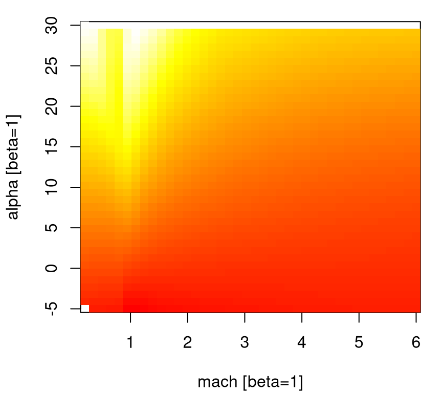
FIGURE 2.6: Heat plot slicing the lift response through side-slip angle one, illustrating an adaptive-grid surrogate version of Figure 2.2.
Notice how this view reveals a nice smooth surface with simple dynamics in high-speed regions, and a more complex relationship near the sound barrier – in particular for low speeds (mach) and high angles of attack (alpha). A suite of 1d slices shows a similar picture. Figure 2.7 utilizes the sequence of unique alpha values in the design, showing a prediction from TGP where each is paired with the full range of mach values.
plot(lgbb.b1$mach, lgbb.b1$lift, type="n", xlab="mach",
  ylab="lift [beta=1]")
for(ub in unique(lgbb.b1$alpha)) {
  a <- which(lgbb.b1$alpha == ub)
  a <- a[order(lgbb.b1$mach[a])]
  lines(lgbb.b1$mach[a], lgbb.b1$lift[a], type="l", lwd=2)
}
FIGURE 2.7: Multi-slice angle of attack analog of Figure 2.6.
This view conveys nuance along the sound barrier more clearly than the previous image plot did. Apparently it was worthwhile sampling more heavily in that region of the input space, relatively speaking, compared to say mach > 2 for any angle of attack (alpha). At the time, building designs that automatically detected the interesting part of the input space was revolutionary. Actually, the real advance is in modeling. We need an apparatus that’s simultaneously flexible enough to learn relevant dynamics in the data, but thrifty enough to accommodate calculations required for inference in reasonable time and space (i.e., computer memory). Once an appropriate model is in place, the problem of design becomes one of backing out relevant uncertainty measures, depending on the goal of the experiment(s). In this case, where understanding dynamics is key, design is a simple matter of putting more runs where uncertainty is high.
Now this discussion treated only the lift output – there were five others. A homework exercise (§2.6) invites the curious reader to create a similar suite of visuals for the other responses. Later we shall use these data to motivate methodology for nonstationary spatial modeling and sequential design, and as a benchmark in comparative exercises. Examples are scattered throughout the latter chapters, with the most complete treatment being in §9.2.2.
2.2 Radiative shock hydrodynamics
Radiative shocks arise from astrophysical phenomena, e.g., supernovae and other high temperature systems. These are shocks where radiation from shocked matter dominates energy transport and results in a complex evolutionary structure. See, e.g., McClarren et al. (2011), and Drake et al. (2011). The University of Michigan’s Center for Radiative Shock Hydrodynamics (CRASH) is tasked with modeling a particular high-energy laser radiative shock system. They developed a mathematical model and computer implementation that simulates a field apparatus, located at the Omega laser facility at the University of Rochester. That apparatus was used to conduct a limited real experiment involving twenty runs.
The basic setup of the experiment(s) is as follows. A high-energy laser irradiates a beryllium disk located at the front end of a xenon (Xe) filled tube, launching a high-speed shock wave into the tube. The left panel in Figure 2.8 shows a schematic of the apparatus. The shock is said to be a radiative shock if the energy flux emitted by the hot shocked material is equal to, or larger than, the flux of kinetic energy into the shock. Each physical observation is a radiograph image, shown in the right panel of the figure, and a quantity of interest is shock location: distance traveled by the head of the shock wave after a predetermined time.
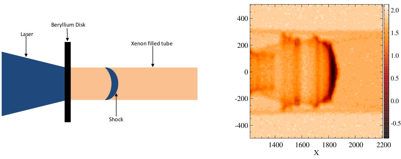
FIGURE 2.8: Schematic of the CRASH experimental apparatus (left); radiograph image of a shock as it moves through the Xe filled tube (right). Adapted from Goh et al. (2013) and used with permission from the American Statistical Association.
2.2.1 Data
The experiments involve nine design variables, listed in Table 2.1 along with ranges or values used in the field experiment in the final column. The first three variables specify thickness of the beryllium disk, xenon fill pressure in the tube and observation time for the radiograph image, respectively. The next four variables are related to tube geometry and the shape of the apparatus at its front end. Most of the physical experiments were performed on circular shock tubes with a small diameter (in the area of 575 microns), and the remaining experiments were conducted on circular tubes with a diameter of 1150 microns or with different nozzle configurations. Aspect ratio describes the shape of the tube: circular or oval. In the field experiment the aspect ratios are all 1, indicating a circular tube. However there’s interest in extrapolating to oval-shaped tubes with an aspect ratio of 2. Finally, laser energy is specified in Joules. Effective laser energy, and its relationship to ordinary laser energy, requires some back story.
| Design Parameter | CE1 | CE2 | Field Design |
|---|---|---|---|
| Be thick (microns) | [18, 22] | 21 | 21 |
| Xe fill press (atm) | [1.1, 1.2032] | [0.852, 1.46] | [1.032, 1.311] |
| Time (nano-secs) | [5, 27] | [5.5, 27] | 6-values in [13, 28] |
| Tube diam (microns) | 575 | [575, 1150] | {575, 1150} |
| Taper len (microns) | 500 | [460, 540] | 500 |
| Nozzle len (microns) | 500 | [400, 600] | 500 |
| Aspect ratio (microns) | 1 | [1, 2] | 1 |
| Laser energy (J) | [3600, 3900] | [3750, 3889.6] | |
| Effective laser energy (J) | [2156.4, 4060] |
R code below reads in data from the field experiment. Thickness of the beryllium disk was not recorded in the data file, so this value is manually added in.
## [1] "LaserEnergy"   "GasPressure"   "AspectRatio"   "NozzleLength"
## [5] "TaperLength"   "TubeDiameter"  "Time"          "ShockLocation"
## [9] "BeThickness"
The field experiment is rather small, despite interest in exploring a rather large number (9) of inputs.
## [1] 20Two computer experiment simulation campaigns were performed (CE1 and CE2 in Table 2.1) on supercomputers at Lawrence Livermore and Los Alamos National Laboratories. The second and third columns of the table reveal differing input ranges in the two computer experiments. CE1 explores small, circular tubes; CE2 investigates a similar input region, but also varies tube diameter and nozzle geometry. Both input plans were derived from Latin hypercube samples (LHSs, see §4.1). Thickness of the beryllium (Be) disk could be held constant in CE2 thanks to improvements in manufacturing in the time between simulation campaigns.
The computer simulator required two further inputs which could not be controlled in the field, i.e., two calibration parameters: electron flux limiter and laser energy scale factor, whose ranges are described in Table 2.2. It’s quite typical for computer models to contain “knobs” which allow practitioners to vary aspects of the dynamics which are unknown, or can’t be controlled in the field. In this particular case, electron flux limiter is an unknown constant involved in predicting the amount of heat transferred between cells of a space–time mesh used by the code. It was held constant in CE2 because in CE1 the outputs were found to be relatively insensitive to this input. Laser energy scale factor accounts for discrepancies between amounts of energy transferred to the shock in the simulations versus field experiments.
| Calibration Parameter | CE1 | CE2 | Field Design |
|---|---|---|---|
| Electron flux limiter | [0.04, 0.10] | 0.06 | |
| Energy scale factor | [0.40, 1.10] | [0.60, 1.00] |
In the physical system the laser energy for a shock is recorded by a technician. Things are a little more complicated for the simulations. Before running CE1, CRASH researchers speculated that simulated shocks would be driven too far down the tube for any specified laser energy. So effective laser energy – the laser energy actually entered into the code – was constructed from two input variables, laser energy and a scale factor. For CE1 these two inputs were varied over ranges specified in the second column of Table 2.2. CE2 used effective laser energy directly. R code below reads in the data from these two computer experiments. Electron flux limiter was miscoded in the data file, being off by a factor of ten. A correction is applied below.
ce1 <- read.csv("crash/RS12_SLwithUnnormalizedInputs.csv")
ce2 <- read.csv("crash/RS13Minor_SLwithUnnormalizedInputs.csv")
ce2$ElectronFluxLimiter <- 0.06
Using both CE1 and CE2 data sources requires reconciling the designs of the two experiments. One way forward entails expanding CE2’s design by gridding values of laser energy scale factor and pairing them with values of laser energy deduced from effective laser energy values contained in the original design. The gridding scheme implemented in the code below constrains scale factors to be less than one but no smaller than value(s) which, when multiplied by effective laser energy (in reciprocal), imply a laser energy of 5000 Joules.
sfmin <- ce2$EffectiveLaserEnergy/5000
sflen <- 10
ce2.sf <- matrix(NA, nrow=sflen*nrow(ce2), ncol=ncol(ce2) + 2)
for(i in 1:sflen) {
  sfi <- sfmin + (1 - sfmin)*(i/sflen)
  ce2.sf[(i - 1)*nrow(ce2) + (1:nrow(ce2)),] <-
    cbind(as.matrix(ce2), sfi, ce2$EffectiveLaserEnergy/sfi)
}
ce2.sf <- as.data.frame(ce2.sf)
names(ce2.sf) <- c(names(ce2), "EnergyScaleFactor", "LaserEnergy")
Figure 2.9 provides a visualization of that expansion.
plot(ce2.sf$LaserEnergy, ce2.sf$EnergyScaleFactor, ylim=c(0.4, 1.1),
  xlab="Laser Energy", ylab="Energy Scale Factor")
points(ce1$LaserEnergy, ce1$EnergyScaleFactor, col=2, pch=19)
legend("bottomleft", c("CE2", "CE1"), col=1:2, pch=c(21,19))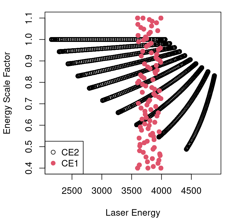
FIGURE 2.9: Expansion of inputs to resolve laser energy with its scale factor.
Subsequent combination with CE1 led to 26,458 input–output combinations.
2.2.2 Computer model calibration
What are typical goals for data/experiments of this kind? One challenge is to identify a modeling apparatus that can cope with data sizes like those described above, while maintaining the richness of fidelity required to describe and learn underlying dynamics. This is a serious challenge because many canonical methods for nonlinear modeling don’t cope well with big data (i.e., more than a few thousand runs) when input dimensions are modest-to-large in size (e.g., bigger than 2d). Supposing that first hurdle is surmountable, some context-specific goals include a) learning settings of the (in this case) two-dimensional calibration parameter; and b) simultaneously determining the nature of bias in computer model runs, relative to field data observations, under those setting(s). Some specific questions might be: Are field data informative about that setting? Is down-scaling of laser energy necessary in CE1?
One may ultimately wish to furnish practitioners with a high-quality predictor for field data measurements in novel input conditions. We may wish to utilize the calibrated and bias-corrected surrogate to extrapolate forecasts to oval-shaped disks, heavily leaning on the computer model simulations under those regimes and with full UQ.
To demonstrate potential, but also expose challenges inherent in such an enterprise, let’s consider simple linear modeling of field and computer simulation data. The field dataset is very small, especially relative to its input dimension. Moreover, only four of the explanatory variables (i.e., besides the response ShockLocation) have more than one unique value.
##   LaserEnergy   GasPressure   AspectRatio  NozzleLength   TaperLength
##            13            11             1             1             1
##  TubeDiameter          Time ShockLocation   BeThickness
##             2             6            20             1
A linear model indicates that only Time has a substantial main effect. See Table 2.3.
fit <- lm(ShockLocation ~ ., data=crash[, u > 1])
kable(summary(fit)$coefficients,
caption='Linear regression summary for field data.')| Estimate | Std. Error | t value | Pr(>|t|) | |
|---|---|---|---|---|
| (Intercept) | 2.507e+03 | 6.275e+03 | 0.3995 | 0.6951 |
| LaserEnergy | -3.968e-01 | 1.491e+00 | -0.2661 | 0.7938 |
| GasPressure | -1.971e+02 | 8.477e+02 | -0.2325 | 0.8193 |
| TubeDiameter | -3.420e-02 | 4.068e-01 | -0.0842 | 0.9340 |
| Time | 1.040e+11 | 1.567e+10 | 6.6406 | 0.0000 |
This is perhaps not surprising: the longer you wait the farther the shock will progress down the tube. In fact, Time mops up nearly all of the variability in these data with \(R^2 = 0.97\), which is nicely illustrated by the visualization of data and fit provided in Figure 2.10.
fit.time <- lm(ShockLocation ~ Time, data=crash)
plot(crash$Time, crash$ShockLocation, xlab="time", ylab="location")
abline(fit.time)
FIGURE 2.10: Time dominates predictors in a linear model fit to field data alone.
It would appear that there isn’t much scope for further information coming from data on the field experiment alone. Now let’s turn to data from computer simulation. To keep the exposition simple, consider just CE1 which varied all but four parameters. A homework exercise (see §2.6) targets data combined from both computer experiments.
ce1 <- ce1[,-1] ## first col is FileNumber
u.ce1 <- apply(ce1, 2, function(x) { length(unique(x)) })
u.ce1
## BeThickness LaserEnergy GasPressure
## 96 96 96
## AspectRatio NozzleLength TaperLength
## 1 1 1
## TubeDiameter Time ElectronFluxLimiter
## 1 24 96
## EnergyScaleFactor ShockLocation
## 96 1723Recall that actual laser energy in each run was scaled by EnergyScaleFactor, but let’s ignore this nuance for the time being. In stark contrast to our similar analysis on the field data, an ordinary least squares fit summarized in Table 2.4 indicates that all main effects which were varied in CE1 are statistically significant.
fit.ce1 <- lm(ShockLocation ~ ., data=ce1[,u.ce1 > 1])
kable(summary(fit.ce1)$coefficients,
caption="Summary of linear regression fit to CE1.")| Estimate | Std. Error | t value | Pr(>|t|) | |
|---|---|---|---|---|
| (Intercept) | -4.601e+02 | 1.321e+02 | -3.483 | 0.0005 |
| BeThickness | -7.595e+01 | 2.104e+00 | -36.101 | 0.0000 |
| LaserEnergy | 3.153e-01 | 2.150e-02 | 14.672 | 0.0000 |
| GasPressure | -3.829e+02 | 8.129e+01 | -4.710 | 0.0000 |
| Time | 1.344e+11 | 4.998e+08 | 268.844 | 0.0000 |
| ElectronFluxLimiter | 4.126e+02 | 1.400e+02 | 2.947 | 0.0032 |
| EnergyScaleFactor | 1.776e+03 | 1.214e+01 | 146.249 | 0.0000 |
These results suggest that the computer simulation data, and subsequent fits, could usefully augment data and fitted dynamics from the field. Data from CE2 tell a similar story, but for a partially disjoint collection of inputs. Focusing back on CE1, consider Figure 2.11 which offers a view into how shock location varies with time and (scaled) laser energy. The heat plot in the figure is examining a linear interpolation of raw CE1 data, but alternatively we could extract a similar surface from predict applied to our fit.ce1 object. It’s apparent from the image that energy and time work together to determine how far/quickly shocks travel. That makes sense intuitively, but wasn’t evident in our analysis of the field data alone. Some sort of hybrid modeling apparatus is needed in order to peruse the potential for further such synergies.
x <- ce1$Time
y <- ce1$LaserEnergy * ce1$EnergyScaleFactor
g <- interp(x/max(x), y/max(y), ce1$ShockLocation, dupl="mean")
image(g, col=heat.colors(128), xlab="scaled time", ylab="scaled energy")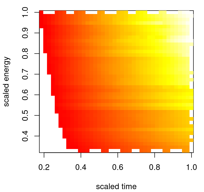
FIGURE 2.11: Energy and time interact to determine shock location.
Before delving headlong into that enterprise, it’ll help to first get some of the base modeling components right. Linear modeling is likely insufficient: physical phenomena rarely covary linearly. With a wealth of simulation data we should be able to train a much more sophisticated meta-model. Plus even our linear model fits reveal that other variables matter besides energy and time. Chapter 8 details computer model calibration, combining a surrogate fit to a limited simulation campaign (Chapter 5) with a suite of methods for estimating bias between computer simulation and field observation, while at the same time determining the best setting of calibration parameters in order to “rein in” and correct for bias. With those elements in hand we’ll be able to build a predictor which combines computer model surrogate with bias correction in order to develop a meta-model for the full suite of physical dynamics under study. Coping with a rather large simulation experiment in a modern surrogate modeling framework will require approximation. Chapter 9 revisits these data within an approximate surrogate–calibration framework.
2.3 Predicting satellite drag
Obtaining accurate estimates of satellite drag coefficients in low Earth orbit (LEO) is a crucial component in positioning (e.g., for scientists to plan experiments: what can be seen when?) and collision avoidance. Toward that end, researchers at Los Alamos National Laboratory (LANL) were tasked with predicting orbits for dozens of research satellites, e.g.:
- HST (Hubble space telescope)
- ISS (International space station)
- GRACE (Gravity Recovery and Climate Experiment), a NASA & German Aerospace Center collaboration
- CHAMP (Challenging Minisatellite Payload), a German satellite for atmospheric and ionospheric research
Drag coefficients are required to determine drag force, which plays a key role in predicting and maintaining orbit. The Committee for the Assessment of the U.S. Air Force’s Astrodynamics Standards recently released a report citing atmospheric drag as the largest source of uncertainty for LEO objects, due in part to improper modeling of the interaction between atmosphere and object. Drag depends on geometry, orientation, ambient and surface temperatures, and atmospheric chemical composition in LEO, which depends on position: latitude, longitude, and altitude. Numerical simulations can produce accurate drag coefficient estimates as a function of these input coordinates, and up to uncertainties in atmospheric and gas–surface interaction (GSI) models. But the calculations are too slow for real-time applications.
Most of the input coordinates mentioned above are ordinary scalars. Satellite geometry however, is rather high dimensional. Geometry is specified in a mesh file: an ASCII representation of a picture like the one in Figure 2.12 for the Hubble space telescope (HST).
FIGURE 2.12: Rendering of the Hubble space telescope mesh. Reproduced from Mehta et al. (2014); used with permission from Elsevier.
A satellite’s geometry is usually fixed; most don’t change shape in orbit. The HST is an exception: its solar panels can rotate, which is a nuance I’ll discuss in more detail later. For now, take geometry as a fixed input. Position and orientation inputs make up the design variables. These are listed alongside their units and ranges, determining the study region of interest, in Table 2.5.
| Symbol [ascii] | Parameter [units] | Range |
|---|---|---|
| \(v_{\mathrm{rel}}\) [Umag] | velocity [m/s] | [5500, 9500] |
| \(T_s\) [Ts] | surface temperature [K] | [100, 500] |
| \(T_a\) [Ta] | atmospheric temperature [K] | [200, 2000] |
| \(\theta\) [theta] | yaw [radians] | [\(-\pi\), \(\pi\)] |
| \(\phi\) [phi] | pitch [radians] | [\(-\pi/2\), \(\pi/2\)] |
| \(\alpha_n\) [alphan] | normal energy AC [unitless] | [0, 1] |
| \(\sigma_t\) [sigmat] | tangential momentum AC [unitless] | [0, 1] |
Atmospheric chemical composition is an environmental variable. At LEO altitudes the atmosphere is primarily comprised of atomic oxygen (O), molecular oxygen (O\(_2\)), atomic nitrogen (N), molecular nitrogen (N\(_2\)), helium (He), and hydrogen (H) (Picone et al. 2002). Mixtures of these so-called chemical “species” vary with position, and there exist calculators, like this one from NASA, which can deliver mixture weights if provided position and time coordinates.
2.3.1 Simulating drag
Researchers at LANL developed the Test Particle Monte Carlo (TPMC) simulator in C, which I wrapped in an R interface called tpm. The entire library, packaging C internals and R wrapper, may be found on a public Bitbucket repository linked here. The TPMC C backend simulates the environment encountered by satellites in LEO under free molecular flow (FMF) as modulated by coordinates in the set of three input categories (geometry, design and chemical composition) described above. Since the C simulations are time-consuming, but ultimately independent for each unique input configuration, the tpm R interface utilizes OpenMP to facilitate symmetric multiprocessing (SMP) parallelization of evaluations. A wrapper routine called tpm.parallel, utilizing an additional message passing interface (MPI) layer, is provided to further distribute parallel instances over nodes in a cluster.
The tpm R interface requires a pointer to a single mesh file, a single six-vector chemical mixture of environmental variables, and a design of as many seven-vector position/orientation configurations as desired, and over which parallel instances are partitioned. In other words the overall design, varying mesh file, mixture and configuration inputs, must be blocked over mesh and mixture. This setup eases distribution of configuration inputs, along which the strongest nonlinear spatial relationships manifest, over parallel instances.
To illustrate, let’s set up an execution with two replicates on a design of eight runs. Note that tpm takes inputs on the nominal scale, with ranges indicated in Table 2.5. R code below builds the 7d design X and specifies one of the GRACE meshes. Meshes for over a dozen other satellites are provided in the "tpm-git/tpm/Mesh_Files" directory.
n <- 8
X <- data.frame(Umag=runif(n, 5500, 9500), Ts=runif(n, 100, 500),
  Ta=runif(n, 200, 2000), theta=runif(n, -pi, pi),
  phi=runif(n, -pi/2, pi/2), alphan=runif(n), sigmat=runif(n))
X <- rbind(X,X)
mesh <- "tpm-git/tpm/Mesh_Files/GRACE_A0_B0_ascii_redone.stl"
moles <- c(0,0,0,0,1,0)
The final line above sets up the atmospheric chemical composition as a unit-vector isolating pure helium (He). With input configurations in place, we are ready to run simulations. Code below loads the R interface and invokes a simulation instance which parallelizes evaluations over the full suite of cores on my machine.
##    user  system elapsed
## 5006.20    2.05  433.03
What do we see? It’s not speedy despite OpenMP parallelization. I have eight cores on my machine, and I’m getting about a factor of \(6 \times\) speedup. That efficiency improves with a larger design. For example, with n <- 800 runs it’s close to parity at \(8 \times\). Also observe that the output is not deterministic.
## [1] 3.445e-05Each simulation involves pseudo-random numbers underlying trajectories of particles bombarding external facets of the satellite. Despite the stochastic response, variability in runs is quite low. Occasionally, in about two in every ten thousand runs, tpm fails to return a valid output (yielding NA) due to numerical issues. When that happens, a simple restart of the offending simulation usually suffices.
Since calculations underlying TPMC are implemented in C, compiling that code is a prerequisite to sourcing tpm-git/tpm/R/tpm.R. But this only needs to be done once per machine. On a Unix-based system, like Linux or Apple OSX, that’s relatively easy with the Gnu C compiler gcc. Note the default compiler on OSX is clang from LLVM, which at the time of writing doesn’t support OpenMP out of the box. The C code will still compile, but it won’t SMP-parallelize. To obtain gcc compilers, visit the HPC for OSX page. On Microsoft Windows, the Rtools library is helpful, providing a Unix-like environment and gcc compilers, enabling commands similar to those below to be performed from the DOS command prompt.
The C code resides in tpm-git/tpm/src, and a shared library (for runtime linking with R) can be built using R’s SHLIB command from the Unix (or DOS command) prompt. Figure 2.13 provides a screen capture from a compile performed on my machine.
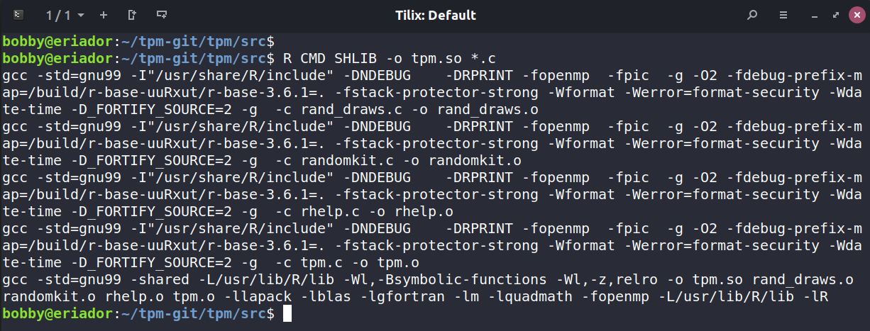
FIGURE 2.13: Compiling the C source code behind TPM.
The tpm library can be used to estimate new drag coefficients. However considering the substantial computational expense, it helps to have some pre-run datasets on hand. There are two suites of pre-run batches: one from a limited pilot experiment performed at LANL in order to demonstrate the potential value of surrogate modeling; and another far more extensive suite performed by me using UChicago’s Research Computing Center (RCC). That second suite utilized seventy-thousand core hours (meaning hours you’d have to wait if only one core of one processor were being used, in serial), distributed over thousands of cores of hundreds of nodes of the RCC Midway supercomputer. In fact, when RCC saw how much computing I was doing they decided to commission a puff piece about it.
2.3.2 Surrogate drag
Consider the first suite of runs from LANL’s pilot study. The goal of that study was to build a surrogate, via Gaussian processes (GPs), such that predictions from GP fits to tpm simulations were accurate to within 1% of actual simulation output, based on root mean-squared percentage error (RMSPE). That proved to be a difficult task considering some of the computational challenges behind GP inference and prediction. My LANL colleagues quickly realized that the data size they’d need, in the 7d input space described by Table 2.5, would be way bigger than what’s conventionally tractable with GPs. In order to meet that 1% goal they had to dramatically reduce the input space for training, and consequently also reduce the domain on which reliable predictions could reasonably be expected (i.e., the testing set). The details and other reasoning behind the experiment they ultimately performed are provided by Mehta et al. (2014); a brief explanation and demonstration follow.
LANL researchers looked at data sets, containing TPMC simulations, that were about \(N=1000\) runs in size. You can handle slightly larger \(N\) with GPs without getting creative (e.g., special linear algebra subroutines; see Appendix A) using desktop workstations circa early 2010’s, but not much. With such a limited number of runs, it was clear that they’d never achieve the 1% RMSPE goal in the full 7d space. Later in §9.3.6 this is verified empirically in a Monte Carlo study. Yet it’s easy to deduce that outcome from the simpler experiment our LANL colleagues ultimately decided to entertain instead. And that variation is as follows: they focused on a narrow, yet realistically representative, band of yaw (\(\theta\)) and pitch (\(\phi\)) angles. For the GRACE satellite, that reduction may be characterized approximately as outlined in Table 2.6.
| Symbol [ascii] | Parameter [units] | Ideal Range | Reduced Range | Percentage |
|---|---|---|---|---|
| \(\theta\) [theta] | yaw [radians] | [\(-\pi\), \(\pi\)] | [0, 0.06] | 1.9 |
| \(\phi\) [phi] | pitch [radians] | [\(-\pi/2\), \(\pi/2\)] | [-0.06, 0.06] | 1.9 |
A narrower range of angles, leading to an input space of smaller volume, has the effect of making the \(N = 1000\) points closer together. This makes fitting and prediction in the reduced space easier, and more accurate. Covering the full range of angles, at the density implied by a space-filling set of \(N=1000\) inputs, would require about 4 million points: well beyond the capabilities that could be provided by a GP-based method – at least any known at the time.
Let’s look at LANL’s GRACE runs for pure He, reproducing the essence of their GP training and testing exercise. A \(N=1000\)-sized training set, and \(N'=100\)-sized testing set, was generated independently as a LHS (§4.1). GP predictions derived on the former for the latter were evaluated for out-of-sample accuracy with RMSPE.
train <- read.csv("tpm-git/data/GRACE/CD_GRACE_1000_He.csv")
test <- read.csv("tpm-git/data/GRACE/CD_GRACE_100_He.csv")
r <- apply(rbind(train, test)[,1:7], 2, range)
r
## Umag Ts Ta theta phi alphan sigmat
## [1,] 5502 100.0 201.2 0.0000127 -0.06978 0.0008822 0.0007614
## [2,] 9498 499.8 2000.0 0.0697831 0.06971 0.9999078 0.9997902As you can see above, the range of theta (yaw) and phi (pitch) are reduced compared to their ideal range. Exact ranges depend on the satellite and pure-species in question, and may not line up perfectly with either of the tables above. In particular notice that yaw- and pitch-angle reduced ranges slightly exceed those from Table 2.6. Columns eight and nine in the files provide estimated coefficients of drag, Cd. The ninth column, labeled Cd_old, provides a legacy estimate based on an older tpm simulation toolkit. These values are internally compatible with Cd_old values from other files in that data/GRACE directory, but may not match bespoke simulations from the latest tpm library. In the particular case of GRACE simulations, differences between Cd and Cd_old are slight.
Before fitting models, it helps to first convert to coded inputs.
X <- train[,1:7]
XX <- test[,1:7]
for(j in 1:ncol(X)) {
  X[,j] <- X[,j] - r[1,j]
  XX[,j] <- XX[,j] - r[1,j]
  X[,j] <- X[,j]/(r[2,j] - r[1,j])
  XX[,j] <- XX[,j]/(r[2,j] - r[1,j])
}
Now we can fit a GP to the training data and make predictions on a hold-out testing set. Suspend your disbelief for now; details of GP fitting and prediction are provided in gory detail in Chapter 5. The library used here, laGP (Gramacy and Sun 2018) on CRAN, is the same as the one used in our introductory wing weight example from §1.2.1.
The fitting code below is nearly cut-and-paste from that example.
fit.gp <- newGPsep(X, train[,8], 2, 1e-6, dK=TRUE)
mle <- mleGPsep(fit.gp)
p <- predGPsep(fit.gp, XX, lite=TRUE)
rmspe <- sqrt(mean((100*(p$mean - test[,8])/test[,8])^2))
rmspe
## [1] 0.672Just as Mehta et al. found: better than 1%. Now that was for just one chemical species, pure He. In a real forecasting context there would be a mixture of elements in LEO depending on satellite position. LANL researchers address this by fitting six, separate GP surrogates, one for each pure species. The data directory provides these files:
## [1] "CD_GRACE_100_H.csv"  "CD_GRACE_100_N.csv"  "CD_GRACE_100_O.csv"
## [4] "CD_GRACE_1000_H.csv" "CD_GRACE_1000_N.csv" "CD_GRACE_1000_O.csv"
A similar suite of files with .dat extensions contain legacy data, duplicated in the Cd_old column of *.csv analogs. Designs in these files are identical up to a column reordering.
Once surrogates have been fit to pure-species data, their predictions may be combined for any mixture as
\[ C_D = \frac{\sum_{j=1}^6 C_{D_j} \cdot \chi_j \cdot m_j}{\sum_{j=1}^6 \chi_j \cdot m_j}, \]
where \(\chi_j\) is the mole fraction at a particular LEO location in the atmosphere, and \(m_j\) are particle masses. For example, NASA’s calculator gives the following at 1/1/2000 0h at 0 deg L&L, and 550km altitude:
mf <- c(O=0.83575679477, O2=0.00004098807, N=0.01409589809,
  N2=0.00591827778, He=0.13795985368, H=0.00622818760)
A periodic table provides the masses which, in relative terms, are proportional to the following.
LANL went on to show that the six independently fit “pure emulators”, when suitably combined, were still able to give RMSPEs out-of-sample that were within the desired 1% tolerance. A homework exercise (§2.6) asks the reader to duplicate this analysis by appropriately collating predictions for other species and comparing, out of sample, to results obtained directly under a mixture-of-species simulation.
Our LANL colleagues provided similar proof-of-concept runs and experiments for the Hubble Space Telescope (HST).
##  [1] "Satellite_H.csv"     "Satellite_He.csv"    "Satellite_N.csv"
##  [4] "Satellite_N2.csv"    "Satellite_O.csv"     "Satellite_O2.csv"
##  [7] "Satellite_TS_H.csv"  "Satellite_TS_He.csv" "Satellite_TS_N.csv"
## [10] "Satellite_TS_N2.csv" "Satellite_TS_O.csv"  "Satellite_TS_O2.csv"
A slightly different naming convention was used here compared to the GRACE files: “TS” means “test set”. Analog files without the .csv extension contain legacy LANL simulation output. These legacy outputs differ substantially from the revised analog for reasons that have to do with special handling of its solar panels. HST is specified by a suite of mesh files, one for each of ten panel angles, resulting in an extra input column (i.e., 8d inputs). Efficient simulation requires additional blocking of tpm simulations, iterating over the ten meshes, each with 1/10th of the space-filling settings of the other inputs.
##  [1] "HST_0.stl"  "HST_10.stl" "HST_20.stl" "HST_30.stl" "HST_40.stl"
##  [6] "HST_50.stl" "HST_60.stl" "HST_70.stl" "HST_80.stl" "HST_90.stl"
Finally, Mehta et al. reported on a similar experiment with the International Space Station (ISS). These files have not been updated from their original format and legacy output.
## [1] "ISS_H.dat"  "ISS_He.dat" "ISS_N.dat"  "ISS_N2.dat" "ISS_O.dat"
## [6] "ISS_O2.dat"
Although the ISS has many “moving parts”, only one representative mesh file is provided.
## [1] "ISS_ascii.stl"2.3.3 Big tpm runs
To address drawbacks of that initial pilot study, particularly the narrow range of input angles, I compiled a new suite of TPMC simulations using tpm for HST and GRACE. HST simulations were collected for \(N=\) 1M and \(N=\) 2M depending on the species. A testing set of size \(N'=\) 1M was gathered under an ensemble of species for out-of-sample benchmarking. The designs were LHSs divided equally between the ten panel angles. For GRACE, which is easier to model, LHSs with \(N=N'=\) 1M is sufficient throughout. This is fortunate since GRACE simulations are more than \(10\times\) slower than HST.
##  [1] "hstA_05.dat"   "hstA.dat"      "hstEns.dat"    "hstH.dat"
##  [5] "hstHe.dat"     "hstHe2.dat"    "hstN.dat"      "hstN2.dat"
##  [9] "hstO.dat"      "hstO2.dat"     "hstQ_05.dat"   "hstQ.dat"
## [13] "graceA_05.dat" "graceEns.dat"  "graceH.dat"    "graceHe.dat"
## [17] "graceN.dat"    "graceN2.dat"   "graceO.dat"    "graceO2.dat"
## [21] "graceQ_05.dat" "graceQ.dat"
Files named with Ens correspond to chemical ensembles which were calculated using mole fractions quoted in §2.3.2. All together these took about 70K service units (SUs). An SU is equivalent to one CPU core-hour. Runs were distributed across dozens of batches farmed out to 32 16-core nodes for about 18 hours each, depending on the mesh being used and the size of the full design. Although the files have a .dat extension, matching the naming scheme of files containing legacy runs, this larger suite was performed with the latest tpm.
Divide-and-conquer is key to managing data of this size with GP surrogates. One option is hard partitioning, for example dividing up the input space by its angles, iterating the Mehta et al. idea. But soft partitioning works better in the sense that it’s simultaneously more accurate, computationally more efficient, and utilizes a smaller training data set. (I needed only \(N=\) 1-2M runs, as described above.) The method of local approximate Gaussian processes (LAGP), introduced in §9.3, facilitates one such approach to soft partitioning having the added benefit of being massively parallelizable, a key feature in the modern landscape of ubiquitous multicore SMP computing. Our examples above leverage full-GP features from the laGP package; local approximate enhancements will have to wait for §9.3.6.
2.4 Groundwater remediation
Worldwide there are more than 10,000 contaminated land sites (Ter Meer et al. 2007). Environmental cleanup at these sites has received increased attention in the last few decades. Preventing migration of contaminant plumes is vital to protect water supplies and prevent disease. One approach is pump-and-treat remediation, in which wells are strategically placed to pump out contaminated water, purify it, and inject treated water back into the system to prevent contaminant spread.
A case study of one such remediation effort is the 580-acre Lockwood Solvent Groundwater Plume Site, an EPA Superfund site near Billings Montana. As a result of industrial practices, groundwater at this site is contaminated with volatile organic compounds that are hazardous to human health. Figure 2.14 shows the location of the site and provides a simplified illustration of the contaminant plumes that threaten a valuable water source: the Yellowstone River.
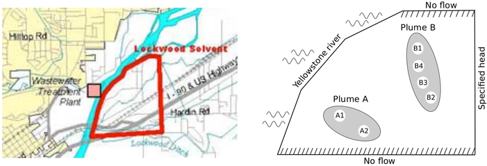
FIGURE 2.14: Lockwood site via map (left) and plume diagram (right). Captured from Gramacy et al. (2016) and used with permission from the American Statistical Association.
To prevent further expansion of these plumes, six pump and treat wells have been proposed. These are shown in sets of two and four in the right panel of Figure 2.14. The amount of contaminant exiting the boundaries of the system – entering the river in particular – depends on placement of the wells and their pumping rates. Here we treat placement as fixed, roughly at the locations shown in the diagram, and focus on determining appropriate pumping rates. An analytic element method (AEM) groundwater model and solver was developed to simulate the amount of contaminant exiting the two boundaries under different pumping regimes (Matott, Rabideau, and Craig 2006).
Code implementing the solver takes a positive six-vector as input, specifying pumping rates for each of the six wells: \(x \in [0,2\cdot 10^4]^6\). It returns two outputs: 1) a quantity proportional to the cost of pumping, which is just \(\sum_j x_j\); and 2) a two-vector, indicating the amount of contaminant exiting the boundaries. The goal is to explore pumping rates where both entries of the contaminant vector are zero, indicating no contaminant spread. If the contaminant output vector is positive in either coordinate then that’s bad (the larger the badder), because it means that some contaminant has escaped. Note that the contaminant vector output is never negative as long as input \(x\) is in the valid range, as described above.
The groundwater solver implementation is delicate, owing to the hodgepodge of C++ libraries that were woven together to obtain the desired calculation(s).
- One was (at the time it was developed) called Bluebird, but now goes by VisualAEM.
- The other is called Ostrich.
- A shell script called
RunLockacts as glue and provides the appropriate configuration files. - An R wrapper (written by me)
runlock.RenablesRunlockto be invoked from R.
The underlying C++ programs, which read and write files with absolute paths, require runs be performed within the runlock directory (after you’ve run the build.sh script to compile all the C++ code). Note that the makefiles used by the build scripts assume g++ compilers, which is the default on most systems but not OSX. OSX uses LLVM/clang with aliases to g++ and doesn’t work with the runlock back-end. This is similar to the issue mentioned above for tpm nearby Figure 2.13, except in this case a true g++ compiler is essential. See the HPC for OSX page to obtain a GNU C/C++ compiler for OSX. At this time, this setup is not known to work on Windows systems. Binary Bluebird and Ostrich executables may be compiled for Windows with slight modification to the source code, but the shell scripts which glue them together assume a Unix environment.
Here’s how output looks on a random input vector.
## $obj
## [1] 60220
##
## $c
## [1] 0.3498 0.0000
Both outputs are derived from deterministic calculations. As described above, the $obj output is \(\sum_j x_j\), the sum of the six pumping rates. The $c output is a two-vector indicating how much contaminant exited the system. About one in ten runs with random inputs, \(x\sim \mathrm{Unif}(0, 20000)^6\), yield output $c at zero for both boundaries. The second boundary is less likely to suffer contaminant breach. One “good” pumping rate is known, but it implies a fair amount of pumping.
## $obj
## [1] 60000
##
## $c
## [1] 0 0
Here’s a run on one hundred random inputs.
runs <- matrix(NA, nrow=100, ncol=9)
runs[,1:6] <- matrix(runif(6*nrow(runs), 0, 20000), ncol=6)
tic <- proc.time()[3]
for(i in 1:nrow(runs)) {
  runs[i,7:9] <- unlist(runlock(runs[i,1:6]))
}
toc <- proc.time()[3]
toc - tic
## elapsed
## 116.2As you can see, simulations are relatively quick (about 1.2s/run), but not instantaneous. More than a decade ago, when this problem was first studied, the computational cost was more prohibitive, being upwards of ten or so seconds per run. Improvements in processing speed and compiler optimizations have combined to provide about a tenfold speedup.
## [1] 18Above, 18% of the random inputs came back without contaminant breach. Before changing gears let’s remember to back out of the runlock directory.
2.4.1 Optimization and search
Mayer, Kelley, and Miller (2002) proposed casting the pump-and-treat setting as a constrained “blackbox” optimization. For the version of the Lockwood problem considered here, pumping rates \(x\) can be varied to minimize the cost of operating wells subject to constraints on the contaminant staying within plume boundaries, whose evaluations require running groundwater simulations. This led to the following blackbox optimization problem, a so-called nonlinear mathematical program.
\[ \min_{x} \; \left\{f(x) = \sum_{j=1}^6 x_j : c_1(x)\leq 0, \, c_2(x)\leq 0, \, x\in [0, 2\cdot 10^4]^6 \right\} \]
The term blackbox means that inner-workings of the program are largely opaque to the optimizer. Objective \(f\) is linear and describes costs required to operate the wells; this matches up with output $obj from runlock above. Absent constraints \(c\) (via $c from runlock), which are satisfied when both components are zero, the solution is at the origin and corresponds to no pumping and no remediation. But this unconstrained solution is of little interest. We desire a pumping rate just low enough, minimizing costs of operating the wells, to accomplish the remediation goal: clean drinking water.
Matott, Leung, and Sim (2011) compared MATLAB® and Python optimizers, treating constraints with the additive penalty method (reviewed in more detail in §7.3.4), all initialized at the known-valid input \(x_j^1 = 10^4\). These results are shown in Figure 2.15. Many of the optimizers, such as “Newton”, “Nelder-Mead” and “BFGS” may be familiar. Several are implemented as options in the optim function for R and have their own Wikipedia pages. More detail will be provided in Chapter 7.
bvv <- read.csv("runlock/pato_results.csv")
cols <- 3:14
nc <- length(cols)
matplot(bvv[1:1000,1], bvv[1:1000,cols], xlim=c(1,1500), type="l", bty="n",
   xlab="number of evaluations", ylab="pump-and-treat cost to remediate",
   lty=1:nc, col=1:nc)
legend("topright", names(bvv)[cols], lty=1:nc, col=1:nc, bty="n")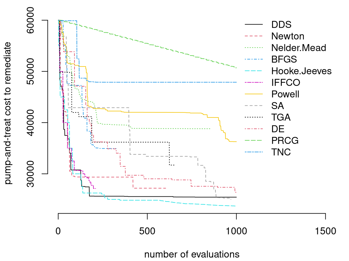
FIGURE 2.15: Best valid values found by MATLAB and Python APM optimizers over the course of 1000 expensive simulations; rebuild of a figure from Matott, Leung, and Sim (2011) using original data.
Observe from Figure 2.15 that there’s great diversity in success of the methods deployed to solve the Lockwood constrained optimization. The goal is to obtain a value on the \(y\)-axis in that plot, indicating the best valid pumping rate, that’s as low as possible as a function of the number of runlock evaluations, indicated on the \(x\)-axis. Better methods “hug the origin”, with lines closer to the lower-left corner of the plot. The very best methods by this metric are “Hooke–Jeeves” and “DDS”.
Looking at the results from that study, the following questions emerge. What makes good methods good, and why do bad methods fail so spectacularly? And by the way, how are statistics and surrogates involved? As a window to potential insight, consider the following random iterative search involving objective improving candidates, or OICs. Algorithm 2.1 shows how to obtain the next OIC given \(n\) runs of the simulator, collecting evaluations of \(f\) and \(c\).
Algorithm 2.1: Next Objective Improving Candidate
Assume the search region is \(\mathcal{B}\), perhaps a unit hypercube.
Require input settings \(x_1, \dots, x_n\) at which the objective \(f\) and constraints \(c\) have already been evaluated.
Then
Find the current best valid input, \(x^\star\), using discrete search over the existing runs \(x^\star = \mathrm{arg}\min_{i=1,\dots,n} \{ f(x_i) : c_j(x_i) \leq 0, \forall j \}\).
Draw \(x_{n+1}\) uniformly from \(\{x \in \mathcal{B} : f(x) < f(x^\star)\}\), for example with rejection sampling.
Return \(x_{n+1}\), the next objective improving candidate.
Importantly, no expensive blackbox evaluations of \(f(\cdot)\) are called for in Algorithm 2.1. With \(x_{n+1}\) in hand, we can evaluate \(f(x_{n+1})\) and \(c(x_{n+1})\) and repeat, which might yield an improved \(x^\star\) and thus result in a narrower subsequent search for the next OIC.
Figure 2.16 shows how such OICs fare on the Lockwood problem. Thin gray lines in the figure are extracted from the first 500 iterations from Matott, Leung, and Sim (2011)’s experiment. A thicker black line added to the plot shows average progress (best valid value, i.e., \(f(x^\star)\) over the iterations, \(n\)) from thirty repeated runs of sequential selection of OICs, from \(n=2, \dots, 500\), initialized with the same high pumping rate \(x^1 = (10^4)^6\) used by all other methods. Note that these are the first R results in the book which don’t originate in Rmarkdown, owing to the substantial computational effort involved in evaluating runlock \(500 \times 30 = 1500\) times. Output file oic_prog.csv is deliberately omitted from the supplementary material. Reproducing these results is the subject of a homework exercise in §2.6.
prog <- read.csv("oic_prog.csv")
matplot(bvv[,cols], col="gray", type="l", lty=1, xlim=c(1,500),
  xlab="evaluations (n)", ylab="best valid value")
lines(rowMeans(prog), lty=1, lwd=2)
legend("topright", "average OIC", lwd=2)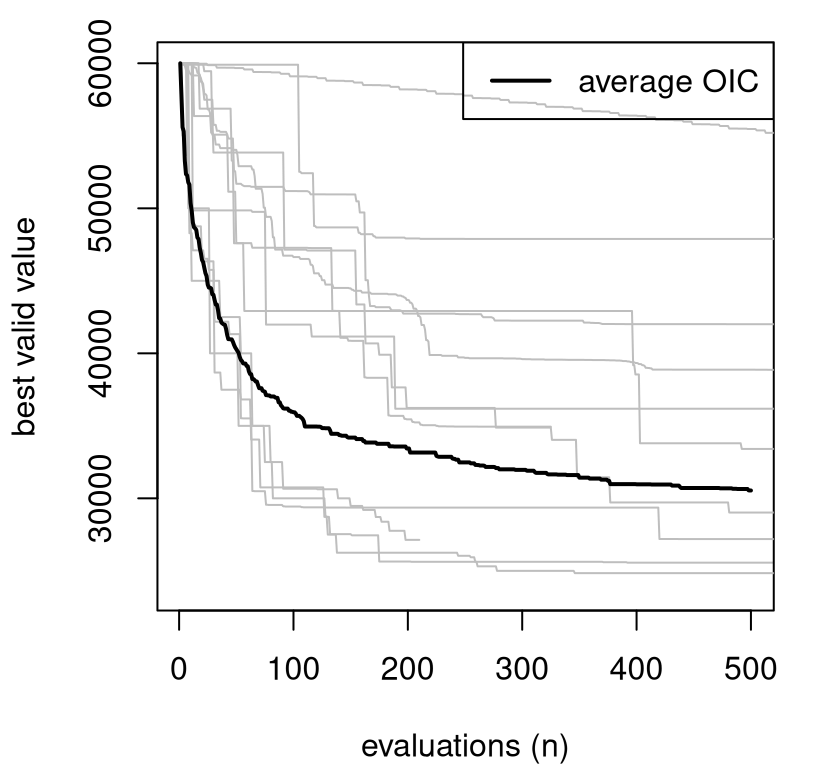
FIGURE 2.16: Objective improving candidates versus Matott optimizers. Rebuild of a figure from Gramacy and Lee (2011) with novel OIC simulations.
What do we notice from the OIC results in the figure? Half of the MATLAB/Python methods are not doing better (on average) than a slightly modified “random search”, as represented by OICs. Those inferior methods are getting stuck in a local minima and failing to explore other opportunities. Now stochastic search, whether via OICs or purely at random, doesn’t represent a compelling practical alternative in this context because of the chance of poor results in any particular run, even though average behavior out of thirty repetitions is pretty good. But those average results, which suggest that a more careful balance between exploration and exploitation could be beneficial, do indicate that a statistical decision process – where striking such balances is routine – could be advantageous. Statistical response surface methods, through suitably flexible surrogate models paired with searching criteria that can trade-off reward and uncertainty, have been shown to be quite effective in this context. These are the subject of Chapter 7.
As a taste of what’s to come, surrogate Gaussian process (GP) models can be fitted to blackbox function evaluations, from the objective and/or from constraints, and sequential design criteria can be derived – acquisition functions in machine learning (ML) jargon – that leverage the full uncertainty of predictive equations (i.e., mean and variance) to decide where to sample next. These so-called Bayesian optimization (BO) procedures have been shown empirically to lead to more global searches, finding better solutions with fewer evaluations, compared to conventional optimizers like those deployed in the Matott, Leung, and Sim (2011) study. The term “Bayesian optimization” is somewhat of a misnomer, because Bayesian methodology/thinking isn’t essential. However the term has caught on owing to excitement in Bayesian updating, of which many sequential statistical calculations are an example. Although work on BO in ML is feverish at the moment – for example, to tune the hyperparameters of deep neural networks – the roots of these methods lie in industrial statistics under the moniker of statistical/surrogate-assisted optimization. In the mathematical programming world, surrogate assisted methods for blackbox optimization falls generically under the class of derivative-free methods (Larson, Menickelly, and Wild 2019). They utilize only function evaluations, requiring little knowledge of how codes implementing those functions are comprised, in particular not requiring derivatives. However use of derivative-like information, often through a surrogate, can be both explicit and implicit in such enterprises.
2.4.2 Where from here?
Once we nail down surrogate models (e.g., via GPs) we’ll be able to address sequential design and optimization problems on both more general and more specific terms. The process of using surrogate model fits to further data collection, updating the design to maximize information or reduce variance, say, has become fundamental to computer simulation experiments. It’s also popular in ML where it goes by the name active learning, where the learner gets to choose the examples it’s trained on. Extending that idea to more general optimization problems, with appropriate design/acquisition criteria – the most popular of which is called expected improvement (EI) – is relatively straightforward. The setting becomes somewhat more challenging when constraints are involved, or when targets are more nuanced: a search for level sets or contours, classification boundaries, etc. We’ll expound upon blackbox constrained optimization in some detail. The others are hot areas at the moment and I shall refer to the literature for many of those in order to keep the exposition relatively self-contained.
Everyone knows that modern statistical learning benefits from optimization methodology. Just think about the myriad numerical schemes for maximizing log likelihoods, or convex optimization in penalized least squares. Throughout the text we’ll make liberal use of optimization libraries as subroutines, ones which over the years have been engineered to the extent that they’ve become so robust that we take their good behavior for granted. But in the spectrum of problems from the mathematical programming literature, which is where optimization experts play, these represent relatively easy examples. The harder ones, like with blackbox objectives and constraints, could benefit from a fresh perspective. Mathematical programmers are learning from statisticians in a big way, porting robust surrogate modeling and decision theoretic criteria to aid in search for global optima. Perhaps a virtuous cycle is forming.
2.5 Data out there
The examples in this chapter are interesting because each involves several facets of modern response surface methods, via surrogates, and sequential design. Yet it’ll be useful to draw from a cache of simpler – you might say toy – examples for our early illustrations, isolating particular features common to real data and real-world simulation experiments and methods which have been designed to suit. Synthetic experiments on simple data, as a first pass on demonstrating and benchmarking new methodology, abound in the literature.
There are several good outposts offering libraries of toy problems, curated and regularly updated. My new favorite is the Virtual Library of Simulation Experiments (VLSE) out of Simon Fraser University. Several homework exercises throughout the book feature data pulled from that site. Good optimization-oriented virtual libraries can be found on the world wide web, although for our purposes the VLSE is sufficient – containing a specifically optimization-oriented tab of problems. An impressive exception is the Decision Tree for Optimization Software out of Arizona State University which not only provides examples, but also sets of live benchmarks offering a kind of unit testing of updated implementations submitted to the site. Two other cool examples get their own heading.
Fire modeling and bottle rockets
I came across a page on Fire Modeling Software when browsing Santner, Williams, and Notz (2003), first edition. That text contains an example in the introductory chapter involving an old FORTRAN/BASIC program called ASET, which is one of the ones listed on that page. Others from that page could offer a source of pseudo-synthetic examples with real code (i.e., real computer model simulations like TPMC), assuming they could be made to compile and run. I couldn’t get ASET-B to compile, but it’s been such a long time since I’ve looked at BASIC. Some of the newer codes are more involved, but potentially more exciting.
Ever do a bottle rocket project in middle school? I certainly did. Folks have written calculators that estimate the height and distance traveled, and other outputs, as a function of bottle geometry, water pressure, etc. There’s an entire web page dedicated to simulators for flying bottle rockets, but sadly the site is old and many links therein are now broken. NASA thinks bottle rockets are pretty cool too, in addition to the real kind. They offer two simulators: a simpler one called BottleRocketSim and a more complex alternative called RocketModeler III. Both have somewhat dated web interfaces but could easily work in a lab/field experiment or “field trip” setting. Students could collect data on real rockets and calibrate simulations (§8.1) in order to improve accuracy of predictions for future runs.
2.6 Homework exercises
These exercises give the reader an opportunity to play with data sets and simulation codes introduced in this chapter and to help head off any system dependency issues in compiling codes required for those simulations.
#1: The other five LGBB outputs
Our rocket booster example in §2.1 emphasized the lift output. Repeat similar slice visuals, for example like Figure 2.6, for the other five outputs. In each case you’ll need to choose a value of the third input, beta, to hold fixed for the visualization.
- Begin with the choice of
beta=1following theliftexample. Comment on any trends or variations across the five (or six includinglift) outputs. - Experiment with other
betachoices. In particular what happens whenbeta=0for the latter three outputs:side,yawandroll? How about with largerbetasettings for those outputs? Explain what you think might be going on.
#2: Exploring CRASH with feature expanded linear models
Revisit the CRASH simulation linear model/curve fitting analysis nearby Figure 2.10 by expanding the data and the linear basis.
- Form a
data.framecombing CE1 data (ce1) and scale factor expanded CE2 data (ce2.sf), and don’t forget to drop theFileNumbercolumn. - Fit a linear model with
ShockLocationas the response and the other columns as predictors. Which predictors load (i.e., have estimated slope coefficients which are statistically different from zero)? - Consider interactions among the predictors. Which load? Are there any collinearity concerns? Fix those if so. You might try
stepwise regression. - Consider quadratic feature expansion (i.e., augment columns with squared terms) with and without interactions. Again watch out for collinearity; try
stepand comment on what loads. - Contemplate higher-order polynomial terms as features. Does this represent a sensible, parsimonious approach to nonlinear surrogate modeling?
#3: Ensemble satellite drag benchmarking
Combine surrogates for pure species TPMC simulations to furnish forecasts of satellite drag under a realistic mixture of chemical species in LEO.
- Get familiar with using
tpmto calculate satellite drag coefficients. Begin by compiling the C code to produce a shared object for use with the R wrapper intpm-git/tpm/R/tpm.R. RunR CMD SHLIB -o tpm.so *.cin thetpm-git/tpm/srcdirectory. Then double-check you have a workingtpmlibrary by trying some of the examples in §2.3.2. You only need to do this once per machine; see note nearby Figure 2.13 about OSX/OpenMP. - Generate a random one-hundred run, 7d testing design uniformly in the ranges provided by Table 2.5 with restricted angle inputs as described in Table 2.6. Evaluate these inputs for GRACE under the mole fractions provided in §2.3.2 for a particular LEO position.
- Train six GP surrogates on the pure species data provided in the directory
tpm-git/data/GRACE. A few helpful notes: pure He was done already (see §2.3.2), so there are only five left to do; be careful to use the same coding scheme for all six sets of inputs; you may wish to double-check your pure species predictors on the pure species testing sets provided. - Collect predictions from all six GP surrogates at the testing locations from #b. Combine them into a single prediction for that LEO position and calculate RMSPE to the true simulation outputs from #b. Is the RMSPE close to 1%?
- Repeat #b–d for HST with an identical setup except that you’ll need to augment your design with 100 random panel angles in \(\{0,10,20,\dots,80,90\}\) and utilize the appropriate mesh files in your simulations.
#4: Objective improving candidates
Reproduce the OIC comparison for the Lockwood problem summarized in Figure 2.16.
- Compile the
runlockback-end using thebuild.shscript provided in the rootlockwooddirectory. Double-check that the compiled library works with the Rrunlockinterface by trying the code in §2.4. - Implement a rejection sampler for generating OICs or figure out how to use
laGP:::rbetterfromlaGPon CRAN. - Starting with the known valid setting, \(x^\star \equiv x^1 = (10^4)^6\), implement 100 iterations of constrained optimization with OICs as described in Algorithm 2.1. Be sure to save your progress in terms of the best valid value found over the iterations. Plot that progress against the MATLAB/Python optimizers.
- Repeat #c 30 times and plot the average progress against the MATLAB/Python optimizers.
References
akima: Interpolation of Irregularly and Regularly Spaced Data. https://CRAN.R-project.org/package=akima.
laGP: Local Approximate Gaussian Process Regression. http://bobby.gramacy.com/r_packages/laGP.