Maps
At the end of the last chapter, we opened the doors to the topic of dynamic visualization with converting our static ggplot2 plots to dynamic plotly plots. We will continue moving in that direction from now on. One thing that fucking fascinated me at the beginning was mapping. I did not understand how it was done and it seemed extremely complicated. I honestly thought that you had to write code to display every single element of a map. Well, you do need to write code to display things, but it is way easier than I thought. I would walk around the office drooling over the people who could do mapping thinking that it was out of reach for me at the moment. Until I reached that topic and saw that it is not as complicated as the stuff that we have covered so far.
Maps are extremely important though. If you decide to continue with the rest of the series, you will see that we will be building a huge chunk of our progress around mapping. Obviously, there are things in maps that are very complex. For those things, you will have to get a dedicated book or a course. But, as usual, whatever we will cover here will be more than enough for your day to day work and will definitely take you to the next level.
0.19 Maps, Different Libraries
There are a few libraries that can draw you a map. I will mention three of them and will show you how to use only one. Only one, but the best one and the only one that you will need. I will explain why here. Just like with plots, maps can be static (just a picture) and dynamic (interactive). They can even be 3D, but we do not need that. You have already seen the limitations of the static plots. My question is then: why the fuck do we even need static maps? Someone who knew what they were talking about could say: they are easier to save and overall lighter than dynamic maps. The first one is bullshit, because if you want a png of a dynamic map, you can just focus on the area of interest and take a snapshot. That inconvenience is nothing for the flexibility that a dynamic map can provide. The argument about the size difference is valid. If you have a heavy (cpu or ram demanding) web application or script, then downgrading to a static map is one of the options for optimizing performance. However, as I mentioned before, first we will learn to get things done no matter what. If you at the point where you need to start optimizing things, then congratulations, you do not need my books anymore. Trust me, at that point, you will be able to use both static and dynamic maps. Here, I will show you the most useful and exciting way to work with maps. If you get interested in the topic, please, go ahead and start looking deeper into it elsewhere.
0.19.1 ggplot2
The library ggplot2 can also draw static maps. For the reasons outlined above, I will not go deep into generating maps using ggplot2. However, I do want to show you an example of how easy it is to create a map and what a static map looks like. Let’s draw an empty map of the US. Before we begin, open a new R file and type:
We will not need to load it though.
First, we need to get the data that ggplot2 will use to draw the map. The ggplot2 library comes with the function map_data(). This function turns on outline of a shapefile into a dataframe where latitudes and longitudes of each point become columns. We can then use that dataframe to plot those points using standard ggplot2 sintax from before.
Getting the data to create a map of USA. Open it to see what the columns that I just talked about look like.
Standard ggplot2() sintax:
# Map.
ourMap <- ggplot(data = usa, aes(x=long, y = lat, group = group)) +
geom_polygon()
# Calling the map
ourMap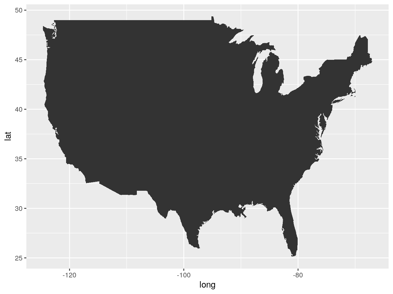
Just like with the line and bar plots that we generated in the previous chapter, we are using the ggplot() function, the ‘+’ sign and, then, specifying the ‘geom_…’ command. The difference here is that we used the geom_polygon() to draw a map instead of the geom_line() or geom_bar() to draw plots.
As you can see it is not too complicated. In total, we wrote five lines of code and got a map. There is no doubt, if you master the ggplot2 you can draw some amazing plots and maps with it. Mastering ggplot2 is not our goal here, which is why we are going to move on.
0.19.2 ggmap
The ggmap library is very similar to the ggplot2. The syntax is very similar and the whole process of gradually layering things on top of each other is the same. The output is static as well. The difference is that ggmap allows you to work with basemaps (background). A basemap is like an atlas. When we generated the shape of the United States, there was nothing behind the shape, just a blank canvas. If we did the same using ggmap, we would see the water, states, and many other things depending on the basemap we selected. It is better if I demonstrate. Before we proceed, type:
Than, load the library.
It is pretty much the same as with the ggplot(), even easier. Instead of five lines, we will do it in four.
# Getting the basemap
ourBasemap <- get_stamenmap()
# storing the map inside of a variable
ourGgmap <- ggmap(ourBasemap)
# rendering the map
ourGgmap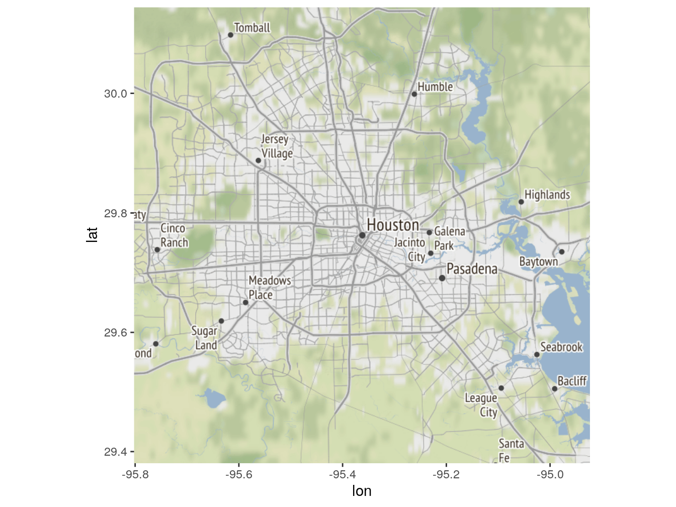
Figure 1: Here is a nice figure!
Nice. Not really though. It is the same shitty static map. It can be useful here and there, but for the reasons that I talked about in the beginning of this section, we will not be using ggmap either. Nevertheless, now you are familiar with both main libraries for generating static maps. I, actually, wanted to skip ggmap library demonstration altogether, because Google now requires us to create an account with them in order to use their basemaps. That is a big annoyance, especially when you are just learning and do not really know how to use ‘api keys’ and other shit that they want you to do. When you are learning, you just want shit to work. Adding that extra layer of complexity is just not worth it, considering that, in my opinion, ggmap is not even that great. Let’s move on to what we came here for.
0.19.3 Leaflet
Taken from the leaflet’s docummentation page on GitHub:
“Leaflet is one of the most popular open-source JavaScript libraries for interactive maps. It’s used by websites ranging from The New York Times and The Washington Post to GitHub and Flickr, as well as GIS specialists like OpenStreetMap, Mapbox, and CartoDB.”
Leaflet is extremely popular. It is a JavaScript library, but it is adopted by R so well that it is actually much easier to use it in R than in JavaScript. I did both. I do not want you to think that I am bullshitting you right now, so let me shock you with how awesome and simple it is right away. Type:
After it is installed, let’s load the library and render our first leaflet.
Just one line this time.
Figure 2: Here is a nice figure!
How cool is this? With just two lines of code you got a fully dynamic map that you can interact with. Go ahead and be amazed of how much better it is compared to that static crap, and how much easier it was to render it. The first time I saw it, I knew that, unless there is a major compromise associated with using it, I will not be going back to static maps. Now that you stopped drooling over that map, let’s talk about leaflet a bit more. After that, I will show you a lot of cool stuff that you can do with it. As always, not too much, but just enough to get you started.
0.20 Leaflet, Deeper Dive
I know that I praised leaflet a lot already, but I am not done yet. Leaflet, along with plotly and shiny (which we will cover later) gave me a huge boost in terms of my drive to learn R and code in general. Going through dry tutorials and hundreds and hundreds of dry lines of code gets very boring at some point. Some people do enjoy coding just for the coding part, others enjoy crunching numbers and solving problems, however, the majority of us want to be entertained from time to time. Crunching numbers and solving problems can be entertaining too, but when you are just starting, in most cases, you need that tangible progress. Not many things in programming are more tangible than making things move on the screen. That is why giving yourself a boost by learning how to inject interactivity in your code will get your further than just sitting and learning dry code. It definitely worked for me.
Before we move to our routine of pulling data from a database, messing with it, and outputting it on a fancy map, I want to go through some leaflet basics. Basically, I want to show you how to place a dot on a map and play with a few parameters. You do not actually have to follow my tutorial on this if you hate me already. Leaflet has an amazing and simple tutorial on their GitHub page, just google ‘leaflet R’. But if you still tolerate me, keep reading.
Let’s see what each part does and what kind of things we can layer on top. First, we will call the leaflet() function without anything else to see if it does anything.
Figure 3: Here is a nice figure!
Apparently, it provides an empty canvas with some basic functionality. The difference between this and the one before is the addTiles() function. So, the addTiles() function must be the one that actually paints the map on top of the canvas. Since we already know that, lets add a few things.
# Base layer
leaflet() %>%
# Base map
addTiles() %>%
# Centering view on the following coordinates and zooming in.
setView(lng = -71.0589, lat = 42.3601, zoom = 12)Figure 4: Here is a nice figure!
We are now centered and zoomed in on Boston.
If you are not familiar with coordinates, every point on earth has it set of coordinates that consist of latitude and longitude. The place where you are sitting right now has its own pair as well. The more decimals, the more precise the location is. Test it, find your set of coordinates on google maps and insert them instead of the ones that I gave you, increase the zoom to see your location.
If we leave the addTiles() function empty, it will just give us the default OpenStreetMap. If you want something else (and you do), you should use the function addProviderTiles() to get the third-party maps. There are a lot of them, you can see most of them here: http://leaflet-extras.github.io/leaflet-providers/preview/index.html. Let’s change the basemap to something different. I really like neutral grey colors.
# Base layer
leaflet() %>%
# Base map
addProviderTiles(providers$CartoDB.Positron) %>%
# Centering view on the following coordinates and zooming in.
setView(lng = -71.0589, lat = 42.3601, zoom = 12)Figure 5: Here is a nice figure!
Go through those maps, experiment with them, find your favorite. One thing you might be confused about from the previous chunk of code is ‘providers$CartoDB.Positron’. The ‘providers’ is the leaflet provided dataframe with the avaliable maps. The ‘CartoDB.Positron’ is one of the maps in that dataframe. Let’s double check.
# Storing the providers inside of the maps variable
maps <- providers
# Printing the first five
print(head(maps,5))## $OpenStreetMap
## [1] "OpenStreetMap"
##
## $OpenStreetMap.Mapnik
## [1] "OpenStreetMap.Mapnik"
##
## $OpenStreetMap.BlackAndWhite
## [1] "OpenStreetMap.BlackAndWhite"
##
## $OpenStreetMap.DE
## [1] "OpenStreetMap.DE"
##
## $OpenStreetMap.CH
## [1] "OpenStreetMap.CH"Now that we got that down, lets add the last two things to our map. The only thing missing right now is some sort of marker. Let’s add it.
# Base layer
leaflet() %>%
# Base map
addProviderTiles(providers$CartoDB.Positron) %>%
# Centering view on the following coordinates and zooming in.
setView(lng = -71.0589, lat = 42.3601, zoom = 12) %>%
# Adding a marker and a popup.
addMarkers(lng = -71.0589, lat = 42.3601, popup = 'Sup?')Figure 6: Here is a nice figure!
Just like that we added a marker and a popup. If you did not see the popup, just click on the marker. Obviously, this is far from it for the leaflet, but I think you get the idea. You just layer more and more things and add more bells and whistles. In the next part, we will use real data to create some real shit that will be good enough to even publish online.
0.21 Leaflet with Real Data
In this section, we will, again, pull data from a database, work with it a little bit, and map it in different ways using leaflet maps. This will be a nice and entertaining project for you. We will still repeat the same work of pulling, munging, and outputting, but a much smaller amount compared to the previous chapters. The exciting part will be mapping the data and making everything look pretty. I can almost guarantee that you will love it.
We got an extremely interesting dataset of car crashes provided be the New York City police (NYPD). That dataset has every car crash registered by NYPD since 2012. There are three particular things that we are interested in. They are the number of crashes, the number of injuries, and the number of deaths. First, we will retrieve the data from the database, then work with it a bit to get it to the right shape, and then, using the leaflet flow that we learned, we will map the crashes. Taking it a step further, I will teach you how to map data using polygons from a shapefile. That should solidify your knowledge and interest in the topic.
You can follow this however you want, but I think it is a good time to create a new project and keep everything there. I will show you how to do it, but I am not insisting because I myself did not start using projects until after my first nine months learning R. Now that I do use them, I know that it is the way to go. Let me refresh your memory on projects in R and how they differ from just opening an R file. To put it simply, a project will create a folder for you where you will be storing everything related to that project. These things will include the project file itself, an R file, any csv, excel, shape, plot, map, etc. files that you are using in that project. The major benefit of it is that you do not need to look for all these files all over your computer and you do not need to specify their paths when loading them in, your project will know that they are in the same folder. Additionally, if you ever decide to move your project to another computer, you will just need to drag that project folder over and that is it.
Sage Tip: Use projects, they are very convenient.
Here is how to do it:
Go to ‘File’ -> ‘New Project…’ -> ‘New Directory’ -> ‘New Project’ -> Give it a name and leave the checkboxes empty. Click ‘Create Project’. You should have an empty Rstudio now. Click ‘File’ -> ‘New File’ -> ‘R Script’.
There you go, everything will be contained in that folder now. For the rest of the book, we will be working out of this project folder. It is not really mandatory, as long as you can reference all the files that we will be using. Before we proceed, I want you to install four packages that deal with shapefiles and geolocation. We will not need them all, but you should have them installed just in case. So,
That was a new syntax for you, but this is how you install multiple packages without repeating install.packages() four times. You just feed a vector of package names to the function, that is it.
# Connecting to the database
connection =
dbConnect(drv = MySQL(),
user = "xxx",
password = 'xxx',
host = 'mybookdatabase.cgac79lt7rx0.us-east-2.rds.amazonaws.com',
port = 3306,
dbname = 'nikita99')Lets pull just one month of data and see what it looks like if we map it.
Lets select a day of data from the ‘pdData’ table:
# Pulling.
crashes <- dbGetQuery(connection,
"SELECT *
FROM book_pdData
WHERE date = '2019-10-01'
")
# Printing the first few records
print(head(crashes))## row_names date zip lat lon injured killed
## 1 86987 2019-10-01 NA NA NA 2 0
## 2 87151 2019-10-01 NA NA NA 0 0
## 3 114890 2019-10-01 10451 NA NA 1 0
## 4 114937 2019-10-01 NA 40.62616 -74.15742 0 0
## 5 114940 2019-10-01 11214 40.60693 -73.99941 0 0
## 6 114947 2019-10-01 10462 40.85241 -73.86777 0 0
## reason
## 1 Following Too Closely
## 2 Unspecified
## 3 Unspecified
## 4 Driver Inattention/Distraction
## 5 Failure to Yield Right-of-Way
## 6 Traffic Control DisregardedThere are quite a few crashes that happened that day. Upon inspection of the first few records, we can see that there are missing coordinates. We cannot map data with missing coordinates; therefore, we are not interested in the entries with missing either lat or lon or both. Let’s get rid of them and map the rest. As a reminder, the sign ‘|’ means ‘or’ and the sign ‘&’ means ‘and’ in R and in most programming languages. In terms of the map, only a couple of things will be different compared to our practice map. First, we will center the view on NYC instead of Boston and zoom out a little. Second, the coordinates in the addMarkers() function will not be the actual two coordinates but a column of coordinates for both ‘lng’ and ‘lat’. Finally, the popup will represent a crash reason for each location.
# Keeping the records where lat or long are not missing
crashes <- crashes[complete.cases(crashes$lat) |
complete.cases(crashes$lon),]
# Base layer
leaflet() %>%
# Base map
addProviderTiles(providers$CartoDB.Positron) %>%
# Centering view on NYC this time and zoom out a bit
setView(lng = -74.0060, lat = 40.7128, zoom = 10) %>%
# Passing the column lon and lat as lng and lat inputs for
# the function. Using the column reason for popups.
addMarkers(lng = crashes$lon,
lat = crashes$lat,
popup = crashes$reason)Figure 7: Here is a nice figure!
This is crap, really. You can still use it and some idiots would, but this is not a proper way of mapping things. It is way too crowded and confusing. We only mapped one day, imagine what it would look like if we mapped one month or one year. Not only would it be crowded but also heavy in terms of processing power. Each element on the map takes a little bit of processing power. If you have thousands and thousands of dynamic elements, your computer might just freeze.
Sage Tip: Let’s see what we can do without changing the whole thing completely. The function addMarkers() has an amazing option called ‘clusterOptions = markerClusterOptions()’. This thing will group all markers that are close to each other and instead of displaying them from the beginning, will do that only when you are zoomed in enough to see them properly. Until then, it will just display how many markers are in each cluster. Win-win!
leaflet() %>%
addProviderTiles(providers$CartoDB.Positron) %>%
setView(lng = -74.0060, lat = 40.7128, zoom = 10) %>%
# Adding clusterOptions = markerClusterOptions()
addMarkers(lng = crashes$lon, lat = crashes$lat,
popup = crashes$reason,
clusterOptions = markerClusterOptions())Figure 8: Here is a nice figure!
This is amazing, right? With one parameter, we took an overcrowded fucked up map and made a proper one, while adding some cool animation as well. If somebody showed it to me before I knew how it is done, I would pee my pants thinking how cool that is. Anyway, let’s see if we can get away with scaling our data to a month and a year using the same trick.
We are going to select a whole year this time so we will not have to do it again:
# Pulling.
crashesYear <- dbGetQuery(connection,
"SELECT *
FROM book_pdData
WHERE date >= '2019-01-01' and date < '2020-01-01'
")
# Keeping the records where lat or long are not missing
crashesYear <- crashesYear[complete.cases(crashesYear$lat) |
complete.cases(crashesYear$lon),]
# Keeping only October
crashesMonth <- crashesYear[crashesYear$date >= '2019-10-01' &
crashesYear$date < '2019-11-01',]Now that we got the data again, lets map it and see what it looks like.
leaflet() %>%
addProviderTiles(providers$CartoDB.Positron) %>%
setView(lng = -74.0060, lat = 40.7128, zoom = 10) %>%
# Adding clusterOptions = markerClusterOptions()
addMarkers(lng = crashesMonth$lon, lat = crashesMonth$lat,
popup = crashesMonth$reason,clusterOptions =
markerClusterOptions())Figure 9: Here is a nice figure!
This is even better. Lets scale up to a year.
leaflet() %>%
addProviderTiles(providers$CartoDB.Positron) %>%
setView(lng = -74.0060, lat = 40.7128, zoom = 10) %>%
# Adding clusterOptions = markerClusterOptions()
addMarkers(lng = crashesYear$lon, lat = crashesYear$lat,
popup = crashesYear$reason, clusterOptions =
markerClusterOptions())Figure 10: Here is a nice figure!
This one is ok and still usable, but you can notice already that it gets confusing even with the clustering trick that we did. There is a way to filter by, let’s say, year in the leaflet, but I will show you how to do that later. What we covered so far is already pretty good. However, I want to take it one step further and show you how to use polygons in leaflet. For this, we will first need to get the polygons and then add some data to them to make it all work.
If you do not know what polygons are, here are the examples: https://rstudio.github.io/leaflet/choropleths.html. Polygons are areas. What are some examples of areas? The states can be areas and therefore polygons, countries, zip codes, neighborhoods, etc. can be areas as well.
What is available to us? It will not be useful to map polygons of the states or countries, because we do not have any corresponding data for them. If we look at our data, we can see that we have the column that holds the zip codes of the corresponding crash locations. This is perfect, because we can calculate the number of accidents per zip code and then get the corresponding polygons to nicely map that data. First thing we need to do is to download the polygons.
Just paste this link into your browser and you will get the zip file that I prepared for you. The password is ‘shapeForBook’ (https://drive.google.com/open?id=1cAv35Epz3AMVCo-YwobsMiD_BAWaiU9M). Unzip the files into the project’s folder.
The next thing we need to do is to get the data into the right shape, and we are good to go.
# Grouping by zip and counting
countByZip <- crashesYear %>%
dplyr::group_by(zip) %>%
dplyr:: count()Before I show you how to add our count to the shapefile, let’s just map the polygons that we downloaded. For this, we need to load the shapefiles into our environment first. We have already loaded the package ‘raster’. The ‘raster’ package has a function called shapefile(), which we will use.
# shapefile() takes the path of the shapefile
ourShape <- raster::shapefile('shape/ZipCodes.shp')
leaflet() %>%
addProviderTiles(providers$CartoDB.Positron) %>%
setView(lng = -74.0060, lat = 40.7128, zoom = 11) %>%
addPolygons(data = ourShape)Figure 11: Here is a nice figure!
Ok, this works. However, it is empty. In order for this kind of map to be useful, we need colors of the polygons to be different. For that, we will need to use color palettes.
A color palette is a range of colors from a color ‘a’ to a color ‘b’. Here is an example if you are confused: a zip code ‘a’ has the smallest number of crashes (five) and a zip code ‘b’ has the most (one thousand). If we pick the blue-to-red palette the zip code ‘a’ will be blue and the zip code ‘b’ will be red, the rest of the zip code will turn into the different shades of these two colors.
The topic of palettes is a big one and it takes practice to nail the colors right. For now, just follow my lead. Before we specify the palette, we need to left join our countByZip to the data file inside of the shapefile. We will be joining by the zip code column. As you might have noticed, the ‘ourShape’ file is not a standard dataframe. It is like a list of different files inside of it. The one we are interested is ‘data’. There are two ways to access the ‘data’ dataframe. We can either extract it, do the left join, and put it back; or do a straight left join using the ‘@’ character to access a column of a dataframe inside of a shapefile. Let’s do the second one, because the first one is even more complicated. Do not worry, it only sounds complicated.
The zip column inside of the shapefile is called ‘ZIPCODE’ and is in character string format. Let’s reformat and rename the zip column of the ‘countByZip’ table to match the one in the shapefile. Then, we will be able to do a simple left join.
Renaming the first column into ‘ZIPCODE’:
Converting the first column into the character string.
Doing a left join. Since the table ‘data’ is inside of the shapefile, we need to access it somehow. Luckily, with such shapefiles we can use the ‘@’ character just like we use ‘$’ character to access columns of dataframes.
## Joining, by = "ZIPCODE"Let’s see what the first few lines of the table ‘data’ look like now.
## ZIPCODE BLDGZIP PO_NAME POPULATION AREA STATE COUNTY ST_FIPS
## 1 11436 0 Jamaica 18681 22699295 NY Queens 36
## 2 11213 0 Brooklyn 62426 29631004 NY Kings 36
## 3 11212 0 Brooklyn 83866 41972104 NY Kings 36
## 4 11225 0 Brooklyn 56527 23698630 NY Kings 36
## 5 11218 0 Brooklyn 72280 36868799 NY Kings 36
## 6 11226 0 Brooklyn 106132 39408598 NY Kings 36
## CTY_FIPS URL SHAPE_AREA SHAPE_LEN n
## 1 081 http://www.usps.com/ 0 0 366
## 2 047 http://www.usps.com/ 0 0 932
## 3 047 http://www.usps.com/ 0 0 1720
## 4 047 http://www.usps.com/ 0 0 689
## 5 047 http://www.usps.com/ 0 0 898
## 6 047 http://www.usps.com/ 0 0 1655Perfect. We added the column ‘n’ with the count of accidents per zip code per year. Now we can create a palette and map the data. There are a few ways to create a palette. The two that you should start with are the functions colorNumeric() and colorBin(). We will be using the colorNumeric() function. The function colorNumeric() takes two inputs, the palette (There are a few of them, just google ‘R color cheatsheet’, they are at the bottom), a the domain. The domain is, basically, the numeric range that you are using to distribute colors. Our domain, for example, is the column ‘n’ (ourShape@data$n). The range from the smallest number there to the highest is the domain for us. We will use the ‘Blues’ palette. So, the zip code with the smallest number of crashes will take the lightest shade of blue and the one with the highest number of crashes will be the darkest.
# Creating the palette.
pal <- colorNumeric(palette = "Blues", domain=ourShape@data$n)
leaflet() %>%
addProviderTiles(providers$CartoDB.Positron) %>%
setView(lng = -73.809354, lat = 40.737084, zoom = 11) %>%
# This time, the map will recognize the color difference based
# on the palette. The sintax '~pal(n)' might look weird right
# now. It is Do not worry about it now. This is how you will
# be specifying it from now on in leaflet.
addPolygons(data = ourShape, color = ~pal(n))Figure 12: Here is a nice figure!
Sweet. However, the boundaries are all blurry and colors are watered down. I do not like it. The function addPolygons() has a few more parameters that will make this map look amazing. The first one is ‘weight’. Weight is responsible for the thickness of the polygon boundaries. I have experimented with this parameter a lot and found that 1.3 is a good number. The second parameter is ‘fillOpacity’. The fillOpacity determines how transparent the polygons are. Right now, they are too transparent and we do not see the contrast, however, we do not want to make them completely solid, because, we still want to see the street names when we zoom in, for example. 0.7 is a good number.
leaflet() %>%
addProviderTiles(providers$CartoDB.Positron) %>%
setView(lng = -73.809354, lat = 40.737084, zoom = 11) %>%
addPolygons(data = ourShape, color = ~pal(n),
# Adding fillOpacity and weight
fillOpacity = 0.7, weight = 1.3)Figure 13: Here is a nice figure!
This is really good now. We can clearly see where the most car crashes happened in 2019. There are two missing things here, though. We must have a color reference to see what each color corresponds to, at least approximately. It would also be good to be able to click on a polygon and get a popup with some basic info. The first one is the ‘popup’ parameter of the addPolygons() function. It works just the same as in the addMarkers() function from before. I will complicate the popup a bit to make it more informative. The info that I want to display are the zip codes and the number of crashes. I, also, want to prefix that info with corresponding titles, and I want to have them on separate lines. To do that, I will use the function paste0() to add the strings ‘zip’ and ‘crashes’ in front of the actual values. Additionally, to have them on separate lines, we have to add an html tag ‘’ between them. Try with and without the tag to see the difference. After we done with that, we will want to add a legend (color reference). Leaflet provides the function addLegend() for this. This function takes position, palette, corresponding values, opacity, and tile as arguments. We will position it in the bottom right corner. See if you can position it in a different corner. I also, want to show you a different color palette (‘YlOrRd’).
# Different palette.
pal <- colorNumeric(palette = "YlOrRd", domain=ourShape@data$n)
leaflet() %>%
addProviderTiles(providers$CartoDB.Positron) %>%
setView(lng = -73.809354, lat = 40.737084, zoom = 11) %>%
addPolygons(data = ourShape, color = ~pal(n), fillOpacity = 0.7,
weight = 1.3,
# Pasting together the prefixes and values, as well as
# placing them on two lines.
popup = paste0("Zip: ", ourShape@data$ZIPCODE, "<br>",
"Crashes: ", ourShape@data$n)) %>%
# Adding a legend
addLegend("bottomright", pal = pal, values = ourShape@data$n,
title = "Car Crashes",
opacity = 0.8
)Figure 14: Here is a nice figure!
This is really useful now. We are almost there. There are a couple more things that are not super essential. That is if you are a noob. To make people who are checking out your maps pee their pants, you absolutely must have the next two things that I am about to show you. The first one is the highlight option. If you hover over the map now, it is not clear which polygon is selected (especially if polygons are small). The highlight option solves this problem. The highlight options is a part of the addPolygons() function. The syntax is as follows: ‘highlightOptions = highlightOptions(weight = …, color = …, bringToFront = True)’. The weight is the thickness of the outline, the color is the color, and the ‘bringToFront’ parameter makes sure that the highlight does not get lost somehow. Before I explain the second thing that I want to add, lets add this one.
leaflet() %>%
addProviderTiles(providers$CartoDB.Positron) %>%
setView(lng = -73.809354, lat = 40.737084, zoom = 11) %>%
addPolygons(data = ourShape, color = ~pal(n), fillOpacity = 0.7,
weight = 1.3, popup = paste0("Zip: ", ourShape@data$ZIPCODE, "<br>",
"Crashes: ", ourShape@data$n),
# Adding the highlightOptions
highlightOptions = highlightOptions(weight = 4,
color = "white",
bringToFront = TRUE)) %>%
addLegend("bottomright", pal = pal, values = ourShape@data$n,
title = "Car Crashes",
opacity = 0.8
)Figure 15: Here is a nice figure!
We are almost done. As far as leaflet goes, this is pretty much what you need for most of your tasks. I know, this might seem like a lot when taking in all at once, but It does not seem that bad when you layer things gradually. That is what we did. Using this template, you can create your own maps. There are many more bells and whistles and other capabilities that you can layer. You should be able to figure them out referencing what we just covered.
As a bonus, I want to show you how to display multiple months of data using the same polygon map. That should show you, both, opportunity for creating really interactive stuff in R, as well as the limitations for working with just maps. Let’s create three dataframes, each holding one month of crashes. We have already pulled the one year of data. We just need to filter for the correct month and count crashes again. We are basically, repeating the same steps that we did but for the whole year.
# Changing the date format from character to date
crashesYear$date <- ymd(crashesYear$date)
# Filtering only for the month of Jan
crashes201901 <- crashesYear %>%
dplyr::filter(date >= '2019-01-01' & date < '2019-02-01')
# Filtering only for the month of Feb
crashes201902 <- crashesYear %>%
dplyr::filter(date >= '2019-02-01' & date < '2019-03-01')
# Filtering only for the month of Mar
crashes201903 <- crashesYear %>%
dplyr::filter(date >= '2019-03-01' & date < '2019-04-01')
# Grouping by zip and counting
crashes201901 <- crashes201901 %>%
dplyr::group_by(zip) %>%
dplyr:: count()
# Grouping by zip and counting
crashes201902 <- crashes201902 %>%
dplyr::group_by(zip) %>%
dplyr:: count()
# Grouping by zip and counting
crashes201903 <- crashes201903 %>%
dplyr::group_by(zip) %>%
dplyr:: count()As you can see, we just repeated the same stuff that we did a few paragraphs before. Some ‘real’ programmers will tell you that you should not repeat your code more than two or three times. While it is true when you know what the hell you are doing, in my opinion, it is impossible to learn that way. The topic of functions and loops are too complicated for beginners and you should tell those ‘masters’ of code to go screw themselves. You will eventually learn how to optimize your code. For now, repetition is good. In the next chunk of code, we will do exactly the same. We got three months of data. Now, we need to join each month with its own shapefile. So, again, we will repeat the steps (multiplied by three) that we took to get the shapefile and join it with our data.
# Renaming the first column (three times)
colnames(crashes201901)[1] <- 'ZIPCODE'
colnames(crashes201902)[1] <- 'ZIPCODE'
colnames(crashes201903)[1] <- 'ZIPCODE'
# Converting the ZIPCODE column into character (three times)
crashes201901$ZIPCODE <- as.character(crashes201901$ZIPCODE)
crashes201902$ZIPCODE <- as.character(crashes201902$ZIPCODE)
crashes201903$ZIPCODE <- as.character(crashes201903$ZIPCODE)
# Loading the shapefile three times into different variables
ourShape201901 <- raster::shapefile('shape/ZipCodes.shp')
ourShape201902 <- raster::shapefile('shape/ZipCodes.shp')
ourShape201903 <- raster::shapefile('shape/ZipCodes.shp')
# Joining three times
ourShape201901@data <- left_join(ourShape201901@data, crashes201901)## Joining, by = "ZIPCODE"## Joining, by = "ZIPCODE"## Joining, by = "ZIPCODE"Great. We got three shapefiles. Now, we can just add each as a separate addPolygons() function. It will look like a lot of code, but we are just copying and pasting it three times one after another. The only two differences will be the shapefile name and we will need to add a grouping name. So the first addPolygons() will look something like this: addPolygons(data = ourShape201901, group = ‘2019-01’, there rest is the same). On top of that, we will need to add the addLayersControl() function. This function will let us switch between the polygons. You will see once it is rendered.
# Using ourShape201903 randomly. You can use any one of three.
pal <- colorNumeric(palette = "YlOrRd", domain=ourShape201903@data$n)
leaflet() %>%
addProviderTiles(providers$CartoDB.Positron) %>%
setView(lng = -73.809354, lat = 40.737084, zoom = 11) %>%
# Adding the first layer of polygons
addPolygons(data = ourShape201901, color = ~pal(n), fillOpacity = 0.7,
weight = 1.3,
# We must include group so we can switch between them.
group = "2019-01",
popup = paste0("Zip: ", ourShape201901@data$ZIPCODE, "<br>",
"Crashes: ", ourShape201901@data$n),
highlightOptions = highlightOptions(weight = 4,
color = "white",
bringToFront = TRUE)) %>%
# Same as with the previous polygones. The shapefile is
# different
addPolygons(data = ourShape201902, color = ~pal(n), fillOpacity = 0.7,
weight = 1.3,
# Different group.
group = "2019-02",
popup = paste0("Zip: ", ourShape201902@data$ZIPCODE, "<br>",
"Crashes: ", ourShape201902@data$n),
highlightOptions = highlightOptions(weight = 4,
color = "white",
bringToFront = TRUE)) %>%
# Same as with the previous polygones. The shapefile is
# different
addPolygons(data = ourShape201903, color = ~pal(n), fillOpacity = 0.7,
weight = 1.3,
# Different group.
group = "2019-03",
popup = paste0("Zip: ", ourShape201903@data$ZIPCODE, "<br>",
"Crashes: ", ourShape201903@data$n),
highlightOptions = highlightOptions(weight = 4,
color = "white",
bringToFront = TRUE)) %>%
addLegend("bottomright", pal = pal, values = ourShape201903@data$n,
title = "Car Crashes", opacity = 0.8) %>%
# Here, we must use the names that we gave to the groups so we can
# switch between them. Collapsed = FALSE means visible.
addLayersControl(baseGroups = c("2019-01", "2019-02","2019-03"),
options = layersControlOptions(collapsed = FALSE))