Chapter 3 Wrangling and Visualizing Data
3.1 Wrangling Data
Wrangling data refers to cleaning/manipulating/reorganizing raw data to make it more useful for analysis. The dplyr package has a host of functions specifically for this purpose. This section will introduce you to a few.
3.1.1 Indexing
Elements in a vector, matrix, or data frame can be extracted using square brackets (numerical indexing). Indexing in R starts at 1 (in some other languages such as Python indexing starts at 0).
Below are some examples of indexing from the cardiac dataset:
# extract element in 1st row and 3th column
cardiacdata[1,3]
## [1] 70# extract rows 5-7 from columns 1-3
cardiacdata[5:7,1:3]## gender bodytemp heartrate
## 5 2 97.1 73
## 6 2 97.1 75
## 7 2 97.1 82
3.1.2 Extracting
The extract operator, $, can extract a named element from a list. Since a data frame is a list, the $ operator can be used to extract columns from a data frame:
# extract column 'bodytemp' and assign to new object 'temperatures'
temperatures <- cardiacdata$bodytemp
3.1.3 Selecting columns
Use select():
# select columns 'gender' and 'heartrate' and assign to new object 'heartrates'
heartrates <- select(cardiacdata, gender, heartrate)
The first argument in the select() function is the data frame you are selecting from, and subsequent arguments are variables you want to select.
3.1.4 Renaming columns
Use rename():
## append variable names with their respective units
# rename 'bodytemp' to 'bodytemp_degF'
cardiacdata <- rename(cardiacdata, bodytemp_degF = bodytemp)

# rename 'heartrate' to 'heartrate_bpm'
cardiacdata <- rename(cardiacdata, heartrate_bpm = heartrate)
Below is a preview of the modified cardiac dataset–now with different column names:
head(cardiacdata)## gender bodytemp_degF heartrate_bpm
## 1 2 96.3 70
## 2 2 96.7 71
## 3 2 96.9 74
## 4 2 97.0 80
## 5 2 97.1 73
## 6 2 97.1 75
3.1.5 Adding/changing columns
Use mutate():
# add new column with body temperature in degrees celsius
cardiacdata <- mutate(cardiacdata, bodytemp_degC = (bodytemp_degF - 32)*(5/9))
# change values in gender column to read "Female" and "Male" instead of 1 and 2
cardiacdata <- mutate(cardiacdata, gender = ifelse(gender == 1, 'Female',
ifelse(gender == 2, 'Male', NA)))See these changes below:
head(cardiacdata)## gender bodytemp_degF heartrate_bpm bodytemp_degC
## 1 Male 96.3 70 35.72222
## 2 Male 96.7 71 35.94444
## 3 Male 96.9 74 36.05556
## 4 Male 97.0 80 36.11111
## 5 Male 97.1 73 36.16667
## 6 Male 97.1 75 36.16667
3.1.6 Filtering data
Use filter():
# filter for data from female subjects only
cardiacdata_female <- filter(cardiacdata, gender == 'Female')
3.1.7 Piping
The pipe operator, %>%, is useful for performing functions simultaneously.
Theoretically: say you have an object, x, and you want to perform three functions on it: f(), g(), and h(). You could do:
f(x)
g(x)
h(x)
Running these three lines of code sequentially would the run x through f(), then run the result through g(), then run that result through h(). A cleaner way to do this is by running it all in one ‘pipe’:
x %>% f() %>% g() %>% h()In short, the pipe operator forwards (‘pipes’) the values on its left hand side into the expression(s) on its right hand side.
E.g. say you want to take the cardiac data, filter for females, drop the column gender, and add a new column calculating body temperature in Kelvin:
cardiacdata <- cardiacdata %>%
  filter(gender == 'Female') %>%
  select(-gender) %>%
  mutate(bodytemp_Kelvin = bodytemp_degC + 273)
3.1.8 Aggregating data
Aggregating data is useful if you want to find summary statistics across particular categories in the data. When aggregating data you must specify your grouping variable (which should be categorical), and you must perform some function (usually a sum or mean) on the non-grouping variables (which should be numeric).
There are many ways to aggregate data. One way is using group_by() to specify the grouping variable(s) and summarize() to specify the function you want to perform on the non-grouping variable(s).1
E.g. to compare averages across gender, use gender as the grouping variable and calculate means for the other variables:
cardiacdata_byGender <- cardiacdata %>%
  group_by(gender) %>%                                  # group by 'gender'
  summarize(avg_bodytemp_degF = mean(bodytemp_degF),    # aggregate using means
            avg_bodytemp_degC = mean(bodytemp_degC),
            avg_heartrate_bpm = mean(heartrate_bpm))
The aggregated data frame, cardiacdata_byGender, should look as follows:
| gender | avg_bodytemp_degF | avg_bodytemp_degC | avg_heartrate_bpm |
|---|---|---|---|
| Female | 98.39385 | 36.88547 | 74.15385 |
| Male | 98.10462 | 36.72479 | 73.36923 |
3.1.9 Dealing with missing data
If your data contains missing values (NA values), some functions may not run as expected:
some_numbers <- c(4,5,6,7,NA,8)

mean(some_numbers)
## [1] NAIf you want the function to skip all missing values, you should specify the argument na.rm = TRUE (by default it is set to FALSE for most functions):
mean(some_numbers, na.rm = TRUE)## [1] 6
3.2 Visualizing Data
ggplot2 is the main plotting library in R. Note although the package name is ggplot2, the function call is simply ggplot(). To make a plot you need to provide ggplot() with two arguments, data and mapping:
data– the data frame you want to plotmapping– an aesthetic mapping for variable(s) go on which axes
The following examples will demonstrate how to use ggplot(). Here is a ggplot cheatsheet.
3.2.1 Histograms
Histograms are a good way to visualize the distribution of data, since they display the frequency (or relative frequency) of observations within specified intervals or ‘bins’.
To plot a histogram you must specify + geom_histogram() after the main function call. Histograms only require one variable (for the \(x\)-axis; the \(y\)-axis is simply frequency).
The following code plots a histogram of the variable body temperature:
ggplot(data = cardiacdata, mapping = aes(x = bodytemp_degC)) +
  geom_histogram(bins = 20)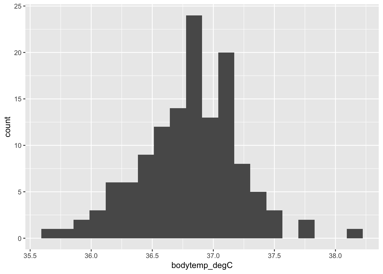
If you want relative frequency on the \(y\)-axis (a density plot) you can specify the aesthetic mapping y = ..density.. in geom_histogram():
ggplot(data = cardiacdata, mapping = aes(x = bodytemp_degC)) +
  geom_histogram(bins = 20, aes(y = ..density..))
You can make the plot prettier by adding axis labels and changing the colors and theme:
ggplot(data = cardiacdata, mapping = aes(x = bodytemp_degC)) +
  geom_histogram(bins = 20, aes(y = ..density..), fill = 'lightblue') +
  xlab('body temperature (celsius)') +
  ggtitle('distribution of body temperatures') +
  theme_light()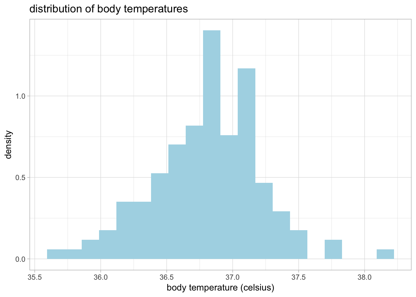
3.2.2 Scatterplots
Scatterplots require two variables–one for \(x\) and one for \(y\). To make a scatterplot you must specify + geom_point() after the main function call.
Below is a scatterplot of heart rate on body temperature:
ggplot(data = cardiacdata, mapping = aes(x = heartrate_bpm, y = bodytemp_degC)) +
  geom_point() +
  theme_light()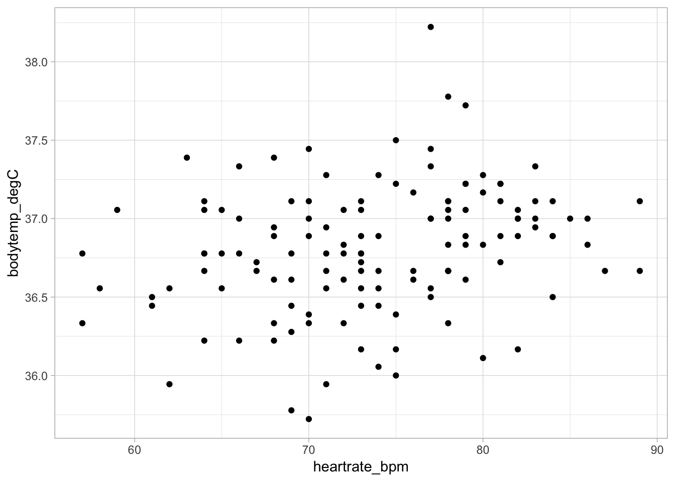
To distinguish between females and males, you can add another argument to the aesthetic mapping, color = gender. This will use different colors for data points corresponding to each gender:2
ggplot(data = cardiacdata, mapping = aes(x = heartrate_bpm, y = bodytemp_degC, color = gender)) +
  geom_point() +
  theme_light()
3.2.3 Box & Whisker Plots
Box and whisker plots require two variables; one should be categorical and the other should be numeric. To make a box and whisker plot you must specify + geom_boxplot() after the main function call.
Below is a box and whisker plot of body temperature (continuous) on gender (categorical):
ggplot(data = cardiacdata, mapping = aes(x = gender, y = bodytemp_degC)) +
  geom_boxplot() +
  xlab('gender') +
  ylab('body temperature (celsius)') +
  theme_light()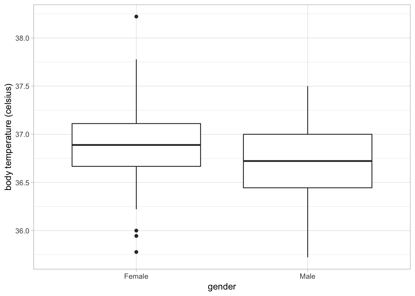
You can see R marks outliers (values substantially outside the interquartile range) as separate points.