2 Week2: Data Visualization I
2.1 What is ggplot2?
- The
ggplot2package is an R package for data visualization. Withggplot2, you can create nice plots with few lines(?) of codes as follows. Although the codes look complicated for now, you can create plots like this example very soon.
# Code chunk 1: an example plot using ggplot2
# This plot comes from
# https://www.r-graph-gallery.com/320-the-basis-of-bubble-plot.html

# create data
gdp <- gapminder %>%
  filter(year=="2007") %>%
  dplyr::select(-year) %>%
  arrange(desc(pop)) %>%
  mutate(country = factor(country, country))

# create a bubble plot
ggplot(data = gdp, mapping = aes(x = gdpPercap, y = lifeExp, size = pop, fill = continent)) +
  geom_point(alpha = 0.5, shape = 21, color = "black") +
  scale_size(range = c(.1, 24), name = "Population (M)") +
  theme_minimal() +
  theme(legend.position = "right") +
  labs(
     subtitle = "Life Expectancy vs. GDP per Capita",
     y = "Life Expectancy",
     x = "GDP per Capita",
     title = "Scatter Plot",
     caption = "Source: gapminder"
  )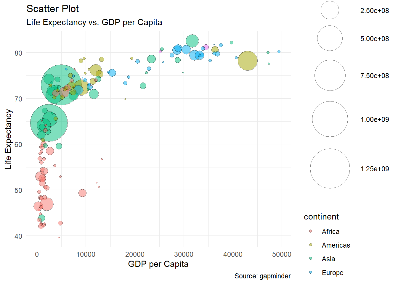
What can you tell from the plot?
ggplot2is a part of tidyverse which is a collection of R packages designed for data science in R.You can find an official R documentation for
ggplot2(or any R package)- by typing
?ggplot2in your console or - by visiting RDocumentation
- by visiting tidyverse.org
- by typing
2.2 Graphical components
ggplot2(Hadley Wickham 2016) was developed to create a graphic by combining few graphical components (e.g., data, coordinate systems, geometric objects, aesthetics, facets, themes) based on the grammar of graphics (gginggplot2stands for grammar of graphics). Hadley Wickham (2016) explains the grammar of graphics as follows:
“Wilkinson (2005) created the grammar of graphics to describe the deep features that underlie all statistical graphics. The grammar of graphics is an answer to a question: what is a statistical graphic? The layered grammar of graphics (Wickham, 2009) builds on Wilkinson’s grammar, focussing on the primacy of layers and adapting it for embedding within R. In brief, the grammar tells us that a statistical graphic is a mapping from data to aesthetic attributes (colour, shape, size) of geometric objects (points, lines, bars). The plot may also contain statistical transformations of the data and is drawn on a specific coordinate system. Faceting can be used to generate the same plot for different subsets of the dataset. It is the combination of these independent components that make up a graphic.”
— Hadley Wickham (2016)
- The graphical components of the grammar of graphics include
- the data you want to visualize
- the geometric objects (geoms for short; e.g., circles, lines, polygons etc.) that appear on the plot
- a set of aesthetic mappings that describe how variables in the data are mapped to aesthetic properties (e.g., color, shape, linetype) of the geometric objects
- a statistical transformation (stats for short) used to calculate the data values used in the plot
- a position adjustment for arranging each geometric object on the plot
- a scale (e.g., range of values) for each aesthetic mapping used
- a coordinate system (coords for short) used to organize the geometric objects
- the facets or groups of data shown in different plots
2.3 ggplot2 syntax
- The basic idea of the
ggplot2package is to build a statistical graph by adding layers representing geometric objects (e.g., points, lines), and the aesthetic properties of the geometric objects (e.g., colors, line types) can be controlled by mapping (or relating) data to the aesthetic properties.
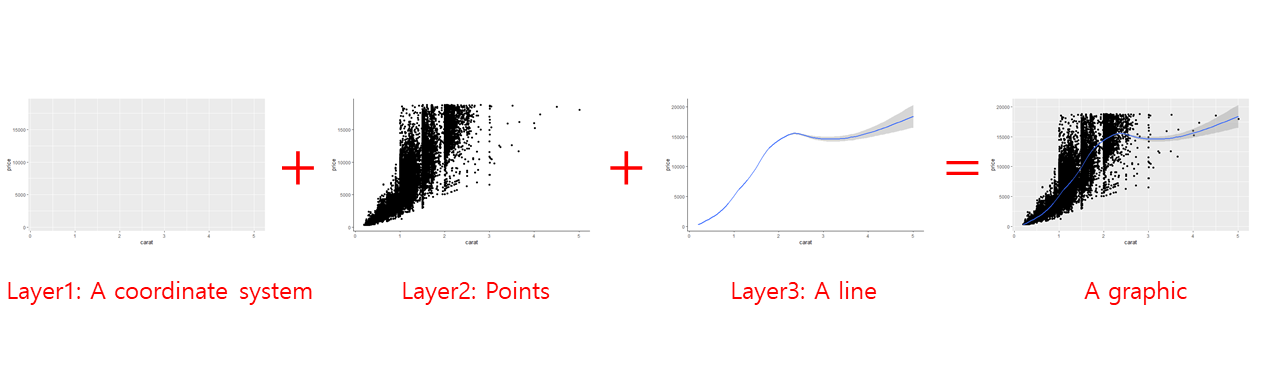
A statistical graph can be created by adding layers
- You can create a plot by combining the graphical components of the grammar of graphics based on the following sytax. Essentially, you add layers representing graphical components to a plot with the character
+. :ggplot(data = <DATA>) +
<GEOM FUNCTION>(mapping = aes(<AESTHETIC MAPPING>), stat = <STAT>, position = <POSITION>) +
<COORDINATE FUNCTION> +
<FACET FUNCTION> +
<SCALE FUNCTION> +<THEME FUNCTION>
2.4 Learning objectives of this lecture
- Students can explain the meaning of each graphical component
- Students understand the basics ggplot2 syntax to combine graphical components
- Students can create common plots using ggplot2
2.5 Installing and laoding ggplot2
- You can install the
ggplot2package (or any package)- using
install.packages()function - using the Packages pane
- using
# Code chunk 2: install packages
# install.packages() will download and install packages
# from CRAN-like repositories or from local files.
install.packages("ggplot2")- Once you install the
ggplot2package, you need to load theggplot2package onto memory whenever you use the package.
- The
ggplot2package is a part oftidyverse. You can install all the packages in the tidyverse and load the core tidyverse packages by running the following code.
2.6 Useful resources for learning ggplot2
Hardley Wickham’s Ch3. Data visualisation in R for Data Science provides a quick overview on
ggplot. Hardley developedggplot2:)Hardley Wickham] wrote a book on
ggplot2: ggplot2: Elegant Graphics for Data Analysis.Winston Chang’s R Graphics Cookbook is another wonderful resource for
ggplot2.The cheatsheet from RStudio nicely summarize
ggplot2. You can easily review various functions inggplot2with the cheatsheet. Whenever you want the cheatsheet, go to Google and type “ggplot2 cheatsheet” as your search keywords.
2.7 Graphical components of ggplot2
- Data
- Geometric objects (geom for short)
- Aesthetic mappings
- Statistical transformations (stats for short)
- Scales
- A coordinate system (coord for short)
- A faceting
2.7.1 Data
“The data are what you want to visualize.” (Hadley Wickham 2016)
In order to create plots from data, you first need to import (or read) your own data into R. We will talk about data importing using
tidyverse’s readr package later. For now, let’s just assume that you already imported your data into R.After importing your data, you may need to get your own data into a useful form for visualization and modeling. This process is often called data wrangling (H. Wickham and Grolemund 2016). For example, data wrangling include selecting variables and rows, creating new variables, and merging data sets. Tidyverse provides a set of R packages which help you to wrangle your data. In later lecture of this course, you will learn
dplyr,tidyr,purrr,stringrpackages intidyversefor data wrangling. For now, let’s assume that we already have our data in the desired format and just focus in learningggplot2.
# Code chunk 5
# diamonds is a built-in data in ggplot2
#, meaning that you can use diamonds data after you load ggplot2 package.
# ?diamonds display the help document for data.
# diamonds is a tibble, which is data structure in tidyverse.
# we will talk data structure later.
diamonds
## # A tibble: 53,940 x 10
## carat cut color clarity depth table price x y z
## <dbl> <ord> <ord> <ord> <dbl> <dbl> <int> <dbl> <dbl> <dbl>
## 1 0.23 Ideal E SI2 61.5 55 326 3.95 3.98 2.43
## 2 0.21 Premium E SI1 59.8 61 326 3.89 3.84 2.31
## 3 0.23 Good E VS1 56.9 65 327 4.05 4.07 2.31
## 4 0.290 Premium I VS2 62.4 58 334 4.2 4.23 2.63
## 5 0.31 Good J SI2 63.3 58 335 4.34 4.35 2.75
## 6 0.24 Very Good J VVS2 62.8 57 336 3.94 3.96 2.48
## 7 0.24 Very Good I VVS1 62.3 57 336 3.95 3.98 2.47
## 8 0.26 Very Good H SI1 61.9 55 337 4.07 4.11 2.53
## 9 0.22 Fair E VS2 65.1 61 337 3.87 3.78 2.49
## 10 0.23 Very Good H VS1 59.4 61 338 4 4.05 2.39
## # ... with 53,930 more rows- The interactive code chunk below was created by the learnr package. You can directly execute R code in this code chunk.
# Please type `diamonds` below and run
# There are 53,940 rows and 10 columns. Can you check these number when you type `diamonds`?
# "carat cut color ... " are the names of variables.
# "<dbl> <ord> <ord> ... " are the `data type` which we will talk more later.
# <dbl> indicates `double` (or real number such as 1.5)
# <ord> indicates `ordered factor` (e.g., small < medium < large)
2.7.2 Geometric objects (geoms)
“Geometric objects, geoms for short, represent what you actually see on the plot” (Hadley Wickham 2016). For example, geometric objects include points, lines, bars, etc in a plot.
Geometric objects can be added to a plot as a new layer using a geom function (i.e.,
geom_*()). For example, data points, which is a geometric object, can be added to a plot as a new layer using thegeom_point()function.In the cheatsheet, you will find many geom functions and their corresponding geometric objects. For example, we often use the following geom functions:
geom_point()for scatter plotgeom_line()for line plotgeom_histogram()for histogram
In
ggplot2, you can create plots by- calling the
ggplot()function to begin a plot (or to initialize a ggplot object or to create a blank canvas) that you can add layers to- An object is a technical terminology. In fact, everything (e.g., vectors, matrices, data frames, lists, functions) in R is an object, a data structure having some values and functions. In computer science, “a data structure is a way to store and organize data in order to facilitate access and modifications” (Cormen et al. 2009). The official definition of an object in R can be found here. We will talk more about data structure in R later.
- specifying aesthetic mappings to specify how you want to map variables to visual aspects of geometric objects
- Each geom has its own aesthetic properties. For example, the aesthetic properties of points in a plot include points’ color, size, and shape. You can change the color, size, and shape of points in a plot using aesthetic mapping.
- adding a new layer representing a geometric object to a plot using a geom function
- calling the
In short, you create a ggplot object using the
ggplot()function, and add additional layer using the geom functions as follows (check the “Basics” section in the cheatsheet):
# Code chunk 6: initialize a ggplot object
# ggplot() initializes a ggplot object.
# In ggplot(), you need to specify 1) a dataset, and 2) aesthetic mapping.
# In the example below, x-position and y-position are mapped into carat and price variables.
# No geometric object yet.
ggplot(data = diamonds, aes(x = carat, y = price))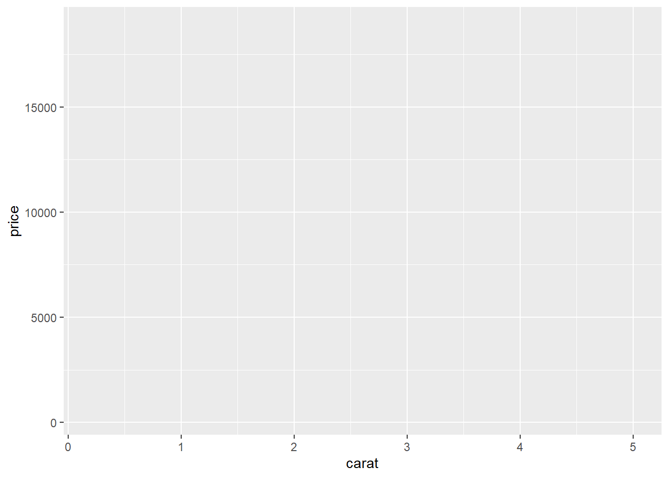
# Code chunk 7: add a geometric object
# geom_points() adds a new layer to a plot by drawing points to produce a scatter plot
ggplot(data = diamonds, aes(x = carat, y = price)) + geom_point()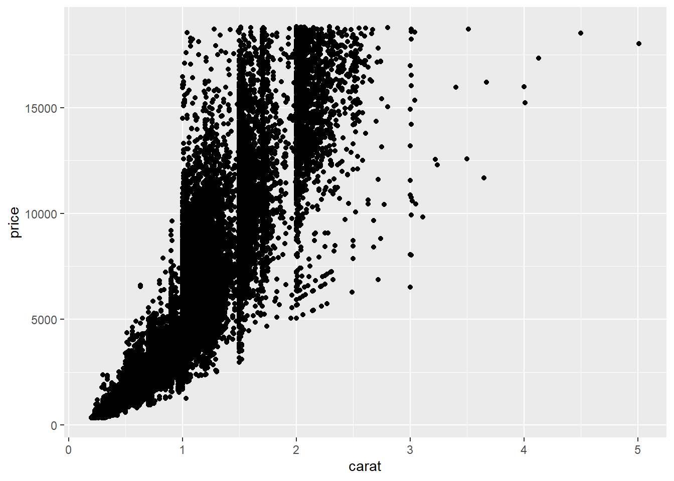
# Code chunk 8: add another geometric object
# geom_smooth() adds an additional layer to the plot by drawing a smoothed line to capture the trend in the scatterplot
ggplot(data = diamonds, aes(x = carat, y = price)) + geom_point() + geom_smooth()
## `geom_smooth()` using method = 'gam' and formula 'y ~ s(x, bs = "cs")'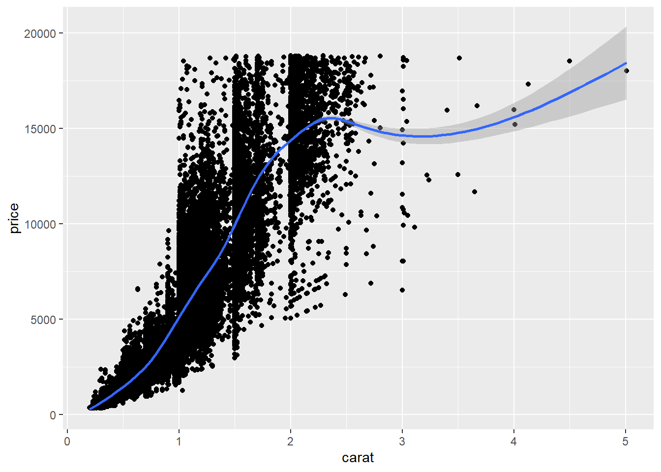
Exercise 2-1. Your first ggplot2 plot
Let’s create your first plot using
mtcarsdata, which is a built-in data in R.First, let’s check the variables in the
mtcarsby just typing mtcars in the interactive R code chunk below.
# type `mtcars` to display the dataset
# `?mtcars` will display a help document for `mtcars` dataset- Second, create a scatter plot between
disp(x-axis) andmpg(y-axis) in themtcarsdataset with a smoothed line like the one in the Code chunk 8. If you type?mtcars, then you can findmtcarsis a dataset for motor trend car road test,mpgis a mile/gallon (how many miles can car go with a gallon), anddispis an engine size of a car.
- What can you tell from the plot about the relationship between fuel efficiency (i.e.,
mpg) and engine size (i.e.,disp)?
2.7.3 Aesthetic mappings
Once you add geometric objects (e.g., points as in the above example) to a plot, you can change the visual (or aesthetic) properties of the geometric objects (e.g., color of the points). You can find some aesthetic properties in R here (e.g., lintypes of a line, shapes of a point, color of a point).
Often, you may want to change the visual (or aesthetic) properties of the geometric objects by mapping variables in the data to aesthetic properties of geoms using the following syntax:
<aesthetic property> = <variable names>. For example,shape = cylmaps theshapeaesthetic (e.g., circle, triangle, cross) of points tocylvariable (number of cylinders in thempgdataset) so that you can encode additional information to a plot using different color of points.“A set of aesthetic mappings describe how variables in the data are mapped to aesthetic properties of the layer” (Hadley Wickham 2016)
“To describe the way that variables in the data are mapped to things that we can perceive on the plot (the "aesthetics"), we use the
aesfunction. Theaesfunction takes a list of aesthetic-variable pairs like these:aes(x = weight, y = height, colour = age). Here we are mapping x-position toweight, y-position toheightand colour toage. The first two arguments can be left without names, in which case they correspond to the x and y variables.” (Hadley Wickham 2016)Aesthetic properties in
ggplot2includeposition(e.g., x and y coordinates)color(outside color)fill(inside color)shape(of points; e.g., circle, triangle)linetype(e.g., solid line, dotted line)sizealpha(transparency)
# Code chunk 9: aesthetic mapping
# `color = color` maps the variable `color` in the dataset to the `color` aesthetics of points to encode further information in the graphic.
ggplot(data = diamonds, aes(x = carat, y = price, color = color)) + geom_point()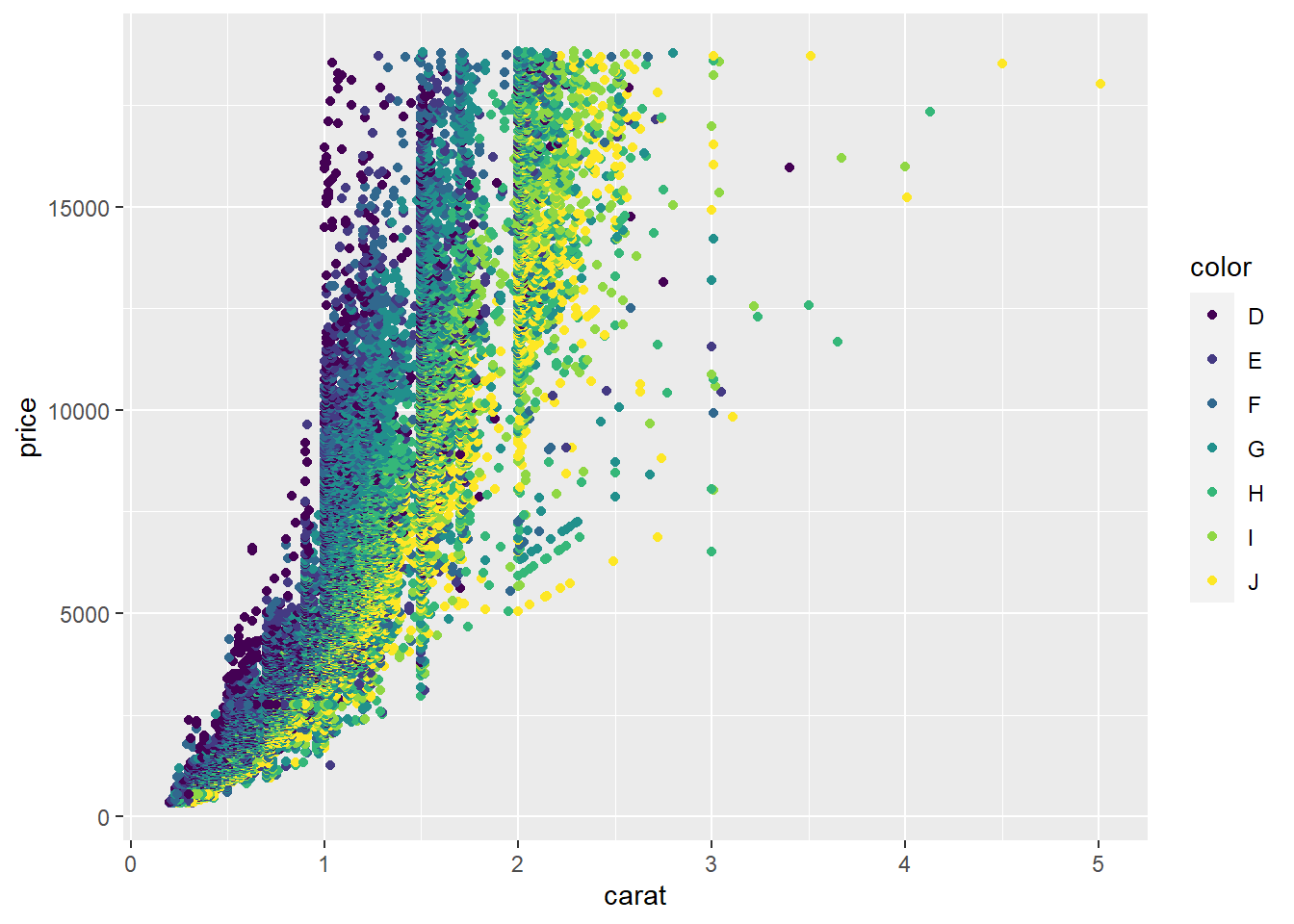
# Code chunk 10: aesthetic mapping
# `shape = cut` maps the `shape` aesthetics of points to the variable `cut` in the dataset to encode further information in the graphic.
# Note that the graphic is not so informative because points are overplotted. Sometimes, facetting may handle overplotting.
# We will talk about facetting later in this lecture.
ggplot(data = diamonds, aes(x = carat, y = price, shape = cut)) + geom_point()
## Warning: Using shapes for an ordinal variable is not advised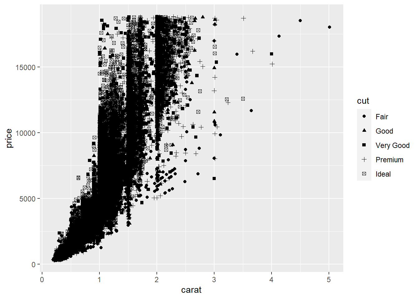
# Code chunk 11: set aesthetic properties to a constant
# We can set aesthetic properties to a constant outside aes() function.
ggplot(data = diamonds, aes(x = carat, y = price)) + geom_point(color = "blue")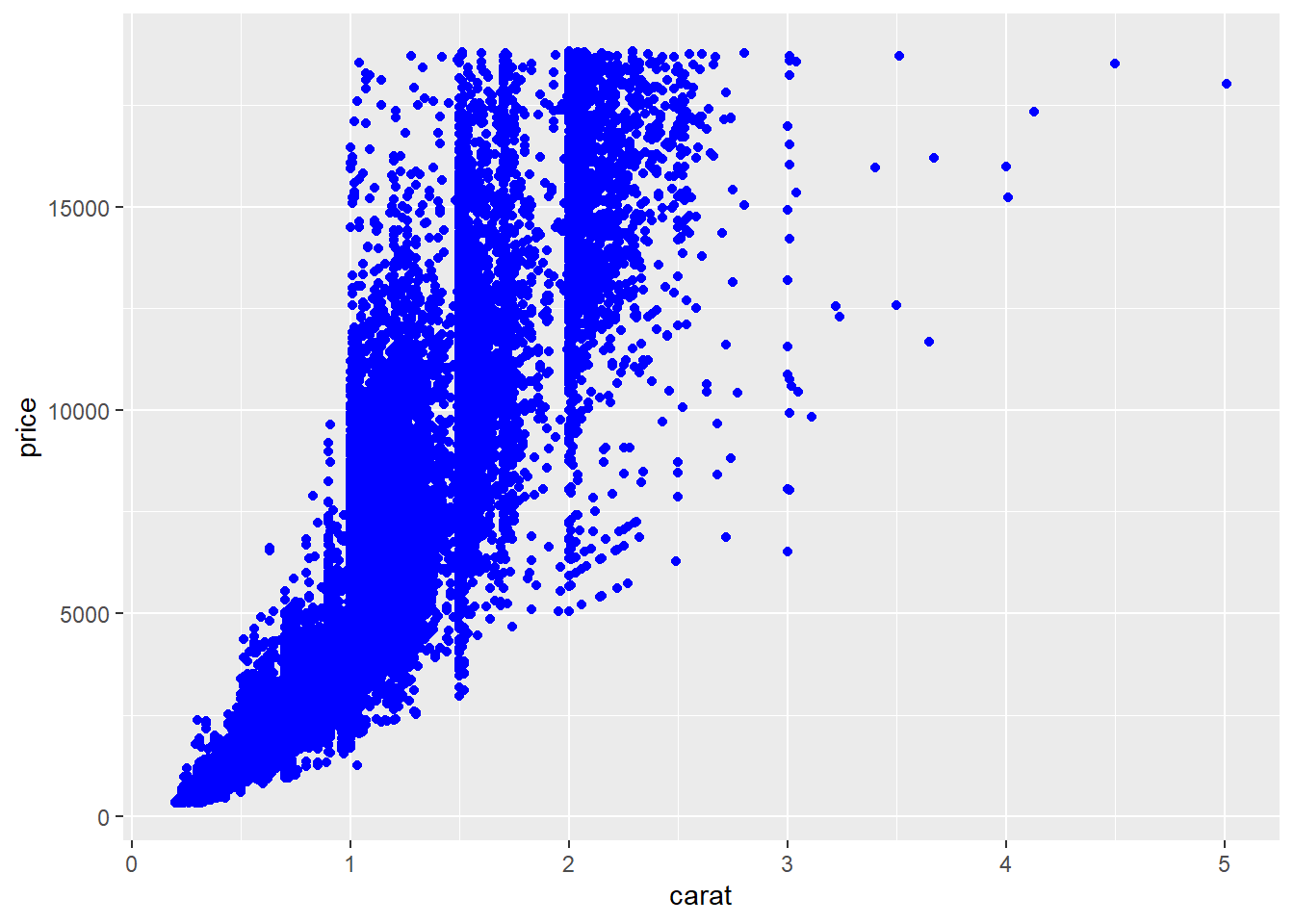
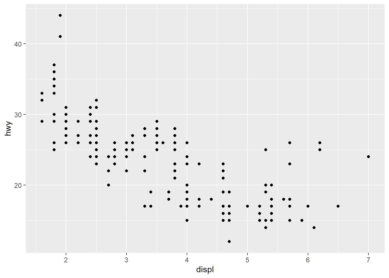
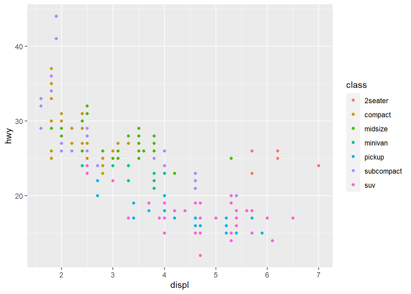
Exercise 2-2. Aesthetic mapping
mpgis similar tomtcarsbut is a built-in tibble inggplot2. Plothwy(mile per gallon: y axis) againstdispl(engine size: x axis)- Recall
ggplot(data = <dataset name>, aes(<aesthetic mapping>)) + geom_*() ...is a basic format for creating a plot inggplot2(check the cheatsheet). - x and y positions are also aesthetic properties in
ggplot2, meaning that you needx = <variable name for x axis>andy = <variable name for y axis>.
- Recall
- Based on the plot from above, map the
cylvariable (number of cylinders) to color aesthetics.
Explain what happens? Can you see the additional information are further encoded in the graph?
This is what happens when mapping
x,y, andcoloraesthetics tohyw,displ, andcylvariables: R creates a new dataset that contains all the data to be displayed on the plot.
| x | y | color |
|---|---|---|
| 1.8 | 29 | 4 |
| 1.8 | 29 | 4 |
| 2.0 | 31 | 4 |
| 2.0 | 30 | 4 |
| 2.8 | 26 | 6 |
| 2.8 | 26 | 6 |
| 3.1 | 27 | 6 |
| 1.8 | 26 | 4 |
| 1.8 | 25 | 4 |
| 2.0 | 28 | 4 |
2.7.4 Scales
- In the previous table, computers don’t know how to display colors based on 4, 6, … Computers need a hexadecimal code for colors such as
FF6C91. The mapping from the data to the final values that computers can use to display aesthetics is called a scale. In this sense, a scale controls aesthetic mapping from data to aesthetics.
| x | y | color |
|---|---|---|
| 1.8 | 29 | #FF6C91 |
| 1.8 | 29 | #FF6C91 |
| 2.0 | 31 | #FF6C91 |
| 2.0 | 30 | #FF6C91 |
| 2.8 | 26 | #00C1A9 |
| 2.8 | 26 | #00C1A9 |
| 3.1 | 27 | #00C1A9 |
| 1.8 | 26 | #FF6C91 |
| 1.8 | 25 | #FF6C91 |
| 2.0 | 28 | #FF6C91 |
- To control the aesthetic mapping, you can use a scale function (i.e.,
scale_*()). Please check the Scales section in the cheatsheet. For example,scale_x_continuous()andscale_y_continuous()allow us to change the default scales for continuousxandyaesthetics. If you see the reference guide, you will findscale_x_continuous()andscale_y_continuous()functions allow you to change the name, break points, limits, etc. of the continuous x and y axis.
# Code chunk 12: create a scatter plot
# you assign a name `p1` to a ggplot object.
# By assigning a ggplot object to the variable `p1`, you can easily add different layers to `p1`.
p1 <- ggplot(mpg, aes(displ, hwy)) + geom_point()
p1
# Code chunk 13: change the axis labels
# add an additional layer to p1 object
p1 +
  scale_x_continuous("Engine displacement (L)") +
  scale_y_continuous("Highway MPG")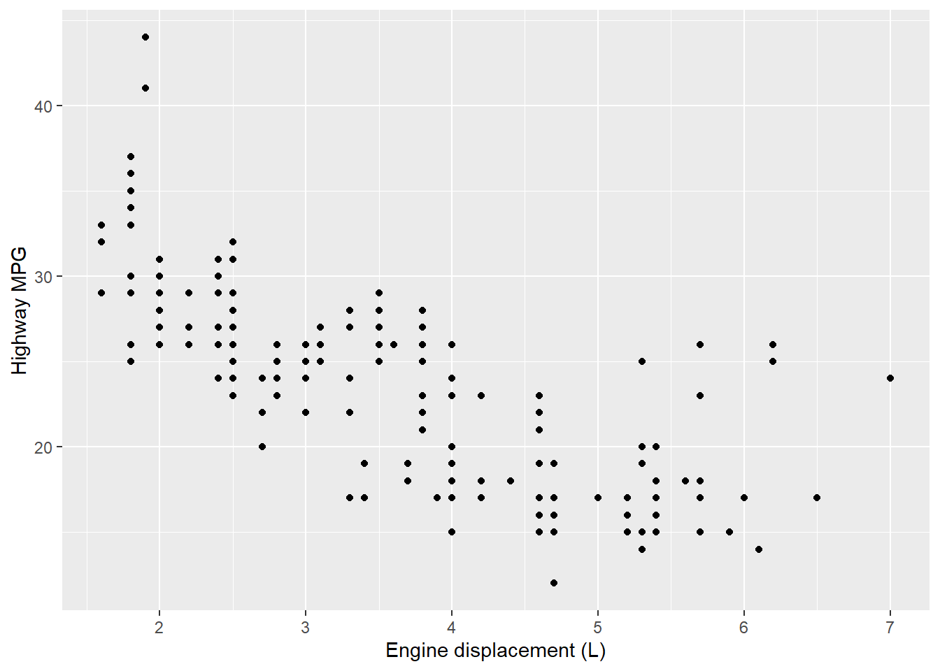
# Code chunk 14: change the axis labels
# use the short-cut labs()
p1 + labs(x = "Engine displacement (L)", y = "Highway MPG")
## Warning: Removed 27 rows containing missing values (geom_point).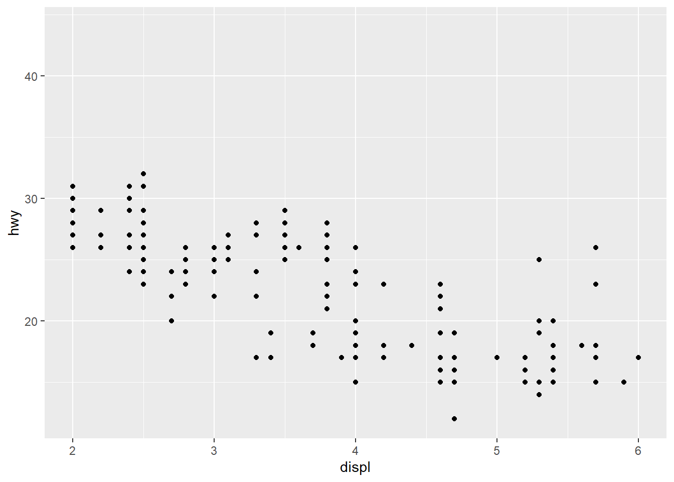
# Code chunk 16: modify the axis limits
# use the short hand functions `xlim()` and `ylim()`
p1 + xlim(2, 6)
## Warning: Removed 27 rows containing missing values (geom_point).
# Code chunk 17: modify the axis limits
#  choose where the `ticks` appear
p1 + scale_x_continuous(breaks = c(2, 4, 6))
# Code chunk 18: choose your own labels
p1 + scale_x_continuous(breaks = c(2, 4, 6), label = c("two", "four", "six"))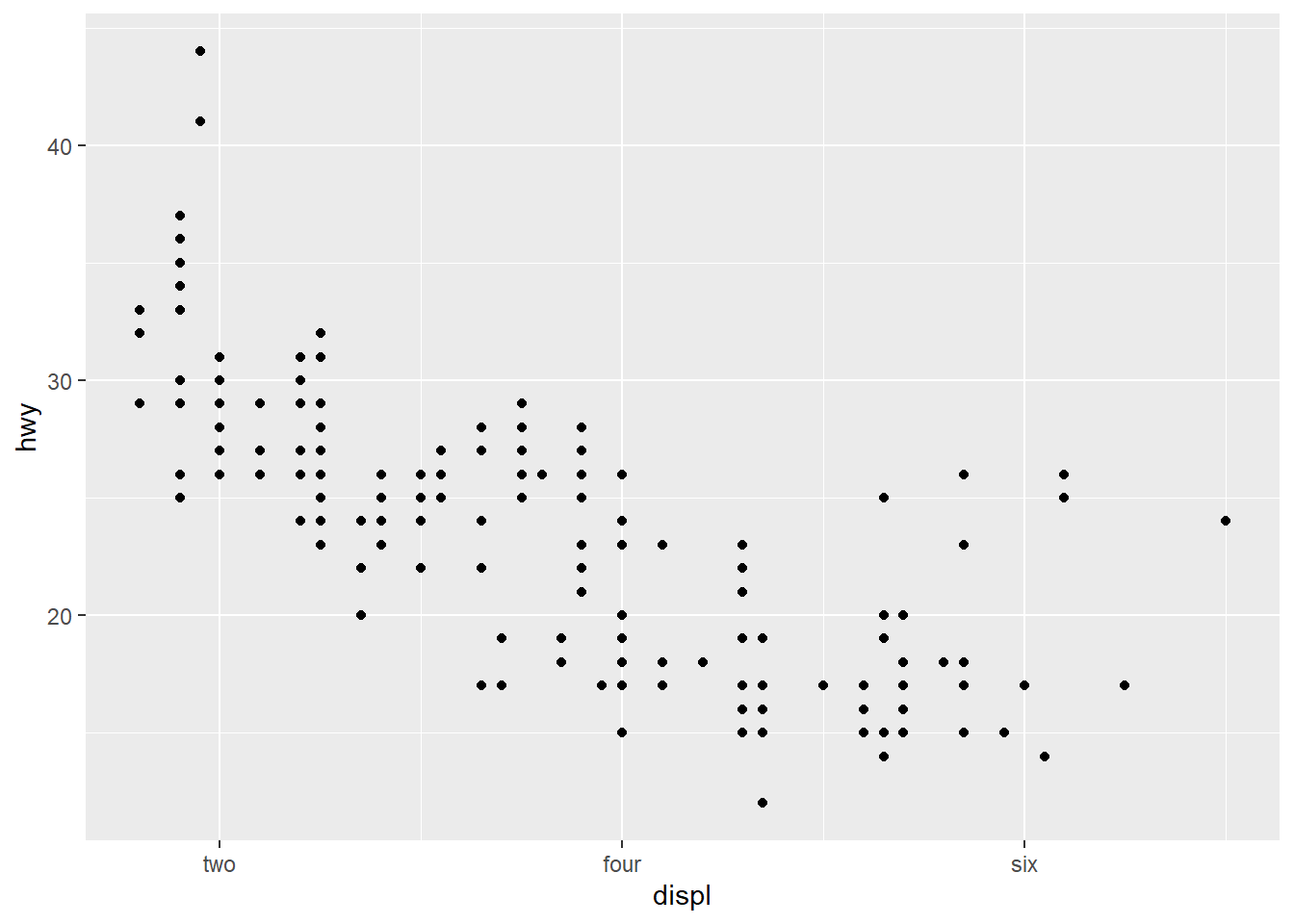
# Code chunk 19: add title and axis labels
ggplot(data = mpg, mapping = aes(x = displ, y = hwy, color=drv)) +
  geom_point() + geom_smooth(method="lm") +
  labs(title ="MPG vs Engine size", x = "Engine size", y = "MPG")
## `geom_smooth()` using formula 'y ~ x'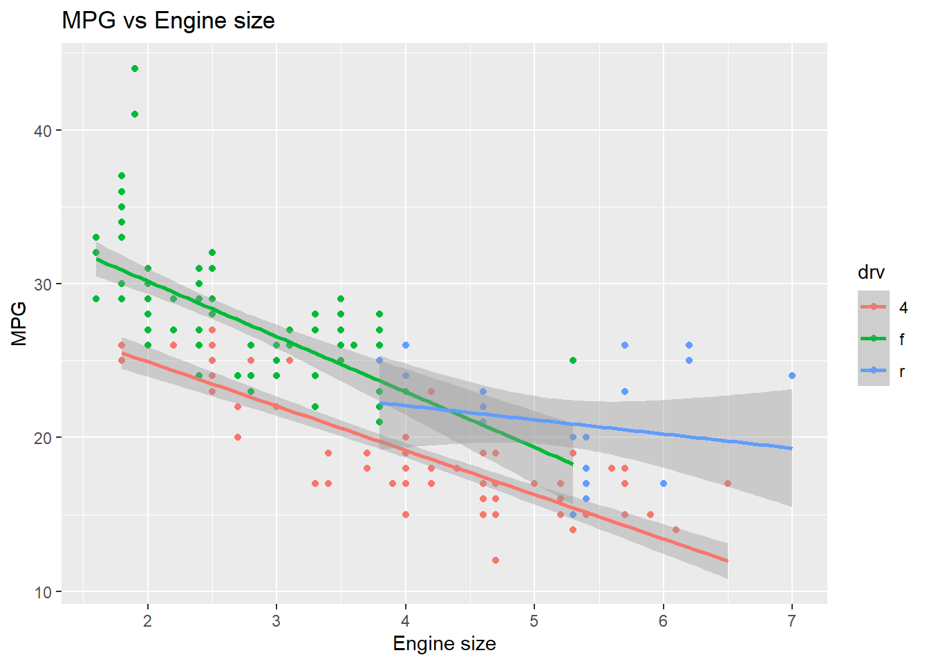
# Code chunk 20: Create your own discrete scale
ggplot(data = mpg, mapping = aes(x = displ, y = hwy, color=drv)) +
  geom_point() + geom_smooth(method="lm") +
  labs(title ="MPG vs Engine size", x = "Engine size", y = "MPG") +
  scale_colour_manual(name = "Drive", values = c("lightpink", "darkseagreen", "lightblue"))
## `geom_smooth()` using formula 'y ~ x'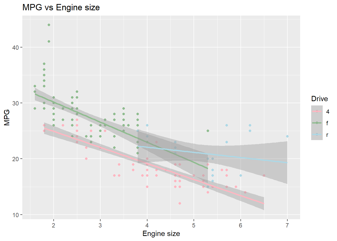
# Code chunk 22:
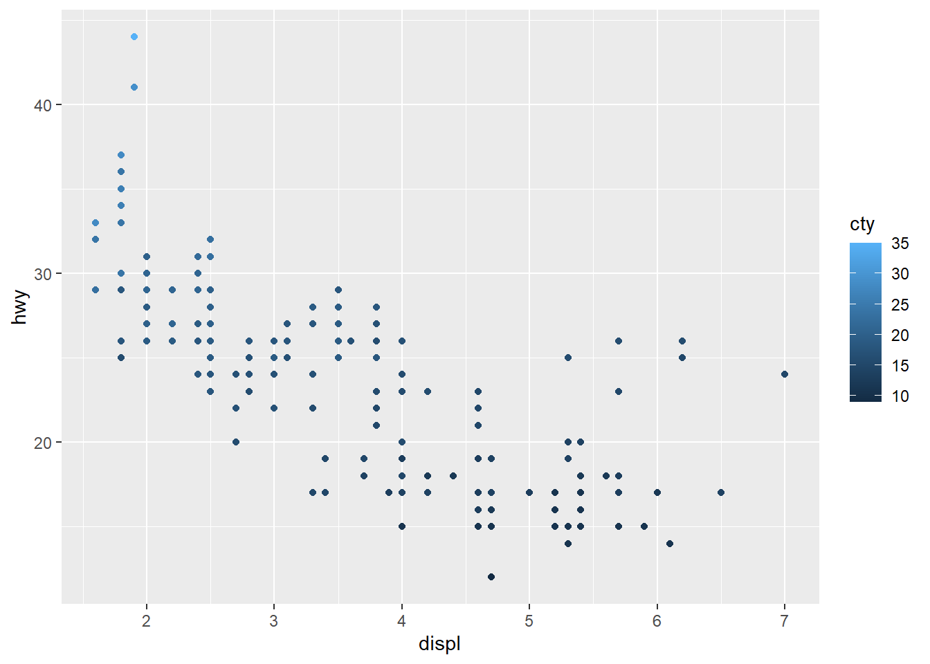
ggplot(data = mpg, mapping = aes(x = displ, y = hwy, color=cty)) +
geom_point() +
scale_colour_gradient(name = "City MPG", low = "red", high = "blue")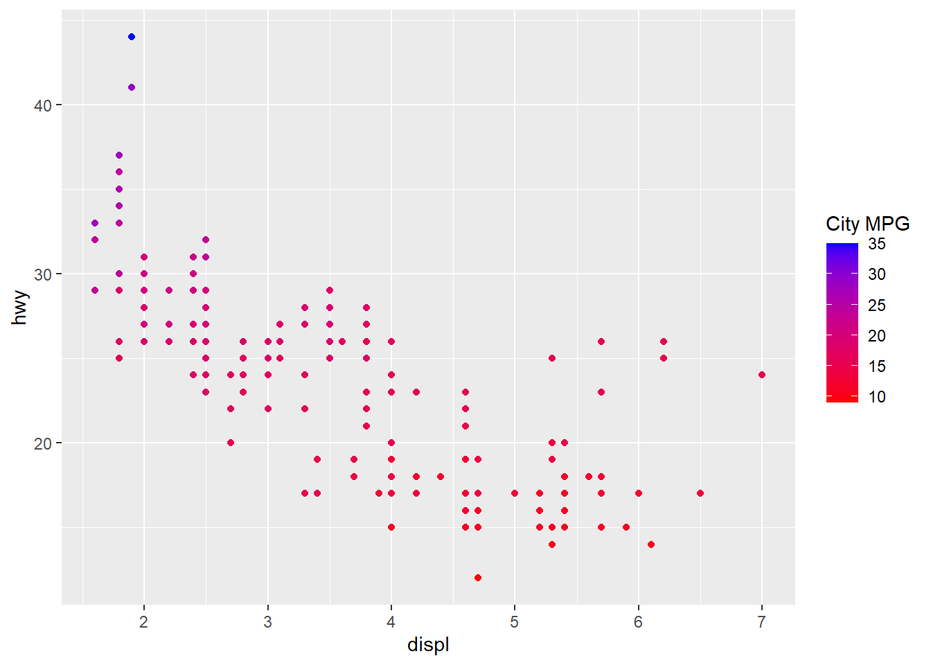
2.7.5 Statistical transformations
# Code chunk 23: create histogram
# historam shows the distribution of a single variable.
# where does the `count` in the plot come from?
ggplot(data = diamonds, aes(x = carat)) + geom_histogram()
## `stat_bin()` using `bins = 30`. Pick better value with `binwidth`.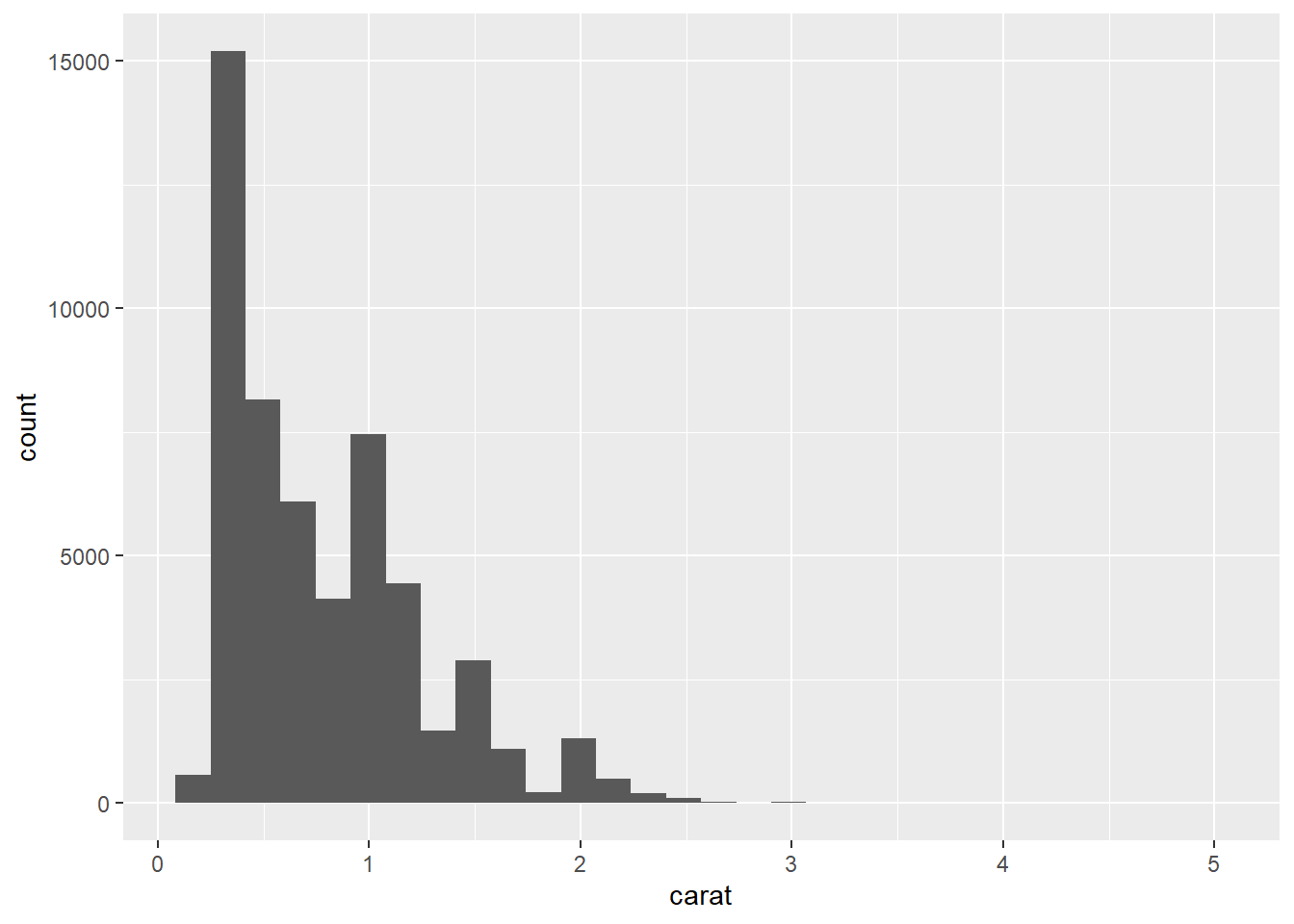
To create the histogram above, we need to calculate
count(the number of diamonds in each bin or interval) from the datasetdiamonds. This example tells us that some plots require new values calculated from raw data. Statistical transformations (stats for short) create new variables to plot.How
geom_histogram()works?- "A stat takes a dataset as input and returns a dataset as output, and so a stat can add new variables to the original dataset. For example,
stat_bin, the statistic used to make histograms, produces the following variables:count, the number of observations in each bindensity, the density of observations in each bin (percentage of total / bar width)x, the centre of the bin" (Hadley Wickham 2016)
- “These generated variables can be used instead of the variables present in the original dataset. For example, the default histogram geom assigns the height of the bars to the number of observations (
count), but if you’d prefer a more traditional histogram, you can use the density (density). The following example shows a density histogram of carat from the diamonds dataset.” (Hadley Wickham 2016)
- "A stat takes a dataset as input and returns a dataset as output, and so a stat can add new variables to the original dataset. For example,
To map the variable created by stats to aesthetics, the names of generated variables must be surrounded with
...
# Code chunk 24: create histogram with density
# the variable `density` is created by stat_bin()
ggplot(diamonds, aes(carat)) + geom_histogram(aes(y = ..density..), binwidth = 0.1)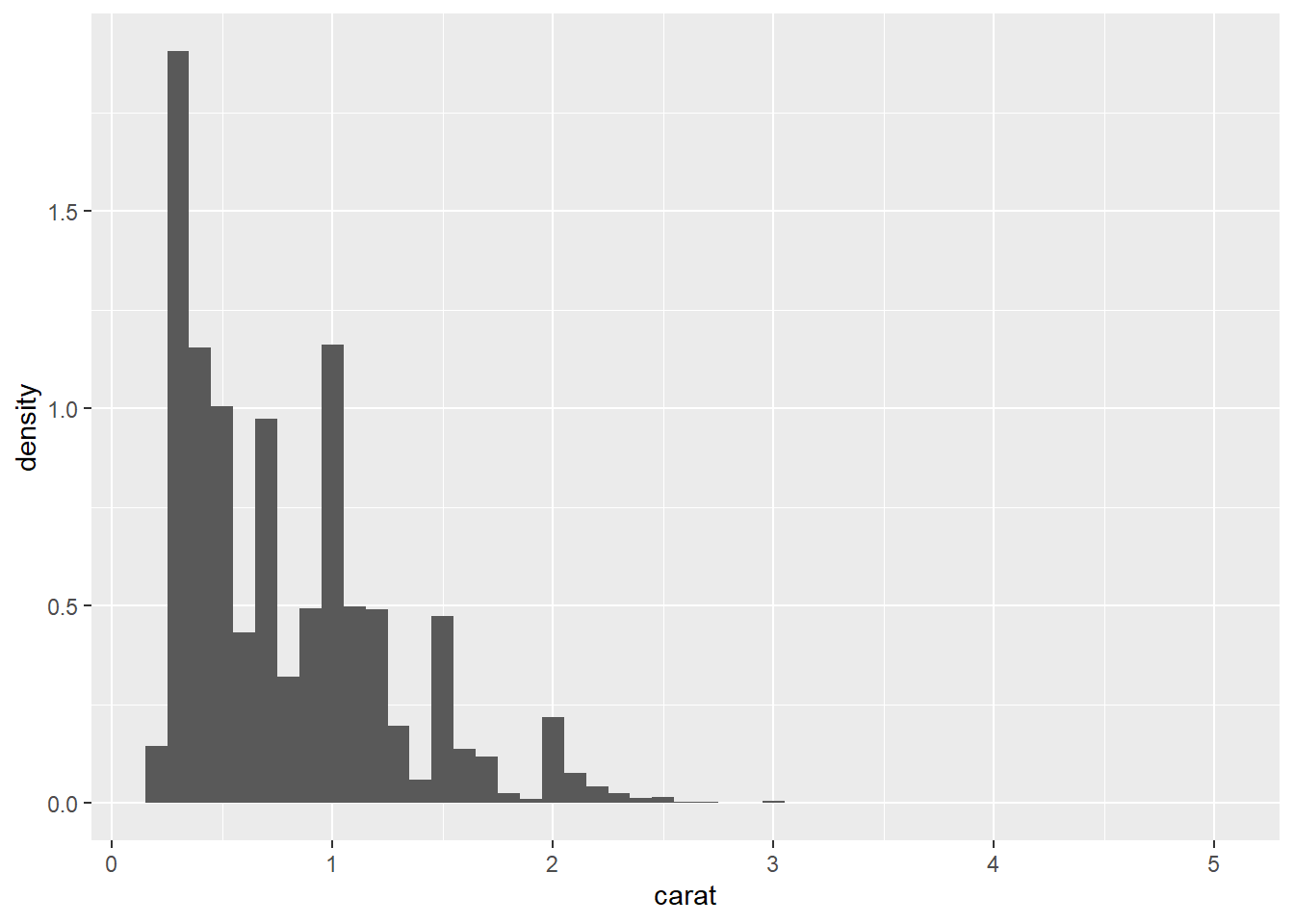
- Every geom has a default stats.
# An alternative way to build a histogram using stat_bin()
 ggplot(diamonds, aes(carat)) + stat_bin()
## `stat_bin()` using `bins = 30`. Pick better value with `binwidth`.
2.7.6 Position adjustments
- Position adjustments determine how to arrange geoms that would otherwise occupy the same space.

2.7.7 A faceting
“A faceting specification describes how to break up the data into subsets and how to display those subsets as small multiples. This is also known as conditioning or latticing/trellising.” (Hadley Wickham 2016)
“There are two types of faceting provided by ggplot2:
facet_gridandfacet_wrap. Facet grid produces a 2d grid of panels defined by variables which form the rows and columns, while facet wrap produces a 1d ribbon of panels that is wrapped into 2d” (Hadley Wickham 2016)
# facet into rows
ggplot(data = diamonds, aes(x = carat)) + geom_histogram() + facet_grid(rows = vars(color))
## `stat_bin()` using `bins = 30`. Pick better value with `binwidth`.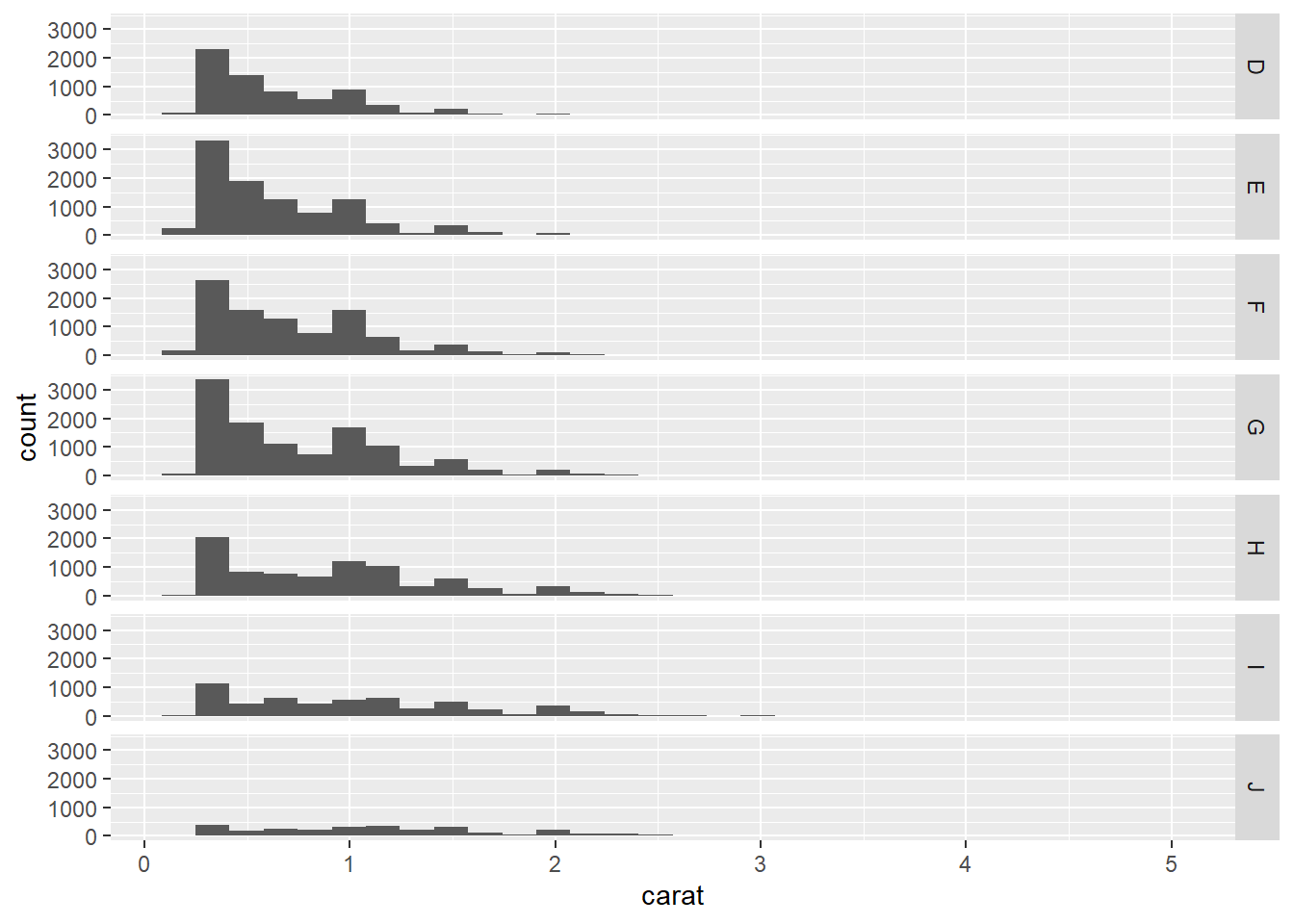
# facet into columns
ggplot(data = diamonds, aes(x = carat)) + geom_histogram() + facet_grid(cols = vars(color))
## `stat_bin()` using `bins = 30`. Pick better value with `binwidth`.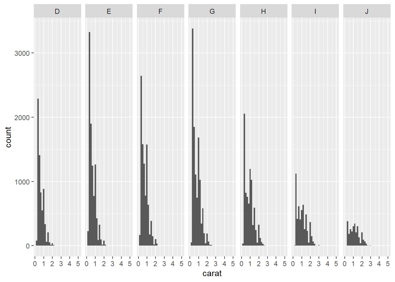
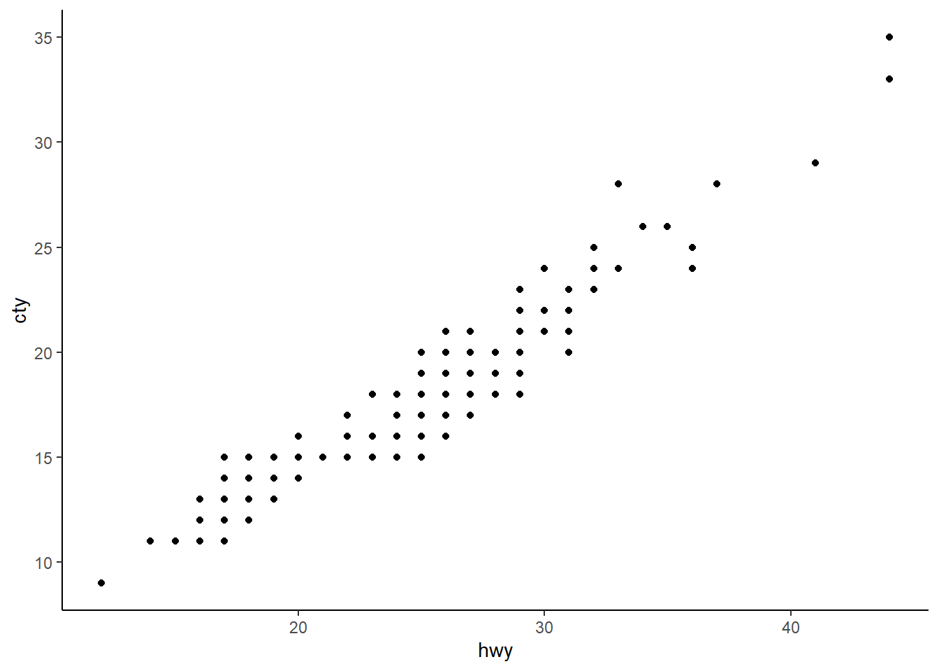
Exercise 2-3. A faceting
Using
mpgdata, plot a scatter plot betweenhwy(y) vscty(x).facet into rows using
cyl.facet into columns using
cyl.facet into rows using
cyland columns usingyear
2.7.8 Grouping
“In many situations, you want to separate your data into groups, but render them in the same way. When looking at the data in aggregate you want to be able to distinguish individual subjects, but not identify them. This is common in longitudinal studies with many subjects, where the plots are often descriptively called spaghetti plots.” (Hadley Wickham 2016)
Oxboysis a dataset in thenlmepackage.Oxboysincludes the height of a selection of boys from Oxford, England versus a standardized age.
## Grouped Data: height ~ age | Subject
##   Subject     age height Occasion
## 1       1 -1.0000  140.5        1
## 2       1 -0.7479  143.4        2
## 3       1 -0.4630  144.8        3
## 4       1 -0.1643  147.1        4
## 5       1 -0.0027  147.7        5
## 6       1  0.2466  150.2        6
# This plot does not make sense
# `x = ` and `y = ` can be omitted within aes()
ggplot(Oxboys, aes(age, height)) + geom_line()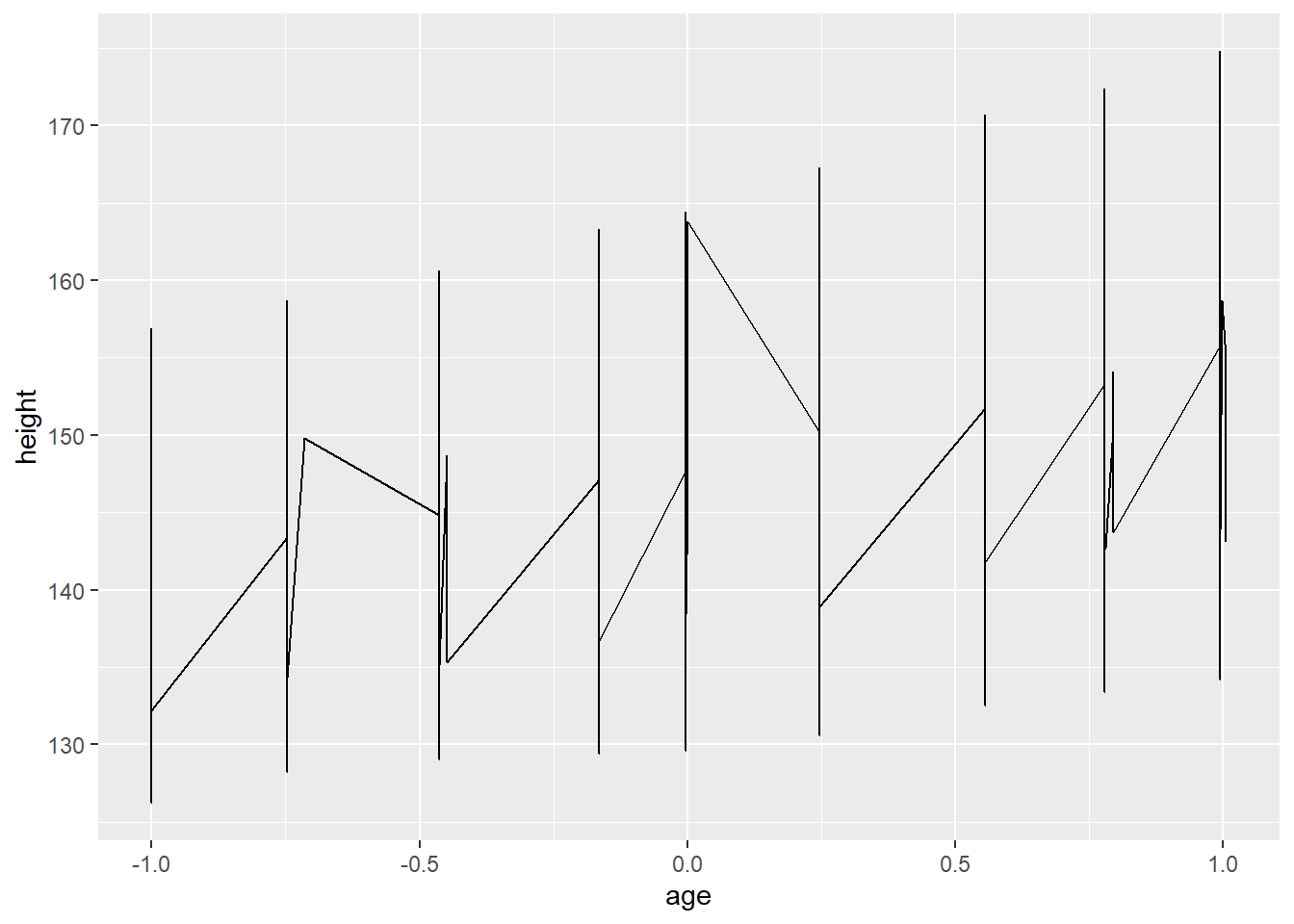
# With ` group = Subject`, you will have a separate line for each subject
ggplot(Oxboys, aes(age, height, group = Subject)) + geom_line()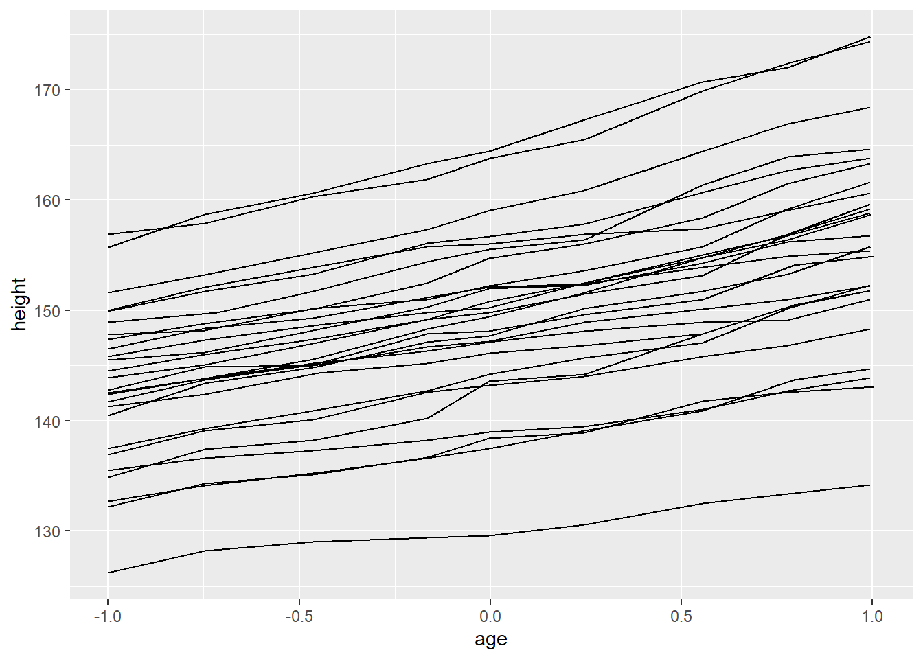
# `group = Subject` in `ggplot()` will affect all the geom functions
# Therefore, a smoothed line is created for each subject
# However, in many cases, this is not what we need
# Often, we need a single smoothed line for entire subjects
ggplot(Oxboys, aes(age, height, group = Subject)) + geom_line() + geom_smooth()
## `geom_smooth()` using method = 'loess' and formula 'y ~ x'
# `group = 1` override the default grouping
ggplot(Oxboys, aes(age, height, group = Subject)) + geom_line() + geom_smooth(aes(group = 1))
## `geom_smooth()` using method = 'loess' and formula 'y ~ x'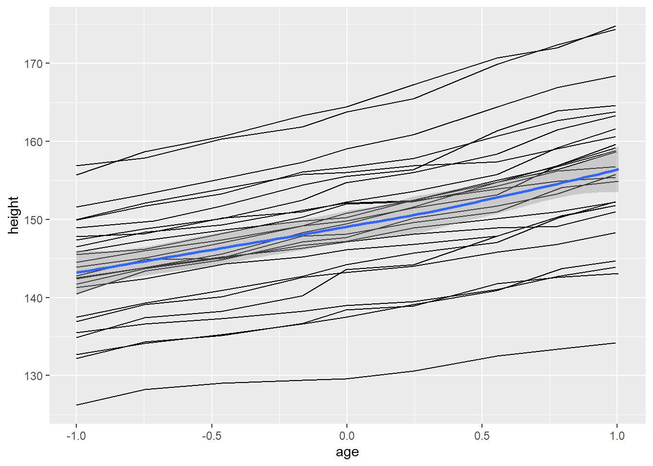
# facet is also useful for visualizing longitudinal data
ggplot(Oxboys, aes(age, height)) + geom_line() + facet_wrap(vars(Subject))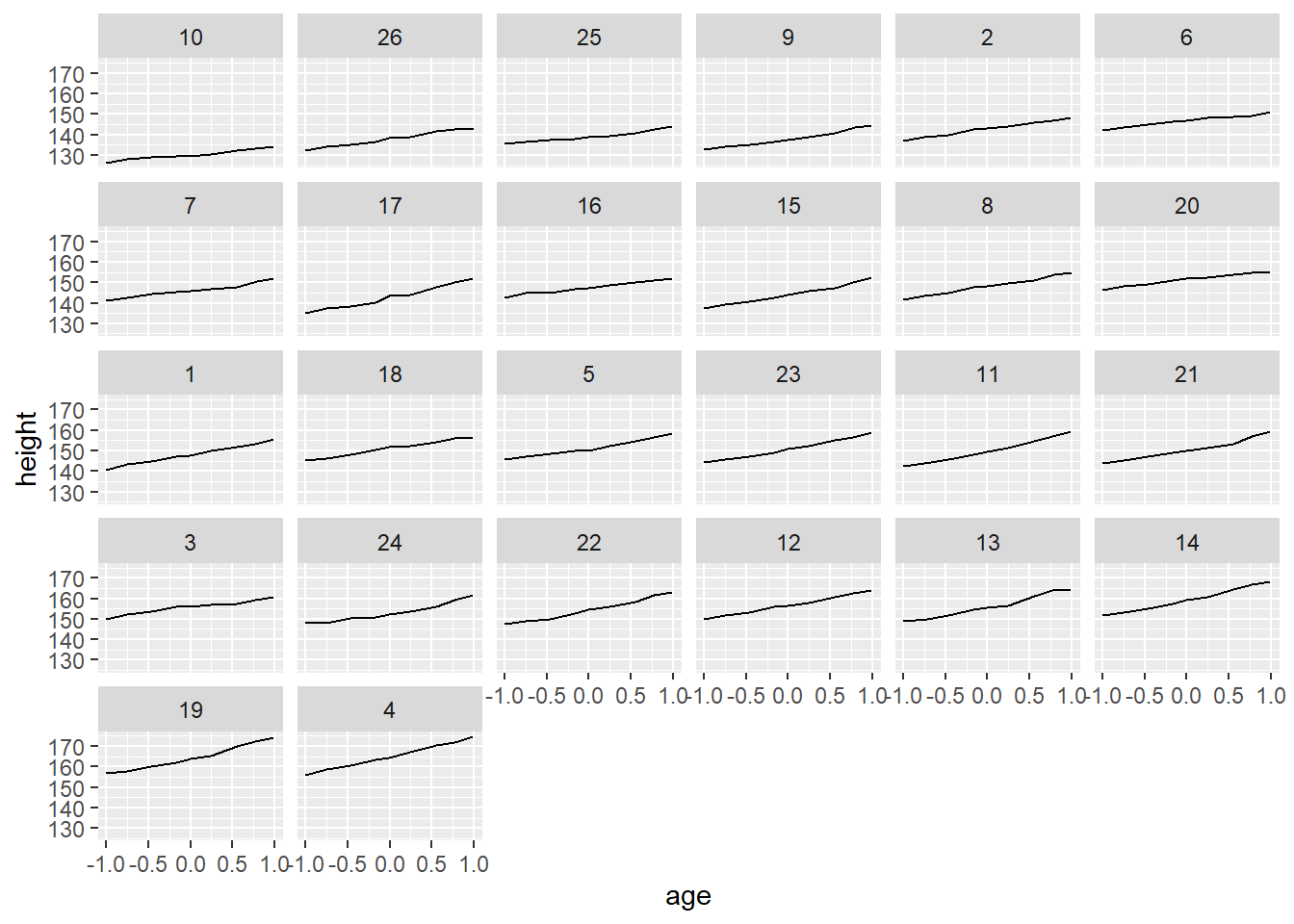
2.8 Themes
“Themes are a powerful way to customize the non-data components of your plots: i.e. titles, labels, fonts, background, gridlines, and legends.” More details are available at https://ggplot2.tidyverse.org/reference/theme.html
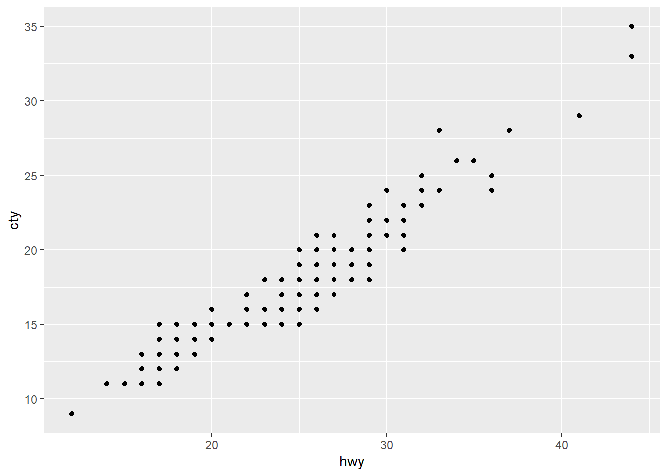
ggplot(mpg, aes(x = hwy, y = cty)) + geom_point() + theme(panel.background = element_rect(fill = "white", colour = "grey50"))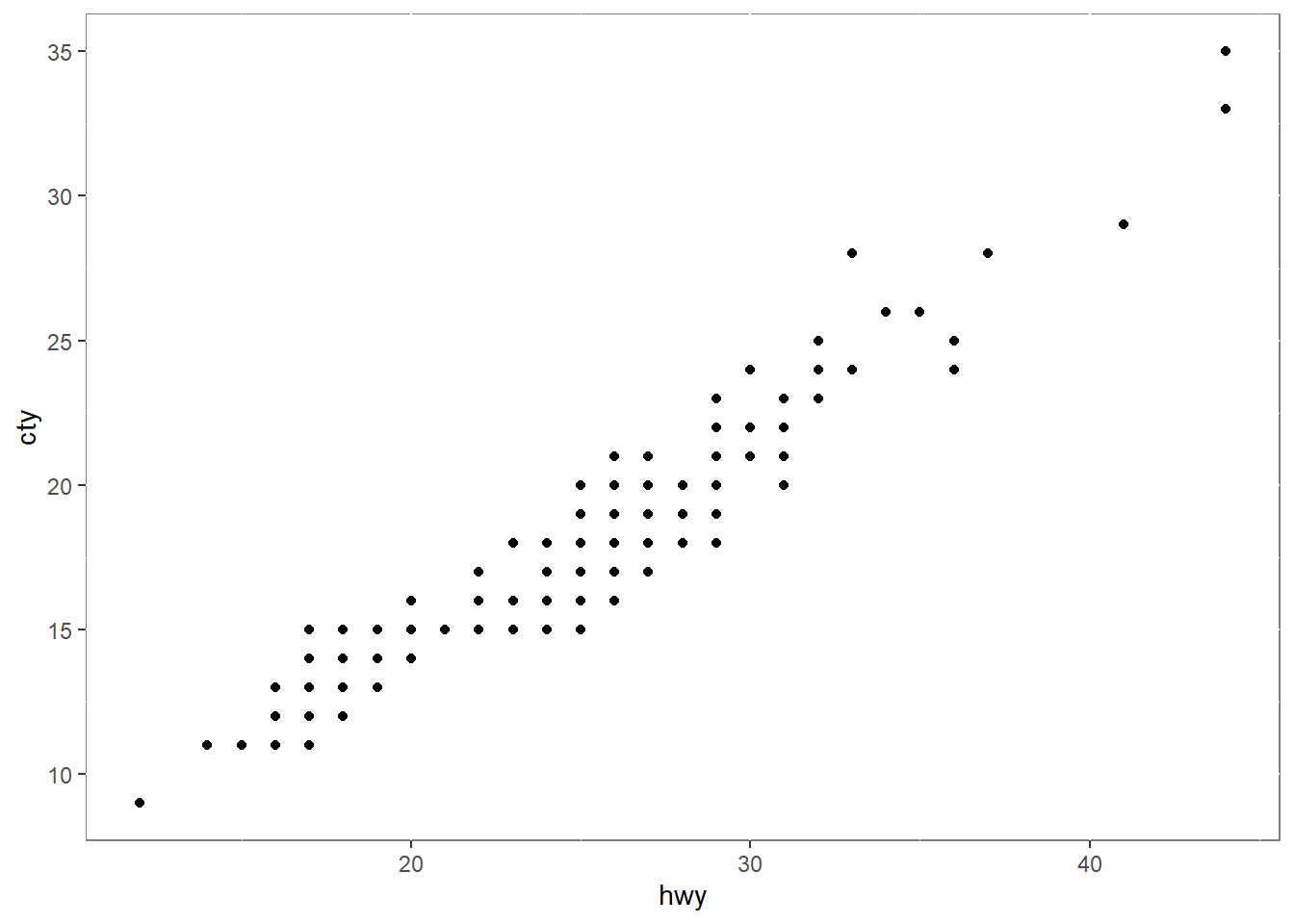
2.9 Saving a ggplot
ggsave()is a convenient function for saving a plot. It defaults to saving the last plot that you displayed.
2.10 Frequently used plots
This section introduces some plots which are used frequently in various fields.
We usually create plots for two reasons:
- for understanding our data
- it’s not necessary to create pretty plots
- for presenting to others
- it’s necessary to create pretty plots
- for understanding our data
To quickly create plots without controlling the details, we use
qplot()in theggplot2package.
2.10.1 qplot()
qplot(), short for quick plot is a function in theggplot2package.qplot()makes it easy to produce complex plots, often requiring several lines of code using other plotting systems, in one line.The syntax of
qplot()isqplot(<AESTHETIC MAPPGIN>, <DATA>, <GEOMS>)
2.10.2 Scatterplots
- scatterplots are used to show the relationship between two numerical variables.

# qplot syntax: `qplot(<AESTHETIC MAPPGIN>, <DATA>, <GEOMS>)`
qplot(displ, hwy, data = mpg, color = class)

# qplot syntax: `qplot(<AESTHETIC MAPPGIN>, <DATA>, <GEOMS>)`
qplot(displ, hwy, data = mpg, color = class, shape = drv)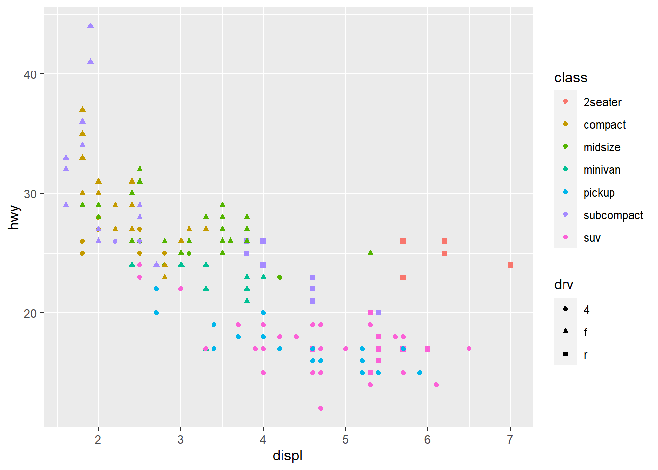
## `geom_smooth()` using formula 'y ~ x'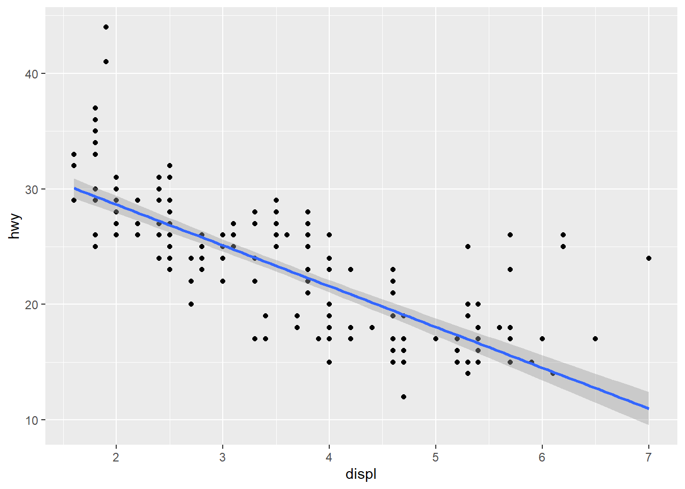
# qplot syntax: `qplot(<AESTHETIC MAPPGIN>, <DATA>, <GEOMS>)`
qplot(displ, hwy, data = mpg, geom = c("point", "smooth"))
## `geom_smooth()` using method = 'loess' and formula 'y ~ x'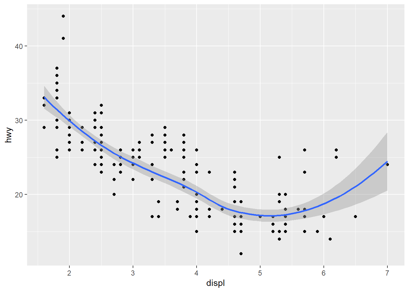
2.10.3 Histogram
- Histograms are used to show the distribution of a numerical variable.
## `stat_bin()` using `bins = 30`. Pick better value with `binwidth`.
## `stat_bin()` using `bins = 30`. Pick better value with `binwidth`.
# `binwidth` controls the width of bins
ggplot(data = diamonds, aes(x = carat)) + geom_histogram(binwidth = 0.05) + xlim(c(0,3))
## Warning: Removed 32 rows containing non-finite values (stat_bin).## Warning: Removed 2 rows containing missing values (geom_bar).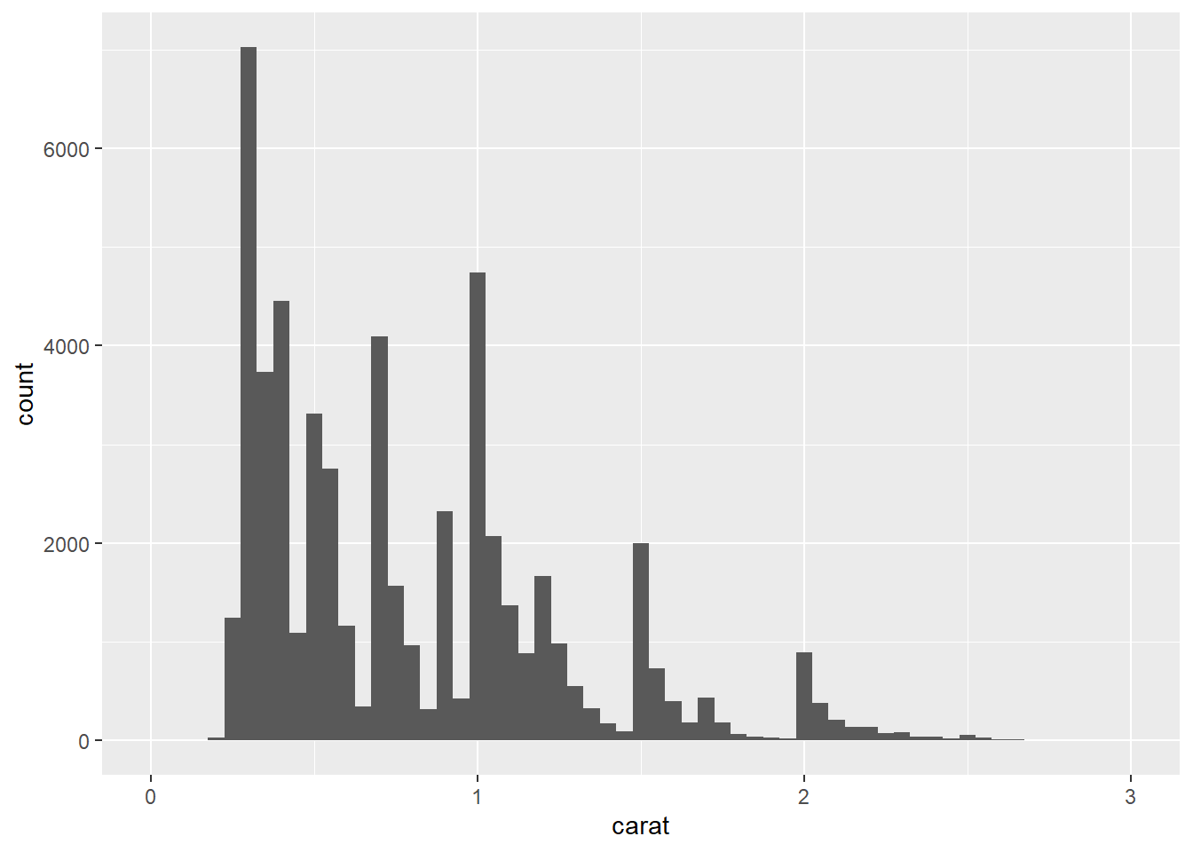
## Warning: Removed 32 rows containing non-finite values (stat_bin).## Warning: Removed 2 rows containing missing values (geom_bar).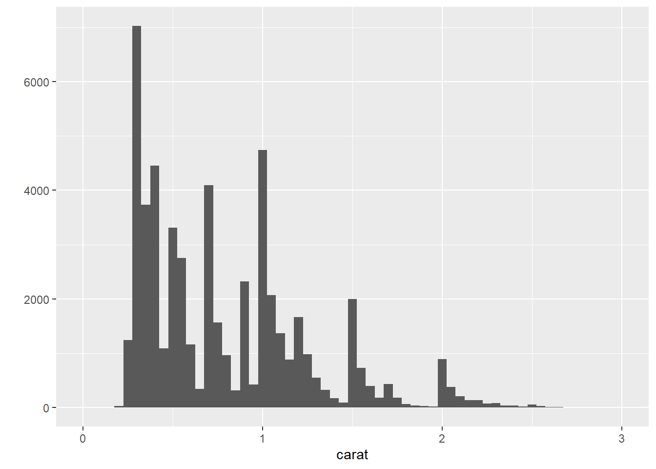
## `stat_bin()` using `bins = 30`. Pick better value with `binwidth`.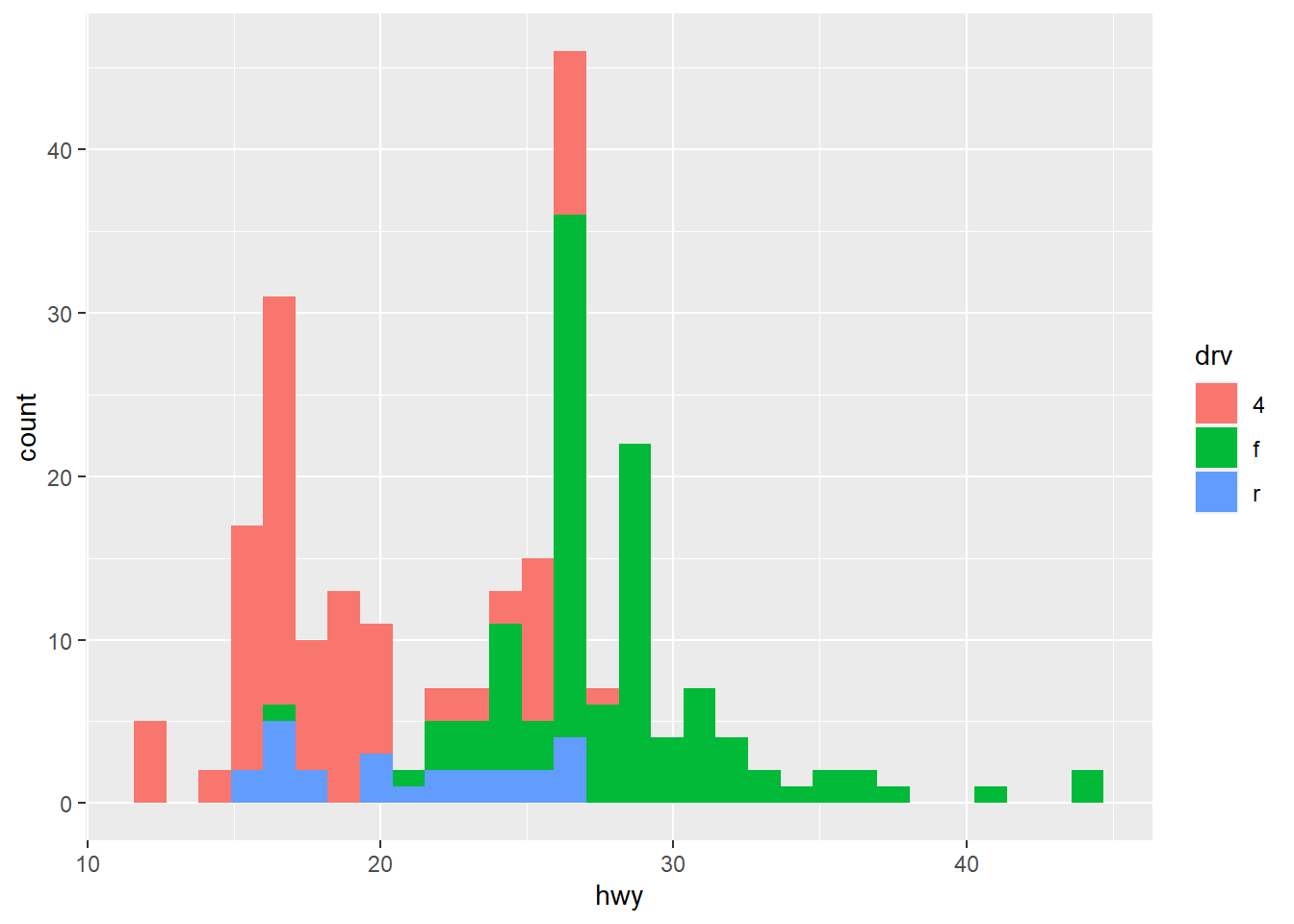
## `stat_bin()` using `bins = 30`. Pick better value with `binwidth`.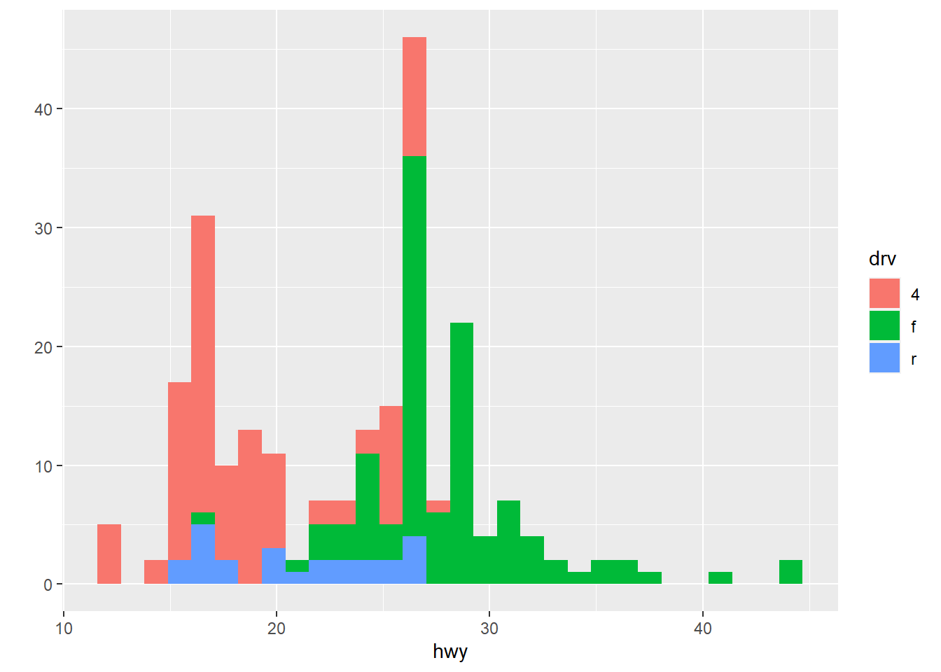
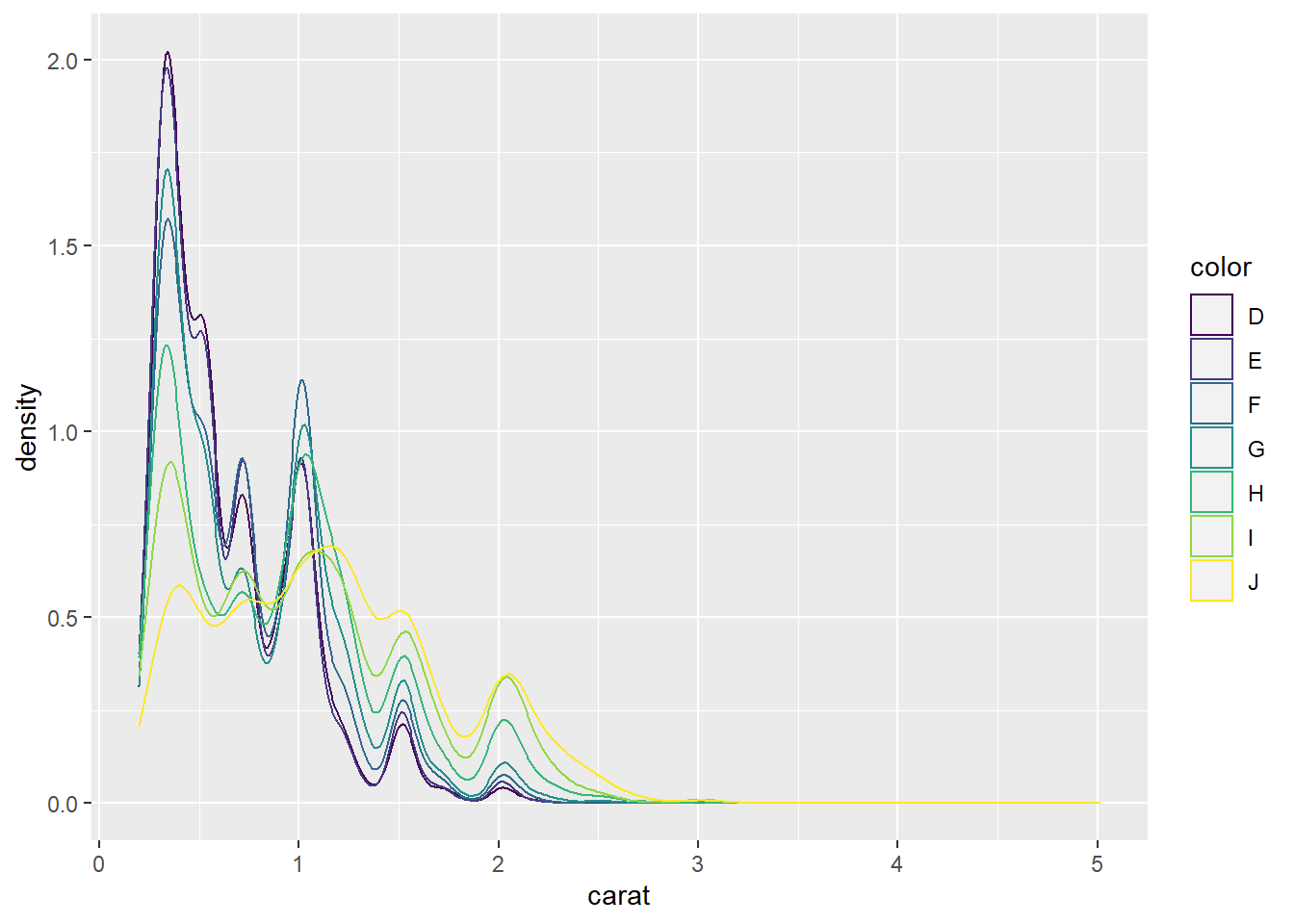
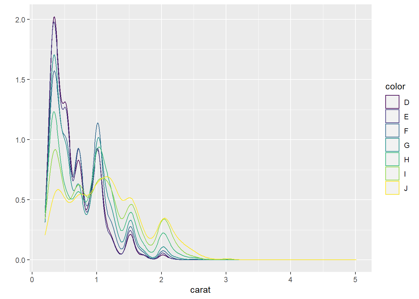
2.10.4 Density plots
- Density plots are used to show the distribution of a numerical variable.
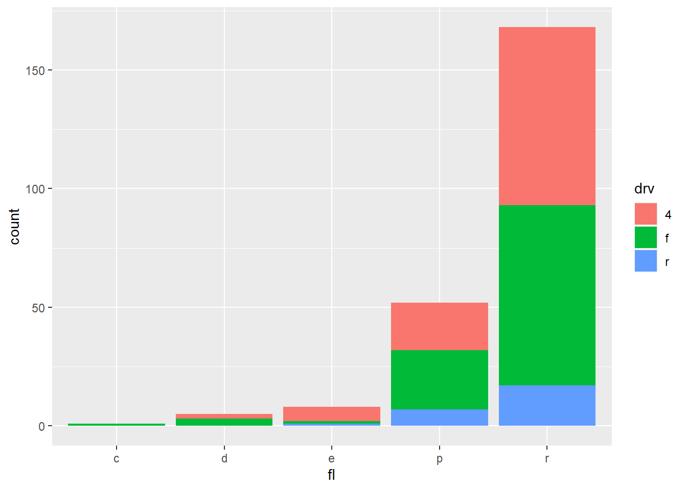
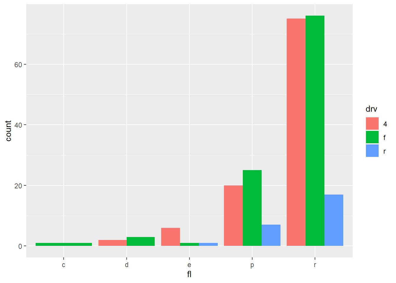
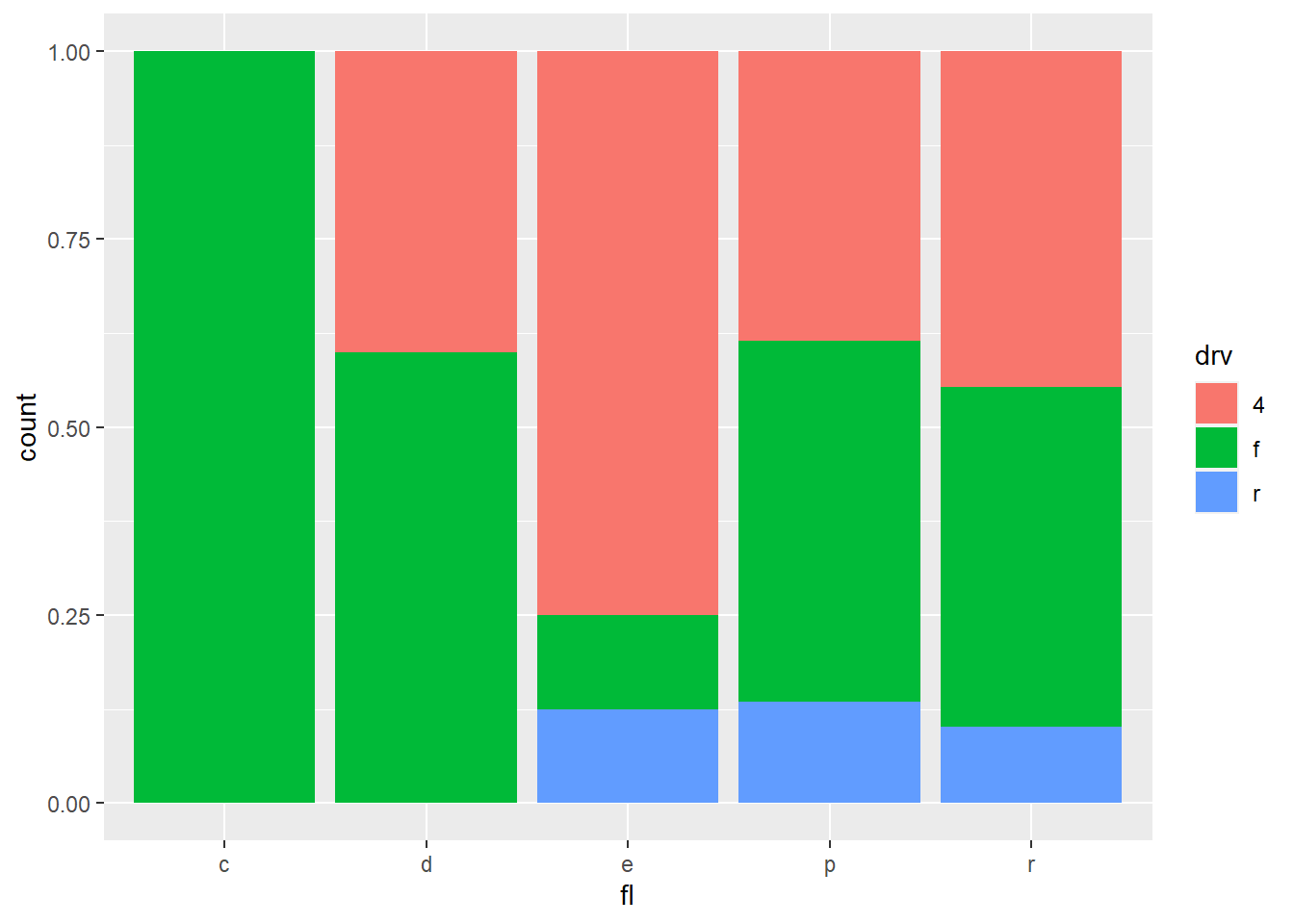
2.10.5 Barplots
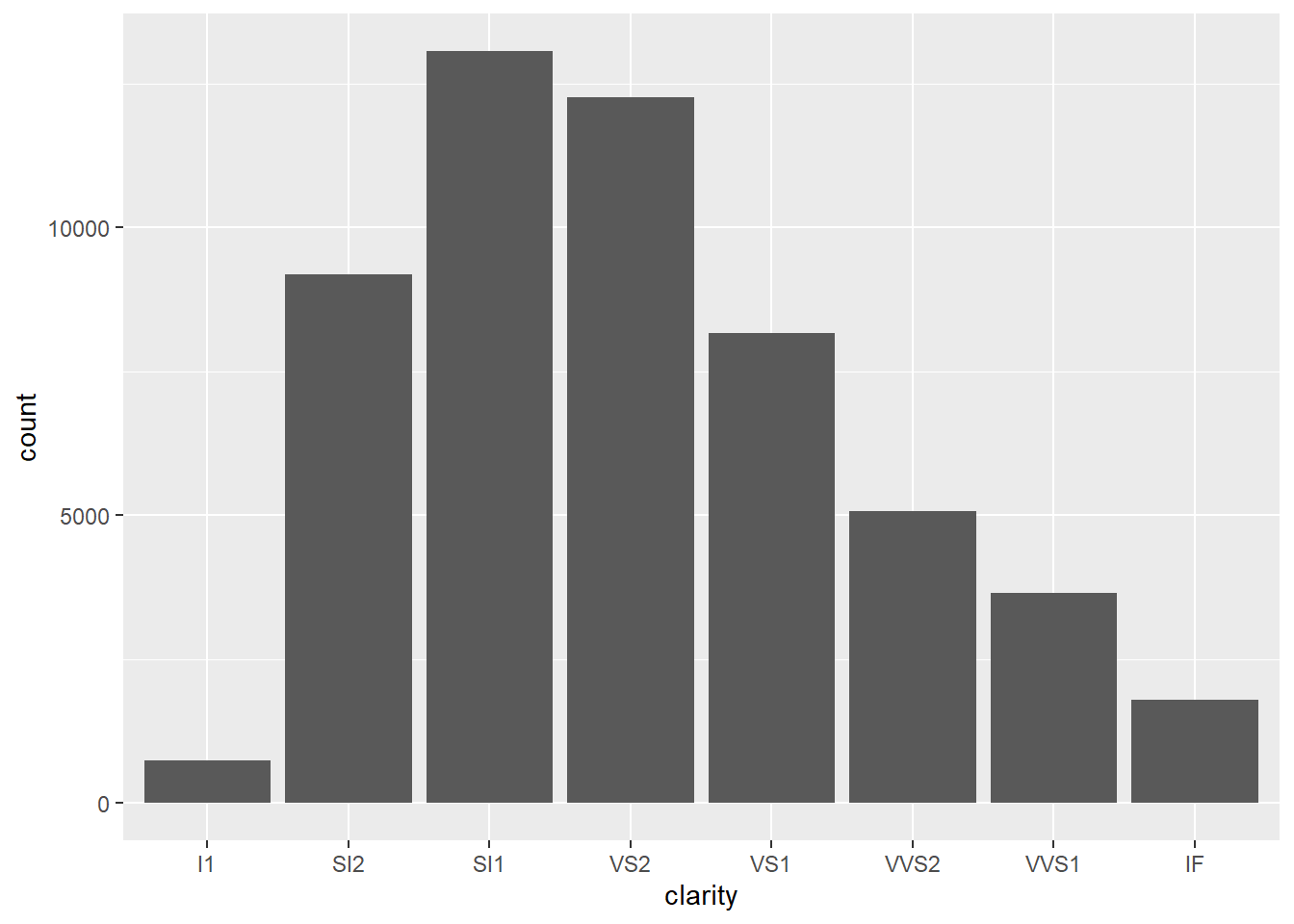
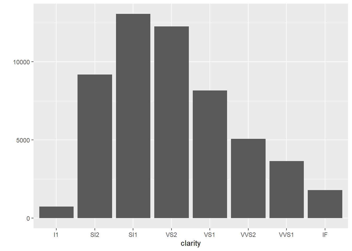
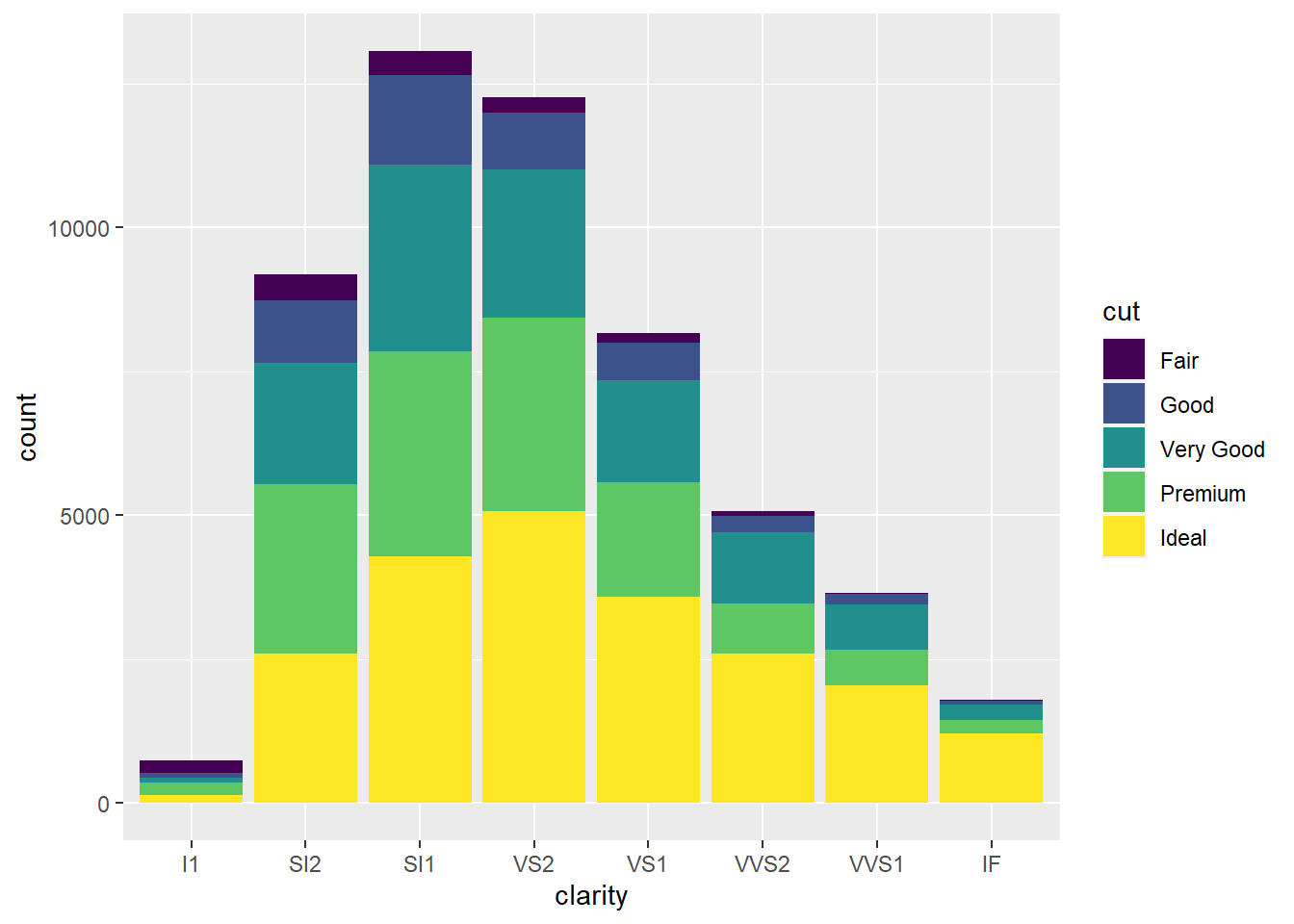
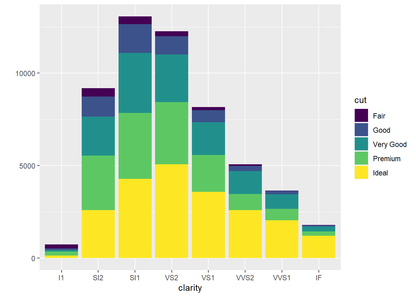
- Barplots are used to show the distribution of a categorical variable.
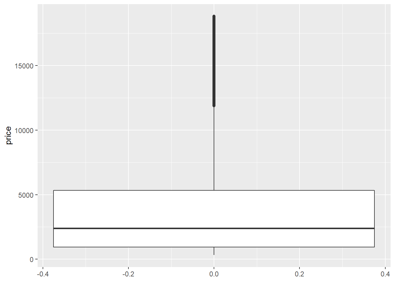
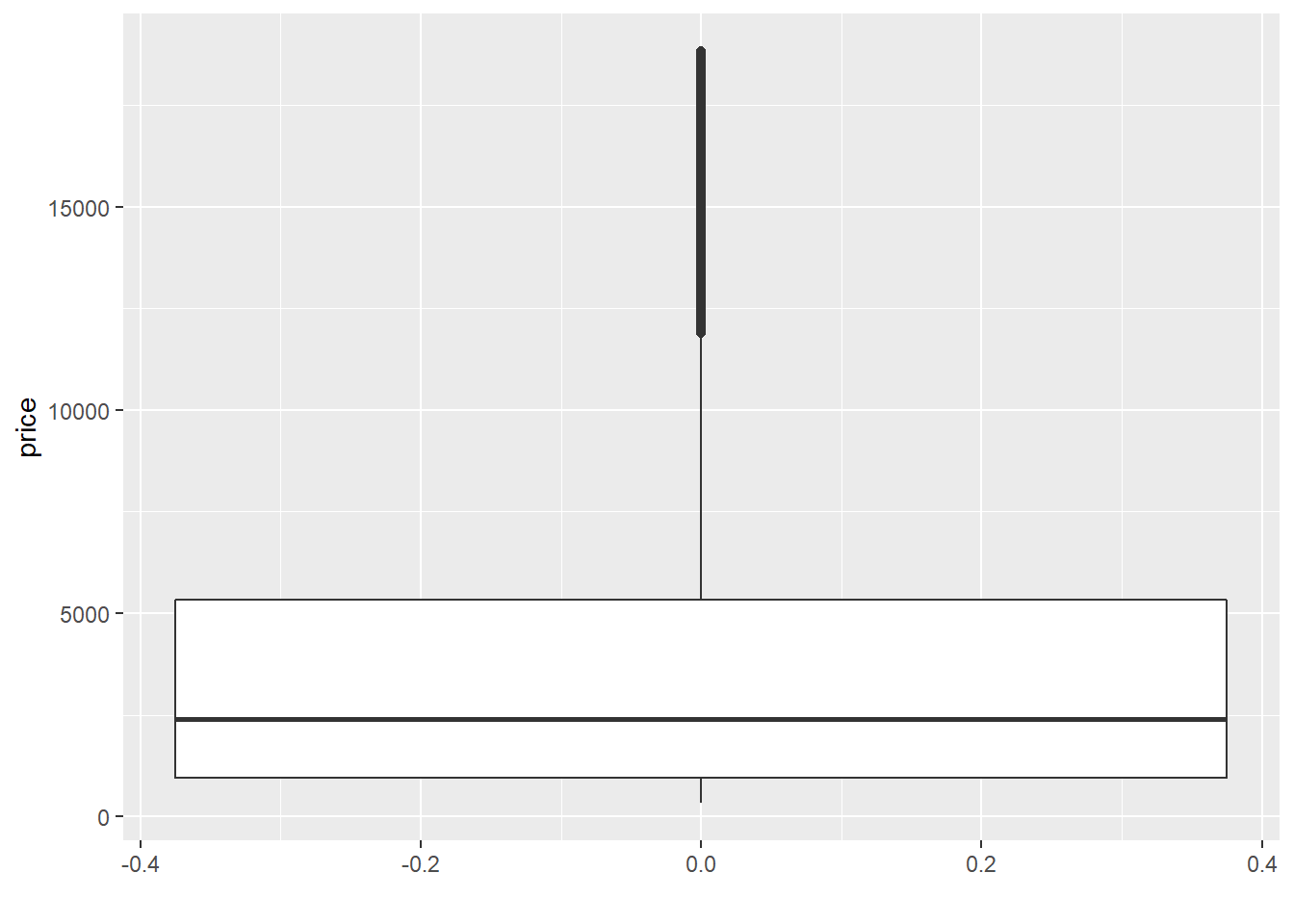
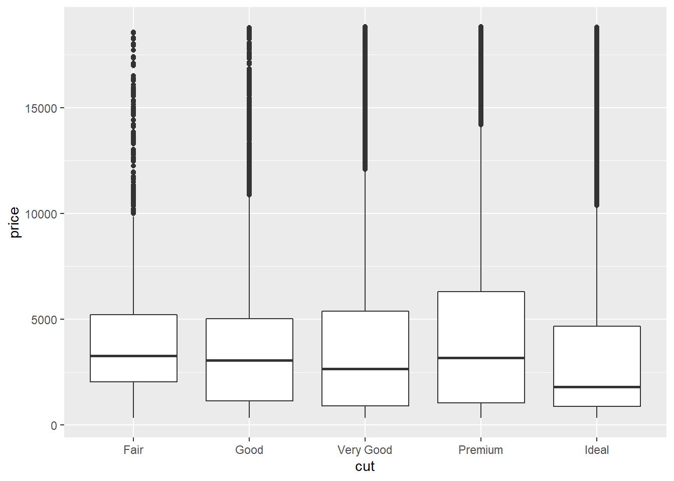
2.10.6 Boxplots
Boxplots are used to show a distribution of a numerical data based on five number summary(i.e., minimum, first quartile Q1, median, third quartile Q3, and maximum).
Boxplots are often used to detect outliers based on interquartile range (IQR). Please check here for more details about boxplots.
2.10.7 The corrplot Package
Often, we are interested in the correlation matrix of some variables.
The corrplot package allows us to create a graphical display of a correlation matrix.
## corrplot 0.84 loaded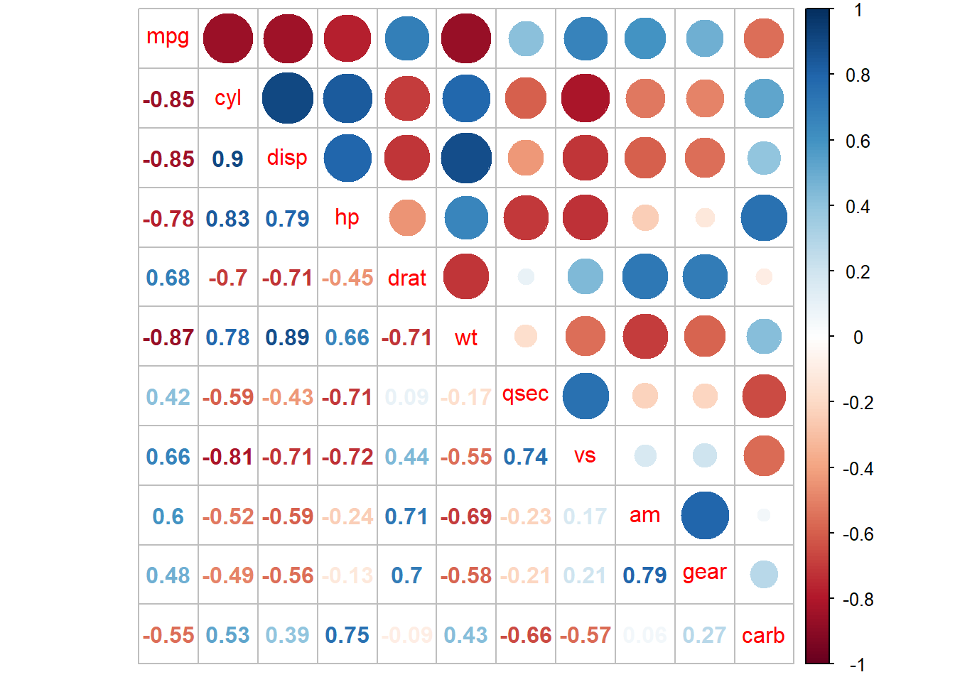
2.11 Homework (this HW will not be graded !!)
- Create your own new R markdown in your RStudio, REPLICATE ALL THE PLOTS in this lecture notes by ACTUALLY TYPING the codes for the plots by considering the meaning of the syntax, and knit to any format (e.g., html, pdf, or word).
References
Cormen, Thomas H, Charles E Leiserson, Ronald L Rivest, and Clifford Stein. 2009. Introduction to Algorithms. MIT press.
Wickham, Hadley. 2016. Ggplot2: Elegant Graphics for Data Analysis. springer.
Wickham, H., and G. Grolemund. 2016. R for Data Science: Import, Tidy, Transform, Visualize, and Model Data. O’Reilly Media. https://books.google.co.kr/books?id=vfi3DQAAQBAJ.