Chapter 9 Data Visualization
Shannon
ggplot, highcharter, custom themes, jastyle
9.1 ggplot()
ggplot() is part of the hadleyverse, or you can load separately as library(ggplot2)
library(tidyverse)The “gg” in ggplot stands for “grammar of graphics”, and it’s designed to have a readable and intuitive syntax. 1. basic grammar 2. multiple geoms 3. geom_abline()
9.2 highcharter()
library(highcharter)- basic grammar
- tooltip
9.3 ggplot() vs highcharter()
We use both of these plotting options often. Each has pros and cons that will help determine which is more appropriate for any use case.
The big pluses for highcharter() are
1. interactivity
* this is a great feature for dashboards
* also very useful for data exploration (e.g., hover over outliers to see what they are and other associated variables)
- attractive and flexible out of the box
- wow factor
- I almost never need to fiddle with axes, number formatting, legends, etc
- scales to different sized screens, even scale of axes!!
The big drawbacks of highcharter() are
1. poor documentation - you normally don’t need to change much, but if you do, it can be a headache. It will probably require some javascript and patience.
2. challenging to have multiple data sources/geometries in the same plot - it’s possible, but much easier in ggplot()
The big pluses for ggplot() are
1. well documented and FULLY customizable
* there are a zillion ggplot() users and several great books
* you have full control over every single element of a ggplot and a great userbase who has done it all before, so with some help of Stack Overflow, you can make the ggplot of your dreams
* this goes for not just styling, but data viz options too. ggplot has more plot types (violin, ridgeline, boxplots, errorbars, etc. etc) and it’s easy to overlay multiple types
- static
- useful for reports and presentations
- easily exportable as a high resolution image or vector file
The major drawback of ggplot() is that it doesn’t look as good as highcharter
9.4 Custom Themes
highcharter() defaults are typically pretty gorgeous, but you will definitely want to add some styling elements to ggplots.
There are bundled themes that are great for quickly beautifying simple charts. My first step is usually to add theme_bw() to a plot.
ggplot(iris, aes(x = Sepal.Length, y = Sepal.Width, color = Species)) +
geom_point() +
theme_bw()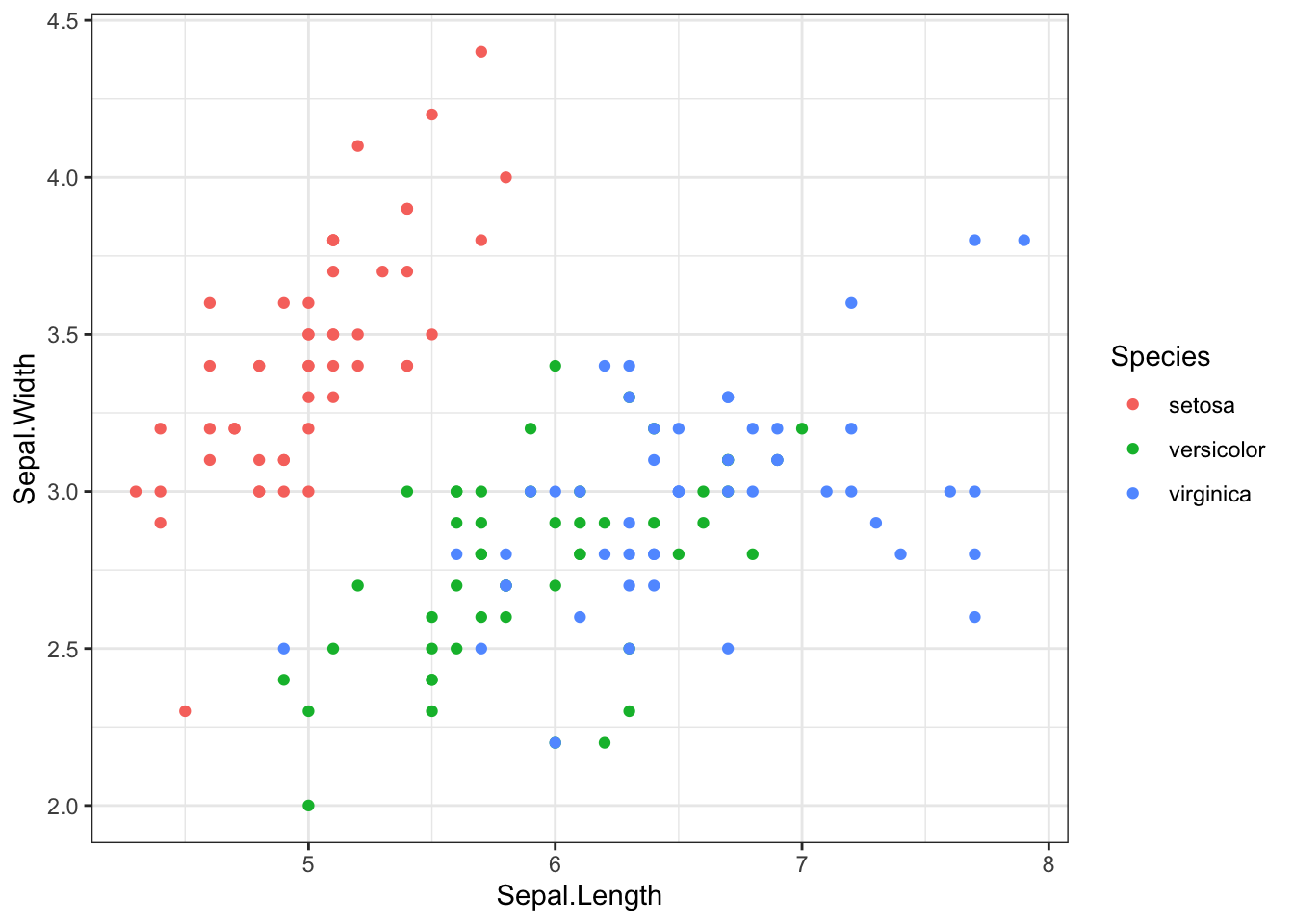 For specific things like “how do I remove this legend?”, it’s easiest to google, or consult the graphs section of Cookbook for R. This is true for all basics like:
* how to move, remove, style a legend
* how to format axes
* how to change text on axes, axis titles, legend, titles, etc.
* how to add colors in gradient, discrete, or scaled patterns
For specific things like “how do I remove this legend?”, it’s easiest to google, or consult the graphs section of Cookbook for R. This is true for all basics like:
* how to move, remove, style a legend
* how to format axes
* how to change text on axes, axis titles, legend, titles, etc.
* how to add colors in gradient, discrete, or scaled patterns
ggplot(iris, aes(x = Sepal.Length, y = Sepal.Width, color = Species)) +
geom_point() +
theme_bw() +
theme(legend.position = "bottom") +
xlim(4, 8) +
ylim(1, 5) +
scale_color_manual(values = c("#83d1c4", "#78517c", "#f17950"))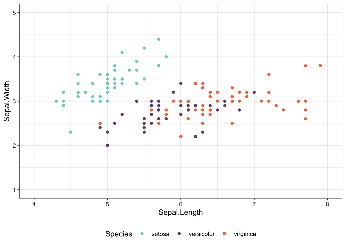 For production-ready charts, we probably want to stray even further from the defaults. We often make custom themes for our apps, that bundle in color palettes, fonts, and general styling of the client’s brand.
9.5 jastyle()
David made us custom plot themes for ggplot() and highcharter()!
Access them by installing the jastyle package from github.
devtools::install_github("januaryadvisors/jastyle")## Skipping install of 'jastyle' from a github remote, the SHA1 (523418e0) has not changed since last install.
## Use `force = TRUE` to force installationlibrary(jastyle)To use, first ensure you have Roboto Condensed font on your computer. If not, download it here.
ja_font()## [1] "Roboto Condensed"View our color palette. You can add these to a plot by referencing the hex code, or call them with ja_hex("blue"), ja_hex("orange4"), etc.
ja_view_colors()9.5.1 jastyle::theme_ja() for ggplot()
Add the theme to a ggplot with theme_ja()
ggplot(iris, aes(x = Sepal.Length, y = Sepal.Width, color = Species)) +
geom_point(size = 3) +
ggtitle("Sepal sizes for common iris species", subtitle = "Species differ in sepal size") +
labs(caption = "Source: Add source here.",
x = "Sepal Length",
y = "Sepal Width") +
theme_ja()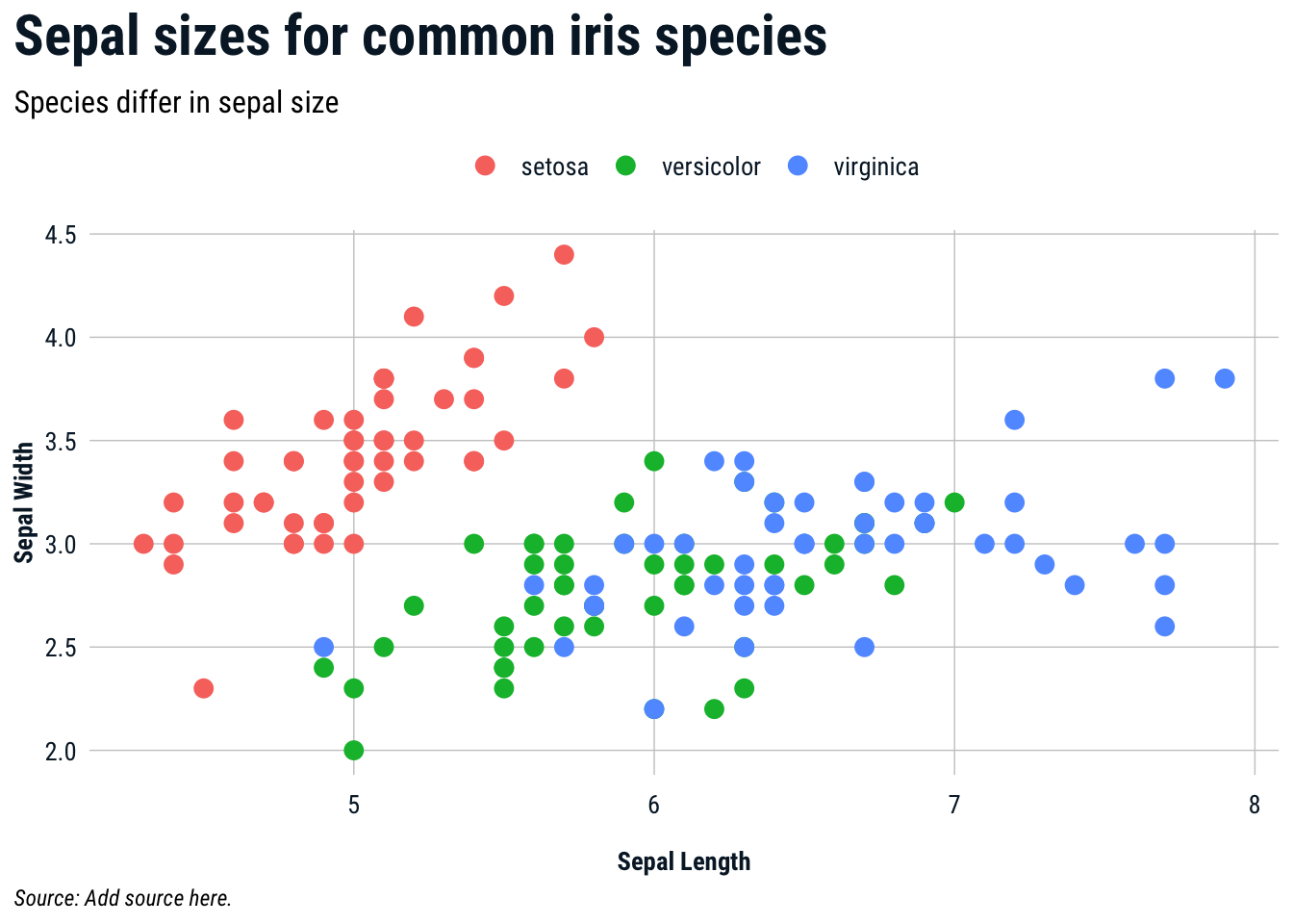 Add our color palette!
ggplot(iris, aes(x = Sepal.Length, y = Sepal.Width, color = Species)) +
geom_point(size = 3) +
ggtitle("Sepal sizes for common iris species", subtitle = "Species differ in sepal size") +
labs(caption = "Source: Add source here.",
x = "Sepal Length",
y = "Sepal Width") +
theme_ja() +
scale_color_manual(
# use e.g., "orange7" for different shades
values = c(ja_hex("blue"), ja_hex("orange"), ja_hex("green"))
)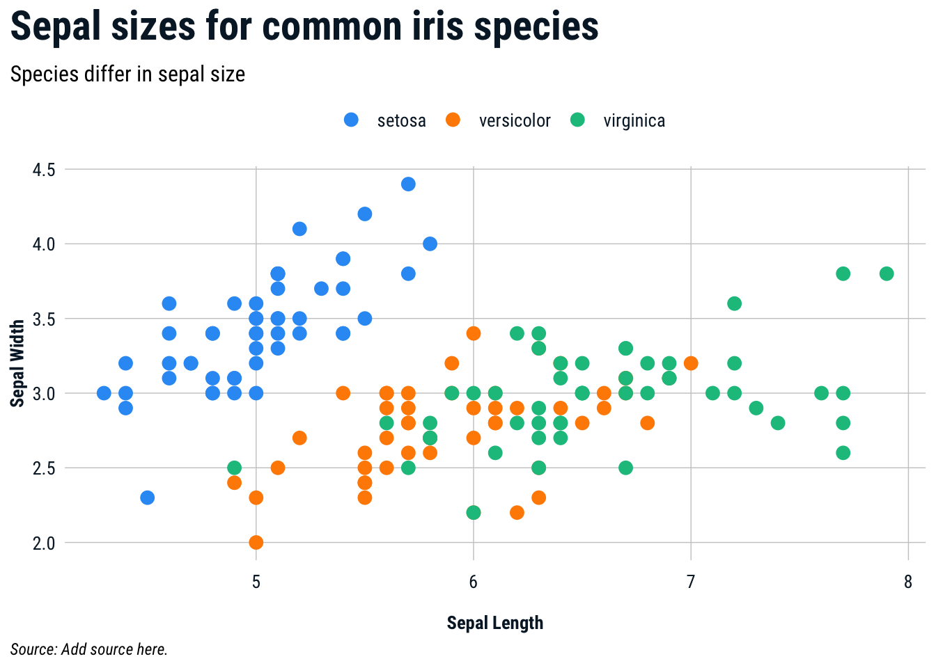 ###
### jastyle::ja_hc_theme() for highcharter()
Add the theme to a ggplot with ja_hc_theme()
highcharter::hchart(iris, "scatter", hcaes(Sepal.Length, Sepal.Width, color=Species)) %>%
  hc_title(text = "Title here") %>%
  hc_subtitle(text = "Subtitle here.") %>%
  hc_caption(text = "<strong>Source</strong>: Source here.") %>%
  hc_add_theme(ja_hc_theme())