There are two ways to generate maps with {plotly}:
Integrated: This approach is convenient if you need a quick map and don’t necessarily need sophisticated representations of geo-spatial objects. Currently there are two supported ways of making integrated maps: either via Mapbox or via an integrated d3.js powered basemap.
Customized: The custom mapping approach offers complete control since you’re providing all the information necessary to render the geo-spatial object(s). With {plotly} you can draw sophisticated maps (e.g., cartograms) using the {sf} R package, but it’s also possible to make custom plotly maps via other tools for geo-computing (e.g., {sp}, {ggmap}, etc).
{plotly} is a general purpose visualization library, and is therefore not a fully featured geo-spatial visualization toolkit. But there are benefits to using plotly-based maps since the mapping APIs are very similar to the rest of {plotly}. If you run into limitations with {plotly}’s mapping functionality, there is a very rich set of tools for interactive geospatial visualization in R, including but not limited to: {leaflet}, {mapview}, {mapedit}, {tmap}, and {mapdeck} (Lovelace, Nowosad, and Muenchow 2025).
4.1 Integrated Maps
If you have fairly simple latitude/longitude data and want to make a quick map, you may want to try one of plotly’s integrated mapping options (i.e., plotly::plot_mapbox() and plotly::plot_geo()). Generally speaking, you can treat these constructor functions as a drop-in replacement for plotly::plot_ly() and get a dynamic basemap rendered behind your data.
4.1.1 plot_mapbox()
Remark 4.1. : How to access a Mapbox token?
To follow the next R chunk you must obtain a mapbox access token. Otherwise you would get an error message with a message how to get and apply the access token. But this requirement is not explained in the plotly book.
It turns out that this is rather a cumbersome process because it requires
your credit number
your full address with (in my case) the European Vat number
fill out a form with several questions
After your sign in inte mapbox you will get a free access token for development purposes.
To hide your access key write the following line into .Renviron file. The .Renviron file contains lists of environment variables to set in the following pattern:
MAPBOX_PUBLIC_TOKEN = your_access_token
This is not R code, it uses a format similar to that used on the command line shell. But note there are no quotes to provide a string variable!
After you have finished editing the .Renviron file restart R.
R Code 4.1 : Using a mapbox powered bubble chart
Code
base::Sys.setenv("MAPBOX_TOKEN"=base::Sys.getenv("MAPBOX_PUBLIC_TOKEN"))# (first line)plotly::plot_mapbox(data =maps::canada.cities)|>plotly::add_markers( x =~long, y =~lat, size =~pop, fill =~'', # prevent Warning: `line.width` does not currently support multiple values. color =~country.etc, colors ="Paired", # Warnings, 'Paired' has only 12 colors, but we have 14 categories text =~base::paste(name, pop), hoverinfo ="text")|>plotly::config(mapboxAccessToken =Sys.getenv("MAPBOX_TOKEN"))# (last line)
Figure 4.1: A mapbox powered bubble chart showing the population of various cities in Canada.
first line: I had to set the environment variable explicitly and before the plotly::plot_mapbox() function. It didn’t work to call the access token with base::Sys.getenv() from the .Renviron file directly.
last line: Adding this line provides the function with access token.
Additionally I got a very long list of warnings. One reason is the use of three different markers These warnings can be prevented with the additional fill = ~'' argument. (See R Code 3.21 where we met this difficulty the first time.) The second reason is that the used discrete color palette contains only 12 colors. But we have 14 categopries (type of cities) to map. (The book uses “Accent” with eight distinct colors as color palette.)
There is a video to demonstrate how to use the interactivity of this map and an example to try it out with the full screen width.
The Mapbox basemap styling is controlled through the layout.mapbox.style attribute. The {plotly} package comes with support for 7 (14??) different styles, but you can also supply a custom URL to a custom mapbox style. To obtain all the pre-packaged basemap style names, you can grab them from the official plotly.jsplotly::schema():
R Code 4.2 : List all available layout Mapbox styles
Run this code chunk manually if the Mapbox styles still needs to be generated
The computation of the above R code chunks takes 3-4 seconds. To reduce rendering time of this document I have run the code just once (manually) and stored the result.
The next R code chunk display the result of the above plotly::schema() call. It loads and displays the list of styles from the hard disk.
R Code 4.3 : Load and display list of Mapbox styles
I added the arguments type = "scattermapbox", mode = "markers" to the plotly::plot_mapbox() to prevent many warnings. (I am not sure if this is the right mode for all types of “scatterbox”.)
Figure 4.6 demonstrates how to create an integrated plotly.js dropdown menu to control the basemap style via the layout.updatemenus attribute. The idea behind an integrated plotly.js dropdown is to supply a list of buttons (i.e., menu items) where each button invokes a plotly.js method with some arguments. In this case, each button uses the relayout method to modify the layout.mapbox.style attribute.
R Code 4.9 : Styling the Mapbox baselayer via a dropdown menu
In contrast to my dowpdown menu with 14 choices the book demonstration shows only seven.
To see more examples of creating and using plotly.js’ integrated dropdown functionality to modify graphs, see https://plot.ly/r/dropdowns/
4.1.2 plot_geo()
Compared to plotly::plot_mapbox(), this approach has support for different mapping projections, but styling the basemap is limited and can be more cumbersome. Whereas plotly::plot_mapbox() is fixed to a mercator projection, the plotly::plot_geo() constructor has a handful of different projection available to it, including the orthographic projection which gives the illusion of the 3D globe.
R Code 4.10 : Visualize flight paths within the United States
Code
# airport locationsair<-readr::read_csv('https://plotly-r.com/data-raw/airport_locations.csv', show_col_types =FALSE)# flights between airportsflights<-readr::read_csv('https://plotly-r.com/data-raw/flight_paths.csv', show_col_types =FALSE)flights$id<-base::seq_len(base::nrow(flights))# map projectiongeo<-base::list( projection =base::list( type ='orthographic', rotation =base::list(lon =-100, lat =40, roll =0)), showland =TRUE, landcolor =plotly::toRGB("gray95"), countrycolor =plotly::toRGB("gray80"))plotly::plot_geo(color =base::I("red"))|>plotly::add_markers( data =air, x =~long, y =~lat, text =~airport, size =~cnt, fill =~'', hoverinfo ="text", alpha =0.5)|>plotly::add_segments( data =dplyr::group_by(flights, id), x =~start_lon, xend =~end_lon, y =~start_lat, yend =~end_lat, alpha =0.3, size =I(1), hoverinfo ="none")|>plotly::layout(geo =geo, showlegend =FALSE)
Figure 4.7: Using the integrated orthographic projection to visualize flight patterns on a ‘3D’ globe.
One nice thing about plotly::plot_geo() is that it automatically projects geometries into the proper coordinate system defined by the map projection. For example, in Figure 4.5 the simple line segment is straight when using plotly::plot_mapbox() yet curved when using plotly::plot_geo(). It’s possible to achieve the same effect using plotly::plot_ly() or plotly::plot_mapbox(), but the relevant marker/line/polygon data has to be put into an sf data structure before rendering (see Section 4.2.1 for more details).
R Code 4.11 : Compare plotly’s integrated mapping solutions
Code
base::Sys.setenv("MAPBOX_TOKEN"=base::Sys.getenv("MAPBOX_PUBLIC_TOKEN"))map1<-plotly::plot_mapbox()|>plotly::add_segments(x =-100, xend =-50, y =50, yend =75)|>plotly::layout( mapbox =base::list( zoom =0, center =base::list(lat =65, lon =-75)))|>plotly::config(mapboxAccessToken =Sys.getenv("MAPBOX_TOKEN"))map2<-plotly::plot_geo()|>plotly::add_segments(x =-100, xend =-50, y =50, yend =75)|>plotly::layout(geo =base::list(projection =base::list(type ="mercator")))htmltools::browsable(htmltools::tagList(map1, map2))
Figure 4.8: A comparison of plotly’s integrated mapping solutions: plotly::plot_mapbox() (top) and plotly::plot_geo() (bottom). The plotly::plot_geo() approach will transform line segments to correctly reflect their projection into a non-cartesian coordinate system.
4.1.3 Choropleths
In addition to scatter traces, both of the integrated mapping solutions (i.e., plotly::plot_mapbox() and plotly::plot_geo()) have an optimized choropleth trace type (i.e., the choroplethmapbox and choropleth trace types). Comparatively speaking, choroplethmapbox is more powerful because you can fully specify the feature collection using GeoJSON, but the choropleth trace can be a bit easier to use if it fits your use case.
Figure 4.9 shows the population density of the U.S. via the choropleth trace using the U.S. state data from the {datasets} package (2024). By simply providing a z attribute, plotly::plotly_geo() objects will try to create a choropleth, but you’ll also need to provide locations and a locationmode.
Note 4.1
The locationmode is currently limited to countries and US states, so if you need to a different geo-unit (e.g., counties, municipalities, etc), you should use the choroplethmapbox trace type and/or use a “custom” mapping approach as discussed in Section 4.2.
R Code 4.12 : A map of U.S. population density using choropleth trace
Figure 4.9: A map of U.S. population density using the state.x77 data from the {datasets} package (choropleth)
Choroplethmapbox is more flexible than choropleth because you supply your own GeoJSON definition of the choropleth via the geojson attribute. Currently this attribute must be a URL pointing to a geojson file. Moreover, the location should point to a top-level id attribute of each feature within the geojson file. Figure 4.10 demonstrates how we could visualize the same information as Figure 4.9, but this time using choroplethmapbox.
R Code 4.13 : A map of U.S. population density using choroplethmapbox trace
Code
plotly::plot_ly()|>plotly::add_trace( type ="choroplethmapbox",# See how this GeoJSON URL was generated at# https://plotly-r.com/data-raw/us-states.R geojson =base::paste(base::c("https://gist.githubusercontent.com/cpsievert/","7cdcb444fb2670bd2767d349379ae886/raw/","cf5631bfd2e385891bb0a9788a179d7f023bf6c8/", "us-states.json"), collapse =""), locations =base::row.names(datasets::state.x77), z =datasets::state.x77[, "Population"]/datasets::state.x77[, "Area"], span =base::I(0))|>plotly::layout( mapbox =base::list( style ="light", zoom =4, center =list(lon =-98.58, lat =39.82)))|>plotly::config( mapboxAccessToken =Sys.getenv("MAPBOX_PUBLIC_TOKEN"),# Workaround to make sure image download uses full container# size https://github.com/plotly/plotly.js/pull/3746 toImageButtonOptions =base::list( format ="svg", width =NULL, height =NULL))
Figure 4.10: A map of U.S. population density using the state.x77 data from the {datasets} package (choroplethmapbox)
Figure 4.9 and Figure 4.10 aren’t an ideal way to visualize state population a graphical perception point of view. We typically use the color in choropleths to encode a numeric variable (e.g., GDP, net exports, average SAT score, etc) and the eye naturally perceives the area that a particular color covers as proportional to its overall effect. This ends up being misleading since the area the color covers typically has no sensible relationship with the data encoded by the color. A classic example of this misleading effect in action is in US election maps – the proportion of red to blue coloring is not representative of the overall popular vote (Newman 2016).
Cartograms are an approach to reducing this misleading effect and grants another dimension to encode data through the size of geo-spatial features. Section 4.2.5 covers how to render cartograms in plotly using {sf} and {cartogram}.
4.2 Custom Maps
4.2.1 Simple Features
The {sf} R package is a modern approach to working with geo-spatial data structures based on tidy data principles. The key idea behind {sf} is that it stores geo-spatial geometries in a list-column of a data frame. This allows each row to represent the real unit of observation/interest – whether it’s a polygon, multi-polygon, point, line, or even a collection of these features – and as a result, works seamlessly inside larger tidy workflows. The {sf} package itself does not really provide geo-spatial data – it provides the framework and utilities for storing and computing on geo-spatial data structures in an opinionated way.
There are numerous packages for accessing geo-spatial data as simple features data structures. A couple notable examples include {rnaturalearth} and {USA.state.boundaries}.
The {rnaturalearth} package is better for obtaining any map data in the world via an API provided by https://www.naturalearthdata.com/.
The {USA.state.boundaries} package is great for obtaining map data for the United States at any point in history.
It doesn’t really matter what tool you use to obtain or create an sf object – once you have one, plotly::plot_ly() knows how to render it.
Note 4.2
See my experiments of how to apply the {rnaturalearth} package: Creating Maps.
4.2.2 Download and save world data
The following code chunk donwloads the world countries and regions of Canada using the {rnaturalearth} package.
R Code 4.14 : Download and save world and canada map data with functions from {rnaturalearth}
Run this code chunk manually if the file still needs to be downloaded.
Code
world<-rnaturalearth::ne_countries(returnclass ="sf")canada<-rnaturalearth::ne_states( country ="Canada", returnclass ="sf")class(world)pb_save_data_file("Chapter4", world, "world.rds")pb_save_data_file("Chapter4", canada, "canada.rds")
The returnclass = "sf" argument for simple feature from the {sf} package wouldn’t be necessary, because it is the default value. The other possible value of this argument would be returnclass = "sv" for “SpatVector” from the {terra} packages.
4.2.3 Draw world map with country names
The next code chunk shows the result of my experiments with basic interactivity of the {plotly} packages using the {sf} object world downloaded in R Code 4.14. It displays the world and shows when you hover the cursor over the map the country names.
R Code 4.15 : Draw world map with country borders showing country names
Code
world<-base::readRDS("data/Chapter4/world.rds")plotly::plot_ly(world, type ="scatter", mode ="lines", color =base::I("gray90"), stroke =base::I("black"), span =base::I(1), split =~name)|>plotly::hide_legend()
Figure 4.11: Rendering all the world’s countries using plotly::plot_ly()
To experiment with mapping {sf} data I have added split = ~name to get all country names. (For more details see: code comment before Figure 3.2 and the paragraph and code before Figure 4.10)
(I could find parameter ‘split’ with plotly::schema() only in “traces.candlestick.attributes.hoverlabel.split” and “traces.ohlc.attributes.hoverlabel.split” but not for “traces.scatter…”)
The next code chunk experiments with basic interactivity of the {plotly} packages using the {sf} object world downloaded in R Code 4.14. It displays the world and shows when you hover the cursor over the map the country names.
R Code 4.16 : Draw world map with country borders and interactive country names and population
Code
plotly::plot_ly(world, type ="scatter", mode ="lines", split =~name, color =~pop_est, text =~base::paste(name, "\nPop.", pop_est), hoveron ="fills", hoverinfo ="text", showlegend =FALSE)
Figure 4.12: World map with country borders. If you hover over the countries you will get information on country names and population. This is similar to R Code 4.18.
There are actually 4 different ways to render sf objects with plotly:
These functions render multiple polygons using a single trace by default, which is fast, but you may want to leverage the added flexibility of multiple traces. For example, a given trace can only have one fillcolor, so it’s impossible to render multiple polygons with different colors using a single trace. For this reason, if you want to vary the color of multiple polygons, make sure to split by a unique identifier (e.g. name), as done in Figure 4.13. Note that, as discussed for line charts in Figure 3.5, using multiple traces automatically adds the ability to filter name via legend entries.
This is essentially the exercise in Figure 4.11 with the world map.
R Code 4.17 : Draw a Canada map with colored regions and their names as tooltips
Code
canada<-base::readRDS("data/Chapter4/canada.rds")plotly::plot_ly(canada, type ="scatter", mode ="lines", split =~name, color =~provnum_ne)
Figure 4.13: Using split and color to create a choropleth map of provinces in Canada.
Another important feature for maps that may require you to split multiple polygons into multiple traces is the ability to display a different hover-on-fills for each polygon. By providing text that is unique within each polygon and specifying hoveron='fills', the tooltip behavior is tied to the trace’s fill (instead of displayed at each point along the polygon).
This is essentially the exercise in Figure 4.12 with the world map.
R Code 4.18 : Providing unique text for each polygon and specifying hoveron='fills'
Code
plotly::plot_ly(canada, type ="scatter", mode ="lines", split =~name, color =base::I("gray90"), text =~base::paste(name, "is \n province number", provnum_ne), hoveron ="fills", hoverinfo ="text", showlegend =FALSE)
Figure 4.14: Using split, text, and hoveron='fills' to display a tooltip specific to each Canadian province.
Although the integrated mapping approaches (plotly::plot_mapbox() and plotly::plot_geo()) can render sf objects, the custom mapping approaches (plotly::plot_ly() and ggplot2::geom_sf()) are more flexible because they allow for any well-defined mapping projection. Working with and understanding map projections can be intimidating for a causal map maker. Thankfully, there are nice resources for searching map projections in a human-friendly interface, like http://spatialreference.org/. Through this website, one can search desirable projections for a given portion of the globe and extract commands for projecting their geo-spatial objects into that projection. One way to perform the projection is to supply the relevant PROJ4 command to the sf::st_transform() function in {sf}.
R Code 4.19 : Show Canada’s population using a Mollweide projection
Code
## load dataworld<-base::readRDS("data/Chapter4/world.rds")## filter the world sf object down to canadacanada<-dplyr::filter(world, name=="Canada")## coerce cities lat/long data to an official sf objectcities<-sf::st_as_sf(maps::canada.cities, coords =c("long", "lat"), crs =4326)## A PROJ4 projection designed for Canada## http://spatialreference.org/ref/sr-org/7/## http://spatialreference.org/ref/sr-org/7/proj4/## not supported anymore## for old data see: ## https://github.com/OSGeo/spatialreference.org/blob/master/scripts/sr-org.jsonmoll_proj<-"+proj=moll +lon_0=0 +x_0=0 +y_0=0 +ellps=WGS84 +units=m +no_defs"## but 'moll_proj <- "+proj=moll' works as well## all the other parameters are optional## perform the projectionscanada<-sf::st_transform(canada, moll_proj)cities<-sf::st_transform(cities, moll_proj)## plot with geom_sf()p<-ggplot2::ggplot()+ggplot2::geom_sf(data =canada)+ggplot2::geom_sf(data =cities, ggplot2::aes(size =pop), color ="red", alpha =0.3)plotly::ggplotly(p)
Figure 4.15: The population of various Canadian cities rendered on a custom basemap using a Mollweide projection.
4.2.5 Cartograms
Cartograms distort the size of geo-spatial polygons to encode a numeric variable other than the land size. Cartograms have been shown to be an effective approach to both encode and teach about geo-spatial data.
The R package {cartogram} provides an interface to several popular cartogram algorithms. A number of other R packages provide cartogram algorithms, but the great thing about {cartogram} is that all the functions can take an {sf} (or {sp}) object as input and return an sf object. This makes it incredibly easy to go from raw spatial objects, to transformed objects, to visual. Instead of the contiguous US population example in the book my Figure 4.16 demonstrates a contiguous area cartogram of the African population using a rubber sheet distortion algorithm (Dougenik, Chrisman, and Niemeyer 1985).
I can’t reproduce the following book examples because the {albersusa} package uses an old-style CRS object. I do not know how to transform (recreate) the object with a recent sf::st_crs(). (I tried to transform it with sf::st_transform(us_cont, crs=3310) but the plotly::plot_ly() function threw an error message:
“Error in st_coordinates.sfc(sf::st_geometry(model)):
not implemented for objects of class sfc_GEOMETRY)
I am trying to create equivalent figures using the demonstrations from the {cartogram} package.
4.2.5.1 Continuous Area Cartogram
R Code 4.20 : Show African population using a rubber sheet distortion algorithm
Code
utils::data("World", package ="tmap")## keep only the african continentafr<-World[World$continent=="Africa", ]# Error in st_geometry.sf(x) : # attr(obj, "sf_column") does not point to a geometry column.# Did you rename it, without setting st_geometry(obj) <- "newname"?## add the following line when using new version 4.0 ## to prevent above error:sf::st_geometry(afr)<-"afr"## project the mapafr<-sf::st_transform(afr, 3395)## construct cartogramafr_cont<-cartogram::cartogram_cont(afr, "pop_est", itermax =5)## plot it after changing tmap v3 code converted to v4# `tm_polygons()`: instead of `style = "jenks"`, use fill.scale = `tm_scale_intervals()`.p_cont<-tmap::tm_shape(afr_cont)+tmap::tm_polygons("pop_est", fill.scale =tmap::tm_scale_intervals())+tmap::tm_layout(frame =FALSE, legend.position =c("left", "bottom"))p_cont
Figure 4.16: A cartogram of population in Africa. A cartogram sizes the area of geo-spatial objects proportional to some metric (e.g., population).
Remark 4.3. : How to make cartograms interactive with (plotly) functions?
The above graphic is not interactive and therefore not equivalent to the books figure 4.13 (using Africa instead of the Albers USA projection). But whenever I used plotly::plot_ly(afr_cont) to get an interactive contiguous area cartogram I received the following error message:
Error in st_coordinates.sfc(sf::st_geometry(model)) :
not implemented for objects of class sfc_GEOMETRY
Finally my Brave browser KI provided the solution:
The error you’re encountering, ‘Error in st_coordinates.sfc(sf::st_geometry(model)) : not implemented for objects of class sfc_GEOMETRY’, occurs because the st_coordinates() function does not know how to handle objects of class sfc_GEOMETRY. This class represents a general geometry type in the sf package, which is why st_coordinates() does not have a specific implementation for it.
To resolve this issue, you can try converting the geometry to a more specific type, such as MULTIPOLYGON, before calling st_coordinates(). For example:
model %>%
st_cast("MULTIPOLYGON") %>%
st_coordinates()
This approach may provide the coordinates you need, as st_coordinates() is implemented for more specific geometry types like MULTIPOLYGON.
See GitHub Issue #584: st_coordinates() doesn’t know about sfc_GEOMETRY
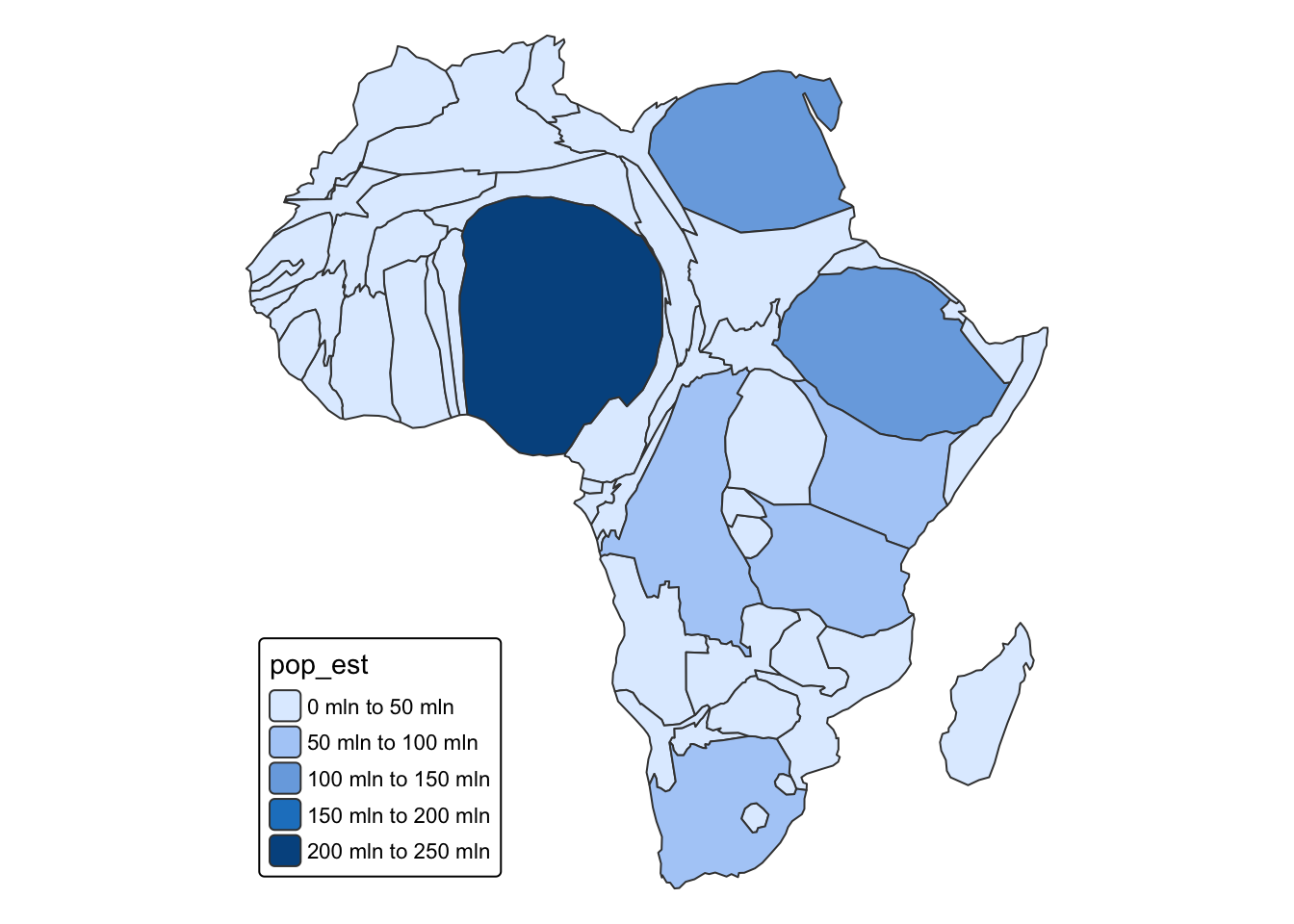
Figure 4.17 demonstrates now the interactivity and contiguous population information for Africa equivalent to the Plotly book example in figure 4.13.
R Code 4.21 : Contiguous interactive area cartogram of Africa’s population
Code
afr_cont1<-afr_cont|>sf::st_cast("MULTIPOLYGON")plotly::plot_ly(afr_cont1, type ="scatter", mode ="lines")|>plotly::add_sf( color =~pop_est, split =~name, span =base::I(1), text =~base::paste(name, "\nPop.", base::round(pop_est/10^6), "M"), hoverinfo ="text", hoveron ="fills")|>plotly::layout(showlegend =FALSE)|>plotly::colorbar(title ="Population")
Figure 4.17: Contiguous area cartogram of African population
4.2.5.2 Non-Overlapping Circles Cartogram
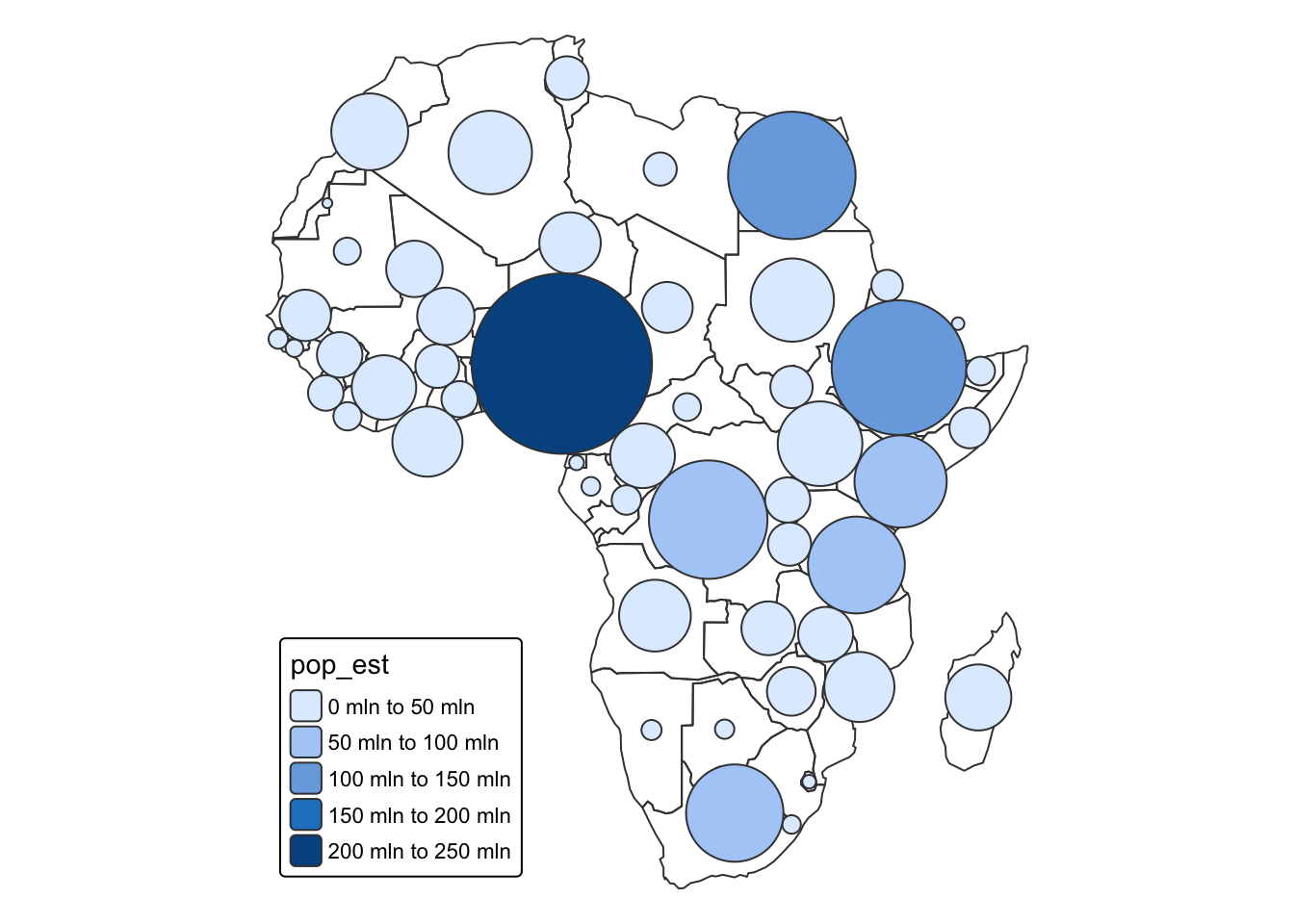
Figure 4.19 demonstrates a non-overlapping circle cartogram of the African population, also called Dorling cartogram (Dorling 2011). This cartogram does not try to preserve the shape of polygons (i.e., states), but instead uses circles to represent each geo-spatial object, then encodes the variable of interest (i.e., population) using the area of the circle.
R Code 4.22 : Non-Overlapping Circles Cartogram with tmap (non-interactive)
Figure 4.18: A Non-Overlapping Non-Interactive Circles Cartogram With {tmap} (non-interactive).
The following figure tries to apply interactivity with the {plotly} package to the dorling cartogram.
R Code 4.23 : An interactive dorling cartogram of the African population
Code
afr_dor<-cartogram::cartogram_dorling(afr, "pop_est")|>sf::st_cast("MULTIPOLYGON")plotly::plot_ly( type ="scatter", mode ="lines", stroke =base::I("black"))|>plotly::add_sf( data =afr, color =base::I("gray95"), span =base::I(1), hoverinfo ="none")|>plotly::add_sf( data =afr_dor, color =~pop_est, split =~name, text =~base::paste(name, "\nPop.", base::round(pop_est/10^6), "M"), hoverinfo ="text", hoveron ="fills")|>plotly::layout(showlegend =FALSE)|>plotly::colorbar(title ="Population")
Figure 4.19: A dorling cartogram of the African population. A dorling cartogram sizes the circles proportional to some metric (e.g., population).
Watch out! 4.2: I don’t know why the African background map and its layers are distorted.
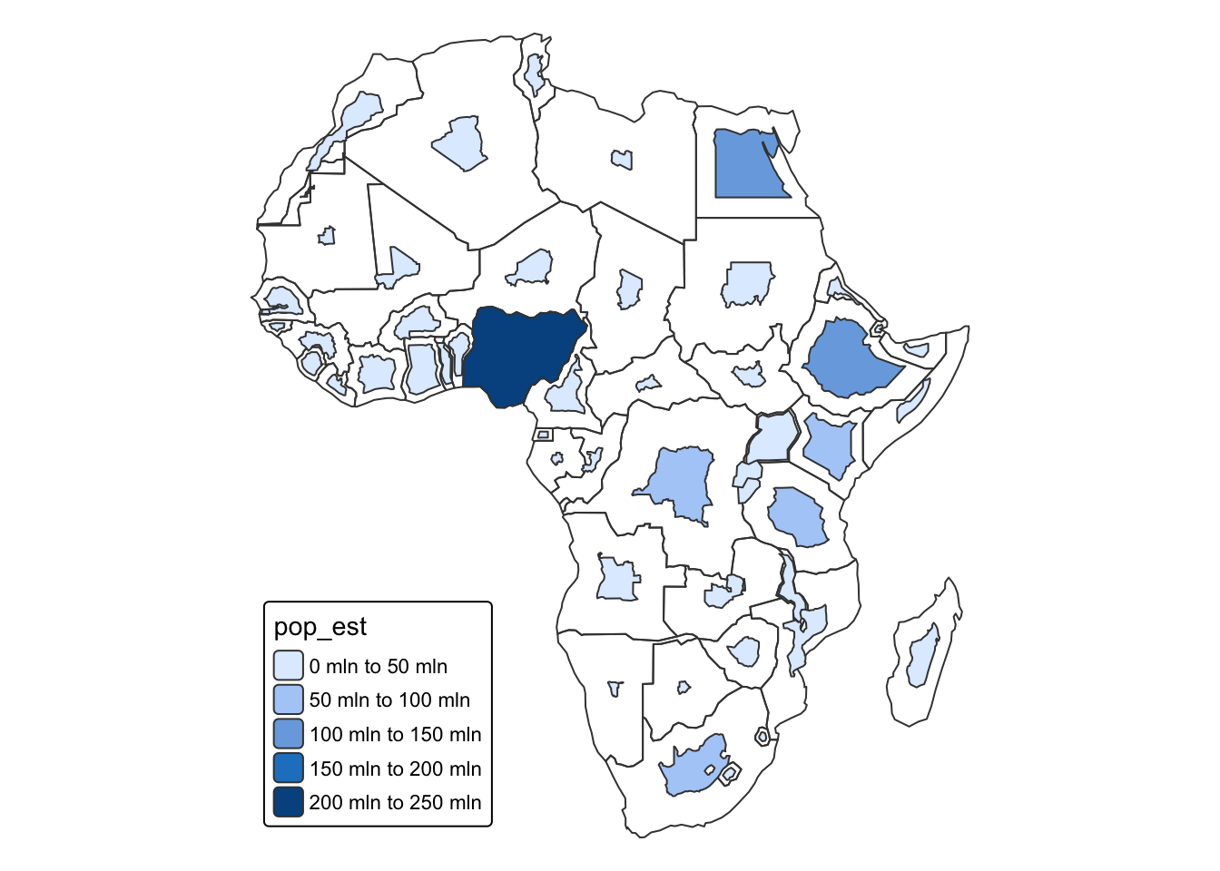
Figure 4.20 shows the dorling cartogram without the background map of Africa.
R Code 4.24 : Dorling cartogram without African background map
Code
utils::data("World", package ="tmap")Africa<-World|>dplyr::filter(continent=="Africa")|>sf::st_transform(3395)plotly::plot_ly(afr_dor, type ="scatter", mode ="lines")|>plotly::add_sf( color =~pop_est, split =~name, span =base::I(1), text =~base::paste(name, "\nPop.", base::round(pop_est/10^6), "M"), hoverinfo ="text", hoveron ="fills")|>plotly::layout(showlegend =FALSE)|>plotly::colorbar(title ="Population")
Figure 4.20: An experiment: Dorling cartogram without African background map.
The exerpiment shows the correct (undistorted) population layer but without the background map with the African country borders. This justifies the conclusion that the problem is with the projection of afr. Just plotting afr confirms this assumption. But then I do not know why using cartogram::cartogram_cont in Figure 4.17 worked without a distorted afr background map.
4.2.5.3 Non-contiguous Area Cartogram
R Code 4.25 : Non-contiguous Area Cartogram with {tmap} non-interactive
Dougenik, James A., Nicholas R. Chrisman, and Duane R. Niemeyer. 1985. “An Algorithm to Construct Continuous Area Cartograms.”The Professional Geographer 37 (1): 75–81. https://doi.org/10.1111/j.0033-0124.1985.00075.x.
Lovelace, Robin, Jakub Nowosad, and Jannes Muenchow. 2025. Geocomputation With R. 2nd ed. Boca Raton, FL: Chapman & Hall/CRC.
R Core Team. 2024. “R: A Language and Environment for Statistical Computing.”https://www.R-project.org/.
Source Code
---knitr: opts_chunk: code-fold: show results: hold---# Maps {#sec-04}```{r}#| label: setup#| results: hold#| include: falsebase::source(file ="R/helper.R")ggplot2::theme_set(ggplot2::theme_bw())```There are two ways to generate maps with {**plotly**}:- **Integrated**: This approach is convenient if you need a quick map and don’t necessarily need sophisticated representations of geo-spatial objects. Currently there are two supported ways of making integrated maps: either via [Mapbox](https://www.mapbox.com/) or via an integrated [d3.js](https://d3js.org/) powered basemap.- **Customized**: The custom mapping approach offers complete control since you’re providing all the information necessary to render the geo-spatial object(s). With {**plotly**} you can draw sophisticated maps (e.g., cartograms) using the {**sf**} R package, but it’s also possible to make custom plotly maps via other tools for geo-computing (e.g., {**sp**}, {**ggmap**}, etc).{**plotly**} is a general purpose visualization library, and is therefore not a fully featured geo-spatial visualization toolkit. But there are benefits to using plotly-based maps since the mapping APIs are very similar to the rest of {**plotly**}. If you run into limitations with {**plotly**}’s mapping functionality, there is a very rich set of [tools for interactive geospatial visualization in R](https://r.geocompx.org/adv-map.html), including but not limited to: {**leaflet**}, {**mapview**}, {**mapedit**}, {**tmap**}, and {**mapdeck**} [@lovelace-2025].## Integrated MapsIf you have fairly simple latitude/longitude data and want to make a quick map, you may want to try one of plotly’s integrated mapping options (i.e., `plotly::plot_mapbox()` and `plotly::plot_geo()`). Generally speaking, you can treat these constructor functions as a drop-in replacement for `plotly::plot_ly()` and get a dynamic basemap rendered behind your data.### plot_mapbox():::::{.my-remark}:::{.my-remark-header}:::::: {#rem-04-access-token}: How to access a Mapbox token?:::::::::::::{.my-remark-container}To follow the next R chunk you must [obtain a mapbox access token](https://www.mapbox.com/help/create-api-access-token/). Otherwise you would get an error message with a message how to get and apply the access token. But this requirement is not explained in the plotly book.It turns out that this is rather a cumbersome process because it requires - your credit number- your full address with (in my case) the European Vat number- fill out a form with several questionsAfter your sign in inte mapbox you will get a free access token for development purposes.**You have to set the token before you start the first `plotly::plot_mapbox()` call.**To hide your access key write the following line into `.Renviron` file. The `.Renviron` file contains lists of environment variables to set in the following pattern:```MAPBOX_PUBLIC_TOKEN = your_access_token```This is not R code, it uses a format similar to that used on the command line shell. But note there are no quotes to provide a string variable!The easiest way to edit `.Renviron` is by running `usethis::edit_r_environ()`.After you have finished editing the `.Renviron` file restart R.::::::::::::::{.my-r-code}:::{.my-r-code-header}:::::: {#cnj-04-plot-mapbox}: Using a mapbox powered bubble chart:::::::::::::{.my-r-code-container}```{r}#| label: fig-plot-mapbox#| fig-cap: "A mapbox powered bubble chart showing the population of various cities in Canada."#| warning: falsebase::Sys.setenv("MAPBOX_TOKEN"= base::Sys.getenv("MAPBOX_PUBLIC_TOKEN")) # (first line)plotly::plot_mapbox(data = maps::canada.cities) |> plotly::add_markers(x =~long, y =~lat, size =~pop, fill =~'', # prevent Warning: `line.width` does not currently support multiple values.color =~country.etc,colors ="Paired", # Warnings, 'Paired' has only 12 colors, but we have 14 categoriestext =~base::paste(name, pop),hoverinfo ="text" ) |> plotly::config(mapboxAccessToken =Sys.getenv("MAPBOX_TOKEN")) # (last line)```***- **first line**: I had to set the environment variable explicitly and *before* the `plotly::plot_mapbox()` function. It didn't work to call the access token with `base::Sys.getenv()` from the `.Renviron` file directly.- **last line**: Adding this line provides the function with access token.Additionally I got a very long list of warnings. One reason is the use of three different markers These warnings can be prevented with the additional `fill = ~''` argument. (See @cnj-03-map-size-and-sizes where we met this difficulty the first time.) The second reason is that the used discrete color palette contains only 12 colors. But we have 14 categopries (type of cities) to map. (The book uses "Accent" with eight distinct colors as color palette.)There is a [video](https://vimeo.com/317352934) to demonstrate how to use the interactivity of this map and an [example to try it out](https://plotly-r.com/interactives/mapbox-bubble) with the full screen width.:::::::::The Mapbox basemap styling is controlled through the `layout.mapbox.style` attribute. The {**plotly**} package comes with support for 7 (14??) different styles, but you can also supply a custom URL to a custom mapbox style. To obtain all the pre-packaged basemap style names, you can grab them from the official **plotly.js** `plotly::schema()`::::::{.my-r-code}:::{.my-r-code-header}:::::: {#cnj-04-layout-mapbox-styles}: List all available layout Mapbox styles:::::::::::::{.my-r-code-container}```{r}#| label: layout-mapbox-styles#| eval: falsemapbox_styles <- plotly::schema()$layout$layoutAttributes$mapbox$style$valuesmy_create_folder("data")my_save_data_file("Chapter4", mapbox_styles, "mapbox_styles.rds")```***<center>**Run this code chunk manually if the Mapbox styles still needs to be generated**</center>:::::::::The computation of the above R code chunks takes 3-4 seconds. To reduce rendering time of this document I have run the code just once (manually) and stored the result.The next R code chunk display the result of the above `plotly::schema()` call. It loads and displays the list of styles from the hard disk.:::::{.my-r-code}:::{.my-r-code-header}:::::: {#cnj-05-load-and-show-styles}: Load and display list of Mapbox styles:::::::::::::{.my-r-code-container}```{r}#| label: load-and-show-stylesstyles <- base::readRDS("data/Chapter4/mapbox_styles.rds")styles```***The book says that there are seven pre-defined styles but a listing of the `plotly::schema()` lists 14 different styles.:::::::::Let's try out some the different styles.::: {.my-code-collection}:::: {.my-code-collection-header}::::: {.my-code-collection-icon}::::::::::: {#exm-04-pre-defined-mapbox-styles}: Show some maps with Mapbox pre-defined stylers::::::::::::::{.my-code-collection-container}::: {.panel-tabset}###### basic:::::{.my-r-code}:::{.my-r-code-header}:::::: {#cnj-04-basic-mapbox-style}: Basic Mapbox Style:::::::::::::{.my-r-code-container}```{r}#| label: basic-mapbox-style#| fig-cap: "Basic MapBox stile using `plotly::plot_mapbox()`."base::Sys.setenv("MAPBOX_TOKEN"= base::Sys.getenv("MAPBOX_PUBLIC_TOKEN"))plotly::layout( plotly::plot_mapbox(type ="scattermapbox", mode ="markers"), mapbox = base::list(style ="basic") ) |> plotly::config(mapboxAccessToken =Sys.getenv("MAPBOX_TOKEN"))```***I added the arguments `type = "scattermapbox", mode = "markers"` to the `plotly::plot_mapbox()` to prevent many warnings. (I am not sure if this is the right mode for all types of "scatterbox".):::::::::###### streets:::::{.my-r-code}:::{.my-r-code-header}:::::: {#cnj-04-streets-mapbox-style}: Streets Mapbox Style:::::::::::::{.my-r-code-container}```{r}#| label: fig-streets-mapbox-style#| fig-cap: "Streets MapBox stile using `plotly::plot_mapbox()`."base::Sys.setenv("MAPBOX_TOKEN"= base::Sys.getenv("MAPBOX_PUBLIC_TOKEN"))plotly::layout( plotly::plot_mapbox(type ="scattermapbox", mode ="markers"),mapbox = base::list(style ="streets") ) |> plotly::config(mapboxAccessToken =Sys.getenv("MAPBOX_TOKEN"))```:::::::::###### outdoors:::::{.my-r-code}:::{.my-r-code-header}:::::: {#cnj-04-outdoors-mapbox-style}: Outdoors Mapbox Style:::::::::::::{.my-r-code-container}```{r}#| label: fig-outdoors-mapbox-style#| fig-cap: "Outdoors MapBox stile using `plotly::plot_mapbox()`."base::Sys.setenv("MAPBOX_TOKEN"= base::Sys.getenv("MAPBOX_PUBLIC_TOKEN"))plotly::layout( plotly::plot_mapbox(type ="scattermapbox", mode ="markers"),mapbox = base::list(style ="outdoors") ) |> plotly::config(mapboxAccessToken =Sys.getenv("MAPBOX_TOKEN"))```:::::::::###### satellite:::::{.my-r-code}:::{.my-r-code-header}:::::: {#cnj-04-satelitte-mapbox-style}: Satellite Mapbox Style:::::::::::::{.my-r-code-container}```{r}#| label: fig-satellite-mapbox-style#| fig-cap: "Satellite MapBox stile using `plotly::plot_mapbox()`."base::Sys.setenv("MAPBOX_TOKEN"= base::Sys.getenv("MAPBOX_PUBLIC_TOKEN"))plotly::layout( plotly::plot_mapbox(type ="scattermapbox", mode ="markers"),mapbox = base::list(style ="satellite") ) |> plotly::config(mapboxAccessToken =Sys.getenv("MAPBOX_TOKEN"))```:::::::::###### open-street-map:::::{.my-r-code}:::{.my-r-code-header}:::::: {#cnj-04-open-street-map-mapbox-style}: Open-street-map Mapbox Style:::::::::::::{.my-r-code-container}```{r}#| label: fig-open-street-map-mapbox-style#| fig-cap: "Open-street-map MapBox stile using `plotly::plot_mapbox()`."base::Sys.setenv("MAPBOX_TOKEN"= base::Sys.getenv("MAPBOX_PUBLIC_TOKEN"))plotly::layout( plotly::plot_mapbox(type ="scattermapbox", mode ="markers"),mapbox = base::list(style ="open-street-map") ) |> plotly::config(mapboxAccessToken =Sys.getenv("MAPBOX_TOKEN"))```:::::::::::::::::::::@fig-styling-with-dropdown-menu demonstrates how to create an integrated **plotly.js** dropdown menu to control the basemap style via the `layout.updatemenus` attribute. The idea behind an integrated **plotly.js** dropdown is to supply a list of buttons (i.e., menu items) where each button invokes a **plotly.js** method with some arguments. In this case, each button uses the `relayout` method to modify the `layout.mapbox.style` attribute.:::::{.my-r-code}:::{.my-r-code-header}:::::: {#cnj-04-styling-with-dropdown-menu}: Styling the Mapbox baselayer via a dropdown menu:::::::::::::{.my-r-code-container}```{r}#| label: fig-styling-with-dropdown-menu#| fig-cap: "Providing a dropdown menu to control the styling of the mapbox baselayer."base::Sys.setenv("MAPBOX_TOKEN"= base::Sys.getenv("MAPBOX_PUBLIC_TOKEN"))style_buttons <- base::lapply(styles, function(s) { base::list(label = s, method ="relayout", args = base::list("mapbox.style", s) )})plotly::layout( plotly::plot_mapbox(type ="scattermapbox", mode ="markers"), mapbox = base::list(style ="dark"),updatemenus = base::list( base::list(y =0.8, buttons = style_buttons) )) |> plotly::config(mapboxAccessToken =Sys.getenv("MAPBOX_TOKEN"))```***:::::{.my-remark}:::{.my-remark-header}:::::: {#rem-04-no-stamen}: Stamen stopped base map service:::::::::::::{.my-remark-container}Stamen stopped providing a base map service. See the announcement in the blog article [Here comes the future of Stamen Maps](https://stamen.com/here-comes-the-future-of-stamen-maps/). Their maps are now provided through the [Stamen x Stadia partnership](https://maps.stamen.com/stadia-partnership/) by [Stadia](https://stadiamaps.com/stamen).:::::::::In contrast to my dowpdown menu with 14 choices the [book demonstration](https://plotly-r.com/interactives/mapbox-style-dropdown) shows only seven. To see more examples of creating and using **plotly.js**’ integrated dropdown functionality to modify graphs, see https://plot.ly/r/dropdowns/:::::::::### plot_geo()Compared to `plotly::plot_mapbox()`, this approach has support for different mapping projections, but styling the basemap is limited and can be more cumbersome. Whereas `plotly::plot_mapbox()` is fixed to a mercator projection, the `plotly::plot_geo()` constructor has a handful of different projection available to it, including the orthographic projection which gives the illusion of the 3D globe.:::::{.my-r-code}:::{.my-r-code-header}:::::: {#cnj-04-flight-paths}: Visualize flight paths within the United States:::::::::::::{.my-r-code-container}```{r}#| label: fig-04-flight-paths#| fig-cap: "Using the integrated orthographic projection to visualize flight patterns on a ‘3D’ globe."# airport locationsair <- readr::read_csv('https://plotly-r.com/data-raw/airport_locations.csv',show_col_types =FALSE)# flights between airportsflights <- readr::read_csv('https://plotly-r.com/data-raw/flight_paths.csv',show_col_types =FALSE)flights$id <- base::seq_len(base::nrow(flights))# map projectiongeo <- base::list(projection = base::list(type ='orthographic',rotation = base::list(lon =-100, lat =40, roll =0) ),showland =TRUE,landcolor = plotly::toRGB("gray95"),countrycolor = plotly::toRGB("gray80"))plotly::plot_geo(color = base::I("red")) |> plotly::add_markers(data = air, x =~long, y =~lat, text =~airport,size =~cnt, fill =~'', hoverinfo ="text", alpha =0.5 ) |> plotly::add_segments(data = dplyr::group_by(flights, id),x =~start_lon, xend =~end_lon,y =~start_lat, yend =~end_lat,alpha =0.3, size =I(1), hoverinfo ="none" ) |> plotly::layout(geo = geo, showlegend =FALSE)```***@fig-04-flight-paths demonstrates using `plotly::plot_geo()` in conjunction with `plotly::add_markers()` and `plotly::add_segments()` to visualize flight paths within the United States.There is a [Vimeo video](https://vimeo.com/317358033) and a screen-wide [interactive demonstration](https://plotly-r.com/interactives/geo-flights).:::::::::One nice thing about `plotly::plot_geo()` is that it automatically projects geometries into the proper coordinate system defined by the map projection. For example, in Figure 4.5 the simple line segment is straight when using `plotly::plot_mapbox()` yet curved when using `plotly::plot_geo()`. It’s possible to achieve the same effect using `plotly::plot_ly()` or `plotly::plot_mapbox()`, but the relevant marker/line/polygon data has to be put into an sf data structure before rendering (see @sec-04-simple-features for more details).:::::{.my-r-code}:::{.my-r-code-header}:::::: {#cnj-04-compare-plotly-integrated-maps}: Compare plotly's integrated mapping solutions:::::::::::::{.my-r-code-container}```{r}#| label: fig-04-compare-plotly-integrated-maps#| fig-cap: "A comparison of plotly’s integrated mapping solutions: plotly::plot_mapbox() (top) and plotly::plot_geo() (bottom). The plotly::plot_geo() approach will transform line segments to correctly reflect their projection into a non-cartesian coordinate system."base::Sys.setenv("MAPBOX_TOKEN"= base::Sys.getenv("MAPBOX_PUBLIC_TOKEN"))map1 <- plotly::plot_mapbox() |> plotly::add_segments(x =-100, xend =-50, y =50, yend =75) |> plotly::layout(mapbox = base::list(zoom =0,center = base::list(lat =65, lon =-75) ) ) |> plotly::config(mapboxAccessToken =Sys.getenv("MAPBOX_TOKEN"))map2 <- plotly::plot_geo() |> plotly::add_segments(x =-100, xend =-50, y =50, yend =75) |> plotly::layout(geo = base::list(projection = base::list(type ="mercator")))htmltools::browsable(htmltools::tagList(map1, map2))```:::::::::### ChoroplethsIn addition to scatter traces, both of the integrated mapping solutions (i.e., `plotly::plot_mapbox()` and `plotly::plot_geo()`) have an optimized `r glossary("choropleth")` trace type (i.e., the [choroplethmapbox](https://plotly.com/r/reference/#choroplethmapbox) and [choropleth](https://plotly.com/r/reference/#choropleth) trace types). Comparatively speaking, choroplethmapbox is more powerful because you can fully specify the feature collection using `r glossary("GeoJSON")`, but the choropleth trace can be a bit easier to use if it fits your use case.@fig-04-us-population-density-choropleth shows the population density of the U.S. via the choropleth trace using the U.S. state data from the {**datasets**} package [@datasets]. By simply providing a `z` attribute, `plotly::plotly_geo()` objects will try to create a choropleth, but you’ll also need to provide [locations](https://plot.ly/r/reference/#choropleth-locations) and a [locationmode](https://plot.ly/r/reference/#choropleth-locationmode). ::: {.callout-note style="color: blue;" #nte-04-locationmode-limitations}The locationmode is currently limited to countries and US states, so if you need to a different geo-unit (e.g., counties, municipalities, etc), you should use the choroplethmapbox trace type and/or use a “custom” mapping approach as discussed in @sec-04-custom-maps.::::::::{.my-r-code}:::{.my-r-code-header}:::::: {#cnj-04-us-population-density-choropleth}: A map of U.S. population density using choropleth trace:::::::::::::{.my-r-code-container}```{r}#| label: fig-04-us-population-density-choropleth#| fig-cap: "A map of U.S. population density using the state.x77 data from the {**datasets**} package (choropleth)"density <- datasets::state.x77[, "Population"] / datasets::state.x77[, "Area"]g <- base::list(scope ='usa',projection =list(type ='albers usa'),lakecolor = plotly::toRGB('white'))plotly::plot_geo() |> plotly::add_trace(z =~density, text = datasets::state.name, span = base::I(0),locations = datasets::state.abb, locationmode ='USA-states' ) |> plotly::layout(geo = g)```:::::::::Choroplethmapbox is more flexible than choropleth because you supply your own GeoJSON definition of the choropleth via the geojson attribute. Currently this attribute must be a URL pointing to a geojson file. Moreover, the location should point to a top-level id attribute of each feature within the geojson file. @fig-04-us-population-density-choroplethmapbox demonstrates how we could visualize the same information as @fig-04-us-population-density-choropleth, but this time using choroplethmapbox.:::::{.my-r-code}:::{.my-r-code-header}:::::: {#cnj-04-us-population-density-choroplethmapbox}: A map of U.S. population density using choroplethmapbox trace:::::::::::::{.my-r-code-container}```{r}#| label: fig-04-us-population-density-choroplethmapbox#| fig-cap: "A map of U.S. population density using the state.x77 data from the {**datasets**} package (choroplethmapbox)"plotly::plot_ly() |> plotly::add_trace(type ="choroplethmapbox",# See how this GeoJSON URL was generated at# https://plotly-r.com/data-raw/us-states.Rgeojson = base::paste(base::c("https://gist.githubusercontent.com/cpsievert/","7cdcb444fb2670bd2767d349379ae886/raw/","cf5631bfd2e385891bb0a9788a179d7f023bf6c8/", "us-states.json" ), collapse =""),locations = base::row.names(datasets::state.x77),z = datasets::state.x77[, "Population"] / datasets::state.x77[, "Area"],span = base::I(0) ) |> plotly::layout(mapbox = base::list(style ="light",zoom =4,center =list(lon =-98.58, lat =39.82) ) ) |> plotly::config(mapboxAccessToken =Sys.getenv("MAPBOX_PUBLIC_TOKEN"),# Workaround to make sure image download uses full container# size https://github.com/plotly/plotly.js/pull/3746toImageButtonOptions = base::list(format ="svg", width =NULL, height =NULL ) )```:::::::::@fig-04-us-population-density-choropleth and @fig-04-us-population-density-choroplethmapbox aren’t an ideal way to visualize state population a graphical perception point of view. We typically use the color in choropleths to encode a numeric variable (e.g., GDP, net exports, average SAT score, etc) and the eye naturally perceives the area that a particular color covers as proportional to its overall effect. This ends up being *misleading since the area the color covers typically has no sensible relationship with the data encoded by the color*. A classic example of this misleading effect in action is in US election maps – the proportion of red to blue coloring is not representative of the overall popular vote [@newman-2016].`r glossary("Cartogram", "Cartograms")` are an approach to reducing this misleading effect and grants another dimension to encode data through the size of geo-spatial features. @sec-04-cartograms covers how to render cartograms in plotly using {**sf**} and {**cartogram**}.## Custom Maps {#sec-04-custom-maps}### Simple Features {#sec-04-simple-features}The {**sf**} R package is a modern approach to working with geo-spatial data structures based on tidy data principles. The key idea behind {**sf**} is that it stores geo-spatial geometries in a [list-column of a data frame](https://jennybc.github.io/purrr-tutorial/ls13_list-columns.html). This allows each row to represent the real unit of observation/interest – whether it’s a polygon, multi-polygon, point, line, or even a collection of these features – and as a result, works seamlessly inside larger tidy workflows. The {**sf**} package itself does not really provide geo-spatial data – it provides the framework and utilities for storing and computing on geo-spatial data structures in an opinionated way.There are numerous packages for accessing geo-spatial data as simple features data structures. A couple notable examples include {**rnaturalearth**} and {**USA.state.boundaries**}. - The {**rnaturalearth**} package is better for obtaining any map data in the world via an API provided by [https://www.naturalearthdata.com/](https://www.naturalearthdata.com/). - The {**USA.state.boundaries**} package is great for obtaining map data for the United States at any point in history. It doesn’t really matter what tool you use to obtain or create an sf object – once you have one, `plotly::plot_ly()` knows how to render it.::: {.callout-note #nte-04-creating-maps}See my experiments of how to apply the {**rnaturalearth**} package: [Creating Maps](https://bookdown.org/pbaumgartner/gdswr-notes/91-creating-maps.html).:::### Download and save world dataThe following code chunk donwloads the world countries and regions of Canada using the {**rnaturalearth**} package.:::::{.my-r-code}:::{.my-r-code-header}:::::: {#cnj-04-download-save-world-data}: Download and save `world` and `canada` map data with functions from {**rnaturalearth**}:::::::::::::{.my-r-code-container}<center>**Run this code chunk manually if the file still needs to be downloaded.**</center>```{r}#| label: download-save-world-data#| eval: falseworld <- rnaturalearth::ne_countries(returnclass ="sf")canada <- rnaturalearth::ne_states(country ="Canada",returnclass ="sf" )class(world)pb_save_data_file("Chapter4", world, "world.rds")pb_save_data_file("Chapter4", canada, "canada.rds")```***The `returnclass = "sf"` argument for simple feature from the {**sf**} package wouldn't be necessary, because it is the default value. The other possible value of this argument would be `returnclass = "sv"` for "SpatVector" from the {**terra**} packages.:::::::::### Draw world map with country namesThe next code chunk shows the result of my experiments with basic interactivity of the {**plotly**} packages using the {**sf**} object `world` downloaded in @cnj-04-download-save-world-data. It displays the world and shows when you hover the cursor over the map the country names.:::::{.my-r-code}:::{.my-r-code-header}:::::: {#cnj-04-draw-world-map}: Draw world map with country borders showing country names:::::::::::::{.my-r-code-container}```{r}#| label: fig-04-draw-world-map#| fig-cap: "Rendering all the world’s countries using `plotly::plot_ly()`"world <- base::readRDS("data/Chapter4/world.rds")plotly::plot_ly(world,type ="scatter",mode ="lines",color = base::I("gray90"),stroke = base::I("black"),span = base::I(1),split =~name ) |> plotly::hide_legend()```***To experiment with mapping {**sf**} data I have added `split = ~name` to get all country names. (For more details see: code comment before [Figure 3.2](https://plotly-r.com/scatter-traces#fig:scatter-lines) and the paragraph and code before [Figure 4.10](https://plotly-r.com/maps#fig:split-color))(I could find parameter 'split' with `plotly::schema()` only in "traces.candlestick.attributes.hoverlabel.split" and "traces.ohlc.attributes.hoverlabel.split" but not for "traces.scatter…")To prevent the very long legend list of country names I have added `plotly::hide_legend()`. --- Another way to hide legend would be the argument `showlegend = FALSE` inside the `plotly::plot_ly()` function (instead of `plotly::hide_legend()`).:::::::::### World map with country names & populationThe next code chunk experiments with basic interactivity of the {**plotly**} packages using the {**sf**} object `world` downloaded in @cnj-04-download-save-world-data. It displays the world and shows when you hover the cursor over the map the country names.:::::{.my-r-code}:::{.my-r-code-header}:::::: {#cnj-04-draw-world-map-country-names}: Draw world map with country borders and interactive country names and population:::::::::::::{.my-r-code-container}```{r}#| label: fig-04-draw-world-map-country-names#| fig-cap: "World map with country borders. If you hover over the countries you will get information on country names and population. This is similar to @cnj-04-hoveron-fills."plotly::plot_ly( world, type ="scatter",mode ="lines",split =~name, color =~pop_est, text =~base::paste(name, "\nPop.", pop_est),hoveron ="fills",hoverinfo ="text",showlegend =FALSE)```:::::::::There are actually 4 different ways to render sf objects with plotly: 1. `plotly::plot_ly()`, 2. `plotly::plot_mapbox()`, 3. ` plotly::plot_geo()`, and4. `ggplot2::geom_sf()`. These functions render multiple polygons using a single trace by default, which is fast, but you may want to leverage the added flexibility of multiple traces. For example, a given trace can only have one fillcolor, so it’s impossible to render multiple polygons with different colors using a single trace. For this reason, if you want to vary the color of multiple polygons, make sure to split by a unique identifier (e.g. name), as done in @fig-04-draw-canada-names-colors. Note that, as discussed for line charts in @fig-03-grouping-one-trace, using multiple traces automatically adds the ability to filter name via legend entries.This is essentially the exercise in @fig-04-draw-world-map with the world map.:::::{.my-r-code}:::{.my-r-code-header}:::::: {#cnj-04-draw-canada-names-colors}: Draw a Canada map with colored regions and their names as tooltips:::::::::::::{.my-r-code-container}```{r}#| label: fig-04-draw-canada-names-colors#| fig-cap: "Using split and color to create a choropleth map of provinces in Canada."canada <- base::readRDS("data/Chapter4/canada.rds")plotly::plot_ly( canada, type ="scatter",mode ="lines",split =~name, color =~provnum_ne)```:::::::::Another important feature for maps that may require you to split multiple polygons into multiple traces is the ability to display a different hover-on-fills for each polygon. By providing text that is unique within each polygon and specifying `hoveron='fills'`, the tooltip behavior is tied to the trace’s fill (instead of displayed at each point along the polygon).This is essentially the exercise in @fig-04-draw-world-map-country-names with the world map.:::::{.my-r-code}:::{.my-r-code-header}:::::: {#cnj-04-hoveron-fills}: Providing unique text for each polygon and specifying `hoveron='fills'`:::::::::::::{.my-r-code-container}```{r}#| label: fig-04-hoveron-fills#| fig-cap: "Using `split`, `text`, and `hoveron='fills'` to display a tooltip specific to each Canadian province."plotly::plot_ly( canada,type ="scatter",mode ="lines",split =~name, color = base::I("gray90"), text =~base::paste(name, "is \n province number", provnum_ne),hoveron ="fills",hoverinfo ="text",showlegend =FALSE)```:::::::::Although the integrated mapping approaches (`plotly::plot_mapbox()` and `plotly::plot_geo()`) can render `sf` objects, the custom mapping approaches (`plotly::plot_ly()` and `ggplot2::geom_sf()`) are more flexible because they allow for any well-defined mapping projection. Working with and understanding map projections can be intimidating for a causal map maker. Thankfully, there are nice resources for searching map projections in a human-friendly interface, like [http://spatialreference.org/](http://spatialreference.org/). Through this website, one can search desirable projections for a given portion of the globe and extract commands for projecting their geo-spatial objects into that projection. One way to perform the projection is to supply the relevant PROJ4 command to the `sf::st_transform()` function in {**sf**}.:::::{.my-r-code}:::{.my-r-code-header}:::::: {#cnj-04-pop-canada-mollweide-proj}: Show Canada's population using a Mollweide projection:::::::::::::{.my-r-code-container}```{r}#| label: fig-pop-canada-mollweide-proj#| fig-cap: "The population of various Canadian cities rendered on a custom basemap using a Mollweide projection."## load dataworld <- base::readRDS("data/Chapter4/world.rds")## filter the world sf object down to canadacanada <- dplyr::filter(world, name =="Canada")## coerce cities lat/long data to an official sf objectcities <- sf::st_as_sf( maps::canada.cities, coords =c("long", "lat"),crs =4326)## A PROJ4 projection designed for Canada## http://spatialreference.org/ref/sr-org/7/## http://spatialreference.org/ref/sr-org/7/proj4/## not supported anymore## for old data see: ## https://github.com/OSGeo/spatialreference.org/blob/master/scripts/sr-org.jsonmoll_proj <-"+proj=moll +lon_0=0 +x_0=0 +y_0=0 +ellps=WGS84 +units=m +no_defs"## but 'moll_proj <- "+proj=moll' works as well## all the other parameters are optional## perform the projectionscanada <- sf::st_transform(canada, moll_proj)cities <- sf::st_transform(cities, moll_proj)## plot with geom_sf()p <- ggplot2::ggplot() + ggplot2::geom_sf(data = canada) + ggplot2::geom_sf(data = cities, ggplot2::aes(size = pop),color ="red",alpha =0.3)plotly::ggplotly(p)```:::::::::### Cartograms {#sec-04-cartograms}`r glossary("Cartogram", "Cartograms")` distort the size of geo-spatial polygons to encode a numeric variable other than the land size. Cartograms have been shown to be an effective approach to both encode and teach about geo-spatial data.The R package {**cartogram**} provides an interface to several popular cartogram algorithms. A number of other R packages provide cartogram algorithms, but the great thing about {**cartogram**} is that all the functions can take an {**sf**} (or {**sp**}) object as input and return an `sf` object. This makes it incredibly easy to go from raw spatial objects, to transformed objects, to visual. Instead of the contiguous US population example in the book my @fig-africa-pop demonstrates a contiguous area cartogram of the African population using a rubber sheet distortion algorithm [@dougenik-1985].::: {.callout-warning #wrn-04-albersusa-not-working}###### {albersusa} package uses old-style CRS objectI can't reproduce the following book examples because the {**albersusa**} package uses an old-style CRS object. I do not know how to transform (recreate) the object with a recent `sf::st_crs()`. (I tried to transform it with `sf::st_transform(us_cont, crs=3310)` but the `plotly::plot_ly()` function threw an error message:> "Error in st_coordinates.sfc(sf::st_geometry(model)): not implemented for objects of class sfc_GEOMETRY)I am trying to create equivalent figures using the demonstrations from the {**cartogram**} package.:::#### Continuous Area Cartogram:::::{.my-r-code}:::{.my-r-code-header}:::::: {#cnj-04-african-pop}: Show African population using a rubber sheet distortion algorithm:::::::::::::{.my-r-code-container}```{r}#| label: fig-africa-pop#| fig-cap: "A cartogram of population in Africa. A cartogram sizes the area of geo-spatial objects proportional to some metric (e.g., population)."utils::data("World", package ="tmap")## keep only the african continentafr <- World[World$continent =="Africa", ]# Error in st_geometry.sf(x) : # attr(obj, "sf_column") does not point to a geometry column.# Did you rename it, without setting st_geometry(obj) <- "newname"?## add the following line when using new version 4.0 ## to prevent above error:sf::st_geometry(afr) <-"afr"## project the mapafr <- sf::st_transform(afr, 3395)## construct cartogramafr_cont <- cartogram::cartogram_cont(afr, "pop_est", itermax =5)## plot it after changing tmap v3 code converted to v4# `tm_polygons()`: instead of `style = "jenks"`, use fill.scale = `tm_scale_intervals()`.p_cont <- tmap::tm_shape(afr_cont) + tmap::tm_polygons("pop_est", fill.scale = tmap::tm_scale_intervals()) + tmap::tm_layout(frame =FALSE, legend.position =c("left", "bottom"))p_cont```::::::::::::::{.my-remark}:::{.my-remark-header}:::::: {#rem-interactive-cartogram}: How to make cartograms interactive with (**plotly**) functions?:::::::::::::{.my-remark-container}The above graphic is not interactive and therefore not equivalent to the books figure 4.13 (using Africa instead of the Albers USA projection). But whenever I used `plotly::plot_ly(afr_cont)` to get an interactive contiguous area cartogram I received the following error message:> Error in st_coordinates.sfc(sf::st_geometry(model)) : not implemented for objects of class sfc_GEOMETRYFinally my Brave browser KI provided the solution:> The error you’re encountering, 'Error in st_coordinates.sfc(sf::st_geometry(model)) : not implemented for objects of class sfc_GEOMETRY', occurs because the st_coordinates() function does not know how to handle objects of class sfc_GEOMETRY. This class represents a general geometry type in the sf package, which is why st_coordinates() does not have a specific implementation for it.> To resolve this issue, you can try converting the geometry to a more specific type, such as MULTIPOLYGON, before calling st_coordinates(). For example:```model %>% st_cast("MULTIPOLYGON") %>% st_coordinates()```> This approach may provide the coordinates you need, as st_coordinates() is implemented for more specific geometry types like MULTIPOLYGON.See [GitHub Issue #584](https://github.com/r-spatial/sf/issues/584): st_coordinates() doesn't know about sfc_GEOMETRY:::::::::@fig-04-cont-int-africa-pop demonstrates now the interactivity and contiguous population information for Africa equivalent to the Plotly book example in figure 4.13.:::::{.my-r-code}:::{.my-r-code-header}:::::: {#cnj-04-cont-int-africa-pop}: Contiguous interactive area cartogram of Africa's population:::::::::::::{.my-r-code-container}```{r}#| label: fig-04-cont-int-africa-pop#| fig-cap: "Contiguous area cartogram of African population"afr_cont1 <- afr_cont |> sf::st_cast("MULTIPOLYGON")plotly::plot_ly( afr_cont1,type ="scatter",mode ="lines" ) |> plotly::add_sf(color =~pop_est, split =~name, span = base::I(1),text =~base::paste(name, "\nPop.", base::round(pop_est /10^6), "M"),hoverinfo ="text",hoveron ="fills" ) |> plotly::layout(showlegend =FALSE) |> plotly::colorbar(title ="Population")```:::::::::#### Non-Overlapping Circles Cartogram@fig-04-dorling demonstrates a non-overlapping circle cartogram of the African population, also called Dorling cartogram [@dorling-2011]. This cartogram does not try to preserve the shape of polygons (i.e., states), but instead uses circles to represent each geo-spatial object, then encodes the variable of interest (i.e., population) using the area of the circle.:::::{.my-r-code}:::{.my-r-code-header}:::::: {#cnj-04-non-overlapping-circles}: Non-Overlapping Circles Cartogram with tmap (non-interactive):::::::::::::{.my-r-code-container}```{r}#| label: fig-04-non-overlapping-circles#| fig-cap: "A Non-Overlapping Non-Interactive Circles Cartogram With {**tmap**} (non-interactive)."# construct cartogramafr_dorling <- cartogram::cartogram_dorling(afr, "pop_est")# plot itp_dorling <- tmap::tm_shape(afr) + tmap::tm_borders() + tmap::tm_shape(afr_dorling) + tmap::tm_polygons("pop_est", fill.scale = tmap::tm_scale_intervals()) + tmap::tm_layout(frame =FALSE, legend.position =c("left", "bottom"))p_dorling```:::::::::The following figure tries to apply interactivity with the {**plotly**} package to the dorling cartogram.:::::{.my-r-code}:::{.my-r-code-header}:::::: {#cnj-04-dorling}: An interactive dorling cartogram of the African population:::::::::::::{.my-r-code-container}```{r}#| label: fig-04-dorling#| fig-cap: "A dorling cartogram of the African population. A dorling cartogram sizes the circles proportional to some metric (e.g., population)."afr_dor <- cartogram::cartogram_dorling(afr, "pop_est") |> sf::st_cast("MULTIPOLYGON")plotly::plot_ly(type ="scatter",mode ="lines",stroke = base::I("black") ) |> plotly::add_sf(data = afr,color = base::I("gray95"),span = base::I(1),hoverinfo ="none" ) |> plotly::add_sf(data = afr_dor, color =~pop_est,split =~name, text =~base::paste(name, "\nPop.", base::round(pop_est /10^6), "M"),hoverinfo ="text", hoveron ="fills" ) |> plotly::layout(showlegend =FALSE) |> plotly::colorbar(title ="Population")```***::: {.callout-warning #wrn-04-distorted-african-continent}###### I don't know why the African background map and its layers are distorted.::::::::::::@fig-04-without-background-map shows the dorling cartogram without the background map of Africa.:::::{.my-r-code}:::{.my-r-code-header}:::::: {#cnj-04-without-African-background-map}: Dorling cartogram without African background map:::::::::::::{.my-r-code-container}```{r}#| label: fig-04-without-background-map#| fig-cap: "An experiment: Dorling cartogram without African background map."utils::data("World", package ="tmap")Africa <- World |>dplyr::filter(continent =="Africa") |> sf::st_transform(3395)plotly::plot_ly( afr_dor,type ="scatter",mode ="lines" ) |> plotly::add_sf(color =~pop_est, split =~name, span = base::I(1),text =~base::paste(name, "\nPop.", base::round(pop_est /10^6), "M"),hoverinfo ="text",hoveron ="fills" ) |> plotly::layout(showlegend =FALSE) |> plotly::colorbar(title ="Population")```***The exerpiment shows the correct (undistorted) population layer but without the background map with the African country borders. This justifies the conclusion that the problem is with the projection of `afr`. Just plotting `afr` confirms this assumption. But then I do not know why using `cartogram::cartogram_cont` in @fig-04-cont-int-africa-pop worked without a distorted `afr` background map. :::::::::#### Non-contiguous Area Cartogram:::::{.my-r-code}:::{.my-r-code-header}:::::: {#cnj-04-non-contiguous-african-cartogram}: Non-contiguous Area Cartogram with {**tmap**} non-interactive:::::::::::::{.my-r-code-container}```{r}#| label: fig-04-non-contiguous-african-cartogram# construct cartogramafr_ncont <- cartogram::cartogram_ncont(afr, "pop_est")# plot ittmap::tm_shape(afr) + tmap::tm_borders() + tmap::tm_shape(afr_ncont) + tmap::tm_polygons("pop_est", fill.scale = tmap::tm_scale_intervals()) + tmap::tm_layout(frame =FALSE, legend.position =c("left", "bottom"))```:::::::::@fig-04-non-contiguous-cartogram demonstrates a non-contiguous cartogram of the African population [@olson-1976]. In contrast to the Dorling cartogram, this approach does preserve the shape of polygons. The implementation behind @fig-04-non-contiguous-cartogram is to simply take the implementation of @fig-04-dorling and change `cartogram::cartogram_dorling()` to `cartogram::cartogram_ncont()`.:::::{.my-r-code}:::{.my-r-code-header}:::::: {#cnj-04-non-contiguous-cartogram}: Non-contiguous cartogram of the African population:::::::::::::{.my-r-code-container}```{r}#| label: fig-04-non-contiguous-cartogram#| fig-cap: "A non-contiguous cartogram of African population that preserves shape."afr_ncont <- cartogram::cartogram_ncont(afr, "pop_est") |> sf::st_cast("MULTIPOLYGON")plotly::plot_ly(type ="scatter",mode ="lines",stroke = base::I("black"), span = base::I(1) ) |> plotly::add_sf(data = afr,color = base::I("gray95"),hoverinfo ="none" ) |> plotly::add_sf(data = afr_ncont, color =~pop_est,split =~name, text =~base::paste(name, "\nPop.", base::round(pop_est /10^6), "M"),hoverinfo ="text", hoveron ="fills" ) |> plotly::layout(showlegend =FALSE) |> plotly::colorbar(title ="Population")```::: {.callout-warning #wrn-04-distorted-african-continent-2}###### Again: I don't know why the map is distorted.::::::::::::