Data Visualization
This chapter will cover plotting functions from the ggplot2 package.
Create a Plot
We first create an initial ggplot object using ggplot() function. We declare the data for plotting within ggplot(), then add layers/components (such as geom functions) to the plot.
To construct a scatterplot, for instance, we add geom_point() with an aesthetic mapping argument inside the parentheses. The aesthetic mappings aes() describe how variables in the data are mapped to visual properties of geometric objects (geom).
## ggplot(data = data_object, mapping = aes(global aesthetics)) +
##   <geom_function>(mapping = aes(specific aesthetics))

ggplot(data = hsb) +   # create a ggplot
  geom_point(mapping = aes(ses, mathach))  # add a layer of points (scatterplot)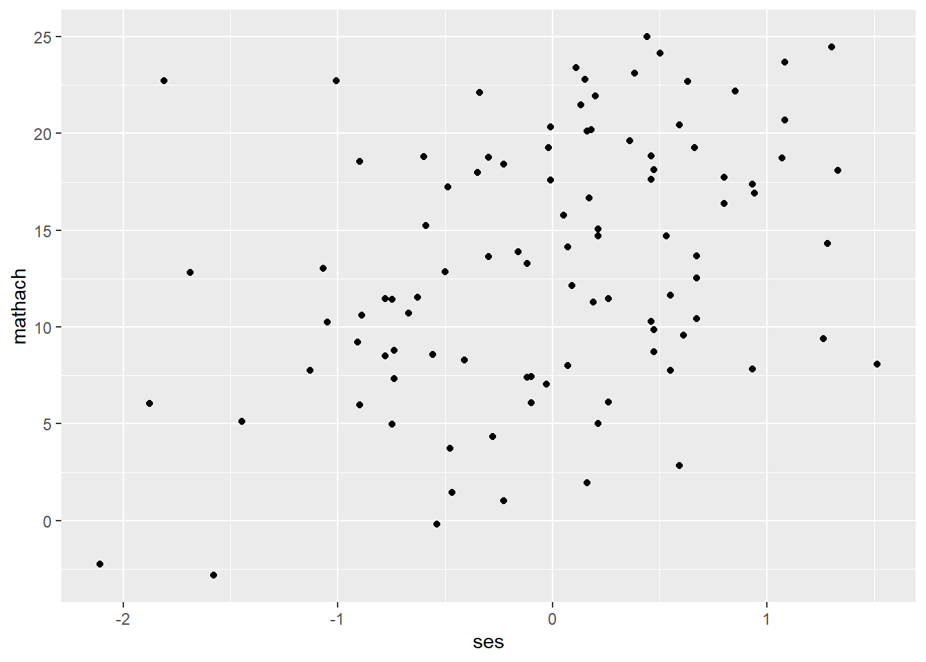
# or

ggplot(data = hsb, mapping = aes(ses, mathach)) +
geom_point() 
## You can also use the pipe operator

hsb %>%    # data
  ggplot() +     # create a ggplot
  geom_point(mapping = aes(ses, mathach)) # add geom_function()
Geom Functions
Frequently used geom functions are introduced in this section. More functions can be found here: https://github.com/rstudio/cheatsheets/blob/master/data-visualization-2.1.pdf
< One variable >
- geom_histogram() for a continuous variable
ggplot(data = hsb) +
  geom_histogram(mapping = aes(mathach), bins = 25)
#or ggplot(data = hsb, mapping = aes(mathach)) +
geom_histogram(bins = 25) # can set the number of bins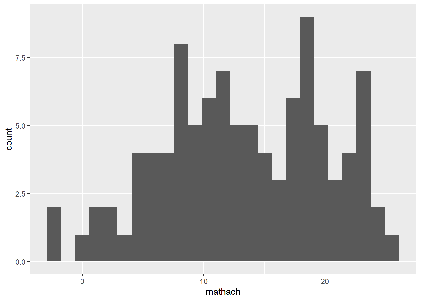
- geom_density() for a continuous variable
ggplot(data = hsb) +
  geom_histogram(mapping = aes(mathach))
# or ggplot(data = hsb, mapping = aes(mathach)) +
geom_density() 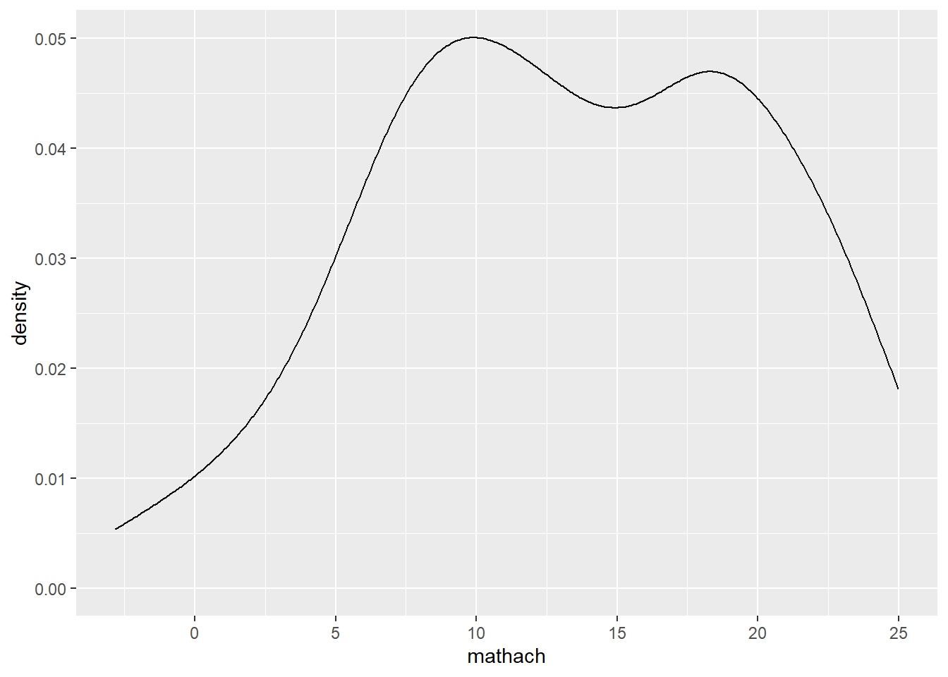
- geom_bar() for a discrete variable
ggplot(data = hsb, mapping = aes(female)) +
geom_bar() 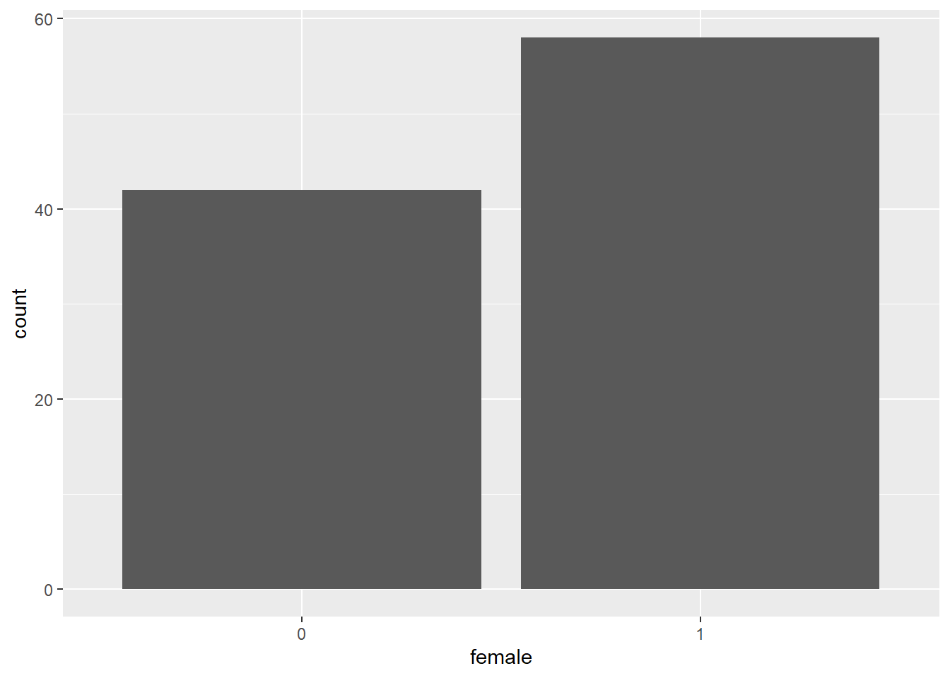
< Two variables >
- geom_boxplot() for discrete X, continuous Y
ggplot(data = hsb, mapping = aes(female, mathach)) +
geom_boxplot() 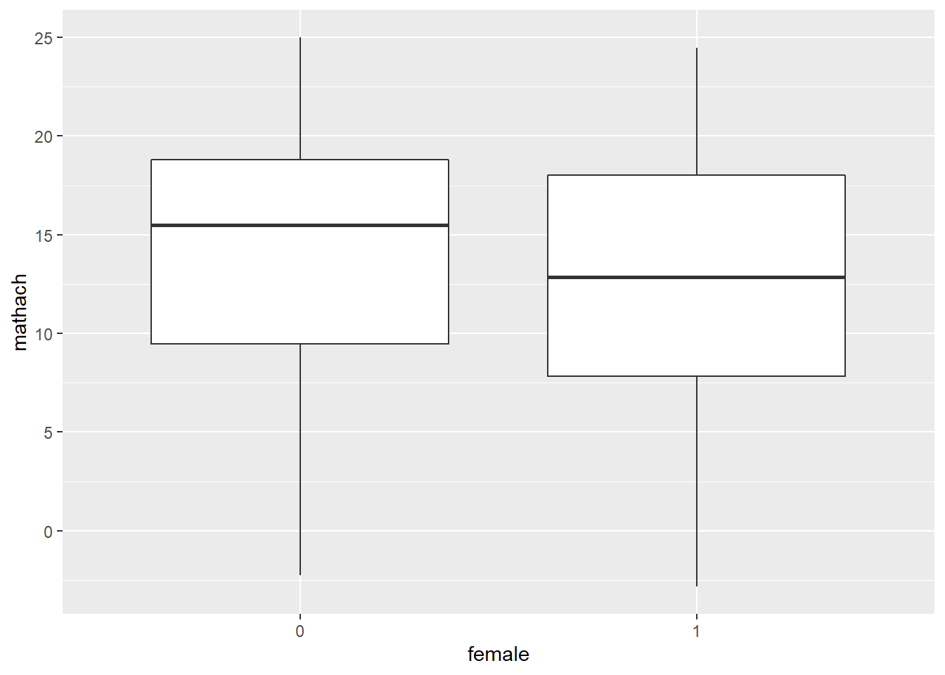
- geom_point() for continuous X, Y
ggplot(data = hsb, mapping = aes(ses, mathach)) +
geom_point() 
- geom_text() for continuous X, Y
## need 'label' aesthetic
ggplot(data = hsb, mapping = aes(ses, mathach)) +
geom_text(mapping = aes(label=id)) # plot labels 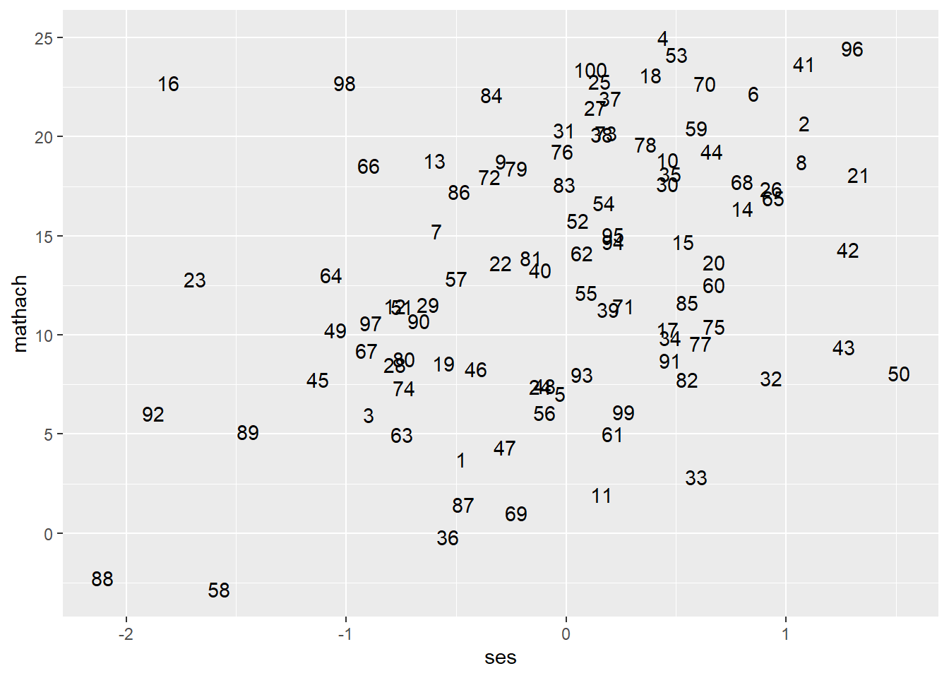
## Add labels to a scatterplot
ggplot(data = hsb, mapping = aes(ses, mathach)) +
  geom_point() +  # draw a scatterplot
  geom_text(mapping = aes(label=id), nudge_x = 0.08) # add 'id' labels to points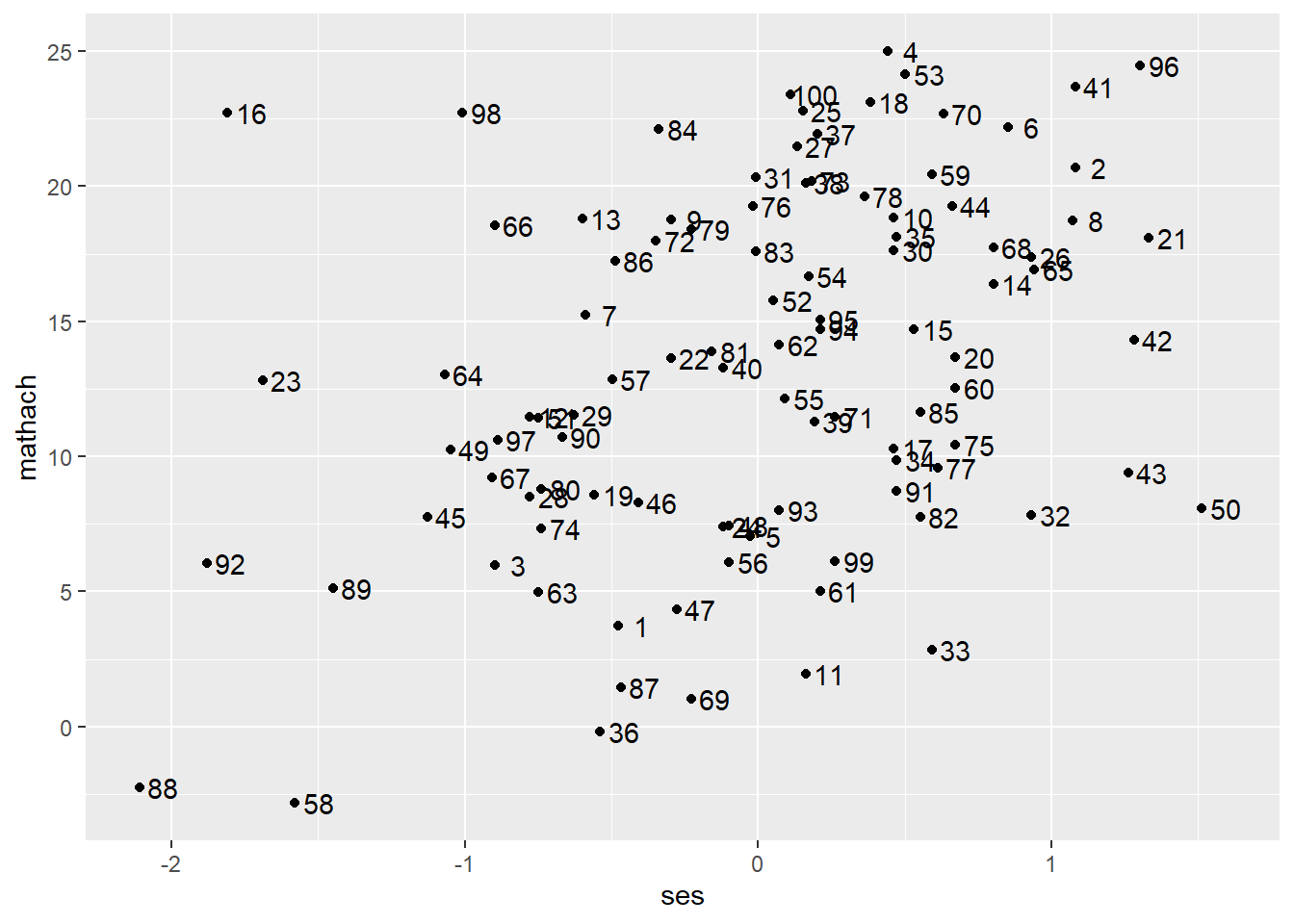
- geom_smooth() for continuous X, Y
ggplot(data = hsb, mapping = aes(ses, mathach)) +
  geom_point() +  # scatterplot
  geom_smooth() # add a smooth line fitted to the data
## `geom_smooth()` using method = 'loess' and formula 'y ~ x'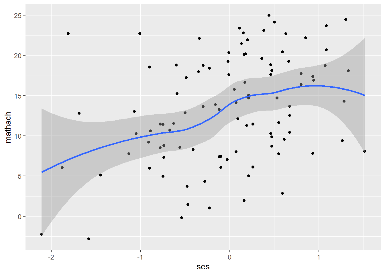
< Line segments >
- geom_abline()
ggplot(data = hsb, mapping = aes(ses, mathach)) +
  geom_point() +  # scatterplot
  geom_abline(aes(intercept = 13.349, slope = 3.224)) # add a regression line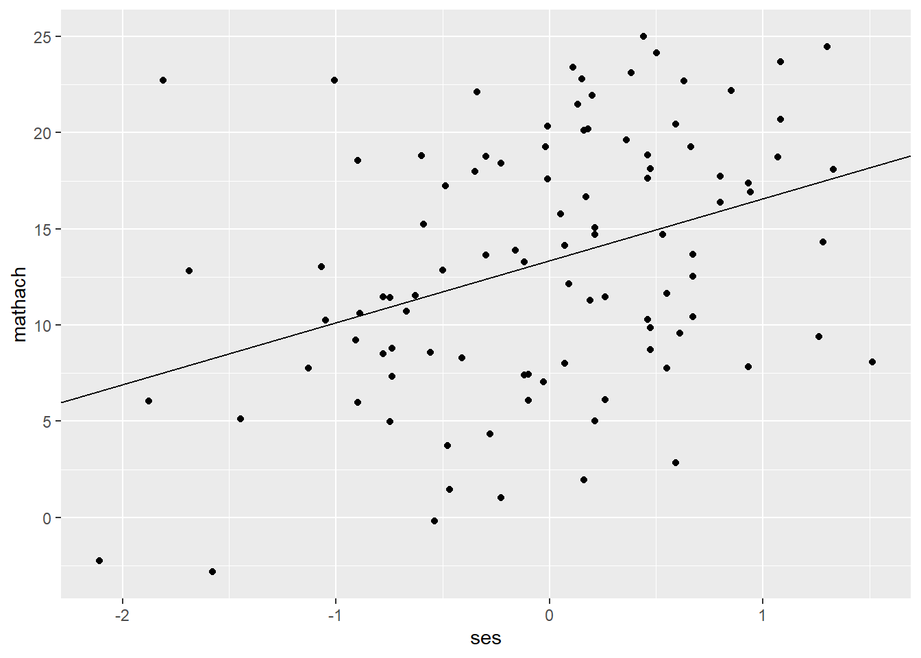
## To add the regression equation
ggplot(data = hsb, mapping = aes(ses, mathach)) +
  geom_point() +  # scatterplot
  geom_abline(aes(intercept = 13.349, slope = 3.224)) + # add a regression line
  geom_text(aes(label = "Mathach = 13.35 + 3.22 * SES + e"), x = 0.93, y = 13.5) # add the equation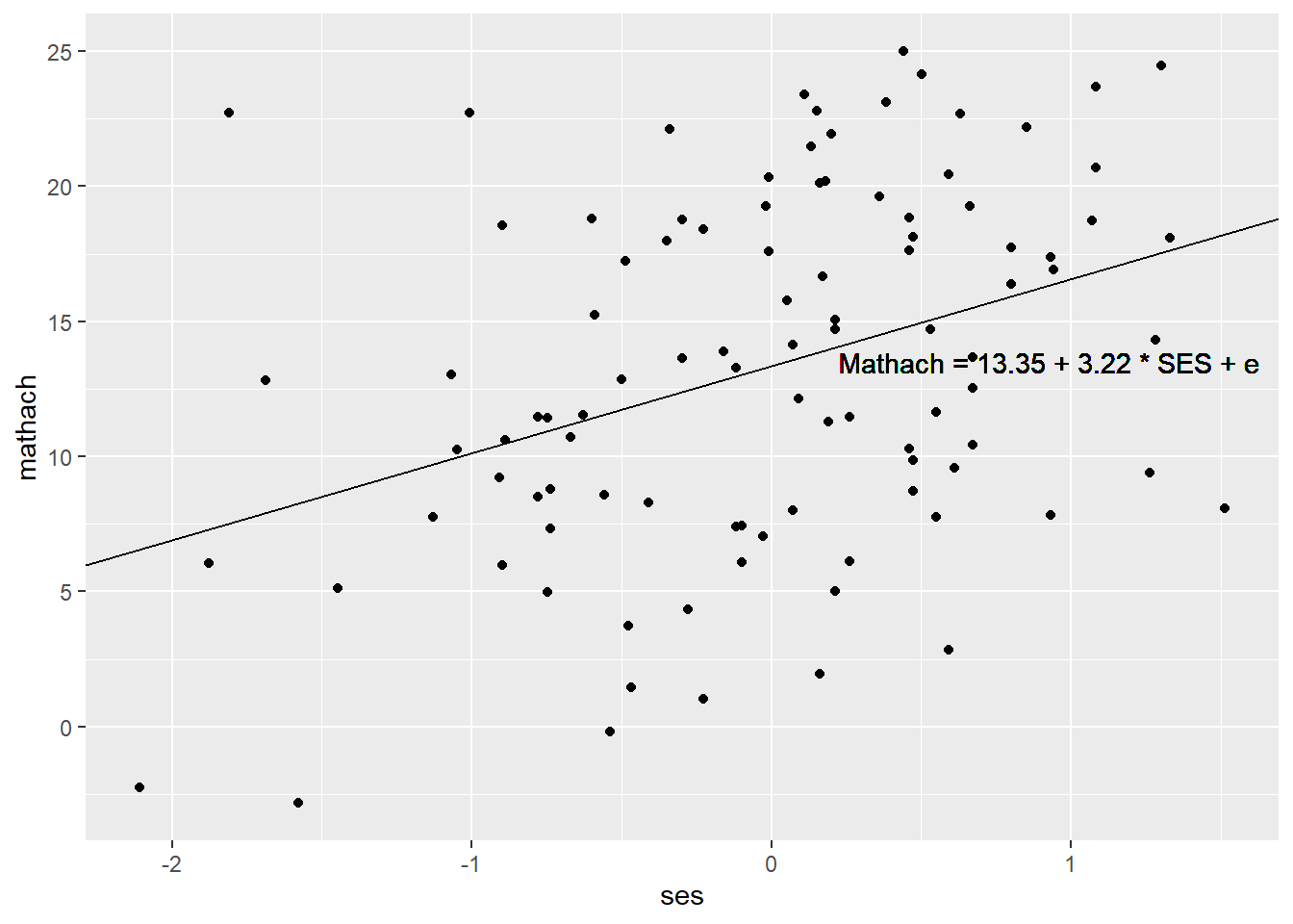
Color/Size/Shape/Linetype
- Color/Opacity
To map colors/opacity to a specific variable, add color/fill or alpha (which controls transparency) inside aes(). If you want to set colors/opacity, add them outside aes().
## Map colors/opacity to a variable
ggplot(data = hsb, mapping = aes(ses, mathach)) +   # create a ggplot object
  geom_point(aes(color = female))   # map colors to 'female' (discrete)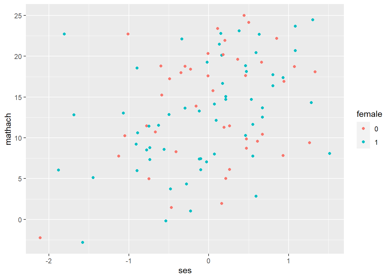
ggplot(data = hsb, mapping = aes(ses, mathach)) +   # create a ggplot object
  geom_point(aes(color = ses))   # map colors to 'ses' (continuous)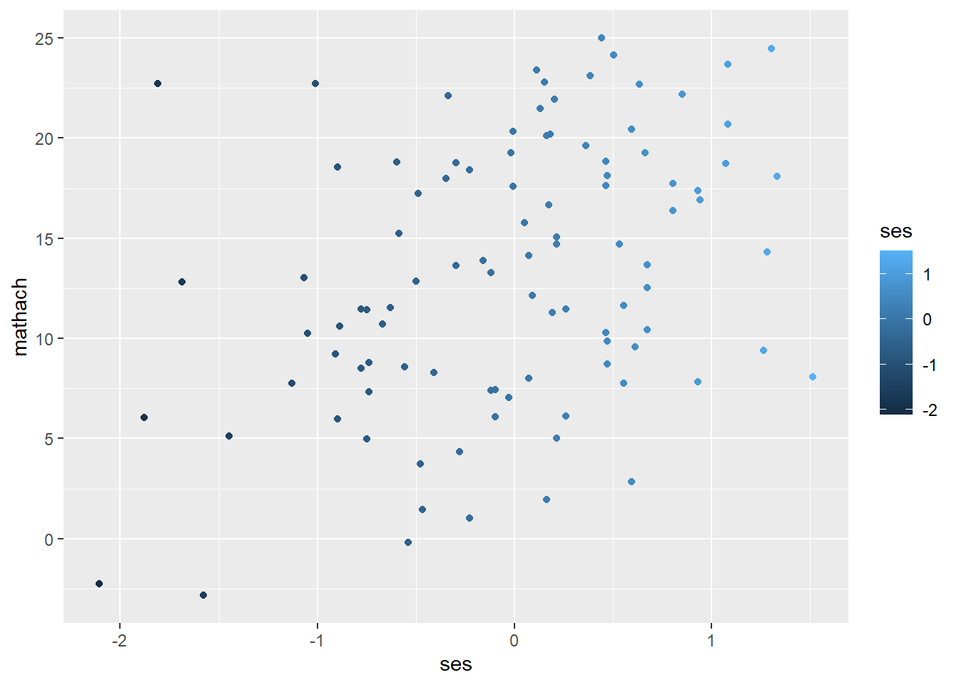
ggplot(data = hsb, mapping = aes(ses, mathach)) +
  geom_point(aes(alpha = ses))  # map opacify to 'ses (continuous)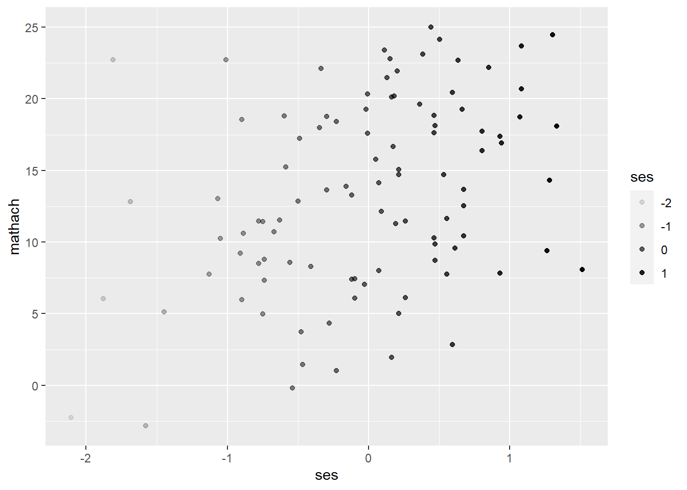
ggplot(data = hsb, mapping = aes(mathach)) +
  geom_density(aes(fill=female))  # map colors to 'female'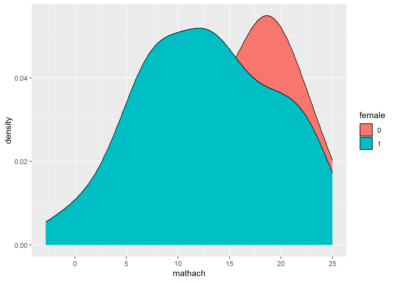
ggplot(data = hsb, mapping = aes(mathach)) +
  geom_density(aes(fill=female), alpha = 0.3) # map colors to 'female' & set alpha to 0.3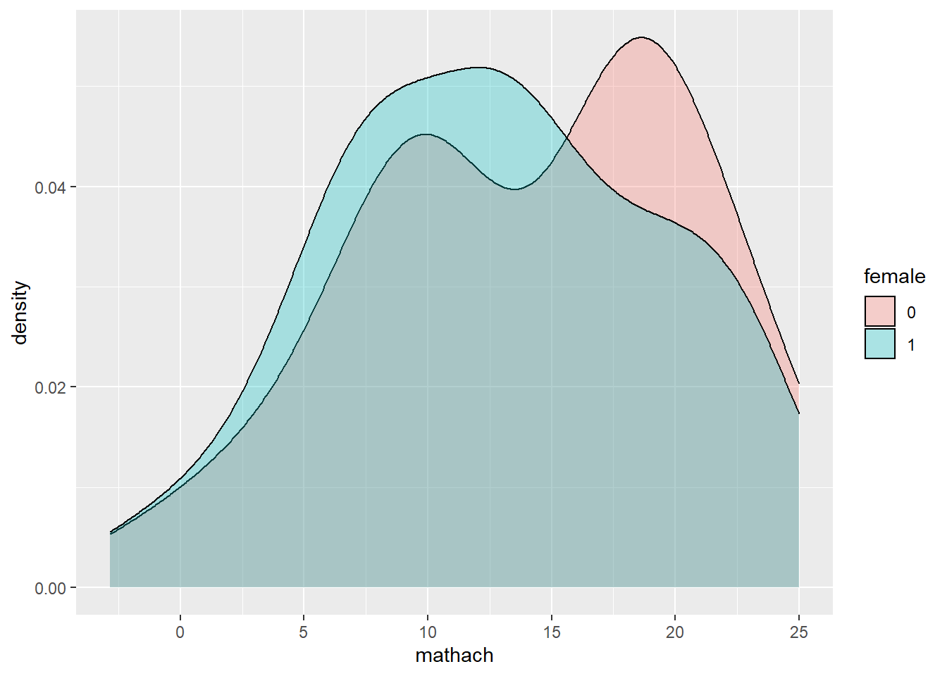
## Set colors to a variable
ggplot(data = hsb, mapping = aes(ses, mathach)) +
  geom_point(color = "orange")  # set color of points to orange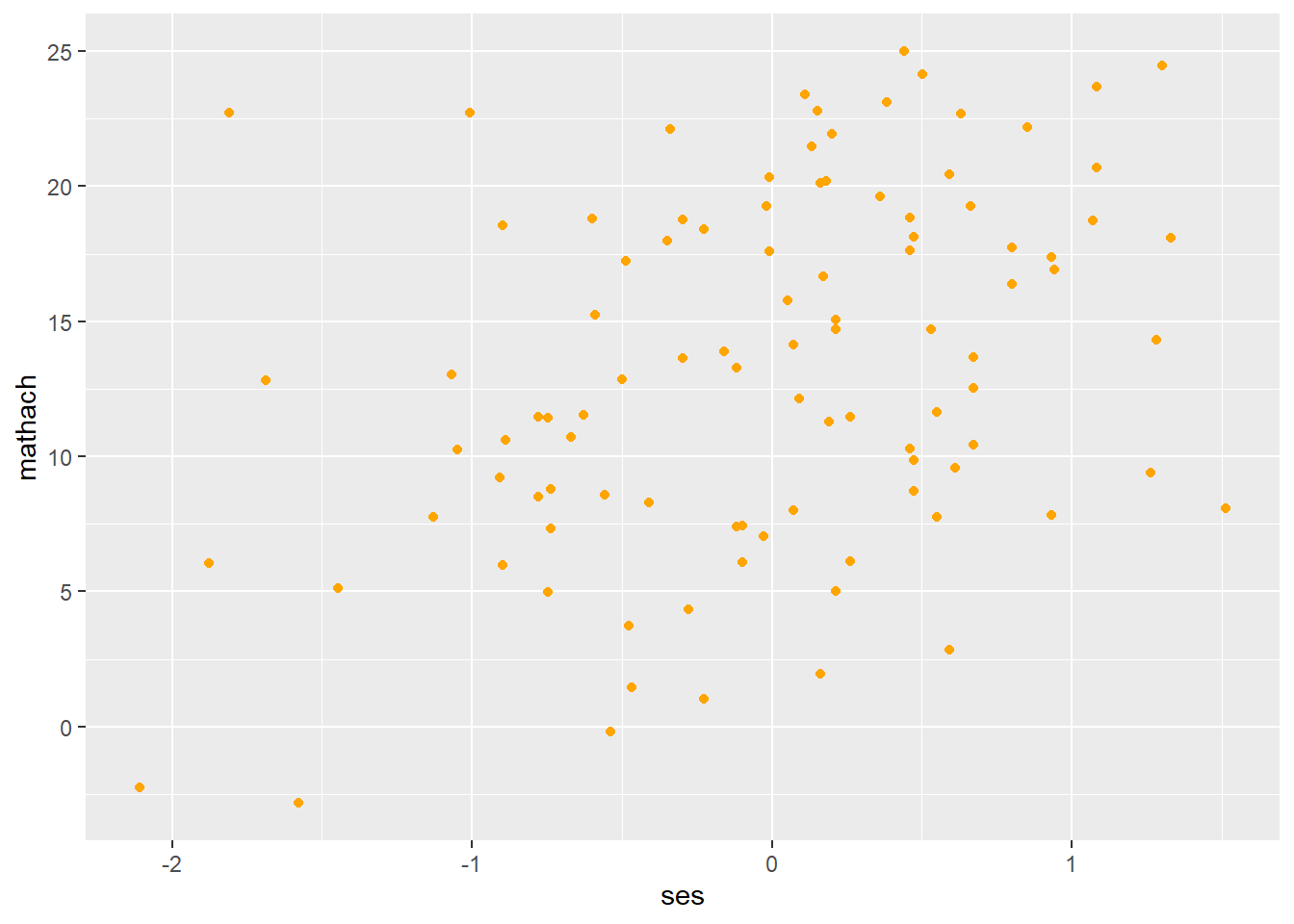
ggplot(data = hsb, mapping = aes(mathach)) +
  geom_density(fill = "pink")  # fill density area with pink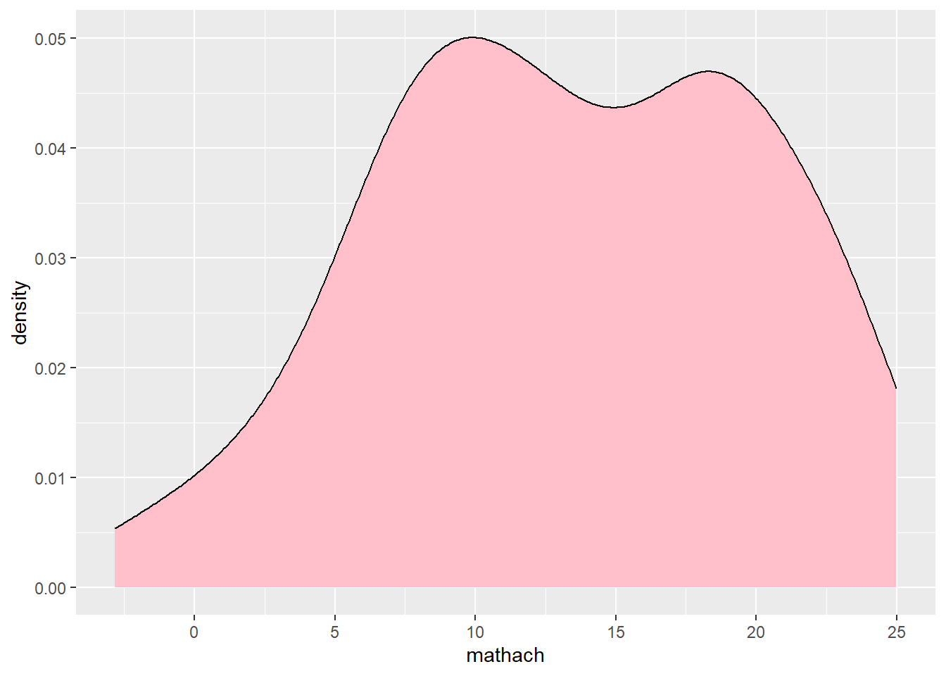
- Size/Shape/Linetype
Likewise, we can set or map a variable to size/type of points/lines using size, shape, linetype arguments. Below are some examples of mapping these aesthetics to a variable.
## Map size/shape/linetype to a variable
ggplot(data = hsb, mapping = aes(ses, mathach)) +
  geom_point(aes(size = ses)) # map size of points to 'ses'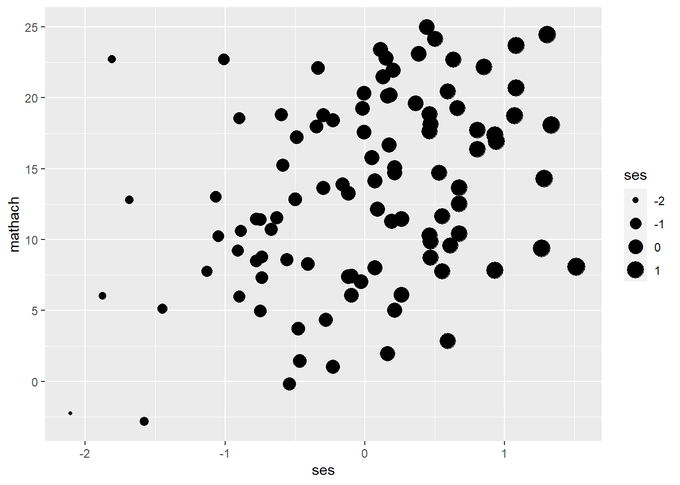
ggplot(data = hsb, mapping = aes(ses, mathach)) +
  geom_point(aes(shape = female)) # map shape of points to 'female'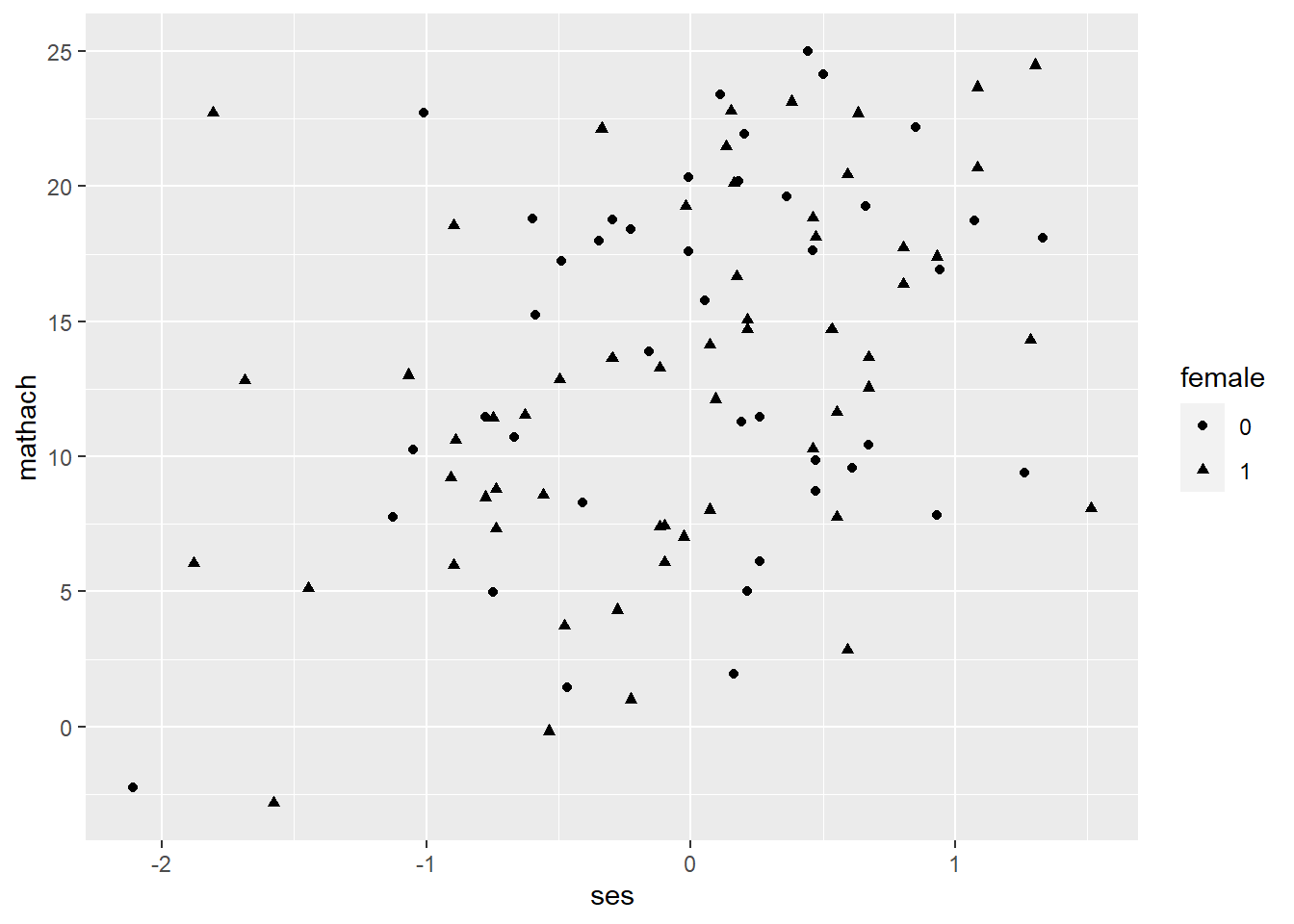
ggplot(data = hsb, mapping = aes(ses, mathach)) +
  geom_smooth(aes(linetype = female)) # map type of lines to 'female'
## `geom_smooth()` using method = 'loess' and formula 'y ~ x'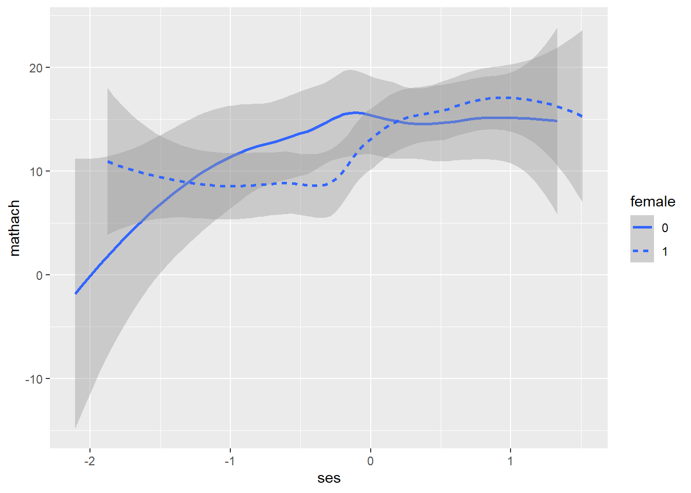
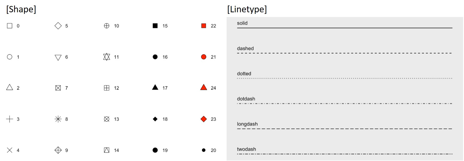
Again, we need to include the arguments outside aes() to set the size and type of points/lines. To identify the type of points/lines, use the numbers/names shown in the figure below.
To learn more, visit https://ggplot2.tidyverse.org/articles/ggplot2-specs.html)
## set size/type of points/lines
ggplot(data = hsb, mapping = aes(ses, mathach)) +
  geom_point(size = 3) # increase the point size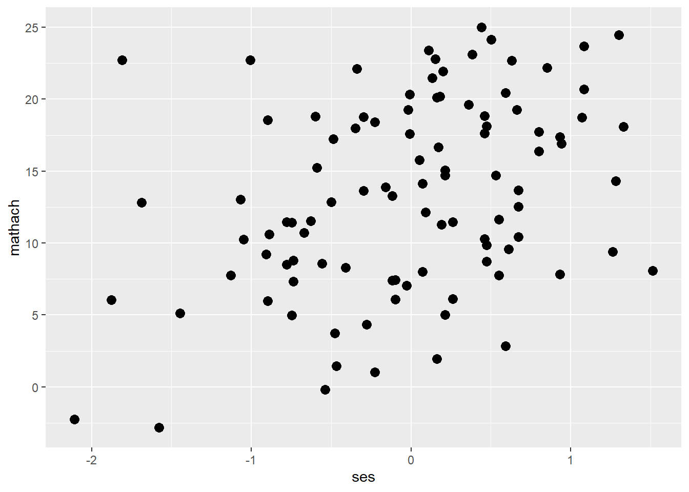
ggplot(data = hsb, mapping = aes(ses, mathach)) +
  geom_point(shape = 5) # change the shape of points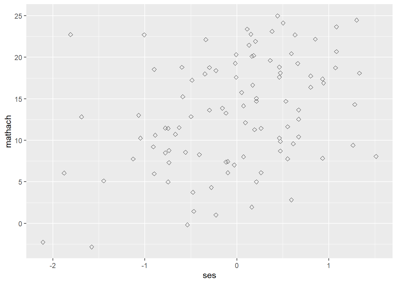
ggplot(data = hsb, mapping = aes(ses, mathach)) +
  geom_smooth(size = 3) # increase the line width
## `geom_smooth()` using method = 'loess' and formula 'y ~ x'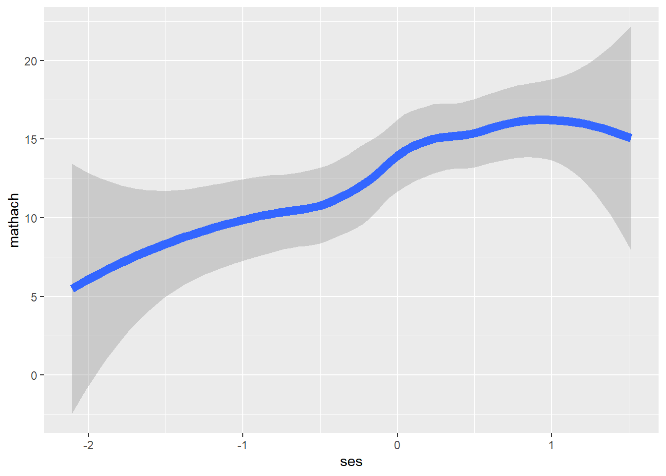
ggplot(data = hsb, mapping = aes(ses, mathach)) +
  geom_smooth(linetype = "longdash") # change the line type
## `geom_smooth()` using method = 'loess' and formula 'y ~ x'
Facet
ggplot2::facet_wrap() and ggplot2::facet_grid() divide a plot into subplots based on the values of one or more discrete variables. facet_grid() is useful when you have two faceting variables. To facet the plot by a single variable with many levels, it is better to use facet_wrap().
## facet_wrap(vars(var_name))

ggplot(data=hsb, mapping = aes(ses, mathach)) +
  geom_point() +
facet_wrap(vars(female), labeller = "label_both") 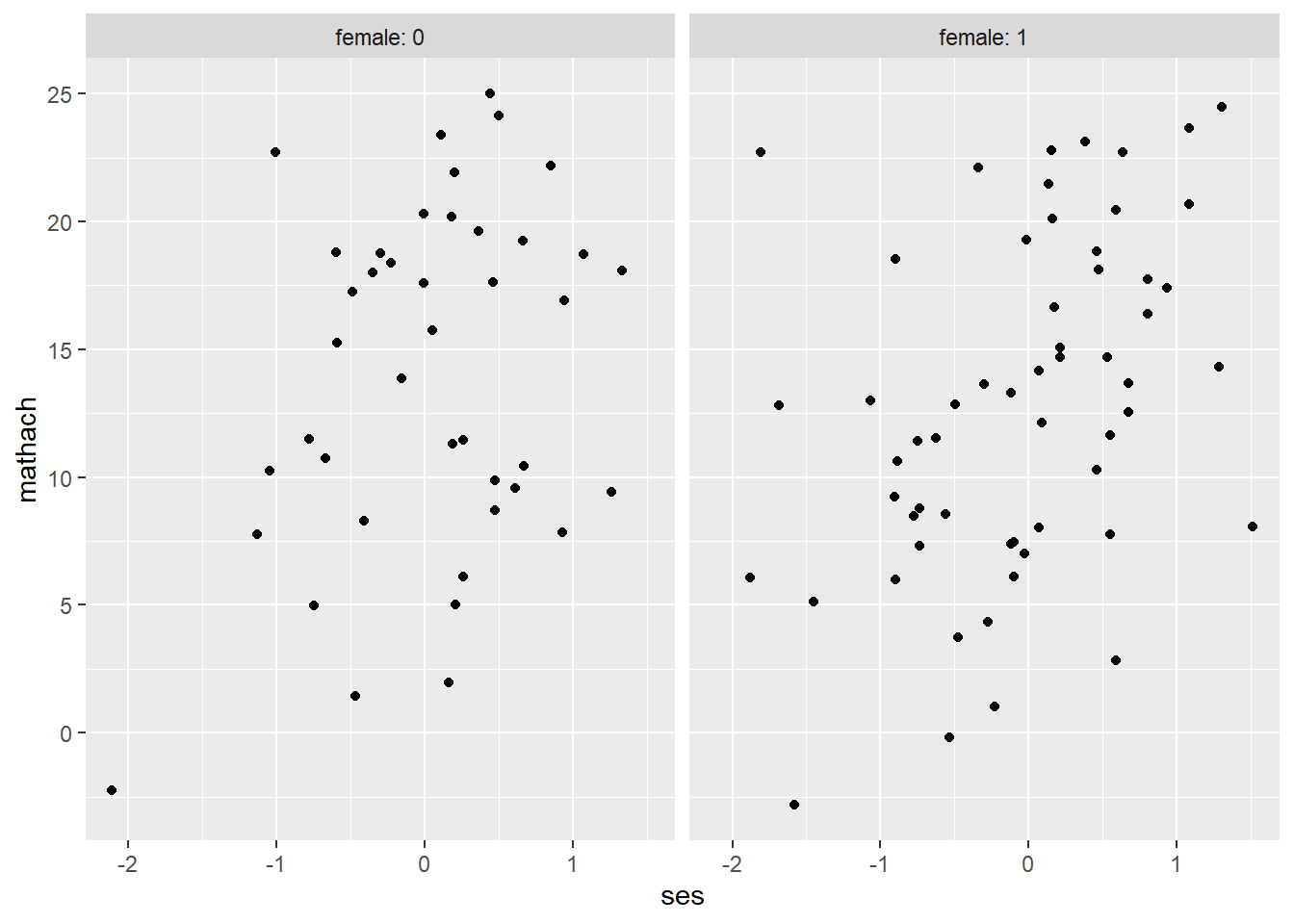
ggplot(data=hsb, mapping = aes(ses, mathach)) +
  geom_point() +
  facet_wrap(vars(female), labeller = "label_both", nrow = 2)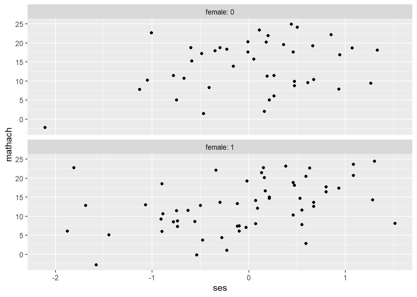
## facet_grid(rows = vars(var1_name), cols = vars(var2_name))

ggplot(data=hsb, mapping = aes(ses, mathach)) +
  geom_point() +
facet_grid(cols = vars(female), labeller = "label_both") 
ggplot(data=hsb, mapping = aes(ses, mathach)) +
  geom_point() +
  facet_grid(rows = vars(minority), cols = vars(female), labeller = "label_both")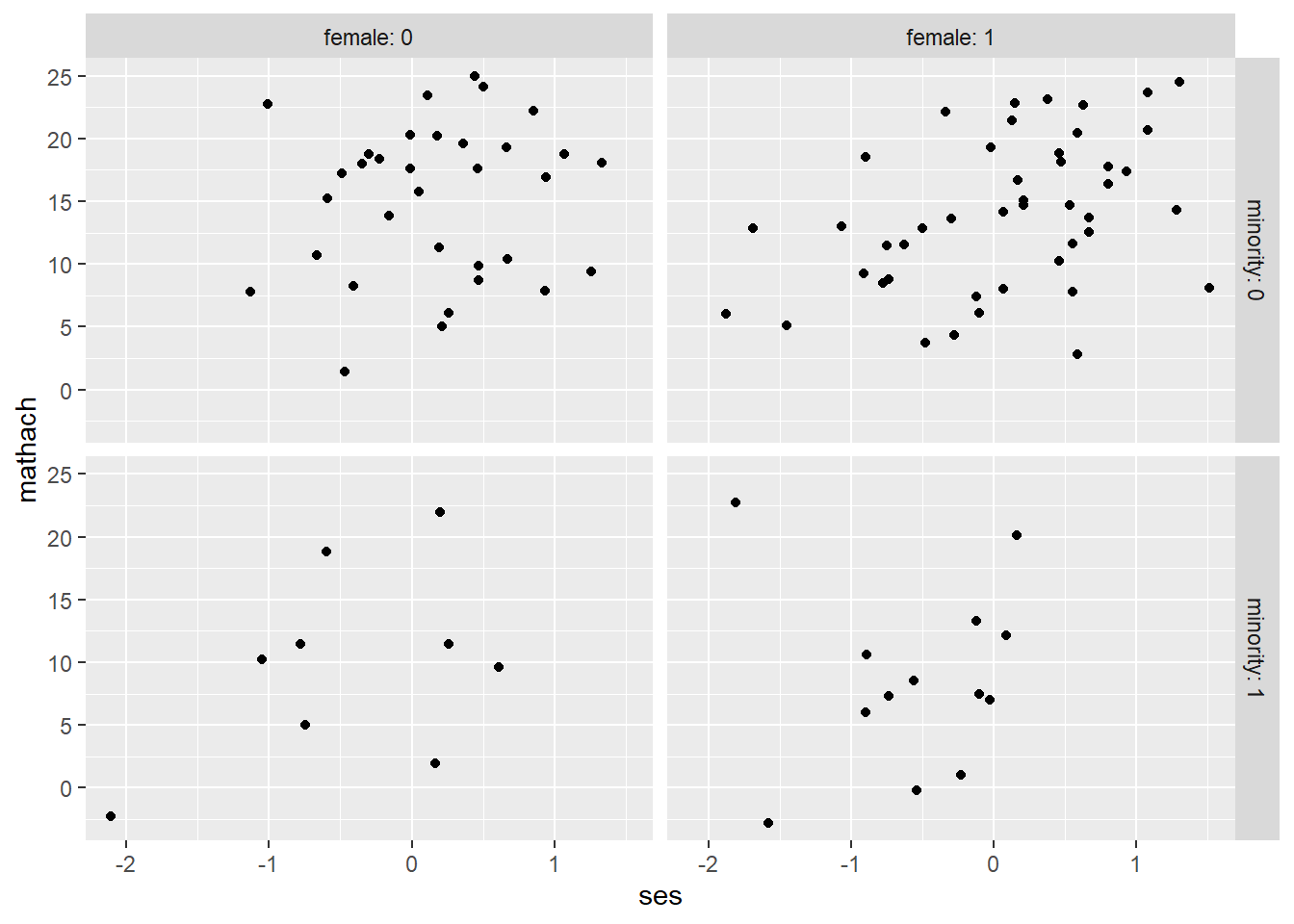
We can also use a formula instead of vars() arguments as below.
ggplot(data=hsb, mapping = aes(ses, mathach)) +
  geom_point() +
  facet_grid(minority~female, labeller = "label_both")

ggplot(data=hsb, mapping = aes(ses, mathach)) +
  geom_point() +
  facet_grid(.~female, labeller = "label_both")

ggplot(data=hsb, mapping = aes(ses, mathach)) +
  geom_point() +
  facet_wrap(~female, labeller = "label_both")
Add Titles/Labels
We can edit/add axes labels and titles using xlab()/ylab()/ggtitle, or labs function.
ggplot(data = hsb, mapping = aes(ses, mathach)) +
  geom_point() +
  xlab("Socioeconomic Status (SES)") +  # add x-axis label
  ylab("Math achievement") +           # add y-axis label
  ggtitle("Scatterplot of Math Achievement versus SES") # add title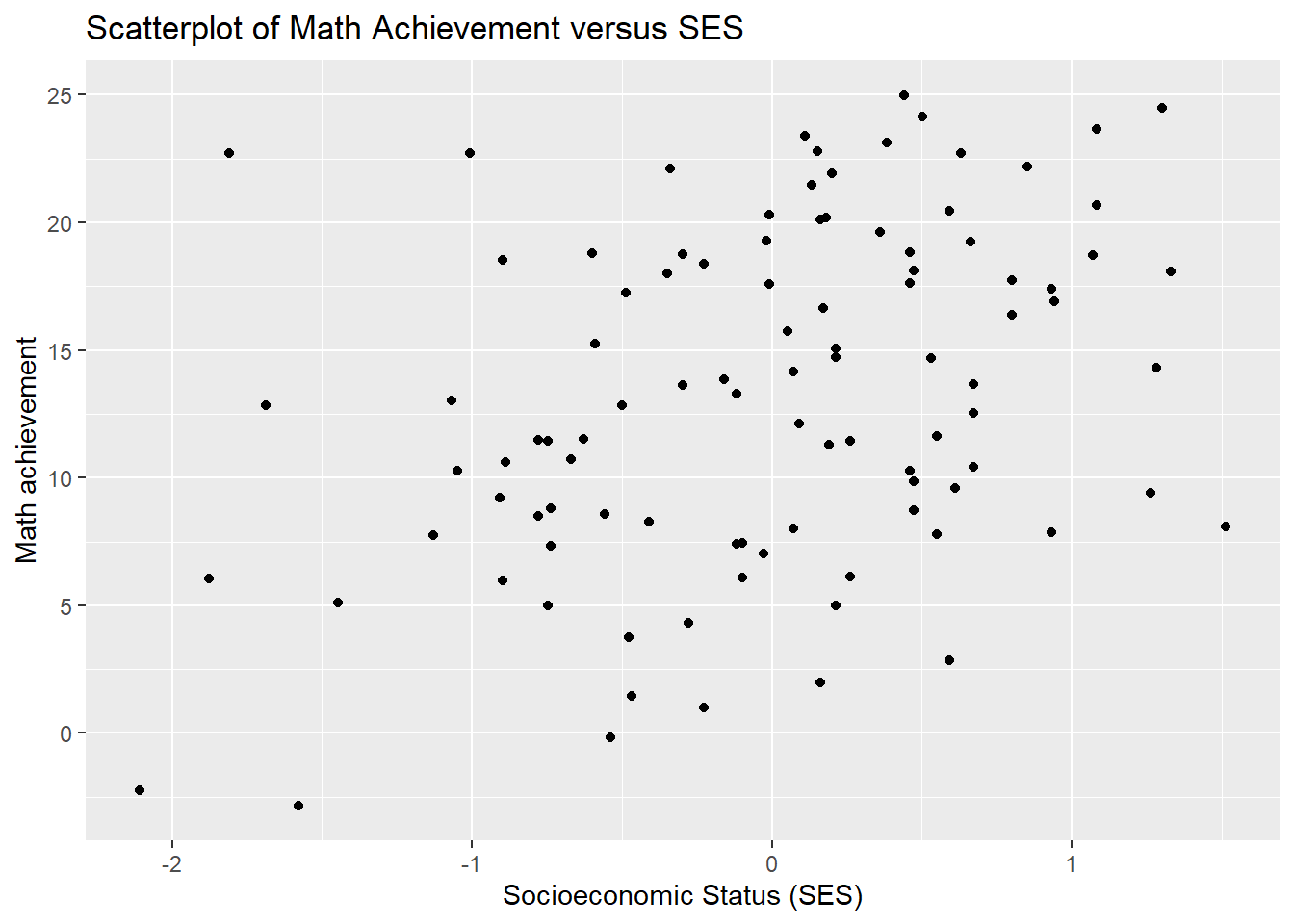
# or

## labs(x="xlab", y="ylab", title="title")
ggplot(data = hsb, mapping = aes(ses, mathach)) +
  geom_point() +
  labs(x = "Socioeconomic Status (SES)",
       y = "Math achievement",
       title = "Scatterplot of Math Achievement versus SES")
Save Plot
We can conveniently save the resulting plot using ggsave(). This function saves the last plot produced.
ggsave("plotname.jpg")

## You can also modify plot size
ggsave("plotname.pdf", path = "folder_path", width = 4, height = 4)
Resources
Manual for ggplot2 https://cloud.r-project.org/web/packages/ggplot2/ggplot2.pdf
Cheat Sheet for ggplot2 https://github.com/rstudio/cheatsheets/blob/master/data-visualization-2.1.pdf
R for Data Science https://r4ds.had.co.nz/data-visualisation.html
Introduction to Data Science by Rafael A. Irizarry https://rafalab.github.io/dsbook/ggplot2.html
R-Ladies Sydney: Ryouwithme https://rladiessydney.org/courses/ryouwithme/03-vizwhiz-1/
IntelliPaat - R tutorial https://intellipaat.com/blog/tutorial/r-programming/data-visualization-in-r/