Visualizations and Color
c <- seq(1:10)
c
## [1] 1 2 3 4 5 6 7 8 9 10We can easily produce plots with the default plotting package in R. With the plot command, R produces the plot that it thinks it should for the given input. Here, we notice it produces a dot plot.
plot(c)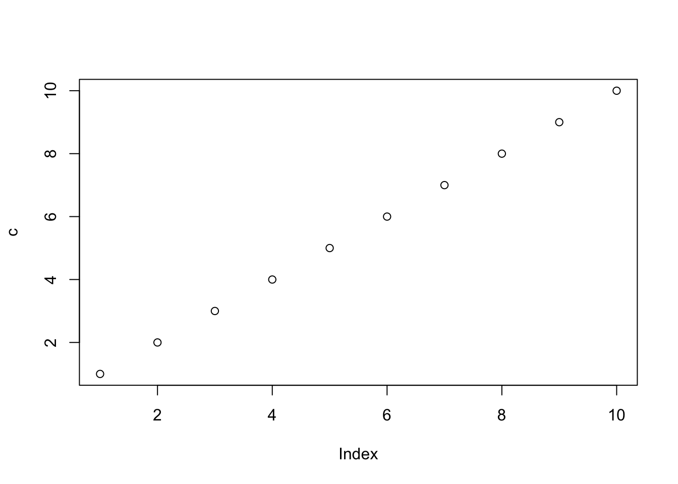
We can also ask R to produce different kinds of plots. We will use the default barplot to explore colors and customizations to begin. Let us create two vectors that represent some hypothetical data on course averages. Let us say that we have five classes Gymnastics, Rhetoric, Architecture, Music. We can also create a vector of hypothetical grades as follows.
classes <- c("Gymnastics", "Rhetoric", "Architecture", "Music")
grades <-  c(98, 73.2, 88.3, 94)
Now, we can create a barplot that uses the classes as our labels along the horizontal axis and the scores as the height of the bars.
mp <-  barplot(grades, names.arg = classes, main = "Plato's Report Card")
text(mp, grades-5, labels = grades )
We may want to add some color to this plot. Here, we can use some of the built in colors by adding the col = argument in the barplot call. You can easily find the names of the base colors in R with an internet search. To apply a range of colors, we will simply create another vector with our color names and call this with the col argument.
barcolor <- c("lightcyan", "lightcyan1", "lightcyan2", "lightcyan3")
grades <-  grades[order(grades,decreasing = TRUE)]
mp <-  barplot(grades, col = barcolor, names.arg = classes,  main = "Plato's Report Card", sub = "Sophomore Year")
text(mp, grades-5, labels = grades )