Chapter 12 Time Series Visualization and Analysis
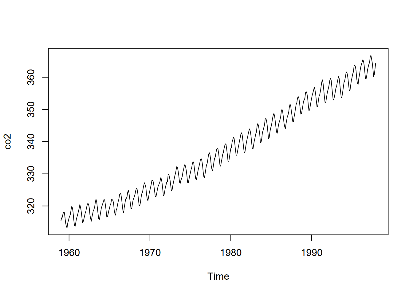
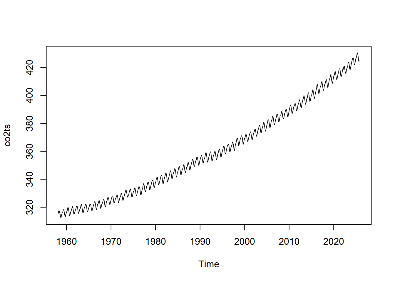
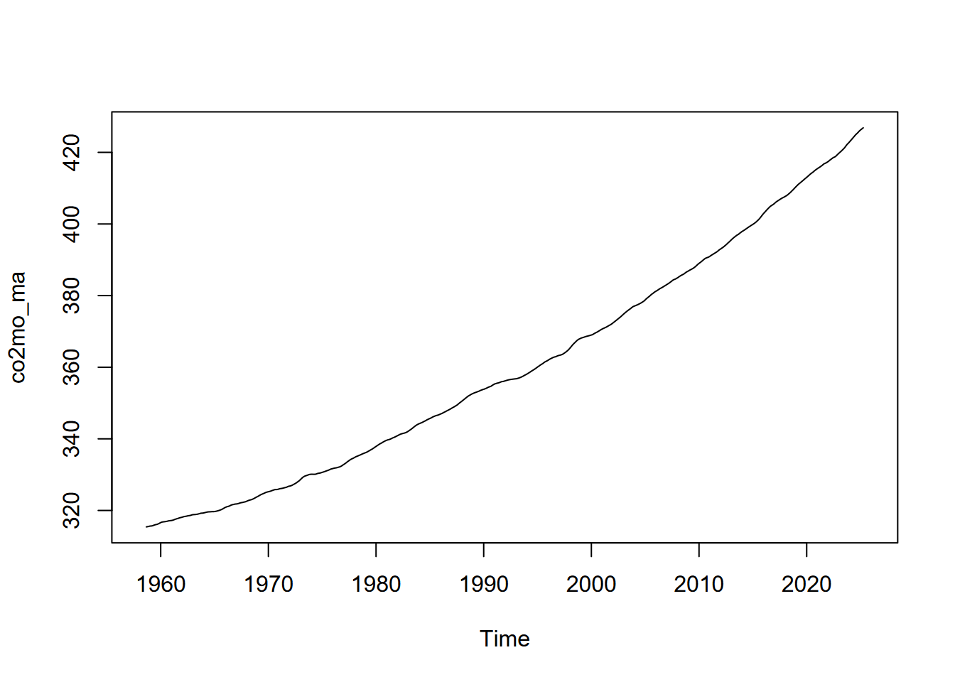
We’ve been spending a lot of time in the spatial domain in this book, but environmental data clearly also exists in the time domain, such as what’s been collected about CO2 on Mauna Loa, Hawai’i, since the late 1950s (shown above). Environmental conditions change over time; and we can sample and measure air, water, soil, geology, and biotic systems to investigate explanatory and response variables that change over time. And just as we’ve looked at multiple geographic scales, we can look at multiple temporal scales, such as the long-term Mauna Loa CO2 data above, or much finer-scale data from data loggers, such as eddy covariance flux towers (Figures 12.1 and 12.2).
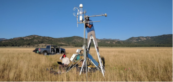
FIGURE 12.1: Red Clover Valley eddy covariance flux tower installation
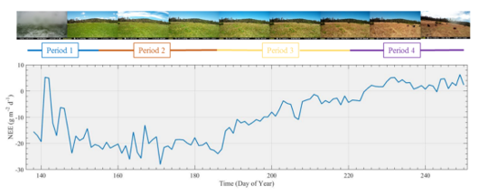
FIGURE 12.2: Loney Meadow net ecosystem exchange (NEE) results (Blackburn et al. 2021)
In this chapter, we’ll look at a variety of methods for working with data over time. Many of these methods have been developed for economic modeling, but have many applications in environmental data science. The time series data type has been used in R for some time, and in fact a lot of the built-in data sets are time series, like the Mauna Loa CO2 data or the flow of the Nile (Figure 12.3).
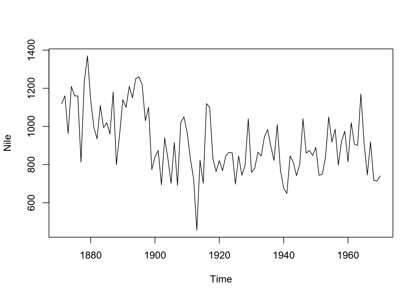
FIGURE 12.3: Time series of Nile River flows
So what’s the benefit of a time series data object? Why not just use a data frame with time stamps as a variable?
You could just work with this data as data frames, and often this is all you need. In this chapter, for instance, we won’t work exclusively with time series data objects; our data may just include variation over time. However there are advantages in R understanding how to deal with actual time series in a temporal dimension, including knowing what time period we’re dealing with, especially if there are regular fluctuations over that period. This is similar to spatial data where it’s useful to maintain the geometry of our data and the associated coordinate system. So we should learn how time series objects work and how they’re built, just as we did with spatial data.
12.1 Structure, Seasonality, and Decomposition of Time Series
A time series is comprised of a series of samples of a phenomenon at a specific time interval, such as 10 seconds, 4 hours, 1 day, or 20 years (the unit of time is important), where that interval might be the time spacing of observations such as temperature, precipitation, solar radiation, or water quality, to name a few of the many environmental parameters commonly measured in scientific studies or monitored by government agencies. These are organized into longer regular periods of time, such as days or years, by specifying the frequency of samples in each period. This is especially useful for data that have periodicity, such as diurnal or seasonal climatic variables.
We’ll thus create the time series with a period in mind by defining its sampling frequency, and considering the time unit. For example, if your data is in monthly samples and you specify a frequency of 12, your period is one year; similarly a frequency of 365 with daily observations will also create a yearly period. But we don’t have to limit our intervals to single units of time: a frequency of 6 two-month samples will also create a yearly period, just as a frequency of 12 two-hour interval samples will create a daily period.
There are many time series built into R, such as co2 and Nile, and we can get a sense of what they contain by plotting them (as above), or just entering them in a line of code, if they’re not long:
## Time Series:
## Start = 1871
## End = 1970
## Frequency = 1
##   [1] 1120 1160  963 1210 1160 1160  813 1230 1370 1140  995  935 1110  994 1020
##  [16]  960 1180  799  958 1140 1100 1210 1150 1250 1260 1220 1030 1100  774  840
##  [31]  874  694  940  833  701  916  692 1020 1050  969  831  726  456  824  702
##  [46] 1120 1100  832  764  821  768  845  864  862  698  845  744  796 1040  759
##  [61]  781  865  845  944  984  897  822 1010  771  676  649  846  812  742  801
##  [76] 1040  860  874  848  890  744  749  838 1050  918  986  797  923  975  815
##  [91] 1020  906  901 1170  912  746  919  718  714  740
With periodic data, we have the concept of seasonality where we want to consider values changing as a cycle over a regular time period, whether it’s seasons of the year or “seasons” of the day or week or other time period. There may also be a trend over time. Decomposing the time series will display all of these things.
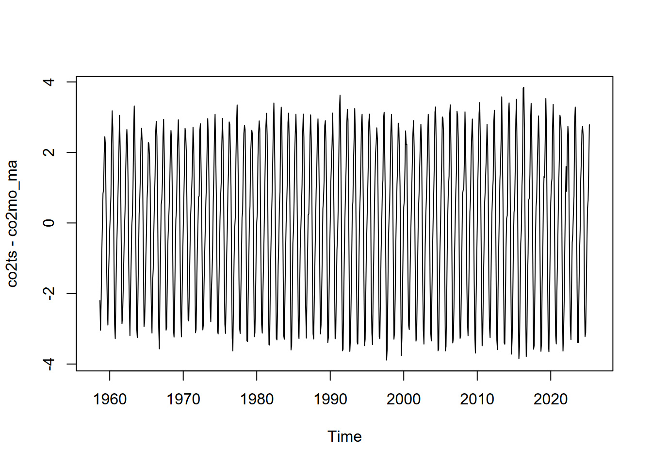
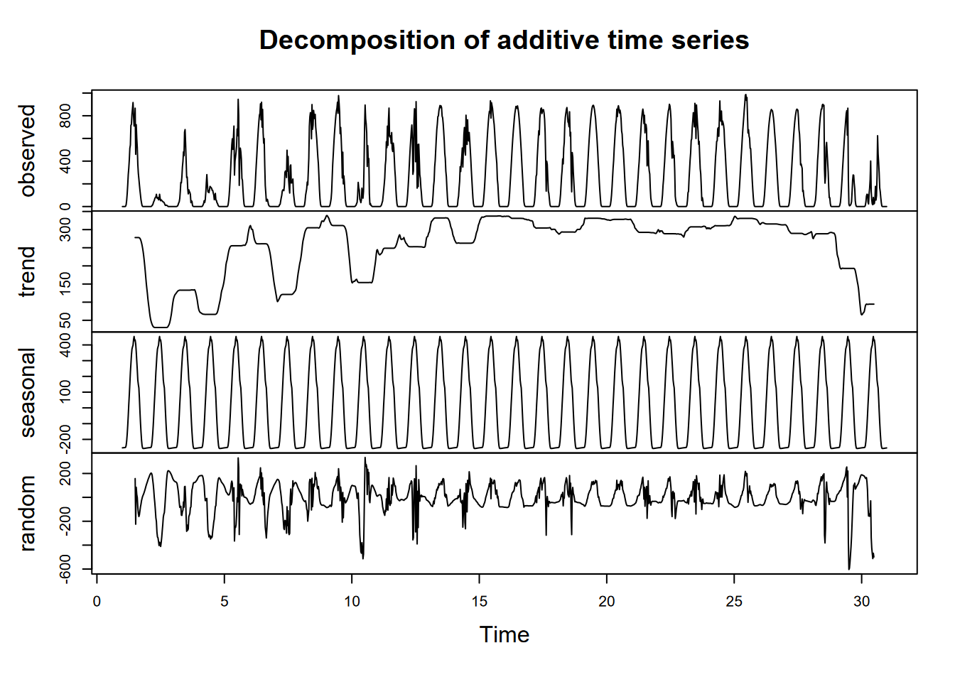
A good data set to observe seasonality and trends is the Mauna Loa CO2 time series, with regular annual cycles, yet with a regularly increasing trend over the years, as shown above in the graphic at the start of the chapter. One time-series graphic, a decomposition, shows the original observations, followed by a trend line that removes the seasonal and local (short-term) random irregularities, a detrended seasonal picture which removes that trend to just show the seasonal cycles, followed by the random irregularities (Figure 12.4).
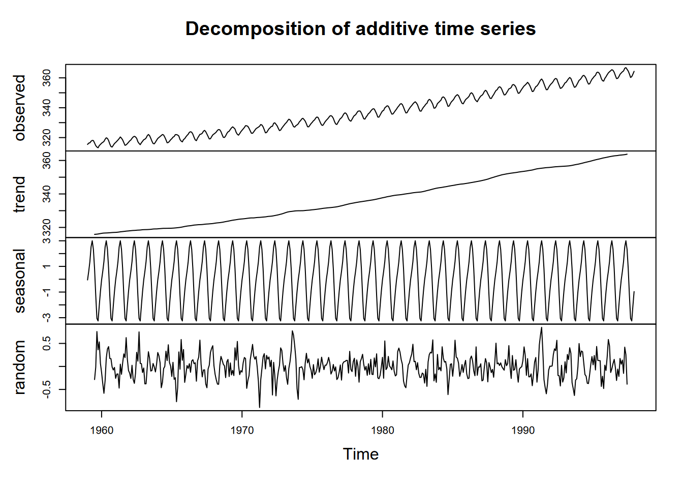
FIGURE 12.4: Decomposition of Mauna Loa CO2 data
In reading this graph, note the vertical scale: the units are all the same – parts per million – so the actual amplitude of the seasonal cycle should be the same as the annual amplitude of the observations. It’s just scaled to the chart height, which tends to exaggerate the seasonal cycles and random irregularities.
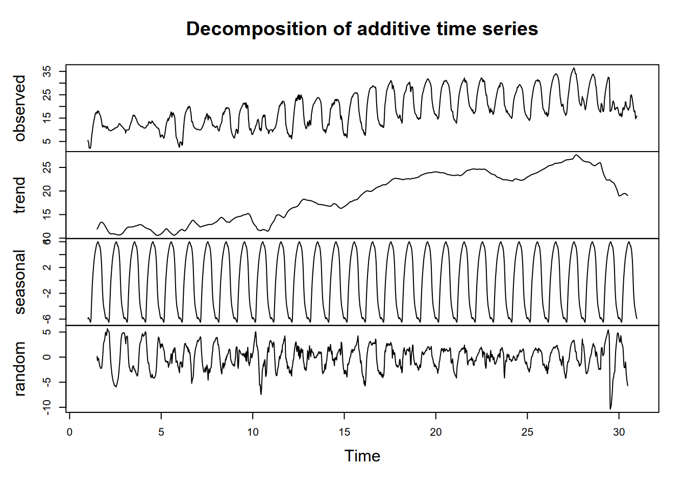
So we’ll look at a more advanced decomposition called Seasonal Decomposition of Time Series with Loess in the stl package that also provides a scale bar, allowing us to compare their amplitudes; we might, for instance, see where random variation is greater than the seasonal amplitude. If s.window = "periodic", the mean is used for smoothing: the seasonal values are removed and the remainder smoothed to find the trend, as we’ll see in the Mauna Loa CO2 data (Figure 12.5).
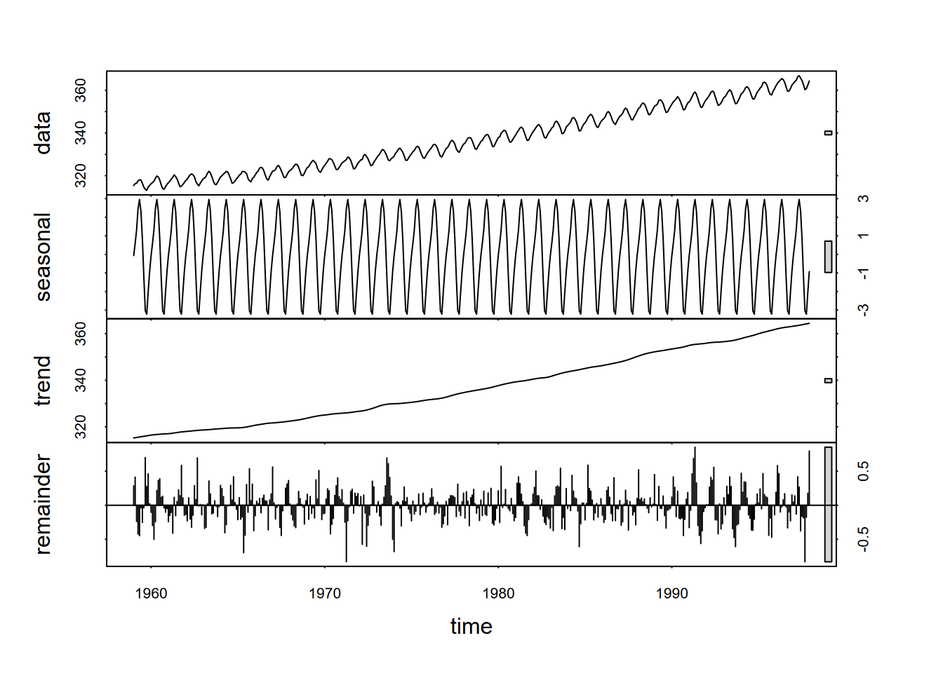
FIGURE 12.5: Seasonal decomposition of time series using loess (stl) applied to CO2. Note that the vertical units for each panel is parts per million (ppm), and the bar on the right shows the size of ~2 ppm.
12.2 Creation of Time Series (ts) Data
So far, we’ve been using built-in time series data, and there are many such available data sets, but we will need to understand how to create them. A time series (ts) can be created with the ts() function:
- the period of time we’re organizing our data into (e.g. daily, yearly) can be anything
- observations must be a regularly spaced series
- time values are not normally included as a variable in the time series
We’ll build a simple time series with monthly high and low temperatures in San Francisco I just pulled off a Google search. We’ll start with just building a data frame, first converting the temperatures from Fahrenheit to Celsius (Figure 12.6).
library(tidyverse)
SFhighF <- c(58,61,62,63,64,67,67,68,71,70,64,58)
SFlowF  <- c(47,48,49,50,51,53,54,55,56,55,51,47)
SFhighC <- (SFhighF-32)*5/9
SFlowC  <- (SFlowF-32)*5/9
SFtempC <- bind_cols(high=SFhighC,low=SFlowC)
plot(ts(SFtempC), main="SF temperature, monthly time unit")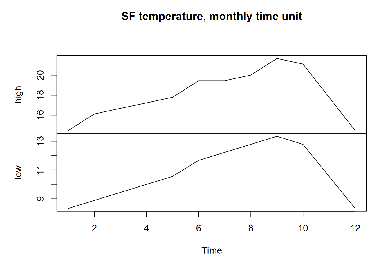
FIGURE 12.6: San Francisco monthly highs and lows as time series
12.2.1 Frequency, start, and end parameters for ts()
To convert this data frame into a time series, we’ll need to provide at least a frequency setting (the default frequency=1 was applied above), which sets how many observations per period. The ts() function doesn’t seem to care what the period is in reality, however some functions figure it out, at least for an annual period, e.g. that 1-12 means months when there’s a frequency of 12 (Figure 12.7).
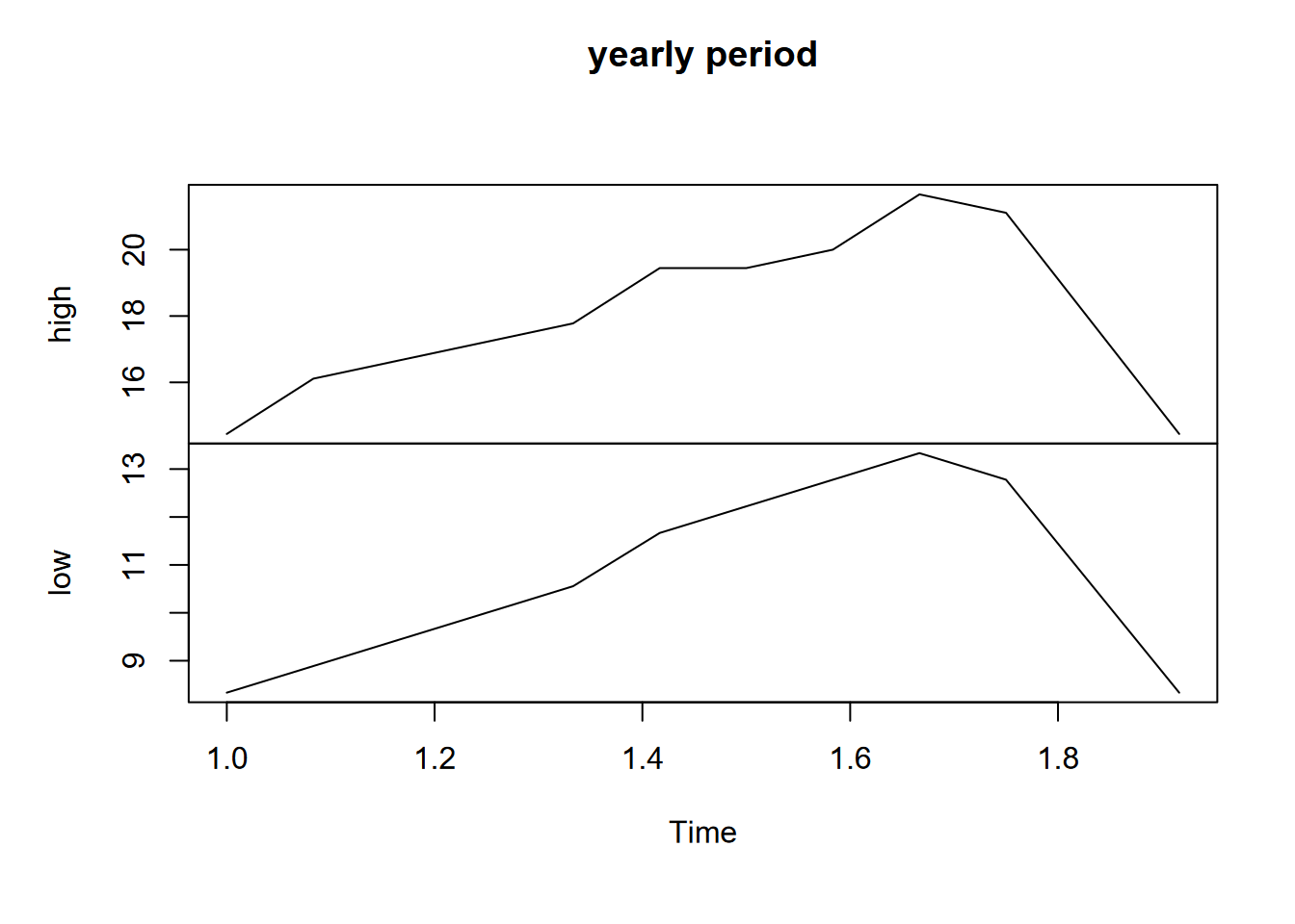
FIGURE 12.7: SF data with yearly period
frequency < 1
You can have a frequency less than 1. For instance, for greenhouse gases (CO2, CH4, N2O) captured from ice cores in Antarctica (Law Dome Ice Core, just south of Cape Poinsett, Antarctica (Irizarry (2019))), there are values for every 20 years, so if we want year to be the period, the frequency would need to be to be 1/20 years = 0.05 (Figure 12.8). Note the use of a pivot to transform the data.
library(dslabs)
data("greenhouse_gases")
GHGwide <- pivot_wider(greenhouse_gases, names_from = gas,
                       values_from = concentration)
GHG <- ts(GHGwide, frequency=0.05, start=20)
plot(GHG)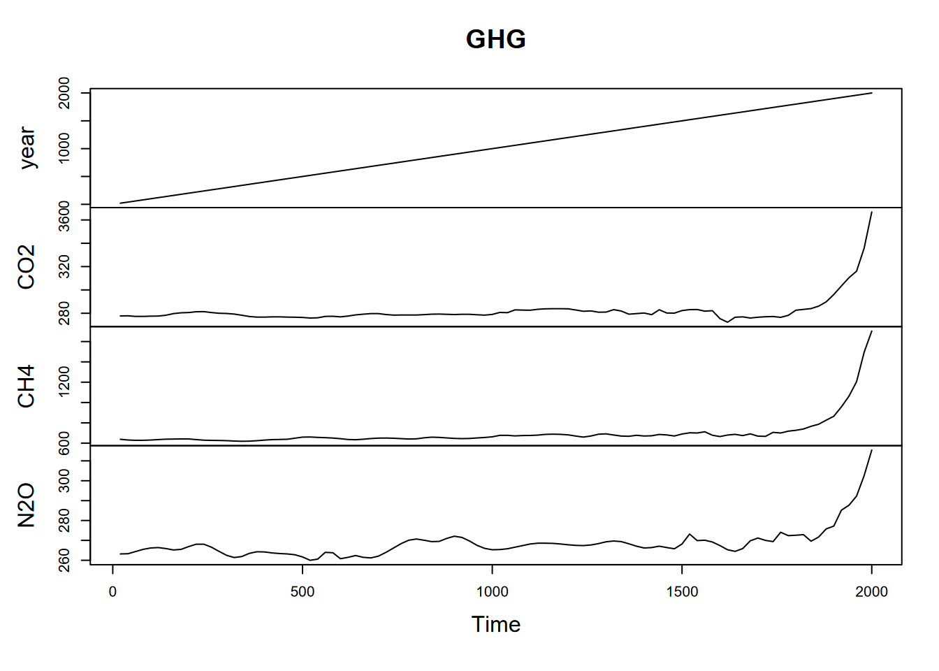
FIGURE 12.8: Greenhouse gases with 20 year observations, so 0.05 annual frequency
12.2.2 Associating times with time series
In the greenhouse gas data above, we not only specified frequency to determine the period, we also provided a start value of 20 to provide an actual year to start the data with. Time series don’t normally include time stamps, so we need to specify start and end parameters. This can be either a single number (if it’s the first reading during the period) or a vector of two numbers (the second of which is an integer), which specify a natural period and a number of samples into that period (e.g. which month during the year, or which hour, minute or second during that day, etc.)
Example with year as the period and monthly data, starting July 2019 and ending June 2020:
frequency=12, start=c(2019,7), end=c(2020,6)
12.2.2.1 Creating a time series from web-scraped Mauna Loa CO2 data
Goal: To download data from NOAA and the Scripps Institute containing monthly average atmospheric CO2 concentration data measured at the Mauna Loa Observatory on Hawai’i. These record recent (since 1958) changes in atmospheric concentrations of the important greenhouse gas, CO2 as measured at 3.3 km above the central Pacific Ocean. For further information on the observations see: http://www.cmdl.noaa.gov/ccgg/
We’ll use R code to download and prepare the data for plotting. The source file at NOAA https://gml.noaa.gov/webdata/ccgg/trends/co2/co2_mm_mlo.txt can be read directly into a data frame. We’ll start by using code to download the text file into the current working directory:
There are various types of time series objects: base R’s ts, extensible time series in the xts package, tsibbles in the tsibble package, and probably others. We’ll use a tsibble and a ts, after starting the read process over and creating the datetime variable. The tsibble package uses an index to order records, one or more key variables that define observational units, with each observation uniquely identified by an index-key combination. In contrast to regular time series, tsibbles preserve the time index as a data variable. You can convert either regular time series or data frames with dates to tsibbles with the as_tsibble function, as long as things are set up right. We’ll stick with regular time series (and the use of xts to handle time stamps), but the reader might consider exploring the tsibble package, as described at https://tsibble.tidyverts.org/, to learn more.
library(RCurl)
filepath = "https://gml.noaa.gov/webdata/ccgg/trends/co2/co2_mm_mlo.txt"
filename <- "co2_mm_mlo.txt"
download.file(filepath, paste0(getwd(),"/",filename))
CO2_HI <- read_table(paste0(getwd(),"/",filename),
comment="#",
col_names =c("year","month","dec_date",
"monthly_CO2","deseasonalized_CO2",
"#days","sd_days","unc.of_mon_mean")) |>
mutate(datetime = date_decimal(dec_date)) Since the table has time stamps, we can use it directly to analyze change over time. Or we could create a tsibble, with the datetime detected as an index, and all other variables available to analyze.
 Well, that’s nice, but it’s no different from what you get with just plotting from the original data frame.
Let’s see if we can create a ts object, but we’ll need to specify the start month (after looking that up in the data) and the frequency of 12 months.
This web-scraped CO2 data method is explored more in https://bookdown.org/igisc/EnvDataSciAddenda/atmospheric-co2-record-from-mauna-loa-hawaii.html, along with some related curve-fitting methods, also explored in the addenda.
12.2.3 Subsetting time series by times
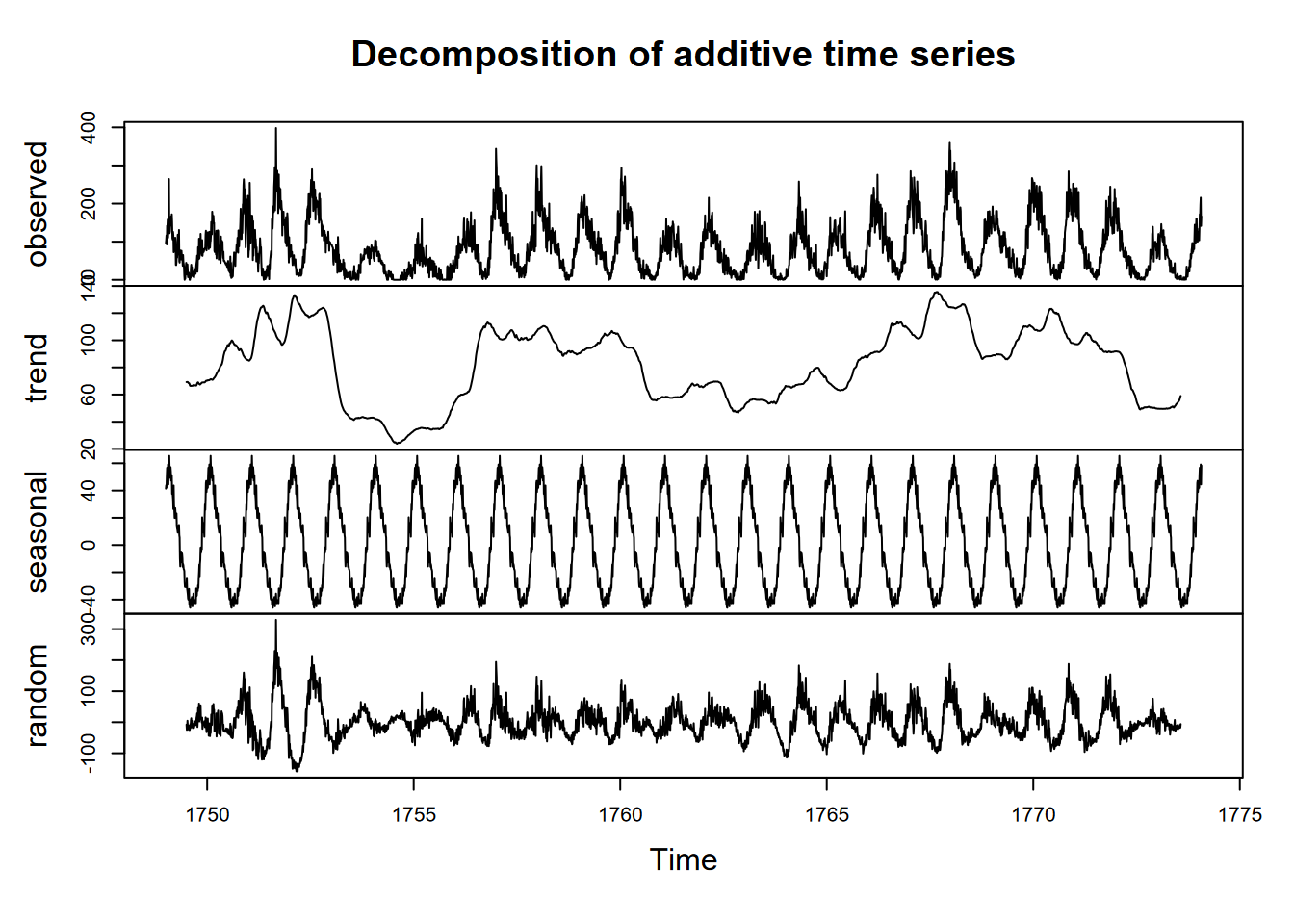
Time series can be queried for their frequency, start, and end properties, and we’ll look at these for a built-in time series data set, sunspot.month, which has monthly values of sunspot activity from 1749 to 2013 (Figure 12.9).
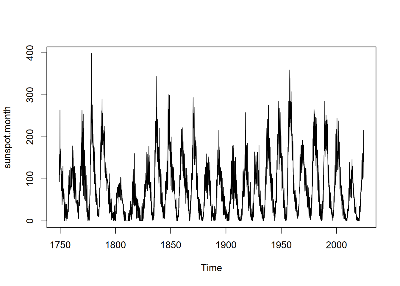
FIGURE 12.9: Monthly sunspot activity from 1749 to 2013
## [1] 12
## [1] 1749    1
## [1] 2024   10
To subset a section of a time series, we can use the window function (Figure 12.10).
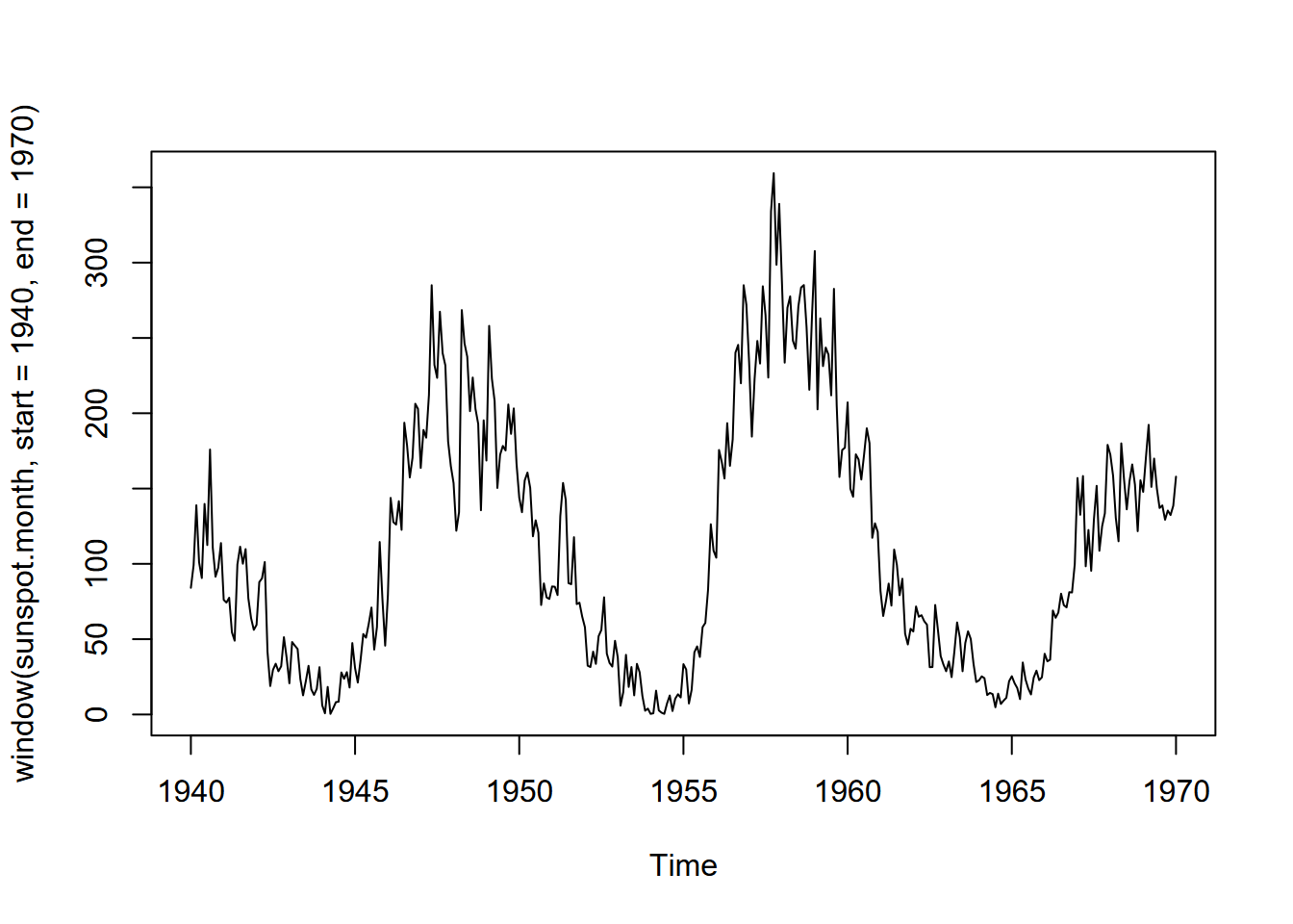
FIGURE 12.10: Monthly sunspot activity from 1940 to 1970
12.2.4 Changing the frequency to use a different period
We commonly use periods of days or years, but other options are possible. During the COVID-19 pandemic, weekly cycles of cases were commonly reported due to the weekly work cycle and weekend activities. Lunar tidal cycles are another.
Sunspot activity is known to fluctuate over about a 11-year cycle, and other than the well-known effects on radio transmission is also part of short-term climate fluctuations (so must be considered when looking at climate change). We can see the 11-year cycle in the above graphs, and we can perhaps see it more clearly in a decomposition where we use an 11-year cycle as the period.
To do this, we need to change the frequency. This is pretty easy to do, but to understand the process, first realize that we can take the original time series and create an identical copy to see how we can set the same parameters that already exist:
To create one with an 11-year sunspot cycle would then require just setting an appropriate frequency:
But we might want to figure out when to start, so let’s window it for the first 20 years so we can visualize it (Figure 12.11).
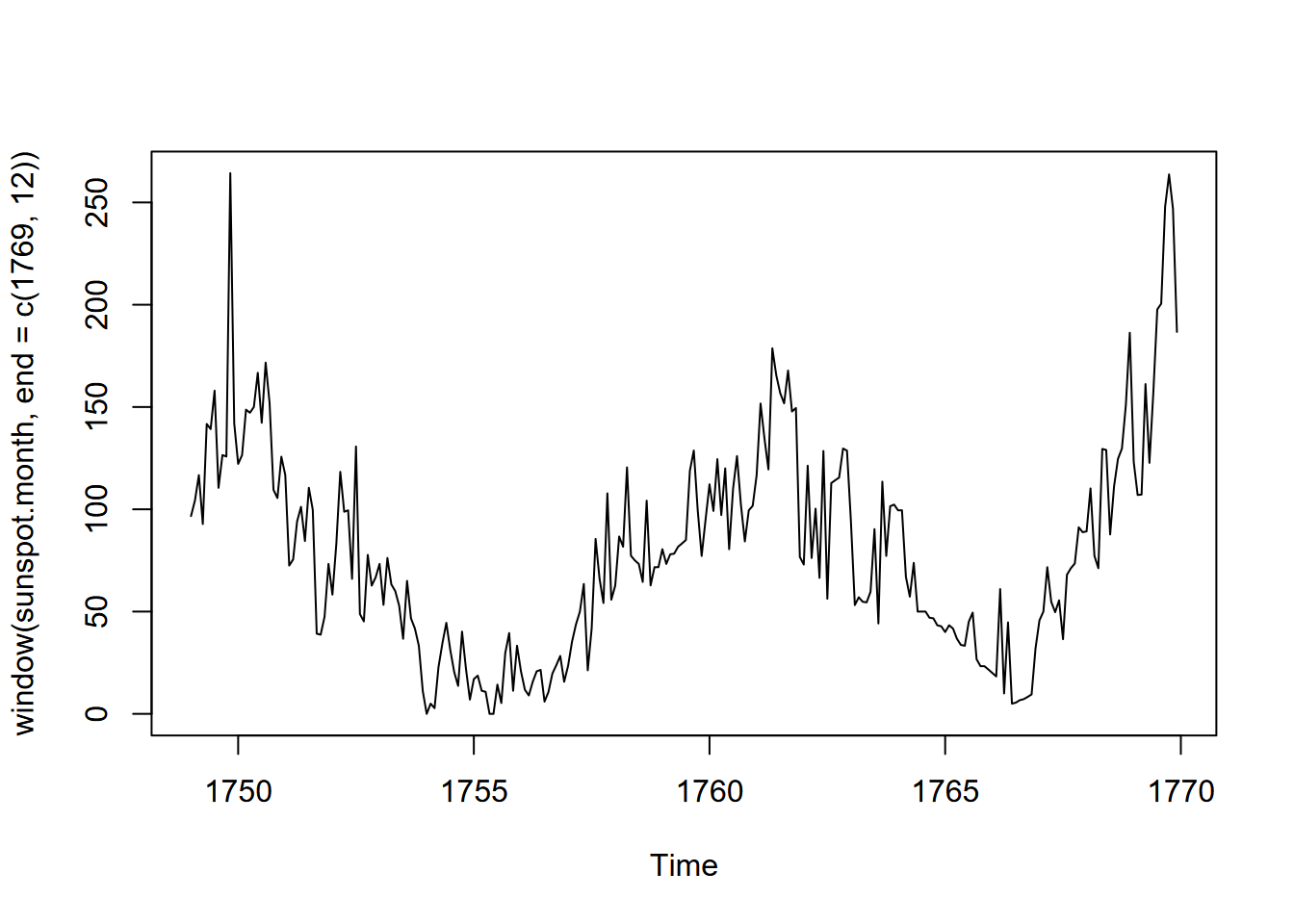
FIGURE 12.11: Sunspots of the first 20 years of data
Looks like a low point about 1755, so let’s start there:
Now this is assuming that the sunspot cycle is exactly 11 years, which is probably not right, but a look at the decomposition might be useful (Figure 12.12).
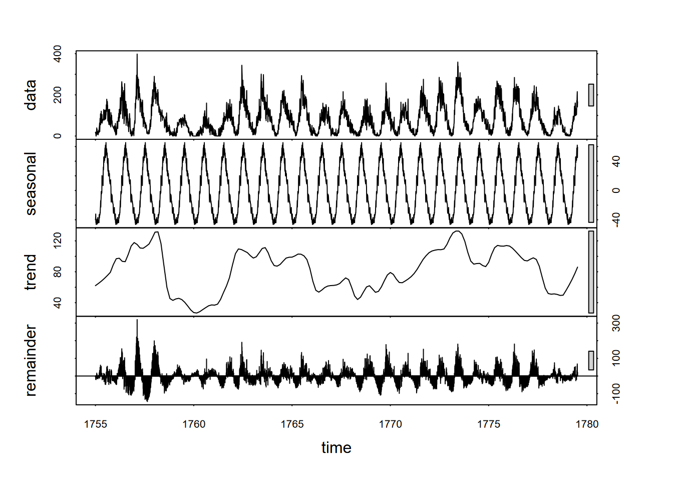
FIGURE 12.12: 11-year sunspot cycle decomposition
The seasonal picture makes things look simple, but it’s deceptive. The sunspot cycle varies significantly; and since we can see (using the scale bars) that the random variation is much greater than the seasonal, this suggests that we might not be able to use this periodicity reliably. But it was worth a try, and perhaps a good demonstration of an unconventional type of period.
12.2.5 Time stamps and extensible time series
What we’ve been looking at so far are data in regularly spaced series where we just provide the date and time as when the series starts and ends. The data don’t include what we’d call time stamps as a variable, and these aren’t really needed if our data set is regularly spaced. However, there are situations where there may be missing data or imperfectly spaced data. Missing data for regularly spaced data can simply be entered as NA, but imperfectly spaced data may need a time stamp. One way is with extensible time series, which we’ll look at below, but first let’s look at a couple of lubridate functions for working with days of the year and Julian dates, which can help with time stamps.
12.2.5.1 Lubridate and Julian dates
As we saw earlier, the lubridate package makes dealing with dates a lot easier, with many routines for reading and manipulating dates in variables. If you didn’t really get a good understanding of using dates and times with lubridate, you may want to review that section earlier in the book. Dates and times can be difficult to work with, so you’ll need to make sure you know the best tools, and lubridate has the best tools.
One variation on dates it handles is the number of days since some start date, using either the year day yday() (for any given year, starting with 1 on the first of January) or the julian() date for any starting date. The default origin for julian() is 1970-01-01, which surprisingly yields a Julian date of 0, but the same date would be a year day of 1.
For climatological work where the year is very important, we usually want the year day, ranging from 1 on the first day of January to 365 or 366 on 31 December, of any given year. It’s the same thing as setting the origin for julian() as 12-31 of the previous year, and is useful in time series when the year is the period and observations are by days of the year.
library(lubridate)
Jan1_1970 <- ymd("1970-01-01")
Jan1_1970
paste("Julian date:",julian(Jan1_1970))
paste("Year day   :",yday(Jan1_1970))
## [1] "1970-01-01"
## [1] "Julian date: 0"
## [1] "Year day : 1"Jan1_2020 <- ymd("2020-01-01")
Jan1_2020
paste("Year day :",yday(Jan1_2020))
paste("Julian date :",julian(Jan1_2020))
paste(" with origin set:",julian(Jan1_2020, origin=ymd("2019-12-31")))## [1] "2020-01-01"
## [1] "Year day : 1"
## [1] "Julian date : 18262"
## [1] " with origin set: 1"To create a decimal yday including fractional days, you could use a function like the following, which simply uses the number of hours in a day, minutes in a day, and seconds in a day.
ydayDec <- function(d) {
           yday(d)-1 + hour(d)/24 + minute(d)/1440 + second(d)/86400}
datetime <- now()
print(datetime)
## [1] "2025-12-05 14:53:38 PST"## [1] 338.62058689512.2.5.2 Extensible time series (xts)
We’ll look at an example where we need to provide time stamps. Weekly water quality data (E. coli, total coliform, and Enterococcus bacterial counts) were downloaded from San Mateo County Health Department for San Pedro Creek, collected weekly since 2012, usually on Monday but sometimes on Tuesday, and occasionally with long gaps in the data, but with the date recorded in the variable SAMPLE_DATE.
First, we’ll just look at this with the data frame, selecting date, total coliform, and E. coli:
library(igisci)
library(tidyverse)
SanPedroCounts <- read_csv(ex("SanPedro/SanPedroCreekBacterialCounts.csv")) %>%
  filter(!is.na(`Total Coliform`)) %>%
  rename(Total_Coliform = `Total Coliform`, Ecoli = `E. Coli`) %>%
  dplyr::select(SAMPLE_DATE,Total_Coliform,Ecoli)
To create a time series from the San Pedro Creek E. coli data, we need to use the package xts (Extensible Time Series), using SAMPLE_DATE to order the data (Figure 12.13).
library(xts); library(forecast)
Ecoli <- xts(SanPedroCounts$Ecoli, order.by = SanPedroCounts$SAMPLE_DATE)
attr(Ecoli, 'frequency') <- 52
plot(as.ts(Ecoli))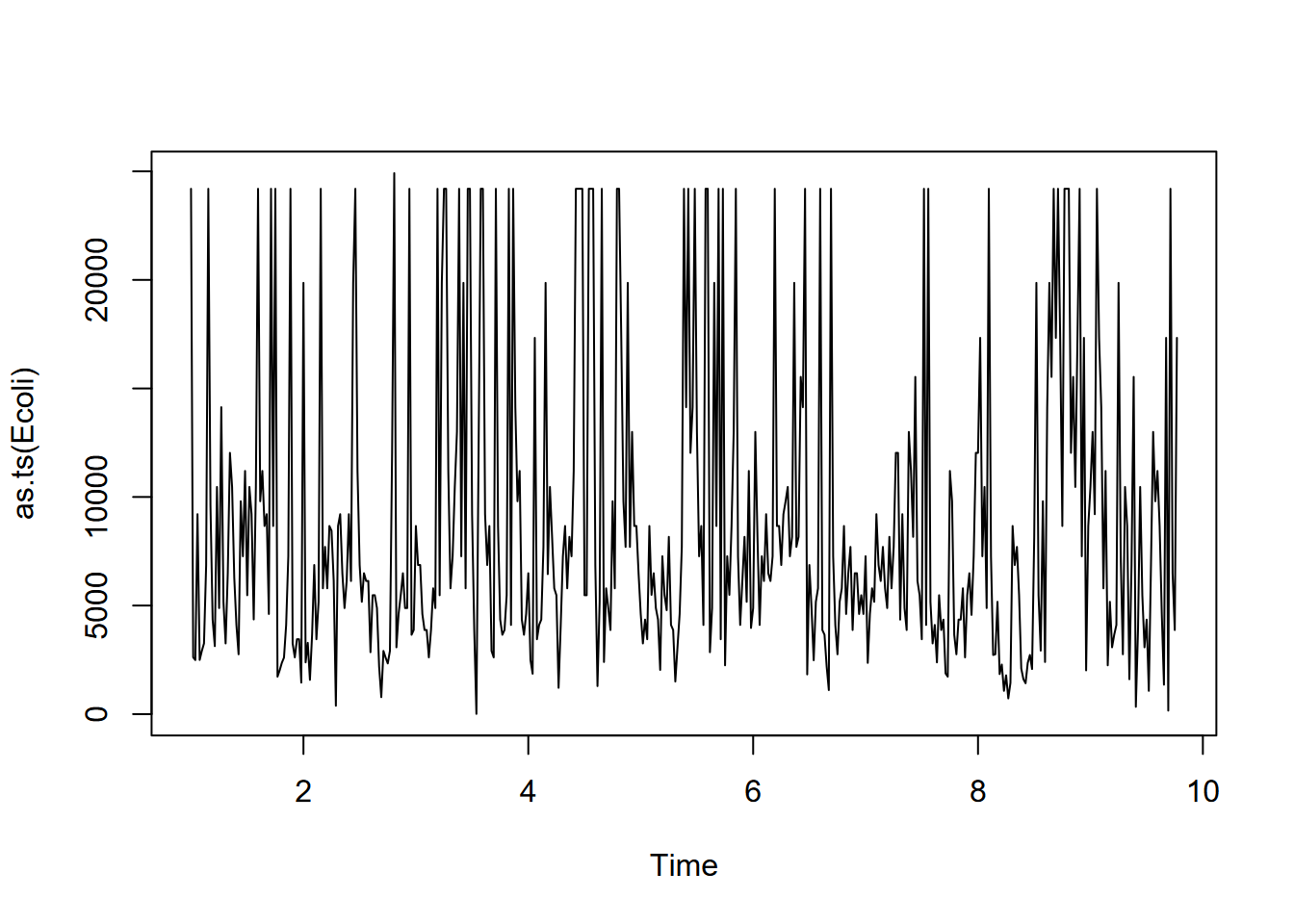
FIGURE 12.13: San Pedro Creek E. coli time series
Then a decomposition can be produced of the E. coli data (Figure 12.14). Note the use of as.ts to produce a normal time series.
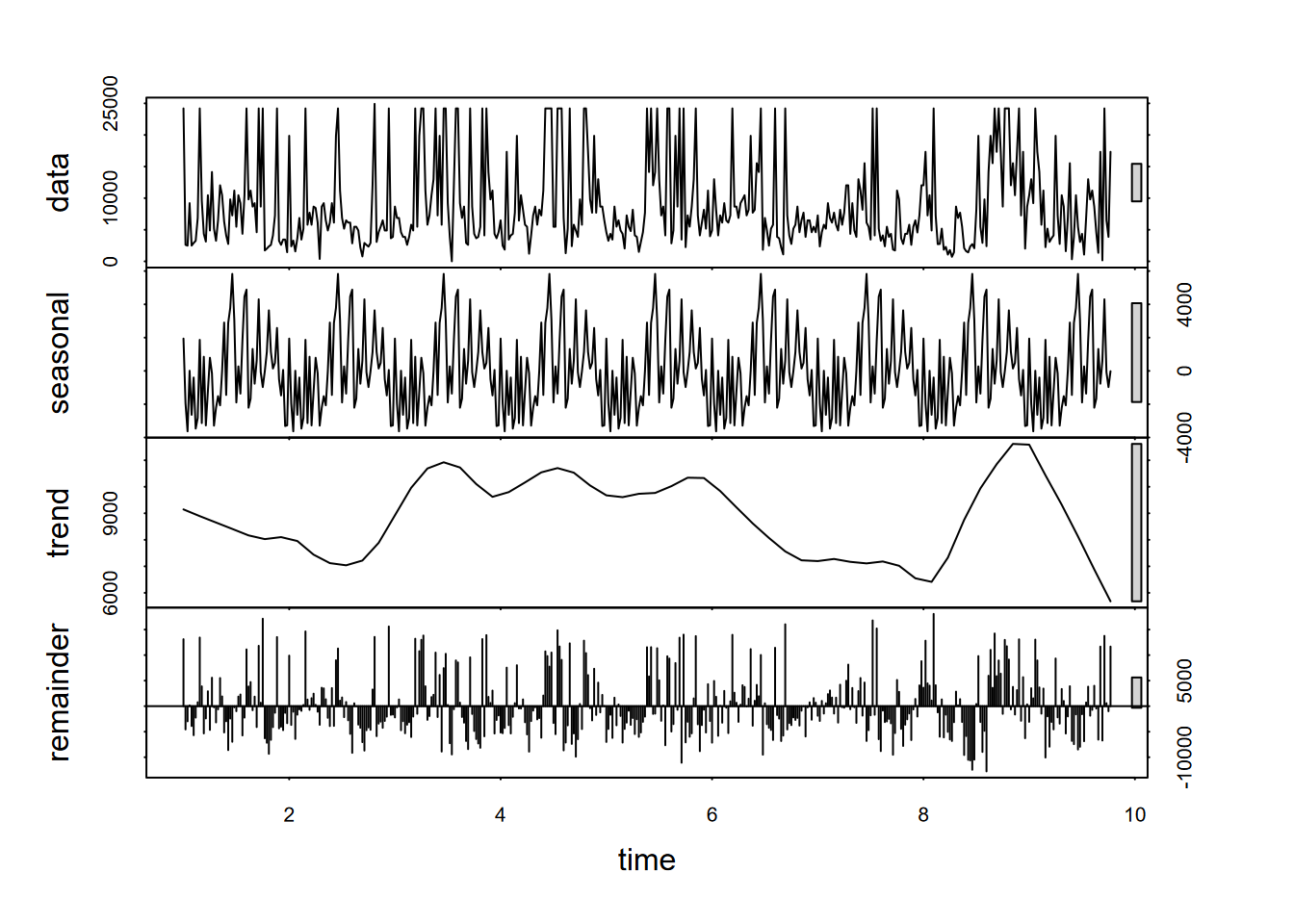
FIGURE 12.14: Decomposition of weekly E. coli data, annual period (frequency 52)
What we can see from the above decomposition is no real signal from the annual cycle (52 weeks), since while there is some tendency for peak levels (“first-flush” events) happening late in the calendar year, the timing of those first heavy rains varies significantly from year to year.
As we saw above with the decomposition, E. coli values don’t exhibit a clear annual cycle; the same is apparent with the stl result here. The trend may, however, be telling us something about the general trend of bacterial counts over time.
12.3 Data smoothing: moving average (ma)
The great amount of fluctuation in bacterial counts we see above makes it difficult to interpret the significant patterns. A moving average is a simple way to generalize data, using an order parameter to define the size of the moving window, which should be an odd number.
To see how it works, let’s apply a ma() to the SF data we created a few steps back. This isn’t a data set we need to smooth, but we can see how the function works by comparing the original and averaged data.
##           high       low
## Jan 1 14.44444  8.333333
## Feb 1 16.11111  8.888889
## Mar 1 16.66667  9.444444
## Apr 1 17.22222 10.000000
## May 1 17.77778 10.555556
## Jun 1 19.44444 11.666667
## Jul 1 19.44444 12.222222
## Aug 1 20.00000 12.777778
## Sep 1 21.66667 13.333333
## Oct 1 21.11111 12.777778
## Nov 1 17.77778 10.555556
## Dec 1 14.44444 8.333333## [,1] [,2]
## Jan 1 NA NA
## Feb 1 15.74074 8.888889
## Mar 1 16.66667 9.444444
## Apr 1 17.22222 10.000000
## May 1 18.14815 10.740741
## Jun 1 18.88889 11.481481
## Jul 1 19.62963 12.222222
## Aug 1 20.37037 12.777778
## Sep 1 20.92593 12.962963
## Oct 1 20.18519 12.222222
## Nov 1 17.77778 10.555556
## Dec 1 NA NAA moving average can also be applied to a vector or a variable in a data frame – doesn’t have to be a time series. For the water quality data, we’ll use a large order (15) to best clarify the significant pattern of E. coli counts (Figure 12.15).
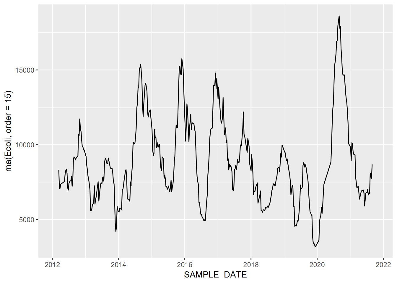
FIGURE 12.15: Moving average (order=15) of E. coli data
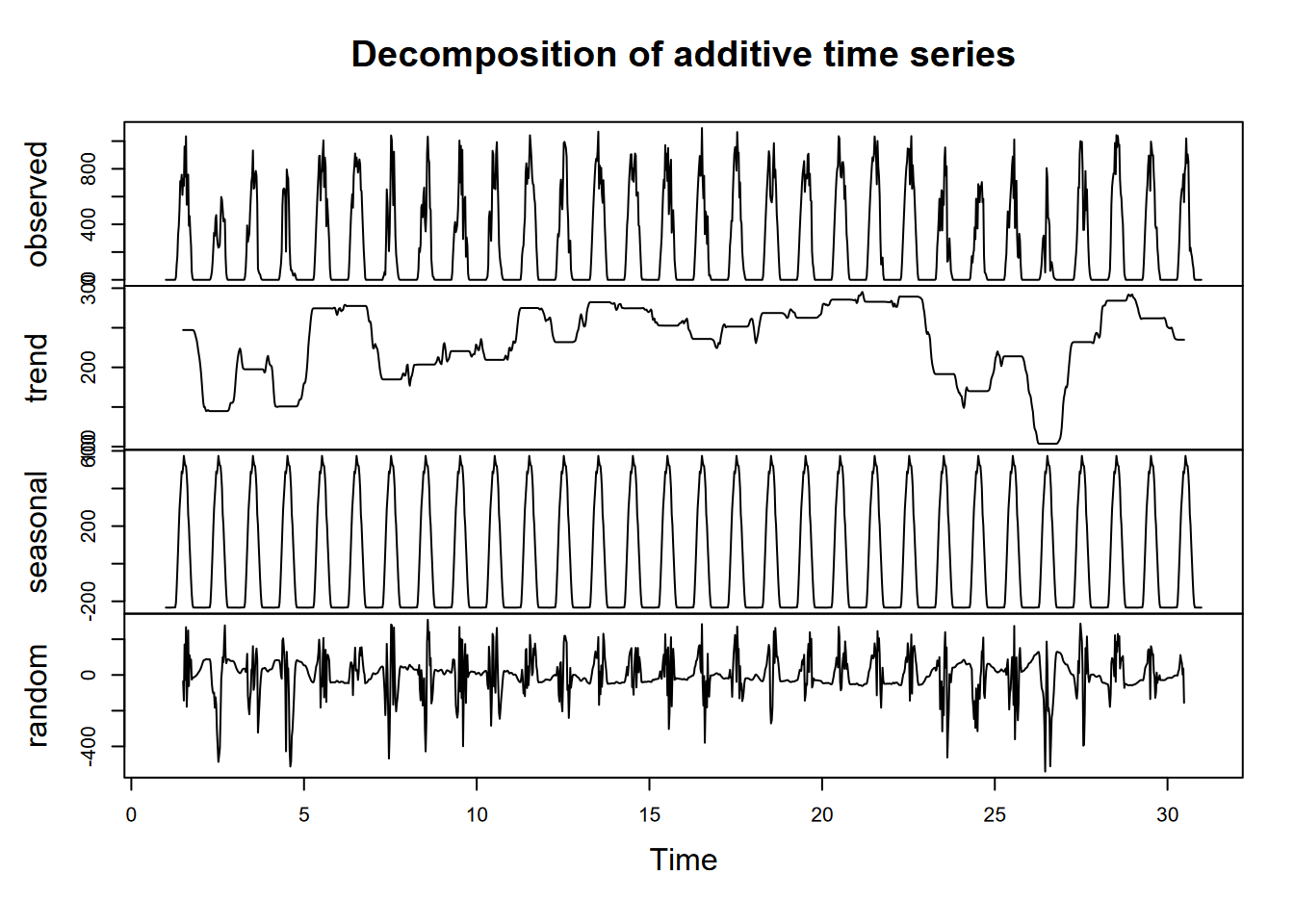
Moving average of CO2 data
We’ll look at another application of a moving average looking at CO2 data from Antarctic ice cores (Irizarry (2019)), first the time series itself (Figure 12.16)…
library(dslabs)
data("greenhouse_gases")
GHGwide <- pivot_wider(greenhouse_gases,
           names_from = gas,
           values_from = concentration)
CO2 <- ts(GHGwide$CO2,
          frequency = 0.05)
plot(CO2)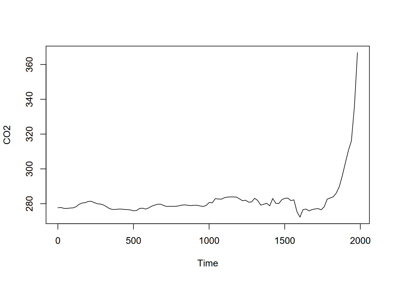
FIGURE 12.16: GHG CO2 time series
… and then the moving average with an order of 7 (Figure 12.17).
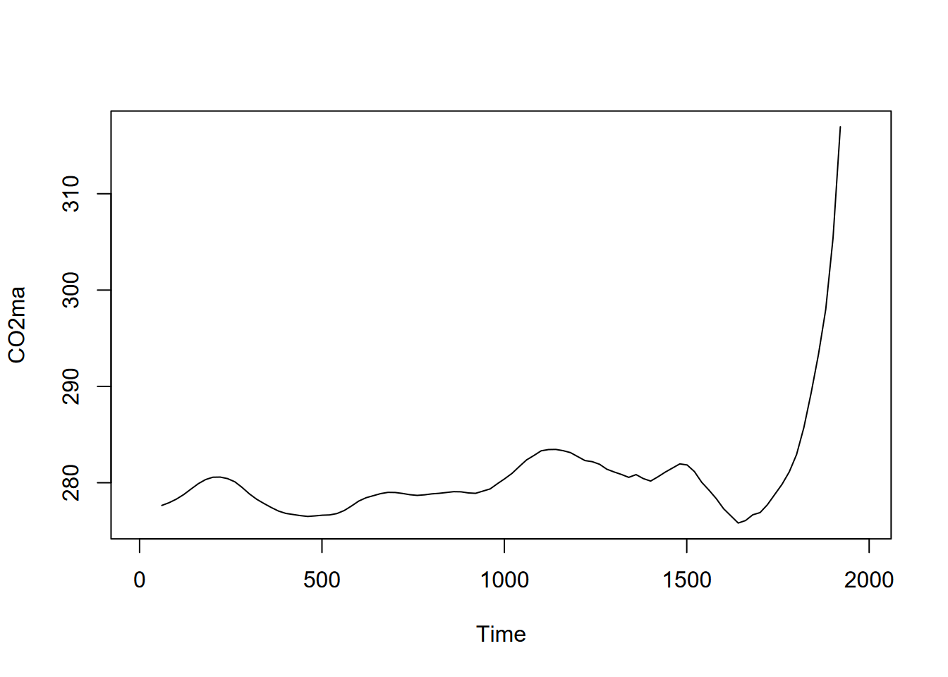
FIGURE 12.17: Moving average (order=7) of CO2 time series
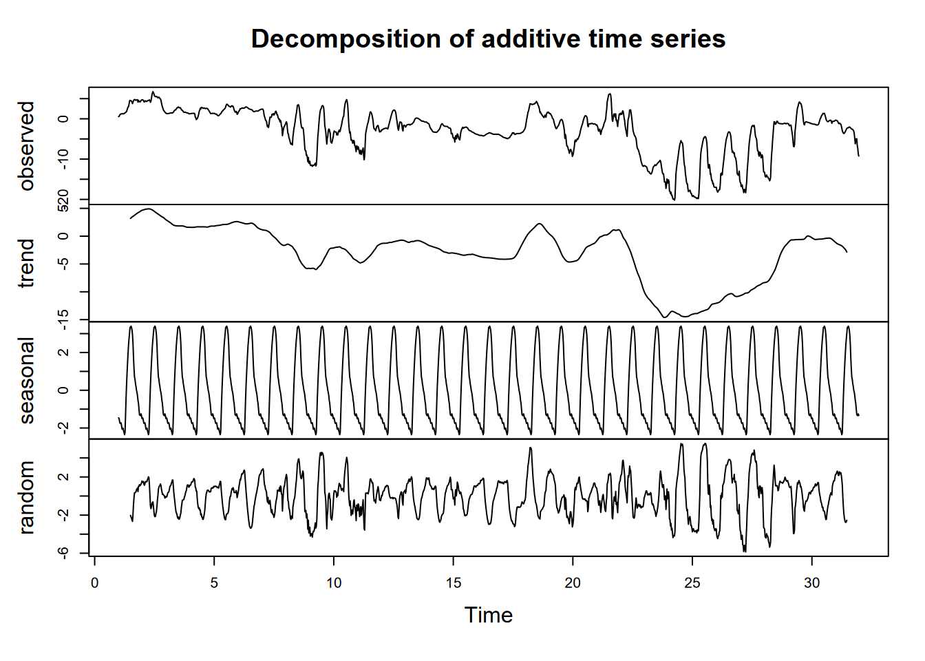
For periodic data we can decompose time series into seasonal and trend signals, with the remainder left as random variation. But even for non-periodic data, we can consider random variation by simply subtracting the major signal of the moving average from the original data (Figure 12.18).
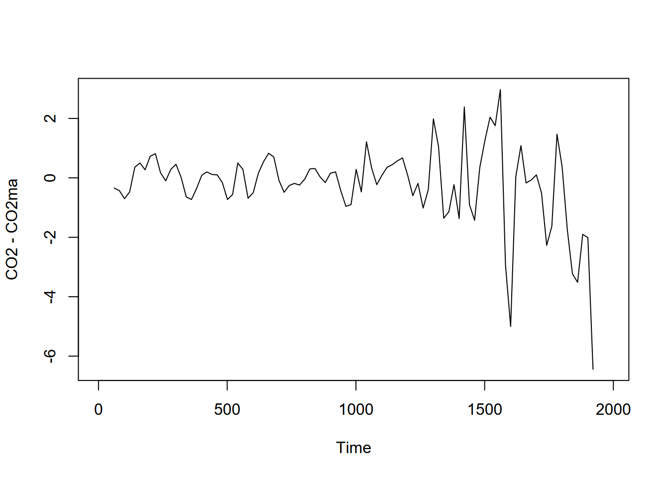
FIGURE 12.18: Random variation seen by subtracting moving average
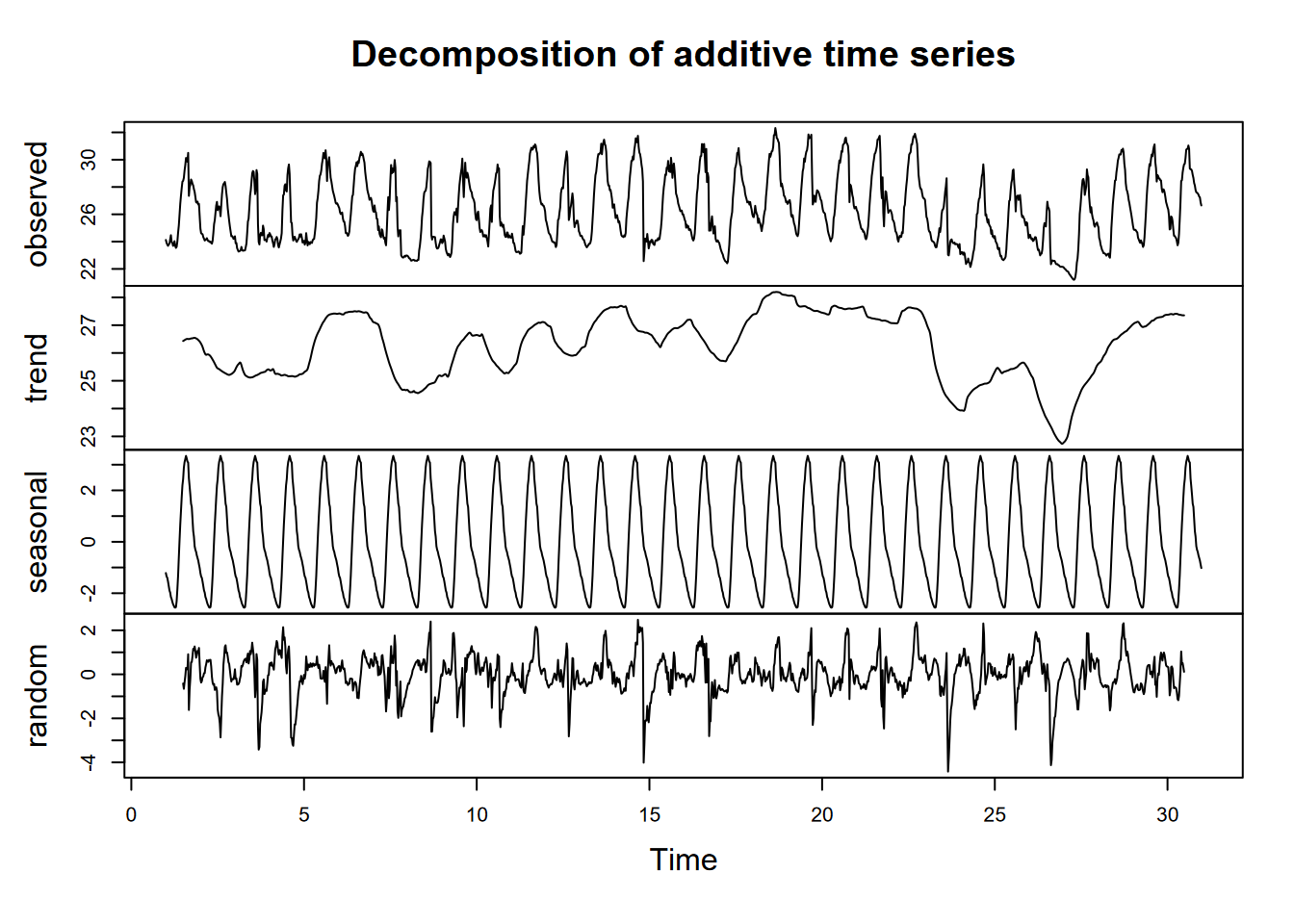
We can also remove the seasonal fluctuation of the monthly Mauna Loa time series we created earlier…
 … and the seasonal pattern by subtracting the moving average from the original data:
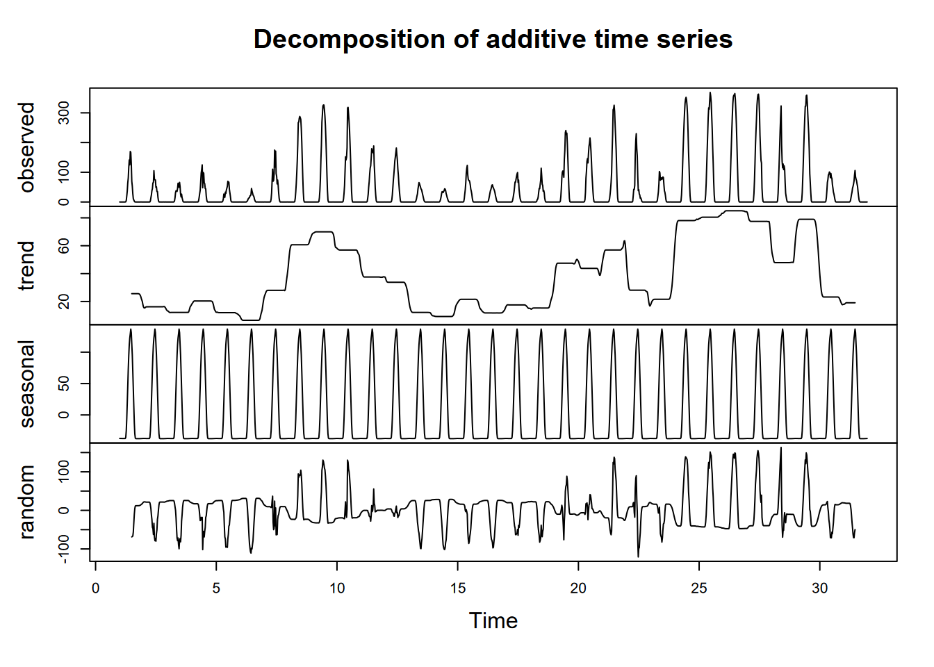
For the E. coli, maybe we can use a moving average to try to see a clearer pattern? We’ll need to use tseries::na.remove to remove the NA at the beginning and end of the data, and I’d probably recommend making sure we’re not creating any time errors doing this (Figure 12.19).
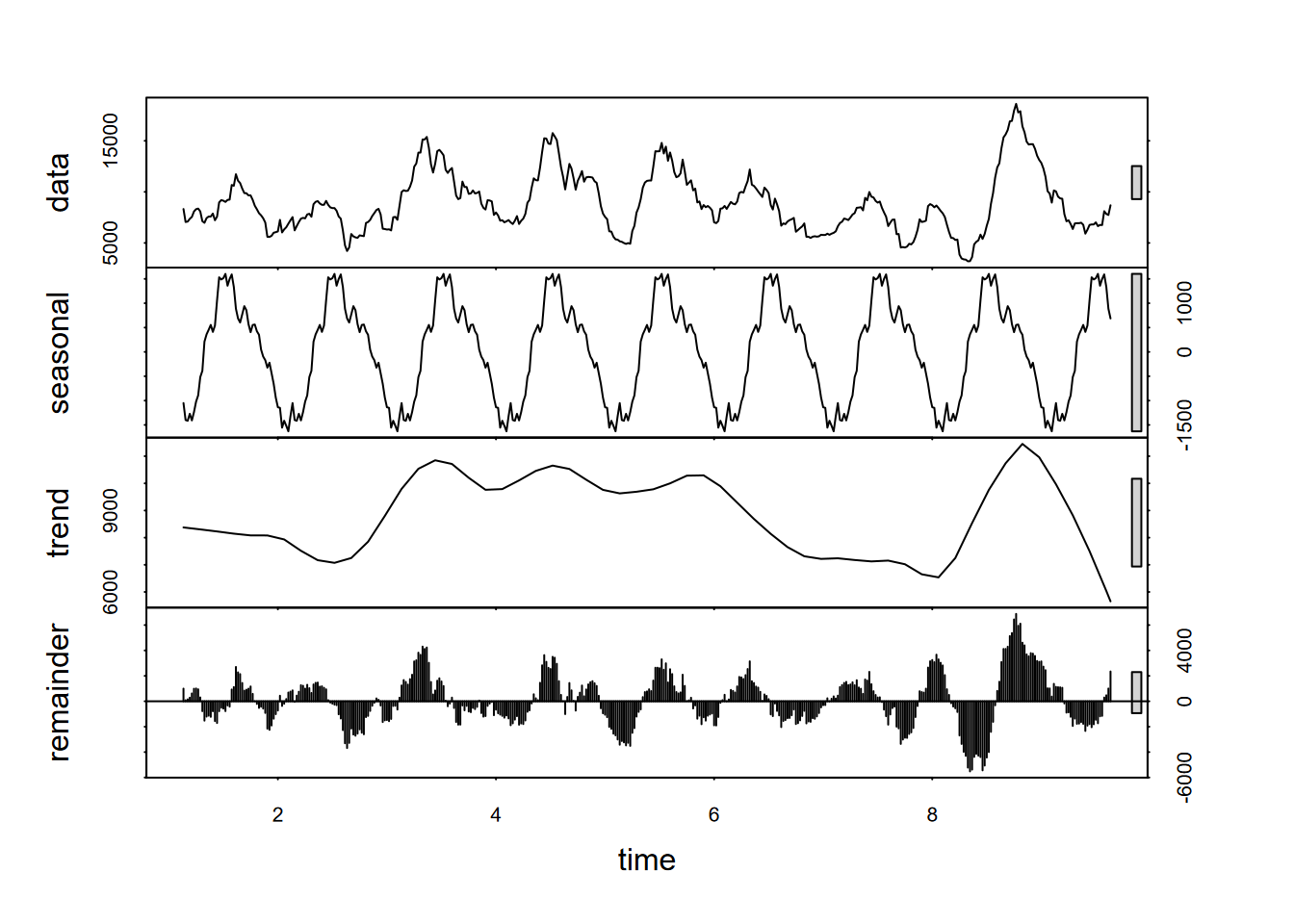
FIGURE 12.19: Decomposition using stl of a 15th-order moving average of E. coli data
12.4 Decomposition of data logger data: Marble Mountains
Data loggers can create a rich time series data set, with readings repeated at very short time frames (depending on the capabilities of the sensors and data logging system) and extending as far as the instrumentation allows. For a study of chemical water quality and hydrology of a karst system in the Marble Mountains of California, a spring resurgence was instrumented to measure water level, temperature, and specific conductance (a surrogate for total dissolved solids) over a four-year time frame (JD Davis and Davis 2001) (Figures 12.20 and 12.21). The frequency was quite coarse – one sample every two hours – but still provides a useful data set to consider some of the time series methods we’ve been exploring (Figure 12.20).

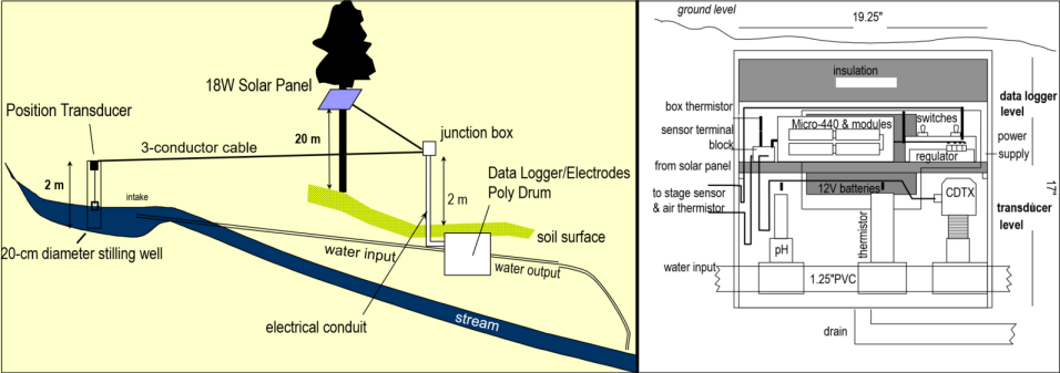
FIGURE 12.20: Marble Mountains resurgence data logger design
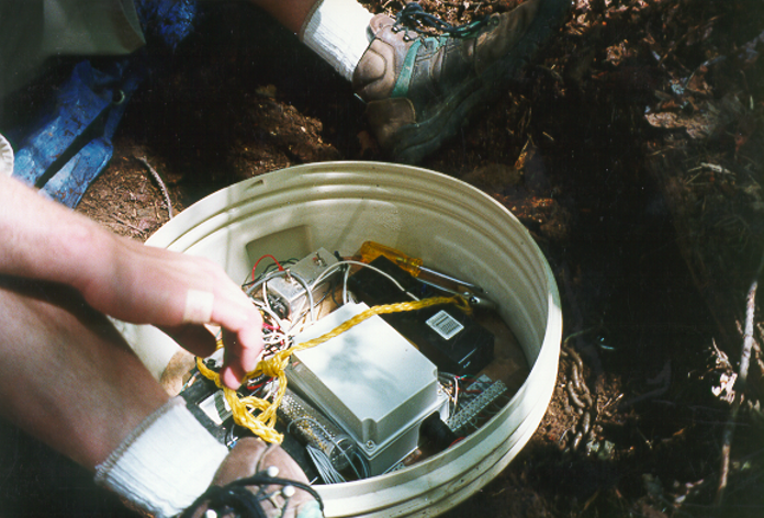
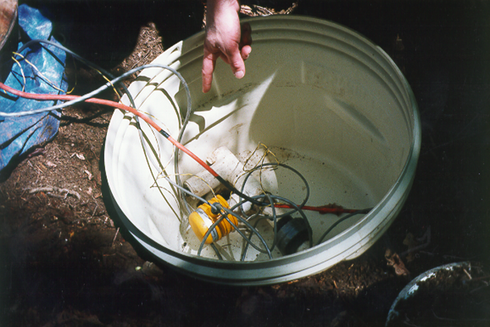
FIGURE 12.21: Marble Mountains resurgence data logger equipment
As always, you might want to start by just exploring the data…
## # A tibble: 17,537 × 9
##    date      time   wlevelm WTemp ATemp    EC InputV BTemp precip_mm
##    <chr>     <time>   <dbl> <dbl> <dbl> <dbl>  <dbl> <dbl>     <dbl>
##  1 9/23/1994 14:00    0.325  5.69  24.7  204.   12.5  24.8        NA
##  2 9/23/1994 16:00    0.325  5.69  20.4  207.   12.5  18.7        NA
##  3 9/23/1994 18:00    0.322  5.64  16.6  207.   12.5  16.3        NA
##  4 9/23/1994 20:00    0.324  5.62  16.1  207.   12.5  14.9        NA
##  5 9/23/1994 22:00    0.324  5.65  15.6  207.   12.5  14.0        NA
##  6 9/24/1994 00:00    0.323  5.66  14.4  207.   12.5  13.3        NA
##  7 9/24/1994 02:00    0.323  5.63  13.9  207.   12.5  12.8        NA
##  8 9/24/1994 04:00    0.322  5.65  13.1  207.   12.5  12.3        NA
##  9 9/24/1994 06:00    0.319  5.61  11.8  207.   12.5  11.9        NA
## 10 9/24/1994 08:00    0.321  5.66  13.1  207.   12.4  11.6        NA
## # ℹ 17,527 more rows
What we can see is that the date_time stamps show that measurements are every two hours. This will help us set the frequency for an annual period. The start time is 1994-09-23 14:00:00, so we need to provide that information as well. Note the computations used to do this (I first worked out that the yday for 9/23 was 266) (Figure 12.22).
resurg <- read_csv(ex("marbles/resurgenceData.csv"))
resurgVars <- resurg %>%
  dplyr::select(ATemp, BTemp, wlevelm, EC, InputV)#%>% # removed date & time
resurgTS <- ts(resurgVars, frequency = 12*365, start = c(1994, 266*12+7))
plot(resurgTS)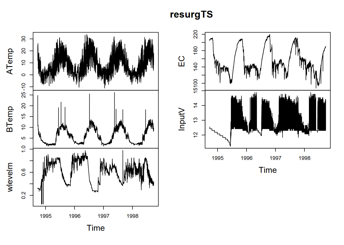
FIGURE 12.22: Data logger data from the Marbles resurgence
In this study, water level water level has an annual seasonality that might be best understood by decomposition (Figure 12.23).
library(tidyverse); library(lubridate)
resurg <- read_csv(ex("marbles/resurgenceData.csv"))
wlevelTS <- ts(resurg$wlevelm, frequency = 12*365, start = c(1994, 266*12+7))
fit <- stl(wlevelTS, s.window="periodic")
plot(fit)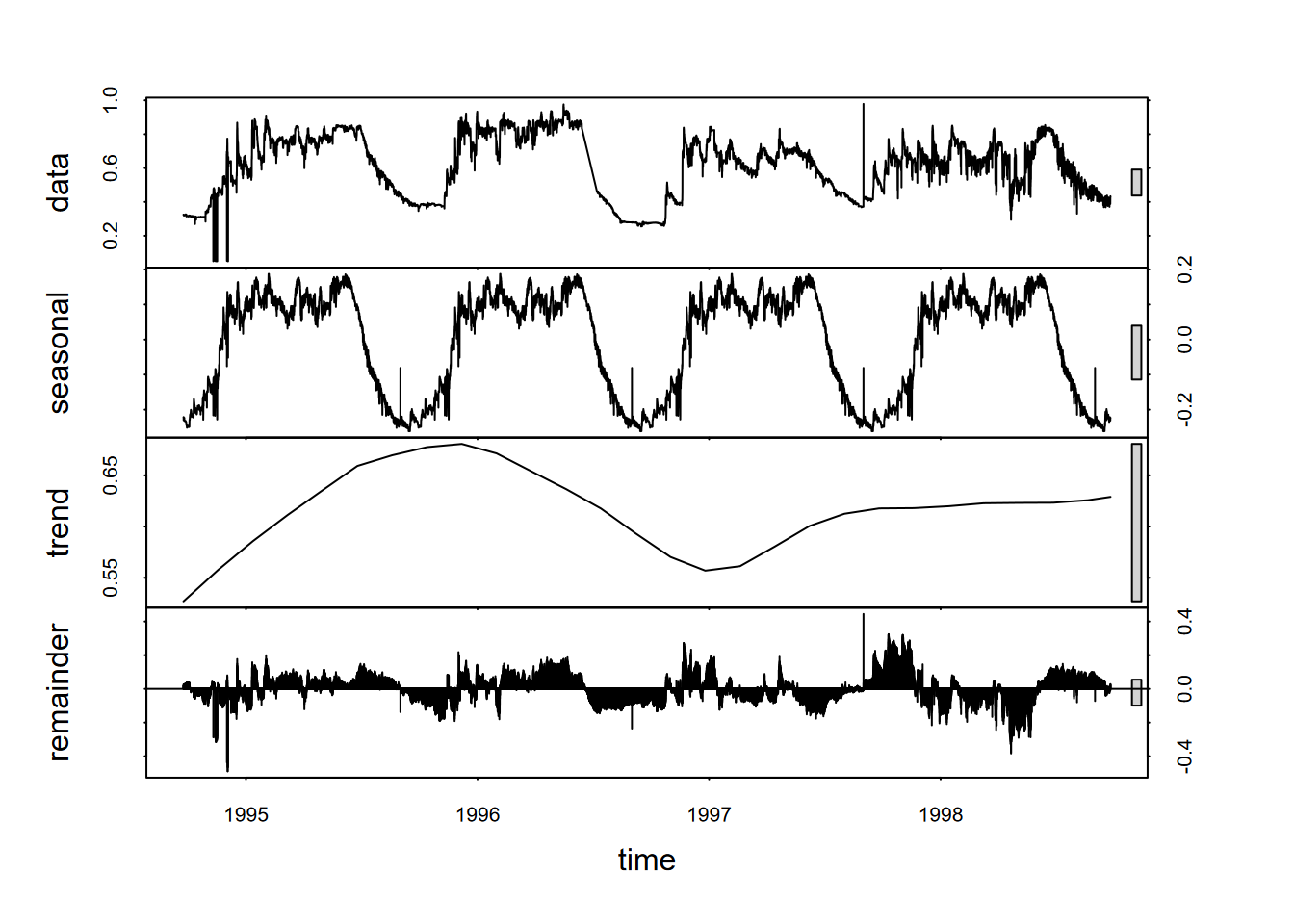
FIGURE 12.23: stl decomposition of Marbles water level time series
12.5 Facet Graphs for Comparing Variables over Time
We’ve just been looking at a data set with multiple variables, and often what we’re just needing to do is to create a combination of graphs of these variables over a common timeframe on the x axis. We’ll look at some flux data from Loney Meadow (Figure 12.24).
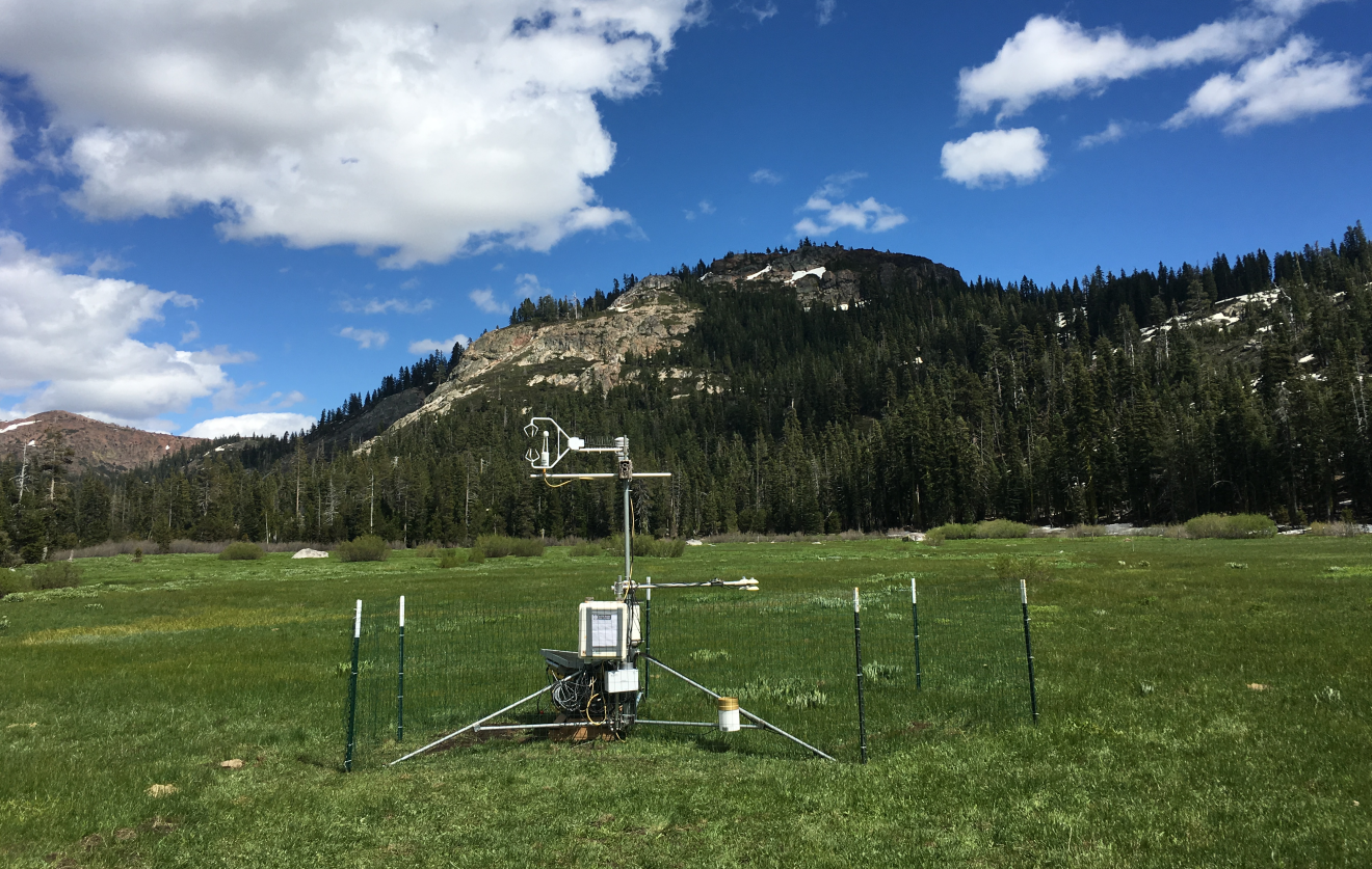
FIGURE 12.24: Flux tower installed at Loney Meadow, 2016. Photo credit: Darren Blackburn
The flux tower data was collected at a high frequency for eddy covariance processing where 3D wind speed data is used to model the movement of atmospheric gases, including CO2 flux driven by photosynthesis and respiration processes. Note that the sign convention of CO2 flux is that positive flux is released to the atmosphere, which might happen when less photosynthesis is happening but respiration and other CO2 releases continue, while a negative flux might happen when more photosynthesis is capturing more CO2.
A spreadsheet of 30-minute summaries from 17 May to 6 September can be found in the igisci extdata folder as "meadows/LoneyMeadow_30minCO2fluxes_Geog604.xls", and includes data on photosynthetically active radiation (PAR), net radiation (Qnet), air temperature, relative humidity, soil temperature at 2 and 10 cm depth, wind direction, wind speed, rainfall, and soil volumetric water content (VWC). There’s clearly a lot more we can do with this data (see Blackburn, Oliphant, and Davis (2021)), but for now we’ll just create a facet graph from the multiple variables collected. We’ll start with writing a function to deal with the 2 lines of header, the first of which has the variable names and the second the units which we won’t use.
library(igisci)
library(readxl); library(tidyverse); library(lubridate)
read_excel2 <- function(xl){
  vnames <- read_excel(xl, n_max=0) |> names()
  vunits <- read_excel(xl, n_max=0, skip=1) |> names()
  read_excel(xl, skip=2, col_names=vnames)
}

Loney <- read_excel2(ex("meadows/LoneyMeadow_30minCO2fluxes_Geog604.xls")) |>
  rename(DecimalDay = `Decimal time`,
         YDay = `Day of Year`,
         Hour = `Hour of Day`,
         CO2flux = `CO2 Flux`,
         Tsoil2cm = `Tsoil 2cm`,
         Tsoil10cm = `Tsoil 10cm`) %>%
  mutate(datetime = as_date(DecimalDay, origin="2015-12-31"))
We’re going to want to analyze changes over a daily period, but we can also look at the data changes over the entire collection duration. A group_by-summarize process by days will give us a generalized picture of changes over that duration, with the diurnal fluctuations removed, reflecting phenological changes from first exposure after snowmelt through the maximum growth period and through the major senescence period of late summer. We’ll look at a faceted graph (with free_y scales setting) from a pivot_longer table (Figure 12.25).
LoneyDaily <- Loney %>%
  group_by(YDay) %>%
  summarize(CO2flux = mean(CO2flux),
            PAR = mean(PAR),
            Qnet = mean(Qnet),
            Tair = mean(Tair),
            RH = mean(RH),
            Tsoil2cm = mean(Tsoil2cm),
            Tsoil10cm = mean(Tsoil10cm),
            wdir = mean(wdir),
            wspd = mean(wspd),
            Rain = mean(Rain),
            VWC = mean(VWC))
LoneyDailyLong <- LoneyDaily %>%
  pivot_longer(cols = CO2flux:VWC,
               names_to="parameter",
               values_to="value") %>%
  filter(parameter %in% c("CO2flux", "Qnet", "Tair", "RH", "Tsoil10cm", "VWC"))
p <- ggplot(data = LoneyDailyLong, aes(x=YDay, y=value)) +
  geom_line()
p + facet_grid(parameter ~ ., scales = "free_y")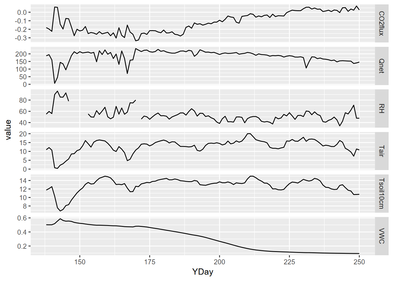
FIGURE 12.25: Facet plot with free y scale of Loney flux tower parameters
12.6 Lag Regression
Lag regression is like a normal linear model, but there’s a timing difference, or lag, between the explanatory and response variables. We have used this method to compare changes in snow melt in a Sierra Nevada watershed and changes in reservoir inflows downstream (Powell et al. (2011)).
Another good application of lag regression is comparing solar radiation and temperature. We’ll explore solar radiation and temperature data over an 8-day period for Bugac, Hungary, and Manaus, Brazil, maintained by the European Fluxes Database (European Fluxes Database, n.d.). This data is every half hour, but let’s have a look. You could navigate to the spreadsheet and open it in Excel, and I would recommend it – you should know where the extdata is stored on your computer – since this is the easiest way to see that there are two worksheets. With that worksheet naming knowledge, we can also have a quick look in R:
## # A tibble: 17,520 × 5
##    Year  `Day of Yr` Hr    SolarRad Tair
##    <chr> <chr>       <chr> <chr>    <chr>
##  1 2006  1           0.5   0        0.55000001192092896
##  2 2006  1           1     0        0.56999999284744263
##  3 2006  1           1.5   0        0.82999998331069946
##  4 2006  1           2     0        1.0399999618530273
##  5 2006  1           2.5   0        1.1699999570846558
##  6 2006  1           3     0        1.2000000476837158
##  7 2006  1           3.5   0        1.2300000190734863
##  8 2006  1           4     0        1.2599999904632568
##  9 2006  1           4.5   0        1.2599999904632568
## 10 2006  1           5     0        1.2599999904632568
## # ℹ 17,510 more rows
Indeed the readings are every half hour, so for a daily period, we should use a frequency of 48. We need to remove the second line of the input, which has the units of the measurements, by using the accessor [-1,]. We’ll filter for a year day range and select the solar radiation and air temperature variables (Figure 12.26).
library(readxl); library(tidyverse)
BugacSolstice <- read_xls(ex("ts/SolarRad_Temp.xls"),
                          sheet="BugacHungary", col_types = "numeric")[-1,] %>%
  filter(`Day of Yr` < 177 & `Day of Yr` > 168) %>%
  dplyr::select(SolarRad, Tair)
BugacSolsticeTS <- ts(BugacSolstice, frequency = 48)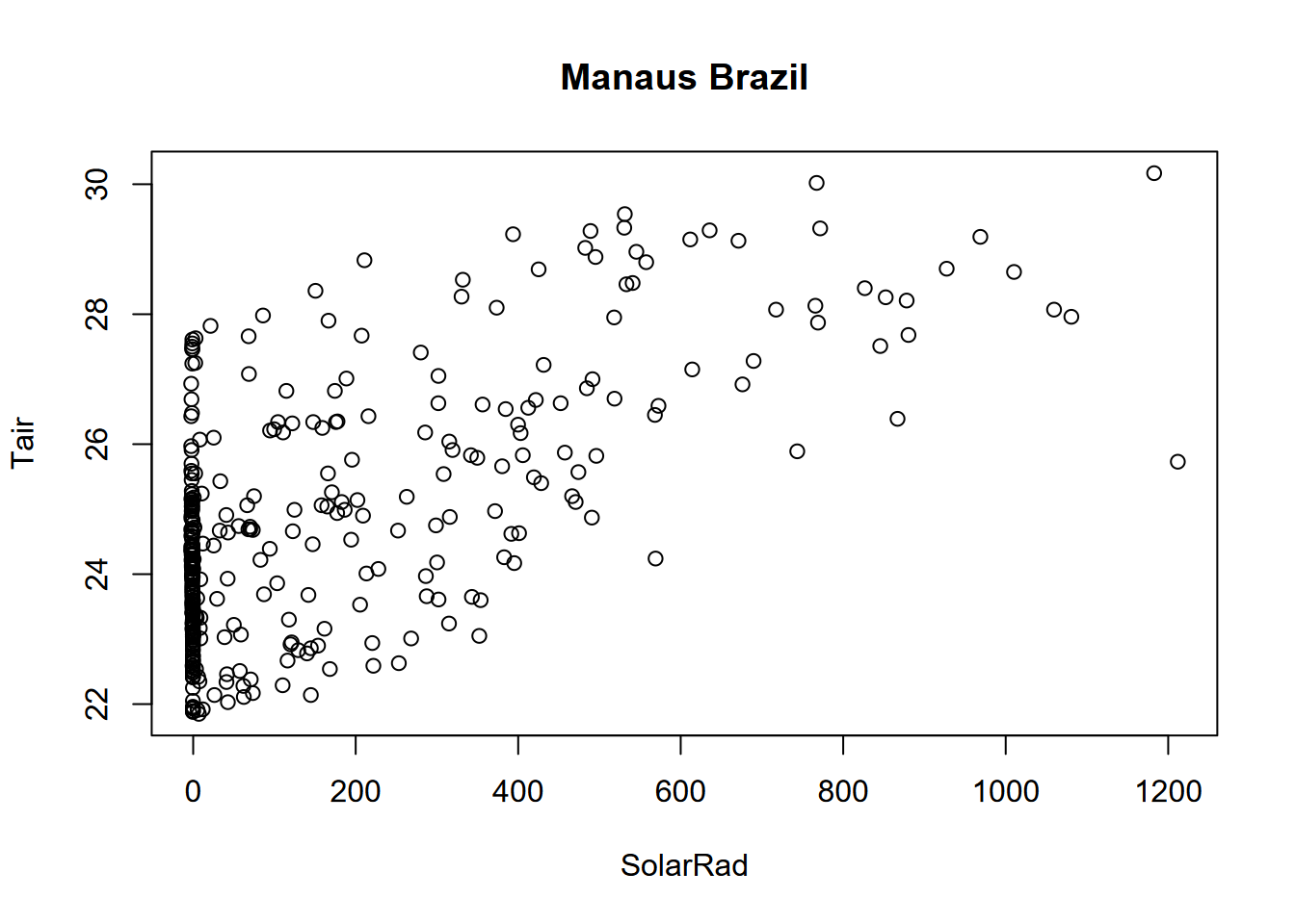
plot(BugacSolstice, main="a simple scatter plot that illustrates hysteresis") 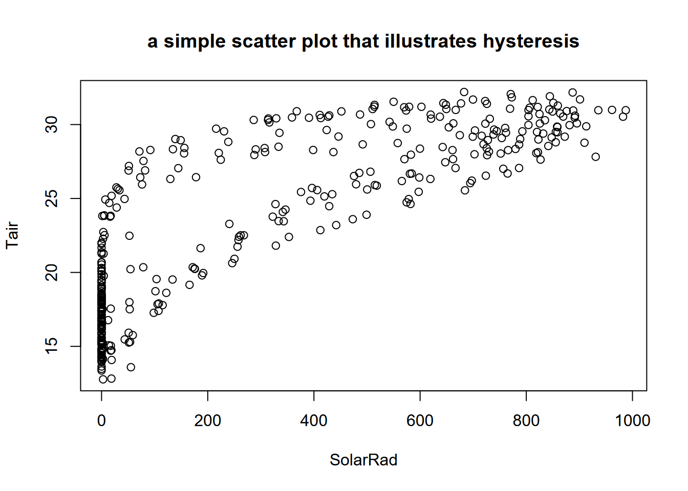
FIGURE 12.26: Scatter plot of Bugac solar radiation and air temperature
Hysteresis is “the dependence of a state of a system on its history” (“Hysteresis” (n.d.)), and one place this can be seen is in periodic data, when an explanatory variable’s effect on a response variable differs on an increasing limb from what it produces on a decreasing limb. Two classic situations where this occur are in (a) water quality, where the rising limb of the hydrograph will carry more sediment load than a falling limb; and in (b) the daily or seasonal pattern of temperature in response to solar radiation, which we can see in the graph above with two apparent groups of scatterpoints representing the varying impact of solar radiation in spring vs fall, where temperatures lag behind the increase in solar radiation (Figure 12.27).
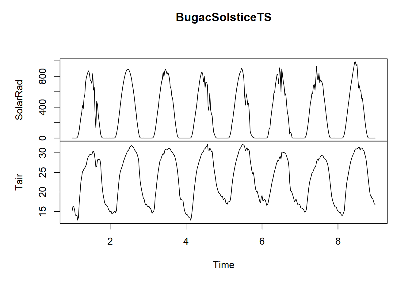
FIGURE 12.27: Solstice 8-day time series of solar radiation and temperature
12.6.1 The lag regression, using a lag function in a linear model
The lag function uses a lag number of sample intervals to determine which value in the response variable corresponds to a given value in the explanatory variable. So we compare air temperature Tair to a lagged solar radiation SolarRad as lm(Tair~lag(SolarRad,i), where i is the number of units to lag. The following code loops through six values (0:5) for i, starting with assigning the RMSE (root mean squared error) for no lag (0), then appending to RMSE for i of 1:5 to hopefully hit the minimum value.
getRMSE <- function(i) {sqrt(sum(lm(Tair~lag(SolarRad,i),
                                    data=BugacSolsticeTS)$resid**2))}
RMSE <- getRMSE(0)
for(i in 1:5){RMSE <- append(RMSE,getRMSE(i))}
lagTable <- bind_cols(lags = 0:5,RMSE = RMSE)
knitr::kable(lagTable)| lags | RMSE |
|---|---|
| 0 | 64.01352 |
| 1 | 55.89803 |
| 2 | 50.49347 |
| 3 | 48.13214 |
| 4 | 49.64892 |
| 5 | 54.36344 |
Minimum RMSE is for a lag of 3, so 1.5 hours. Let’s go ahead and use that minimum RMSE lag (using which.min with the RMSE to automate that selection), then look at the summarized model.
## [1] "Lag: 3"##
## Call:
## lm(formula = Tair ~ lag(SolarRad, n), data = BugacSolsticeTS)
##
## Residuals:
## Min 1Q Median 3Q Max
## -5.5820 -1.7083 -0.2266 1.8972 7.9336
##
## Coefficients:
## Estimate Std. Error t value Pr(>|t|)
## (Intercept) 18.352006 0.174998 104.87 <2e-16 ***
## lag(SolarRad, n) 0.016398 0.000386 42.48 <2e-16 ***
## ---
## Signif. codes: 0 '***' 0.001 '**' 0.01 '*' 0.05 '.' 0.1 ' ' 1
##
## Residual standard error: 2.472 on 379 degrees of freedom
## (3 observations deleted due to missingness)
## Multiple R-squared: 0.8265, Adjusted R-squared: 0.826
## F-statistic: 1805 on 1 and 379 DF, p-value: < 2.2e-16So, not surprisingly, air temperature has a significant relationship to solar radiation. Confirmatory statistics should never be surprising, but just give us confidence in our conclusions. What we didn’t know before was just what amount of lag produces the strongest relationship, with the least error (root mean squared error, or RMSE), which turns out to be 3 observations or 1.5 hours. Interestingly, the peak solar radiation and temperature are separated by 5 units, so 2.5 hours, which we can see by looking at the generalized seasonals from decomposition (Figure 12.28). There’s a similar lag for Manaus, though the peak solar radiation and temperatures coincide.
SolarRad_comp <- decompose(ts(BugacSolstice$SolarRad, frequency = 48))
Tair_comp <- decompose(ts(BugacSolstice$Tair, frequency = 48))
seasonals <- bind_cols(Rad = SolarRad_comp$seasonal, Temp = Tair_comp$seasonal)ggplot(seasonals) +
geom_line(aes(x=seq_along(Temp), y=Temp), col="black",size=1.5) +
geom_line(aes(x=seq_along(Rad), y=Rad/50), col="gray", size=1) +
scale_x_continuous(breaks = seq(0,480,12))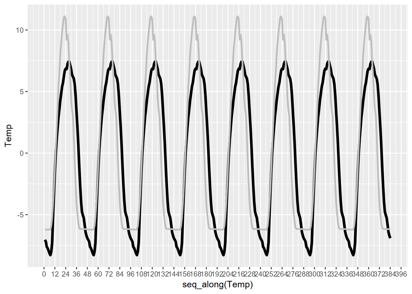
FIGURE 12.28: Bugac solar radiation and temperature
## [1] "23 28"12.7 Ensemble Summary Statistics
For any time series data with meaningful periods like days or years (or even weeks when the observations vary by days of the week – this has been the case with COVID-19 data), ensemble averages (along with other summary statistics) are a good way to visualize changes in a variable over that period.
As you could see from the decomposition and sequential graphics we created for the Bugac and Manaus solar radiation and temperature data, looking at what happens over one day as an “ensemble” of all of the days – where the mean value is displayed along with error bars based on standard deviations of the distribution – might be a useful figure.
We’ve used group_by - summarize elsewhere in this book (3.4.5) and this is yet another use of that handy method. Note that the grouping variable Hr is not categorical, not a factor, but simply a numeric variable of the hour as a decimal number – so 0.0, 0.5, 1.0, etc. – representing half-hourly sampling times, so since these repeat each day they can be used as a grouping variable (Figure 12.29).
library(cowplot)
Manaus <- read_xls(system.file("extdata","ts/SolarRad_Temp.xls",package="igisci"),
                   sheet="ManausBrazil", col_types = "numeric")[-1,] %>%
  dplyr::select(Year:Tair)
ManausSum <- Manaus %>% group_by(Hr) %>%
  summarize(meanRad = mean(SolarRad), meanTemp = mean(Tair),
            sdRad = sd(SolarRad), sdTemp = sd(Tair))
px <- ManausSum %>% ggplot(aes(x=Hr)) + scale_x_continuous(breaks=seq(0,24,3))
p1 <- px + geom_line(aes(y=meanRad), col="blue") +
  geom_errorbar(aes(ymax = meanRad + sdRad, ymin = meanRad - sdRad)) +
  ggtitle("Manaus 2005 ensemble solar radiation")
p2 <- px + geom_line(aes(y=meanTemp),col="red") +
  geom_errorbar(aes(ymax=meanTemp+sdTemp, ymin=meanTemp-sdTemp)) +
  ggtitle("Manaus 2005 ensemble air temperature")
plot_grid(plotlist=list(p1,p2), ncol=1, align='v') # from cowplot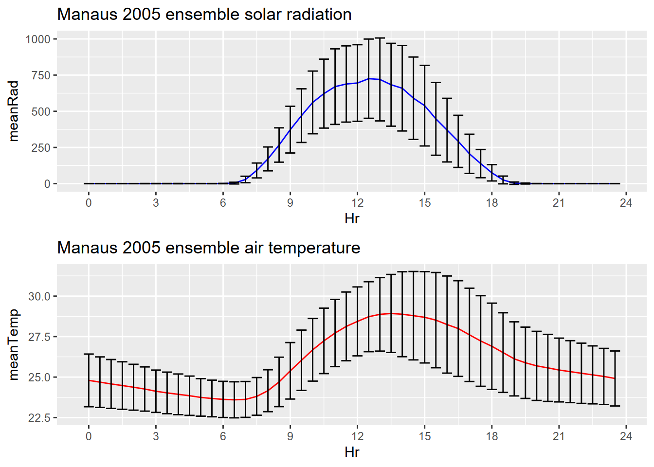
FIGURE 12.29: Manaus ensemble averages with error bars
12.8 Learning more about Time Series in R
There has been a lot of work on time series in R, especially in the financial sector where time series are important for forecasting models. Some of these methods should have applications in environmental research. Here are some resources for learning more:
- At CRAN: https://cran.r-project.org/web/views/TimeSeries.html
- The time series data library: https://pkg.yangzhuoranyang.com/tsdl/
- https://a-little-book-of-r-for-time-series.readthedocs.io/
- The tsibble: https://tsibble.tidyverts.org/
12.9 Exercises: Time Series
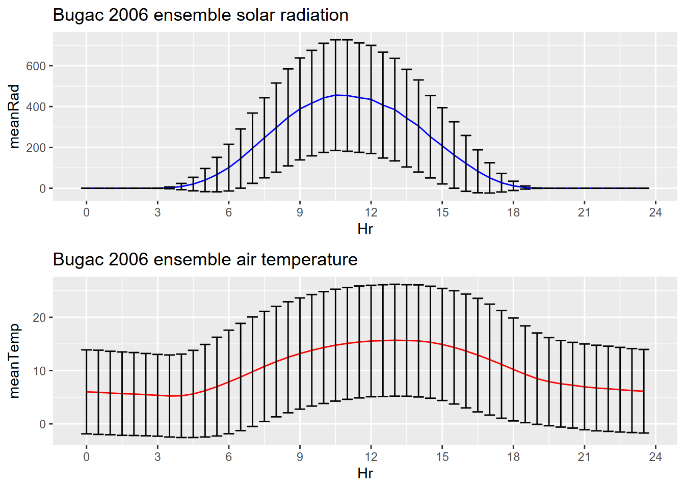
Exercise 12.1 Create an half-hourly ensemble plot of Bugac, Hungary, similar to the one we created for Manaus, Brazil.
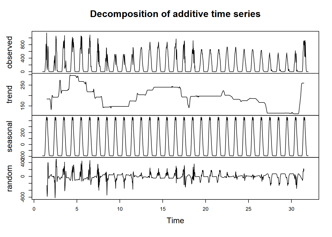
Exercise 12.2 Create a ManausJan tibble for just the January data (hint: use a filter and consider that the Day of Yr has 31 for January 31, and 32 for February 1), then decompose a ts of ManausJan$SolarRad, and plot it. Consider carefully what frequency to use to get a daily period, realizing that values are every half hour. Also, remember that “seasonal” in this case means “diurnal”. Code and plot.
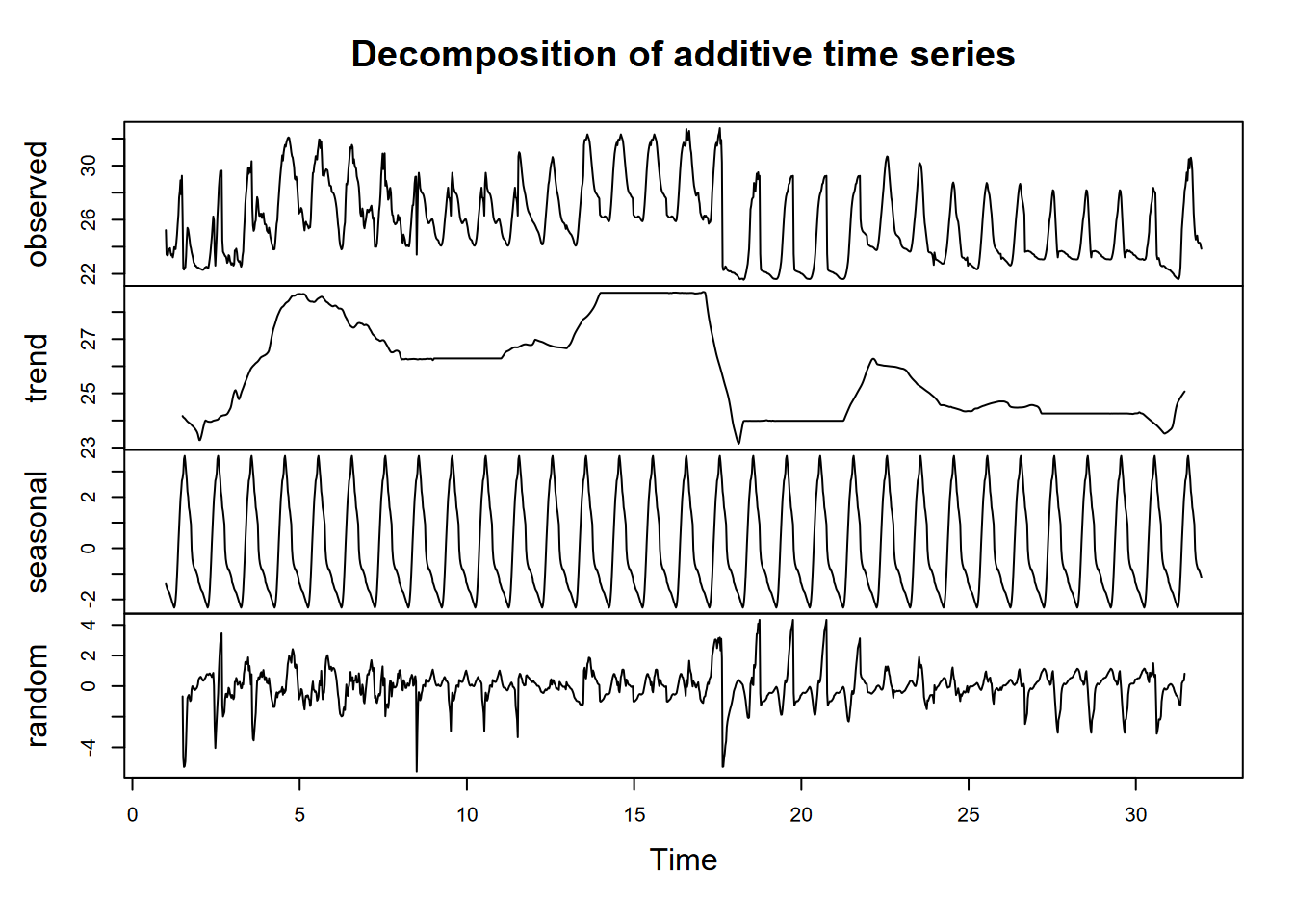
Exercise 12.3 Then do the same for air temperature (Tair) for Manaus in January, providing code and plot. What observations can you make from this on conditions in Manaus in January?
Exercise 12.4 Now do both of the above for Bugac, Hungary, and reflect on what it tells you, and how these places are distinct (other than the obvious).
Exercise 12.5 Now do the same for June. You’ll probably need to use the yday and ymd (or similar) functions from lubridate to find the date range for 2005 or 2006 (neither are leap years, so they should be the same). Hint: what does yday(ymd("2005:06:01")) give you?
Exercise 12.6 Do a lag regression over an 8-day period over the March equinox (about 3/21), when the sun’s rays should be close to vertical since it’s near the Equator, but it’s very likely to be cloudy at the Intertropical Convergence Zone. As we did with the Bugac data, work out the best lag value using the minimum-RMSE model process we used for Bugac, and produce a summary of that model.
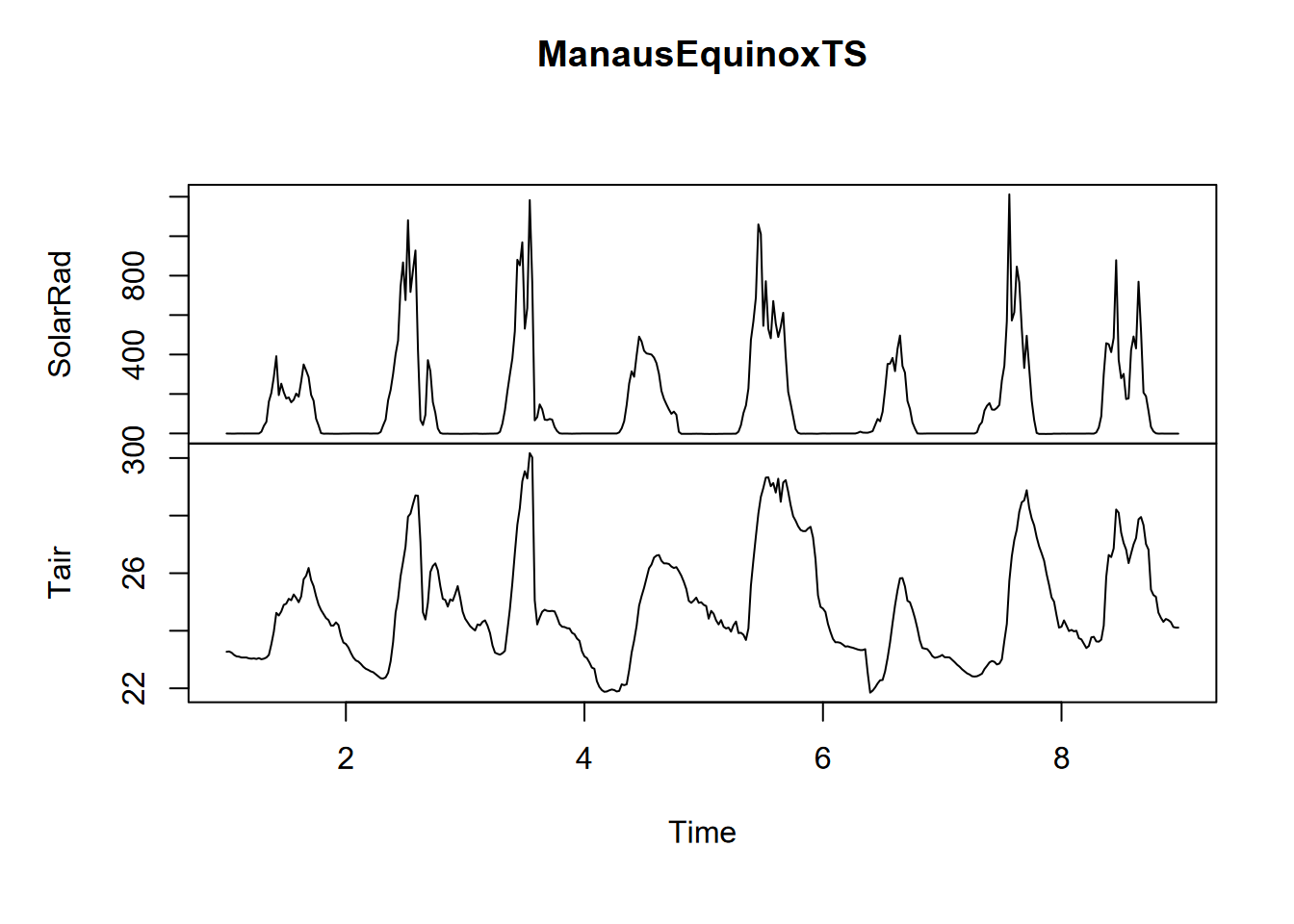
## [1] "Lag: 3"##
## Call:
## lm(formula = Tair ~ lag(SolarRad, n), data = ManausEquinoxTS)
##
## Residuals:
## Min 1Q Median 3Q Max
## -6.4549 -0.8112 -0.0009 0.7236 3.7333
##
## Coefficients:
## Estimate Std. Error t value Pr(>|t|)
## (Intercept) 2.388e+01 7.667e-02 311.50 <2e-16 ***
## lag(SolarRad, n) 5.743e-03 2.677e-04 21.45 <2e-16 ***
## ---
## Signif. codes: 0 '***' 0.001 '**' 0.01 '*' 0.05 '.' 0.1 ' ' 1
##
## Residual standard error: 1.269 on 379 degrees of freedom
## (3 observations deleted due to missingness)
## Multiple R-squared: 0.5483, Adjusted R-squared: 0.5471
## F-statistic: 460.1 on 1 and 379 DF, p-value: < 2.2e-16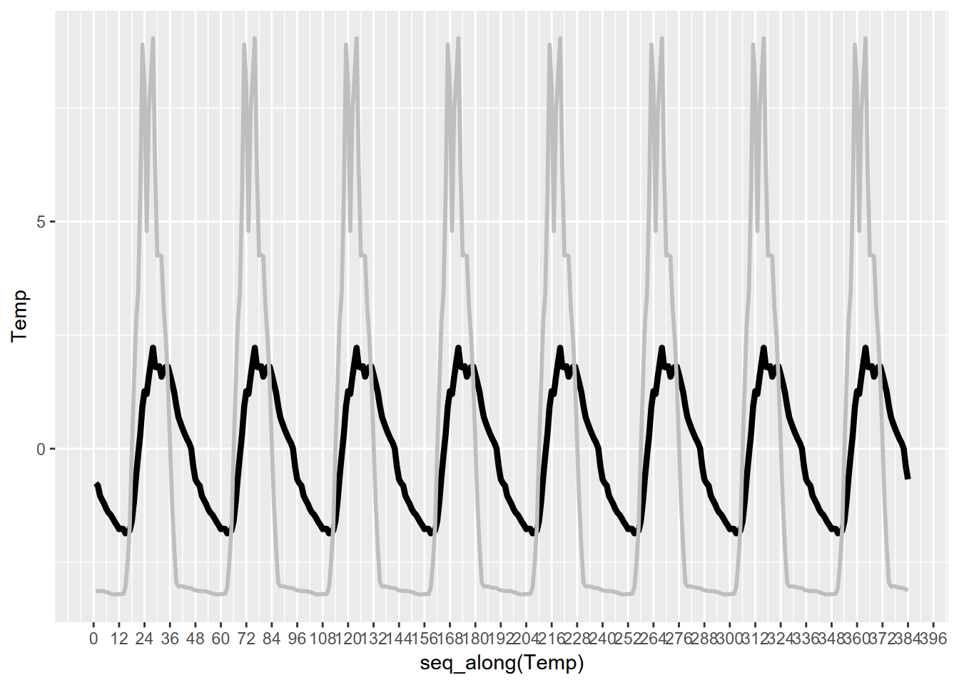
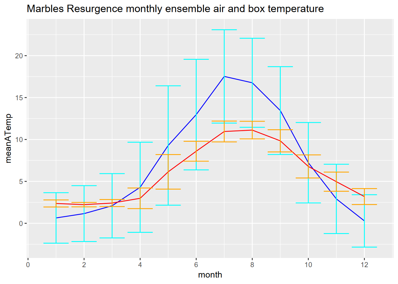
## [1] 28## [1] 28Exercise 12.7 Create an ensemble plot of monthly air and box temperature from the Marble Mountains Resurgence data. The air temperature was measured from a thermistor mounted near the ground but outside the box, and the box temperature was measured within the buried box (see the pictures to visualize this.) You’ll want to start with reading the dates and times – which we didn’t actually use when we built a time series from the data – by building date_time and month variables:
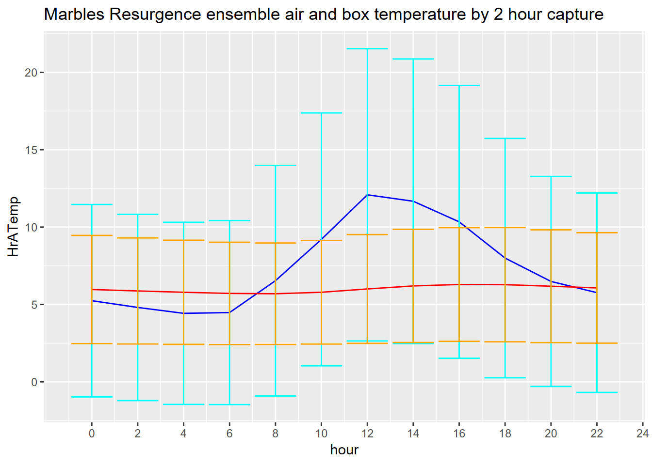
Exercise 12.8 How about looking at daily cycles? The Marbles resurgence data were collected every two hours, so group by hour (created using hour(time), which will return integers 0,2,…,22). Interpret what you get, and what the air vs box temperature patterns might show, considering where the sensors are installed.
Exercise 12.9 Using methods from 12.5, create a graph of daily air temperature (ATemp), water level (wlevelm), conductance (EC), and input voltage from the solar panel (InputV) from the Marble Mountains resurgence data (Figure 12.30). Use the same type of y axis scaling as was used in figure 12.25.
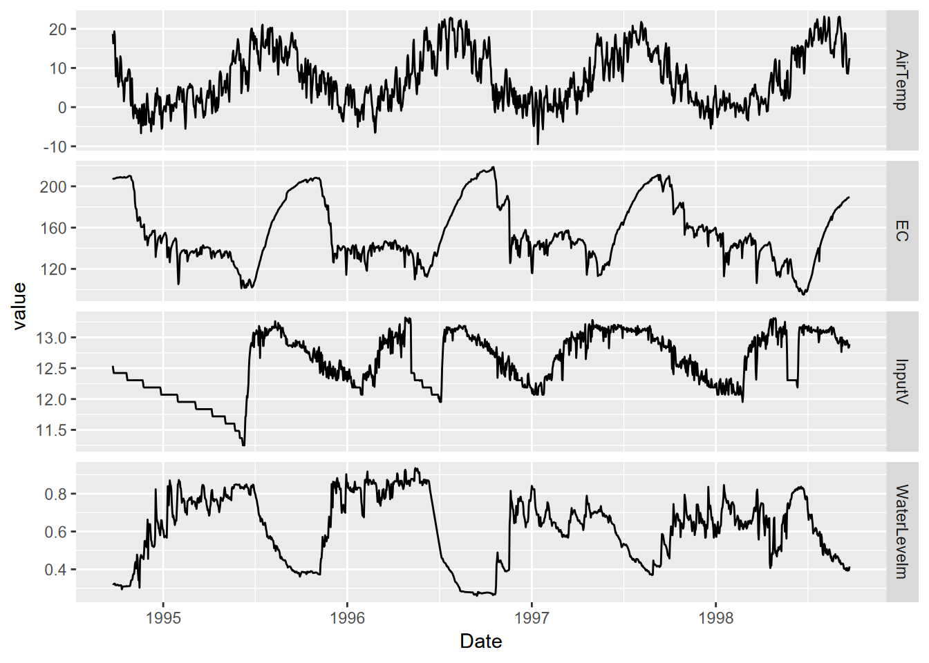
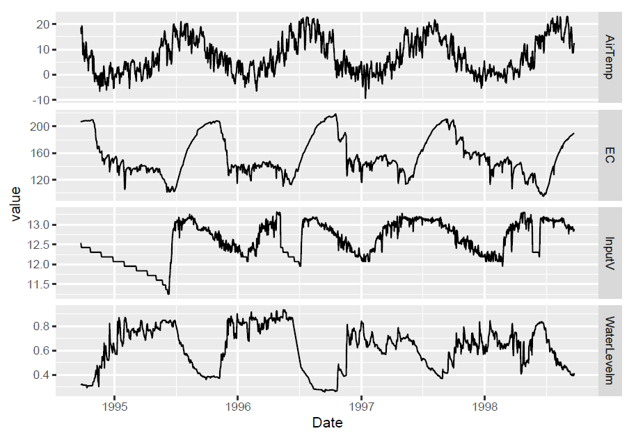
FIGURE 12.30: Facet graph of Marble Mountains resurgence data (goal)
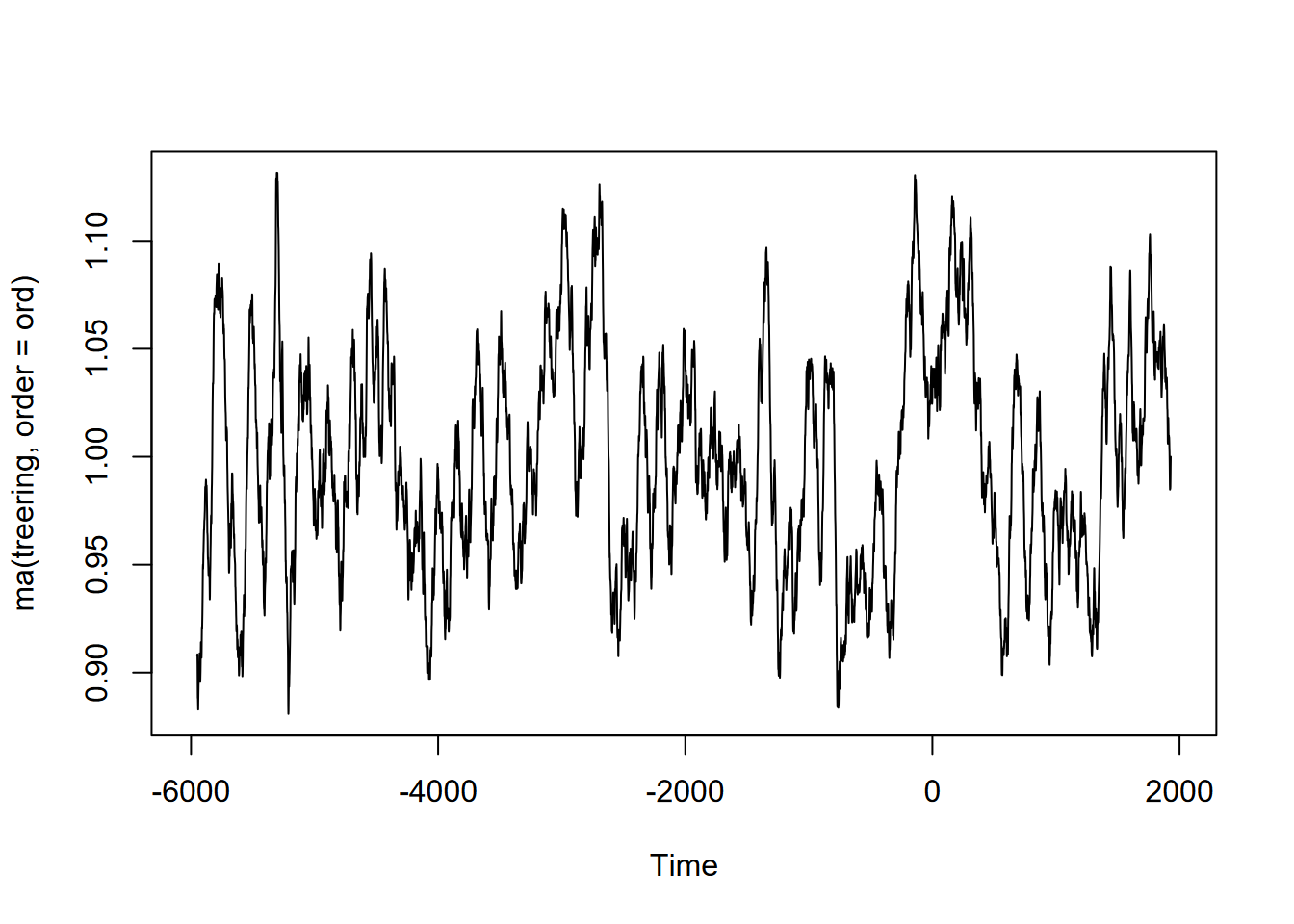
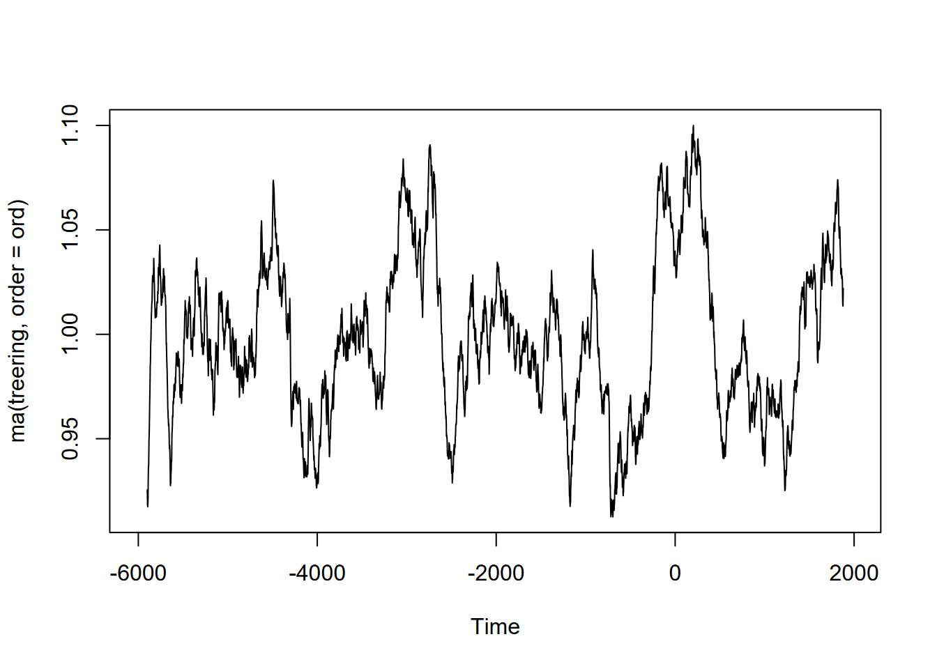
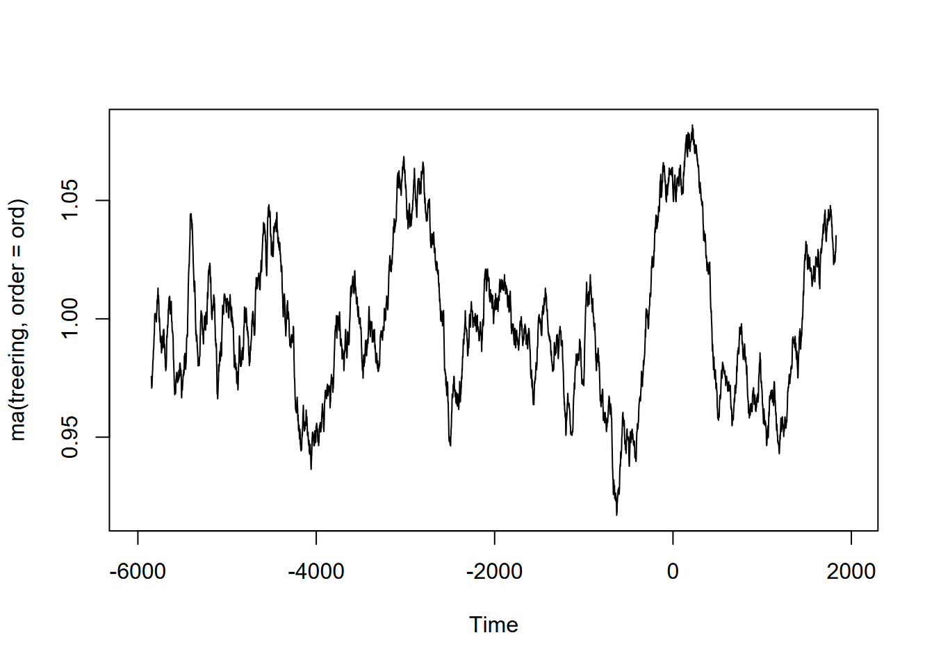
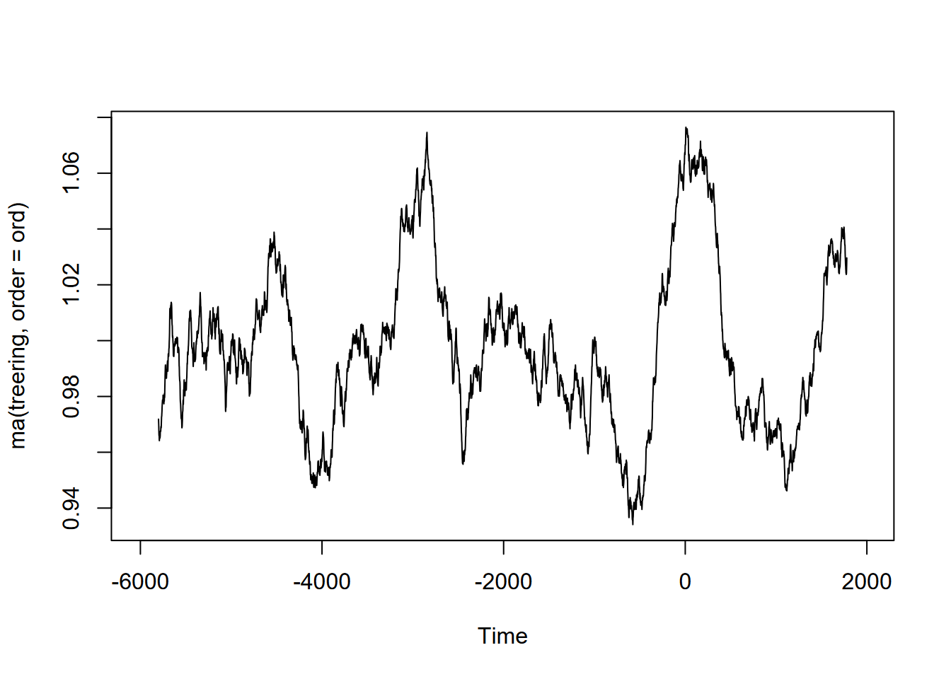
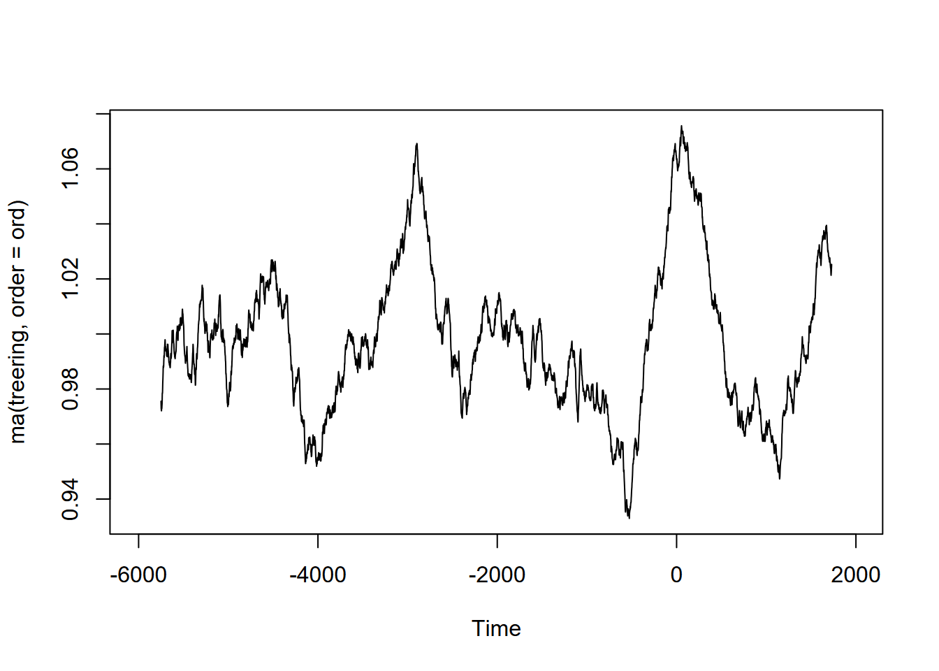
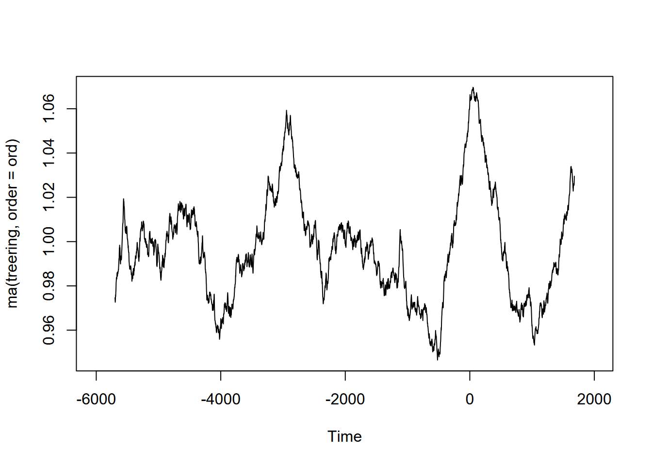
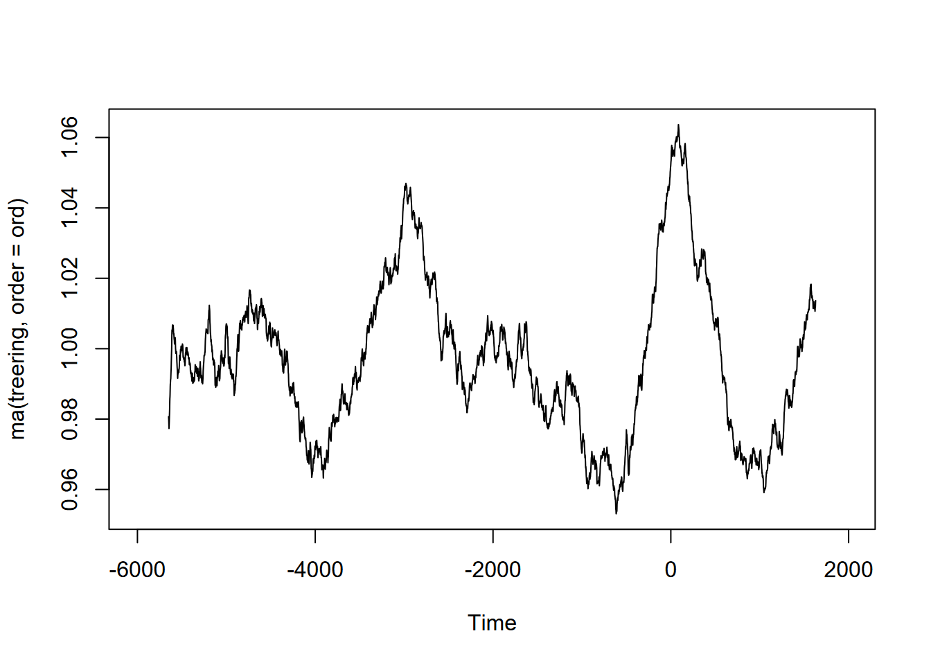
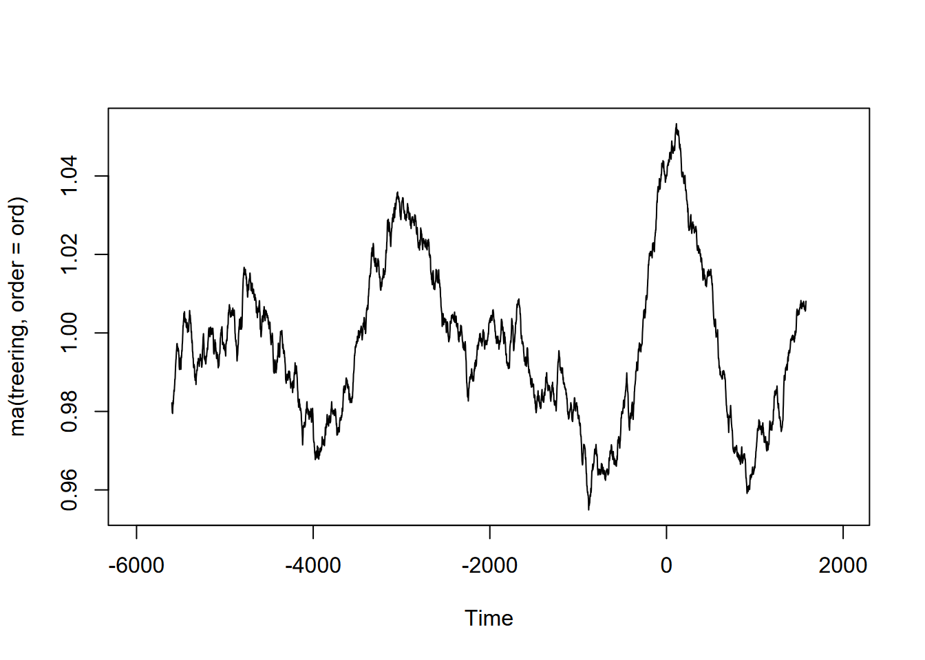
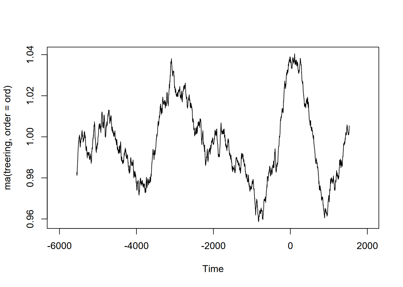
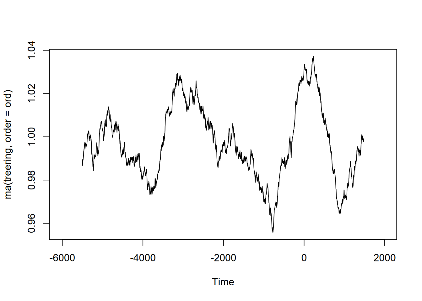
Exercise 12.10 (Optional) Tree-ring data: Using forecast::ma and the built-in treering time series, find a useful order value for a curve that communicates a pattern of tree rings over the last 8,000 years, with high values around -3,500 and 0 years. Note: the order may be pretty big, and you might want to loop through a sequence of values to see what works. I found that creating a sequence in a for loop with seq(from=100,to=1000,by100) useful, and any further created some odd effects.
Exercise 12.11 (Optional) Sunspot activity is known to fluctuate over about a 11-year cycle, and other than the well-known effects on radio transmission is also part of short-term climate fluctuations (so must be considered when looking at climate change). The built-in data set sunspot.month has monthly values of sunspot activity from 1749 to 2014. Use the frequency function to understand its period, then create an alternative ts with an 11-year cycle as frequency (how do you define its frequency?) and plot a decomposition and stl.