Preprocessing the data
Remove control guides
First we remove 1000 control (non-targeting) sgRNAs from the count matrix as they are designed not to target in the genome.
[1] 121411 6Check guide distribution
The control samples contain the majority of sgRNAs, and the numbers decrease in the treated samples.
data <- NULL
sample_names <- c(colnames(d), "GeCKO")
l <- c(as.integer(colSums(!d$counts == 0)), nrow(d$counts))
t <- c(as.character(d$samples$group), "GeCKO")
data <- data.frame(row.name = sample_names, l = l, t = t)
data <- data[order(data$l, data$t), ]
col <- c("#FF6666", "#6DAEB0", "#FAA578", "#FFB6C1")
my_bar <- barplot(data$l, xlim = c(0, 130000), names.arg = data$row.name,
    cex.names = 0.7, las = 1, space = 1, xlab = "The number of detected guides",
    main = "The distribution of guides", col = col[as.factor(data$t)],
    border = NA, legend = TRUE, horiz = TRUE)
text(my_bar, x = data$l + 6000  # adjust this number
, paste0("n:",
    data$l), las = 2)
legend("bottomright", legend = levels(factor(data$t)), fill = col)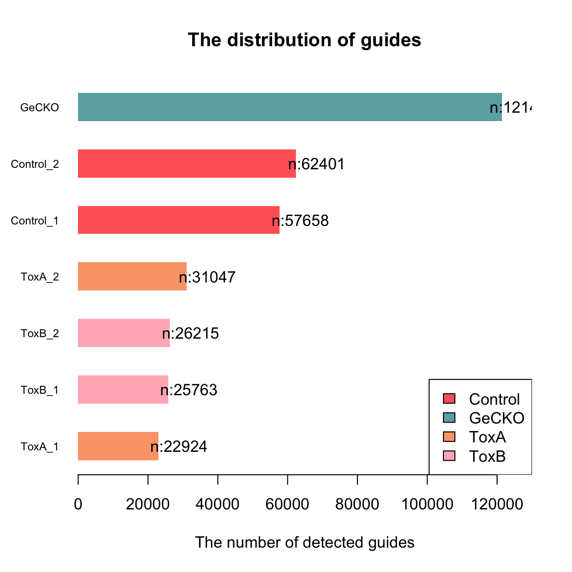
Evaluate the uniformity
The Gini index, originally an economic measure of inequality, is used in CRISPR analysis to evaluate the uniformity of sgRNA presence. A Gini index of 0 indicates evenness, while an index of 1 suggests unevenness. Here, it’s notable that the control samples exhibit greater uniformity compared to the treated samples.
Control_1 Control_2    ToxA_1    ToxA_2    ToxB_1    ToxB_2
0.7743390 0.7519516 0.9493576 0.9198235 0.9703805 0.9723415 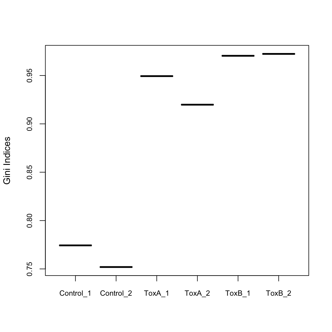
Remove lowly expressed guides
Guides lacking a substantial number of reads in any sample should be excluded from downstream analyses. There are multiple rationales for this choice. From a biological perspective, guides that fail to register at a biologically relevant level in any condition are deemed uninteresting and are consequently disregarded. From a statistical standpoint, the elimination of guides with low counts enhances the reliability of estimating the mean-variance relationship in the data. It also reduces the number of statistical tests required for subsequent analyses focused on differential abundance.
To implement this, here we used two filtering methods: one permissive and the other strict. For the rigorous approach, guides with low expression were filtered out, retaining as many guides as possible with meaningful counts. This was achieved using the filterByExpr() function in the edgeR package, a tool commonly applied in RNA-seq experiments for automated gene filtering. Initially, the count matrix contained 122,411 guides. After applying filterByExpr(), 113,395 guides (93%) were removed due to their low presence, leaving 9,016 guides for further analysis. It’s worth noting that filterByExpr() often retains only one guide per gene, which is sub optimal for CRISPR screens, where the collective behavior of multiple guides targeting the same gene is essential for validation.
To address this limitation, we used a more permissive filtering approach. This method involved defining guide-wise threshold (\(th1\)) and sample-wise threshold (\(th2\)). We utilize CPM (Counts Per Million) values instead of raw counts to prevent bias toward samples with larger library sizes. For this dataset, the median library size is about \(341,201\) and \(th1\) is computed as \(1e6/341201 ≈ 0.29\), so the permissive filtering keeps the guides that have a CPM of 0.29 or more in at least \(th2=2\) samples.
This approach aims to strike a balance, allowing for the inclusion of as many guides as possible targeting the same gene, facilitating a more robust assessment of the collective impact of guides in CRISPR screens. Consequently, with the permissive approach, we retained \(58171 (48\%)\) of the guides.
Strict filtering
keep.exprs
 FALSE   TRUE
112601 8810 [1] 8810 6[1] 7277
   1    2    3    4    5    6
5912 1215 135 13 1 1 barplot(nsgrna, col = "#FF9999", ylim = c(0, 7000), border = NA, main = "The distribution of number of sgRNAs per gene \n (After strict filtering)")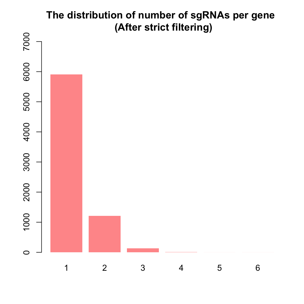
Permissive filtering
th1 <- as.vector(cpm(1, median(d$samples$lib.size)))
th1  # median count per million reads (1e6/mean(d$samples$lib.size))
[1] 2.930824th2 <- 2 # average number of sample per condition
keep.exprs <- rowSums(cpm(d) > th1) >= th2
table(keep.exprs)keep.exprs
FALSE TRUE
65484 55927 [1] 55927 6[1] 19659
   1    2    3    4    5    6
2867 5150 5870 3983 1516 273 barplot(nsgrna, col = "#FF9999", ylim = c(0, 7000), border = NA, main = "The distribution of number of sgRNAs per gene \n (After permissive filtering)")
Look at density plots
x <- d
nsamples <- ncol(x)
col.density <- brewer.pal(nsamples, "Paired")
par(mfrow = c(1, 3))
samplenames <- colnames(x)
cpm <- cpm(x)
lcpm <- cpm(x, log = TRUE)
L <- mean(x$samples$lib.size) * 1e-06
M <- median(x$samples$lib.size) * 1e-06
lcpm.cutoff <- log2(10/M + 2/L)
plot(density(lcpm[, 1]), col = col.density[1], lwd = 2, ylim = c(0,
    8), las = 2, main = "", xlab = "")
title(main = "A. Raw data", xlab = "Log-cpm")
abline(v = lcpm.cutoff, lty = 3)
for (i in 2:nsamples) {
    den <- density(lcpm[, i])
    lines(den$x, den$y, col = col.density[i], lwd = 2)
}
legend("topright", samplenames, text.col = col.density, bty = "n")

x <- d.filtered.p
cpm <- cpm(x)
lcpm <- cpm(x, log = TRUE)
L <- mean(x$samples$lib.size) * 1e-06
M <- median(x$samples$lib.size) * 1e-06
lcpm.cutoff <- log2(10/M + 2/L)
plot(density(lcpm[, 1]), col = col.density[1], lwd = 2, ylim = c(0,
    6), las = 2, main = "", xlab = "")
title(main = "A. Permissively filtered data", xlab = "Log-cpm")
abline(v = lcpm.cutoff, lty = 3)
for (i in 2:nsamples) {
    den <- density(lcpm[, i])
    lines(den$x, den$y, col = col.density[i], lwd = 2)
}
legend("topright", samplenames, text.col = col.density, bty = "n")

x <- d.filtered.s
cpm <- cpm(x)
lcpm <- cpm(x, log = TRUE)
L <- mean(x$samples$lib.size) * 1e-06
M <- median(x$samples$lib.size) * 1e-06
lcpm.cutoff <- log2(10/M + 2/L)
plot(density(lcpm[, 1]), col = col.density[1], lwd = 2, ylim = c(0,
    2), las = 2, main = "", xlab = "")
title(main = "A. Strictly filtered data", xlab = "Log-cpm")
abline(v = lcpm.cutoff, lty = 3)
for (i in 2:nsamples) {
    den <- density(lcpm[, i])
    lines(den$x, den$y, col = col.density[i], lwd = 2)
}
legend("topright", samplenames, text.col = col.density, bty = "n")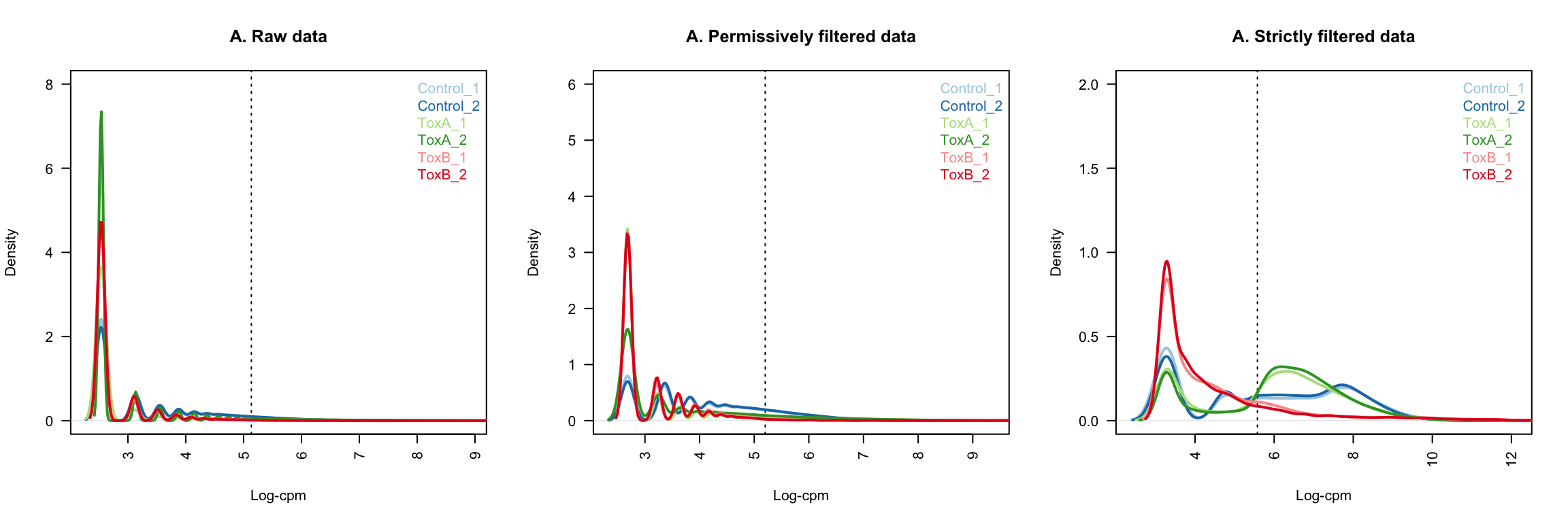
Normalise the counts
During the sample preparation or sequencing process, external factors that are not of biological interest can affect the expression of individual samples.
For example, samples processed in the first batch of an experiment can have higher expression overall when compared to samples processed in a second batch.
It is assumed that all samples should have a similar range and distribution of expression values.
Normalisation is required to ensure that the expression distributions of each sample are similar across the entire experiment.
It is common practice to transform raw counts to a scale that accommodates differences in library sizes.
Here we first transformed raw counts into counts per million (CPM) and log 2-counts per million (log-CPM) values using the cpm function in edgeR.
CPM normalised counts
par(mfrow = c(1, 3))

yy <- d[, order(d$samples$group, colSums(d$counts))]
yy.logcpm <- cpm(yy, log = T)
boxplot(yy.logcpm, las = 2, pch = 19, col = col[as.factor(yy$samples$group)],
    outcex = 0.3, outcol = col[as.factor(yy$samples$group)], labels = colnames(yy.logcpm),
    main = "A. CPM normalised raw data", ylab = "SgRNA representation (log2 cpm normalised reads)")
legend("topleft", legend = levels(factor(yy$samples$group)), col = col,
    pch = 19, cex = 0.5)

yy <- d.filtered.p[, order(d.filtered.p$samples$group, colSums(d.filtered.p$counts))]
yy.logcpm <- cpm(yy, log = T)
boxplot(yy.logcpm, las = 2, pch = 19, col = col[as.factor(yy$samples$group)],
    outcex = 0.3, outcol = col[as.factor(yy$samples$group)], labels = colnames(yy.logcpm),
    main = "B. CPM normalised permissively filtered data", ylab = "SgRNA representation (log2 cpm normalised reads)")
legend("topleft", legend = levels(factor(yy$samples$group)), col = col,
    pch = 19, cex = 0.5)

yy <- d.filtered.s[, order(d.filtered.s$samples$group, colSums(d.filtered.s$counts))]
yy.logcpm <- cpm(yy, log = T)
boxplot(yy.logcpm, las = 2, pch = 19, col = col[as.factor(yy$samples$group)],
    outcex = 0.3, outcol = col[as.factor(yy$samples$group)], labels = colnames(yy.logcpm),
    main = "C. CPM normalised strictly filtered data", ylab = "SgRNA representation (log2 cpm normalised reads)")
legend("topleft", legend = levels(factor(yy$samples$group)), col = col,
    pch = 19, cex = 0.5)
Next we applied the TMM normalisation using normLibSizes function in edgeR.
When working with DGEList-objects, the normalisation factors are automatically stored.
For this dataset, the effect of TMM is mild, as evident in the magnitude of the scaling factors, which are all not too far from 1 as we expected them to be.
TMM normalised counts
par(mfrow = c(2, 2))

yy <- d.filtered.p[, order(d.filtered.p$samples$group, colSums(d.filtered.p$counts))]
yy$samples$norm.factors <- normLibSizes(yy$counts, method = "TMM")
yy$samples[, 1:3]
group lib.size norm.factors
Control_2 Control 258228 1.3182523
Control_1 Control 261610 1.3544882
ToxA_2 ToxA 323563 1.1733655
ToxA_1 ToxA 334876 1.2013967
ToxB_2 ToxB 344894 0.5817462
ToxB_1 ToxB 346781 0.6829248yy.logcpm <- cpm(yy, log = T)
boxplot(yy.logcpm, las = 2, pch = 19, col = col[as.factor(yy$samples$group)],
outcex = 0.3, outcol = col[as.factor(yy$samples$group)], labels = colnames(yy.logcpm),
main = "B. TMM normalised permissively ed data", ylab = "SgRNA representation (log2 cpm normalised reads)")
legend("topleft", legend = levels(factor(yy$samples$group)), col = col,
pch = 19, cex = 0.5)
yy <- d.filtered.p[, order(d.filtered.p$samples$group, colSums(d.filtered.p$counts))]
yy$samples$norm.factors <- normLibSizes(yy$counts + 100, method = "TMM")
yy$samples[, 1:3] group lib.size norm.factors
Control_2 Control 258228 1.0193334
Control_1 Control 261610 1.0187857
ToxA_2 ToxA 323563 0.9939975
ToxA_1 ToxA 334876 0.9917365
ToxB_2 ToxB 344894 0.9884410
ToxB_1 ToxB 346781 0.9882539yy.logcpm <- cpm(yy, log = T)
boxplot(yy.logcpm, las = 2, pch = 19, col = col[as.factor(yy$samples$group)],
outcex = 0.3, outcol = col[as.factor(yy$samples$group)], labels = colnames(yy.logcpm),
main = "B. TMM offset-normalised permissively filtered data", ylab = "SgRNA representation (log2 cpm normalised reads)")
legend("topleft", legend = levels(factor(yy$samples$group)), col = col,
pch = 19, cex = 0.5)
yy.norm <- yy # we continue downstream analysis with this object
yy <- d.filtered.s[, order(d.filtered.s$samples$group, colSums(d.filtered.s$counts))]
yy$samples$norm.factors <- normLibSizes(yy$counts, method = "TMM")
yy$samples[, 1:3] group lib.size norm.factors
Control_1 Control 56390 2.0995847
Control_2 Control 57402 1.8983192
ToxA_2 ToxA 242030 1.9418813
ToxA_1 ToxA 283958 1.8621100
ToxB_1 ToxB 298310 0.2919254
ToxB_2 ToxB 300952 0.2376826yy.logcpm <- cpm(yy, log = T)
boxplot(yy.logcpm, las = 2, pch = 19, col = col[as.factor(yy$samples$group)],
outcex = 0.3, outcol = col[as.factor(yy$samples$group)], labels = colnames(yy.logcpm),
main = "B. TMM normalised strictly filtered data", ylab = "SgRNA representation (log2 cpm normalised reads)")
legend("topleft", legend = levels(factor(yy$samples$group)), col = col,
pch = 19, cex = 0.5)
yy <- d.filtered.s[, order(d.filtered.s$samples$group, colSums(d.filtered.s$counts))]
yy$samples$norm.factors <- normLibSizes(yy$counts + 100, method = "TMM")
yy$samples[, 1:3] group lib.size norm.factors
Control_1 Control 56390 1.1054064
Control_2 Control 57402 1.1063956
ToxA_2 ToxA 242030 1.0496637
ToxA_1 ToxA 283958 1.0223192
ToxB_1 ToxB 298310 0.8749980
ToxB_2 ToxB 300952 0.8708108yy.logcpm <- cpm(yy, log = T)
boxplot(yy.logcpm, las = 2, pch = 19, col = col[as.factor(yy$samples$group)],
outcex = 0.3, outcol = col[as.factor(yy$samples$group)], labels = colnames(yy.logcpm),
main = "B. TMM offset-normalised strictly filtered data", ylab = "SgRNA representation (log2 cpm normalised reads)")
legend("topleft", legend = levels(factor(yy$samples$group)), col = col,
pch = 19, cex = 0.5)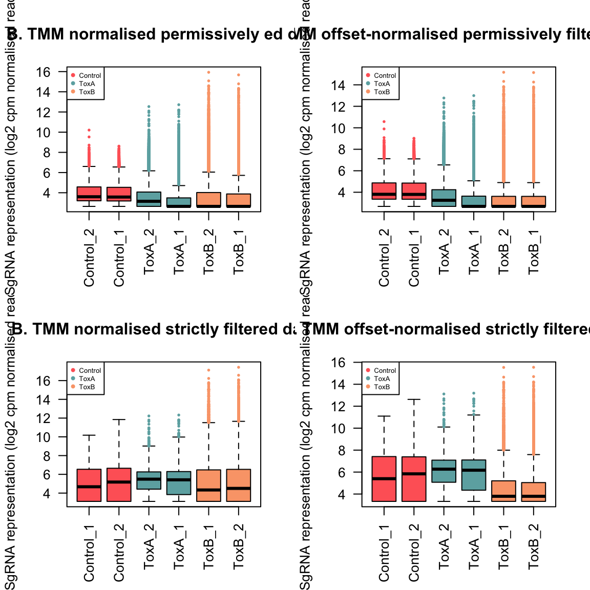
A normalization factor below one indicates that a small number of high count genes are monopolizing the sequencing, causing the counts for other genes to be lower than would be usual given the library size. As a result, the library size will be scaled down, analogous to scaling the counts upwards in that library. Conversely, a factor above one scales up the library size, analogous to downscaling the counts.
Unsupervised clustering of samples
Multi-dimensional scaling (MDS) plot visually illustrates the similarities and dissimilarities between samples in an unsupervised manner, offering insight into the potential for detecting differential expression before conducting formal tests.
By default, leading fold-change is defined as the root-mean-square of the largest 500 log2-fold changes between the pair of samples.
We use plotMDS function from limma package. Loading the limma package is unnecessary, as edgeR already incorporates and calls its functions.
lcpm <- cpm(yy.norm, log = TRUE)
cols <- col
plotMDS(lcpm, col = cols[factor(yy.norm$samples$group)], main = "MDS plot of permissevly filtered and TMM normalised data",
    pch = 16, cex = 2)
legend("bottomright", legend = levels(factor(yy.norm$samples$group)),
    col = cols, pch = 16, cex = 0.8)
# The code below is an optional interactive version of MDS plots
# produced by Glimma<https://github.com/shians/Glimma>
glMDSPlot(lcpm, labels = yy.norm$samples$sampleName, groups = yy.norm$samples$group,
    launch = FALSE)
We can see that the biological replicates of control and treated samples cluster well within the groups over dimension 1 and 2. The first dimension accounts for largest variability in the data. Then the larger the dimension, the lower the variation is. While samples exhibit grouping tendencies, there are significant abundance distinctions between control and treated samples. Consequently, we anticipate that when performing pairwise comparisons among control and treated samples, there will be a higher count of differentially abundant guides in comparisons. Datasets in which samples do not exhibit distinct clustering based on experimental groups may exhibit minimal or no indications of differential abundance in subsequent analyses.
0.1 Visualise expression profiles of samples
A more in-depth examination of individual sample expression profiles can be achieved through mean-difference (MD) plots. An MD plot visualizes the library size-adjusted log-fold change between two libraries (the difference) against the average log-expression across those libraries (the mean). It is a good practice to look at MD plots for all samples for a quality check. We use plotMD from edgeR package to do that.
par(mfrow = c(3, 2))
for (i in 1:6) {
    plotMD(yy.norm, column = i)
    abline(h = 0, col = "red", lty = 2, lwd = 2)
}
When bulk of the counts are centered around the line of zero log-fold change. The diagonal lines in the lower left of the plot correspond to genes with counts of 0, 1, 2 and so on in the first sample.
For a good quality, we expect he majority of the counts to be concentrated near the zero log-fold change line. However, this is hardly ever the case for CRISPR experiments due to the sparse nature of CRISPR screen counts. The diagonal lines in the lower-left portion of the plot correspond to guides with counts of 0, 1, 2, and so forth. And it is typical to observe a positive skew, with a number of very highly upregulated guides in the upper right of the treated sample plots. These points correspond to the guides that are both highly abundant and highly up-regulated in the given sample compared to others. Especially ToxB samples are more positively skewed than ToxA samples. These guides also explain why the normalization factor for ToxB sample were well below one before adding an offset. By contrast, the log-ratios for control samples were somewhat negatively skewed, corresponding to their normalization factor above one. Although we used TMM normalisation with an added offset to the counts, a more specialised normalisation methods are needed for accurate CRISPR screen analyses.