3 Finding Interesting Summaries of the Data
We want to find slices of the data which are interesting and informative. As newcomers to the sport of cricket, we might be interested in what a typical scoreline looks like in the cricket world, and whether this varies by format.
Note: Going forward, for the sake of simplicity, teams batting in the first innings will be referred to as the “home” team, while teams batting in the second innings will be referred to as the “away” team.
home <- gamelog %>% filter(NumOutcome!=-1,Inning==1) %>% group_by(Format,MatchNo) %>%
        dplyr::summarise(home = sum(NumOutcome))
away <- gamelog %>% filter(NumOutcome!=-1,Inning==2) %>% group_by(Format,MatchNo) %>%
        dplyr::summarise(away = sum(NumOutcome))
score <- merge(home,away)
score$Format <- factor(score$Format)library(ggplot2)
p <- ggplot(score, aes(away,home)) + geom_density_2d_filled() + facet_wrap(vars(Format))+
geom_abline(intercept=0,slope=1,colour='red') + geom_point(colour='white',alpha=0.2)+
geom_abline(intercept=50,slope=1,colour='red',linetype='dashed') +
theme_bw() + theme(legend.position='none')
p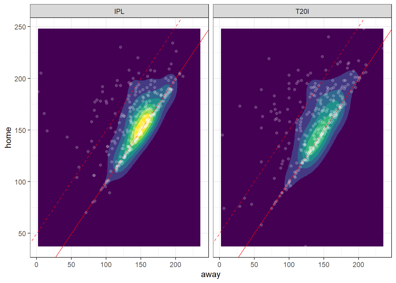
Observe that in the IPL, the most common scores are in the vicinity of 150 for both home and away teams, whereas in the T20I format, the centre of the innermost cluster is a little lower, at about 140 runs for each team. In general, however, the distribution of scores across these two formats is quite similar, and perhaps statistically insignificant. We see, as we would expect, that games won by the team batting second (the “away” team) have a close score, not deviating far from the line with unit slope passing through the origin; this is because the game ends as soon as the away team scores more runs than the home team. On the flip side, “blowout” victories of above 50 runs (above the dashed line) of the home team are possible, though most games are within 50 runs.
Consider the following:
library(dplyr)
library(ggplot2)

sixes <- gamelog %>% group_by(Over=Over+1,Wickets=Wickets+1) %>% filter(length(NumOutcome) > 7) %>% dplyr::summarise(prob=sum(NumOutcome==6)/length(NumOutcome))

ggplot(sixes,aes(Over,Wickets,fill=prob)) + geom_tile()+ scale_fill_gradient(low='blue',high = 'yellow') +
  theme_bw() + labs(title="Chance of a 6-Run Play by T20 Game Situation",fill="Probability")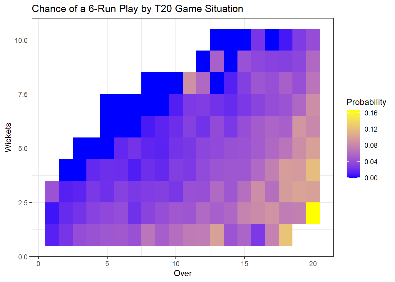
This is a heatmap of the empirical chance of any throw/ball/pitch ending up as a six (a “home run”, in baseball terms) as a function of overs and wickets taken. All games start in the lower-left corner, with 20 overs and 10 wicketrs remaining. From there, plausible game situations “fan out”, where games with situations following the top of the fan are those where relatively few batters are dismissed by the time most of the overs are used.
In these games, many sixes occur in the late game. Scoring a six involves hitting the ball with great power, which involves taking a greater risk of a dismissal. Since in these low-dismissal games, remaining throws are a more precious resource than remaining wickets, this high-risk, high-reward strategy is rational.
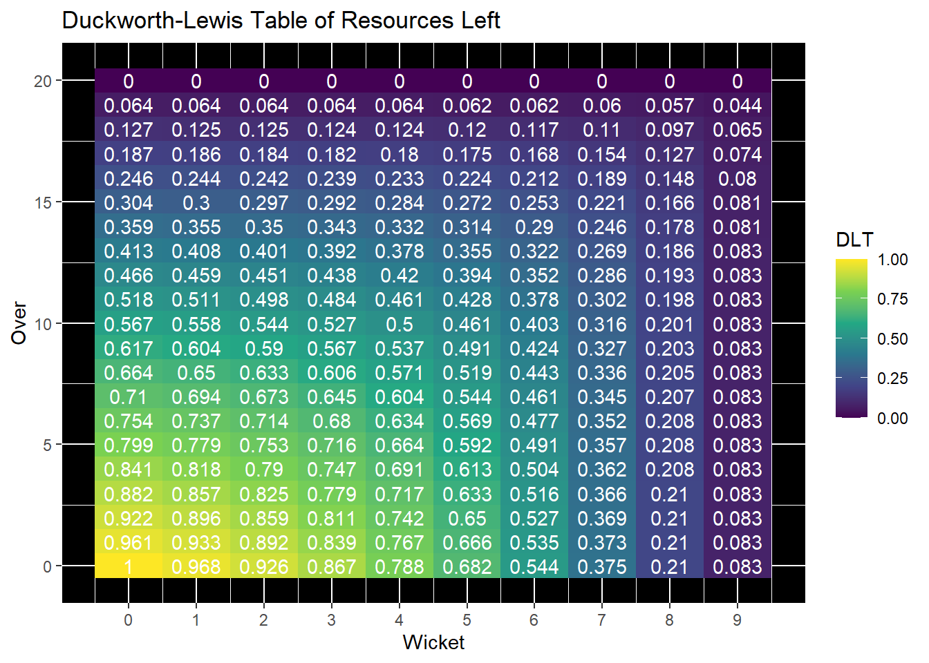
DLS2 <- expand.grid(Over = 0:20,Wicket=0:9)
DLS2$DLT = c(DLS$`Wicket 0`,DLS$`Wicket 1`,DLS$`Wicket 2`,DLS$`Wicket 3`,DLS$`Wicket 4`,DLS$`Wicket 5`,DLS$`Wicket 6`,DLS$`Wicket 7`,DLS$`Wicket 8`,DLS$`Wicket 9`)
ggplot(DLS2,aes(Wicket,Over,fill=DLT)) + geom_tile() + scale_fill_continuous(type='viridis') +
      ggtitle("Duckworth-Lewis Table of Resources Left") +
      geom_text(label=DLS2$DLT,check_overlap=T,colour='white') +
      theme(panel.background=element_rect(fill='black')) +
      scale_x_continuous(breaks=0:9)