4 Session 3: Data analysis and visualization
Aim: To provide tools for extracting answers from your data.
Intended Learning Outcomes:
At the end of the session a successful student will be able to:
Build an analysis dataset
Filter, group, and summarise data to answer questions
Build presentation-ready tables using R
Understand the key concepts behind making graphs with ggplot
4.1 What will be covered today?
4.2 Looking at your data
Section from Epidemiologist R handbook- 17 Descriptive Tables
There are many functions available to look at descriptive statistics from your dataset. For this example, we will use a function that is included in the basic installation of R.
library(here)
pacman::p_load(here)
africa_covid_cases_long <- read.csv(here('data', 'africa_covid_cases_long.csv'))
summary(africa_covid_cases_long)
## X ISO COUNTRY_NAME AFRICAN_REGION
## Min. : 1 Length:25917 Length:25917 Length:25917
## 1st Qu.: 6480 Class :character Class :character Class :character
## Median :12959 Mode :character Mode :character Mode :character
## Mean :12959
## 3rd Qu.:19438
## Max. :25917
##
## excel_date cases date_format
## Min. :43831 Min. : -209.0 Length:25917
## 1st Qu.:43953 1st Qu.: 0.0 Class :character
## Median :44075 Median : 7.0 Mode :character
## Mean :44075 Mean : 177.6
## 3rd Qu.:44197 3rd Qu.: 78.0
## Max. :44319 Max. :21980.0
## NA's :231This function provides useful information which we can use for building our approach to designing an analysis workflow. For example, we can see from the summary of the date variable that the first record (Min) is from 2020-01-01 and the last record (Max) is from 2021-05-03, For the cases variable, the maximum number of cases recorded on one day was 6,195.
4.3 Building an analysis dataset
Before analysing the data, it is good to generate a new dataset that only contains the variables you need to analyse.
So what variables do we have in africa_covid_cases_long
names(africa_covid_cases_long)## [1] "X" "ISO" "COUNTRY_NAME" "AFRICAN_REGION"
## [5] "excel_date" "cases" "date_format"We can select the variables we want to keep using the select function from the dplyr package. dplyr is a core package of the tidyverse so it is loaded when you write library(tidyverse).
library(tidyverse) # this will load the dplyr package along with other core tidyverse packages
library(dplyr) # this will only load the dplyr package
# you don't need to run both lines! Loading a package twice will not have any negative consequences. But it makes your code less efficient to read!
analysis_dataset <- africa_covid_cases_long %>% #use this dataset
  select(date_format,AFRICAN_REGION, COUNTRY_NAME, cases) #select the named columns
The select function from the dplyr package is very useful. It is used to tell R which columns you want to keep in the new data frame. We can look at the first few rows of the dataset we have created to check that we have selected the correct variables.
head(analysis_dataset)## date_format AFRICAN_REGION COUNTRY_NAME cases
## 1 2020-01-01 Northern Africa Algeria 0
## 2 2020-01-02 Northern Africa Algeria 0
## 3 2020-01-03 Northern Africa Algeria 0
## 4 2020-01-04 Northern Africa Algeria 0
## 5 2020-01-05 Northern Africa Algeria 0
## 6 2020-01-06 Northern Africa Algeria 0The select function can also be used to rename selected variables.
analysis_dataset <- africa_covid_cases_long %>%
  select(date_format,region=AFRICAN_REGION, country=COUNTRY_NAME, cases) %>%
  mutate(date=lubridate::ymd(date_format))
We have renamed AFRICAN_REGION and COUNTRY_NAME as region and country.
head(analysis_dataset)## date_format region country cases date
## 1 2020-01-01 Northern Africa Algeria 0 2020-01-01
## 2 2020-01-02 Northern Africa Algeria 0 2020-01-02
## 3 2020-01-03 Northern Africa Algeria 0 2020-01-03
## 4 2020-01-04 Northern Africa Algeria 0 2020-01-04
## 5 2020-01-05 Northern Africa Algeria 0 2020-01-05
## 6 2020-01-06 Northern Africa Algeria 0 2020-01-064.4 Answering questions with data
The Epidemiologist R handbook has several comprehensive sections focusing on data analysis. We will continue to work with the dataset we have built while applying some of the examples from the handbook.
So far, we have:
Imported the data from an Excel worksheet
Reshaped the data into a “tidy” format
Changed the format of a variable to a date
Selected only the variables we want to use for the analysis
Now we can start to use the dataset to answer questions. The dplyr package contains many useful functions for analysing data. Some of these functions are covered in the Epidemiologist R Handbook - Section 17.4. We will use some of these functions to answer questions using our dataset.
How many confirmed cases of COVID-19 have been recorded in Africa?
analysis_dataset %>%  # Tell R what dataset we want to use
    summarise(total_covid_cases=sum(cases))  #Tell R you want to sum all cases
## total_covid_cases
## 1 NAThe answer is “NA”, which stands for “Not Available”. This is a good example of how R “sees” missing data
There may be dates in our dataset where there were no confirmed cases of COVID-19 recorded.
When data are missing, R will display “NA” for the variable.
If you try to run a calculation on data where there is one or more “NA” values, the results will be “NA”.
One option for dealing with missing values in R is to exclude “NA” values from calculations. To do this we, can add an additional argument to the function to remove any record with “NA” in the variable “cases”.
total_covid_cases <- analysis_dataset %>%
    summarise(total_covid_cases=sum(cases, na.rm=TRUE)) #Tell R you want to sum all cases but remove NA values - values with "missing" data
total_covid_cases
## total_covid_cases
## 1 4561465This command has now excluded NA values and has provided us with an answer for the number of confirmed COVID-19 cases in Africa - 4561465.
4.4.1 Grouping and pivoting data
group_by is a very powerful function for summarising data. You can instruct R to recognise specific groups in your data. Functions can then be applied to these groups providing you with additional information.
How many confirmed cases of COVID-19 have been recorded in Africa, by region?
total_covid_cases_region <- analysis_dataset %>%
  group_by(region) %>% #use the values in the region column to group the data
    summarise(total_covid_cases=sum(cases, na.rm=TRUE)) #for each region, sum the number of cases
total_covid_cases_region
## # A tibble: 5 x 2
## region total_covid_cases
## <chr> <int>
## 1 Central Africa 161353
## 2 Eastern Africa 622537
## 3 Northern Africa 1371469
## 4 Southern Africa 1970137
## 5 Western Africa 435969The arrange function can be used to sort the results. In this case, we have instructed R to sort the results by the total_covid_cases variable, from highest to lowest value.
total_covid_cases_region_sort <- analysis_dataset %>%
  group_by(region) %>% #use the values in the region column to group the data
    summarise(total_covid_cases=sum(cases, na.rm=TRUE)) %>%
  arrange(-total_covid_cases)
total_covid_cases_region_sort
## # A tibble: 5 x 2
## region total_covid_cases
## <chr> <int>
## 1 Southern Africa 1970137
## 2 Northern Africa 1371469
## 3 Eastern Africa 622537
## 4 Western Africa 435969
## 5 Central Africa 161353We can add multiple variables to group_by.
If we add region and country to the group_by command, sort from highest to lowest, we can see which countries reported the most confirmed COVID-19 cases.
total_covid_cases_region_country_sort <- analysis_dataset %>%
  group_by(region, country) %>%
    summarise(total_covid_cases=sum(cases, na.rm=TRUE)) %>% #for each region, sum the number of cases
  arrange(-total_covid_cases) #sort the result from highest to lowest number of cases
## `summarise()` has grouped output by 'region'. You can override using the `.groups` argument.total_covid_cases_region_country_sort## # A tibble: 53 x 3
## # Groups: region [5]
## region country total_covid_cases
## <chr> <chr> <int>
## 1 Southern Africa South Africa 1584064
## 2 Northern Africa Morocco 511856
## 3 Northern Africa Tunisia 311743
## 4 Eastern Africa Ethiopia 258353
## 5 Northern Africa Egypt 228584
## 6 Northern Africa Libya 178335
## 7 Western Africa Nigeria 165199
## 8 Eastern Africa Kenya 160559
## 9 Northern Africa Algeria 122522
## 10 Western Africa Ghana 92683
## # … with 43 more rows4.4.2 Filtering data
Another useful function is filter which can be used to apply filters to calculations.
We can repeat the previous calculation, but then add a filter to only include results from countries in Northern Africa.
analysis_dataset %>%
  group_by(region, country) %>%
    summarise(total_covid_cases=sum(cases, na.rm=TRUE)) %>%
  arrange(-total_covid_cases) %>% #sort the result from highest to lowest number of cases
  filter(region=="Northern Africa") #filter the result to only include rows where the region is "Northern Africa"
## `summarise()` has grouped output by 'region'. You can override using the `.groups` argument.## # A tibble: 6 x 3
## # Groups: region [1]
## region country total_covid_cases
## <chr> <chr> <int>
## 1 Northern Africa Morocco 511856
## 2 Northern Africa Tunisia 311743
## 3 Northern Africa Egypt 228584
## 4 Northern Africa Libya 178335
## 5 Northern Africa Algeria 122522
## 6 Northern Africa Mauritania 18429The filter can be applied at any point within the calculation. For very complex calculations, it is helpful to apply the filter as early as possible. This reduces the number of records before the complex portion of the calculation occurs.
filter can also be used to make data frames
northern_africa <- analysis_dataset %>%
  filter(region=="Northern Africa")
head(northern_africa)
## date_format region country cases date
## 1 2020-01-01 Northern Africa Algeria 0 2020-01-01
## 2 2020-01-02 Northern Africa Algeria 0 2020-01-02
## 3 2020-01-03 Northern Africa Algeria 0 2020-01-03
## 4 2020-01-04 Northern Africa Algeria 0 2020-01-04
## 5 2020-01-05 Northern Africa Algeria 0 2020-01-05
## 6 2020-01-06 Northern Africa Algeria 0 2020-01-06Using filters, we can answer additional questions.
What percentage of North Africa’s confirmed COVID-19 cases were recorded in each country in North Africa?
#to convert the calculation to percentage we will need to install and load an additional package called "scales"
pacman::p_load(scales)

northern_africa_cases_country <- northern_africa %>%
  group_by(country) %>%
  summarise(total_covid_cases=sum(cases, na.rm=TRUE)) %>%
  mutate(percentage=scales::percent(total_covid_cases/sum(total_covid_cases))) %>%
  #with this mutate command we are telling r to divide the total number of covid cases for each country by the total number of covid cases for all countries in northern africa
  arrange(-total_covid_cases)
northern_africa_cases_country
## # A tibble: 6 x 3
## country total_covid_cases percentage
## <chr> <int> <chr>
## 1 Morocco 511856 37.3%
## 2 Tunisia 311743 22.7%
## 3 Egypt 228584 16.7%
## 4 Libya 178335 13.0%
## 5 Algeria 122522 8.9%
## 6 Mauritania 18429 1.3%4.5 Visualising data using ggplot
One of the major strengths of R is visualising data. There are many packages which have functions you can use to make graphs, tables, maps…the list is endless! The first package of functions we will use for visualising data is another core tidyverse package called ggplot2. This is commonly referred to as ggplot.
We have already loaded the package when we ran library(tidyverse). You can also choose to only load the ggplot2 package by typing library(ggplot2).
library(ggplot2)The Epidemiologist R handbook has 2 sections focused on ggplot:
These sections contain very helpful explanations of many of the functions available with ggplot. There are also a number of excellent references for every type of graph you want to make. We will walk through some common examples to teach some of the most common approaches.
4.5.1 Epicurves
Firstly, we will produce epicurves to describe the distribution of COVID-19 cases (y axis) over time (x axis). Make a graph of confirmed COVID-19 cases in Northern Africa. The Epidemiologist R handbook has a very useful section on this topic - 32.3 Epicurves with ggplot
ggplot(northern_africa, aes(x=date,y=cases)) +
  geom_line()
## Warning: Removed 7 row(s) containing missing values (geom_path).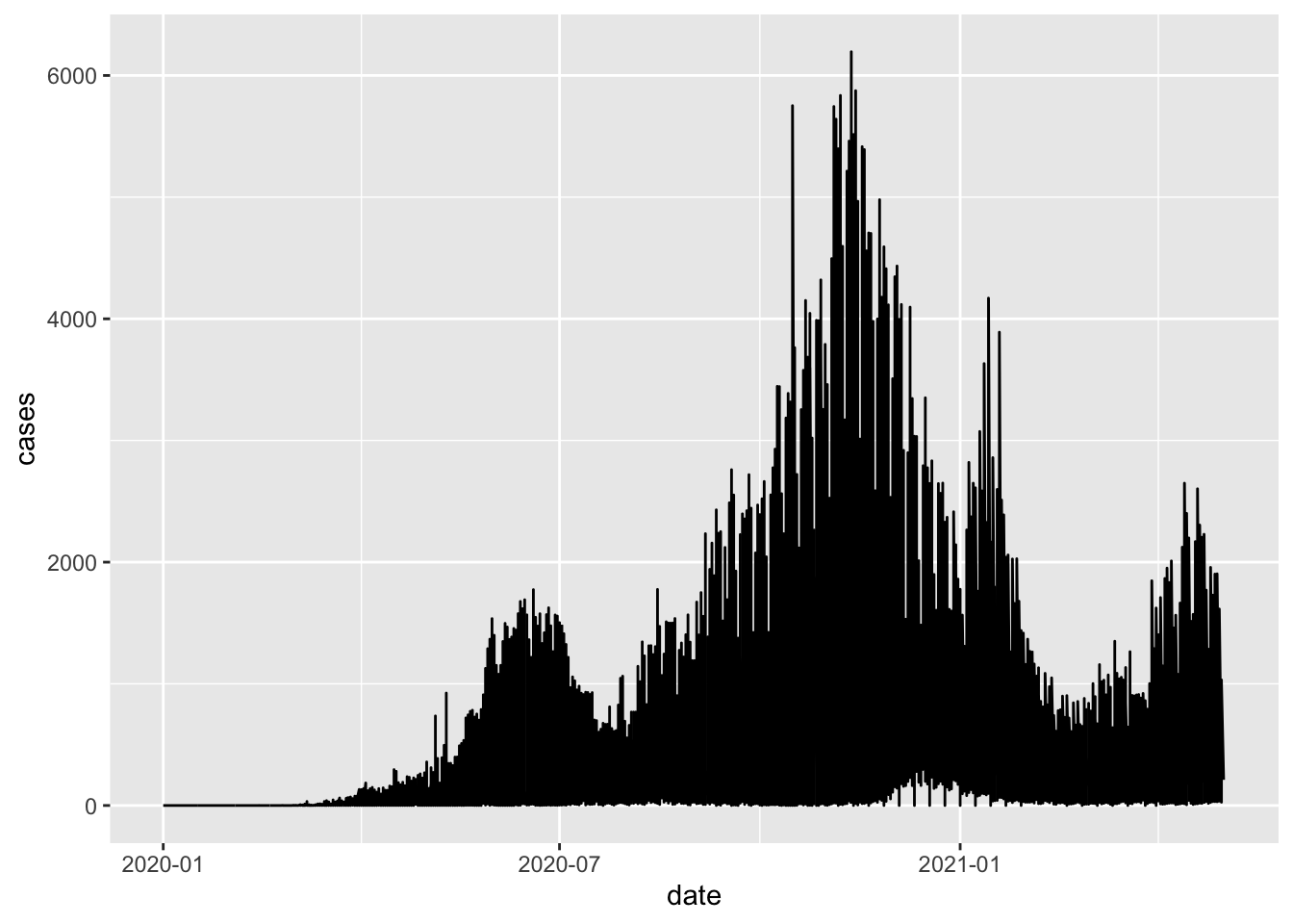
This command has generated a line graph of confirmed COVID-19 cases for countries in Northern Africa. From earlier steps, we know that the dataset northern_africa contains data from multiple countries: `r unique(northern_africa$country’. We can add more information to the ggplot command to draw separate lines for each country.
ggplot(northern_africa, aes(x=date,y=cases, color=country)) +
  geom_line()
## Warning: Removed 9 row(s) containing missing values (geom_path).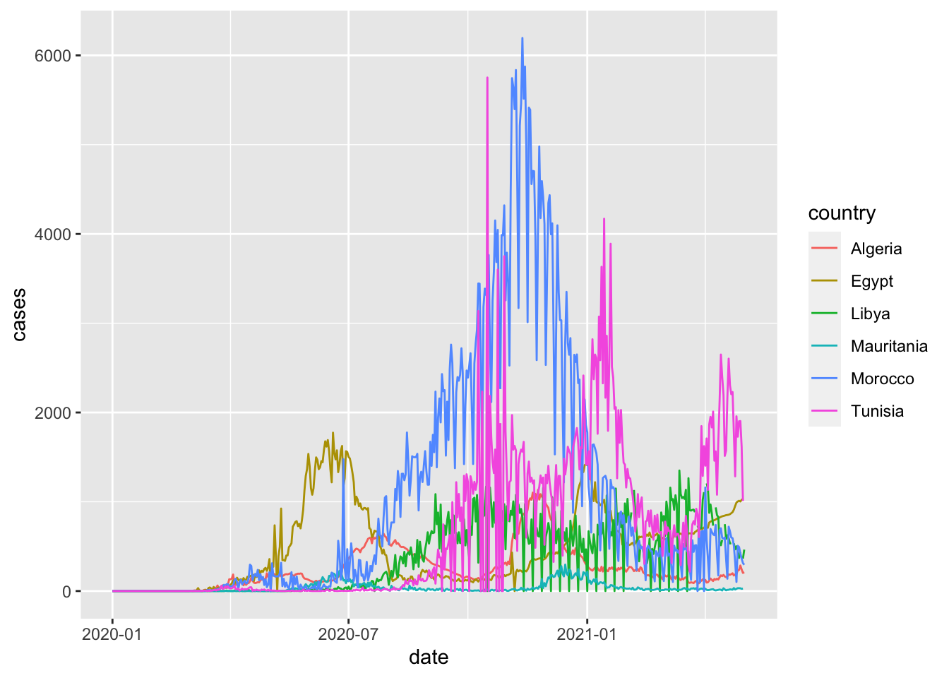
To make the graph more presentable, we can add more options to the ggplot command.
ggplot(northern_africa, aes(x=date,y=cases, color=country)) +
  geom_line() +
  labs(x='Date', y='Total cases', color='Country') + #label axes
  theme(legend.position='top') + #place legend at top of graph
  scale_x_date(date_breaks = '2 months', #set x axis to have 2 month breaks
               date_minor_breaks = '1 month', #set x axis to have 1 month breaks
               date_labels = '%b-%y') #change label for x axis
## Warning: Removed 9 row(s) containing missing values (geom_path).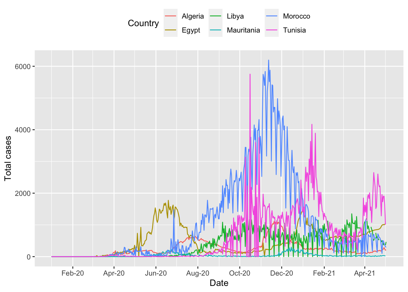
More information on plotting time-series data using ggplot can be found here.
It is still difficult to see the data for each country. There is a helpful command called facet_wrap to fix this and show multiple epicurves by country.
ggplot(northern_africa, aes(x=date,y=cases, color=country)) +
  geom_line() +
  labs(x='Date', y='Total cases') + #label axes
  theme(legend.position='none') + #remove legend by setting position to 'none'
  scale_x_date(date_breaks = '4 months', #set x axis to have 2 month breaks
               date_minor_breaks = '2 months', #set x axis to have 1 month breaks
               date_labels = '%b-%y') + #change label for x axis
  facet_wrap(~country) # this will create a separate graph for each country
## Warning: Removed 9 row(s) containing missing values (geom_path).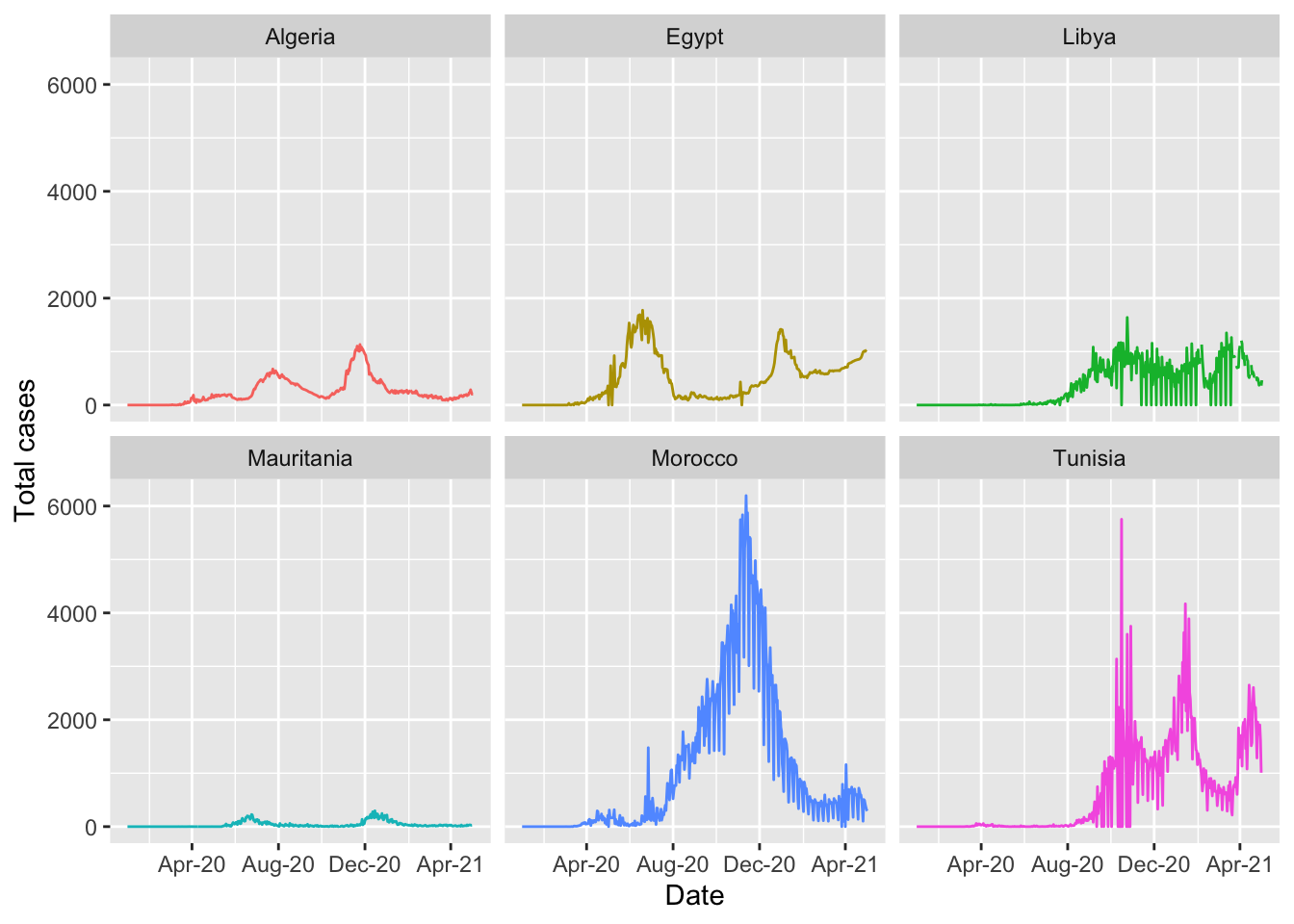
4.5.1.1 Highlighting
When data are presented for multiple countries, it can be helpful to highlight specific countries to show their path. This can be easily done in ggplot using the package gghighlight and is covered in the Epidemiologist R handbook Section 31.8 Highlighting.
pacman::p_load(gghighlight)
highlight_country_morocco_gph <- ggplot(northern_africa, aes(x=date,y=cases, color=country)) +
  geom_line() +
  gghighlight::gghighlight(country == "Morocco") + #highlight data reported by Morocco
  labs(x='Date', y='Total cases') + #label axes
  theme(legend.position='none') + #remove legend by setting position to 'none'
  scale_x_date(date_breaks = '4 months', #set x axis to have 2 month breaks
               date_minor_breaks = '2 months', #set x axis to have 1 month breaks
               date_labels = '%b-%y')  #change label for x axis
## Warning: Tried to calculate with group_by(), but the calculation failed.
## Falling back to ungrouped filter operation...## label_key: country highlight_country_morocco_gph## Warning: Removed 9 row(s) containing missing values (geom_path).## Warning: Removed 1 row(s) containing missing values (geom_path).## Warning: Removed 1 rows containing missing values (geom_label_repel).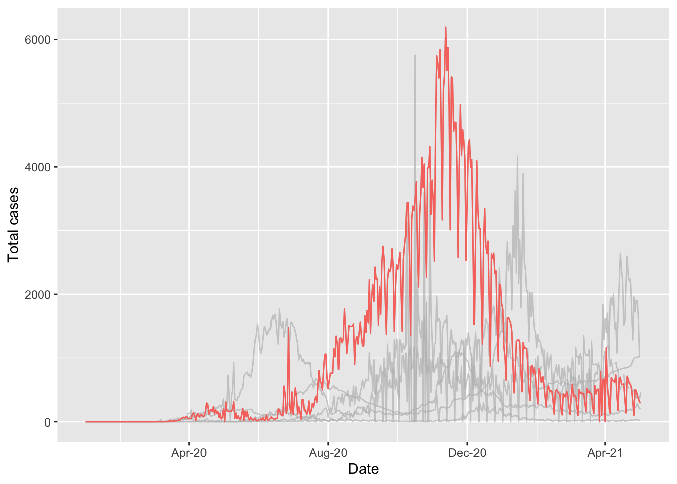
Highlighting can also be applied to graphs with the facet_wrap function applied.
highlight_country_facet_gph <- ggplot(northern_africa, aes(x=date,y=cases, color=country)) +
  geom_line() +
  labs(x='Date', y='Total cases') + #label axes
  gghighlight::gghighlight() + #highlight each country independently
  theme(legend.position='none') + #remove legend by setting position to 'none'
  scale_x_date(date_breaks = '4 months', #set x axis to have 2 month breaks
               date_minor_breaks = '2 months', #set x axis to have 1 month breaks
               date_labels = '%b-%y') + #change label for x axis
  facet_wrap(~country) # this will create a separate graph for each country
## label_key: countryhighlight_country_facet_gph## Warning: Removed 9 row(s) containing missing values (geom_path).
## Warning: Removed 9 row(s) containing missing values (geom_path).## Warning: Removed 6 rows containing missing values (geom_label_repel).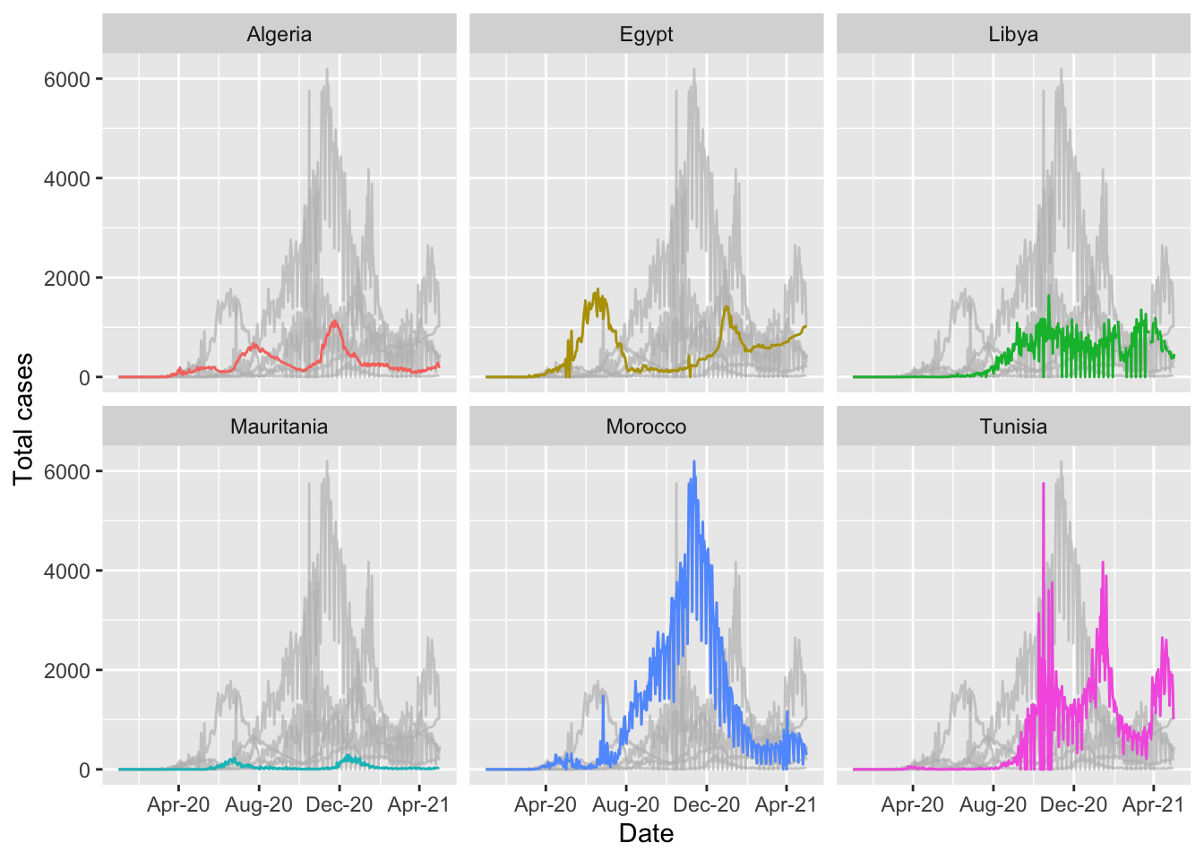
4.5.2 Building your confidence
This code can seem overwhelming at first. The method to build a ggplot is very different to the ‘point and click’ method used in Excel. It will be very helpful to your learning to work through each step and see what changes when you delete/add code. A very helpful package called eqsuisse can help you understand more about how ggplot works.
pacman::p_load(esquisse)
esquisse::esquisser()
Using this package, you can drag and drop variables, change the type of graph and make a lot customisations. You can also click the button “code” and it will show you what the ggplot code is for each graph you have selected. This code can then be copied into your R script.
4.6 Useful resources
Epidemiologist R handbook
Data Management
- 15: De-duplication
Analysis
- 17: Descriptive tables
- 22: Moving averages
Data visualization
- 30: ggplot basics
- 31: ggplot tips
- 32: Epidemic curves
Reports and dashboards
4.7 Additional questions and workflows
4.7.1 When was the first confirmed case of COVID-19 in Northern Africa?
first_cases_northern_africa <- northern_africa %>% # use the northern_africa data
  filter(cases>0) %>% #filter to only include rows with a case value of greater than 0
  filter(date == min(date, na.rm=TRUE))  #keep the row with the minimum (first) date
first_cases_northern_africa
## date_format region country cases date
## 1 2020-02-14 Northern Africa Egypt 1 2020-02-14Here we have added 2 filters:
Only keep records where the value for
casesis higher than 0.Only keep records where the value for
dateis equal to the minimum value fordate.We have also added thena.rm=TRUEcommand from a previous step. If you don’t know the data very well, it is good practice to add this command.
When was the first confirmed case of COVID-19 in Northern Africa, by country?
first_case_northern_africa_country <- northern_africa %>%
  group_by(country) %>%
  filter(cases>0) %>%
  filter(date == min(date, na.rm=TRUE))
first_case_northern_africa_country
## # A tibble: 6 x 5
## # Groups: country [6]
## date_format region country cases date
## <chr> <chr> <chr> <int> <date>
## 1 2020-02-25 Northern Africa Algeria 1 2020-02-25
## 2 2020-02-14 Northern Africa Egypt 1 2020-02-14
## 3 2020-03-24 Northern Africa Libya 1 2020-03-24
## 4 2020-03-13 Northern Africa Mauritania 1 2020-03-13
## 5 2020-03-02 Northern Africa Morocco 1 2020-03-02
## 6 2020-03-02 Northern Africa Tunisia 1 2020-03-02The filter function can also be used to exclude certain records from the analysis
first_case_northern_africa_country_exclude_tunisia <- northern_africa %>%
  group_by(country) %>%
  filter(cases>0) %>%
  filter(date == min(date, na.rm=TRUE)) %>%
  #filter(!country=="Tunisia") %>%
  filter(country!="Tunisia") #both methods for excluding results (in this case excluding results where the value for country is Tunisia) can be used
first_case_northern_africa_country_exclude_tunisia
## # A tibble: 5 x 5
## # Groups: country [5]
## date_format region country cases date
## <chr> <chr> <chr> <int> <date>
## 1 2020-02-25 Northern Africa Algeria 1 2020-02-25
## 2 2020-02-14 Northern Africa Egypt 1 2020-02-14
## 3 2020-03-24 Northern Africa Libya 1 2020-03-24
## 4 2020-03-13 Northern Africa Mauritania 1 2020-03-13
## 5 2020-03-02 Northern Africa Morocco 1 2020-03-02On what date was the 100th case of COVID-19 reported from each country in Northern Africa?
first_cases_northern_africa_data <- northern_africa %>%
  group_by(country) %>%
  mutate(cumulative_cases=cumsum(cases)) %>%
  filter(cumulative_cases>=100) %>%
  slice(1) %>%
  pull(date, country)
Here we have introduced two new functions, slice and pull. slice can be used to select specific rows from a dataset. In this case, we have added a column which is the cumulative number of cases, selected the first row after filtering the dataset to only include results where the value is greater than or equal to 100, and then selected the first row using the slice command. An additional function is the pull command. This is useful when you want to extract specific values from the result.
first_100cases <- northern_africa %>%
  group_by(country) %>%
  mutate(cumulative_cases=cumsum(cases)) %>%
  filter(cumulative_cases>=100) %>%
  slice(1) %>%
  pull(date, country)
The Epidemiologist R Handbook has a thorough section on slicing data: 15.3- Slicing
4.7.2 Using the results in RMarkdown
RStudio has a powerful tool for writing documents called RMarkdown. These slides were written in RMarkdown and there are many resources online built using the same approach.
One major benefit of RMarkdown is that it is an excellent tool for reproducible research.
RMarkdown will not be covered during this training, but there are excellent resources online providing walk-through guides and some are included in the useful resources section of this session.
Here is one example:
If we write this text
The first COVID-19 case recorded in Northern Africa was in `r first_cases_northern_africa %>% pull(country)` on `r first_cases_northern_africa %>% pull(date)`.it will work through the functions and this is the result
The first COVID-19 case recorded in Northern Africa was in Egypt on 2020-02-14.
If you were to re-run the report with data from eastern Africa, the figures would update using the same functions on the new dataset for eastern Africa. This is very helpful when multiple people work on a report that needs to be run at regular intervals.
4.7.3 Moving averages
The dataset is currently set up so that each row contains information on the number of recorded COVID-19 cases for a specific date for a specified country. One calculation that we may be interested in is the overall trend of case numbers over time. For this, we can calculate cumulative values and averages to identify any trends in the data.
To demonstrate this, we will filter the dataset only to include one country - in this case, Morocco.
morocco_covid_cases <- northern_africa %>%
  filter(country=="Morocco")
When data are collected daily, it can be helpful to apply functions to improve the interpretation of trends that may be present in the data. For example, with this COVID dataset, data are available for 489 days between January 1, 2020, & May 3, 2021. There will be some days when 0 cases are reported, and there will be some days when many more cases are reported. Some of these differences may be due to delays in reporting cases if, for example, reporting does not take place at the weekend.
There are many functions in the slider package that can help us partially account for reporting delays. These examples use code from the Epidemiologist R handbook: 22.2 Calculate with slider.
4.7.3.1 Rolling seven-day average (mean) of cases
pacman::p_load(slider)

morocco_covid_cases_mean <- morocco_covid_cases %>%
  mutate(                                # create new columns
    # Using slide_dbl()
    ###################
    reg_7day = slide_dbl(
      cases,                         # calculate on new_cases
      .f = ~mean(.x, na.rm = T),          # function is sum() with missing values removed
      .before = 7))                     # window is the ROW and 6 prior ROWS
We have now created a new variable which calculates the 7-day moving average of cases. In the visualisation session of this training, we will compare the graphs of cases to the seven-day moving average to show the difference between the two indicators.
If you wanted to calculate a moving average over a more extended period, you could adjust the number after k=
morocco_covid_cases_mean <- morocco_covid_cases %>%
    mutate(                                # create new columns
    # Using slide_dbl()
    ###################
    cases_7day_mean = slide_dbl(
      cases,                         # calculate on new_cases
      .f = ~mean(.x, na.rm = T),          # function is sum() with missing values removed
      .before = 7),                  # window is the ROW and 6 prior ROWS
     cases_14day_mean = slide_dbl(
      cases,                         # calculate on new_cases
      .f = ~mean(.x, na.rm = T),          # function is sum() with missing values removed
      .before = 14))                  # window is the ROW and 6 prior ROWS
4.7.4 Picking the right graph
With so many options to choose from you will find yourself spending a lot of time trying to work out the most effective visualisation for your analysis. Graphs are a very powerful method for visualising complex information but they can be misleading if they are not designed correctly.
4.7.4.1 Tufte’s 6 fundamental principles of design
Edward Tufte is a world-famous graphic designer who has published several books focusing on data visualisation. Tufte has suggested 6 fundamental principles of design which have been discussed here and here. We will work through the 6 principles and consider how we can apply them when building graphs in ggplot.
“The representation of numbers, as physically measured on the surface of the graphic itself, should be directly proportional to the numerical quantities measured.”

Use an accurate scale
“Clear, detailed, and thorough labeling should be used to defeat graphical distortion and ambiguity. Write out explanations of the data on the graphic itself. Label important events in the data.”
Label the graph so that the reader understands the story you are telling.
“Show data variation, not design variation.”
Pick colours that can help to tell the story. Don’t have more than 5 colours as it’s difficult to identify individual groups. Use the most commonly used types of graph.
“In time-series displays of money, deflated and standardized units of monetary measurement are nearly always better than nominal units.”
Use appropriate units to ensure data are comparable. For diseases, consider presenting incidence as cases/100,000 people.
“The number of information-carrying (variable) dimensions depicted should not exceed the number of dimensions in the data.”
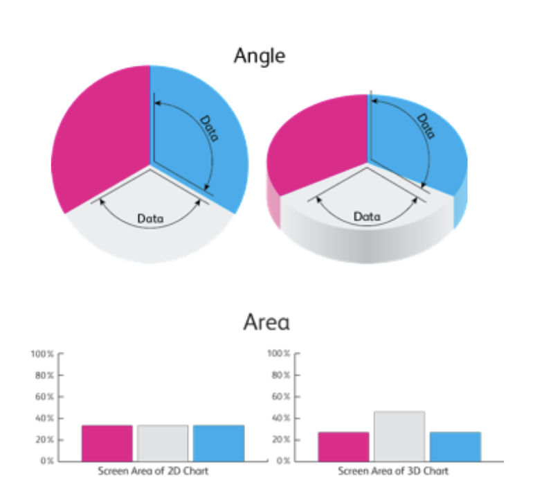
Don’t use pie charts!
“Graphics must not quote data out of context.”
Ensure your graph is telling the truth!
Due to the structure of code using ggplot these principles can be followed to ensure clean, clear graphics.
4.7.5 Visualising the moving average
In a previous section, we added indicators for the rolling average and rolling sum of cases. These indicators can be helpful for identifying trends over time.
moroocco_covid_cases_graph <- morocco_covid_cases_mean %>%
  ggplot() +
  geom_col(aes(x=date, y=cases, color=country)) +
  geom_line(aes(x=date, y=cases_7day_mean)) +
  labs(x='Month-Year',
       y='Total cases',
       title='Cases and 7-day average (black line)') +
  theme(legend.position='none') +
  scale_x_date(date_breaks = '4 months', #set x axis to have 2 month breaks
               date_minor_breaks = '2 months', #set x axis to have 1 month breaks
               date_labels = '%b-%y')  #change label for x axis

moroocco_covid_cases_graph
## Warning: Removed 1 rows containing missing values (position_stack).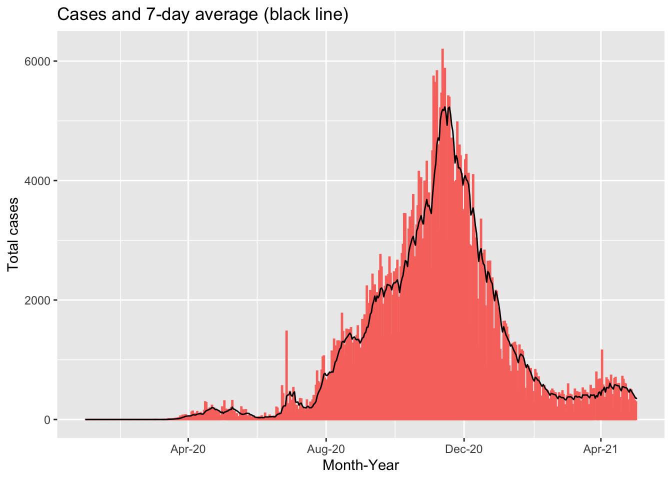
This chart shows the total number of COVID-19 cases for each day in Morocco between January 1, 2020 and May 3, 2021. The red bars show the reported case numbers for each day while the black line show the 7-day average of cases. We can see that there are several dates with substantially higher numbers of cases compared to the neighbouring dates. This could be due to increased testing on specific days but it is more likely due to delays in reporting leading to a backlog of cases reported on specific days. The black line “smooths” out these differences, allowing us to see the overall trend.
4.7.6 Presenting your results in a table
The gt package provides a very flexible interface for building tables from your data.
pacman::p_load(gt,here,dplyr)The documentation describing the functions can be found here. Below is an example using the dataset of COVID-19 cases in Northern Africa.
northern_africa_cases_country_table <- northern_africa_cases_country %>%
  gt() %>%
   tab_header(
    title = md("COVID-19 in Northern Africa")
  ) %>%
  cols_label(
    country = "Country",
    total_covid_cases = "Count",
    percentage = "% of total cases in Northern Africa"
  ) %>%
    tab_spanner(
    label = "Confirmed cases",
    columns = c(total_covid_cases,percentage)
  ) %>%
    fmt_number(
    columns = total_covid_cases,
    decimals=0,
    use_seps = TRUE
  ) %>%
   cols_align(
    align = "center",
    columns = c(total_covid_cases, percentage)
  )
northern_africa_cases_country_table| COVID-19 in Northern Africa | ||
|---|---|---|
| Country | Confirmed cases | |
| Count | % of total cases in Northern Africa | |
| Morocco | 511,856 | 37.3% |
| Tunisia | 311,743 | 22.7% |
| Egypt | 228,584 | 16.7% |
| Libya | 178,335 | 13.0% |
| Algeria | 122,522 | 8.9% |
| Mauritania | 18,429 | 1.3% |
gt has many options for customising tables. To demonstrate this, we will build a table to show when each country in Africa recorded its first COVID-19 case. This example uses some of the techniques demonstrated in this article.
first_cases_africa <- africa_covid_cases_long %>%
  select(date=date_format,region=AFRICAN_REGION, country=COUNTRY_NAME, cases) %>%
  group_by(region,country) %>%
  filter(cases>0) %>%
  filter(date == min(date, na.rm=TRUE)) %>%
  ungroup()

first_cases_africa_table <- first_cases_africa %>%
  select(region,country,date) %>%
  group_by(region) %>%
  arrange(date) %>%
gt() %>%
  tab_header(
    title = md("When did countries in Africa record their first case of COVID-19?")
  ) %>%
  fmt_date(
    columns = date,
    date_style = 4
  ) %>%
  opt_all_caps() %>%
  #Use the Chivo font
  #Note the great 'google_font' function in 'gt' that removes the need to pre-load fonts
  opt_table_font(
    font = list(
      google_font("Chivo"),
      default_fonts()
    )
  ) %>%
  cols_label(
    country = "Country",
    date = "Date"
  )  %>%
  cols_align(
    align = "center",
    columns = c(country, date)
  ) %>%
  tab_options(
    column_labels.border.top.width = px(3),
    column_labels.border.top.color = "transparent",
    table.border.top.color = "transparent",
    table.border.bottom.color = "transparent",
    data_row.padding = px(3),
    source_notes.font.size = 12,
    heading.align = "left",
    #Adjust grouped rows to make them stand out
    row_group.background.color = "grey") %>%
  tab_source_note(source_note = "Data: Compiled from national governments and WHO by Humanitarian Emergency Response Africa (HERA)")

first_cases_africa_table| When did countries in Africa record their first case of COVID-19? | |
|---|---|
| Country | Date |
| Northern Africa | |
| Egypt | Friday 14 February 2020 |
| Algeria | Tuesday 25 February 2020 |
| Morocco | Monday 2 March 2020 |
| Tunisia | Monday 2 March 2020 |
| Mauritania | Friday 13 March 2020 |
| Libya | Tuesday 24 March 2020 |
| Western Africa | |
| Nigeria | Thursday 27 February 2020 |
| Senegal | Friday 28 February 2020 |
| Togo | Friday 6 March 2020 |
| Burkina Faso | Monday 9 March 2020 |
| Cote d'Ivoire | Wednesday 11 March 2020 |
| Ghana | Thursday 12 March 2020 |
| Guinea | Thursday 12 March 2020 |
| Benin | Monday 16 March 2020 |
| Gambia | Monday 16 March 2020 |
| Liberia | Monday 16 March 2020 |
| Niger | Thursday 19 March 2020 |
| Guinea-Bissau | Wednesday 25 March 2020 |
| Mali | Wednesday 25 March 2020 |
| Sierra Leone | Tuesday 31 March 2020 |
| Southern Africa | |
| South Africa | Thursday 5 March 2020 |
| Eswatini | Saturday 14 March 2020 |
| Namibia | Saturday 14 March 2020 |
| Zimbabwe | Friday 20 March 2020 |
| Angola | Saturday 21 March 2020 |
| Zambia | Sunday 22 March 2020 |
| Mozambique | Monday 23 March 2020 |
| Botswana | Monday 30 March 2020 |
| Malawi | Thursday 2 April 2020 |
| Lesotho | Tuesday 12 May 2020 |
| Central Africa | |
| Cameroon | Friday 6 March 2020 |
| Democratic Republic of the Congo | Tuesday 10 March 2020 |
| Gabon | Thursday 12 March 2020 |
| Central African Republic | Saturday 14 March 2020 |
| Equatorial Guinea | Saturday 14 March 2020 |
| Chad | Thursday 19 March 2020 |
| Congo | Sunday 22 March 2020 |
| Burundi | Tuesday 31 March 2020 |
| Sao Tome and Principe | Monday 6 April 2020 |
| Eastern Africa | |
| Ethiopia | Friday 13 March 2020 |
| Kenya | Friday 13 March 2020 |
| Sudan | Friday 13 March 2020 |
| Rwanda | Saturday 14 March 2020 |
| Somalia | Monday 16 March 2020 |
| Mayotte | Tuesday 17 March 2020 |
| Tanzania | Tuesday 17 March 2020 |
| Djibouti | Wednesday 18 March 2020 |
| Mauritius | Wednesday 18 March 2020 |
| Madagascar | Friday 20 March 2020 |
| Eritrea | Saturday 21 March 2020 |
| Uganda | Saturday 21 March 2020 |
| South Sudan | Monday 6 April 2020 |
| Comoros | Thursday 30 April 2020 |
| Data: Compiled from national governments and WHO by Humanitarian Emergency Response Africa (HERA) | |