2 Lab 2. Activity Budgets and Ethograms
Background
In this lab you will continue to become familiar with the ways that we visualize and analyze behavioral data. I assume that you have completed Field Labs 1 and 2, and that you have read the ‘Living Together: Behavior and Welfare in Single and Mixed Species Groups’ by Leonardi et al. 2010.
Goals of the exercises
The main goal(s) of today’s lab are to:
1) Enter and visualize your ethogram data
2) Qualitatively compare the ethograms of two primate individuals
3) Calculate meerkat activity budgets
4) Compare inter-observer reliability from the meerkat data
Getting started
First we need to load the relevant packages for our data analysis. Packages contain all the functions that are needed for data analysis.
2.1 Lab 2a. Enter and visualize your ethogram data
Here we will do an exploratory analysis of the ethograms that you created in Field Lab 1. First we will use some simulated (or made up) data to create our ethogram. In R we call these objects ‘dataframes’.
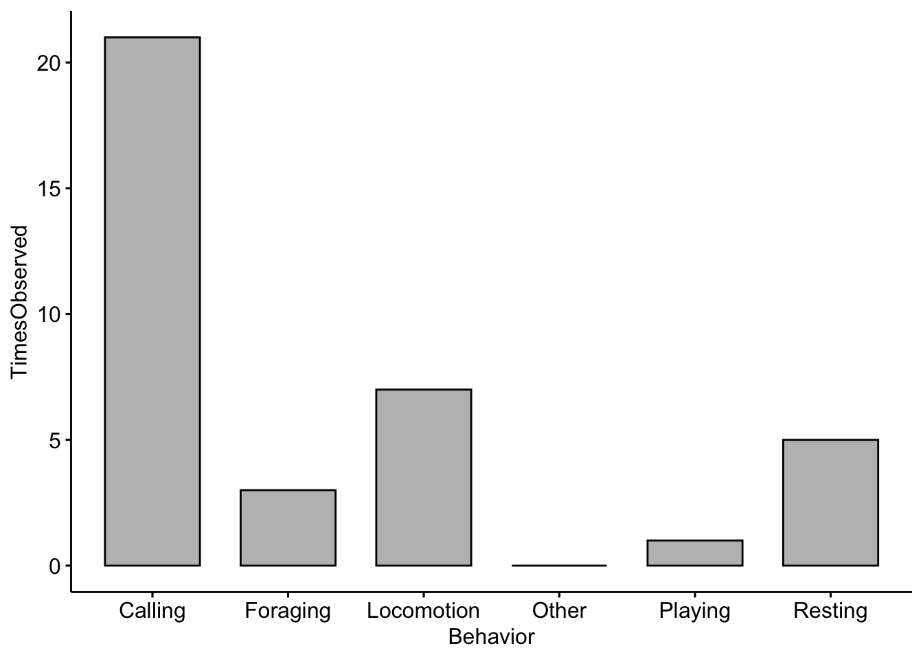
EthogramDF <-
  data.frame(Behavior=c('Resting','Locomotion','Foraging','Calling','Playing','Other'),
                 TimesObserved=c(5,7,3,21,1,0))
If you run the object ‘EthogramDF’ you should see your table:
##     Behavior TimesObserved
## 1    Resting             5
## 2 Locomotion             7
## 3   Foraging             3
## 4    Calling            21
## 5    Playing             1
## 6      Other             0
A common command to check data structure is ‘str’. Here we can see our dataframe has two variables:‘Behavior’ and ‘TimesObserved’.
## 'data.frame':    6 obs. of  2 variables:
##  $ Behavior     : Factor w/ 6 levels "Calling","Foraging",..: 6 3 2 1 5 4
##  $ TimesObserved: num  5 7 3 21 1 0
Now we can make a barplot to visualize our results using the ‘ggpubr’ package
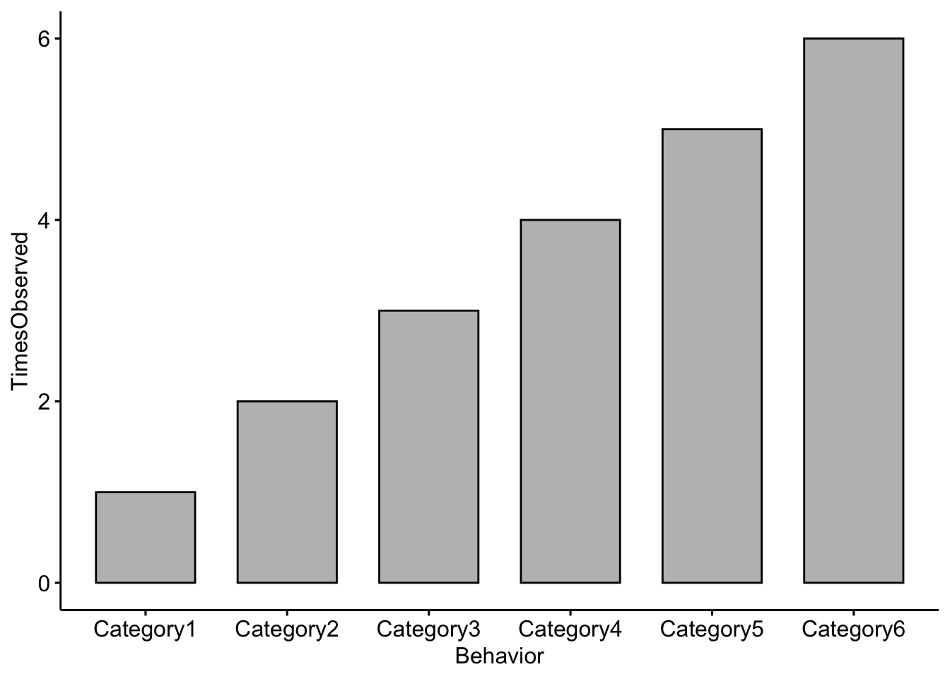
In the space below I want you to add in your own ethogram categories and create a plot based on the ethogram you created in Field lab 1.
Change the Behavior categories (i.e. Category1) to the categories you used in your ethogram and the TimesObserved values to the actual values you recorded
EthogramDFupdated <- data.frame(Behavior=c('Category1','Category2','Category3',
                                           'Category4','Category5','Category6'),
                         TimesObserved=c(1,2,3,4,5,6))
If you run the object you should see your dataframe
##    Behavior TimesObserved
## 1 Category1             1
## 2 Category2             2
## 3 Category3             3
## 4 Category4             4
## 5 Category5             5
## 6 Category6             6
NOTE: Your plot will look different than this as you will enter your own data above!
Question 1
Change the code to reflect the categories you used in your ethogram and change the TimesObserved values to the actual values you recorded. NOTE: You may need to add more categories if your ethogram had more than six. What trends did you notice in terms of behaviors observed?
2.2 Lab 2b. Qualitatively compare the ethograms of two primate individuals
Here we are simulating ethograms of two monkey individuals.
Cebus1 <- data.frame(Behavior=c('Resting','Locomotion','Foraging',
                                'Vocalizing','Playing','Other'),
                         TimesObserved=c(25,5,4,2,3,3))
Check the output of the dataframe
##     Behavior TimesObserved
## 1    Resting            25
## 2 Locomotion             5
## 3   Foraging             4
## 4 Vocalizing             2
## 5    Playing             3
## 6      Other             3
Saimiri1 <- data.frame(Behavior=c('Resting','Locomotion','Foraging',
'Vocalizing','Playing','Other'),
TimesObserved=c(4,30,21,2,12,15))Check the output of the dataframe
##     Behavior TimesObserved
## 1    Resting             4
## 2 Locomotion            30
## 3   Foraging            21
## 4 Vocalizing             2
## 5    Playing            12
## 6      Other            15
Now we will add a column indicating a category for which primate
Now we will combine the two dataframes into one so that we can plot our results
##      Behavior TimesObserved Primate
## 1     Resting            25   Cebus
## 2  Locomotion             5   Cebus
## 3    Foraging             4   Cebus
## 4  Vocalizing             2   Cebus
## 5     Playing             3   Cebus
## 6       Other             3   Cebus
## 7     Resting             4 Saimiri
## 8  Locomotion            30 Saimiri
## 9    Foraging            21 Saimiri
## 10 Vocalizing             2 Saimiri
## 11    Playing            12 Saimiri
## 12      Other            15 Saimiri
And we will plot the ethograms of the two primates
ggplot(data=CombinedPrimateDF, aes(x=Behavior, y=TimesObserved, fill=Primate)) +
  geom_bar(stat="identity", position='dodge')+theme_classic()+
  scale_fill_manual(values = c('gray56','gray88'))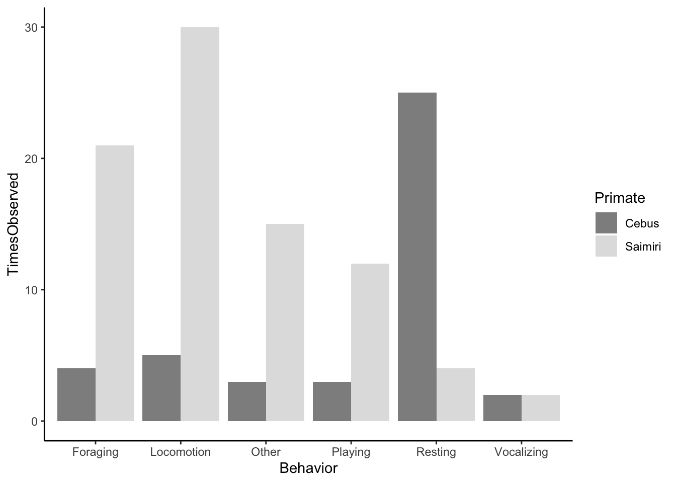
Question 2. What differences do you notice about the behaviors of our two simulated primates?
2.3 Lab 2c. Calculate meerkat activity budgets.
Our previous examples only included counts of different behaviors that we observed, but we did not standardize our results in any way. Activity budgets give an indication of how much time an animal spends doing each activity; these are generally expressed as percentages.
First we need to import the data. See the tutorial on the Canvas page for importing your data into RStudioCloud. It is pretty straightforward, you just click on the ‘upload’ button and find the datasheet saved on your computer.
NOTE: You will want to keep the file name the exact same or R won’t be able to find the data. Let’s check the structure of our data.
## 'data.frame':    28 obs. of  6 variables:
##  $ StartTimeMin            : int  0 1 2 3 3 4 4 5 5 5 ...
##  $ StartTimeSec            : int  30 20 40 0 30 0 20 0 30 50 ...
##  $ BehaviorCode            : Factor w/ 5 levels "Drinking","Eating",..: 2 4 1 1 2 3 2 3 3 3 ...
##  $ TimeSeconds             : int  30 80 160 180 210 240 260 300 330 350 ...
##  $ SecondsEngagedinBehavior: int  30 50 80 20 30 30 20 40 30 20 ...
##  $ Partner                 : Factor w/ 2 levels "A","B": 1 1 1 1 1 1 1 1 1 1 ...
Then we calcuate the total number of seconds for each behavior. There are many different ways that we can summarize our data using R, but we will use the package ‘dplyr’.
Here we take the sum for each unique behavior and return it
MeerkatFocalData %>%
dplyr::group_by(BehaviorCode) %>%
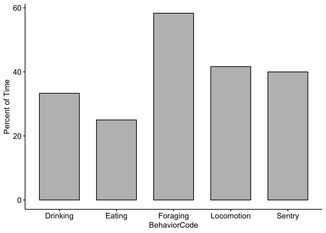
dplyr::summarise(TotalSeconds = sum(SecondsEngagedinBehavior))## # A tibble: 5 x 2
## BehaviorCode TotalSeconds
## <fct> <int>
## 1 Drinking 200
## 2 Eating 150
## 3 Foraging 350
## 4 Locomotion 250
## 5 Sentry 240Then we need to save the output as an R object
MeerkatFocalDataSummary <- MeerkatFocalData %>%
  dplyr::group_by(BehaviorCode) %>%
  dplyr::summarise(TotalSeconds = sum(SecondsEngagedinBehavior))
Now we need to standardize for our total observation time. We divide by 600 because our video was 10 minutes (or 600 seconds) long.
Now let’s plot our results! NOTE: The example here is using fake data.
Now lets see if there were differences between you and your partner. We need to save the output as an R object, but this time including the sums by partner.
MeerkatFocalDataPartner <- MeerkatFocalData %>%
  dplyr::group_by(BehaviorCode,Partner) %>%
  dplyr::summarise(TotalSeconds = sum(SecondsEngagedinBehavior))
Again, we divide by 600 because our video was 10 minutes (or 600 seconds) long. We then multiply by 100 so that we can report in percentages.
Now we compare our data with our partner’s. Note that there are two new lines in the code below. The fill argument tells R which category or factor to use to color the bars. The position argument tells R to place the bars side-by-side.
ggbarplot(data=MeerkatFocalDataPartner,x='BehaviorCode',y='ActivityBudget', fill='Partner',
          position = position_dodge(0.9))+ylab('Percent of Time')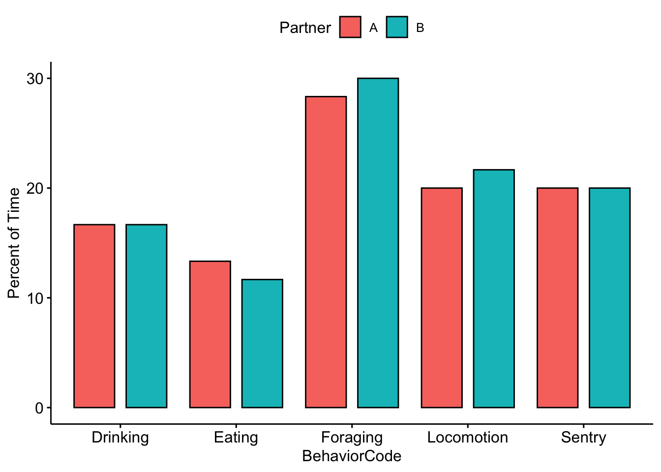
Question 3.
Were there any noticeable differences between you and your partner’s activity budgets?
2.4 Lab 2d. Scan sampling and inter-observer reliability.
Load your data as you did before, but this time upload the ‘MeerkatScanData.csv’ file.
Check the structure of our data. If we use ‘head’ it will return the first few rows of our dataframe.
##   Time Vigilant NotVigilant OutOfSight  Treatment Partner
## 1   10        1           3          2 NoPredator       A
## 2   20        1           5          0 NoPredator       A
## 3   30        2           3          1 NoPredator       A
## 4   40        2           4          0 NoPredator       A
## 5   50        1           4          1 NoPredator       A
## 6   60        2           4          1 NoPredator       A
For this analysis the ‘Time’ column isn’t needed so we can remove it; It is the first column so we use 1 in the code below.
R deals with blanks in dataframes by converting them to ‘NA’. This is useful for some cases, but we want to convert our blanks to zeros using the following code.
Here we take the sum for each unique behavior and return it.
MeerkatScanData %>%
  dplyr::group_by(Treatment) %>%
  dplyr::summarise(Vigilant = sum(Vigilant),
                   OutOfSight=sum(OutOfSight),
                   NotVigilant=sum(NotVigilant))
## # A tibble: 3 x 4
## Treatment Vigilant OutOfSight NotVigilant
## <fct> <int> <dbl> <int>
## 1 AerialPredator 119 73 15
## 2 NoPredator 50 64 119
## 3 TerrestrialPredator 199 131 0We need to save the output as an R object
MeerkatScanDataSummary <- MeerkatScanData %>%
  dplyr::group_by(Treatment,Partner) %>%
  dplyr::summarise(Vigilant = sum(Vigilant),
                   OutOfSight=sum(OutOfSight),
                   NotVigilant=sum(NotVigilant))
There are many functions in R that allow us to change the format of our data. This one changes the format to one that is more easily used by ‘ggpubr’
MeerkatScanDataSummaryLong <- melt(MeerkatScanDataSummary, id.vars=c("Treatment", "Partner"))
str(MeerkatScanDataSummaryLong)
## 'data.frame': 18 obs. of 4 variables:
## $ Treatment: Factor w/ 3 levels "AerialPredator",..: 1 1 2 2 3 3 1 1 2 2 ...
## $ Partner : Factor w/ 2 levels "A","B": 1 2 1 2 1 2 1 2 1 2 ...
## $ variable : Factor w/ 3 levels "Vigilant","OutOfSight",..: 1 1 1 1 1 1 2 2 2 2 ...
## $ value : num 57 62 24 26 101 98 43 30 27 37 ...Now we change the column names so they are better for plotting
Again we can plot our results
ggbarplot(data=MeerkatScanDataSummaryLong,x='Treatment',y='NumberObservations', fill='Behavior',
          position = position_dodge(0.9))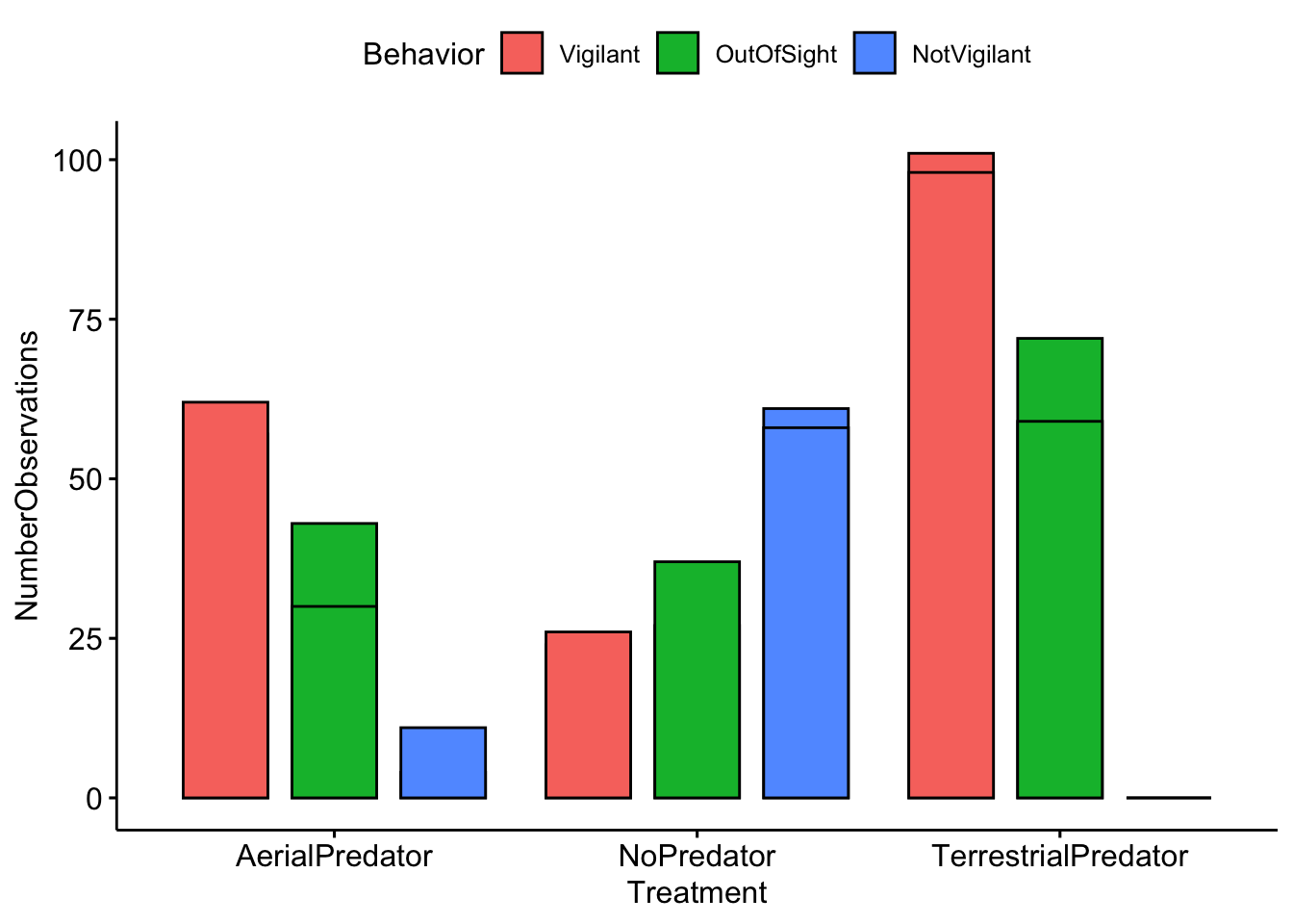
And now we can visually compare our results with our partners. Note that in order to separate the plots by partner we use facet.by = ‘Partner’.
ggbarplot(data=MeerkatScanDataSummaryLong,x='Treatment',y='NumberObservations', fill='Behavior',
          position = position_dodge(0.9),facet.by = 'Partner')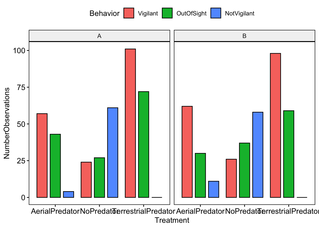
Now we want to calculate inter-observer reliablity. NOTE: that you will want to change the A and B to the names you used in the datasheet
Partner1Data <- subset(MeerkatScanData,Partner=='A')
Partner1Data <- Partner1Data[,-c(5)] # We remove the 'Partner' column so that we only focus on scans

Partner2Data <- subset(MeerkatScanData,Partner=='B')
Partner2Data <- Partner2Data[,-c(5)] # We remove the 'Partner' column so that we only focus on scans
Reliability is often and most simply expressed as a correlation coefficient. A correlation of 1 means a perfect positive association between two sets of measurements, whereas a correlation of zero means the complete absence of a linear association. Reliability is generally calcuated for each category of behavior.
# Here we calculate reliability for vigilance
VigilantCorrelation <- cor(Partner1Data$Vigilant,Partner2Data$Vigilant)

# Here we calculate reliability for vigilance
NotVigilantCorrelation <- cor(Partner1Data$NotVigilant,Partner2Data$NotVigilant)

# Here we calculate reliability for out of sight
OutOfSightCorrelation <-  cor(Partner1Data$OutOfSight,Partner2Data$OutOfSight)

# Print the results
cbind.data.frame(VigilantCorrelation,NotVigilantCorrelation,OutOfSightCorrelation)
## VigilantCorrelation NotVigilantCorrelation OutOfSightCorrelation
## 1 0.9027009 0.9347273 0.7840471NOTE: In my toy example I used the same values for both partners, so my correlation values are 1. Yours should be different!
Question 4.
What was the reliability (or correlation coefficent) between you and your partner for each of the different behavioral categories? What do you think lead to these differences?