Chapter 6 Grammar for visualization
Let’s start with some practical plotting
6.1 Excercise 1 Fill in the blank spaces
First read in data and then fill in the blank spaces.
kunder <- read_csv("path-to-data")
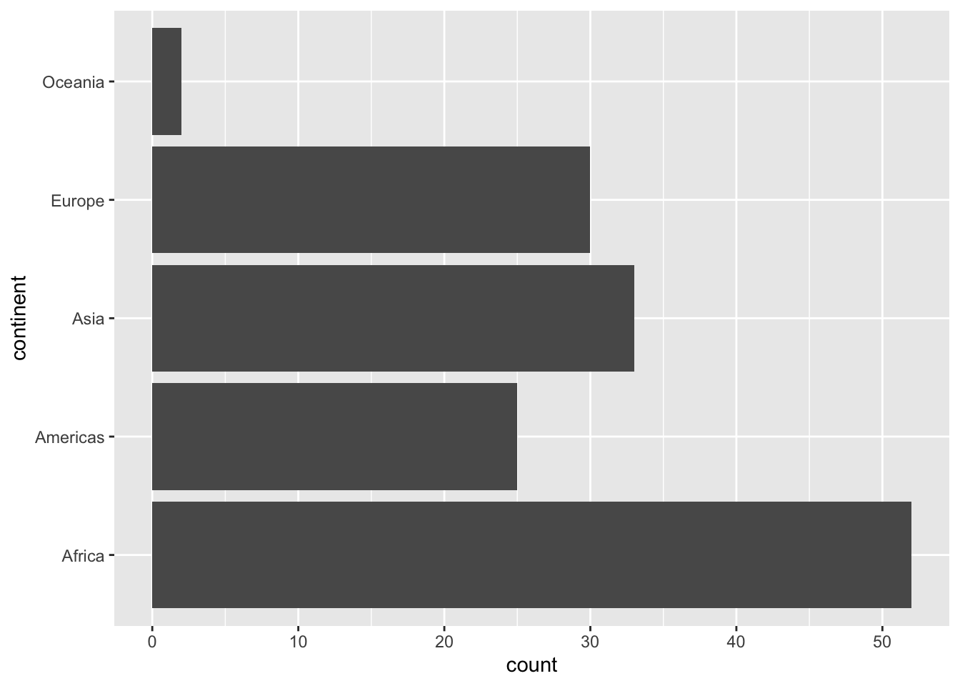
ggplot(kunder, aes(x = column-for-price-plan)) +
geom_bar() +
coord_flip() +
labs(title = "Title of the plot",
x = "Title for X", "Title for Y")Like this:
## Parsed with column specification:
## cols(
##   .default = col_double(),
##   source_date = col_datetime(format = ""),
##   ar_key = col_character(),
##   cust_id = col_character(),
##   pc_l3_pd_spec_nm = col_character(),
##   cpe_type = col_character(),
##   cpe_net_type_cmpt = col_character(),
##   pc_priceplan_nm = col_character(),
##   sc_l5_sales_cnl = col_character(),
##   rt_fst_cstatus_act_dt = col_datetime(format = ""),
##   rrpu_amt_used = col_character(),
##   rcm1pu_amt_used = col_character()
## )
## See spec(...) for full column specifications.ggplot(kunder, aes(x = pc_priceplan_nm)) +
geom_bar() +
coord_flip() +
labs(title = "Number of customers per priceplan",
x = "Priceplan", y = "Number of customers")
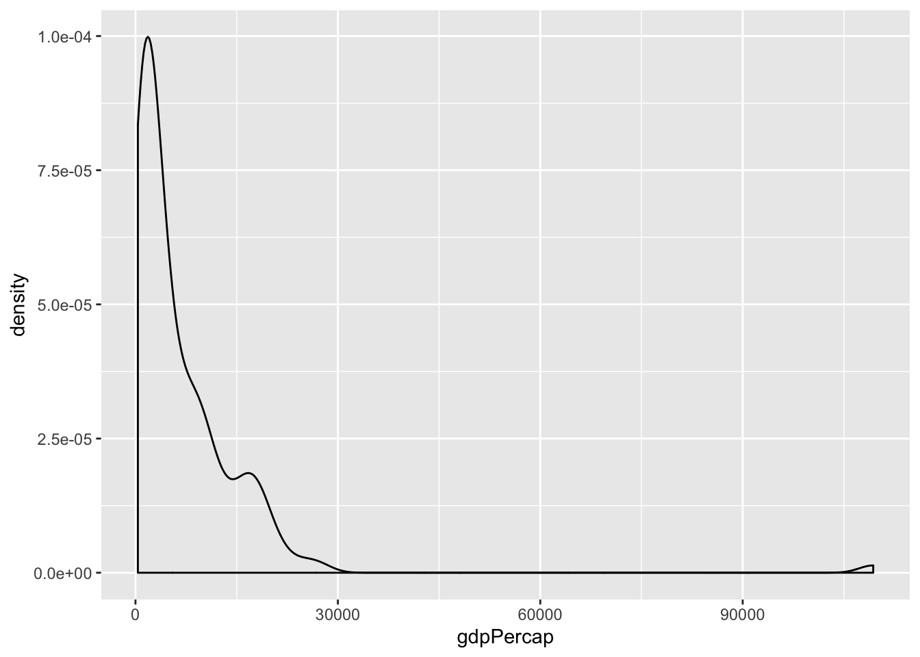
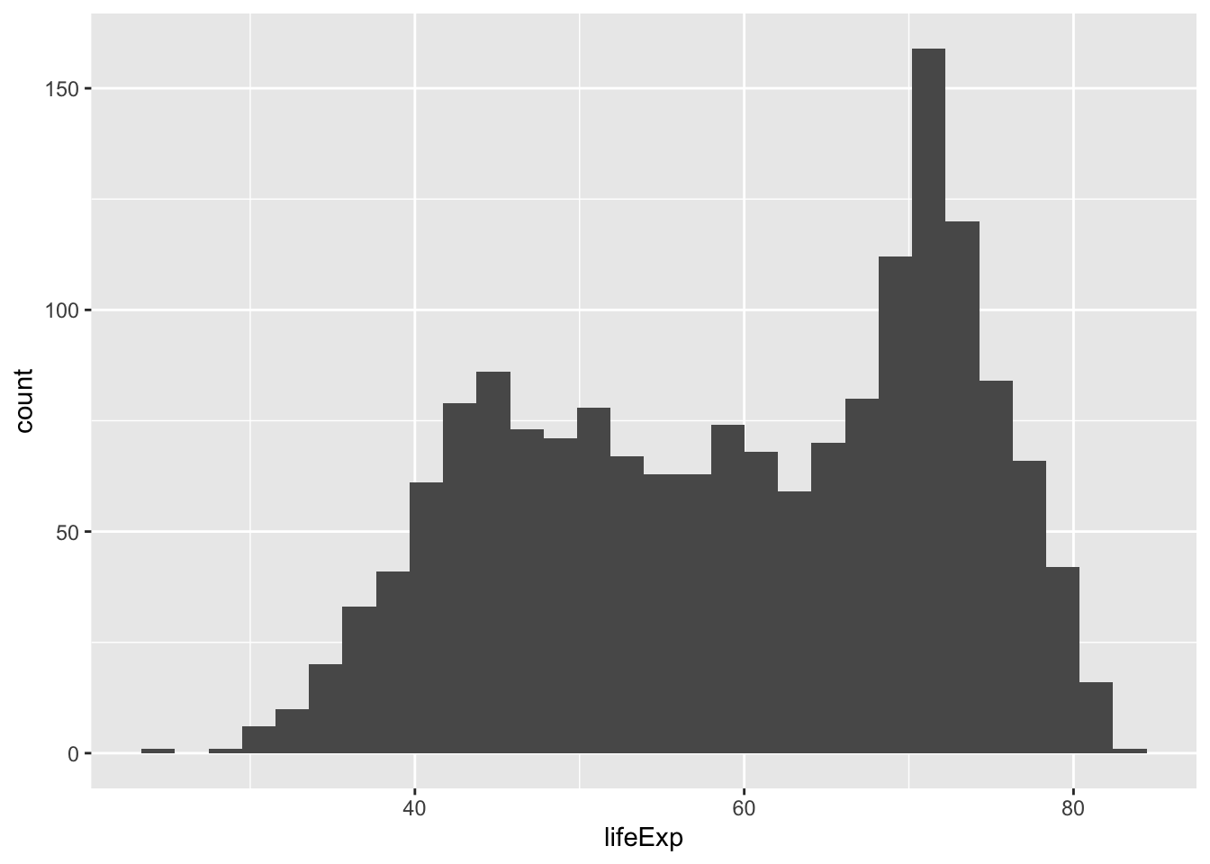
6.1.1 Excercise 2
- Map one of the
tr_tot_data...columns to x
## Warning: Removed 4 rows containing non-finite values (stat_density).
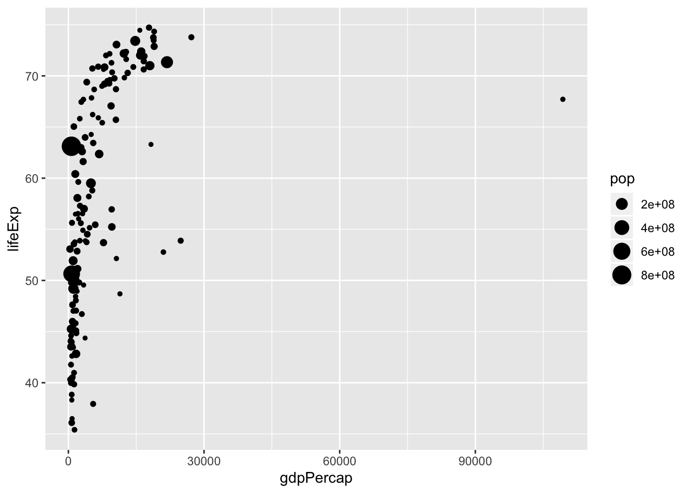
6.2 Let’s look at this visualization, what’s in it?
library(gapminder)
library(ggplot2)
library(gganimate)

p <- gapminder %>%
  filter(year == 1972) %>%
        ggplot(aes(gdpPercap, lifeExp, size = pop, colour = continent)) +
  geom_point(alpha = 0.7) +
  scale_size(range = c(2, 12)) +
  scale_x_log10() +
  labs(title = 'Year: 1972', x = 'GDP per capita', y = 'life expectancy')

p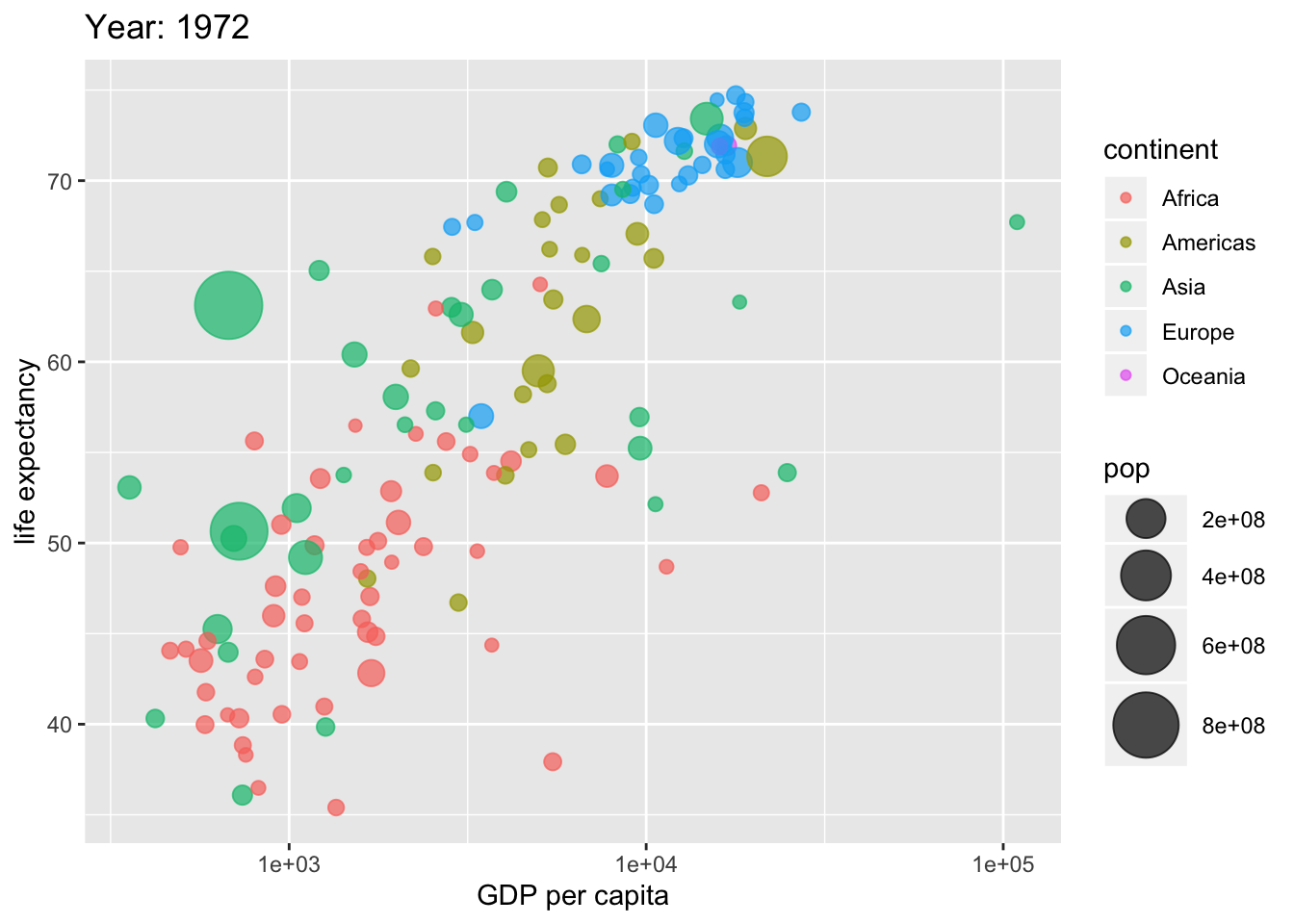
Data
Aestetics
Geometrical objects
Scales
Statistics
Facets
##Data
Firstly, we have data
## # A tibble: 6 x 6
##   country     continent  year lifeExp      pop gdpPercap
##   <fct>       <fct>     <int>   <dbl>    <int>     <dbl>
## 1 Afghanistan Asia       1952    28.8  8425333      779.
## 2 Afghanistan Asia       1957    30.3  9240934      821.
## 3 Afghanistan Asia       1962    32.0 10267083      853.
## 4 Afghanistan Asia       1967    34.0 11537966      836.
## 5 Afghanistan Asia       1972    36.1 13079460      740.
## 6 Afghanistan Asia       1977    38.4 14880372      786.
Note that we got tidy data, each observations is a row and every column is a variable.
- Data is the first argument in
ggplot()
When we filter data

6.3 aestsetics
- In order for the visualization to work we need to specify the mapping in the data.
- We map
aesteticssuch asxandyorcolorandsize
6.3.1 Excercise 3
- map x to
gdpPercapand y tolifeExp

6.4 Geometrical objects
- We need a geometrical object to represent the mapping and the data such as
lines,barsorpoints.
We can manipulate the objects by adding more aesthetics
6.4.1 Excercise 4
- Map size to pop

6.4.2 Excercise 5
- Map color to continent
p <- ggplot(data = data, mapping = aes(x = gdpPercap,
                                       y = lifeExp,
                                       size = pop,
                                       color = ...)) + #<<
  geom_point()
Like this:
ggplot(data = data, mapping = aes(x = gdpPercap,
                                       y = lifeExp,
                                       size = pop,
                                       color = continent)) + #<<
  geom_point()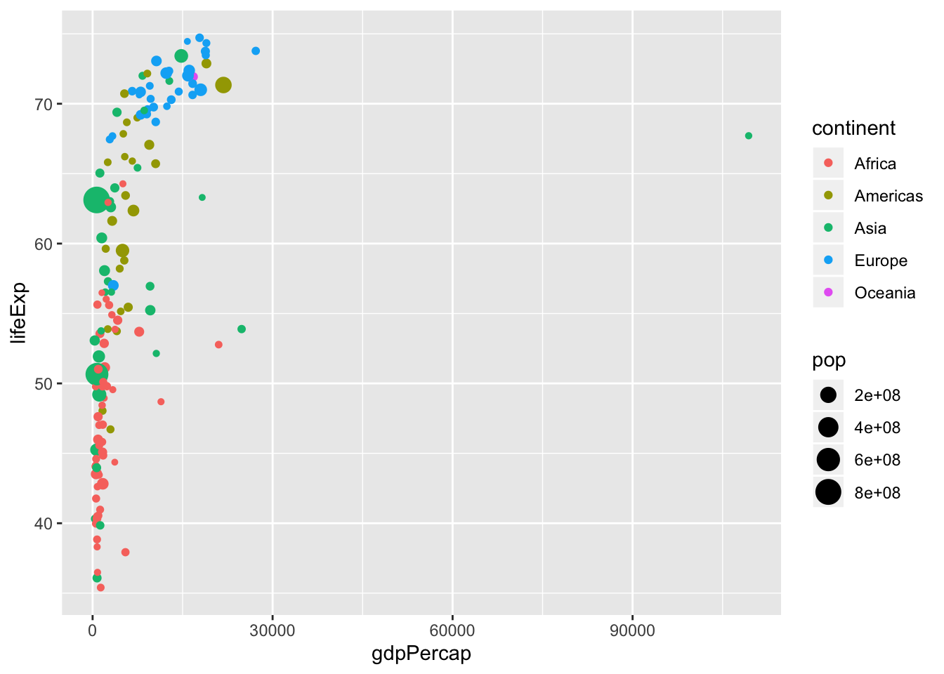
6.5 Scale
Per default ggplot() uses the following functions scale_y_continuous() and scale_x_continuous() when x and y are numerical.
p <- ggplot(data = data, mapping = aes(x = gdpPercap,
                                       y = lifeExp,
                                  size = pop,
                                  color = continent)) +
  geom_point() +
  scale_y_continuous() + #<<
  scale_x_continuous() #<<
- Scale-functions have arguments
- Sometimes we want to show the y axis from 0 to max
p <- ggplot(data = data, mapping = aes(x = gdpPercap,
                                       y = lifeExp,
                                  size = pop,
                                  color = continent)) +
  geom_point() +
  scale_y_continuous(limits = c(0, 80)) + #<<
scale_x_continuous() 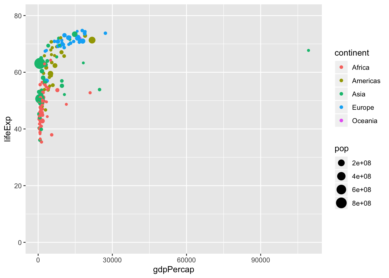
6.5.1 Excercise 6
- Not only the axis scale can be manipulated
- Change the color scale to
scale_color_viridis_d()
p <- ggplot(data = data, mapping = aes(x = gdpPercap,
                                       y = lifeExp,
                                  size = pop,
                                  color = continent)) +
  geom_point() +
  scale_y_continuous(limits = c(0, 80)) +
  scale_x_continuous() +
     scale_color_...() #<<
Like this:
ggplot(data = data, mapping = aes(x = gdpPercap,
                                       y = lifeExp,
                                  size = pop,
                                  color = continent)) +
  geom_point() +
  scale_y_continuous(limits = c(0, 80)) +
  scale_x_continuous() +
     scale_color_viridis_d()
6.5.2 Scales are important
- Working with log-normal data
6.5.3 Excercise 7
- Change the x scale to
scale_x_log10()
p <- ggplot(data = data, mapping = aes(x = gdpPercap,
                                  y = lifeExp,
                                  size = pop,
                                  color = continent)) +
  geom_point() +
  scale_y_continuous() +
  scale_...
Like this:
ggplot(data = data, mapping = aes(x = gdpPercap,
                                  y = lifeExp,
                                  size = pop,
                                  color = continent)) +
  geom_point() +
  scale_y_continuous() +
     scale_x_log10()
6.6 Statistical features
- Often we want to complement the plot with a statistical calculation, for instance a trend line.
p <- ggplot(data = data, mapping = aes(x = gdpPercap,
                                  y = lifeExp,
                                  size = pop,
                                  color = continent)) +
  geom_point() +
  scale_x_log10() +
stat_smooth(method = "lm") #<<## Warning in qt((1 - level)/2, df): NaNs produced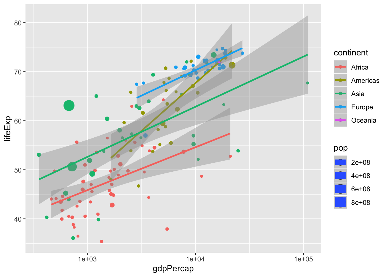
We can add calculations with stat_...(), but we can specify our own models:
p <- ggplot(data = data, mapping = aes(x = gdpPercap,
                                  y = lifeExp,
                                  size = pop,
                                  color = continent)) +
  geom_point() +
  scale_x_log10() +
  stat_smooth(method = "lm", formula = y ~ 1)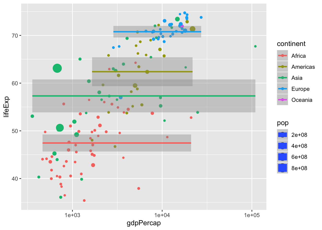
Or use non-linear trends
p <- ggplot(gapminder, mapping = aes(x = year,
                                  y = lifeExp,
                                  size = pop,
                                  color = continent)) +
  geom_point() +
  stat_smooth(method = "loess") #<<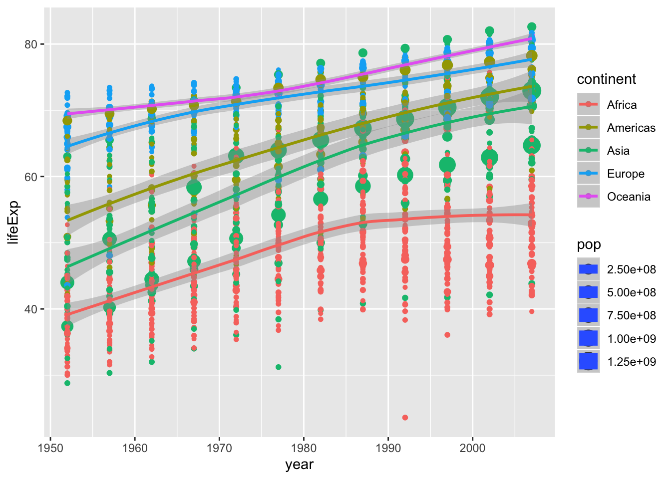
If we want to calculate for the whole population we simply move size and color out from the main statement.
p <- ggplot(data = data, mapping = aes(x = gdpPercap, y = lifeExp)) +
  geom_point(aes(size = pop, color = continent)) + #<<
  scale_x_log10() +
  stat_smooth(method = "lm")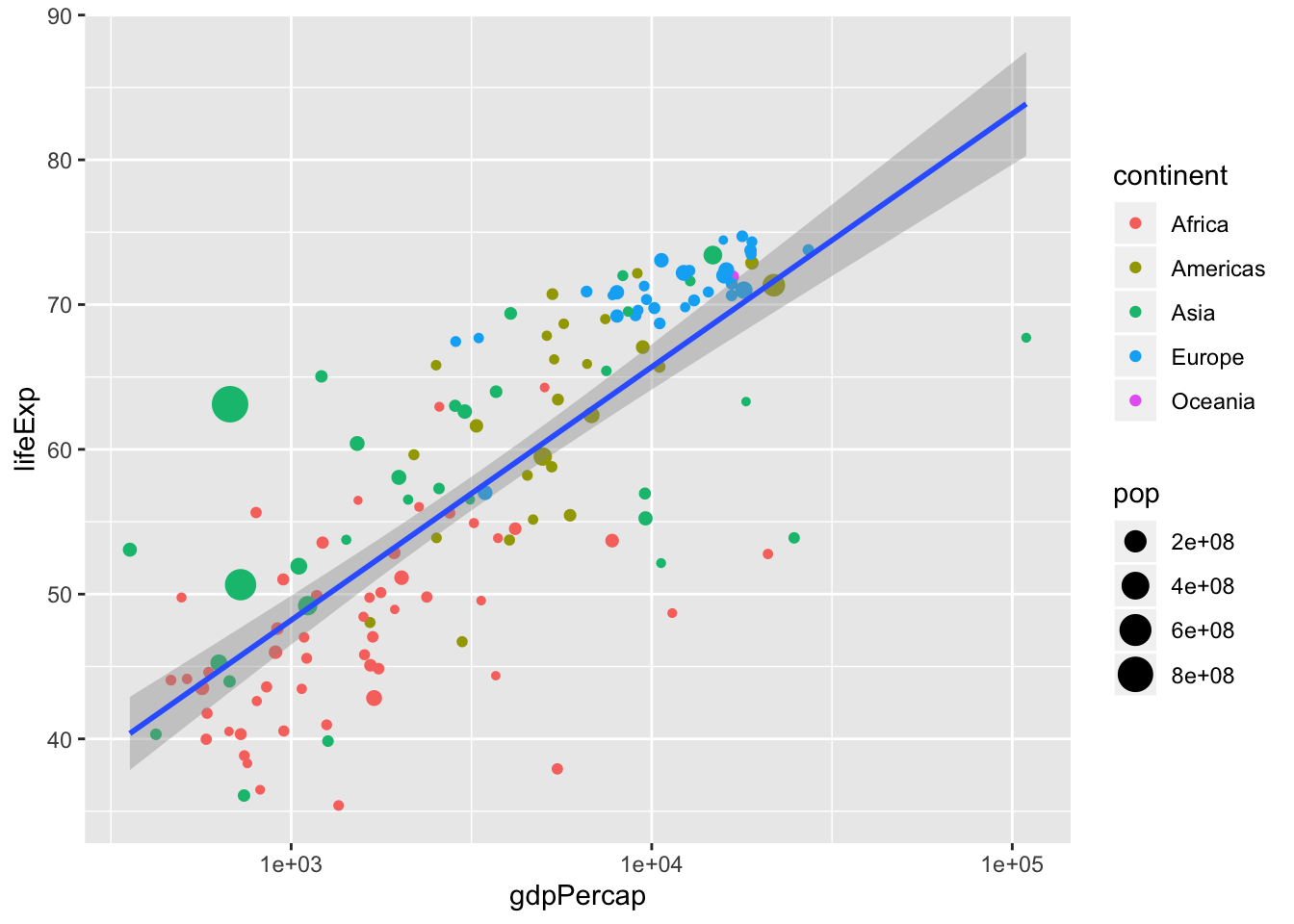
6.7 Facets
One common task is to visualize groups in
sub plotsbut in the same graph. This is one of the most powerful features inggplot2.We do this with
facets
p <- ggplot(data = data, mapping = aes(x = gdpPercap,
                                  y = lifeExp,
                                  size = pop,
                                  color = continent)) +
  geom_point() +
  scale_x_log10() +
  stat_smooth(method = "lm") +
facet_wrap(~continent) #<<## Warning in qt((1 - level)/2, df): NaNs produced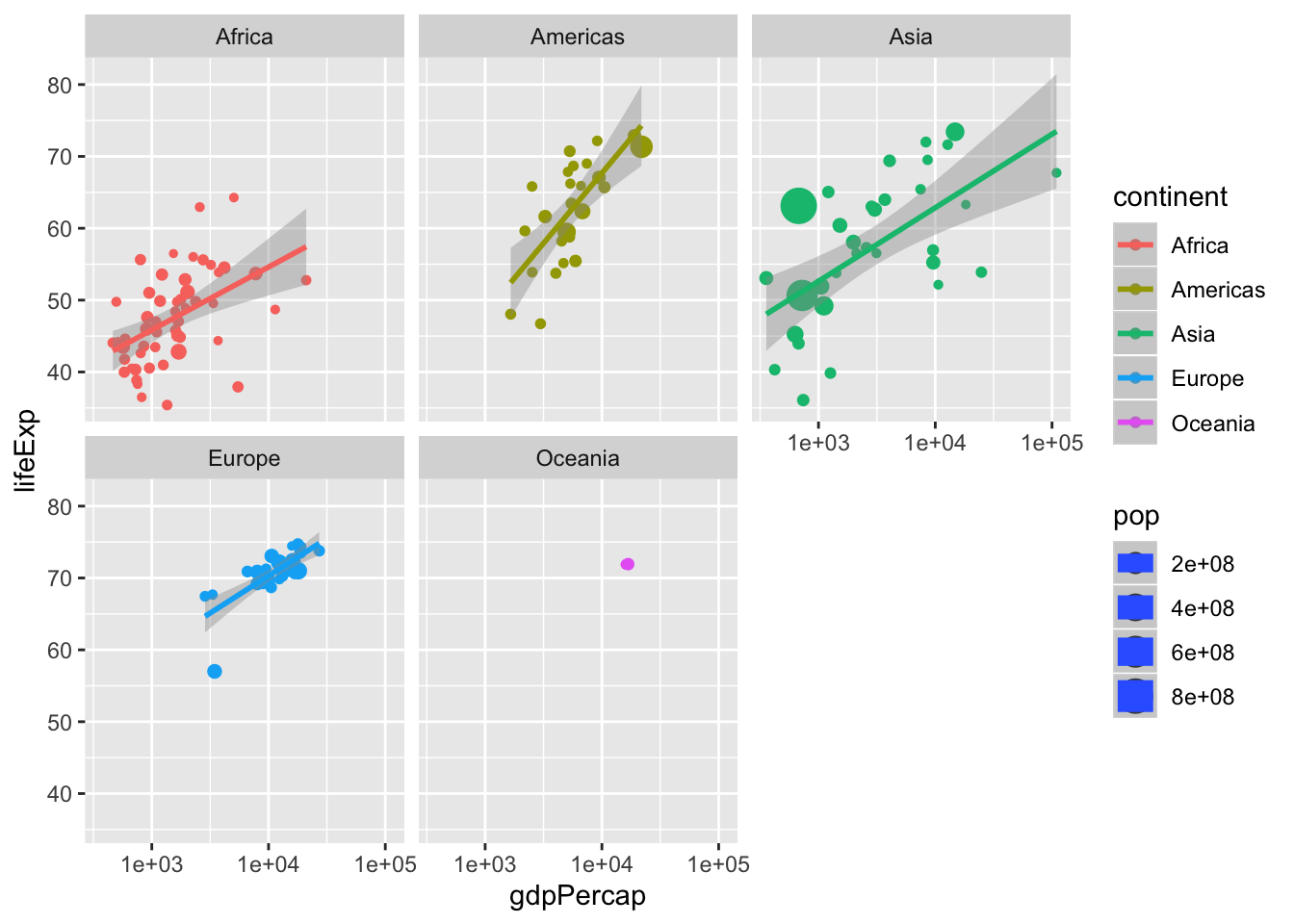
6.7.1 Excercise 8
- We can specify the scales as “free” or “fixed”.
- Change scales to “free”
p <- ggplot(data = data, mapping = aes(x = gdpPercap,
                                  y = lifeExp,
                                  size = pop,
                                  color = continent)) +
  geom_point() +
  scale_x_log10() +
  stat_smooth(method = "lm") +
facet_wrap(~continent, scales = "fixed") #<< ggplot(data = data, mapping = aes(x = gdpPercap,
y = lifeExp,
size = pop,
color = continent)) +
geom_point() +
scale_x_log10() +
stat_smooth(method = "lm") +
facet_wrap(~continent, scales = "free") ## Warning in qt((1 - level)/2, df): NaNs produced
6.8 Coordinate system
The last component in the plot is coordinate system
- Usually cartesian
- Most useful when we want to flip the plot
6.9 Let’s get practical
6.9.1 Excercise 9
Visualize the relationship between the last two months of data volume.
Which are you aestetics?
Which geom do you use?
Is the scale suitable?
Can you use any statistical computation to visualize the relationship?
p <- ggplot(kunder, aes(x = tr_tot_data_vol_all_netw_1, y = tr_tot_data_vol_all_netw_2)) +
geom_point() +
scale_y_log10() +
scale_x_log10()## Warning: Removed 4 rows containing missing values (geom_point).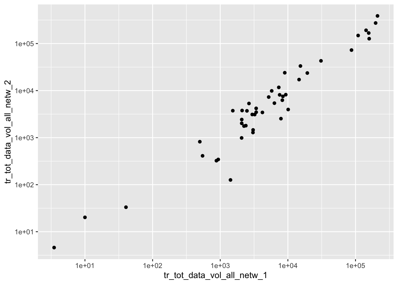
6.9.2 Excercise 10
Add aestetics
- Such as
fill,colororsize
p <- ggplot(kunder, aes(x = tr_tot_data_vol_all_netw_1,
y = tr_tot_data_vol_all_netw_2,
color = cpe_type,
size = alloc_rrpu_amt)) +
geom_point() +
scale_y_log10() +
scale_x_log10()## Warning: Removed 4 rows containing missing values (geom_point).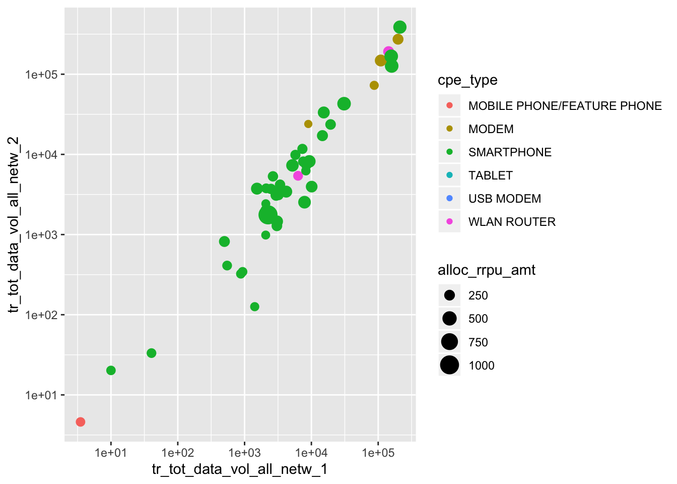
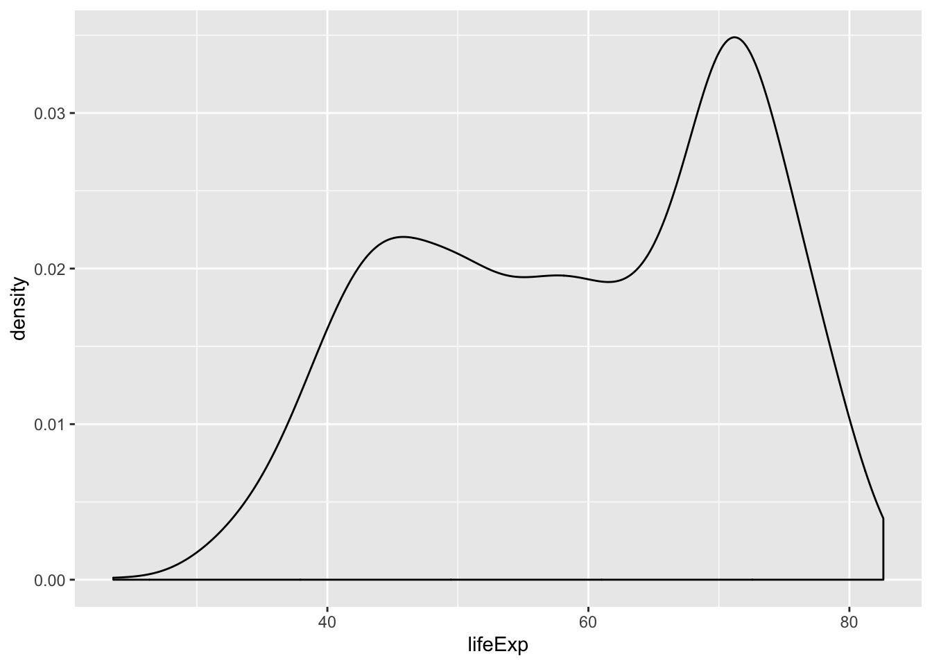
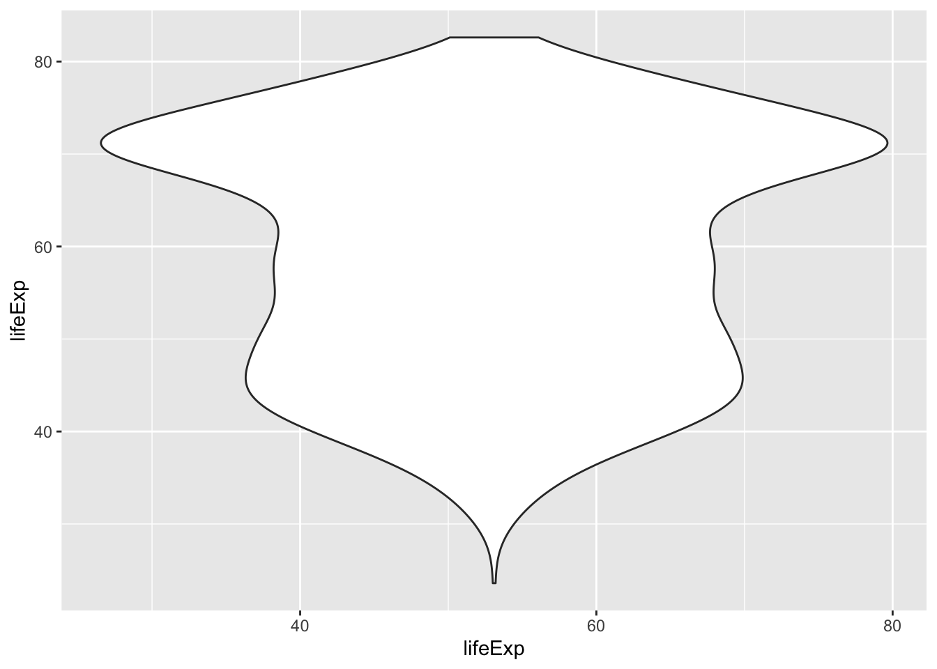
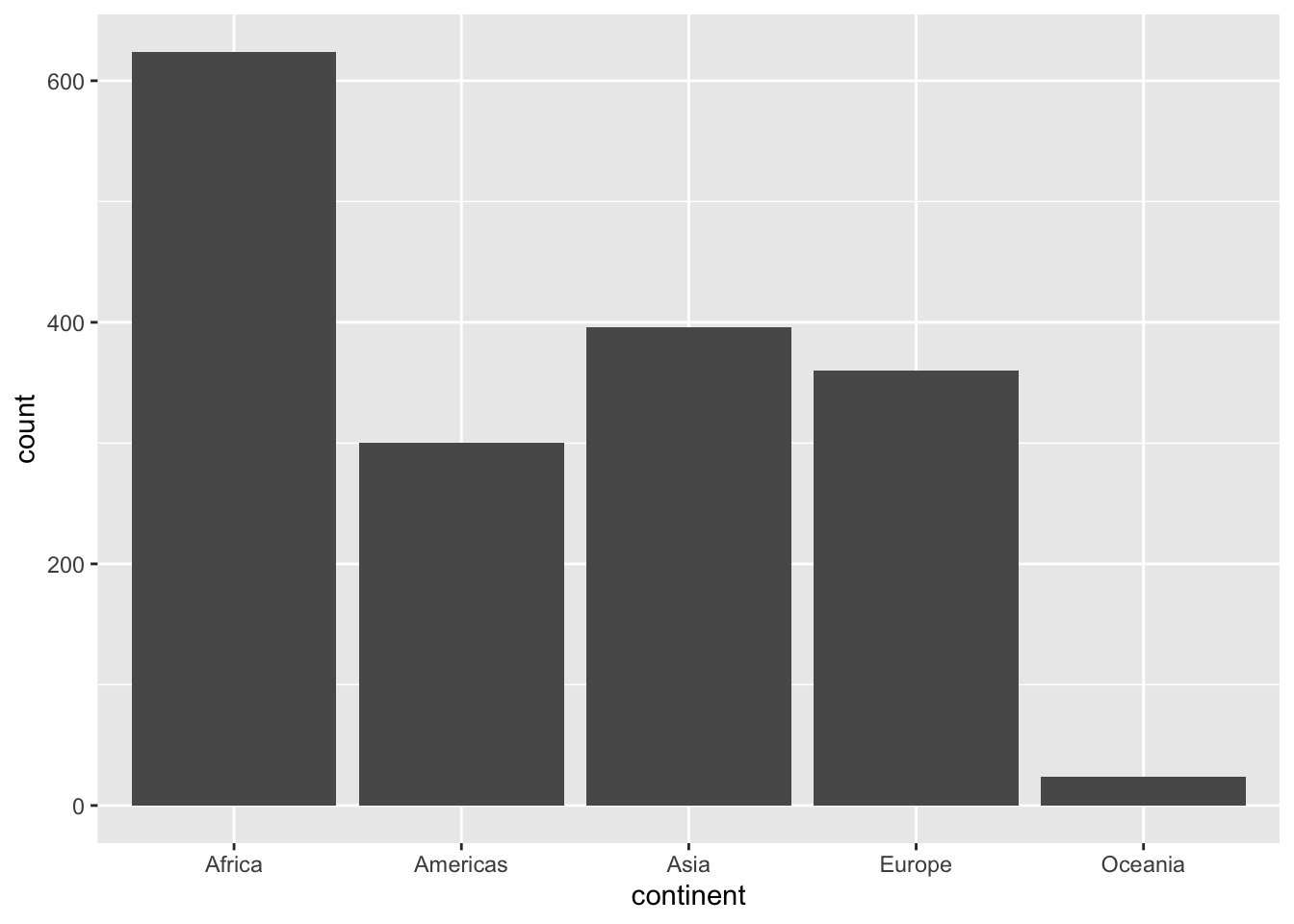
6.10 Geoms to visualize one variable
geom_bar()andgeom_col()forbar chartsgeom_histogram()geom_density()for distributionsgeom_boxplot()geom_violin()for so called violin plots
## Warning: Continuous x aesthetic -- did you forget aes(group=...)?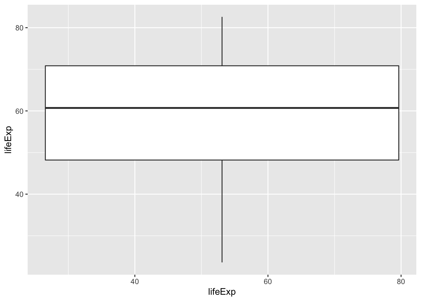
6.11 Groups
map groups to x to have multiple groups
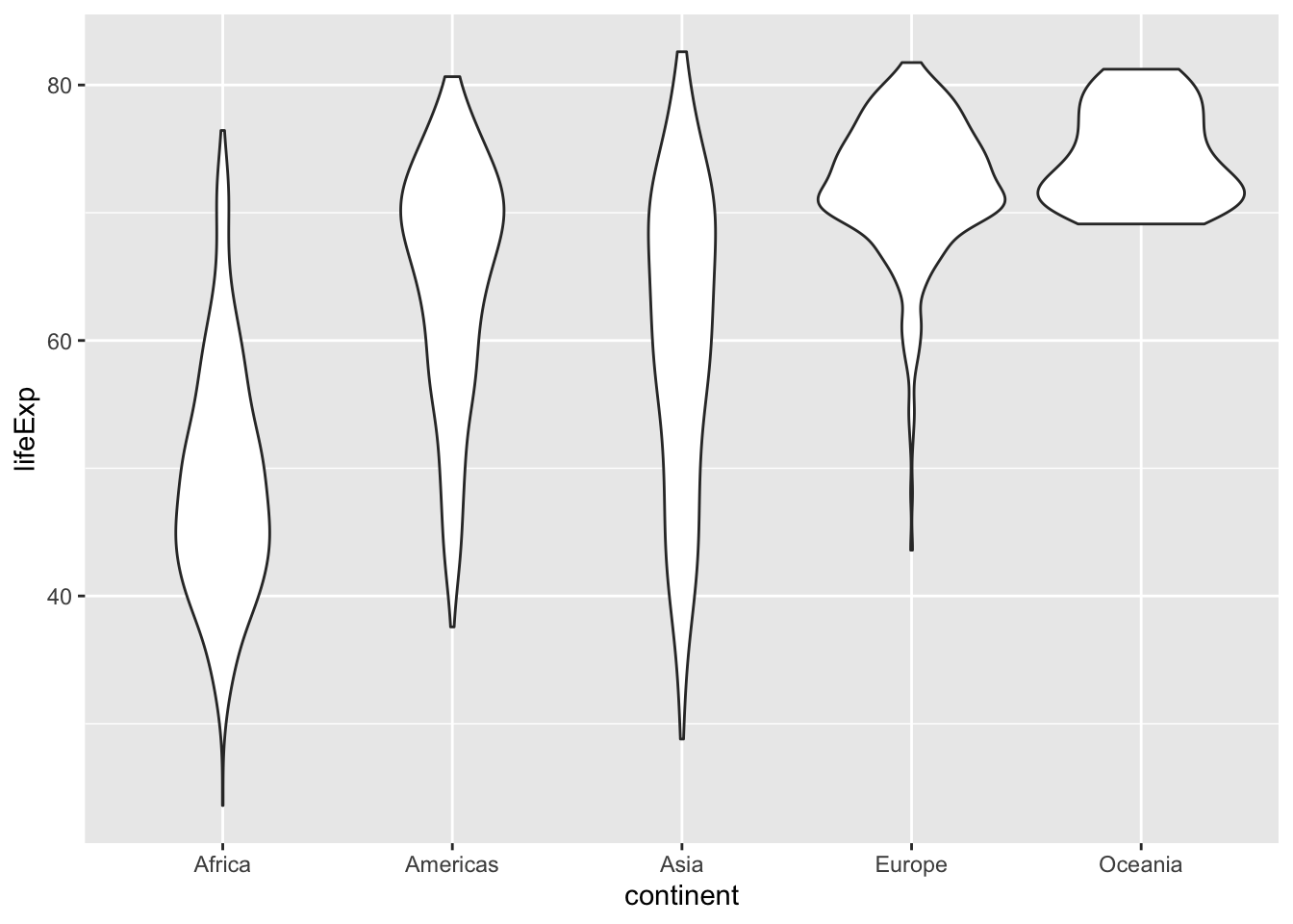
6.12 Using dplyr with ggplot2 part 1
- You can pipe
dplyrwithggplotwith%>%
p <- gapminder %>% #<<
filter(country %in% c("Sweden", "Norway", "Denmark", "Finland")) %>% #<<
ggplot(aes(x = country, y = lifeExp)) +
geom_violin()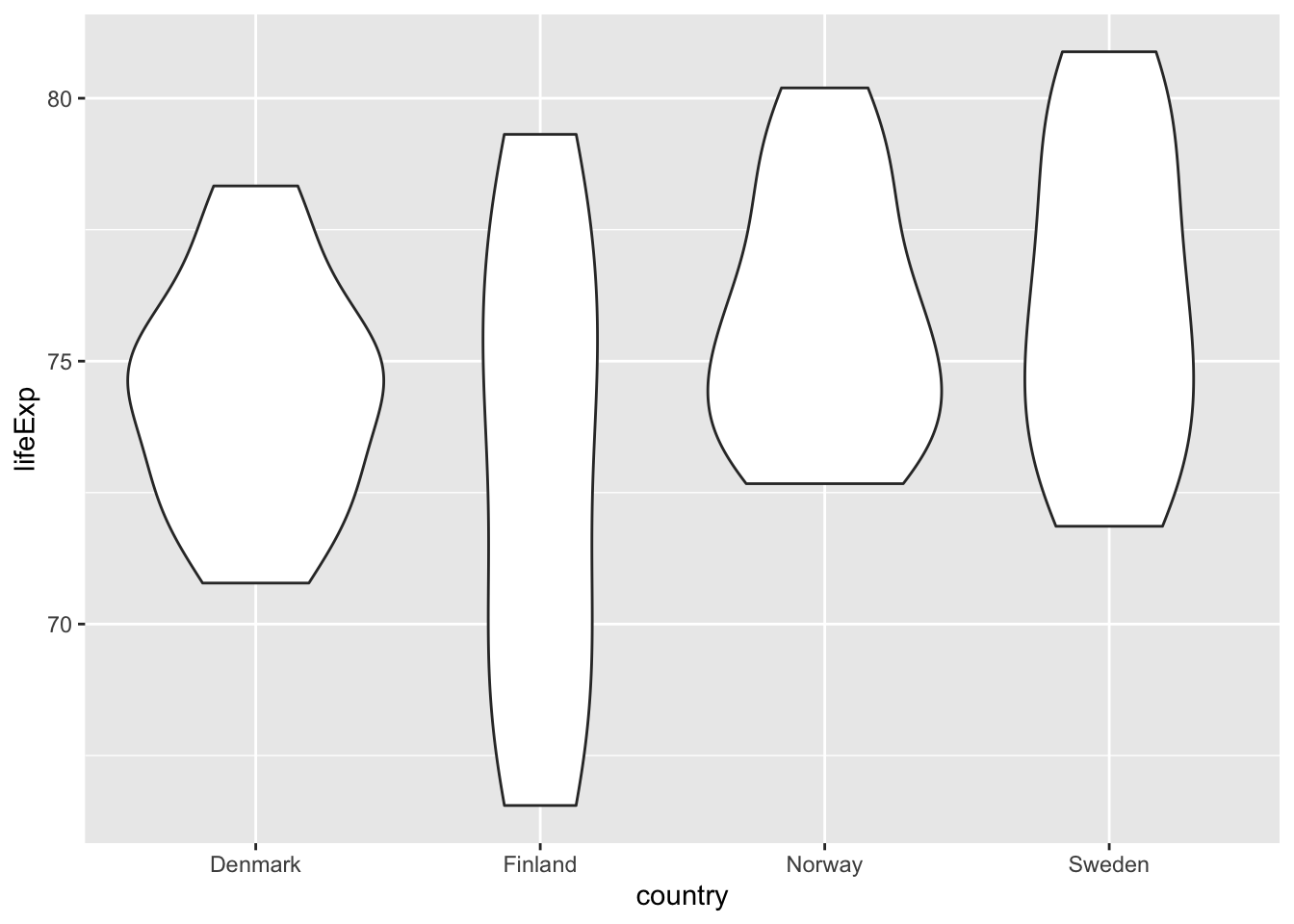
6.12.1 Excercise 11
Vizualise calculated revenue per month (alloc_rrpu_amt)
Use
%>%Which
geombest represents the data?Is the distribution normal?
Are there any outliers? How do you filter these out?
Is the scale suitable?
6.13 Use dplyr with ggplot2 part 2
We can use dplyr to calculate summary statistics and then visualize it with ggplot.
p <- gapminder %>%
group_by(continent) %>%
summarize(mean_lifeExp = mean(lifeExp)) %>%
ggplot(aes(x = continent, y = mean_lifeExp)) +
geom_col() #<<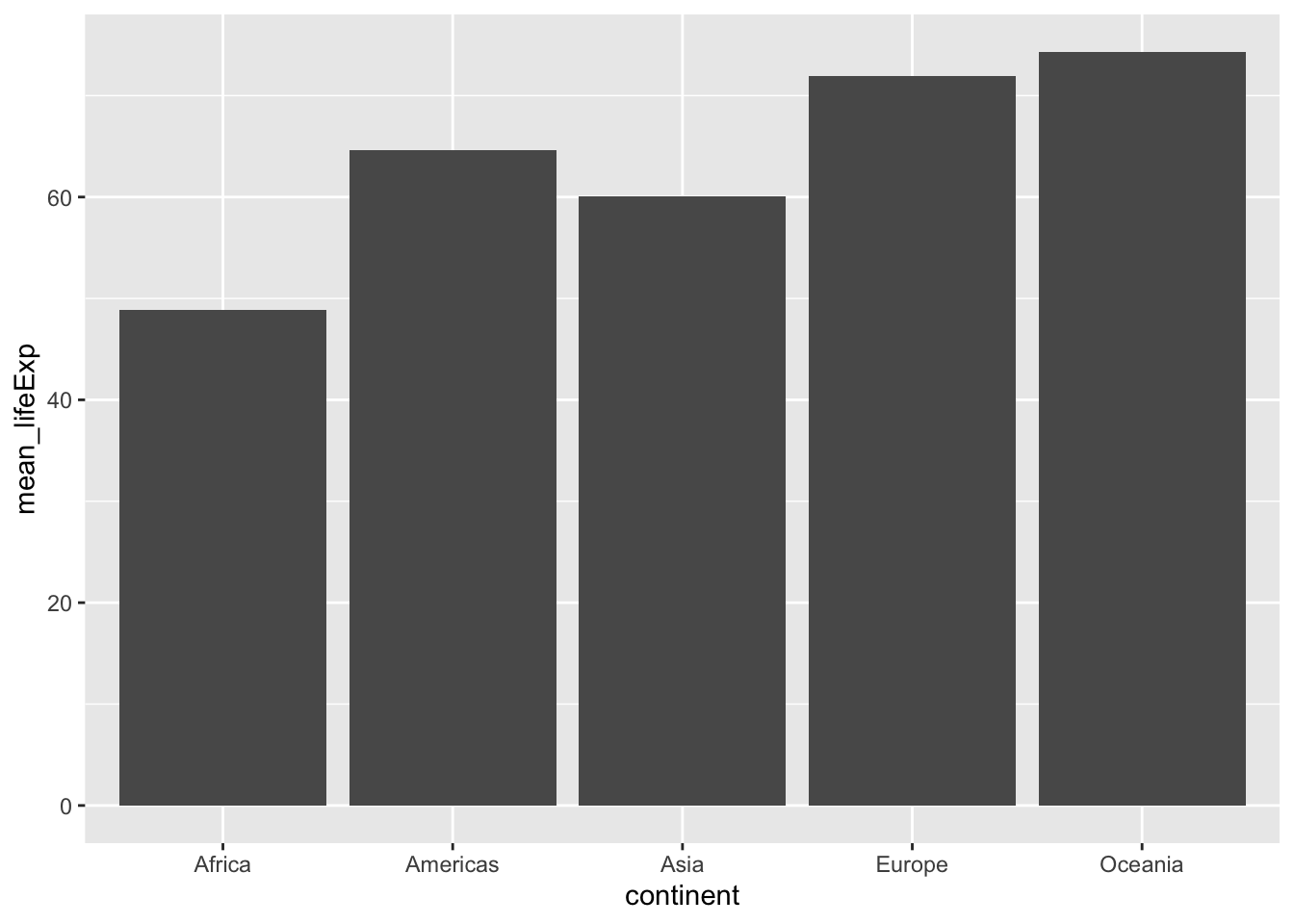
What’s the difference between geom_bar() and geom_col?
geom_bar()How many obsevationsgeom_col()Values in summary tables
6.14 Changing the order on the axis
- Function
reorder(variable, by = variable)
p <- gapminder %>%
group_by(continent) %>%
summarize(mean_lifeExp = mean(lifeExp)) %>%
ggplot(aes(x = reorder(continent, -mean_lifeExp), #<<
y = mean_lifeExp)) +
geom_col() 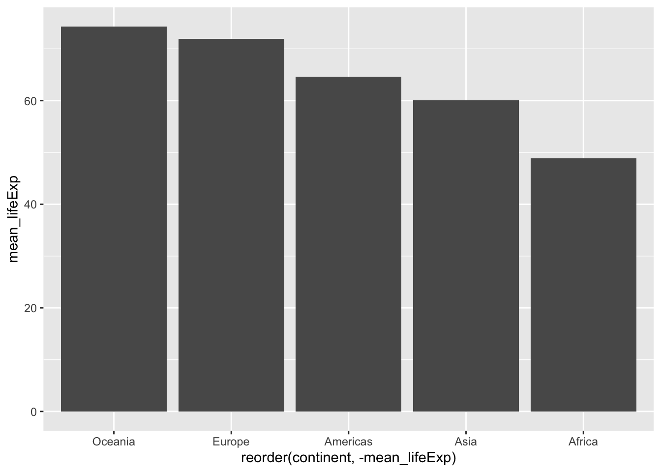
6.15 Flipped plots
p <- gapminder %>%
group_by(continent) %>%
summarize(mean_lifeExp = mean(lifeExp)) %>%
ggplot(aes(x = reorder(continent, mean_lifeExp), y = mean_lifeExp)) + #<<
geom_col() +
coord_flip() 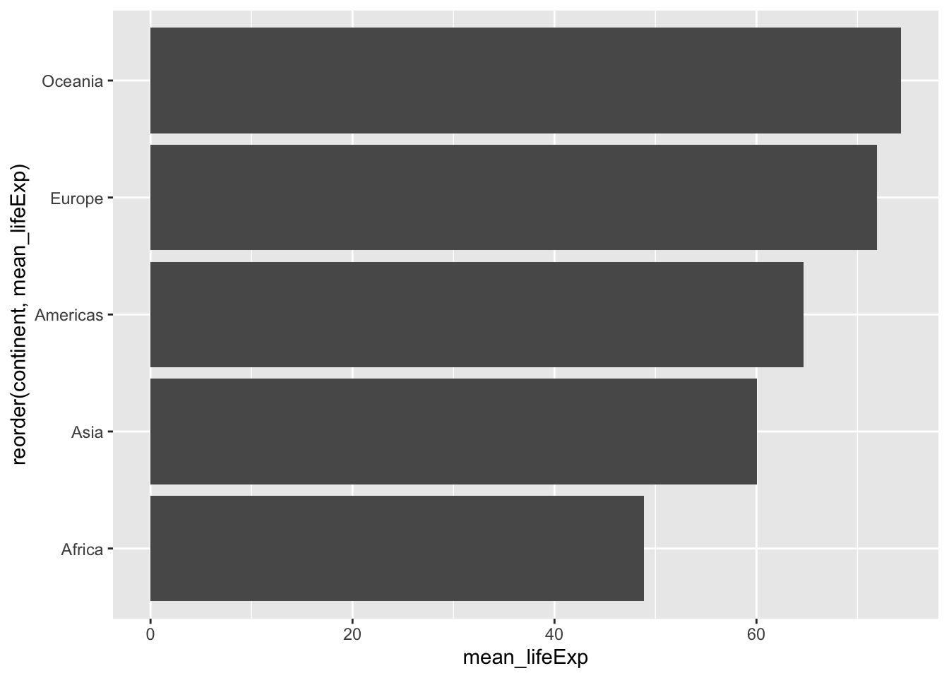
6.15.1 Excercise 12
Inspect the categories of
pc_priceplan_nm, are there any natural categories they could be assigned to?Create a new column that groups priceplan into three or four categories, use
case_when()andstr_detect()Create a summary table of revenue per month per priceplan category (that you previously created)
Visualize it with an adequate geom
Reorder the plot in ascending order
flip the coord if you get a problem with axis
Style your plot with a theme and labels
## Parsed with column specification:
## cols(
## .default = col_double(),
## source_date = col_date(format = ""),
## ar_key = col_character(),
## cust_id = col_character(),
## pc_l3_pd_spec_nm = col_character(),
## cpe_type = col_character(),
## cpe_net_type_cmpt = col_character(),
## pc_priceplan_nm = col_character(),
## sc_l5_sales_cnl = col_character(),
## rt_fst_cstatus_act_dt = col_date(format = ""),
## rrpu_amt_used = col_character(),
## rcm1pu_amt_used = col_character()
## )## See spec(...) for full column specifications.## # A tibble: 137 x 2
## # Groups: pc_priceplan_nm [137]
## pc_priceplan_nm n
## <chr> <int>
## 1 Fast pris 44578
## 2 Fast pris +EU 8 GB - 2018 20011
## 3 Unlimited - 2018 15887
## 4 Fast pris +EU 3 GB - 2018 14906
## 5 Fast pris +EU 15 GB - 2018 13686
## 6 Bredband 4G 13218
## 7 Fast pris +EU 1 GB 13017
## 8 Fast pris +EU 15 GB 12634
## 9 Fast pris +EU 5 GB 12610
## 10 Rörligt pris 12273
## # … with 127 more rowskunder_sample <- kunder_sample %>%
mutate(priceplan_cat = case_when(
str_detect(tolower(pc_priceplan_nm), "bredband") ~ "Bredband",
str_detect(tolower(pc_priceplan_nm), "fast") ~ "Fast pris",
TRUE ~ "Rörligt/övrigt")
) p <- kunder_sample %>%
group_by(priceplan_cat) %>%
summarise(median_rev = median(alloc_rrpu_amt, na.rm = T)) %>%
ggplot(aes(x = reorder(priceplan_cat, median_rev), y = median_rev)) +
geom_col() +
coord_flip() +
theme_minimal() +
labs(title = "Revenue per priceplan",
x = "Priceplan", y = "Median revenue")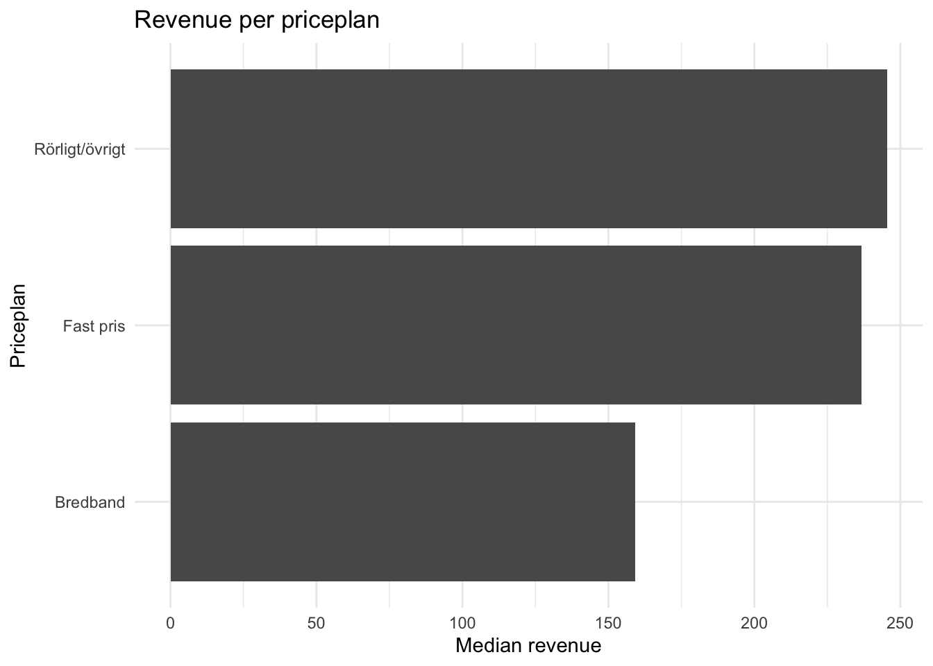
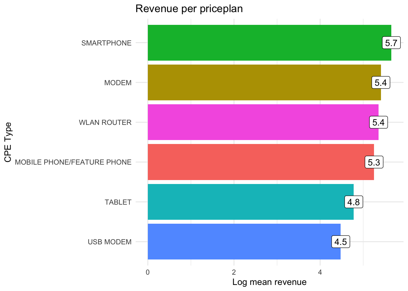
6.16 Annotations and styling
- It is fairly easy to create color palettes and custome themes
- Example: Coop
library(crmutils)
p <- kunder %>%
group_by(cpe_type) %>%
summarise(log_mean_rev = log(mean(alloc_rrpu_amt, na.rm = T))) %>%
ggplot(aes(x = reorder(cpe_type, log_mean_rev), y = log_mean_rev, fill = cpe_type)) +
geom_col() +
scale_fill_coop() + #<<
coord_flip() +
theme_minimal() +
labs(title = "Revenue per priceplan",
x = "CPE Type", y = "Log mean revenue") +
geom_label(aes(label = round(log_mean_rev, 1)), fill = "white") + #<<
theme(legend.position = "none") #<<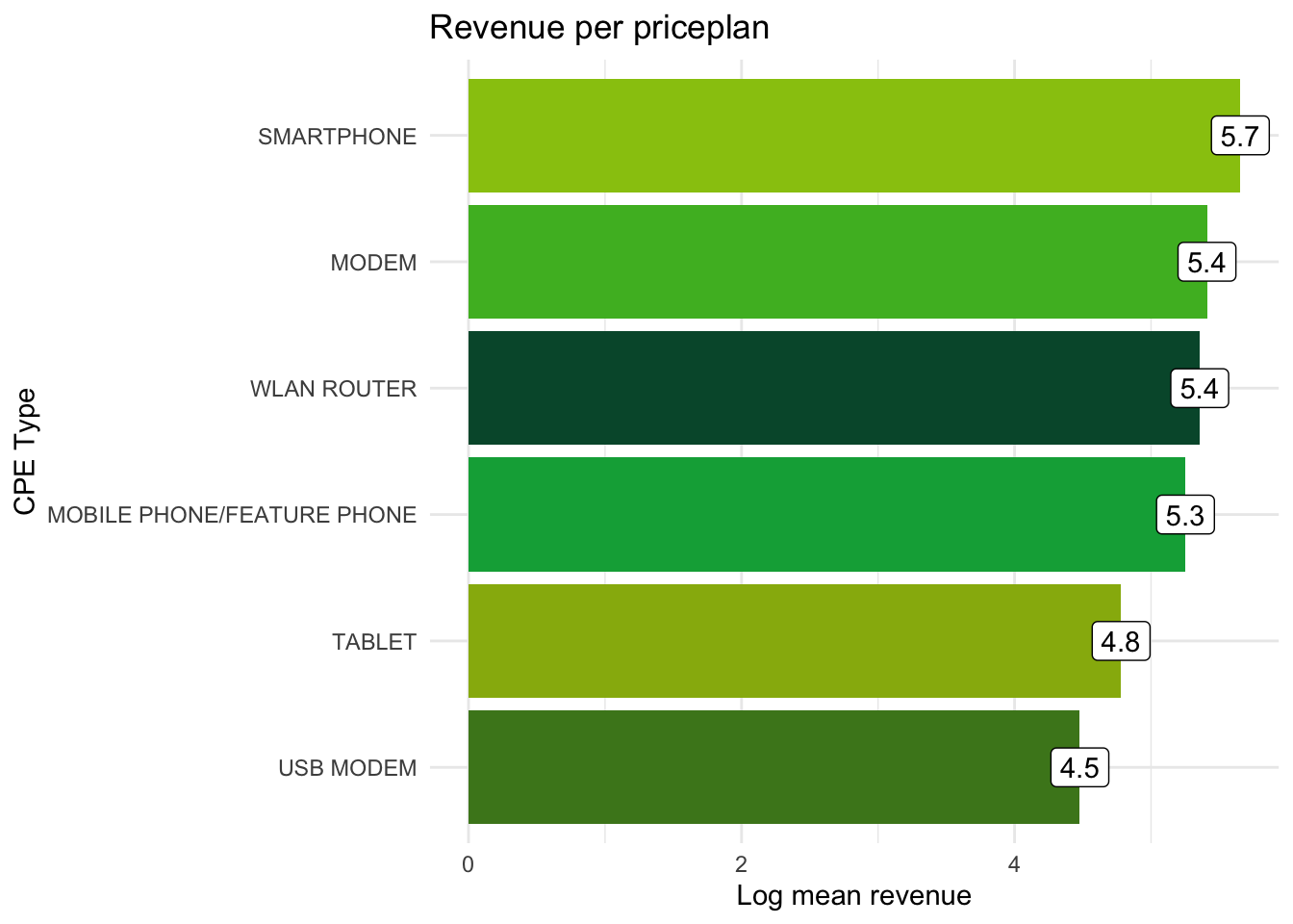
6.17 Interactivity
- Multiple libraries for interactive, web-based, plots
plotly,highcharter,r2d3and more
Plotly:
## Warning in geom2trace.default(dots[[1L]][[1L]], dots[[2L]][[1L]], dots[[3L]][[1L]]): geom_GeomLabel() has yet to be implemented in plotly.
## If you'd like to see this geom implemented,
## Please open an issue with your example code at
## https://github.com/ropensci/plotly/issuesPlotly also have an own syntax for custom graphs - highly recommended for interactive applications in Shiny.
6.17.1 Excericse 13
Make some of your plots interactive with ggplotly()
6.18 Time over?
- Test as many geoms as you can
- Try out plotlys own syntax for creating graphs, can be found here: https://plot.ly/r/line-and-scatter/
6.19 Exporting plots
There are several ways you can export visualizations.
The easiest way is to use ggsave()
Reading the documentation on ggsave() how can you use it?
You can also export visualizations to PowerPoint if using the package officer.
You can read more about officer here: https://davidgohel.github.io/officer/articles/powerpoint.html
##
## Attaching package: 'officer'## The following object is masked from 'package:readxl':
##
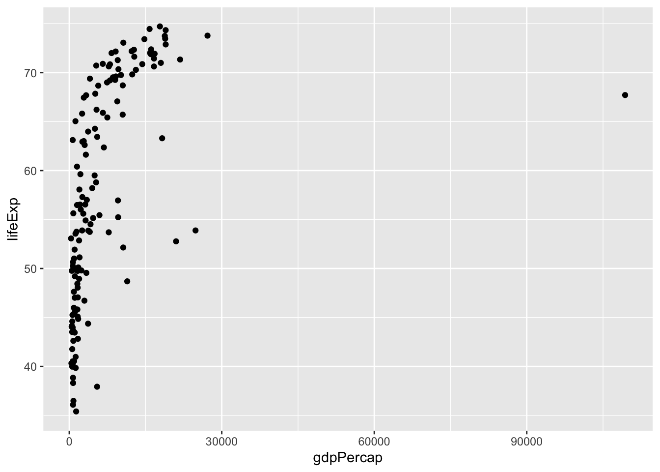
## read_xlsxp <- gapminder %>%
filter(year == 1972) %>%
ggplot(mapping = aes(x = gdpPercap,
y = lifeExp,
size = pop,
color = continent)) +
geom_point() +
scale_y_continuous(limits = c(0, 80)) + #<<
scale_x_log10() +
theme_minimal() +
labs(title = )
p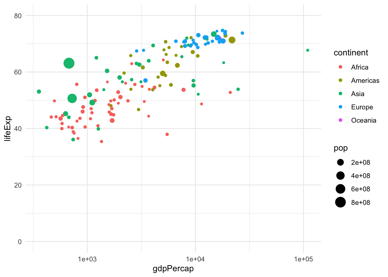
This way you can automate powerpoint-presentations.
doc <- read_pptx()
doc <- add_slide(doc, layout = "Title and Content", master = "Office Theme") %>%
ph_with(value = "Let's get rich...", location = ph_location_type(type = "title")) %>%
ph_with(value = p, location = ph_location_type(type = "body"))z
print(doc, target = "ph_with_gg.pptx")6.19.1 .15
Create your own powerpoint-presentation!
You may also refer to another powerpoint-presentation in read_pptx(path = "documents/report_q2.pptx") to use it as a template. Feel free to try this out on your own computer (i.e. not in the cloud environment), read more about it on the officer-website.
6.20 Answers to excercies visualization
6.21 Excercise 1.
## Parsed with column specification:
## cols(
## .default = col_double(),
## source_date = col_datetime(format = ""),
## ar_key = col_character(),
## cust_id = col_character(),
## pc_l3_pd_spec_nm = col_character(),
## cpe_type = col_character(),
## cpe_net_type_cmpt = col_character(),
## pc_priceplan_nm = col_character(),
## sc_l5_sales_cnl = col_character(),
## rt_fst_cstatus_act_dt = col_datetime(format = ""),
## rrpu_amt_used = col_character(),
## rcm1pu_amt_used = col_character()
## )## See spec(...) for full column specifications.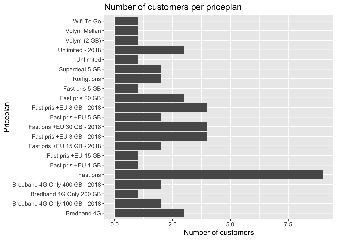
6.22 Excercise 2.
- Let’s make a distribution plot
## Warning: Removed 4 rows containing non-finite values (stat_density).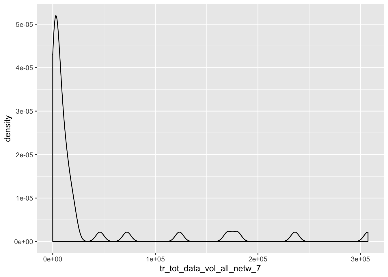
6.23 Excercise 3.
- map x to
gdpPercapand y tolifeExp
library(gapminder)
data <- gapminder %>%
filter(year == 1972)
ggplot(data = data, mapping = aes(x = gdpPercap, y = lifeExp))
6.24 Excercise 4.
- Map size to pop
6.25 Excercise 5.
- Map color to continent
ggplot(data = data, mapping = aes(x = gdpPercap,
y = lifeExp,
size = pop,
color = continent)) + #<<
geom_point()
6.26 Excercise 6.
- Change the color scale to
scale_color_viridis_d()
ggplot(data = data, mapping = aes(x = gdpPercap,
y = lifeExp,
size = pop,
color = continent)) +
geom_point() +
scale_y_continuous(limits = c(0, 80)) +
scale_x_continuous() +
scale_color_viridis_d() #<<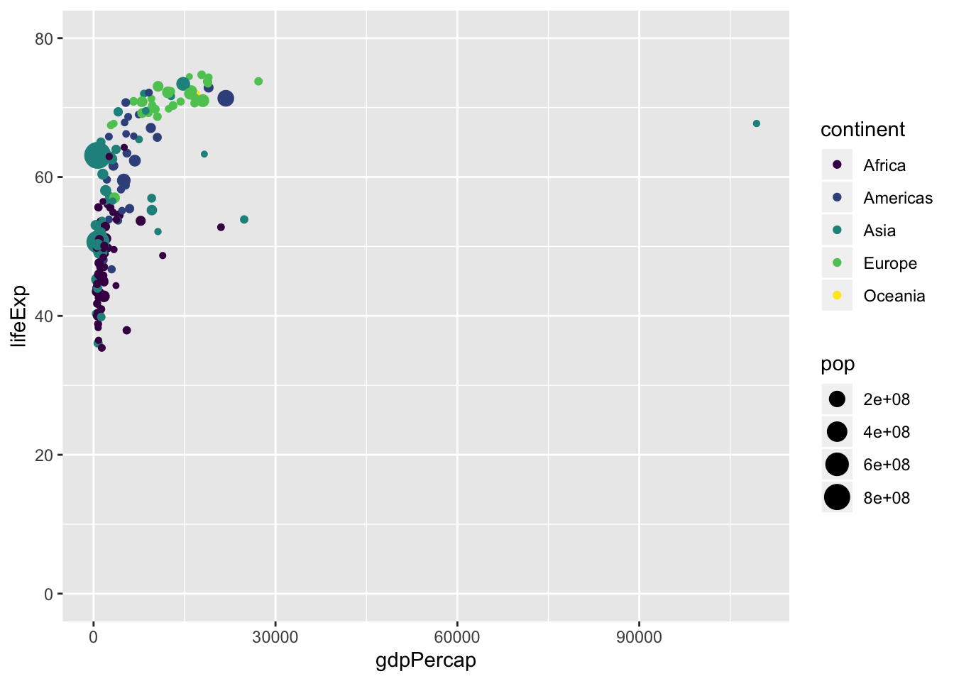
6.27 Excercise 7.
- Change the x scale to
scale_x_log10()
ggplot(data = data, mapping = aes(x = gdpPercap,
y = lifeExp,
size = pop,
color = continent)) +
geom_point() +
scale_y_continuous() +
scale_x_log10()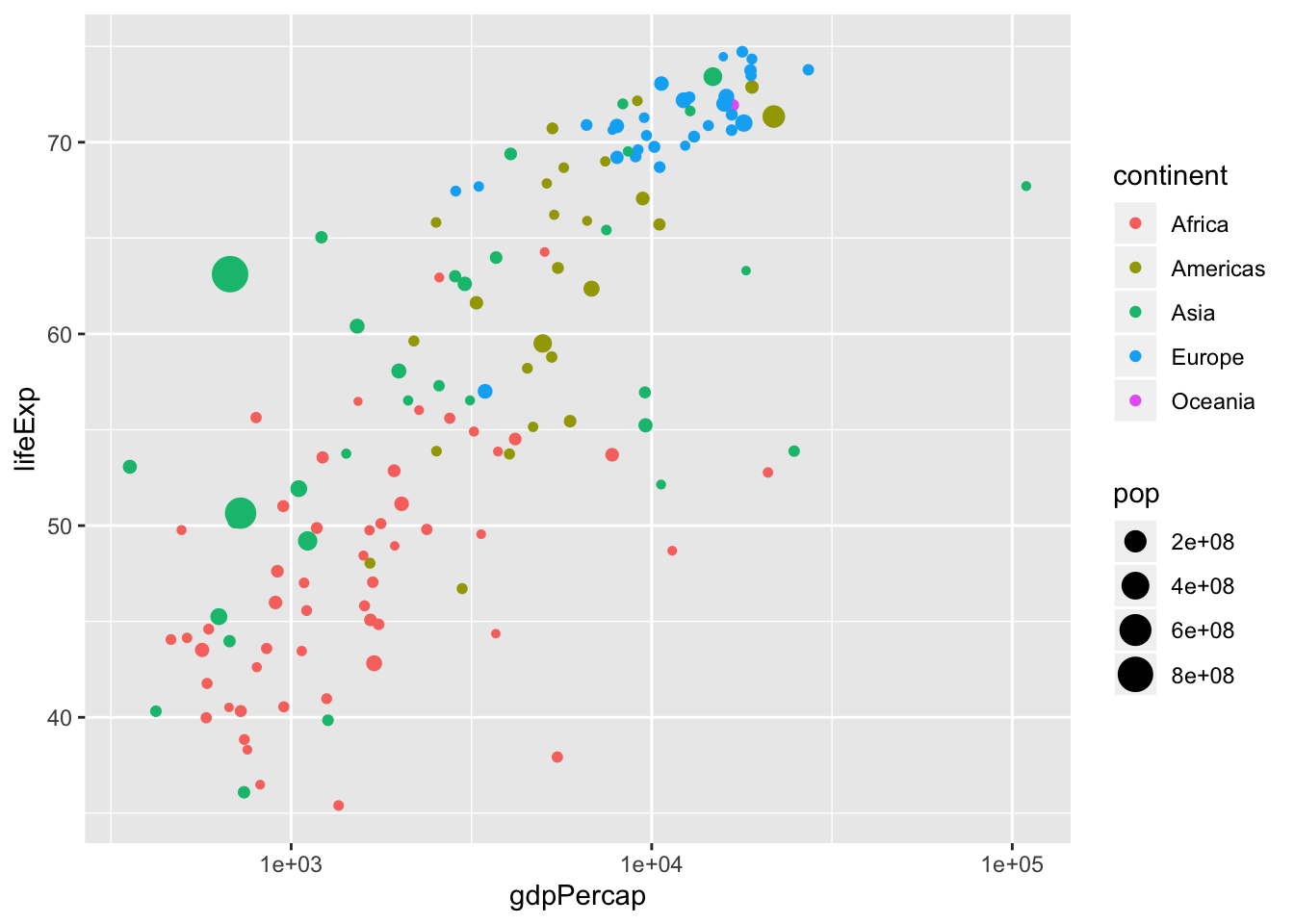
6.28 Excercise 8.
- We can specify the scales as “free” or “fixed”.
- Change scales to “free”
ggplot(data = data, mapping = aes(x = gdpPercap,
                                  y = lifeExp,
                                  size = pop,
                                  color = continent)) +
  geom_point() +
  scale_x_log10() +
  stat_smooth(method = "lm") +
facet_wrap(~continent, scales = "free") #<< ## Warning in qt((1 - level)/2, df): NaNs produced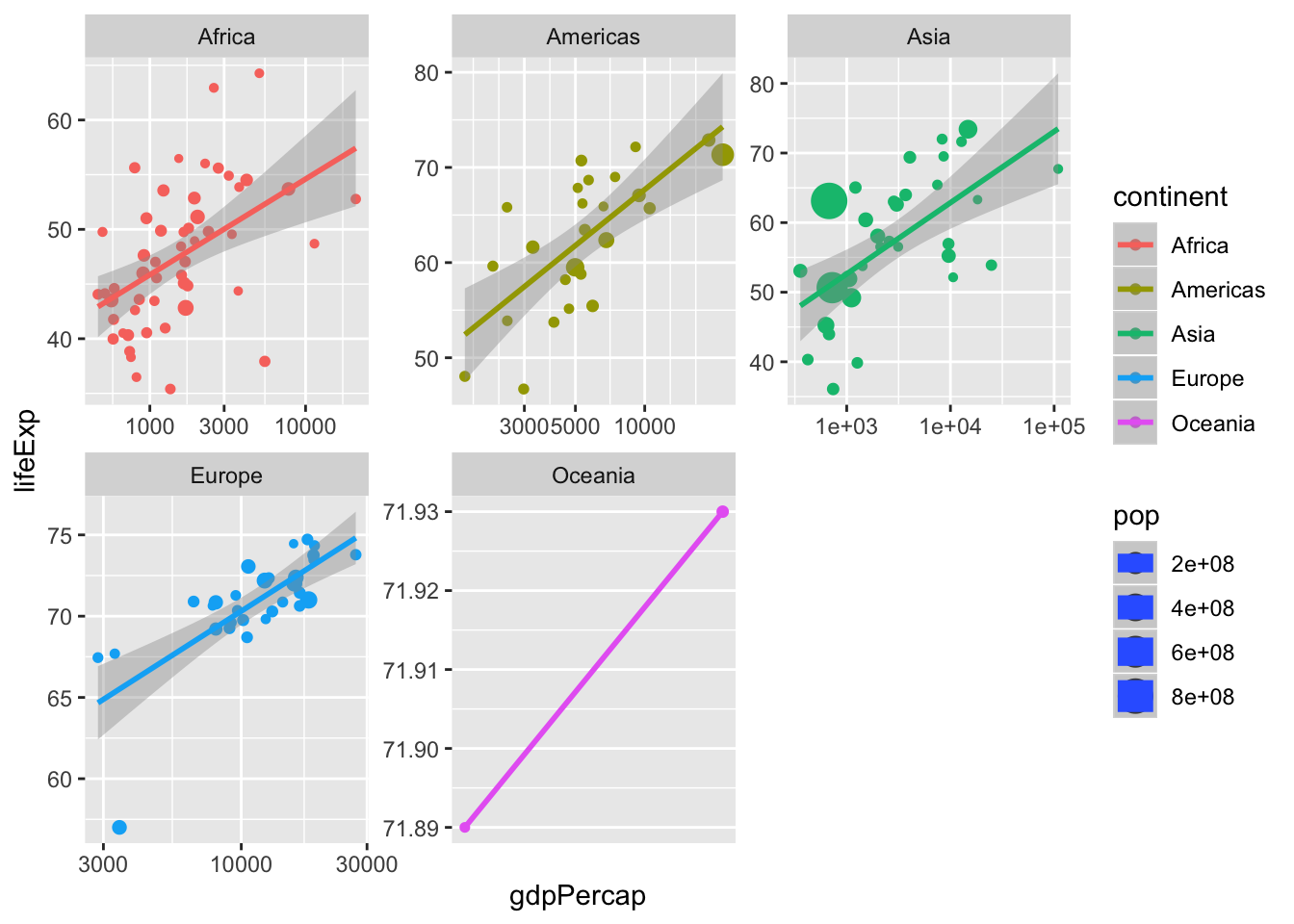
6.29 Excercise 9.
Visualize the relationship between the last two months of data volume.
Which are you aestetics?
Which geom do you use?
Is the scale suitable?
Can you use any statistical computation to visualize the relationship?
6.30 Excercise 10.
Add aestetics
- Such as
fill,colororsize
ggplot(kunder, aes(x = tr_tot_data_vol_all_netw_1,
y = tr_tot_data_vol_all_netw_2,
color = cpe_type,
size = alloc_rrpu_amt)) +
geom_point() +
scale_y_log10() +
scale_x_log10()## Warning: Removed 4 rows containing missing values (geom_point).
6.31 Excercise 11.
Vizualise calculated revenue per month (alloc_rrpu_amt)
Use
%>%Which
geombest represents the data?Is the distribution normal?
Are there any outliers? How do you filter these out?
Is the scale suitable?
## Parsed with column specification:
## cols(
## .default = col_double(),
## source_date = col_date(format = ""),
## ar_key = col_character(),
## cust_id = col_character(),
## pc_l3_pd_spec_nm = col_character(),
## cpe_type = col_character(),
## cpe_net_type_cmpt = col_character(),
## pc_priceplan_nm = col_character(),
## sc_l5_sales_cnl = col_character(),
## rt_fst_cstatus_act_dt = col_date(format = ""),
## rrpu_amt_used = col_character(),
## rcm1pu_amt_used = col_character()
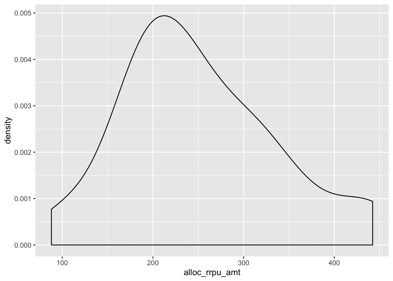
## )## See spec(...) for full column specifications.kunder_sample %>%
filter(alloc_rrpu_amt < 1000) %>%
ggplot(aes(x = alloc_rrpu_amt)) +
geom_histogram()## `stat_bin()` using `bins = 30`. Pick better value with `binwidth`.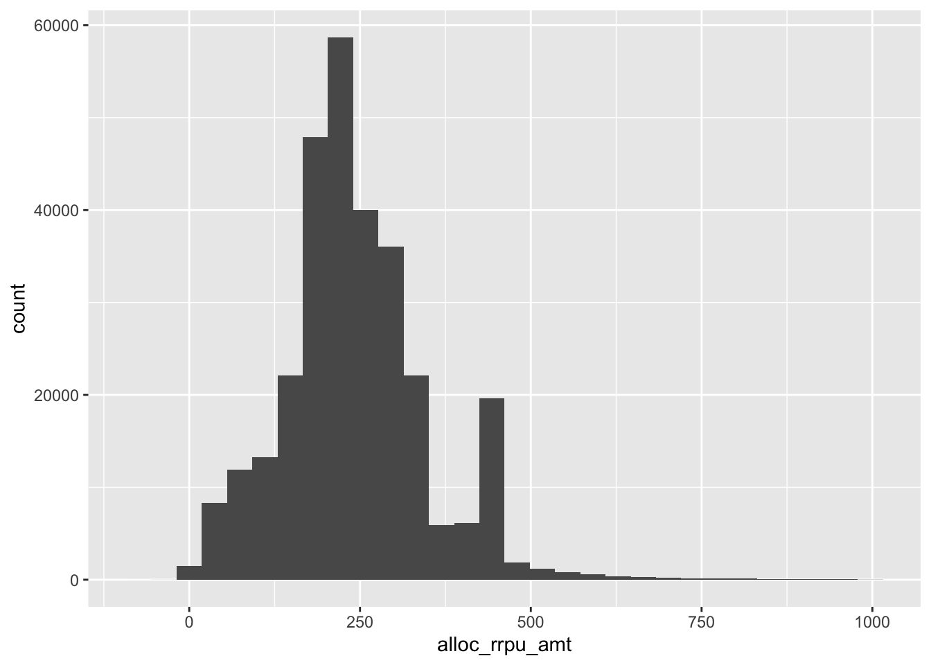
6.32 Excercise 12.
- Inspect the categories of
pc_priceplan_nm, are there any natural categories they could be assigned to?
## # A tibble: 137 x 2
## # Groups:   pc_priceplan_nm [137]
##    pc_priceplan_nm                n
##    <chr>                      <int>
##  1 Fast pris                  44578
##  2 Fast pris +EU 8 GB - 2018  20011
##  3 Unlimited - 2018           15887
##  4 Fast pris +EU 3 GB - 2018  14906
##  5 Fast pris +EU 15 GB - 2018 13686
##  6 Bredband 4G                13218
##  7 Fast pris +EU 1 GB         13017
##  8 Fast pris +EU 15 GB        12634
##  9 Fast pris +EU 5 GB         12610
## 10 Rörligt pris               12273
## # … with 127 more rows- Create a new column that groups priceplan into three or four categories
kunder_sample <- kunder_sample %>%
    mutate(priceplan_cat = case_when(
        str_detect(tolower(pc_priceplan_nm), "bredband") ~ "Bredband",
        str_detect(tolower(pc_priceplan_nm), "fast") ~ "Fast pris",
        TRUE ~ "Rörligt/övrigt")
) Create a summary table of revenue per month per priceplan category (that you previously created)
Visualize it with an adequate geom
Reorder the plot in ascending order
flip the coord if you get a problem with axis
Style your plot with a theme and labels
p <- kunder_sample %>%
    group_by(priceplan_cat) %>%
    summarise(median_rev = median(alloc_rrpu_amt, na.rm = T)) %>%
    ggplot(aes(x = reorder(priceplan_cat, median_rev),  y = median_rev)) +
    geom_col() +
    coord_flip() +
    theme_minimal() +
    labs(title = "Revenue per priceplan",
                        x = "Priceplan", y = "Median revenue")
p
6.34 Excercise 14.
- Add annotations, labels and other styling to your plot
6.35 Example: Annotations and styling
- It is fairly easy to create color palettes and custome themes
- Example: Coop
kunder %>%
    group_by(cpe_type) %>%
    summarise(log_mean_rev = log(mean(alloc_rrpu_amt, na.rm = T))) %>%
    ggplot(aes(x = reorder(cpe_type, log_mean_rev),  y = log_mean_rev, fill = cpe_type)) +
    geom_col() +
    coord_flip() +
    theme_minimal() +
    labs(title = "Revenue per priceplan",
                        x = "CPE Type", y = "Log mean revenue") +
    geom_label(aes(label = round(log_mean_rev, 1)), fill = "white") + #<<
    theme(legend.position = "none") #<<