3 Week3: Data Visualization II
3.1 The Review of Key Concepts in ggplot2
The data is what we want to visualize. It consists of variables, which are stored as columns in a data frame.
Geoms are the geometric objects that are drawn to represent the data, such as bars, lines, and points.
Aesthetic attributes, or aesthetics, are visual properties of geoms, such as x and y position, line color, point shapes, etc.
There are mappings from data values to aesthetics.
Scales control the mapping from the values in the data space to values in the aesthetic space. A continuous y scale maps larger numerical values to vertically higher positions in space.
Guides show the viewer how to map the visual properties back to the data space. The most commonly used guides are the tick marks and labels on an axis.
Notes. This review came from the appendix of Winston Chang’s R Graphics Cookbook. In our class, I just introduced some key concepts and examples in ggplot2. If you want to further develop your skill for ggplot2, I strongly recommend you to read Chang’s book.
Notes. The gcookbook package contains data sets for many examples in Chang’s book.
3.2 Annotations
- Once you create your plot using data, you can add extra contextual information (e.g., text, lines).
3.2.1 Adding Text Annotations
- faithful data
# faithful is a built-in data in R
# ?faithful in your console will display the help documentation for the data
# faithful contains waiting time between eruptions and the duration of the eruption for the Old Faithful geyser in Yellowstone National Park, Wyoming, USA.
# head() will display the first six observations in your screen
head(faithful)
## eruptions waiting
## 1 3.600 79
## 2 1.800 54
## 3 3.333 74
## 4 2.283 62
## 5 4.533 85
## 6 2.883 55- Let’s create the scatter plot between
eruptions(x-axis) andwaiting(y-axis)
# A variable name `p` points to (or binds or references) the ggplot object
# Simply, we just give a name `p` to the ggplot object
# <- is an assignment operator in R
# e.g., a <- 10  # a variable name `a` points to the value `10`
p <- ggplot(faithful, aes(x = eruptions, y = waiting)) +
  geom_point()
p 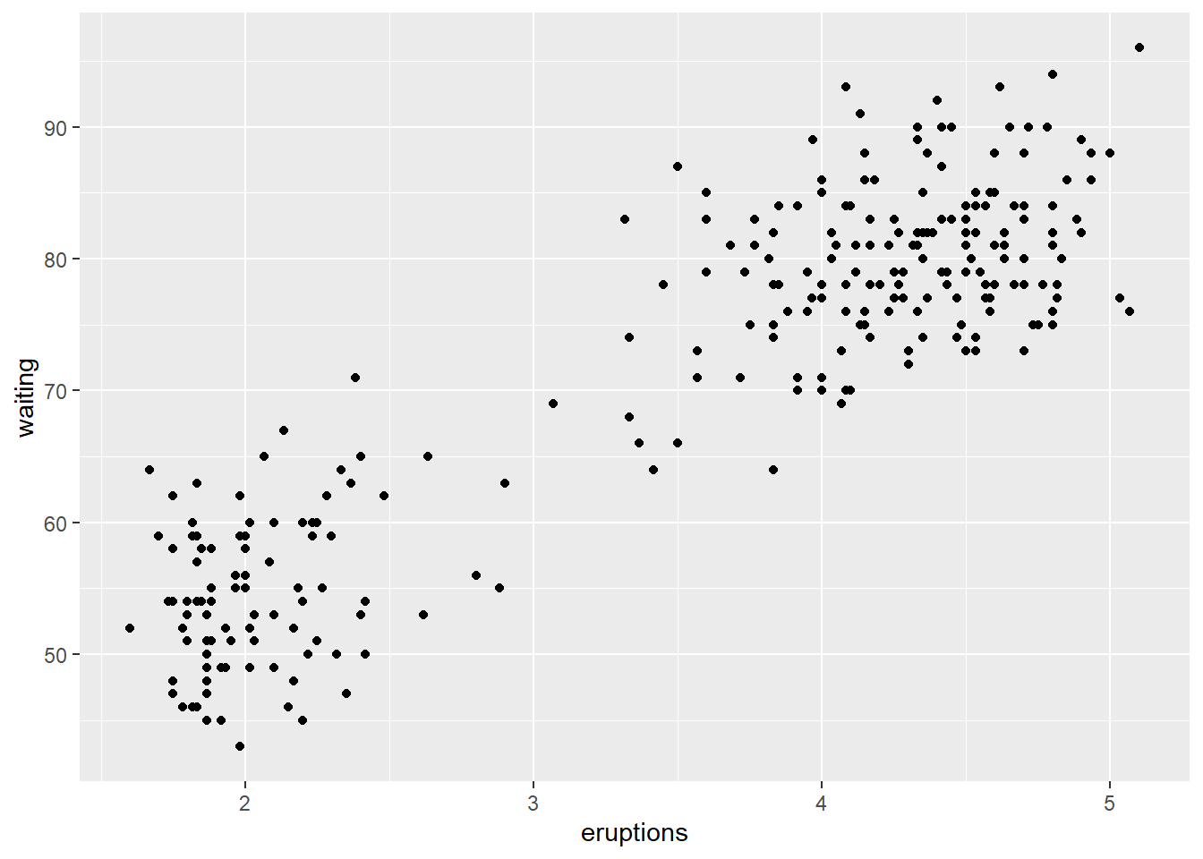
- The
annotate()function can be used to add any type of geometric object. In the example below, we addtextto a plot.
# we are adding another layers to the `p` object
# Where do the values 3, 48, 4.5, and 66 come from?
p +
  annotate("text", x = 3, y = 48, label = "Group 1") +
  annotate("text", x = 4.5, y = 66, label = "Group 2")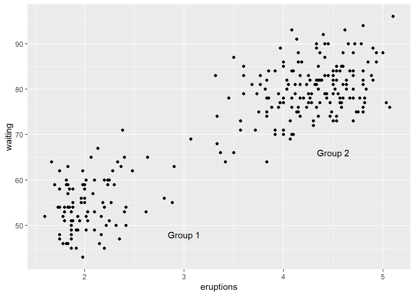
3.2.2 Adding Lines
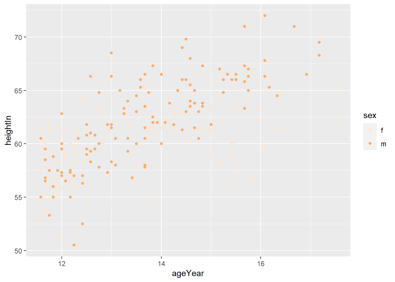
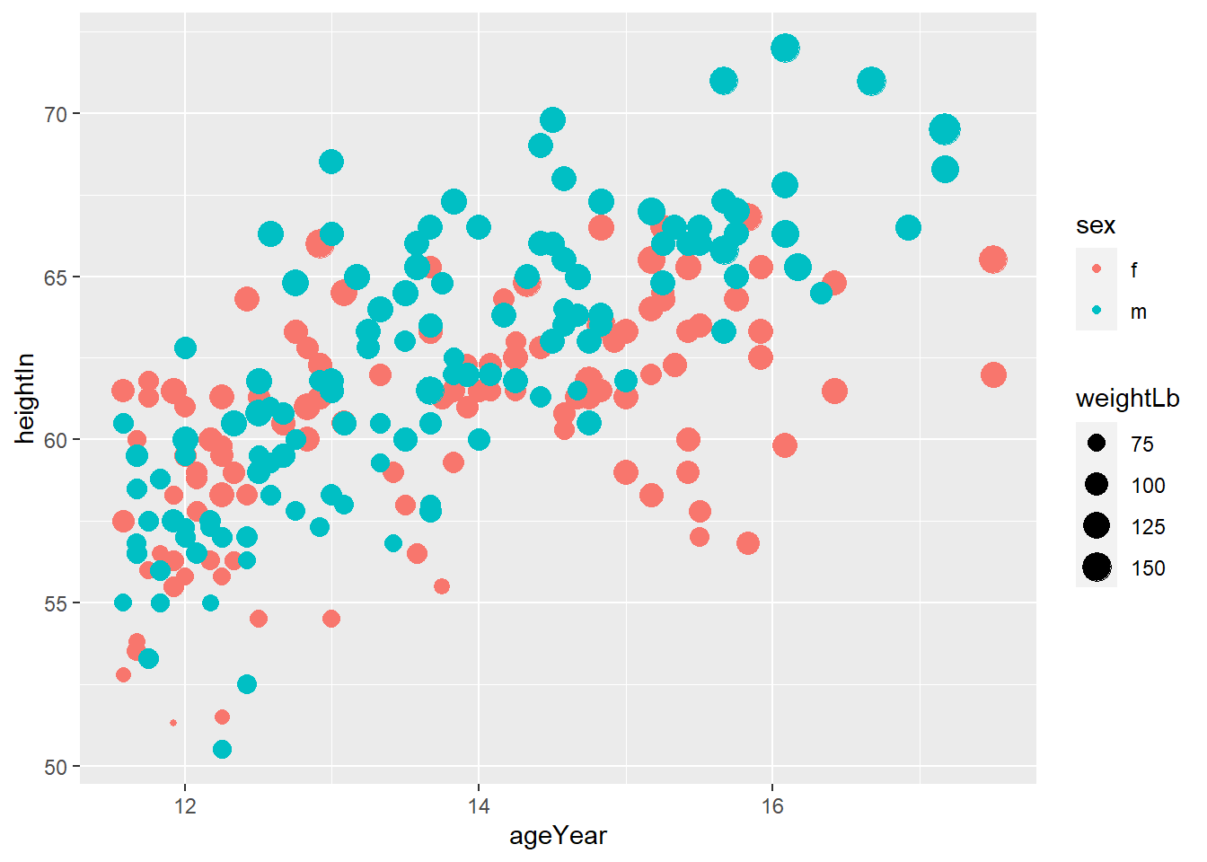
- heightweight data
## sex ageYear ageMonth heightIn weightLb
## 1 f 11.92 143 56.3 85.0
## 2 f 12.92 155 62.3 105.0
## 3 f 12.75 153 63.3 108.0
## 4 f 13.42 161 59.0 92.0
## 5 f 15.92 191 62.5 112.5
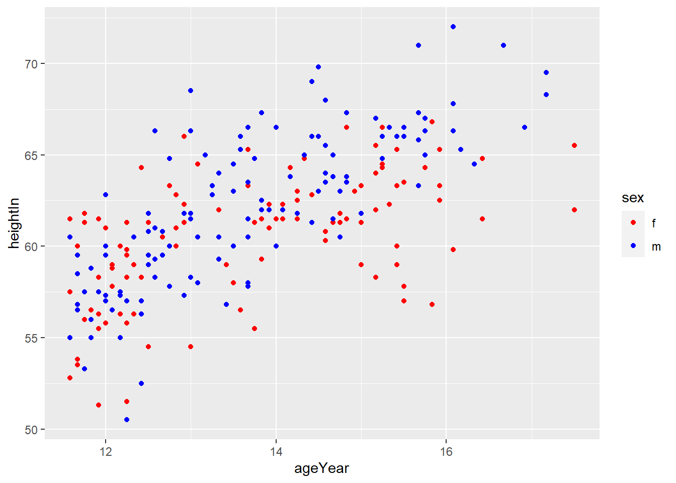
## 6 f 14.25 171 62.5 112.0# How do you read `colour = sex` in the code below?
# Explain the role of `colour = sex`
hw_plot <- ggplot(heightweight, aes(x = ageYear, y = heightIn, colour = sex)) +
geom_point()
hw_plot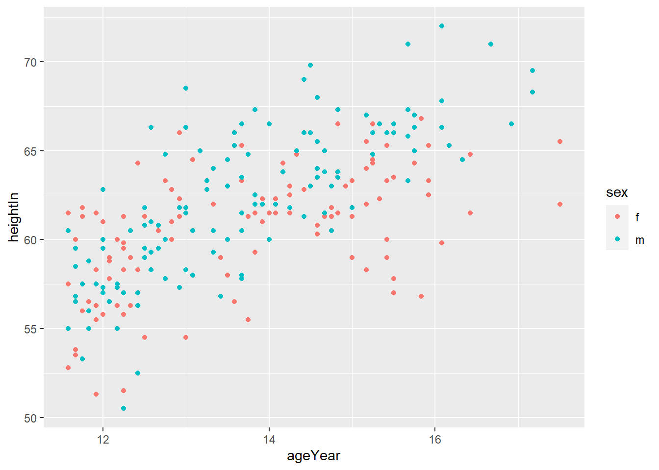
geom_hline(yintercept = y)adds horizontal line at y
# Add horizontal lines
# how do you get more detailed information about the geom_hline() function?
hw_plot +
  geom_hline(yintercept = 60)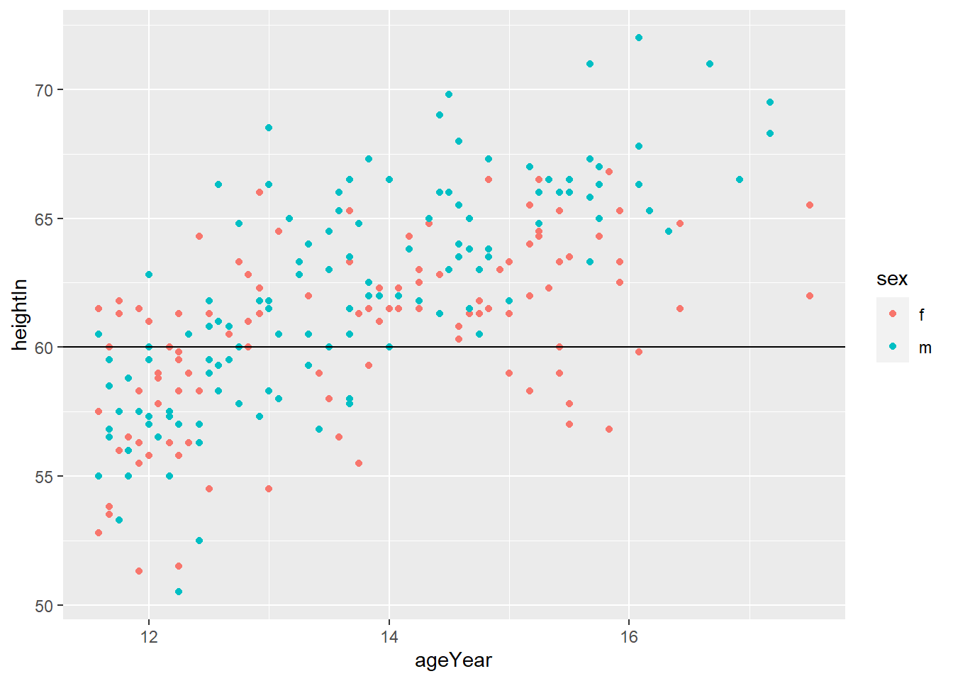
geom_vline(xintercept = x)adds horizontal line at x

- You can do both
# Add horizontal and vertical lines
hw_plot +
  geom_hline(yintercept = 60) +
  geom_vline(xintercept = 14)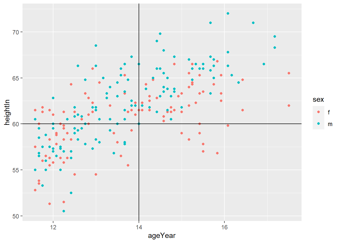
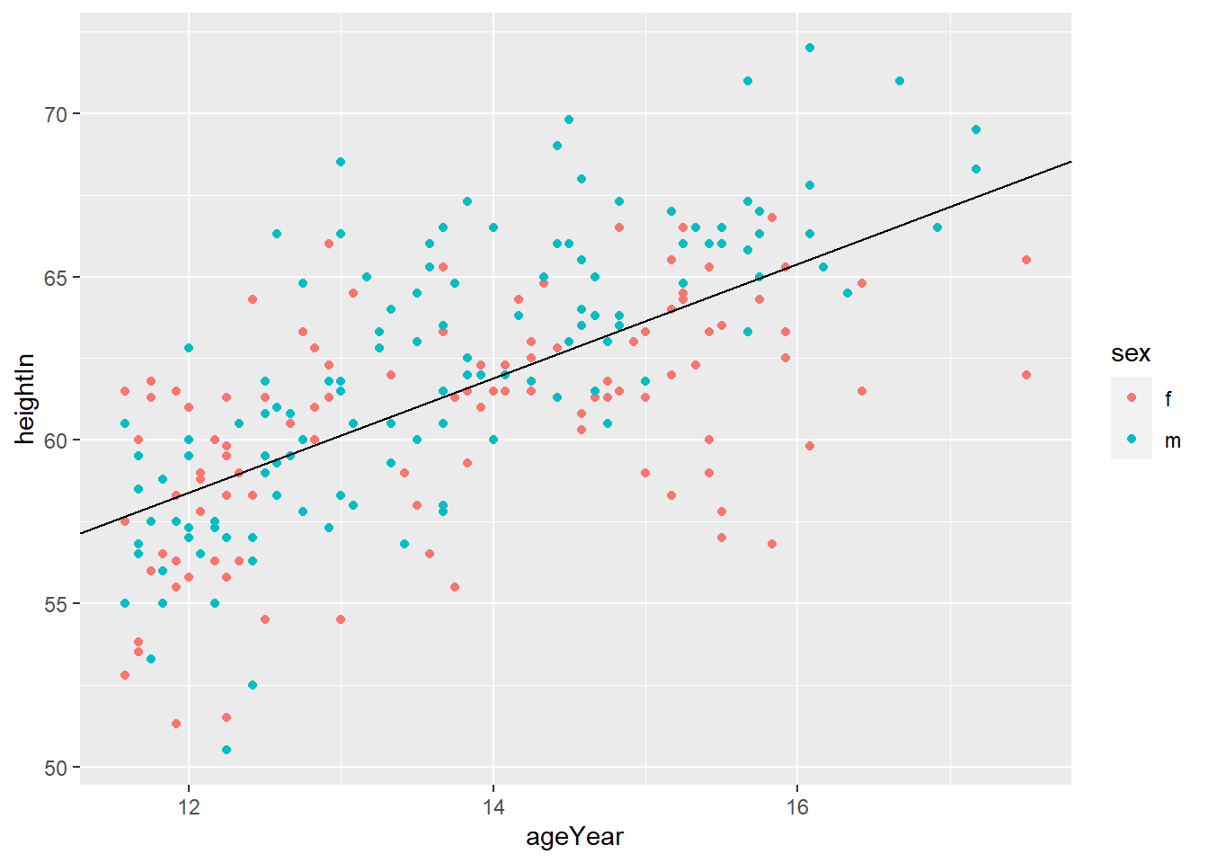
geom_abline(intercept = i, slope = s)adds horizontal line with y = i + s*x
## Warning: `...` is not empty.
##
## We detected these problematic arguments:
## * `needs_dots`
##
## These dots only exist to allow future extensions and should be empty.
## Did you misspecify an argument?
## # A tibble: 234 x 11
## manufacturer model displ year cyl trans drv cty hwy fl class
## <chr> <chr> <dbl> <int> <int> <chr> <chr> <int> <int> <chr> <chr>
## 1 audi a4 1.8 1999 4 auto(l~ f 18 29 p comp~
## 2 audi a4 1.8 1999 4 manual~ f 21 29 p comp~
## 3 audi a4 2 2008 4 manual~ f 20 31 p comp~
## 4 audi a4 2 2008 4 auto(a~ f 21 30 p comp~
## 5 audi a4 2.8 1999 6 auto(l~ f 16 26 p comp~
## 6 audi a4 2.8 1999 6 manual~ f 18 26 p comp~
## 7 audi a4 3.1 2008 6 auto(a~ f 18 27 p comp~
## 8 audi a4 quat~ 1.8 1999 4 manual~ 4 18 26 p comp~
## 9 audi a4 quat~ 1.8 1999 4 auto(l~ 4 16 25 p comp~
## 10 audi a4 quat~ 2 2008 4 manual~ 4 20 28 p comp~
## # ... with 224 more rows3.3 Axes
- ggplot will display the axes with defaults that look good in most cases, but you might want to control, for example, the axis labels, the number and placement of tick marks, the tick mark labels, and so on.
3.3.1 Swapping X- and Y-Axes
- You can’t read the tick labels
coord_flip()flips the axes

3.3.2 Setting the Position of Tick Marks
- Often, we want to set the tick marks on the axis
breakssets the tick marks.
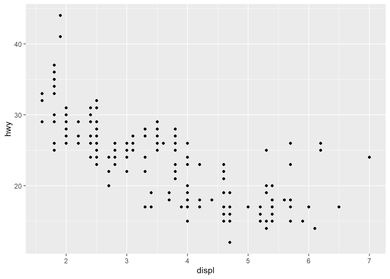
ggplot(mpg, aes(x = displ, y = hwy)) +
geom_point() +
scale_x_continuous(breaks = c(2,4,6)) +
scale_y_continuous(breaks = c(15, 25, 35, 45))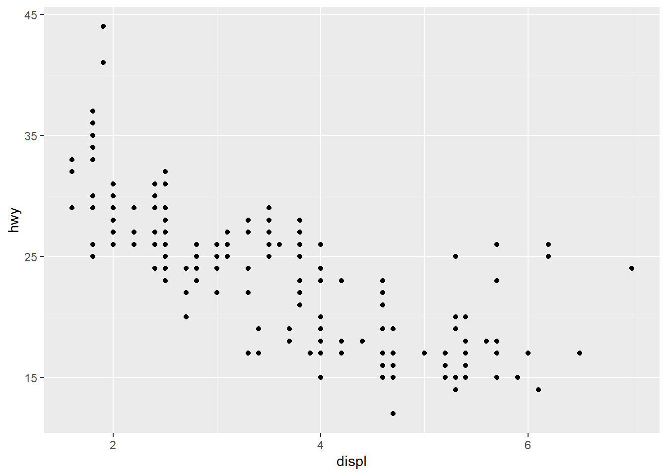
3.3.3 Changing the Text of Tick Labels
labelssets the tick labels.
ggplot(mpg, aes(x = displ, y = hwy)) +
geom_point() +
scale_x_continuous(breaks = c(2,4,6), labels = c("2 cylinders", "4 cylinders", "6 cylinders")) +
scale_y_continuous(breaks = c(15, 25, 35, 45))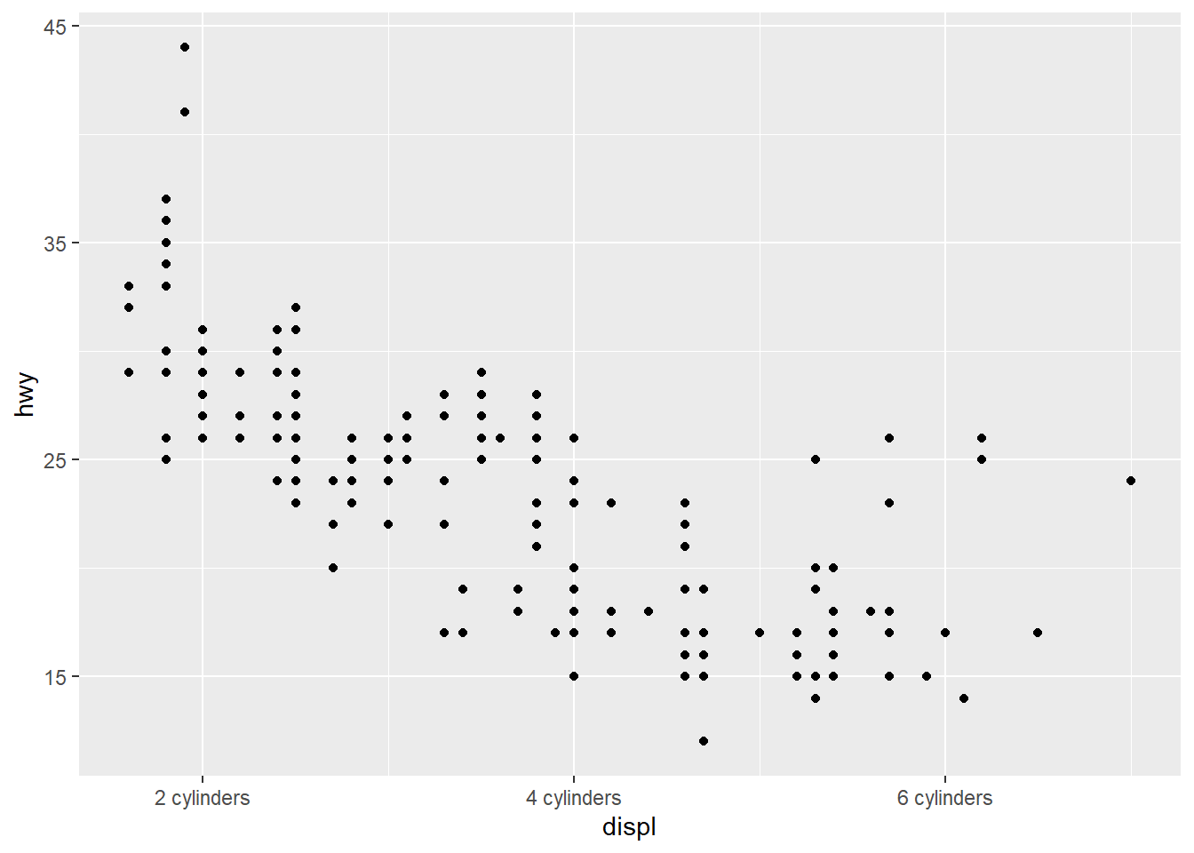
3.3.4 Changing the Appearance of Tick Labels
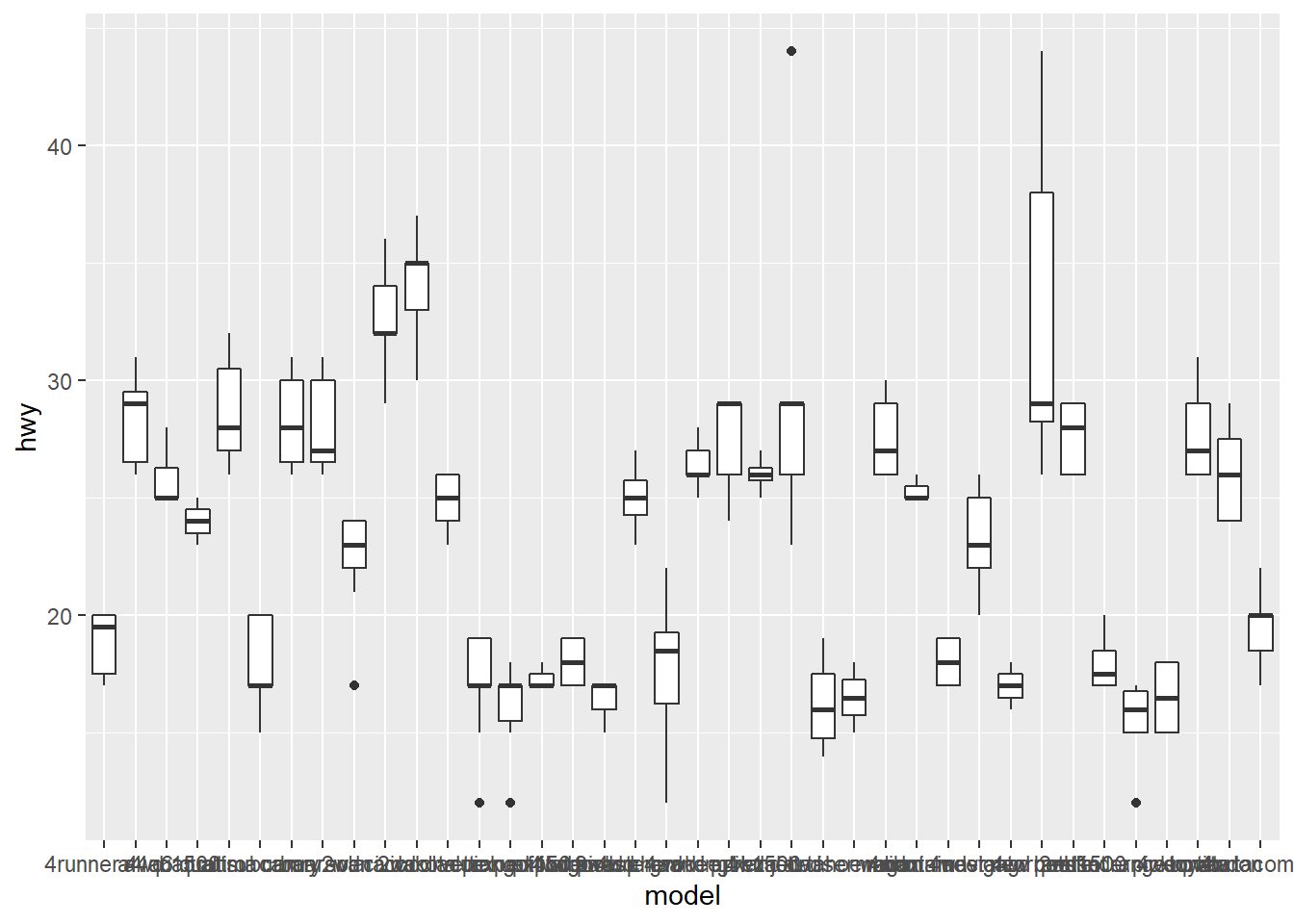
- You can rotate your tick labels using
theme().

# rotate 30 degrees
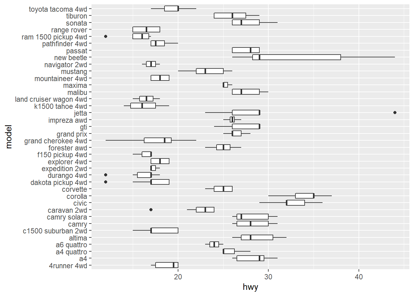
ggplot(mpg, aes(x = model, y = hwy)) +
geom_boxplot() +
theme(axis.text.x = element_text(angle = 30))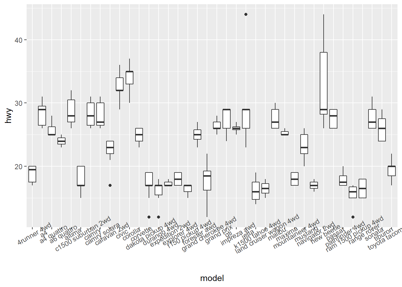
# rotate 90 degrees
ggplot(mpg, aes(x = model, y = hwy)) +
geom_boxplot() +
theme(axis.text.x = element_text(angle = 90))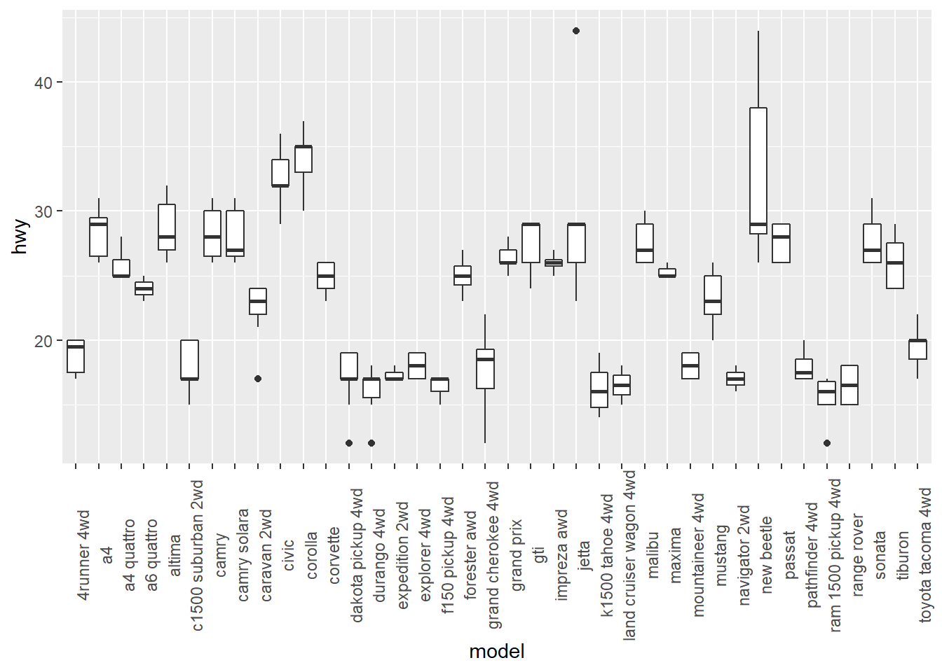
3.4 Using Colors in Plots
3.4.1 Setting and Mapping the Colors of Objects
- It is important to distinguish
- setting aesthetics to a constant
- mapping aesthetics to a variable
- Setting aesthetics to a constant means you fix the value of aesthetics to a constant value.
# set the value of the color aesthetics to "blue"
ggplot(mpg, aes(x = displ, y = hwy)) +
geom_point(color = "blue") 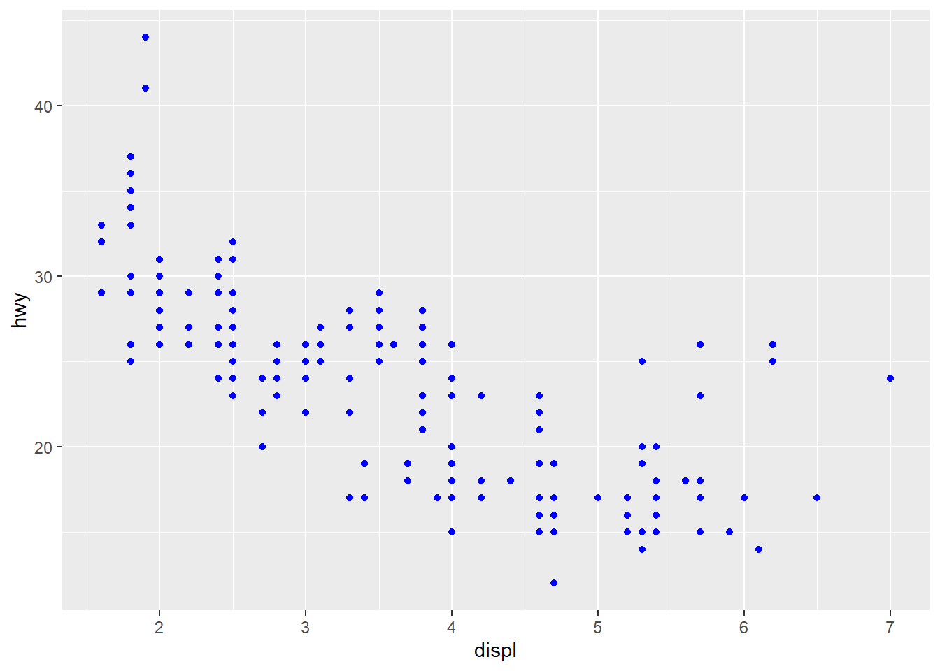
# set the value of the color aesthetics to "red"
ggplot(mpg, aes(x = displ, y = hwy)) +
geom_point(color = "red") 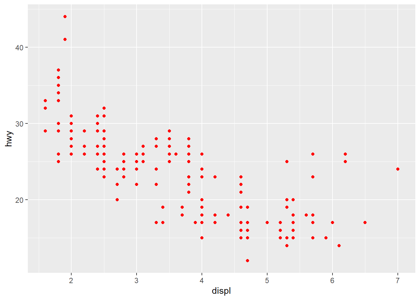
You can find many resources on the name of the color in R by typing “R color” in Google. Here is an example.
Mapping aesthetics to a variable means you want to use different colors depending on the value of the variable.
# map the value of the color aesthetics to the variable `drv`
# This is called an aesthetic mapping, and you need aes()
ggplot(mpg, aes(x = displ, y = hwy)) +
geom_point(aes(color = drv)) 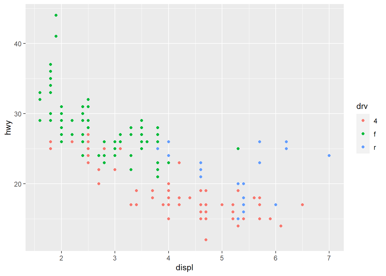
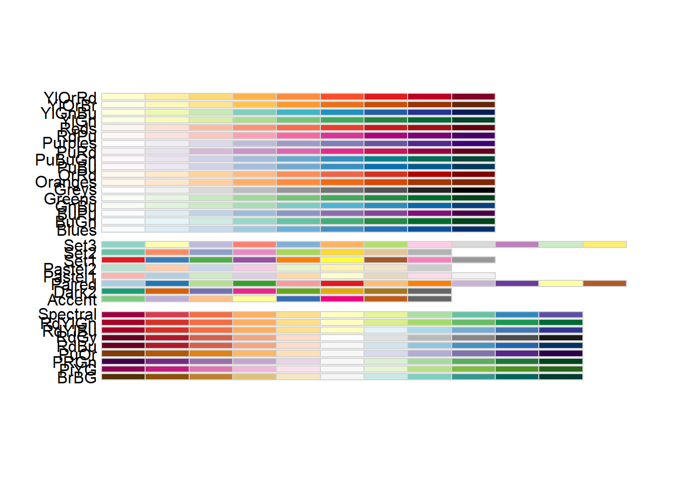
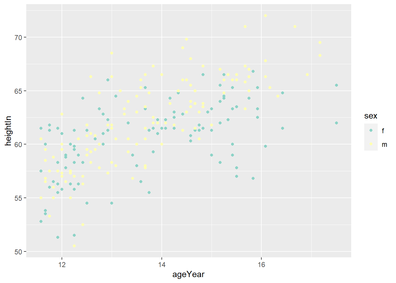
3.4.2 Using a Different Palette for a Discrete Variable
- To use different color scheme, color palettes are available from the
RColorBrewerpackage.
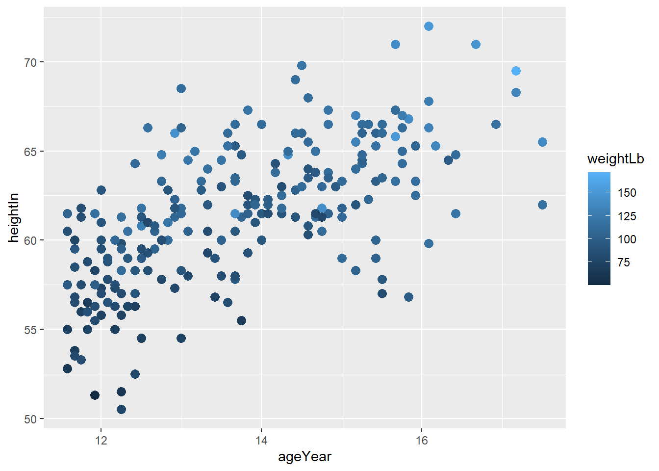
library(gcookbook)
hw_splot <- ggplot(heightweight, aes(x = ageYear, y = heightIn, colour = sex)) +
  geom_point()
hw_splot
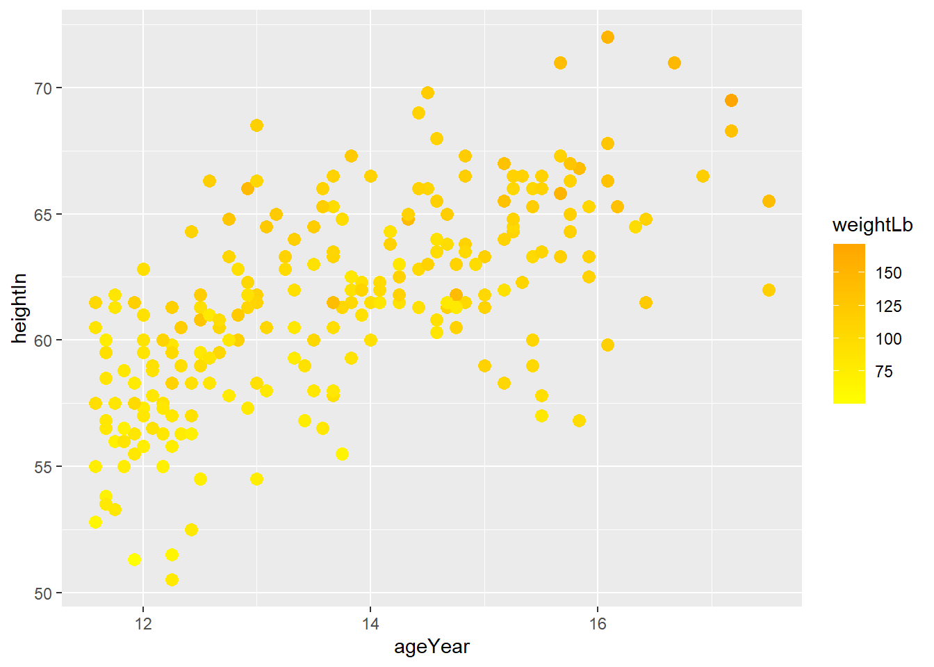
3.4.3 Using a Manually Defined Palette for a Discrete Variable
scale_colour_manual()sets the values of color
3.5 Legends
- The
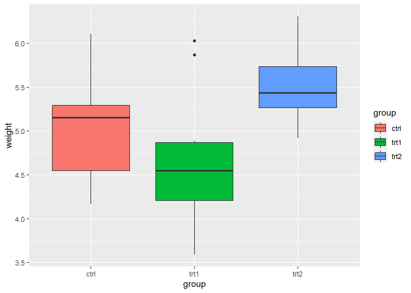
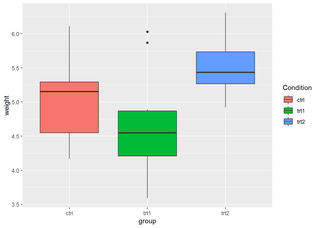
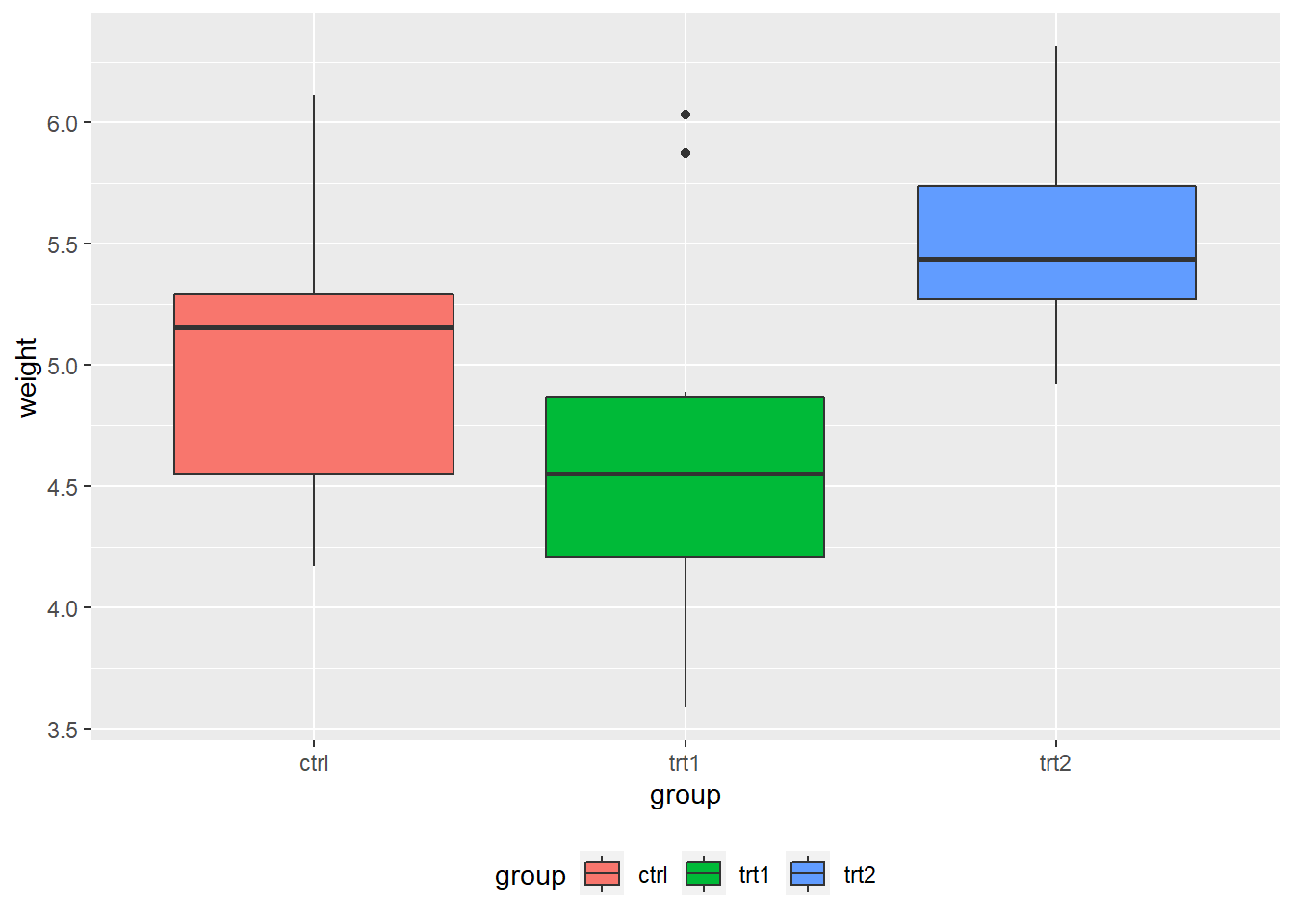
PlantGrowthdata are the results from an experiment to compare yields (as measured by dried weight of plants) obtained under a control and two different treatment conditions.
- Use
labs()and set the value offill,colour,shape, or whatever aesthetic is appropriate for the legend
- In fact,
labs()sets the title, subtitle, caption, x-axis label, y-axis label, and the title of the legend.
pg_plot +
  labs(title = "Weight of Plants",
       subtitle = "By Experimental Conditions",
       caption = "source: PlantGrowth",
       x = "Experimental Conditions",
       y = "Weight (pounds)",
       fill = "Condition")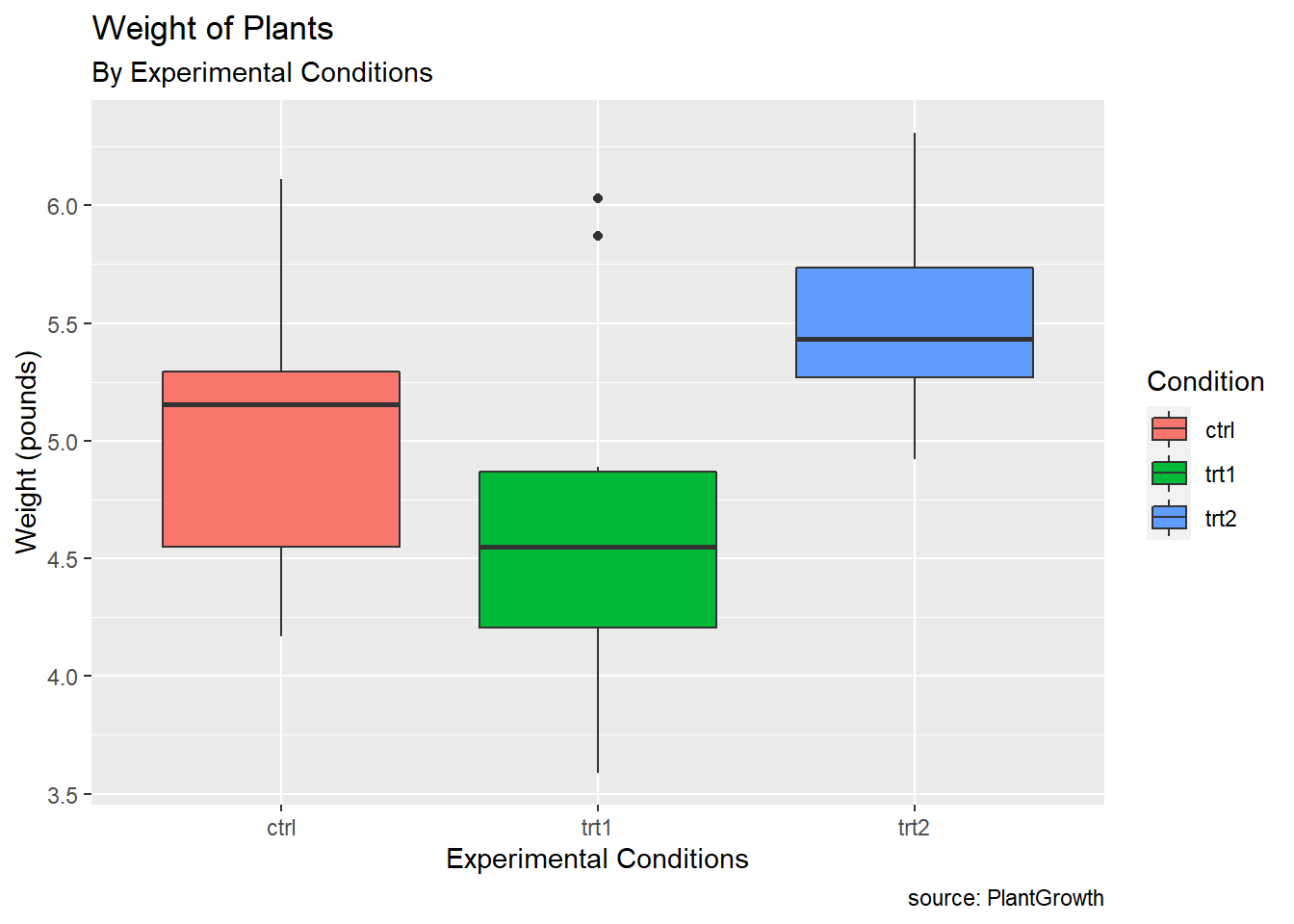
- Changing the position of the legend

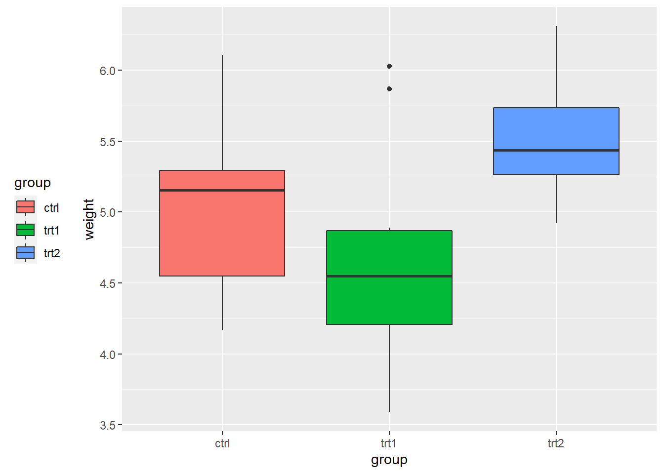
# place the legend inside the plot
# The coordinate space starts at (0, 0) in the bottom left and goes to (1, 1) in the top right.
pg_plot +
  theme(legend.position = c(.8, .3))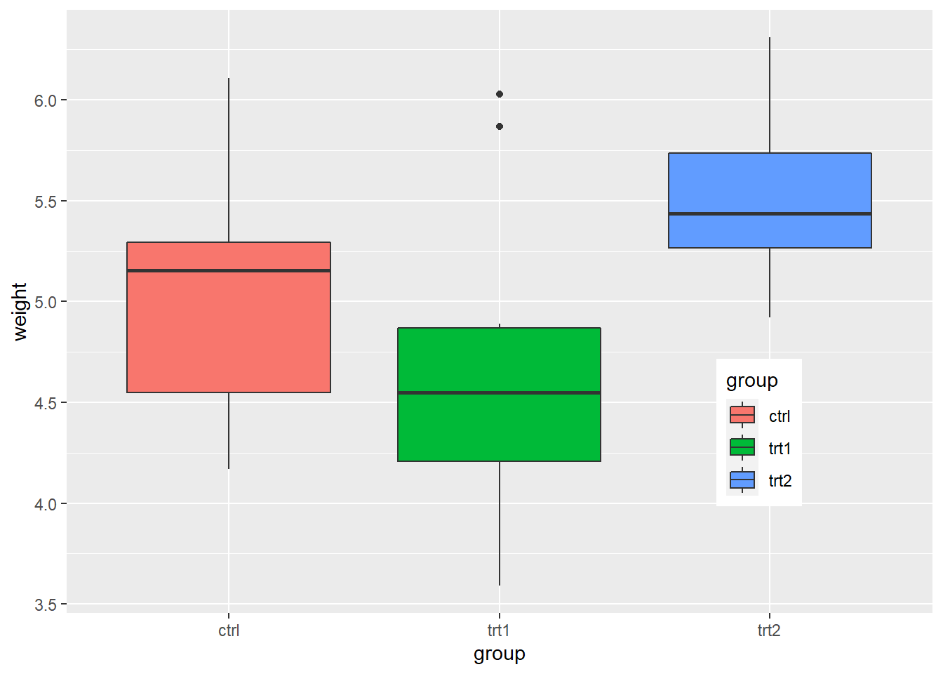
3.6 Exercise
- Replicate each plot by yourself
3.6.1 Exercise 3-1
- Using the
heightweightdataset in thegcookbookpackage, replicate the following plots
# Height and weight of school children
# head() displays the first six observations
head(heightweight)
## sex ageYear ageMonth heightIn weightLb
## 1 f 11.92 143 56.3 85.0
## 2 f 12.92 155 62.3 105.0
## 3 f 12.75 153 63.3 108.0
## 4 f 13.42 161 59.0 92.0
## 5 f 15.92 191 62.5 112.5
## 6 f 14.25 171 62.5 112.0
- Exercise 3-1-a. Replicate the plot above
- Often we want to set (or map) the transparency of points, especially when points overlaps. In that case,
alphacontrols the transparency of points. In this exercise, usealpha = 0.3.

- Exercise 3-1-b. Replicate the above plot
ggplot(heightweight, aes(x = ageYear, y = heightIn, size = weightLb, color = sex)) +
  geom_point(alpha = 0.3)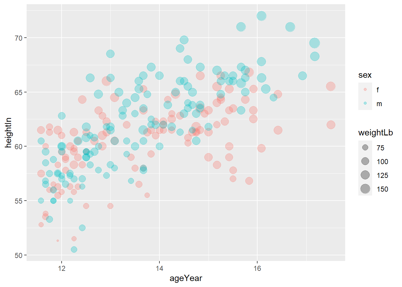
- you can set the title, subtitle, x-axis label, y-axis label, and legend title using
labs()
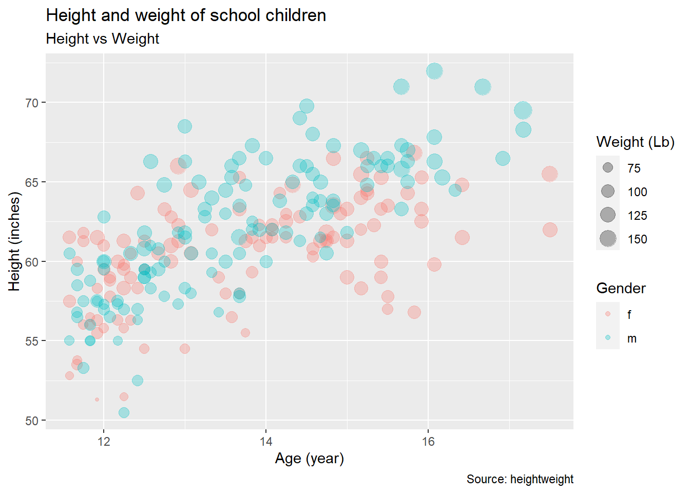
- Exercise 3-1-c. Replicate the above plot
ggplot(heightweight, aes(x = ageYear, y = heightIn, size = weightLb, color = sex)) +
  geom_point(alpha = 0.3) +
  labs(title = "Height and weight of school children",
       subtitle = "Height vs Weight",
       caption = "Source: heightweight",
       x = "Age (year)",
       y = "Height (inches)",
       size = "Weight (Lb)",
       color = "Gender"
  )
- You may want to use themes. Use
theme_classic().

- Exercise 3-1-d. Replicate the above plot
ggplot(heightweight, aes(x = ageYear, y = heightIn, size = weightLb, color = sex)) +
  geom_point(alpha = 0.3) +
  labs(title = "Height and weight of school children",
       subtitle = "Height vs Weight",
       x = "Age (year)",
       y = "Height (inches)",
       size = "Weight (Lb)",
       color = "Gender"
  ) +
  theme_classic()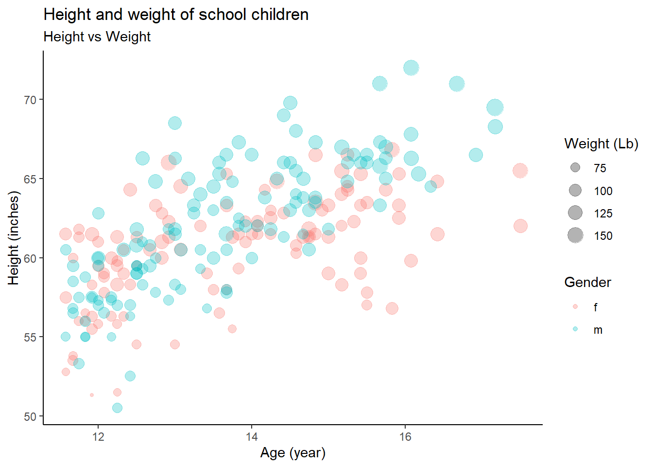
3.6.2 Exercise 3-2
- Using the
heightweightdataset in thegcookbookpackage, replicate the following plots
# Height and weight of school children
# head() displays the first six observations
head(heightweight)
## sex ageYear ageMonth heightIn weightLb
## 1 f 11.92 143 56.3 85.0
## 2 f 12.92 155 62.3 105.0
## 3 f 12.75 153 63.3 108.0
## 4 f 13.42 161 59.0 92.0
## 5 f 15.92 191 62.5 112.5
## 6 f 14.25 171 62.5 112.0geom_histogram()displays a histogram to display the distribution of a variable.
## `stat_bin()` using `bins = 30`. Pick better value with `binwidth`.
- Exercise 3-2-a. Replicate the above plot
## `stat_bin()` using `bins = 30`. Pick better value with `binwidth`.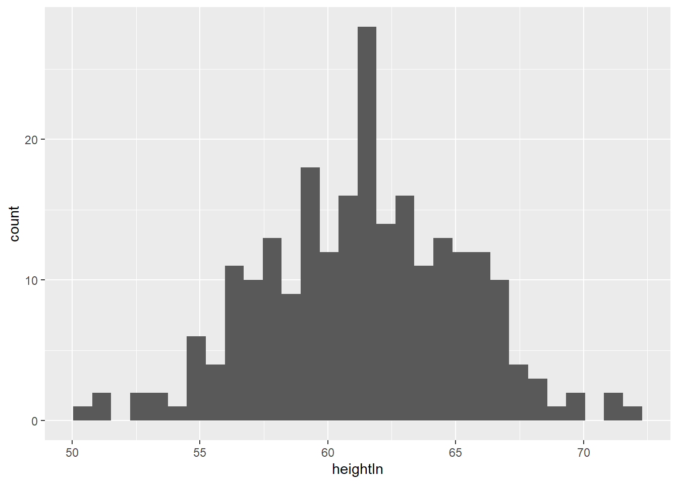
- The
fillaesthetics control the inside color of a geometric object.
## `stat_bin()` using `bins = 30`. Pick better value with `binwidth`.
- Exercise 3-2-b. Replicate the above plot
## `stat_bin()` using `bins = 30`. Pick better value with `binwidth`.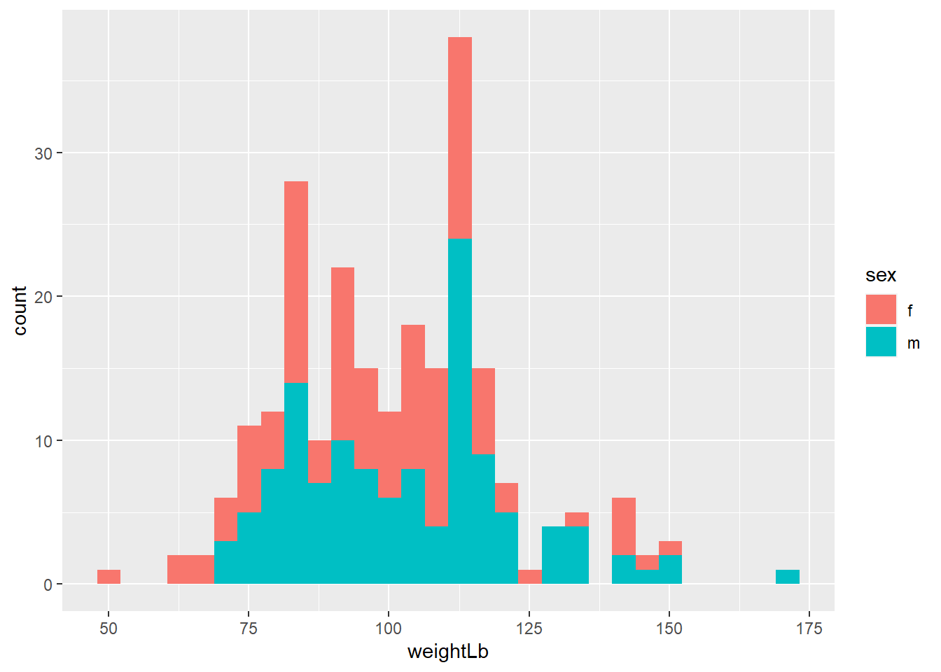
- If you use
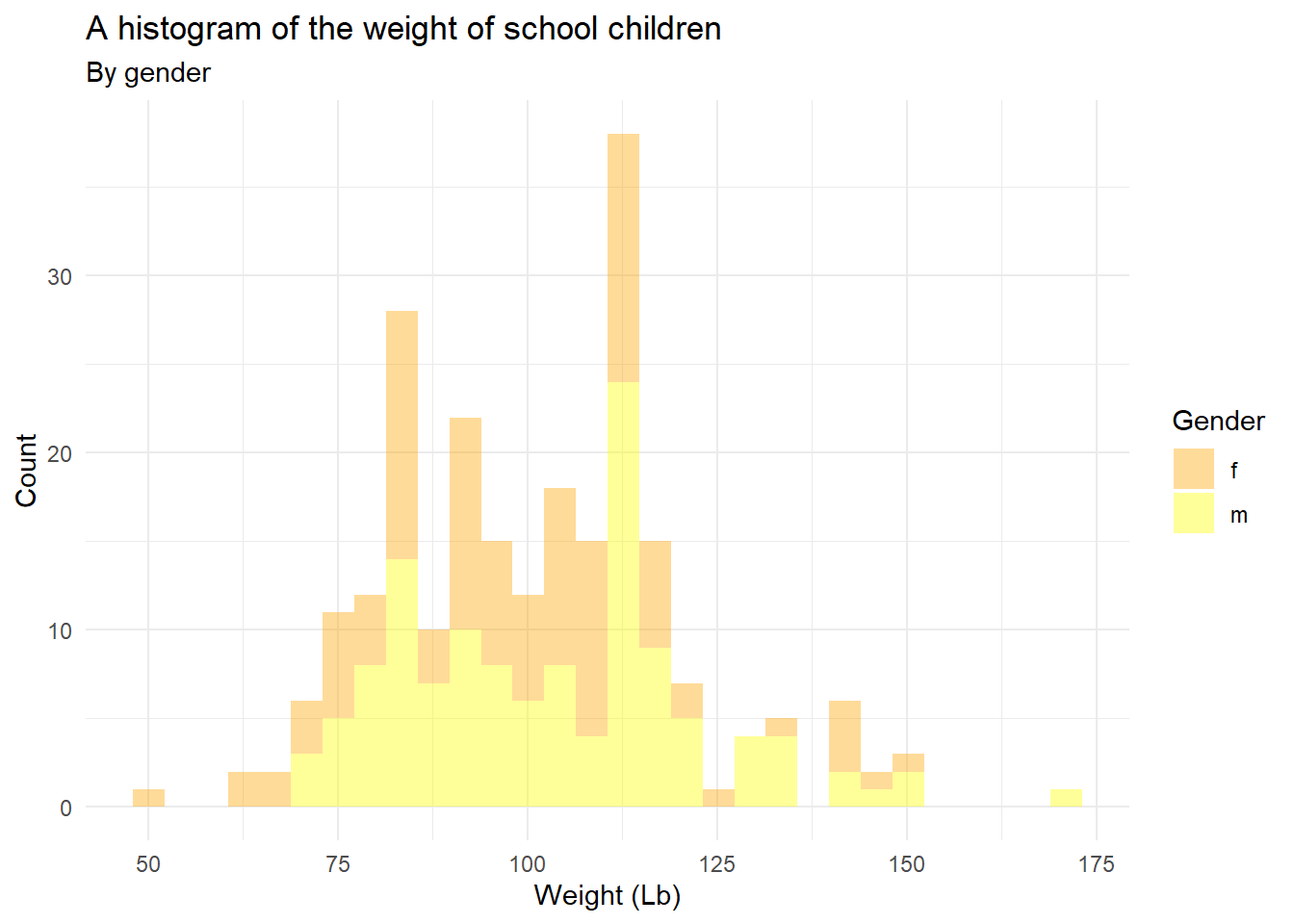
colorandfillaesthetics, you needscale_color_manual()andscale_fill_manual()to manually control the color and fill aesthetics. Depending on the aesthetic you used in 3-2-a, manually change the color of the female to orange and male to yellow.
## `stat_bin()` using `bins = 30`. Pick better value with `binwidth`. * Exercise 3-2-c. Replicate the above plot
ggplot(heightweight, aes(x = weightLb, fill = sex)) +
  geom_histogram(alpha = 0.4) +
  scale_fill_manual(values = c("orange", "yellow"))
## `stat_bin()` using `bins = 30`. Pick better value with `binwidth`.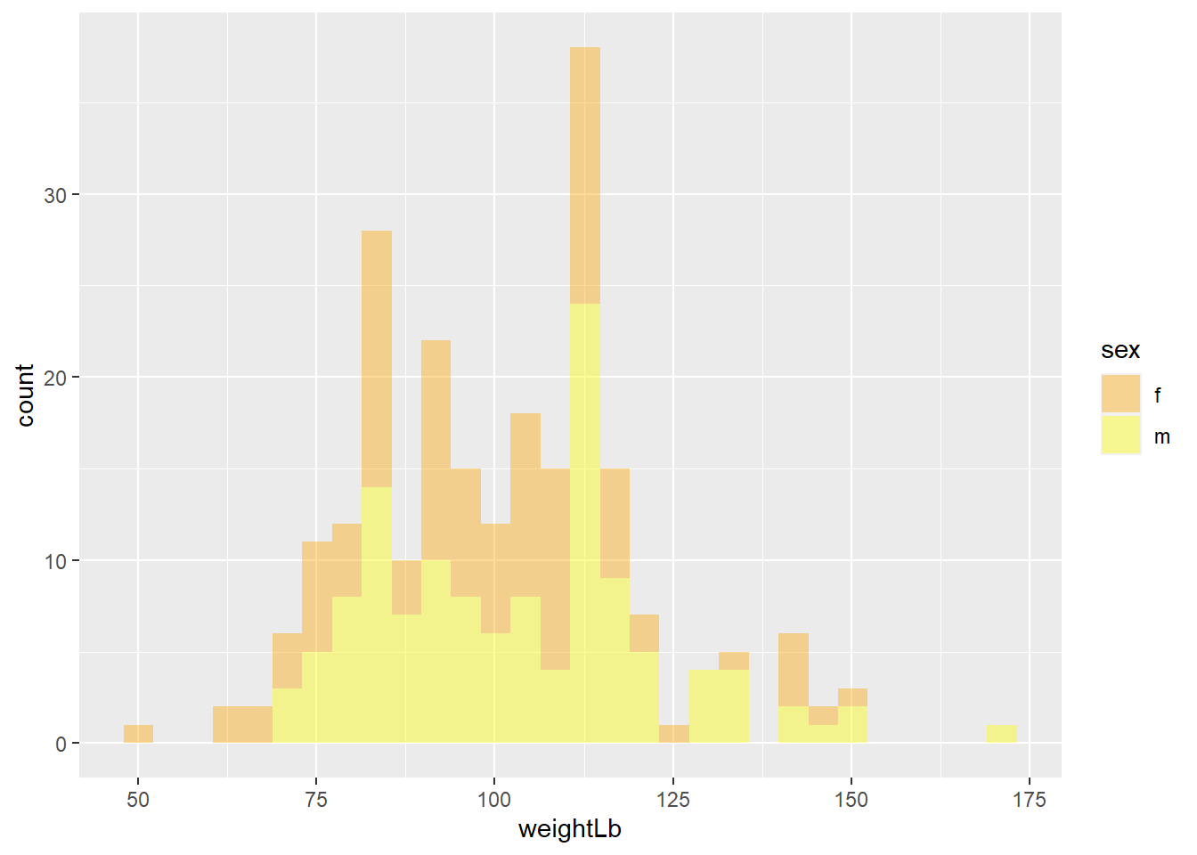
- Again, add titles and apply
theme_minimal()
## `stat_bin()` using `bins = 30`. Pick better value with `binwidth`.
- Exercise 3-2-d. Replicate the above plot
ggplot(heightweight, aes(x = weightLb, fill = sex)) +
  geom_histogram(alpha = 0.4) +
  scale_fill_manual(values = c("orange", "yellow")) +
  labs(title = "A histogram of the weight of school children",
       subtitle = "By gender",
       x = "Weight (Lb)",
       y = "Count",
       fill = "Gender"
  ) +
  theme_minimal()
## `stat_bin()` using `bins = 30`. Pick better value with `binwidth`.