4 Creating Graphics with ggplot2
The package ggplot2 provides an abstract and declarative environment for creating graphics.
The graphics system built into R is already quite powerful and flexible, but creating sophisticated graphics can be time-consuming and many steps that could be performed automatically, like adding a legend, have to be performed manually. Code producing more complex visualisations tends be “procedural”: rather than describing how the visualisation should look like, the code describes the detailed control flow of how the plot is constructed.
4.1 ggplot terms
This section gives an overview of key terms in the ggplot2 world. ggplot2 is based on the philosophy of a “layered grammar of graphics”: plots in ggplot2 are made up of at least one layer of geometric objects.
4.1.1 Geometric objects
A geometric object (or geom_<type>(...) in ggplot2 commands) controls what type of plot a layer contains. The are many different geometric objects: the most important ones are …
| Geometry name | Description | Basic R equivalent | Common aesthetics |
|---|---|---|---|
geom_point |
Points (scatter plot) |
plot / points
|
x, y, alpha, colour, shape,size
|
geom_line |
Lines (drawn left to right) |
lines (after ordering) |
x, y, alpha, colour,linetype, size
|
geom_path |
Lines (drawn in original order) | lines |
x, y, alpha, colour, group,linetype, size
|
geom_abline |
Line (one line) | abline |
intersept, slope, alpha,colour, linetype, size
|
geom_hline |
Horizontal line | abline |
yintercept, alpha,colour, linetype, size
|
geom_vline |
Vertical line | abline |
xintercept, alpha, colour,linetype, size
|
geom_text |
Text | text |
x, y, label, alpha, angle, colour, size, family, hjust,vjust, check_overlap
|
geom_label |
Text (styled as label) | text |
x, y, label, alpha, angle, colour, size, family, hjust, vjust, check_overlap
|
geom_rect |
Rectangle | rect |
xmin, xmax, ymin, ymax,alpha, colour, fill,linetype, size
|
geom_polygon |
Polygon | polygon |
x, y, alpha, colour, fill,group, linetype, size
|
geom_ribbon |
Ribbon (for confidence bands) | - |
x, ymin, ymax, alpha, colour,fill, group, linetype,size
|
geom_bar |
Bar plot | barplot |
x, alpha, colour, fill,linetype, size
|
geom_boxplot |
Boxplot | boxplot |
x, y, alpha, colour, fill,group, linetype,shape, size
|
geom_histogram |
Histogram | hist |
x, y, alpha, colour, fill,linetype, size
|
geom_raster /geom_tile
|
Image plot | image |
x, y, alpha, fill (both) and linetype, size, width (geom_tiles only) |
geom_counter |
Contour lines | contour |
x, y, z, alpha, colour, group,linetype,size
|
There is a cheat sheet providing a detailed overview of the different geometries and data.
4.1.2 Aesthetics
An aesthetic (or aes(...) in ggplot2 commands) controls which variables are mapped to which properties of the geometric objects (like x-coordinates, y-coordinates, colours, etc.). The aesthetics available depend on the geometric object. Aesthetics commonly available are …
| Aesthetic | Description |
|---|---|
x |
x-coordinate |
y |
y-coordinate |
color or colour
|
Colour (outline) |
fill |
Fill colour |
alpha |
Transparency (transparent \(0\leq \alpha\leq 1\) opaque) |
linetype |
Line type (“lty”) |
symbol |
Plotting symbol (“pch”) |
size |
Size of plotting symbol / font or line thickness |
The help file for each geometry lists the available aesthetics.
4.2 Using the more general ggplot interface
4.2.1 A typical ggplot call
A plotting command for ggplot consists of a sequence of function calls added together using the standard sum operator +:
ggplot(data=...) +                # Specify data source
    aes(...) +                    # Generic aesthetics applying to all layers
    geom_<type>(aes(...), ...)  + # Geometry for one layer with layers-specific aesthetics
    geom_<type>(aes(...), ...)  +
    ...                           # Further arguments for fine-tuning (themes, scales, facets, ...)
geom_<type> objects do not necessarily have to use the same data as specified in the call to ggplot. If the optional argument data is specified, then the data source provided is used for this layer.
For the following example, we will use data on health expenditure by country, reported on an annual basis. We can produce a plot like the following using ggplot commands
ggplot(data=health) +
  aes(x=HealthExpenditure,  y=LifeExpectancy) +
  geom_point(aes(colour=Region, size=Population)) +
  scale_x_log10()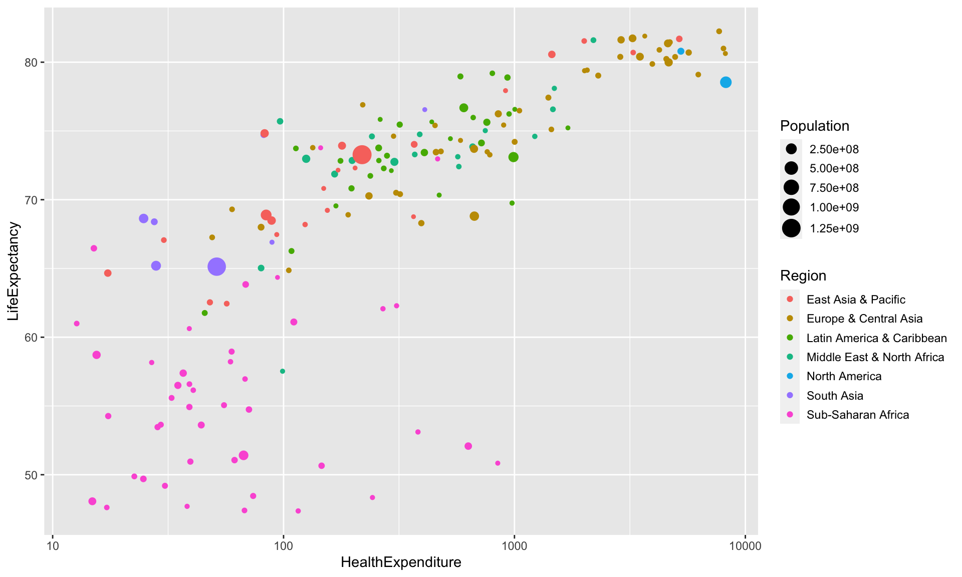
4.2.2 Adding additional layers
Additional layers can simply be added to the plot. For example, we can add an overall regression line with confidence bands using
ggplot(data=health) +
    aes(x=HealthExpenditure,  y=LifeExpectancy) +
    geom_point(aes(colour=Region, size=Population)) +
    geom_smooth(method="lm")  +
    scale_x_log10()
## `geom_smooth()` using formula 'y ~ x'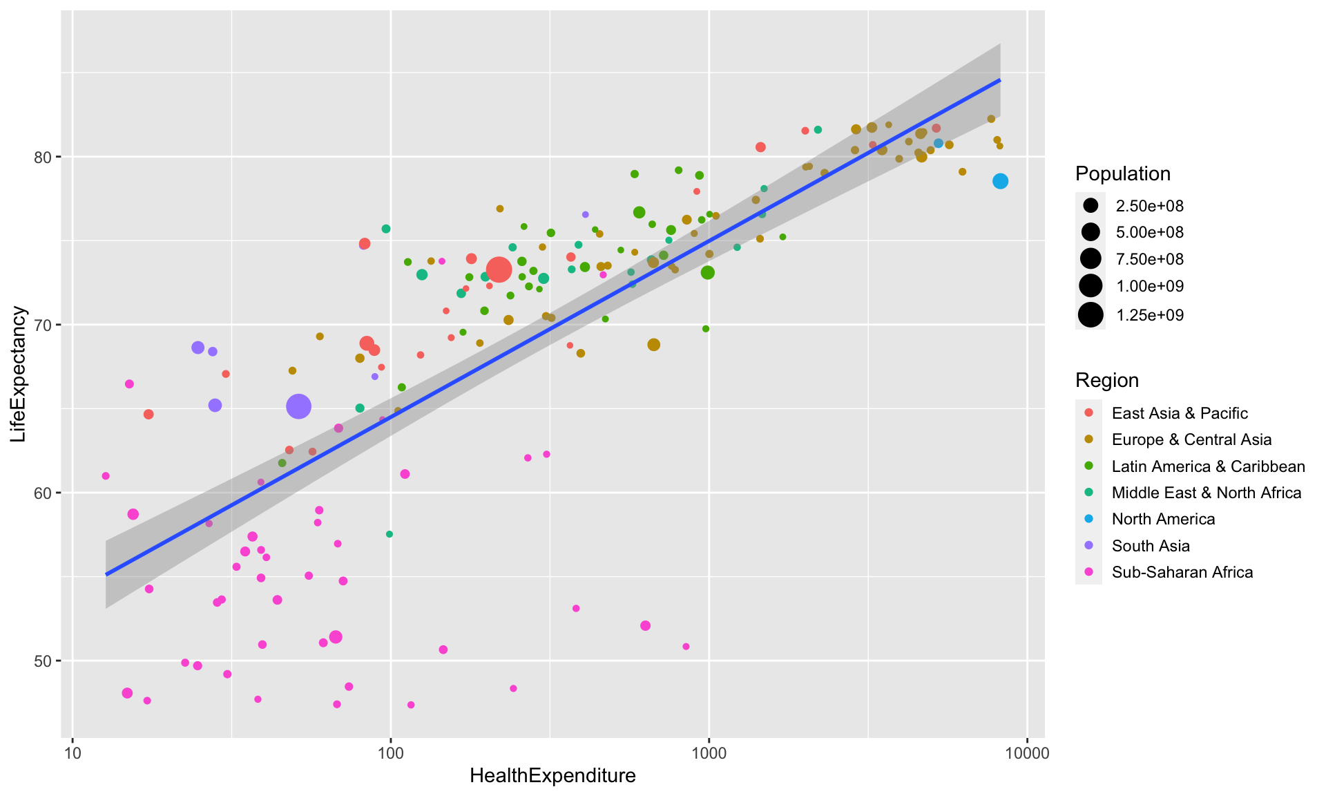
If we want to add a different regression line for each country we have to make sure that a group or colour aesthetic is passed to geom_smooth. We could pass aes(colour=Region) to geom_smooth. Alternatively, we can move colour=Region from the aesthetics specific to geom_point to the generic aesthetics, so that colour=Region now applies to both geom_point and geom_smooth.
ggplot(data=health) +
    aes(x=HealthExpenditure,  y=LifeExpectancy, colour=Region) +
    geom_point(aes(size=Population)) +
    geom_smooth(method="lm")  +
    scale_x_log10()
## `geom_smooth()` using formula 'y ~ x'## Warning in qt((1 - level)/2, df): NaNs produced## Warning in max(ids, na.rm = TRUE): no non-missing arguments to max; returning
## -Inf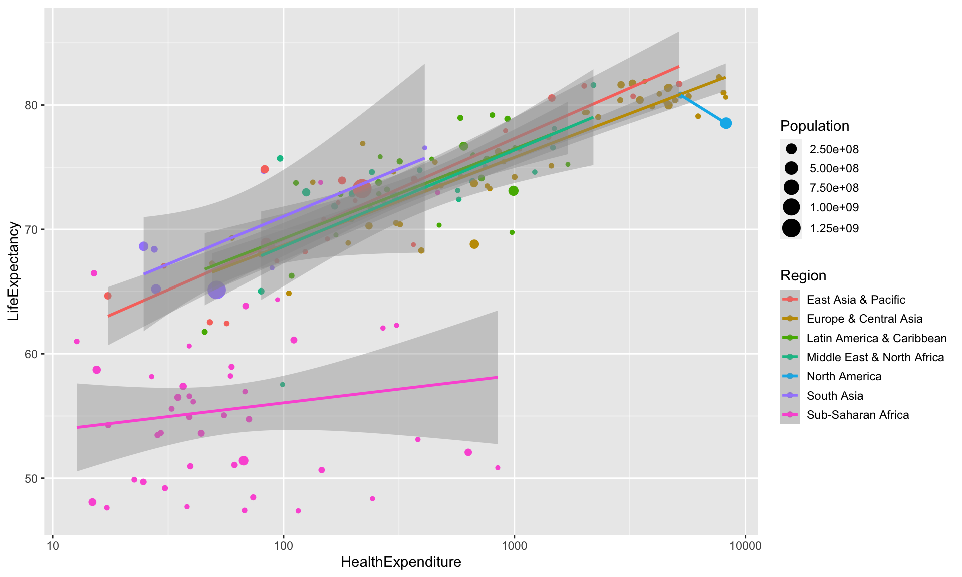
The warning comes from the fact that there are only two North American countries, so we can fit a line through them with no error, which means we cannot draw confidence bands.
The plot looks slightly messy, we will use facet_wrap later on to split it into separate panels.
Suppose we want to annotate the observations belonging to Australia, the UK, the US.
health2 <- health %>%
    filter(Country %in% c("Australia", "United Kingdom", "United States"))
ggplot(data=health) +
    aes(x=HealthExpenditure,  y=LifeExpectancy, colour=Region) +
    geom_point(aes(size=Population)) +
    geom_label(data=health2,
               aes(x=HealthExpenditure,  y=LifeExpectancy, label=Country),
               show.legend=FALSE)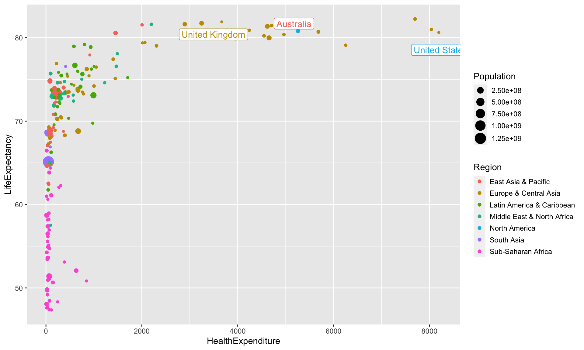
The labels however cover the observations and might not be fully visible. This can be avoided by using the function geom_label_repel from ggrepel.
health <- health %>%
    mutate(CountryLabel=ifelse(Country%in%c("Australia", "United Kingdom", "United States"),
                               as.character(Country),""))

library(ggrepel)
ggplot(data=health) +
    aes(x=HealthExpenditure,  y=LifeExpectancy, colour=Region) +
    geom_point(aes(size=Population)) +
    geom_label_repel(aes(label=CountryLabel), show.legend=FALSE)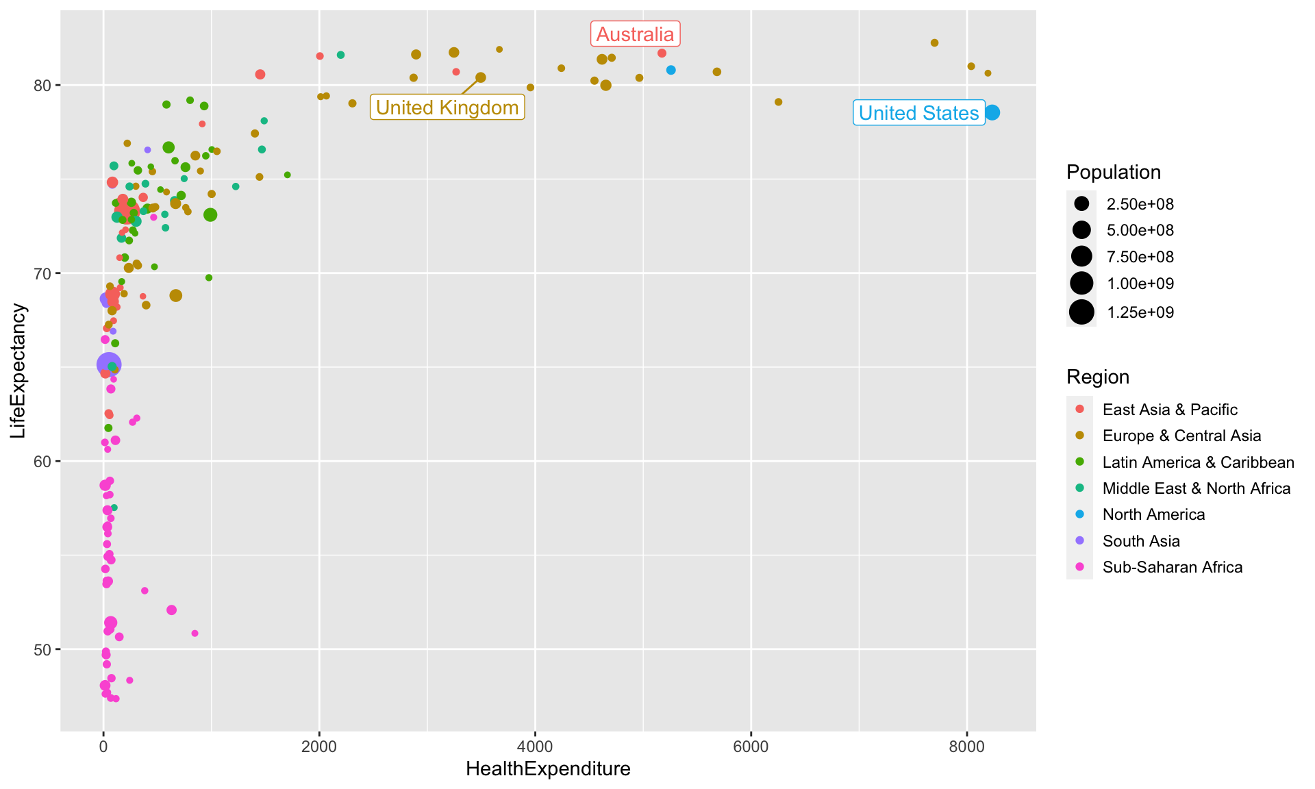
This time, we have used a different approach. Rather than subsetting the data and creating a separate data frame only containing the data for the three countries, we have created a new column in the data frame health, which is blank except for the three countries. This is required because ggrepel layers are only aware of data drawn in their own layer: this way we can avoid the labels covering observations we have not labelled.
4.2.3 Explicit drawing
The standard R plotting functions draw a plot as soon as the plot function is invoked.
Plotting commands in ggplot2 (including qplot) return objects (otherwise the + notation would not work) and only draw the plot when their print or plot methods are invoked. In the console this is the case when they are used without an assignment.
a <- ggplot(data=health) +            # Does not draw anything
         aes(x=HealthExpenditure, y=LifeExpectancy) +
         geom_point()

b <- a + scale_x_log10()              # Does not draw anything either

a                                     # Now the plot stored in a gets drawn
print(a)                              # Draw a again (explicit invocation)

b                                     # Now the plot stored in b gets drawn
Inside loops and functions the print or plot methods need to be invoked explicitly by using the methods print or plot.
4.2.4 Task
Consider two vectors x and y created using
n <- 1e3
x <- runif(n, 0, 2*pi)                   # x is random uniform from (0,2*pi)
# x <- sort(x)                           # Sorting of x _not_ needed for ggplot
y <- sin(x)                              # Set y to the sine of x
y.noisy <- y + .25 * rnorm(n)            # Create noisy version of y
Use ggplot2 to create a scatterplot of y.noisy against x, which also shows the noise-free sine curve in y.
4.2.5 Answer
We can use the following R code:
ggplot() +                               # No need to use data=... as x, y and y.noisy
                                         # are variables in the workspace and not columns
                                         # in a dataset
    geom_point(aes(x, y.noisy)) +
    geom_line(aes(x, y))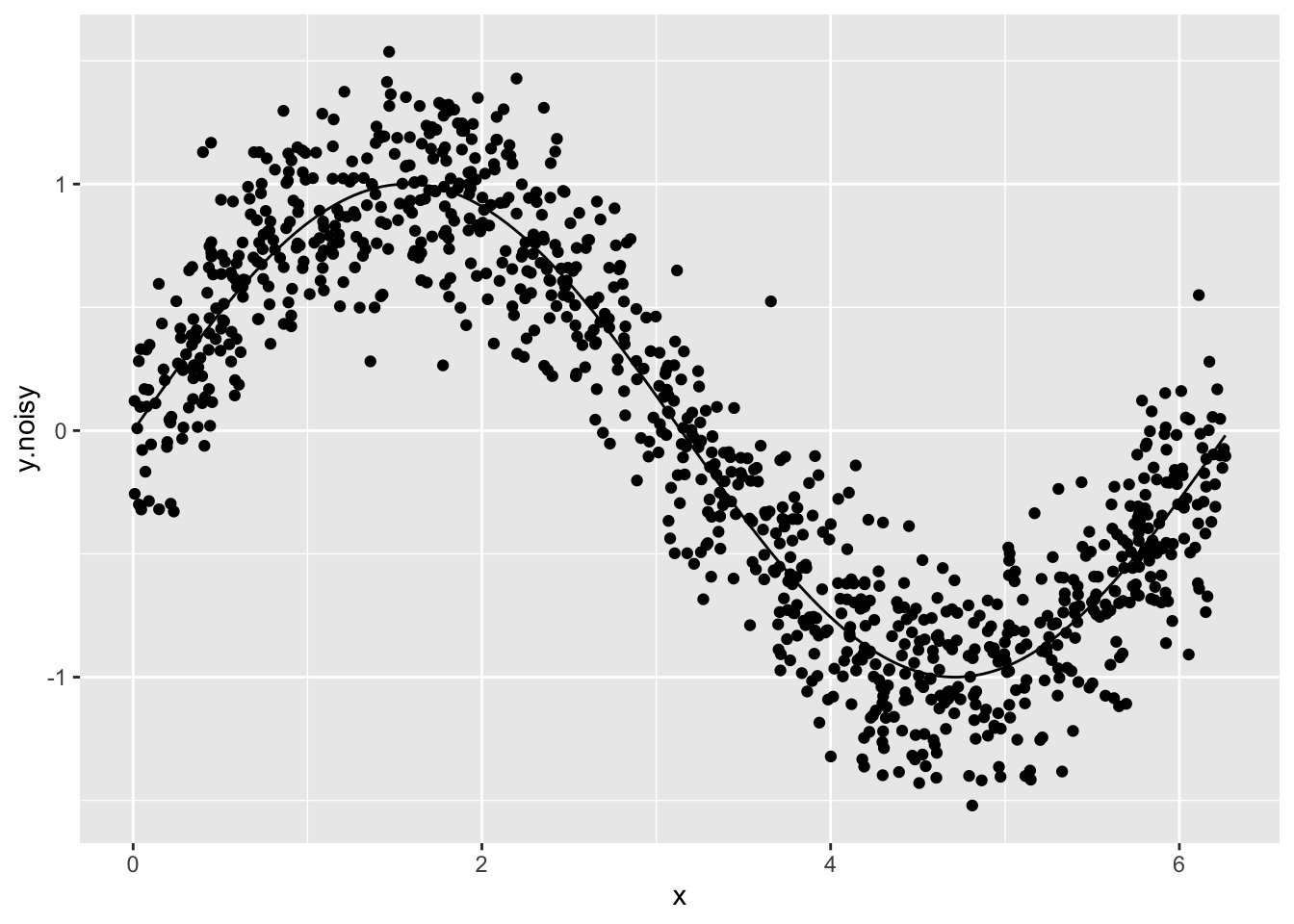
It does not matter whether geom_point or geom_line comes first. ggplot2 adapts the axes so that all objects drawn fit (and not just the first one as is the case when using standard R plotting functions plot and points).
4.3 Modifying Plots
4.3.1 Labels and titles
We can set the plot title using ggtitle(title) and the axis labels using xlab(label) and ylab(label).
ggplot(data=health) +
    aes(x=HealthExpenditure,  y=LifeExpectancy, colour=Region) +
    geom_point(aes(size=Population)) +
    geom_smooth(method="lm")  +
    scale_x_log10() +
    ggtitle("Relationship between Health Expenditure and Life Expectancy") +
    xlab("Health Expenditure") +
    ylab("Life Expectancy")
## `geom_smooth()` using formula 'y ~ x'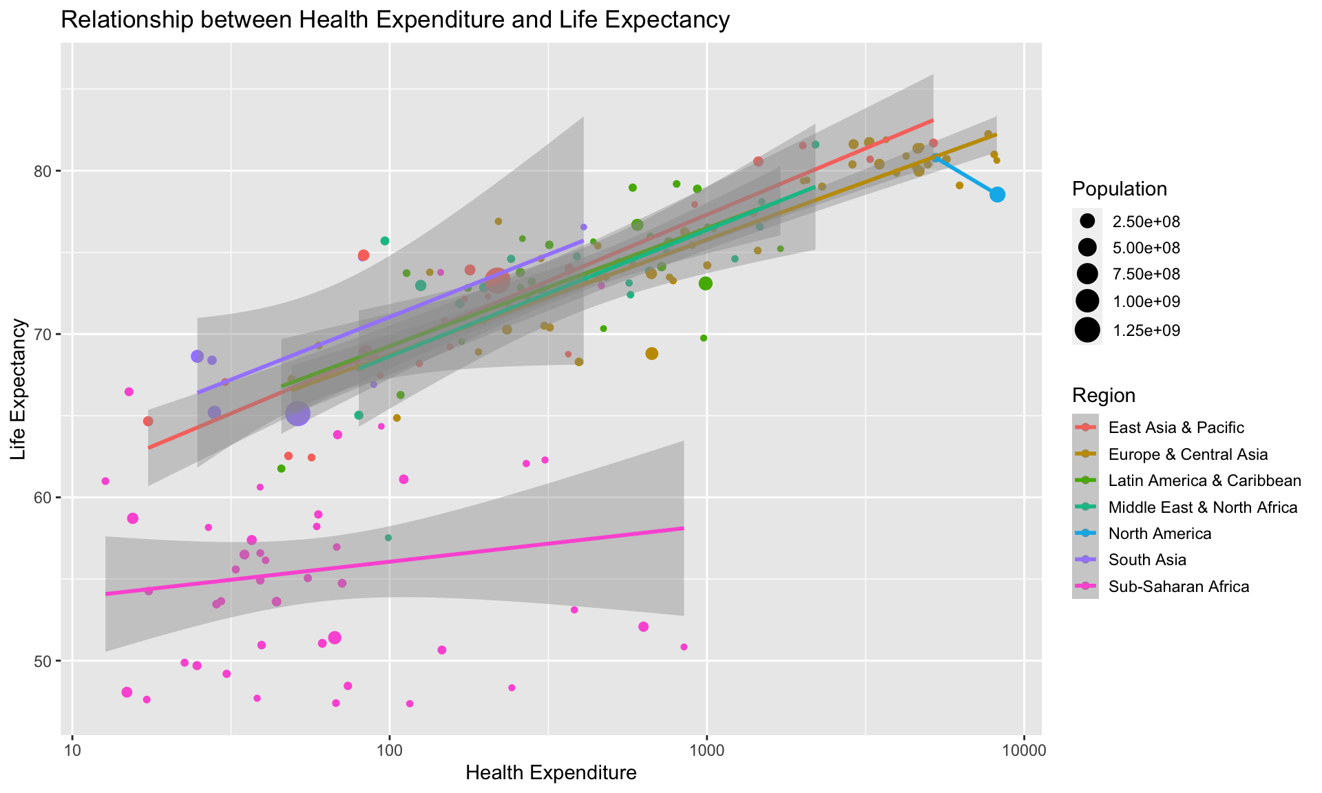
Changing the text shown in legends (like in our case the names of the regions) is more complicated. It is almost always easier to simply change the levels of the categorical variable in the dataset itself before invoking ggplot2 commands.
4.3.2 Scales
Aesthetics control which variables are mapped to which property of the geometric object. However, aesthetics do not specify how this mapping is performed. This is where scales come into play. Scales control how any value from the variable is translated into a property of a geometric object: scales control for example how a variable is translated into coordinates (say through a log transform) or into colours (say though a discrete colour palette).
ggplot2 automatically chooses (what it thinks is) a suitable scale. This is usually reasonable, but on occasions it might be necessary to override this.
There is a family of scale functions for each aesthetic. The template for the function name for scales is scale_<aesthetic>_<type>.
4.3.2.1 Scales for continuous data
We have already seen that we can log-transform the axes using scale_x_log10 and scale_x_log10. The more general functions for coordinate transforms are scale_<x or y>_continous(...). We can. amongst others, set the axis label (argument name, the ticks and tickmarks (arguments breaks and labels) the limits (argument limit) and the transform to be used (argument trans).
The axes might use scientific notation (e.g. “4e5”). If you want to avoid using scientific notation and use fixed notation, change the scipen option in R, which controls when scientific notation is used (for example run options(scipen=1e3)).
There are functions for mapping continuous data to other aesthetics, too. For example, scale_colour_gradient converts a continuous variable to a colour using a gradient of colours. The arguments low and high specify the colours used at the two ends. scale_colour_gradient2 allows for also specifying a mid-point colour (argument mid). scale_colour_gradientn is the most general function it allows specifying a vector of colours and corresponding vector of colours. The function scale_colour_distiller uses the colour brewer available at http://colorbrewer2.org/ and allows for constructing colours scales which are photocopier-safe and/or work for colour-blind readers.
a <- ggplot(data=health) +
         aes(x=HealthExpenditure, y=LifeExpectancy) +
         geom_point(aes(colour=Population)) +
         scale_colour_distiller(palette="YlOrRd" , trans="log")
a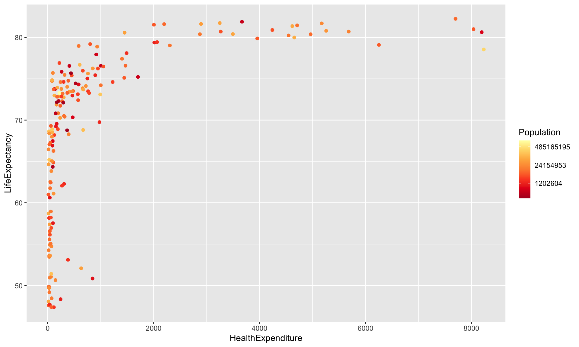
We have used trans="log" to use the log-transformed values of the population sizes (due to its skewness). The values given in the legend seem slightly odd choices: this is due to the log-transform (they are roughly \(\exp(14)\), \(\exp(17)\) and \(\exp(20)\), so “nice” numbers on the log scale).
We have stored the plot in a variable a so that we can redraw it later on with different themes.
4.3.3 Statistics
Sometimes data has to be aggregated before it can be used in a plot. For example, when creating a bar plot illustrating the distribution of a categorical variable we have to count how many observations there are in each category. This will then determine the height of the bars. ggplot2 automatically chooses (what it thinks is) a suitable statistic.
For example, when we draw a bar plot using geom_bar, it uses by default the statistic count, which first produces a tally. We don’t need to worry about this, ggplot2 does all the work for us.
ggplot(data=health) +
    geom_bar(aes(x=Region)) +
    theme(axis.text.x = element_text(angle = 90, hjust = 1)) # Rotate x axis labels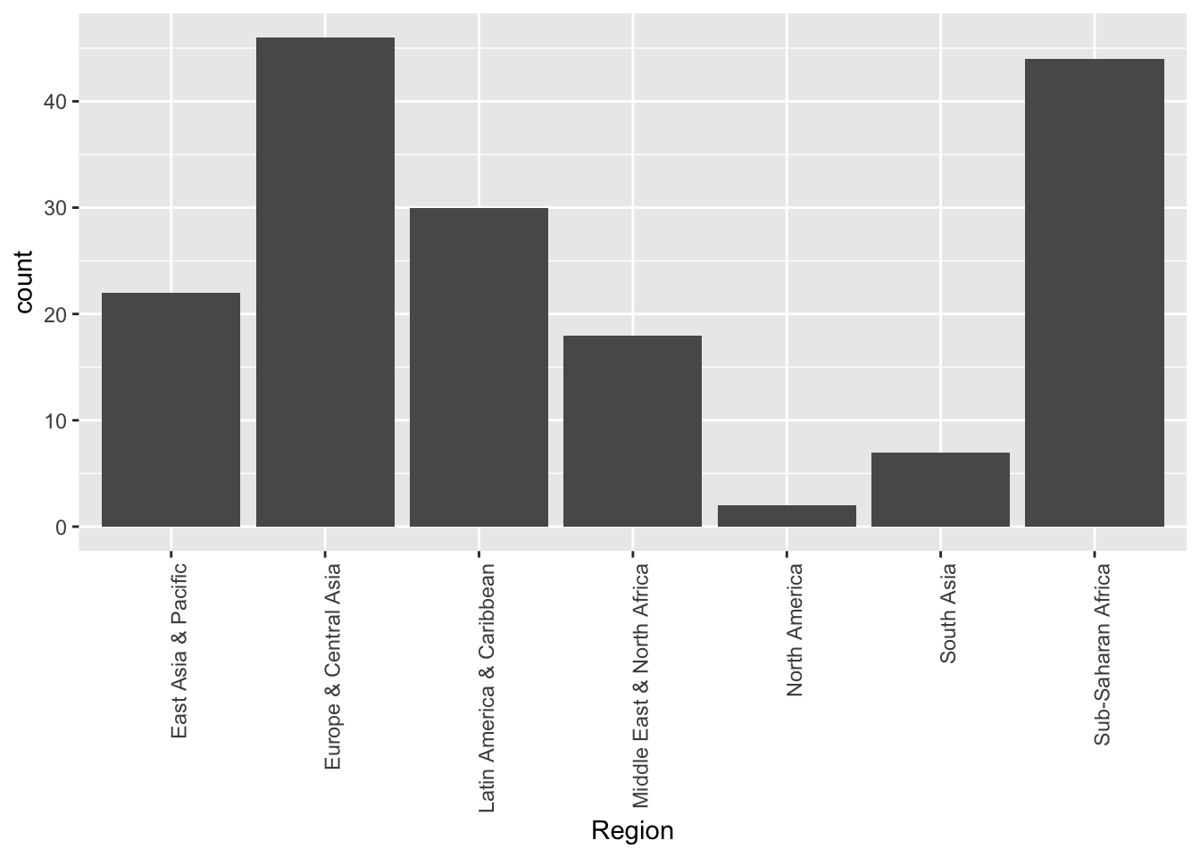
Suppose we now want to a draw bar chart visualising the mean health expenditure in each region. Now we don’t want ggplot2 to produce a tally of how often which value occurs, we want it to simply draw the bars to the heights specified in the data. Because we now want no aggregation, we have to use the statistic identity.
library(dplyr)
HESummary <- health %>%                                      # Get avg health exp
                 group_by(Region) %>%
                 summarise(HealthExpenditure=mean(HealthExpenditure))
ggplot(data=HESummary) +
    geom_bar(aes(x=Region, y=HealthExpenditure), stat="identity") +
    theme(axis.text.x = element_text(angle = 90, hjust = 1)) # Rotate x axis labels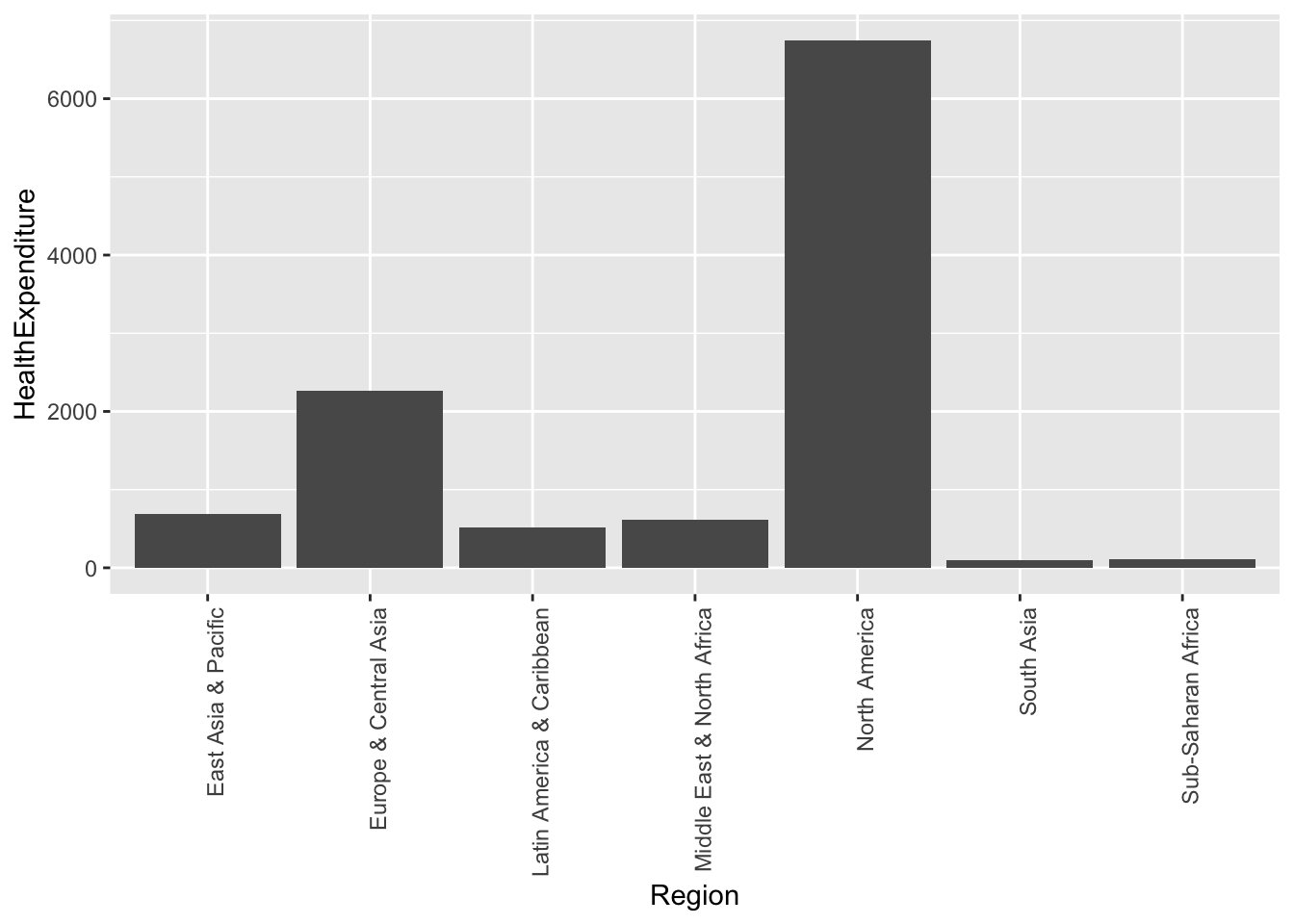
4.3.4 Theming
Themes can be used to customise how ggplot2 graphics look like. We have already used theme to change how the horizontal axis is typeset.
ggplot2 has several themes built-in. The default theme is theme_gray. Other themes available are theme_bw (monochrome), theme_light, theme_lindedraw and theme_minimal. Further themes are available in extension packages such ggthemes.
a + theme_minimal()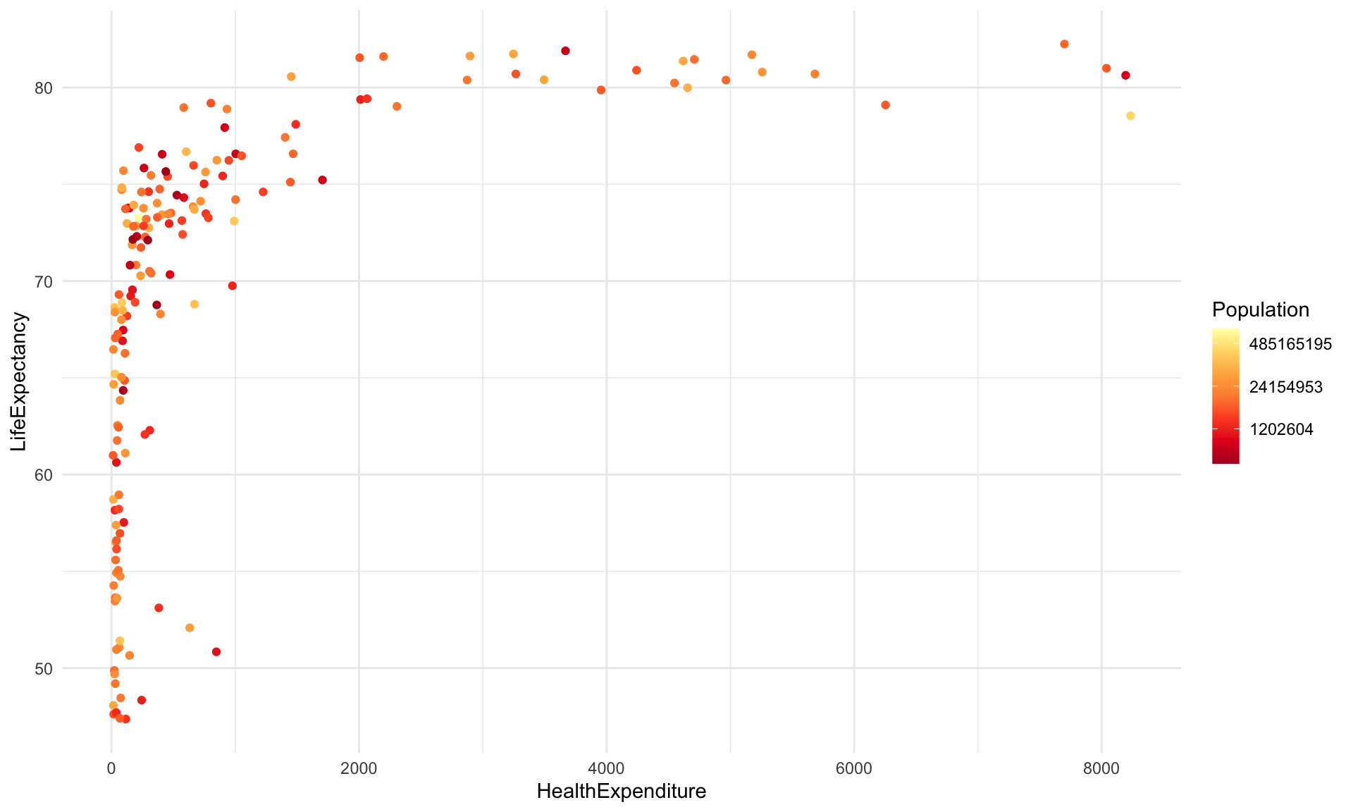
library(ggthemes)
a + theme_economist() + theme(legend.position="right")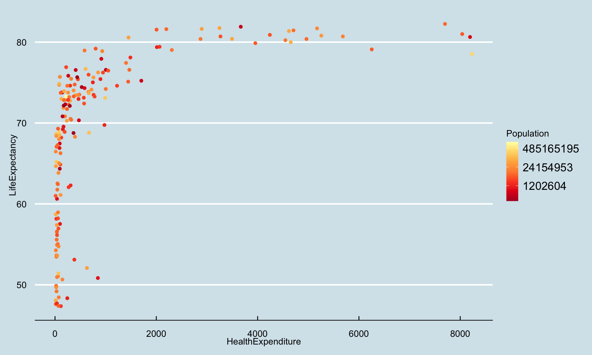
4.3.5 Arranging plots (faceting)
The function facet_grid(rvar~cvar) creates separate plots based on the values rvar (rows) and cvar (columns) takes. The function facet_wrap(~var1+var2) arranges the plots in several rows and columns without rigidly associating one variable with rows and one with columns. Continuous variables need to be discretised (for example using cut) before they can be used for defining facets.
ggplot(data=health) +
    aes(x=HealthExpenditure,  y=LifeExpectancy, colour=Region) +
    geom_point(aes(size=Population)) +
    geom_smooth(method="lm")  +
    scale_x_log10() +
    facet_wrap(~Region)
## `geom_smooth()` using formula 'y ~ x'## Warning in qt((1 - level)/2, df): NaNs produced## Warning in max(ids, na.rm = TRUE): no non-missing arguments to max; returning
## -Inf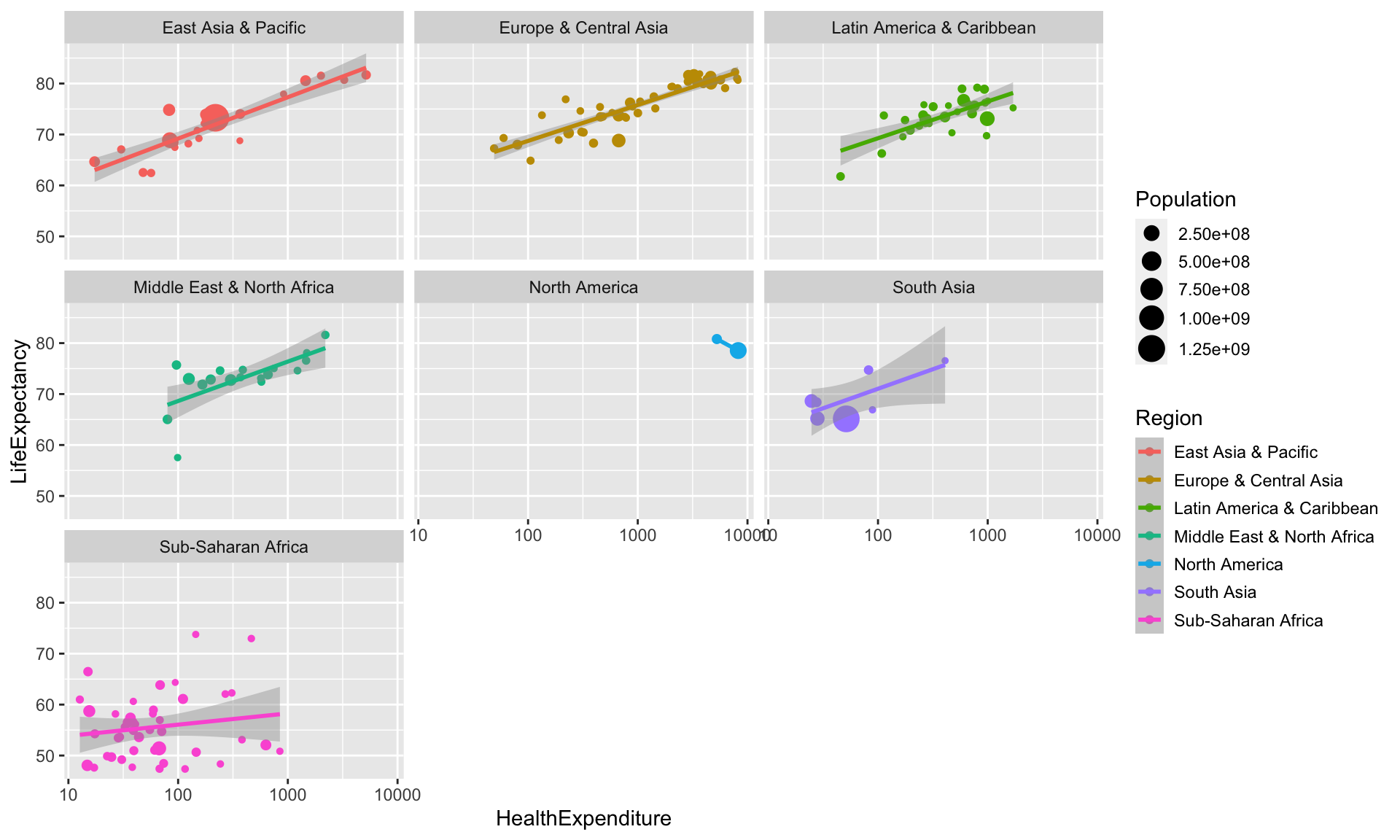
Arranging plots in more general ways (like in par(mfrow=c(...)) or layout) is not directly possible with ggplot2. The package gridExtra however provides a function grid.arrange, which allows for arranging ggplot2 plots side by side.