Chapter 2 Methodology
2.1 DW-Nominate Scores
To measure the evolution of congressional voting patterns topologically, I consider how the number of “loops” and “connected components” have changed over time. To do so, I have to first develop a measure of the distance between congress members based on their roll call votes. Helpfully, a multi-dimensional scaling method, called DW-NOMINATE, has been developed to turn high-dimensional roll call votes into ideology scores along two orthogonal dimensions. The first dimension relates to a member’s placement on the classic liberal-conservative axis on economic issues, with a score of -1 corresponding to the most liberal members and a score of 1 corresponding to the most conservative. The second dimension relates to voting patterns on the social issues of the day, such as slavery, bi-metalism, civil rights, gay marriage, etc.
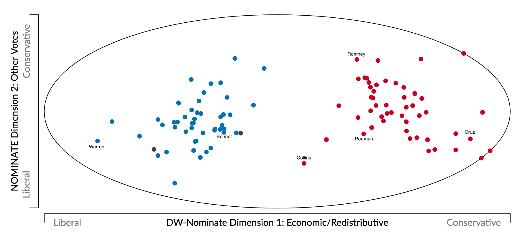
To make this process concrete, consider the example below, which shows 2-dimensional DW-NOMINATE scores for the most recent senate. Congress members are represented by points in 2-dimensional space, where the x-axis indicates economic scores and the y-axis shows scores for social/other votes. Red dots represent republican senators, blue dots represent democrats, and the two black dots represent independents. There is a clear split between parties on economic issues, with democrats further to the left of republicans, as expected, but there is significant within-party variation on social/other issues. For example, Mitt Romney and Rob Portman are nearly identical on dimension-1, but Romney is significantly more conservative on dimension-2 (shown with labels in the figure).

2.2 Distance
To define the ideological difference between congress members, I simply use the Euclidean distance between points in this 2-dimensional space:
\[d(p,q)=\sqrt{\left(DW_1\left(p\right)-DW_1\left(q\right)\right)^2+\left(DW_2\left(p\right)-DW_2\left(q\right)\right)^2}\] where \(DW_i(.)\) is the \(i\)th dimension DW-NOMINATE score.
2.3 Persistent Homology
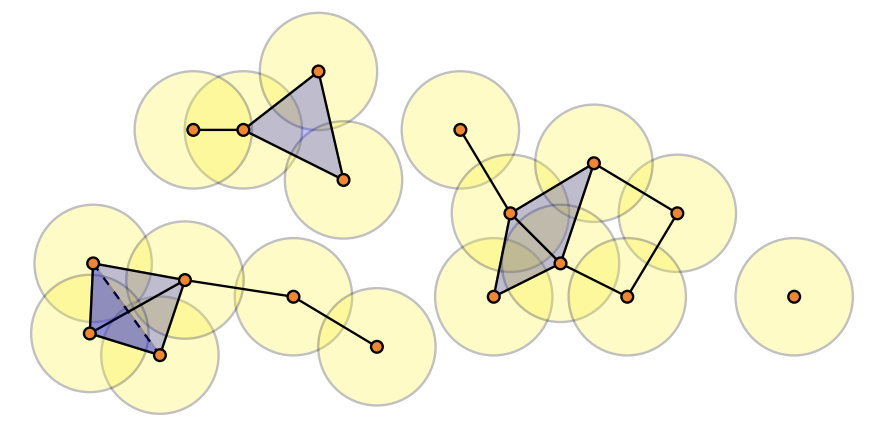
After calculating the pairwise distance between each member, I apply a tool from topology called persistent homology, which is all about finding the number of “holes” in data. First, we need some way to turn a collection of independent points into connected objects. To do so, we create balls around each point with some radius and then connect points if their balls overlap. If a pair of points have overlapping balls, we add a line between them. If a set of three points have pairwise intersecting balls, we create a filled in triangle. If a set of four points have pairwise intersecting balls, we create a filled in tetrahedron. And so on… This process is illustrated in the figure below, and creates what is called a Rips simplicial complex.
 For balls of a given radius, we then calculate the number of “holes” of different dimensions. The number of 1-dimensional holes is just the number of connected components – the figure above, for example, has 4 connected components. The number of 1-dimensional holes is the number of non-filled in cycles – in the figure above, there is just a single such hole, the cycle with four vertices on the right. In this paper, I consider only 1 and two-dimensional holes, but this idea extends to higher dimensions as well (2-dimensional holes are trapped volumes, for example).
To find holes that represent fundamental structures of the data (rather than noise) we want to consider features which are present for a relatively large range of radius values. By looking at how long each feature persists – that is, for what interval of radius values it is present – we are able to get a sense of the data’s topological shape.
This information can then be visualized by something called a barcode. An example barcode is shown below, where the proximity parameter (radius length) is shown on the x-axis and the persistence of holes of different dimensions are shown on the y-axis.

2.4 Changes in Persistent Homology Over Time
Given that the goal of my project is to track changes in congressional structure, I need to not only compute barcodes at a particular time, but also measure how these barcodes change over time. To do so, I use two approaches.
2.4.1 CROCKER Plot
Next, I use the idea of a CROCKER plot (Topaz et al, 2015), which is a way of tracking how the number of \(n\)-dimensional holes at a certain distance parameter changes over time. For example, I am able to track how the distance parameter needed for 5 connected components changes over time.
2.4.2 Bottleneck Distance
Next, I use something called the bottleneck distance, which is a way to measure the similarity between barcodes – two barcodes with a larger bottleneck distance between them are less similar.
After computing the bottleneck distance between each pair of congresses, I regressing this bottleneck distance on the difference in polarization between the two sessions:
\[\text{BottleneckDistance}_{i,j}=\beta |\text{polarization}_i-\text{polarization}_j|+\epsilon_{i,j} \]
The polarization scores are based on standard measures like those shown in the figure in the introduction section.
A coefficient \(\beta>0\) indicates that similarly polarized congresses are more similar homologically.