Chapter 6 Week 5
Th reccomended additonal reading can be found in Chapter 5 of Navarro Textbook.
We will pretty much summarise the key information from the reading and lecture notes in this week materials so you can get grasp of how to quikcly produce description of your data in R. By this week, you hopefully get some intution about creating data in R and providing visualisations to accompany your descriptive data analysis.
6.1 Descriptive Statistics
When statisticians are asked to describe what their data looks like, they often would resort to descriptive statistics as a quick way to to inform about data or variable distribution. It may sound weird by now but as you move through the years of doing statistics you will find that reproting mean, median and standar deviation alone can easily allow you to visualise the data in your mind without any graphics needed.
Descriptives are essential component of any reserach paper or report and you will often find those in your readings that use empirical evidence.
Interestingly, when it comes to news articles, you often hear only mean/median being reported (i.e. median wage in the UK is £29,588). Without addional information on sample size and measures of central tendnecy these can be quite meangingless and can trick the reader and we will show you why in the practice below.
6.2 Central tendency & variability
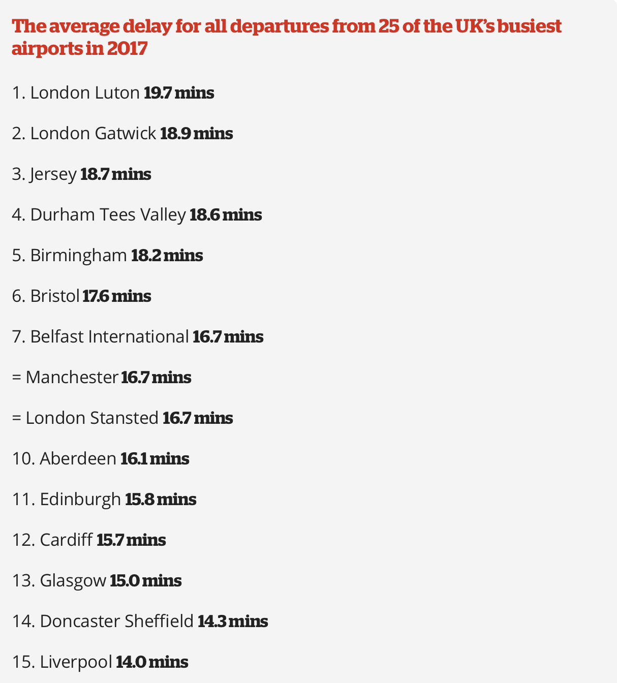
To isslutrate the measures of central tendency we will be using quite a common but easy to understand example of flight delays. Knowing the average flight delay is handy when you are making plans for travelling, but without knowing the actual distribution of the delays on a given data, we cannot really know exactly what to expect.
Here is some data I found online on average flight delays across some of the biggest UK airports 6
6.3 Visualising disitributions
We will work with flight delays in Edinburgh, since we are based here after all! You will know from experience that you rarely have a delay of exactly 15.8 minutes and in fact the delay may range easily from a minute to a few hours. Such may depend on the day of the year, airline, time of the day and many other factors so taking the mean at face value is not always great strategy!
I have collected the data for delays on Christmas Eve flights and a randomly picked midweek day during autumn. Lets see what we have. The data comes in minutes. Read the data in using the command below: LINK THE DATA TO READ FROM ONLINE
#Read data in
edinburgh_delays<-read.csv('edinburgh_delays.csv')
#Check whats inside
head(edinburgh_delays)## christmas_delay average_delay
## 1 10 16
## 2 26 17
## 3 35 17
## 4 12 10
## 5 120 11
## 6 450 176.4 Mean, Median and Mode
6.4.1 Mean
Mean is also known as average across your observations and achived via the sum of all observations which are then divided by total N.
Here is the formula:
Get the means for each of the days and compare.
mean(edinburgh_delays$average_delay)## [1] 15.325mean(edinburgh_delays$christmas_delay)## [1] 57.725Seems like an average day is much closer to the one we saw in the article. With Christmas Eve delays being more than doubled.
6.4.2 Median
Median suggests where the centre of distribution is. If skewed (i.e. example of income), median is certainly a better measure of central tendency than the mean.
median(edinburgh_delays$average_delay)## [1] 15.5median(edinburgh_delays$christmas_delay)## [1] 266.4.3 Mode
Mode is handy if you have categorical data. By suggesting which value is th emost frequent in the data we can then see which group tend to be dominating. Try to use fnction mode with the data we have. You should get a note from R that you are dealing with the variable type ‘numeric’ and mode might be a meaningless statistic to use.
mode(edinburgh_delays$average_delay)## [1] "numeric"We will get to using modes in a minute when we reach the example of categorical data.
6.5 Normal Distribution
If the mean, median and mode are the same - we have a perfectly normal distribution of the data which is prefectly symmetric and looks like this:
6.5.1 Range
6.5.2 Variance
6.5.3 Standard Deviation
6.6 Skew
6.7 All descriptives in one go!
In practice of course, you would want to be quick and produce the table of descriptive statistics in one go. R is great for that and there are two ways to appraoch the task. Via summary() function or via describe() from package ‘psych’.
#Load the package
library(psych)
#Describe the flight delays using summary
summary(edinburgh_delays)## christmas_delay average_delay
## Min. : 3.00 Min. : 8.00
## 1st Qu.: 10.00 1st Qu.:12.75
## Median : 26.00 Median :15.50
## Mean : 57.73 Mean :15.32
## 3rd Qu.: 57.00 3rd Qu.:18.00
## Max. :450.00 Max. :22.00#Describe the flight delays using describe
describe(edinburgh_delays)## vars n mean sd median trimmed mad min max range
## christmas_delay 1 40 57.73 97.54 26.0 36.06 28.17 3 450 447
## average_delay 2 40 15.32 3.85 15.5 15.38 3.71 8 22 14
## skew kurtosis se
## christmas_delay 3.22 10.13 15.42
## average_delay -0.08 -1.06 0.61Looks much tidier now! Can you say anything about the distributions before we visualise it?
6.8 Visualise your data
Think we know what to expect by now. Lets see how good our intutition about what data will look like.
Lets try with the average day first:
#Load ggplot2
library(ggplot2)

#Visualise the data using histogram- vary the binwidth if necessary
ggplot(data=edinburgh_delays, aes(x=average_delay)) +
  geom_histogram(binwidth=0.7, color="blue") +
  xlab("Delays on Average Day") +
  ylab("Frequency") +
  ggtitle("Histogram of Average Delays")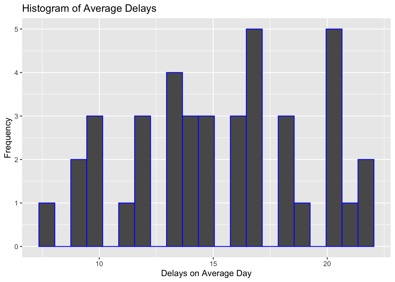
We can add density to the plot to see better what the shape of the distribution looks like:
#Now lets add density instead of a histogram
ggplot(data=edinburgh_delays, aes(x=average_delay)) +
    geom_density() +
  xlab("Delays on an Average Day") +
  ylab("Density") +
  ggtitle("Disitribution of Average Delays")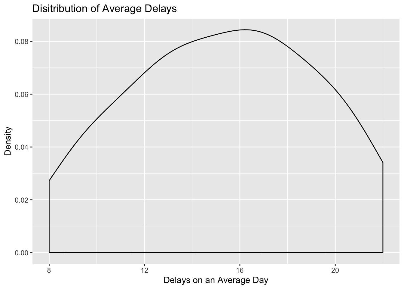
What about Christmas Eve?
#Visualise the data using histogram- vary the binwidth if necessary here as well
ggplot(data=edinburgh_delays, aes(x=christmas_delay)) +
  geom_histogram(binwidth=8, color="blue") +
  xlab("Delays on Christmas Eve") +
  ylab("Frequency") +
  ggtitle("Histogram of  Delays on Christmas Eve")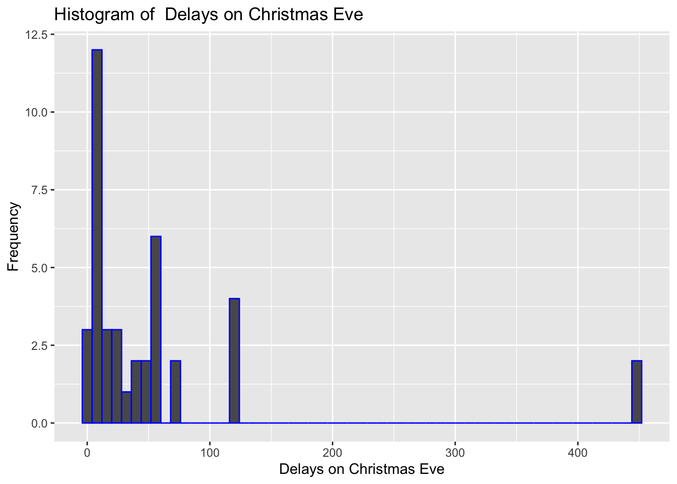
Not so smooth here after all? What about density? There was certainly one huge delay of more then 400 minutes (~5 hours). While on average it looks like, there were dealys just under an hour, there are occurencies of mugh higher delays.
#Now lets add density instead of a histogram
ggplot(data=edinburgh_delays, aes(x=christmas_delay)) +
    geom_density() +
  xlab("Delays on Christmas Eve") +
  ylab("Density") +
  ggtitle("Disitribution of Christmas Eve Delays")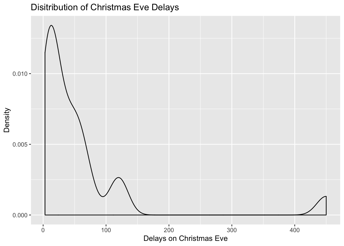
Conclusions?
Of course when drawing an average delay for the new article is is best to focus on an average day than on Christmas Eve. From the example above, if we take an avearge autumn weekday our data matches pretty well what the article suggest. Neverthless, it tell us little about what to expect during the weekend or busy public holiday. To gauge the range of delays and variation around the mean value, we would need statistics for variance and standard deviation to get a better picture about the situation.
Note: we have records only for 40 flights for each of the days. Edinbrugh Airport can see as as many as 313 flights a day. Since we picked our data at random we can consider our samples representative (note: rule of thumb is >25 but this can vary depending on the phenomena you are trying to describe).
6.9 Categorical Data Example
Which fruits on sale?
6.10 Now Over to You: Income Distribution Example
Lets look at some data on income collected for the UK in 2017 by ONS. Note the mean and median values, the skew. What can you say about the income distribution in the UK? How representative the data is of true population?7
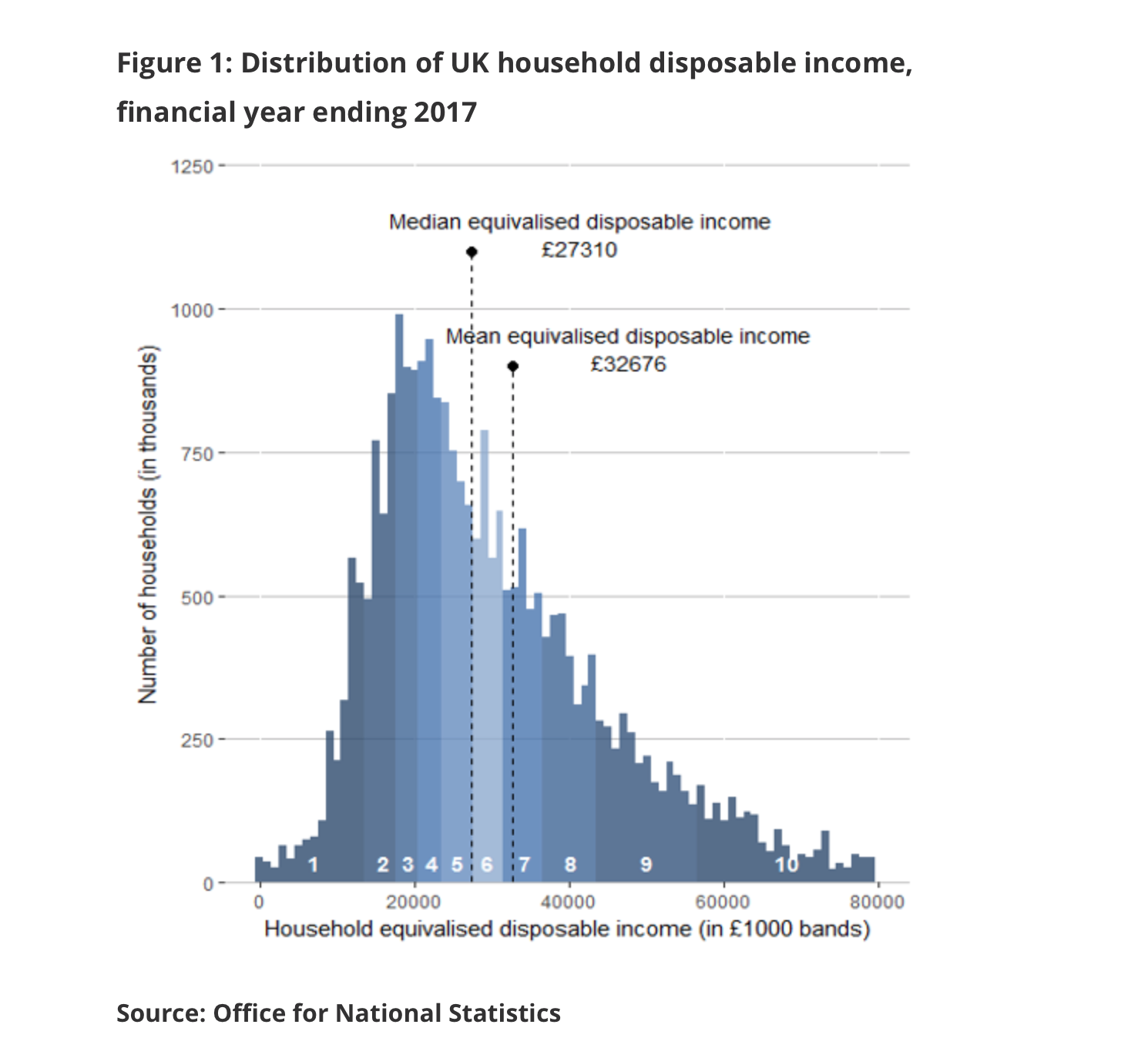
I decided to collect my own sample of individuals and collected the data for 150 residents aged 18+ in London.
income_london<-read.csv('income_london.csv')- Work with the data on income to provide information about the income distribution for Londoners.
- Make sure to visualise the data, describe it and write few notes with conclusions about what you found.
- Pay attention to the sample size and how representative it can be of the true population (i.e. Can we use London mean to represent the overall UK mean?)
- Create a new RMarkdown file for this lab, make notes where necessary and replicate the steps you have seen in the worked example.
- Compile your file in the end
- Congratulate yourself on the amazing work you have done over past five weeks!
Original Article ‘The average flight delay at each of the UK’s 25 busiest airports’↩
You can read more about income calculations in the ONS report, if curious of course.↩