Chapter 3 Always visualize
3.1 Histograms
Histograms of the actual score values are the best way to visualize Likert data—they have two real axes, showing counts by score value or category, so you can parse the visual and understand the results very quickly. Using the same data as above, you can instantly see that the “improvement” in year 2 was perhaps not an improvement after all: while most respondents appear to be satisfied above what they thought in year 1, one respondent may be at risk of leaving.
Histogram of simple example Likert scale data.
# Figure 1
ggplot(ex_1_long, aes(value)) +
    geom_histogram(binwidth=1) +
    facet_wrap(~variable, ncol=1) +
    xlab("Likert Scale Value") +
    theme_bw()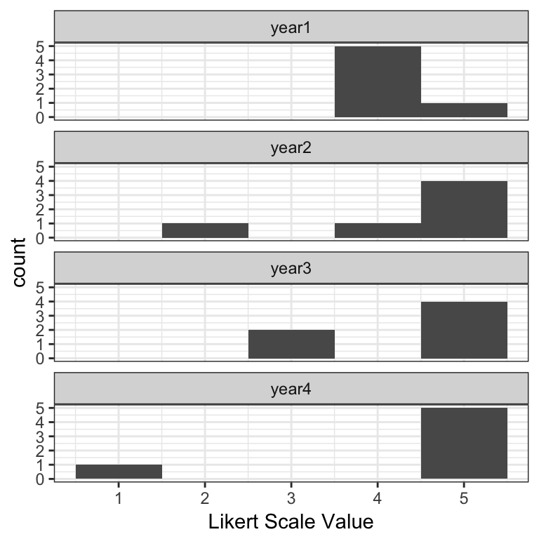
3.2 Likert charts
The main disadvantage of histograms is space; Likert charts—which are in essence just stacked bar charts—are far more compact. The disadvantage is that it takes slightly longer for a user to parse them, but when faced with lots of questions or groupings, they tend to be a better option.
There are two kinds of Likert charts—those that use a center line for a point of reference, and those that do not, in which case they are simply percentage bar charts for individual questions or are mosaic plots when comparing groupings. In the graphs below, each score value has its own color, and each score category—e.g., unfavorable is 1-2, neutral is 3, and favorable is 4-5 on a 5-point scale—is summarized by a percentage value at the left, middle/interior, and right sides of the bar, respectively.
The likert package provides some out-of-the-box plots for this type of data, though you must convert the numeric values to factors for it to work.
Centered Likert chart.
# Covert values to factors
ex_1[2:5] = lapply(ex_1[2:5], factor, levels = 1:5)

# Create a likert object
ex_1_likert = likert(ex_1[2:5])

# Figure 2
plot(ex_1_likert, ordered = FALSE, group.order = names(ex_1[2:5]))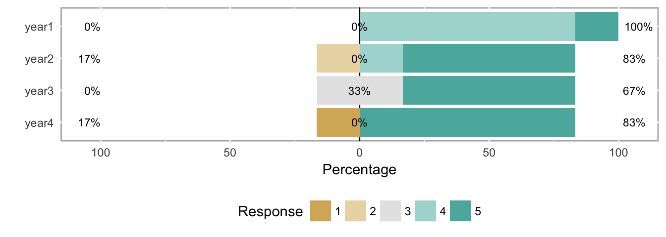
Uncentered Likert chart (aka percent bar chart).
# Figure 3
plot(ex_1_likert, ordered = FALSE, centered = FALSE, group.order=names(ex_1[2:5]))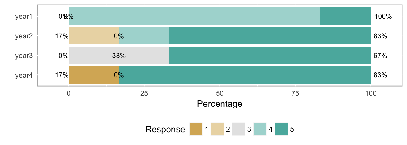
Neither Likert chart type is as clear as the histogram at making the results immediately understandable, but again, histograms take more space, and busy decision makers often need to see the forest (all the questions) at the expense of some trees (each question). In this case, analysts might use the histograms to explore potentially important results themselves, and then use Likert charts in a report with some strategically-placed text highlighting important patterns they found with the histograms.
3.3 Other ordinal-scale visualizations
We’ll use a larger data set in this section to illustrate other visualizations of ordinal data.
# Create likert object for example data set 2
ex_2_likert = likert(both[2:3])
3.3.1 Heatmap
Figure 4 shows a heatmap of the response frequency for two different questions (e.g., as within a single year’s survey). While the use of means and SDs is inappropriate, this particular example directly illustrates why those values don’t capture the response patterns in the data.
Heatmap of the response frequency for two different questions.
# Figure 4
plot(ex_2_likert, type = "heat")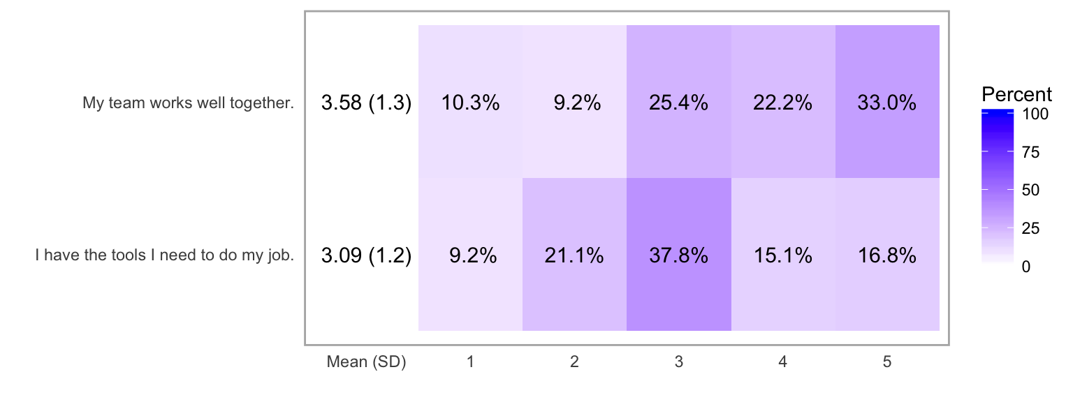
3.3.2 Likert chart with response count histograms
The same data as seen in the heatmap above is more clearly shown with a Likert chart. Another option available with likert objects is to include count histogram to show number of responses and non-answers for each question.
Likert chart of the response frequency for two different questions.
# Figure 5
plot(ex_2_likert, include.histogram = TRUE)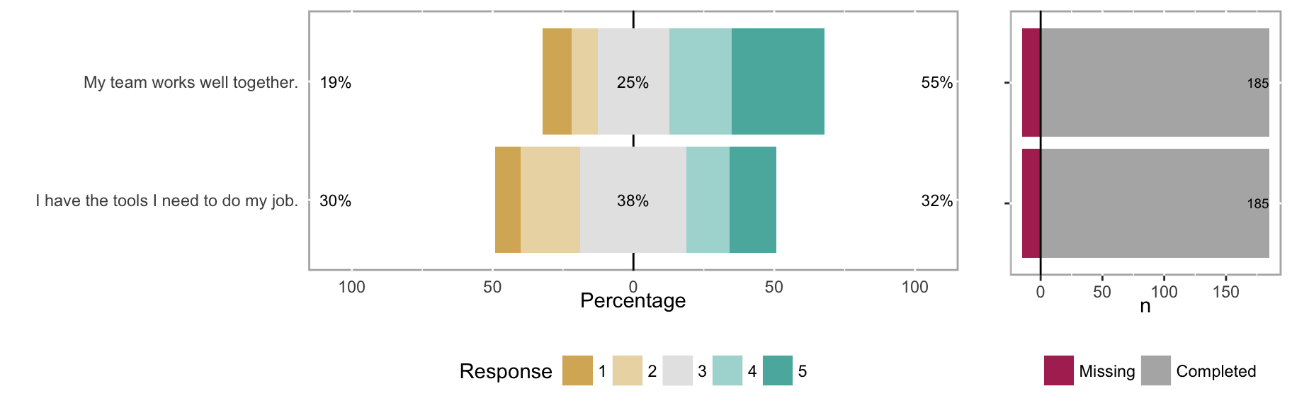
3.3.3 Likert chart with subgroups
Subgroups can sometimes reveal patterns not seen in aggregate data. For example, compare the overall results for “My team works well together” in Figure 5 with the responses when broken out by the subgroups of MDs and RNs in Figure 6.
Likert chart of the response frequency for two different questions, grouped by MDs and RNs.
# Create likert object with groupings included
both_likert_2 = likert(both[, c(2:3), drop = FALSE], grouping = both$EmployeeType)

# Figure 6
plot(both_likert_2, include.histogram = TRUE)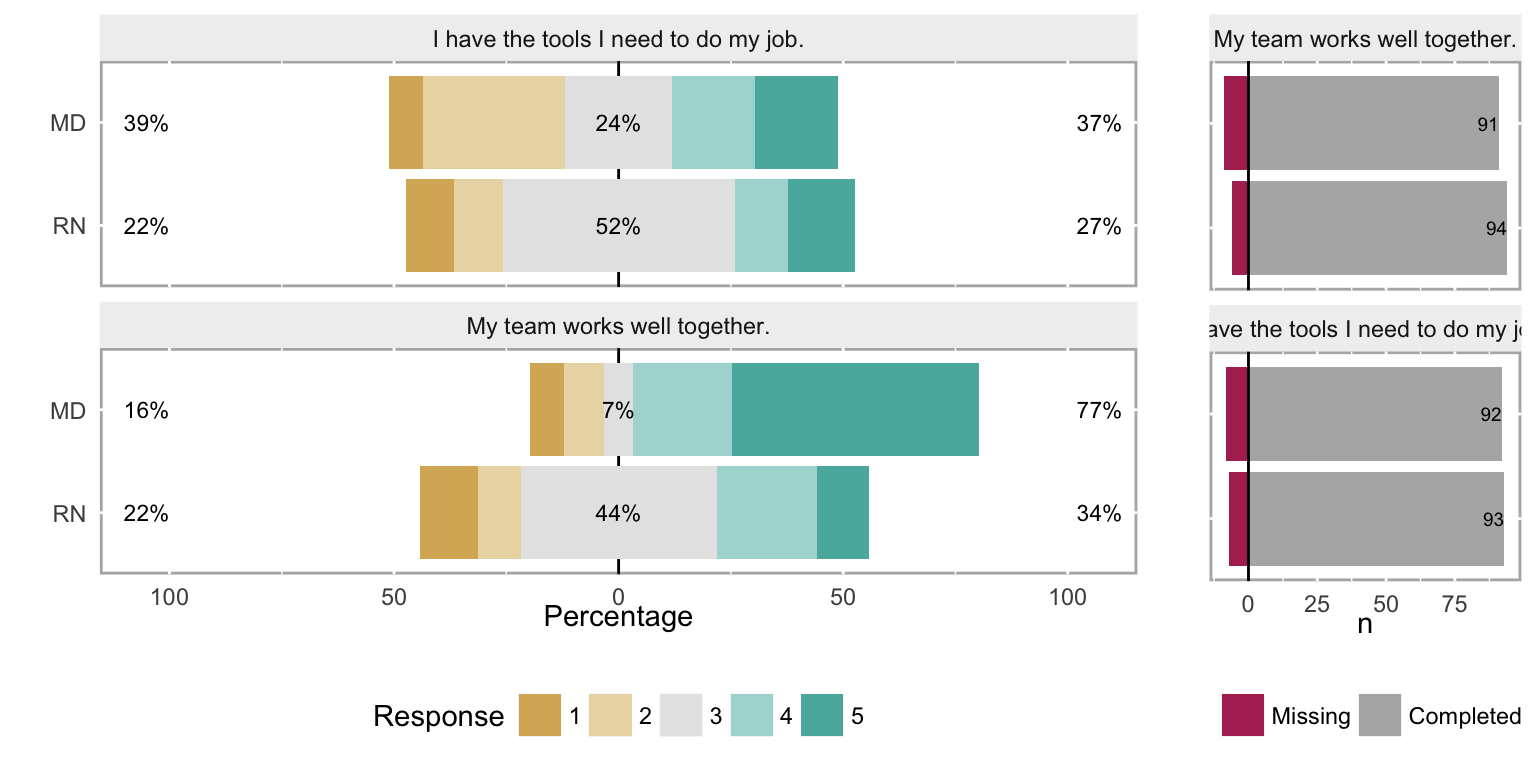
3.3.4 Density histograms
While using a density plot on ordinal data is also statistically inappropriate, it can be a useful tool for an analyst. Bar histograms are difficult to overlay subgroups or different years for a direct comparsion, so must be separated into facets instead, as was seen in Figure 1. Density plots are easier to overlay to show these comparisons, so while not appropriate for a report or dashboard, they can be really useful tools for an analyst during the exploration phase.
Density histograms of the response frequency for two different questions, with a grouping variable (MDs and RNs).
# Figure 7
plot(both_likert_2, type = "density")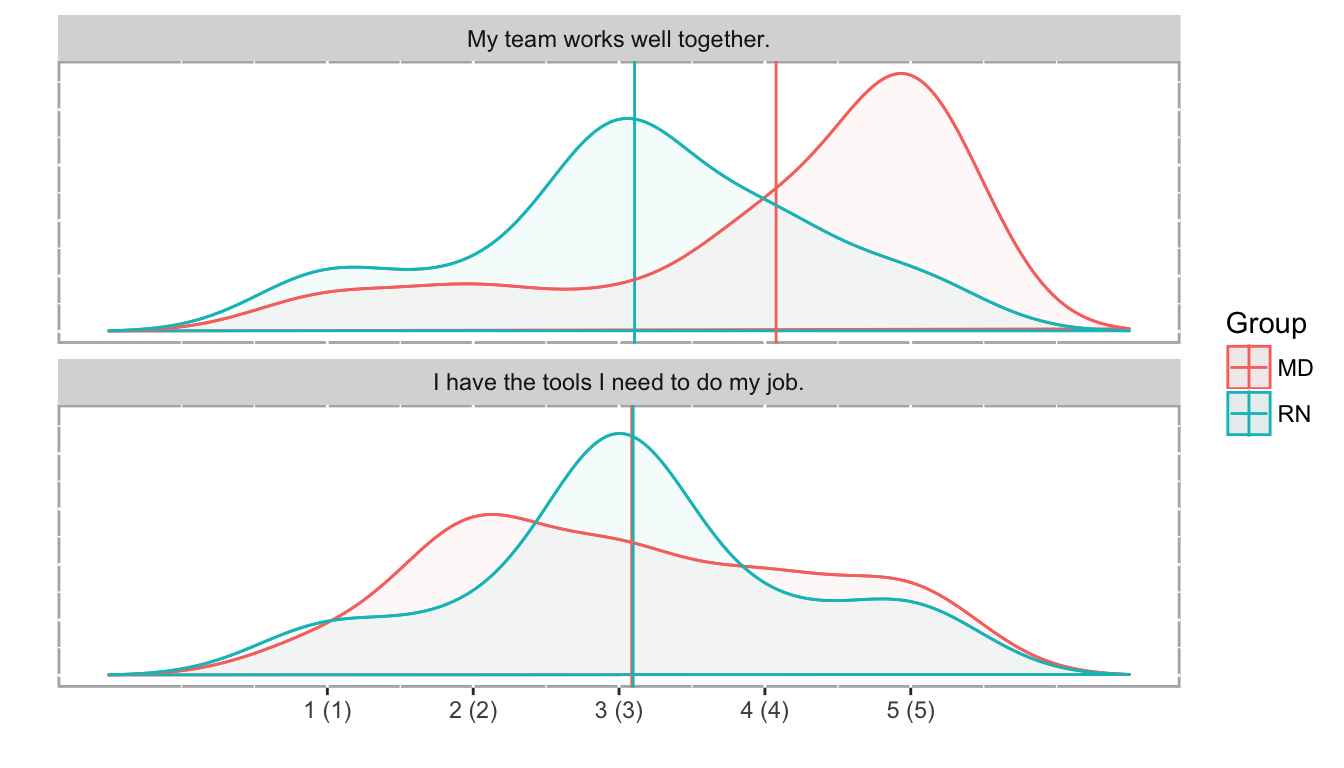
3.3.5 Scatterplots & ordinal correlation
Although traditionally many analysts used non-parametric correlation like Spearman’s or Kendall’s, polychoric correlation is the proper tool to assess similarities between Likert scale results. (Polyserial correlation is used when one variable is numeric and the other is ordinal.)
poly_c_both = polychor(both[,2], both[,3])The polychoric correlation coefficient between “My team works well together” and “I have the tools I need to do my job” is 0.0579. As expected, that suggests that there is no relationship between the responses to these two questions. It’s fairly easy to see this lack of relationship in a scatterplot, with the points jittered to give a sense of response density.
Scatterplot of ordinal comparisons (jittered to show point density) between the questions ‘My team works well together’ and ‘I have the tools I need to do my job’.
# Figure 8
ggplot(both, aes(both[,2], both[,3], group=EmployeeType, color=EmployeeType)) +
  geom_jitter(na.rm=TRUE, width = 0.15, height = 0.15, alpha=0.6, size=3) +
  xlab("My team works well together") +
  ylab("I have the tools I need to do my job") +
  coord_equal()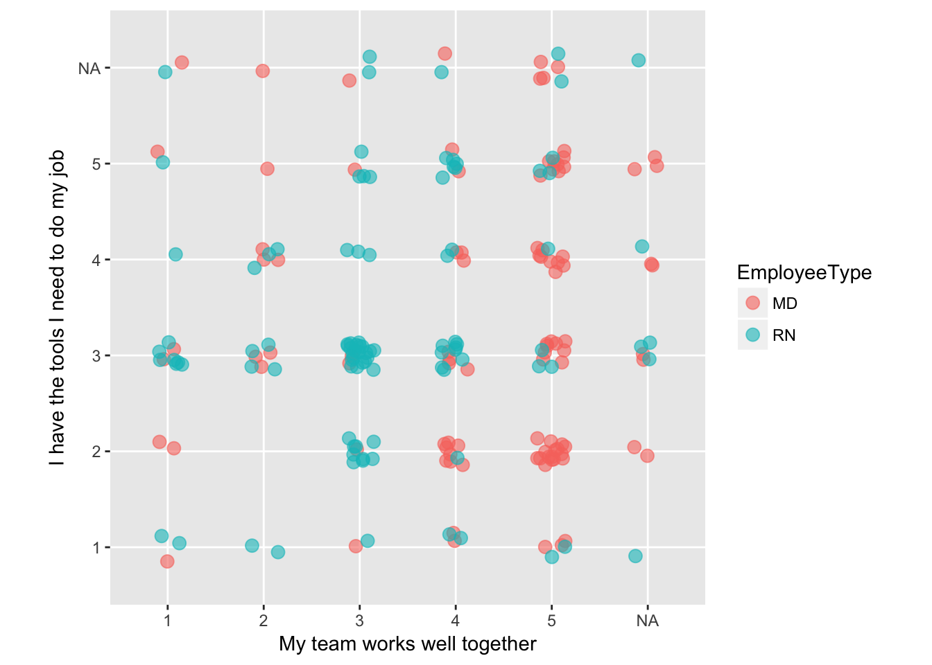
3.3.6 Monitoring ordinal data
In some cases, you may want to monitor data that uses an ordinal scale. If your metric is a “top box” type of score, a simple line chart can show that data over time; if it’s monitoring a stable process, statistical process control methods can be used as well.
If you want to monitor a more complete view of the data, a stacked percentage bar chart shows you trends across the time series.
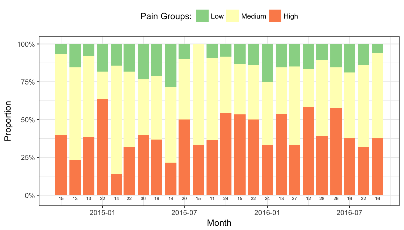
Pain scores are a common outcome measure in surgeries, which are usually recorded on an intensity scale of 1-10, with 10 being the highest pain imaginable. Many researchers and quality improvement analysts collapse those values into Low (1-3), Medium (4-7), and High (8-10) categories, as the meaning of the exact values varies from patient to patient as well as between clinicians.
In this example (Figure 9), the maximum pain score for each patient in the 24 hours following a surgery are recorded, and assigned to a pain category. The total number of patients with maximum pain scores in each pain category are summed each month.
Monitoring maximum pain scores with a stacked percentage bar chart. Total surgeries performed that month occur just below each bar.
# Figure 9
ggplot(surgeries_pain, aes(x = Month, y = Count, fill = Pain_Group)) +
  geom_bar(position = "fill", stat = "identity") +
  scale_y_continuous(labels = scales::percent) +
  scale_fill_brewer(name = "Pain Groups:", type = "div", palette = "Spectral", direction = -1) +
  geom_text(aes(y = -0.02, label = Surgeries), size = 2, color = "gray40") +
  ylab("Proportion") +
  theme_bw() +
  theme(legend.position = "top")