Recitation 7 Note
2021-08-05
Chapter 1 The remaining part of Assignment 7
1.1 Exercise 23.2.1.1
library(tidyverse)## ── Attaching packages ─────────────────────────────────────── tidyverse 1.3.1 ──## ✓ ggplot2 3.3.5 ✓ purrr 0.3.4
## ✓ tibble 3.1.2 ✓ dplyr 1.0.7
## ✓ tidyr 1.1.3 ✓ stringr 1.4.0
## ✓ readr 1.4.0 ✓ forcats 0.5.1## ── Conflicts ────────────────────────────────────────── tidyverse_conflicts() ──
## x dplyr::filter() masks stats::filter()
## x dplyr::lag() masks stats::lag()library(modelr)
options(na.action = na.warn)
set.seed(1)
sim1a <- tibble(
x = rep(1:10, each = 3),
y = x * 1.5 + 6 + rt(length(x), df = 2)
)
sim1a_mod <- lm(y ~ x, data = sim1a)
coef(sim1a_mod)## (Intercept) x
## 7.313038 1.175975ggplot(sim1a, aes(x, y)) +
geom_point(size = 2, colour = "grey30") +
geom_abline(intercept = coef(sim1a_mod)[1], slope = coef(sim1a_mod)[2])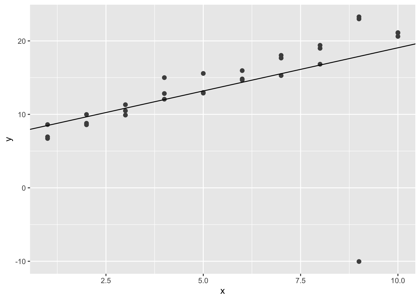
Note that the plot might be different. In this plot, the simulated line is heavily influenced by the extreme value at around \((9,-10)\).
1.2 Exercise 23.2.1.2
One way to make linear models more robust is to use a different distance measure. For example, instead of root-mean-squared distance, you could use mean-absolute distance:
model1 <- function(a, data) {
  a[1] + data$x * a[2]
}
measure_distance <- function(mod, data) {
  diff <- data$y - model1(mod, data)
  mean(abs(diff))
}
best <- optim(c(1, 0), measure_distance, data = sim1a)
best$par
## [1] 5.924893 1.520462ggplot(sim1a, aes(x, y)) +
geom_point(size = 2, colour = "grey30") +
geom_abline(intercept = best$par[1], slope = best$par[2])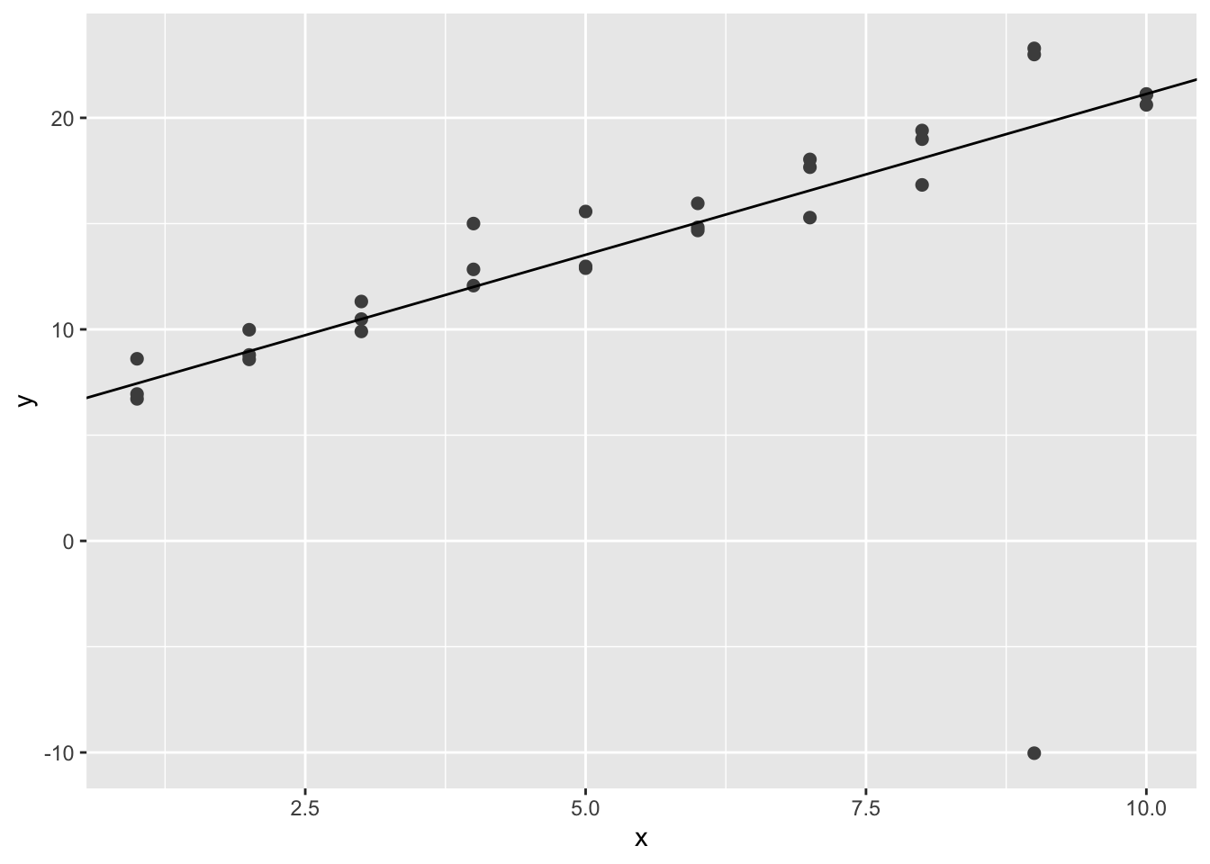
We can see that the simulated line is less affected by the extreme value.
1.3 Exercise 23.2.1.3
One challenge with performing numerical optimization is that it’s only guaranteed to find one local optimum. What’s the problem with optimizing a three parameter model like this?
model2 <- function(a, data) {
  a[1] + data$x * a[2] + a[3]
}

measure_distance <- function(mod, data) {
  diff <- data$y - model2(mod, data)
  mean(abs(diff))
}
best <- optim(c(0, 0, 0), measure_distance, data = sim1a)
best$par
## [1] 21.538107 1.520462 -15.613224best <- optim(c(1, 0, 0), measure_distance, data = sim1a)
best$par## [1] 1.941942 1.520462 3.982948best <- optim(c(2, 0, 0), measure_distance, data = sim1a)
best$par## [1] 5.3549390 1.5204620 0.5699432We can see that the estimation results are related with the initial values if three parameters are assumed. However, the estimation results are not influenced by the initial values if only two parameters are used. That is to say, two parameters are guaranteed to ind one local optimum, while three parameters are not.
1.4 Exercise 23.3.3.1
Instead of using lm() to fit a straight line, you can use loess() to fit a smooth curve. Repeat the process of model fitting, grid generation, predictions, and visualization on sim1 using loess() instead of lm(). How does the result compare to geom_smooth()?
options(na.action = na.warn)
sim1_mod <- loess(y ~ x, data = sim1)

grid <- sim1 %>%
  data_grid(x)
grid <- grid %>%
  add_predictions(sim1_mod)
grid
## # A tibble: 10 x 2
## x pred
## <int> <dbl>
## 1 1 5.34
## 2 2 8.27
## 3 3 10.8
## 4 4 12.8
## 5 5 14.6
## 6 6 16.6
## 7 7 18.7
## 8 8 20.8
## 9 9 22.6
## 10 10 24.0ggplot(sim1, aes(x)) +
geom_point(aes(y = y)) +
geom_line(aes(y = pred), data = grid, colour = "red", size = 1)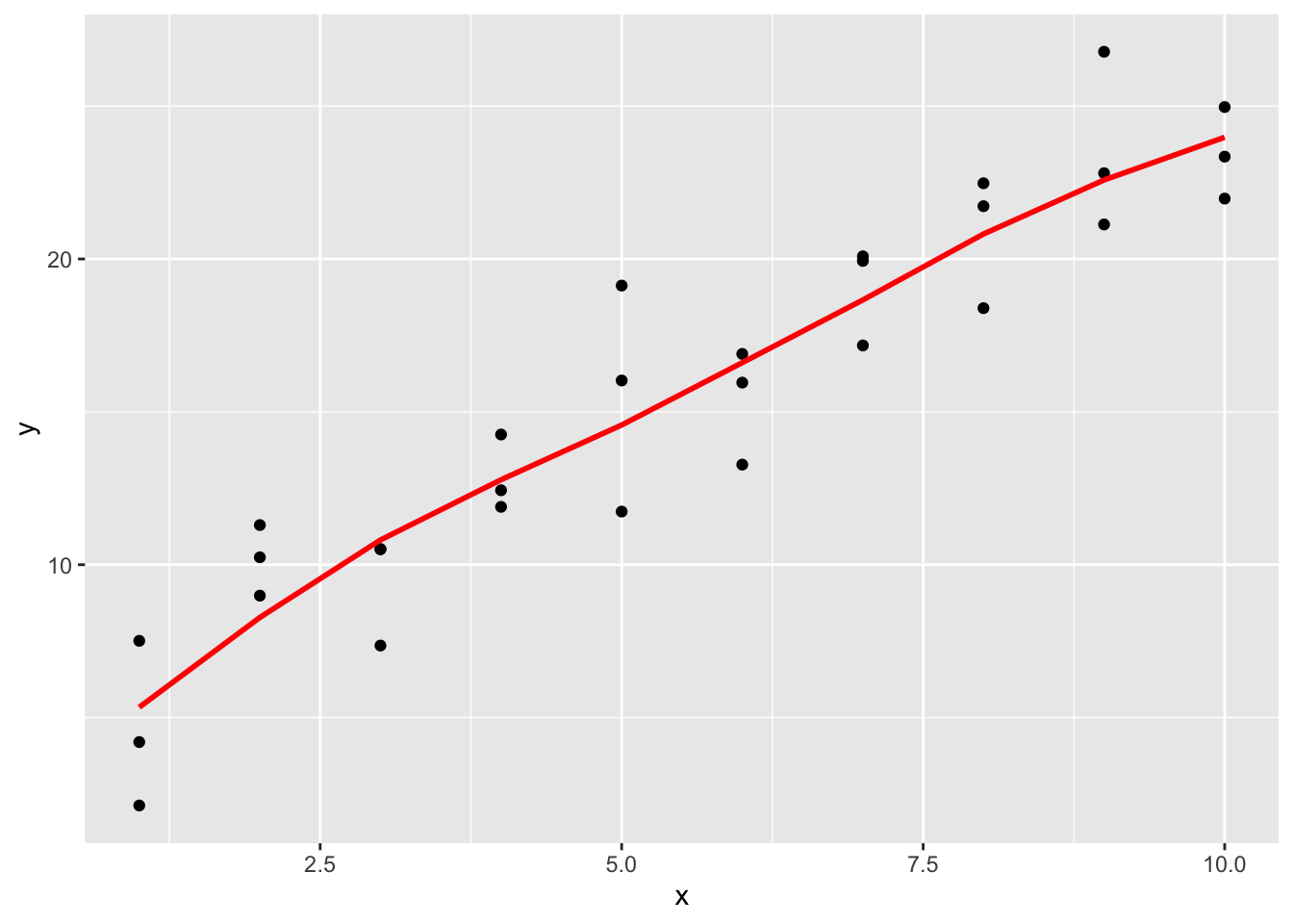
# Compared with geom_smooth
ggplot(sim1, aes(x,y)) +
  geom_point() +
  geom_smooth()
## `geom_smooth()` using method = 'loess' and formula 'y ~ x'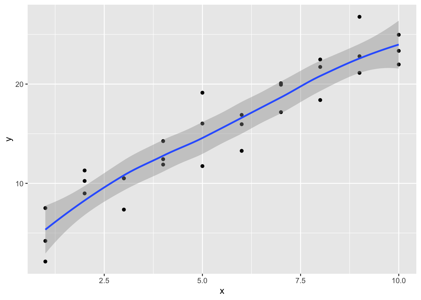
It is observed that the new fitted line is smoother. It is also close to geom_smooth().
1.5 Exercise 23.3.3.2
Add predictions to a data frame
add_predictions(data, model, var = "pred", type = NULL)

spread_predictions(data, ..., type = NULL)

gather_predictions(data, ..., .pred = "pred", .model = "model", type = NULL)
A data frame. add_prediction() adds a single new column, with default name pred, to the input data. spread_predictions() adds one column for each model. gather_predictions() adds two columns .model and .pred, and repeats the input rows for each model.
1.6 Exercise 23.3.3.3
geom_ref_line() adds a reference line to the plot. It comes from Package modelr. We need a reference line in residual plot because we are interested in the difference between residuals and 0. If the residuals are close to 0 and not showing any pattern, then we can conclude that this is a good fit; otherwise, the model is poor and needs update.
1.7 Exercise 23.3.3.4
In one word, using a frequency polygon of absolute residuals makes the problem intuitive and straightforward. If there is something wrong about our underlining assumptions, there will be some clear patterns in the frequency plot; we are expecting to see no pattern in the residual plot or frequency polygon, if the model is a good fit.