Chapter 2 QQ Plot
The Q-Q plot, or quantile-quantile plot, is a graphical tool to help us assess if a set of data plausibly came from some theoretical distribution such as a Normal or exponential. For example, if we run a statistical analysis that assumes our dependent variable is Normally distributed, we can use a Normal Q-Q plot to check that assumption. It’s just a visual check, not an air-tight proof, so it is somewhat subjective. But it allows us to see at-a-glance if our assumption is plausible, and if not, how the assumption is violated and what data points contribute to the violation.
A Q-Q plot is a scatterplot created by plotting two sets of quantiles against one another. If both sets of quantiles came from the same distribution, we should see the points forming a line that’s roughly straight. Here’s an example of a Normal Q-Q plot when both sets of quantiles truly come from Normal distributions.
x = rnorm(1000)
qqnorm(x)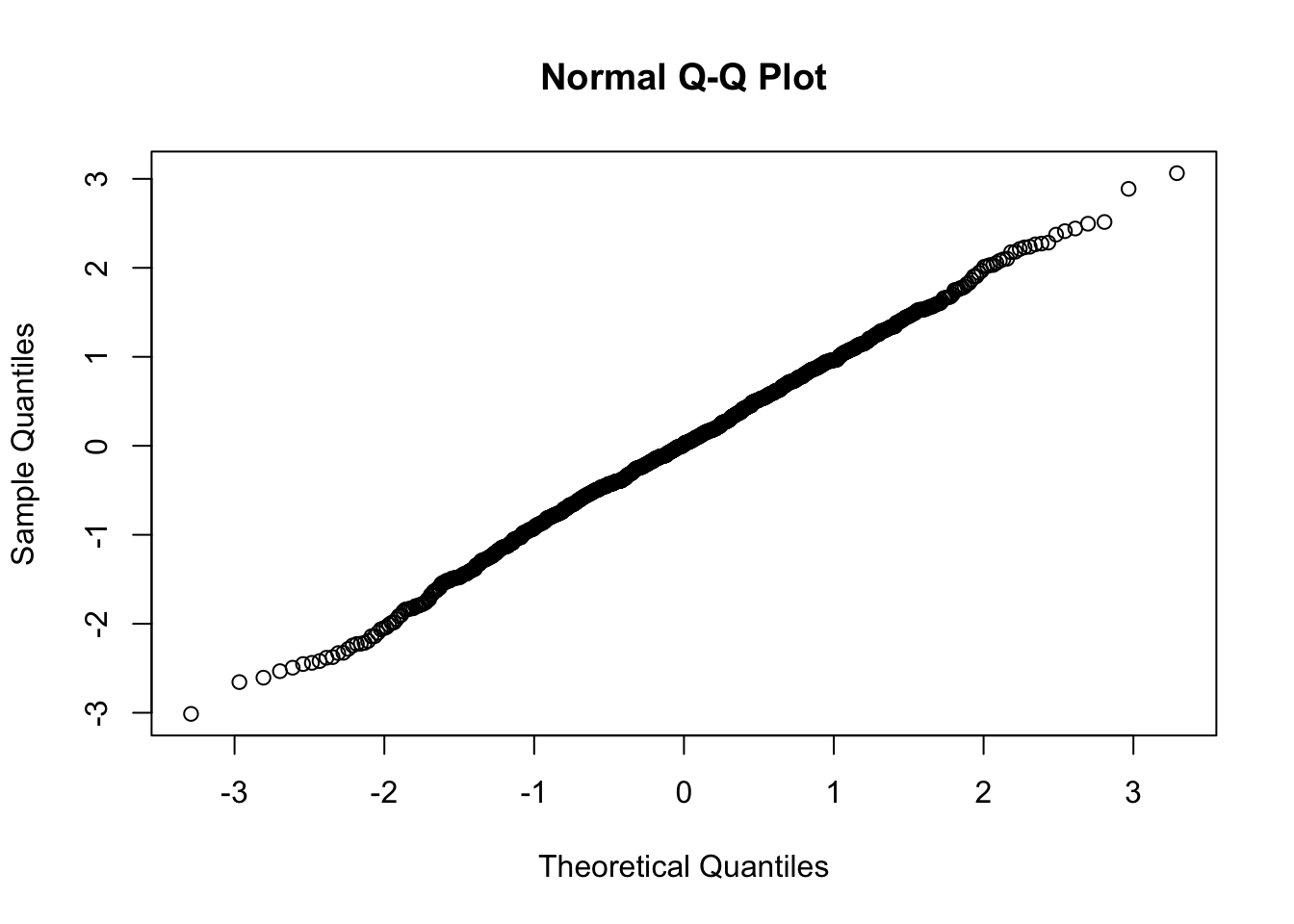
Now what are “quantiles?” These are often referred to as “percentiles.” These are points in your data below which a certain proportion of your data fall. For example, imagine the classic bell-curve standard Normal distribution with a mean of 0. The 0.5 quantile, or 50th percentile, is 0. Half the data lie below 0. That’s the peak of the hump in the curve. The 0.95 quantile, or 95th percentile, is about 1.64. 95 percent of the data lie below 1.64. The following R code generates the quantiles for a standard Normal distribution from 0.01 to 0.99 by increments of 0.01:
qnorm(seq(0.01,0.99,0.01))## [1] -2.32634787 -2.05374891 -1.88079361 -1.75068607 -1.64485363 -1.55477359
## [7] -1.47579103 -1.40507156 -1.34075503 -1.28155157 -1.22652812 -1.17498679
## [13] -1.12639113 -1.08031934 -1.03643339 -0.99445788 -0.95416525 -0.91536509
## [19] -0.87789630 -0.84162123 -0.80642125 -0.77219321 -0.73884685 -0.70630256
## [25] -0.67448975 -0.64334541 -0.61281299 -0.58284151 -0.55338472 -0.52440051
## [31] -0.49585035 -0.46769880 -0.43991317 -0.41246313 -0.38532047 -0.35845879
## [37] -0.33185335 -0.30548079 -0.27931903 -0.25334710 -0.22754498 -0.20189348
## [43] -0.17637416 -0.15096922 -0.12566135 -0.10043372 -0.07526986 -0.05015358
## [49] -0.02506891 0.00000000 0.02506891 0.05015358 0.07526986 0.10043372
## [55] 0.12566135 0.15096922 0.17637416 0.20189348 0.22754498 0.25334710
## [61] 0.27931903 0.30548079 0.33185335 0.35845879 0.38532047 0.41246313
## [67] 0.43991317 0.46769880 0.49585035 0.52440051 0.55338472 0.58284151
## [73] 0.61281299 0.64334541 0.67448975 0.70630256 0.73884685 0.77219321
## [79] 0.80642125 0.84162123 0.87789630 0.91536509 0.95416525 0.99445788
## [85] 1.03643339 1.08031934 1.12639113 1.17498679 1.22652812 1.28155157
## [91] 1.34075503 1.40507156 1.47579103 1.55477359 1.64485363 1.75068607
## [97] 1.88079361 2.05374891 2.32634787We can also randomly generate data from a standard Normal distribution and then find the quantiles. Here we generate a sample of size 200 and find the quantiles for 0.01 to 0.99 using the quantile() function:
quantile(rnorm(200),probs = seq(0.01,0.99,0.01))## 1% 2% 3% 4% 5% 6%
## -2.64302601 -1.86883848 -1.83483162 -1.72024298 -1.64930593 -1.61368739
## 7% 8% 9% 10% 11% 12%
## -1.52086308 -1.49084660 -1.43916489 -1.37487255 -1.28165457 -1.25268392
## 13% 14% 15% 16% 17% 18%
## -1.23148333 -1.12927316 -1.04951755 -1.02069368 -0.99774402 -0.95047576
## 19% 20% 21% 22% 23% 24%
## -0.90604780 -0.89151932 -0.87364665 -0.86400940 -0.85908888 -0.84228100
## 25% 26% 27% 28% 29% 30%
## -0.81573455 -0.76131692 -0.68415412 -0.67093670 -0.64149006 -0.58649997
## 31% 32% 33% 34% 35% 36%
## -0.55444031 -0.51597524 -0.47733720 -0.45101557 -0.42459451 -0.39088096
## 37% 38% 39% 40% 41% 42%
## -0.36606733 -0.35323370 -0.33636028 -0.30739288 -0.29523046 -0.27435445
## 43% 44% 45% 46% 47% 48%
## -0.19206581 -0.16015019 -0.13863908 -0.08617355 -0.05328691 -0.03280260
## 49% 50% 51% 52% 53% 54%
## -0.01434253 0.01131148 0.04216680 0.05852656 0.07086649 0.07707506
## 55% 56% 57% 58% 59% 60%
## 0.12097650 0.15449390 0.18251930 0.22117134 0.24367477 0.28329730
## 61% 62% 63% 64% 65% 66%
## 0.29759344 0.31894617 0.34538706 0.35888012 0.40252417 0.46386337
## 67% 68% 69% 70% 71% 72%
## 0.50781456 0.55058034 0.58740915 0.64014079 0.66600546 0.70326751
## 73% 74% 75% 76% 77% 78%
## 0.73687678 0.75996802 0.77881909 0.81180301 0.84781283 0.87240366
## 79% 80% 81% 82% 83% 84%
## 0.89332733 0.90746928 0.98046939 0.99128302 1.01152697 1.02766603
## 85% 86% 87% 88% 89% 90%
## 1.06628549 1.10229977 1.15986152 1.18459865 1.23723343 1.36307369
## 91% 92% 93% 94% 95% 96%
## 1.41707582 1.47066980 1.49918221 1.60381562 1.65310760 1.78359773
## 97% 98% 99%
## 1.91700768 2.07085875 2.11603262So we see that quantiles are basically just your data sorted in ascending order, with various data points labelled as being the point below which a certain proportion of the data fall. However it’s worth noting there are many ways to calculate quantiles. In fact, the quantile function in R offers 9 different quantile algorithms! See help(quantile) for more information.
The generic function quantile produces sample quantiles corresponding to the given probabilities. The smallest observation corresponds to a probability of 0 and the largest to a probability of 1.
set.seed(1)
a = rnorm(10)
quantile(a, probs= seq(0,1,0.25))
## 0% 25% 50% 75% 100%
## -0.8356286 -0.5461875 0.2565755 0.5536933 1.5952808a## [1] -0.6264538 0.1836433 -0.8356286 1.5952808 0.3295078 -0.8204684
## [7] 0.4874291 0.7383247 0.5757814 -0.3053884qqnorm(quantile(a, probs= seq(0,1,0.25)))
qqline(quantile(a, probs= seq(0,1,0.25)))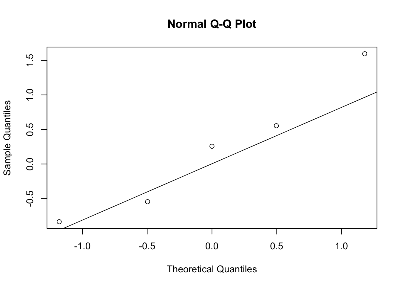
If we can plot the sample norm quantile v.s. the theoretical norm quantile as follows:
qqnorm(qnorm(seq(0.01,0.99,0.01)))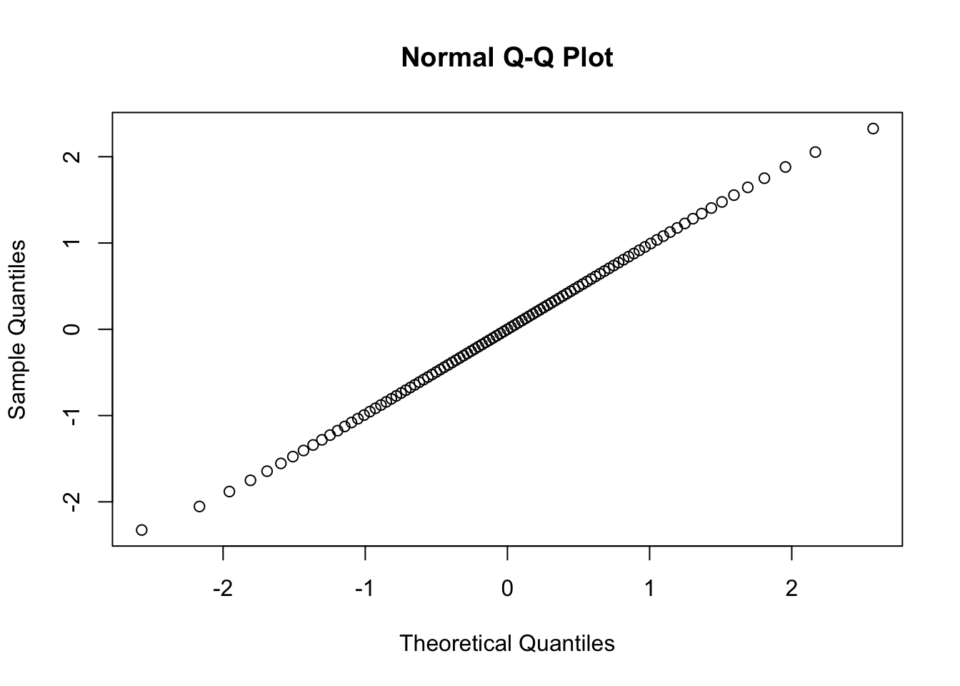
The results show that if the sample are perfectly normally distributed, then the qq plot will be a straight line; if the sample are standard normal, then the slope of the line will be 45。.
Q-Q plots take your sample data, sort it in ascending order, and then plot them versus quantiles calculated from a theoretical distribution. The number of quantiles is selected to match the size of your sample data. While Normal Q-Q Plots are the ones most often used in practice due to so many statistical methods assuming normality, Q-Q Plots can actually be created for any distribution.
What about when points don’t fall on a straight line? What can we infer about our data? To help us answer this, let’s generate data from one distribution and plot against the quantiles of another. First we plot a distribution that’s skewed right, a Chi-square distribution with 3 degrees of freedom, against a Normal distribution.
qqplot(qnorm(ppoints(30)), qchisq(ppoints(30),df=3))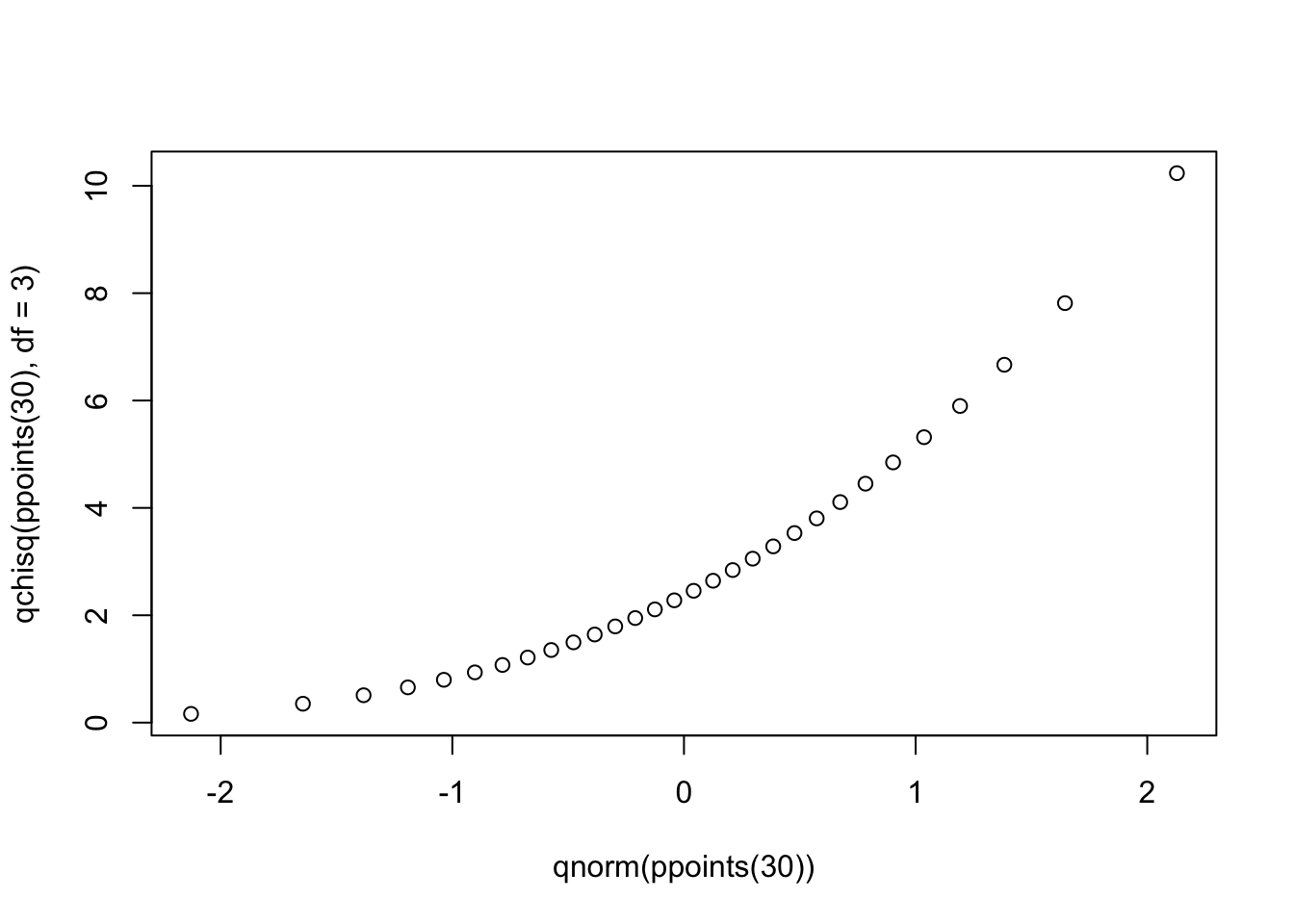
Notice the points form a curve instead of a straight line. Normal Q-Q plots that look like this usually mean your sample data are skewed.
Next we plot a distribution with “heavy tails” versus a Normal distribution:
qqplot(qnorm(ppoints(30)), qcauchy(ppoints(30)))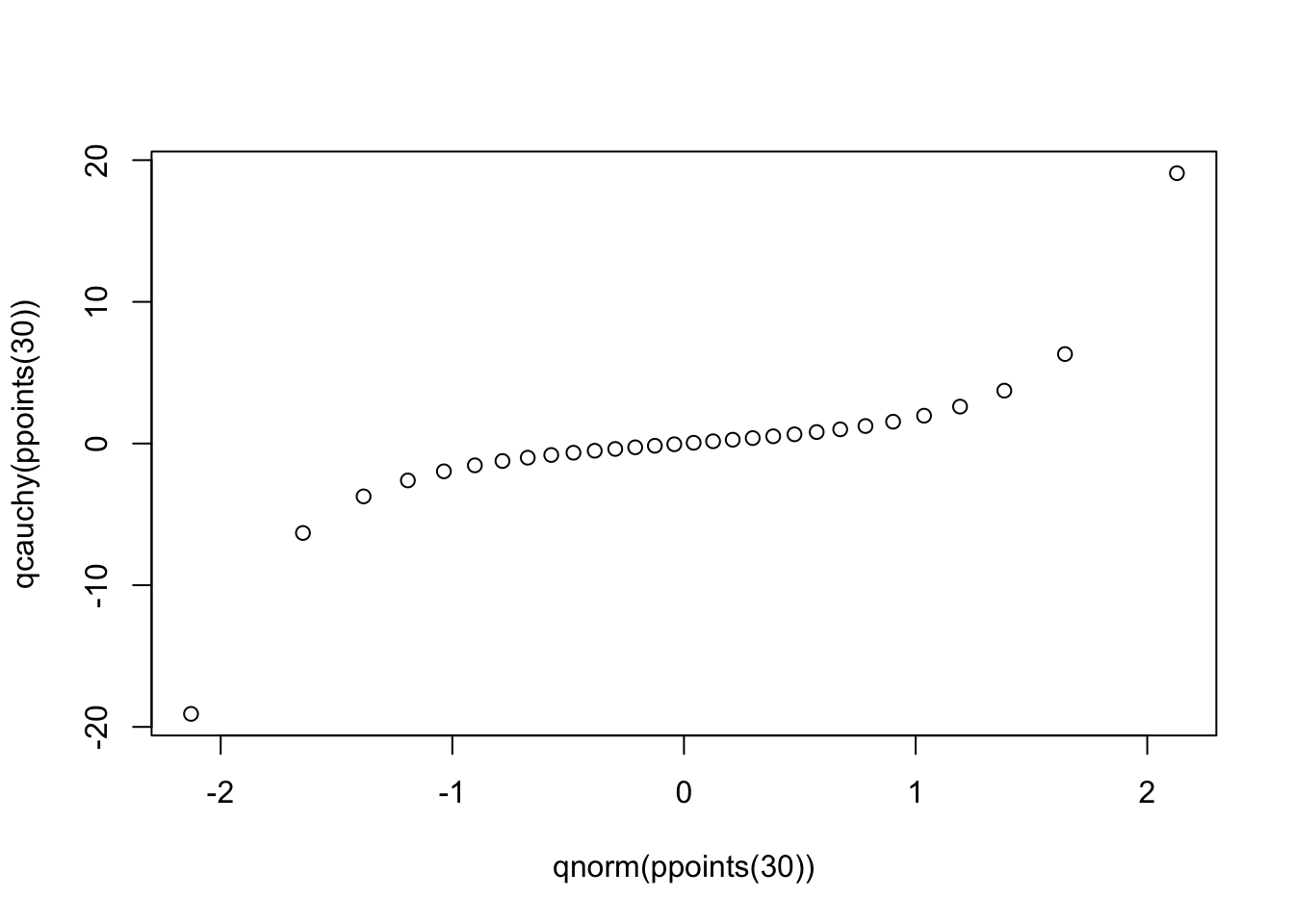
Notice the points fall along a line in the middle of the graph, but curve off in the extremities. Normal Q-Q plots that exhibit this behavior usually mean your data have more extreme values than would be expected if they truly came from a Normal distribution.
2.1 Interpretaion
2.1.1 The slope of the plot
First, let’s do a simple experiment. We plot the sample normal with standard deviation being 2 and 0.5 seperately with both mean being 0, and compare the slope of the two different Q-Q plot.
par(mfcol = c(1,2))
qqnorm(qnorm(seq(0.01,0.99,0.01), mean = 0, sd = 2), ylim = c(-4,4),
main = "sample sd = 2")
qqnorm(qnorm(seq(0.01,0.99,0.01), mean= 0, sd = 0.5), ylim = c(-4,4),
main = "sample sd = .5")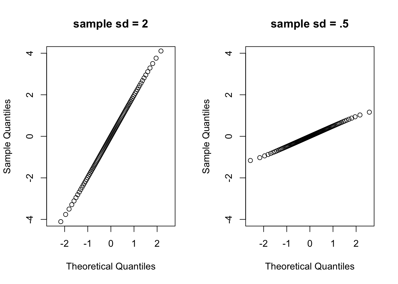 We can see that if the general trend of the Q–Q plot is flatter than the line \(y = x\), the distribution plotted on the horizontal axis is more dispersed than the distribution plotted on the vertical axis. Conversely, if the general trend of the Q–Q plot is steeper than the line \(y = x\), the distribution plotted on the vertical axis is more dispersed than the distribution plotted on the horizontal axis.