Lecture 8 Note
2021-07-30
Chapter 1 Some update of goodness of fit
## ── Attaching packages ─────────────────────────────────────── tidyverse 1.3.1 ──## ✓ ggplot2 3.3.5 ✓ purrr 0.3.4
## ✓ tibble 3.1.2 ✓ dplyr 1.0.7
## ✓ tidyr 1.1.3 ✓ stringr 1.4.0
## ✓ readr 1.4.0 ✓ forcats 0.5.1## ── Conflicts ────────────────────────────────────────── tidyverse_conflicts() ──
## x dplyr::filter() masks stats::filter()
## x dplyr::lag() masks stats::lag()## Loading required package: lubridate##
## Attaching package: 'lubridate'## The following objects are masked from 'package:base':
##
## date, intersect, setdiff, union## Loading required package: PerformanceAnalytics## Loading required package: xts## Loading required package: zoo##
## Attaching package: 'zoo'## The following objects are masked from 'package:base':
##
## as.Date, as.Date.numeric##
## Attaching package: 'xts'## The following objects are masked from 'package:dplyr':
##
## first, last##
## Attaching package: 'PerformanceAnalytics'## The following object is masked from 'package:graphics':
##
## legend## Loading required package: quantmod## Loading required package: TTR## Registered S3 method overwritten by 'quantmod':
## method from
## as.zoo.data.frame zoo## ══ Need to Learn tidyquant? ════════════════════════════════════════════════════
## Business Science offers a 1-hour course - Learning Lab #9: Performance Analysis & Portfolio Optimization with tidyquant!
## </> Learn more at: https://university.business-science.io/p/learning-labs-pro </>## Registered S3 method overwritten by 'rmutil':
## method from
## print.response httr##
## Attaching package: 'rmutil'## The following object is masked from 'package:tidyr':
##
## nesting## The following object is masked from 'package:stats':
##
## nobs## The following objects are masked from 'package:base':
##
## as.data.frame, units1.1 Plot the value
par(mfcol=c(1,1))
Y00=casestudy1.data0.00[,Y00.name0]
plot(Y00, ylab="Value",main=Y00.name0)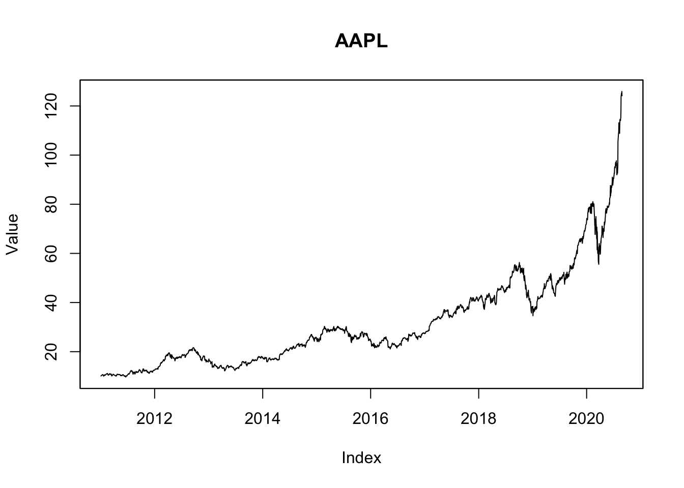
1.2 Plot the daily return
y00<-zoo( x=as.matrix(exp(diff(log(Y00)))-1),
                    order.by=time(Y00)[-1])
names(y00)<-"y00"
plot(y00, ylab="Daily Returns (pct)",main=Y00.name0)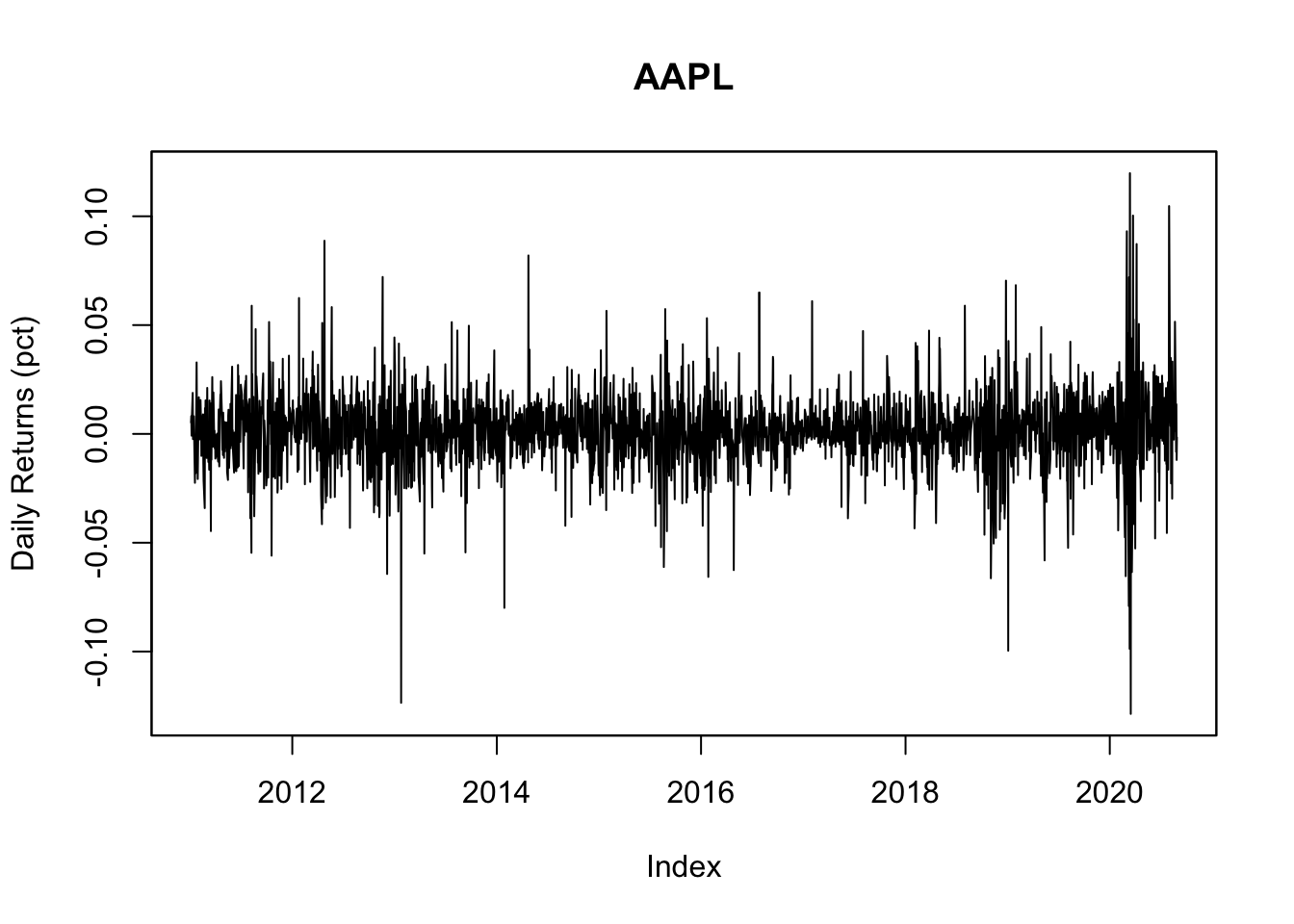
1.3 Use base plot to plot Rolling Estimates of mu/median
#   4.1 Use base plot to plot Rolling Estimates of mu/median -----

y00both<-c(y00_df1$muNormal ,
           y00_df1$thetaLaplace)

ylim0<-c(min(y00both,na.rm=TRUE), max(y00both,na.rm=TRUE))
plot(x=y00_df1$date,y=y00_df1$thetaLaplace,
     ylim=ylim0,
     col='red',type="l",
     ylab="mu or theta",xlab="date")
lines(x=y00_df1$date,y=y00_df1$muNormal, col='blue',type="l")
title(main=paste(c(
  "Center Distribution Estimates of ", Y00.name0,
  "\nNormal(blue) and Laplace(red)",
  "\nRolling Windows (ndays=",ndays0,")"),
  collapse=""))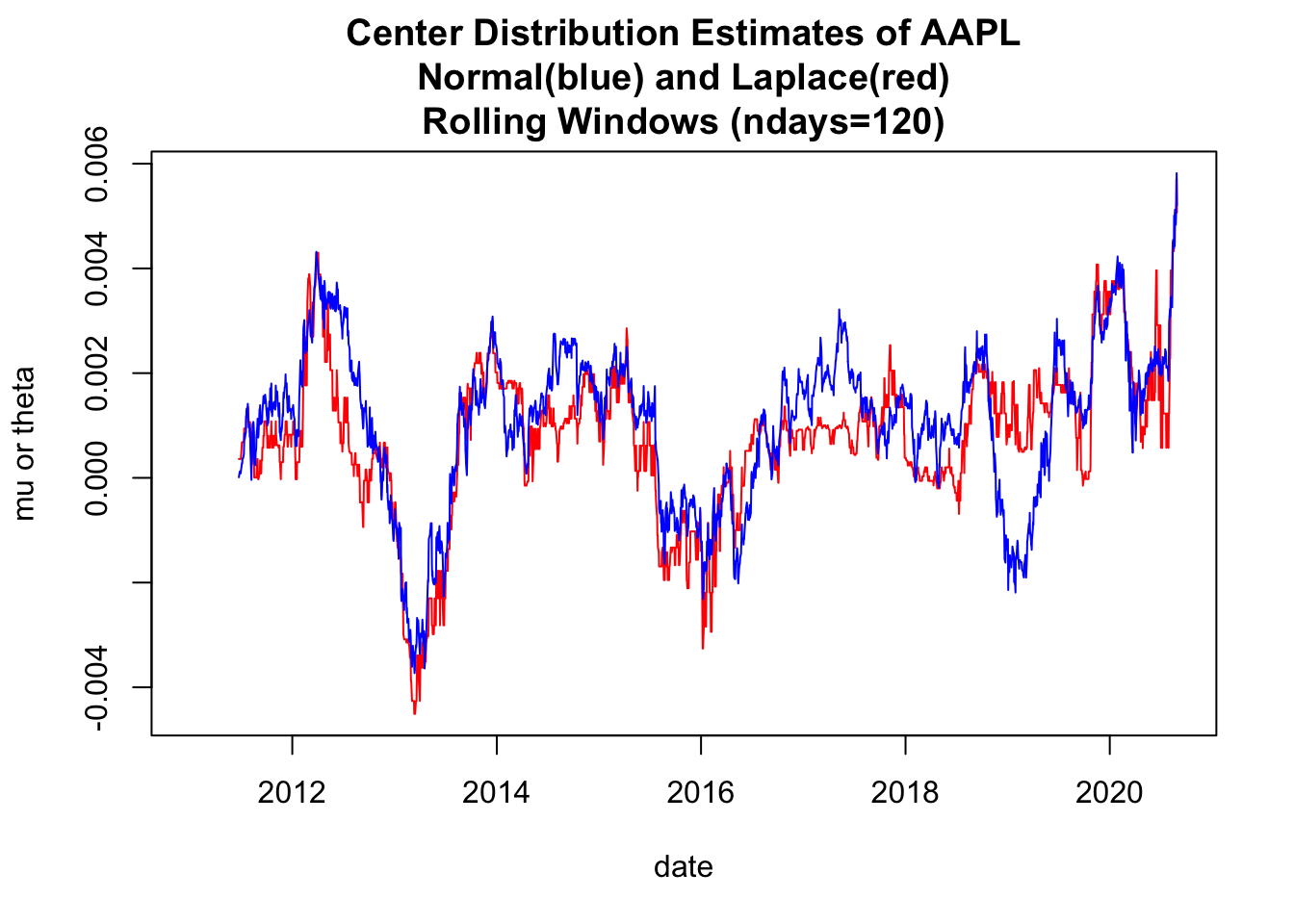
1.4 Use base plot to plot Rolling Estimates of st. devs
#   4.2 Use base plot to plot Rolling Estimates of st. devs -----
y00both<-c(y00_df1$sigmaNormal ,
           y00_df1$scaleLaplace*sqrt(2))

ylim0<-c(min(y00both,na.rm=TRUE), max(y00both,na.rm=TRUE))
plot(x=y00_df1$date,y=y00_df1$scaleLaplace*sqrt(2),
     ylim=ylim0,
     col='red',type="l",
     ylab="st dev ",xlab="date")
lines(x=y00_df1$date,y=y00_df1$sigmaNormal, col='blue',type="l")
title(main=paste(c(
  "St Dev of Distribution Estimates of ", Y00.name0,
  "\nNormal(blue) and Laplace(red)",
  "\nRolling Windows (ndays=",ndays0,")"),
  collapse=""))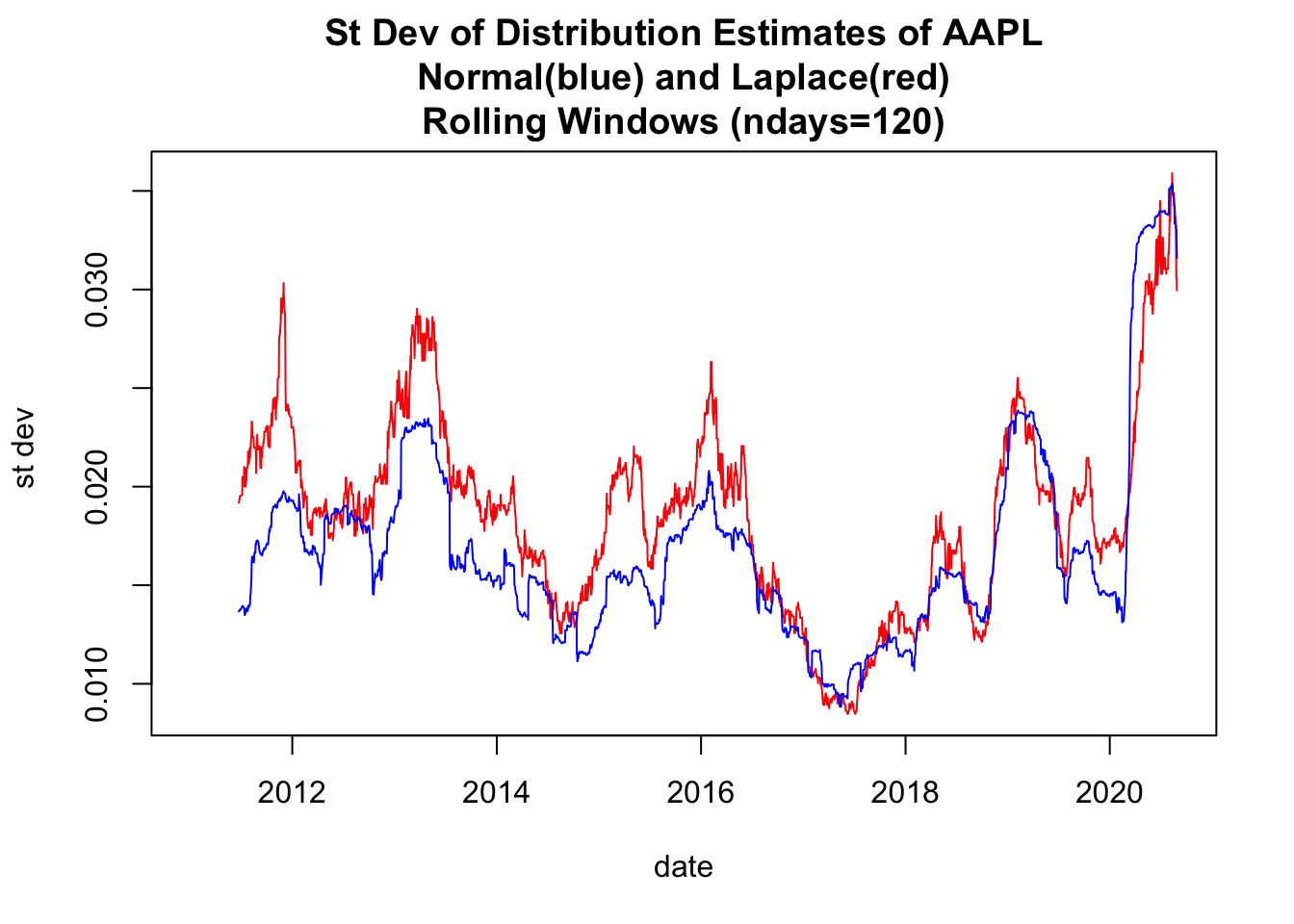
1.5 Use base plot to plot Rolling Volatilities
#   4.3 Use base plot() to plot Rolling Volatilities ----
y00both<-c(y00_df1$volLaplace, y00_df1$volNormal)
ylim0<-c(min(y00both,na.rm=TRUE), max(y00both,na.rm=TRUE))
plot(x=y00_df1$date,y=y00_df1$volLaplace,
     ylim=ylim0,
     col='red',type="l",
     ylab="volatility",xlab="date")
lines(x=y00_df1$date,y=y00_df1$volNormal, col='blue',type="l",
      ylab="volatility")
title(main=paste(c(
  "Volatility Estimates of ", Y00.name0,
  "\nNormal(blue) and Laplace(red)",
  "\nRolling Windows (ndays=",ndays0,")"),
  collapse=""))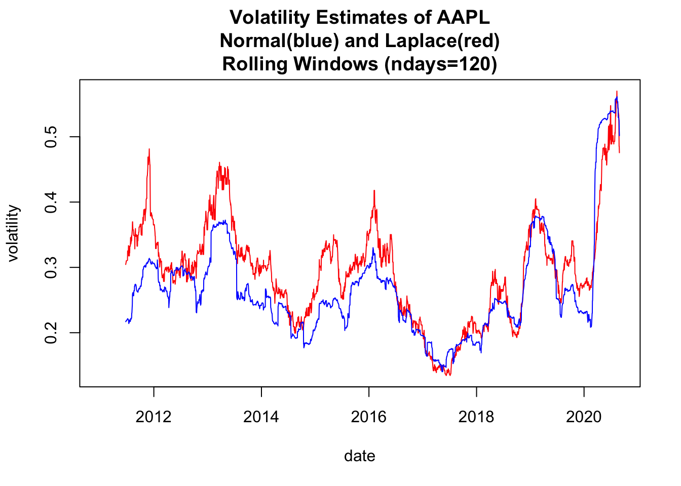
1.6 Use ggplot2 to plot Rolling Volatilities
#   4.4 Use ggplot2 to plot Rolling Volatilities ----
df2<-rbind(
  data.frame(
    date=y00_df1$date,
    vol=y00_df1$volNormal,
    model="NormalMLE",
    ndays=ndays0),
  data.frame(
    date=y00_df1$date,
    vol=y00_df1$volLaplace,
    model="LaplaceMLE",
    ndays=ndays0))


df2$model=as.factor(df2$model)
dim(df2)
## [1] 4860 4gg0<-ggplot(df2, aes(x=date, y=vol, col=model)) + geom_line() +
theme(legend.position="bottom") +
ggtitle(paste(c("Volatilities \nRolling Windows(ndays=", as.character(ndays0),
")\n", Y00.name0),collapse="")
)
print(gg0)## Warning: Removed 238 row(s) containing missing values (geom_path).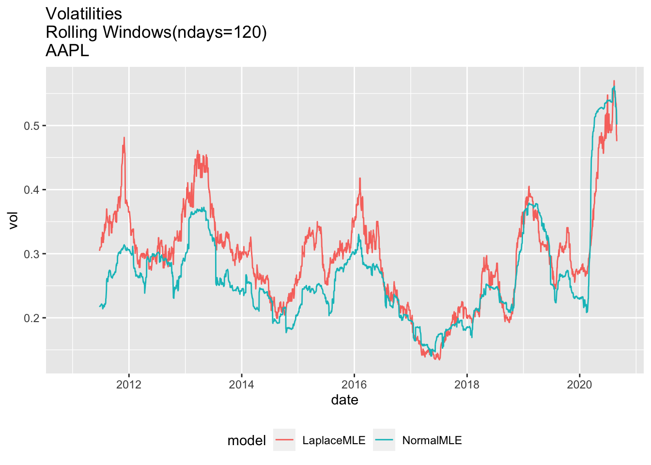
#4.4 Use ggplot2 to plot pvalues of Rolling Fits1.7 Plot pvalues for entire period
# 4.5 Plot pvalues for entire period ----
gg3<-ggplot(df3, aes(x=date, y=pval, col=model))+geom_line()
print(gg3+ggtitle(label=paste(c(
  Y00.name0,": ndays=",df3$ndays[1]),
  collapse="")
  ))
## Warning: Removed 357 row(s) containing missing values (geom_path).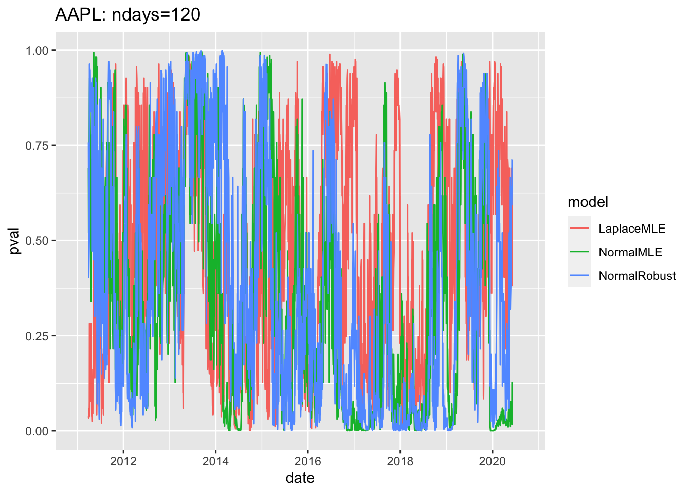
1.8 Sample plot of pvalues since 2019
# 4.6 Sample plot of pvalues since 2019 ----

gg4<-df3 %>% filter(date>=as.Date("2019-01-01")) %>%
ggplot( aes(x=date, y=pval, col=model))+geom_line()
print(gg4 + ggtitle(label=paste(c(
  Y00.name0,": ndays=",df3$ndays[1]),
  collapse="")
))
## Warning: Removed 180 row(s) containing missing values (geom_path).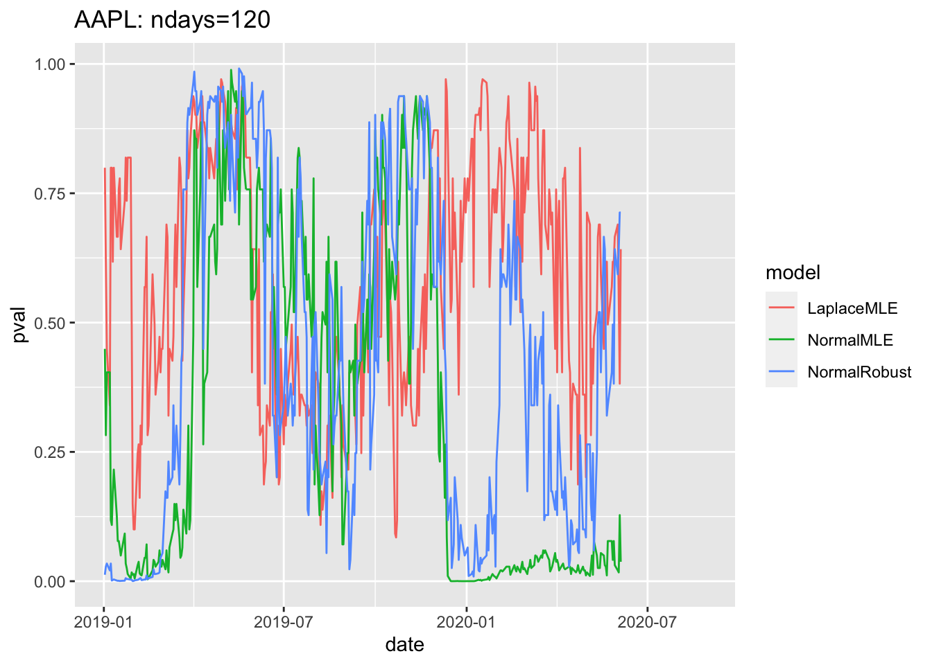
1.9 Change \(y\) scale to \(log(p)/log(0.05)\)
# 4.5 Plot pvalues for entire period ----
gg3b<-ggplot(df3, aes(x=date, y=log(pval)/log(0.05), col=model))+geom_line()
print(gg3+ggtitle(label=paste(c(
  Y00.name0,": ndays=",df3$ndays[1]),
  collapse="")
))
## Warning: Removed 357 row(s) containing missing values (geom_path).
1.10 Sample plot of log pvalues since 2019
# 4.6 Sample plot of pvalues since 2019 ----
df3$logpval=log(df3$pval)
gg4<-df3 %>% filter(date>=as.Date("2019-01-01")) %>%
  ggplot( aes(x=date, y=logpval, col=model))+geom_line()+
  geom_hline(yintercept=log(0.05), col='red')+
  geom_hline(yintercept=log(0.01),col='red', lwd=2)
geom_hline(yintercept=log(0.01),col='red', lwd=2)
## mapping: yintercept = ~yintercept
## geom_hline: na.rm = FALSE
## stat_identity: na.rm = FALSE
## position_identityprint(gg4 + ggtitle(label=paste(c(
Y00.name0,": ndays=",df3$ndays[1]),
collapse="")
))## Warning: Removed 180 row(s) containing missing values (geom_path).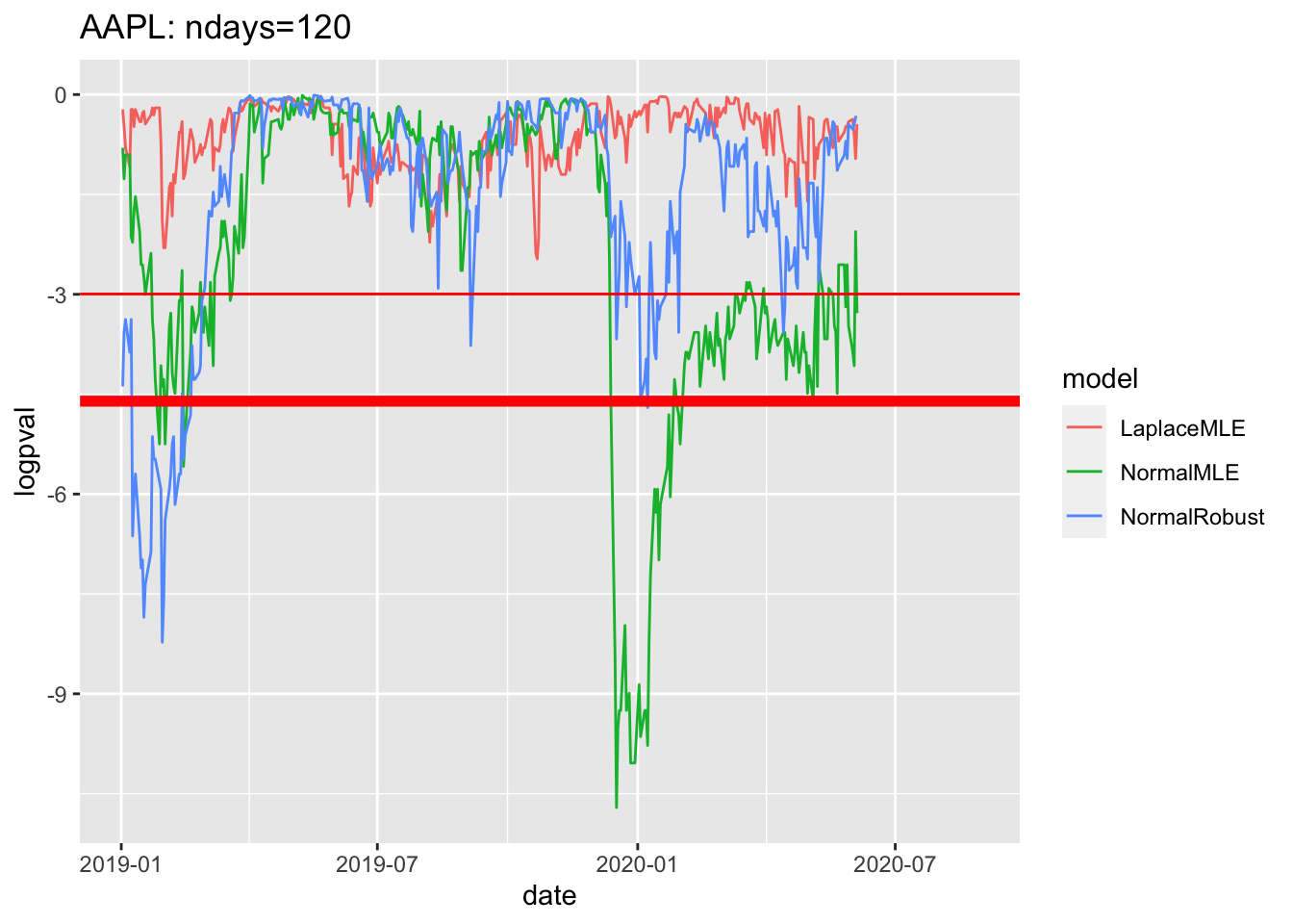
# 4.6 Sample plot of pvalues since 2019 ----
df3$logpval=log(df3$pval)
gg4<-df3 %>% filter(date>=as.Date("2015-01-01")) %>%
  ggplot( aes(x=date, y=logpval, col=model))+geom_line()+
  geom_hline(yintercept=log(0.05), col='red')+
  geom_hline(yintercept=log(0.01),col='red', lwd=2)
geom_hline(yintercept=log(0.01),col='red', lwd=2)
## mapping: yintercept = ~yintercept
## geom_hline: na.rm = FALSE
## stat_identity: na.rm = FALSE
## position_identityprint(gg4 + ggtitle(label=paste(c(
Y00.name0,": ndays=",df3$ndays[1]),
collapse="")
))## Warning: Removed 180 row(s) containing missing values (geom_path).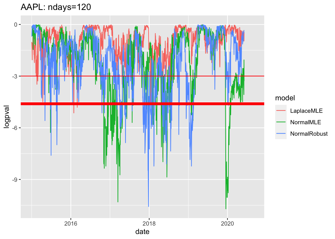
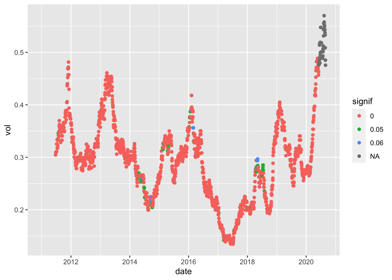
df2_sub1<-df2_AAPL_120 %>% filter(model=="LaplaceMLE")
dim(df2_sub1)
## [1] 2430 4pval_sub<-pvals_AAPL_120 %>% filter(model=="LaplaceMLE")
dim(pval_sub)## [1] 2430 4names(pval_sub)## [1] "date" "pval" "model" "ndays"df2_sub1$pval<-pval_sub$pval
df2_sub1$signif<-.05*(pval_sub$pval < .05) + .01*(pval_sub$pval<.01)
df2_sub1$signif<-factor(df2_sub1$signif)
ggplot(df2_sub1, aes(x=date, y=vol, col=signif)) + geom_point()## Warning: Removed 119 rows containing missing values (geom_point).