Bölüm 2 ggplot2 Kütüphanesi
2.1 ggplot2 Katmanları
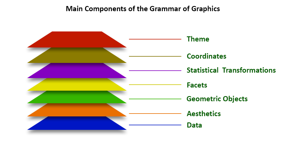
- Temalar
- Koordinatlar (coordinates)
- İstatistikler (statistics)
- Görünüşler/kesimler (facets)
- Kesimler, her biri verilerin farklı bir alt kümesini gösteren küçük katlar oluşturur.
- Geometriler (geometries)
- Verinin hangi tipte, nasıl görselleştirileceğinin belirlenmesi (serpilme diyagramı, sütun grafiği vb.)
- Estetikler (aesthetics mapping)
- Grafikte görülmek istenilen şeyler (x ve y eksenlerinin pozisyonları, renkler, şekiller, boyutlar vb.)
- Veri
library(ggplot2)
library(dplyr) # veri manipülasyonu
library(tidyr) # veri manipülasyonu
library(knitr) # tablolar
2.1.1 Veri
2.1.1.1 Geniş tipte veri
| Sepal.Length | Sepal.Width | Petal.Length | Petal.Width | Species |
|---|---|---|---|---|
| 5.1 | 3.5 | 1.4 | 0.2 | setosa |
| 4.9 | 3.0 | 1.4 | 0.2 | setosa |
| 4.7 | 3.2 | 1.3 | 0.2 | setosa |
| 4.6 | 3.1 | 1.5 | 0.2 | setosa |
| 5.0 | 3.6 | 1.4 | 0.2 | setosa |
| 5.4 | 3.9 | 1.7 | 0.4 | setosa |
(Aşağıdaki grafikler bu veri seti ile yapılmıştır.)
2.1.1.2 Uzun tipte veri
| Species | Species_turu | olcum |
|---|---|---|
| setosa | Sepal.Length | 5.1 |
| versicolor | Sepal.Length | 7.0 |
| virginica | Sepal.Length | 6.3 |
| setosa | Sepal.Width | 3.5 |
| versicolor | Sepal.Width | 3.2 |
| virginica | Sepal.Width | 3.3 |
| setosa | Petal.Length | 1.4 |
| versicolor | Petal.Length | 4.7 |
| virginica | Petal.Length | 6.0 |
| setosa | Petal.Width | 0.2 |
| versicolor | Petal.Width | 1.4 |
| virginica | Petal.Width | 2.5 |
tidyr::gather() uzun formattaki veri setini geniş formata çevirir.
tidyr::spread() uzun formattaki veri setini geniş formata çevirir.
2.1.4 Facets
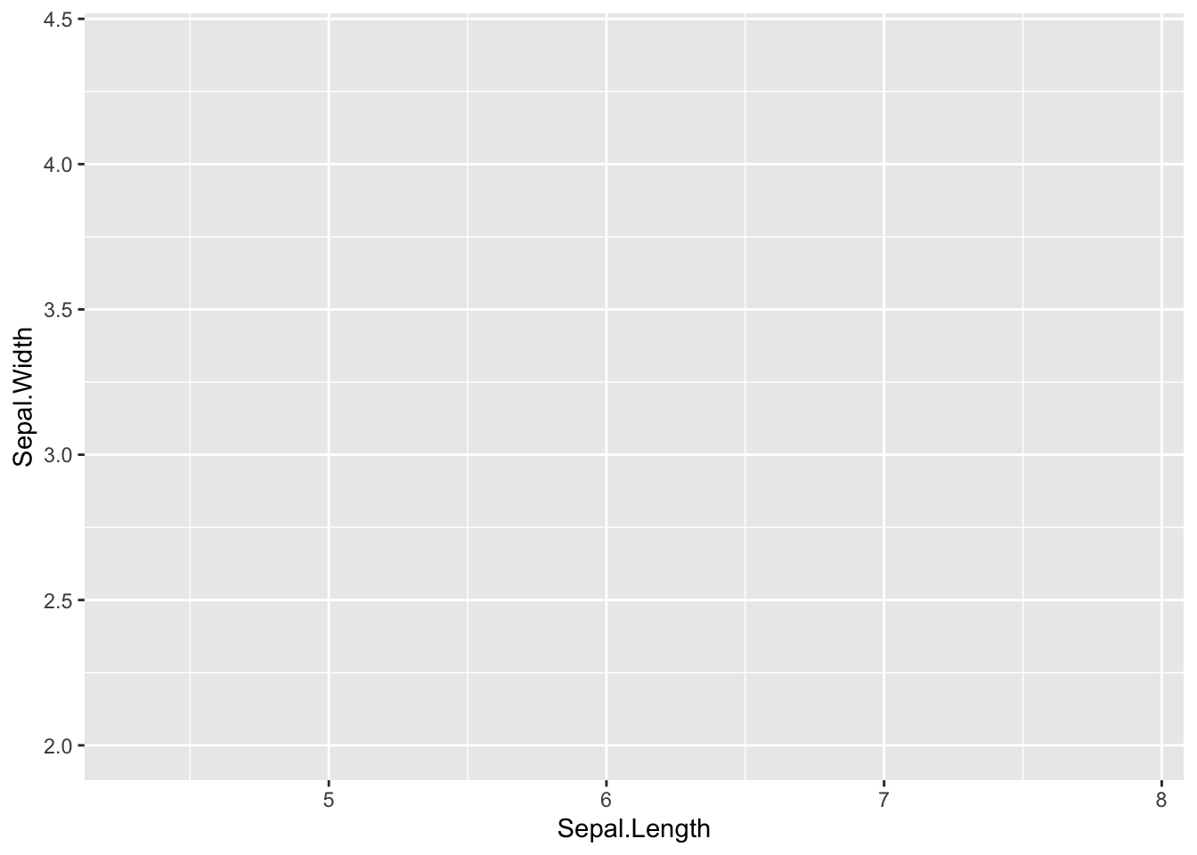
ggplot(iris, aes(x=Sepal.Length, y = Sepal.Width)) +
geom_point() +
facet_grid(~Species)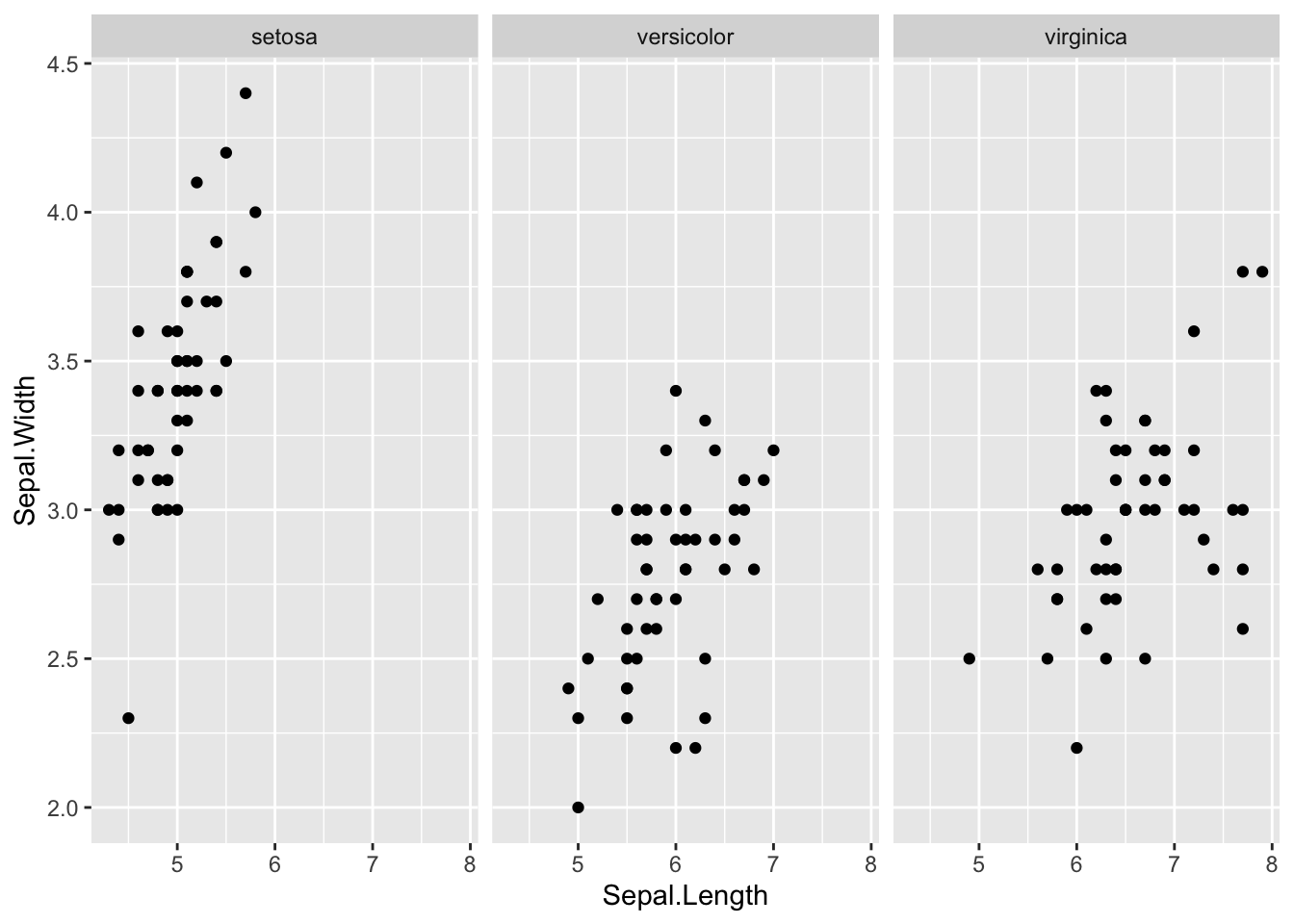
2.1.5 İstatistikler
ggplot(iris, aes(x=Sepal.Length, y = Sepal.Width)) +
  geom_point() +
facet_grid(~Species) +
stat_smooth(method='lm')
#> `geom_smooth()` using formula = 'y ~ x'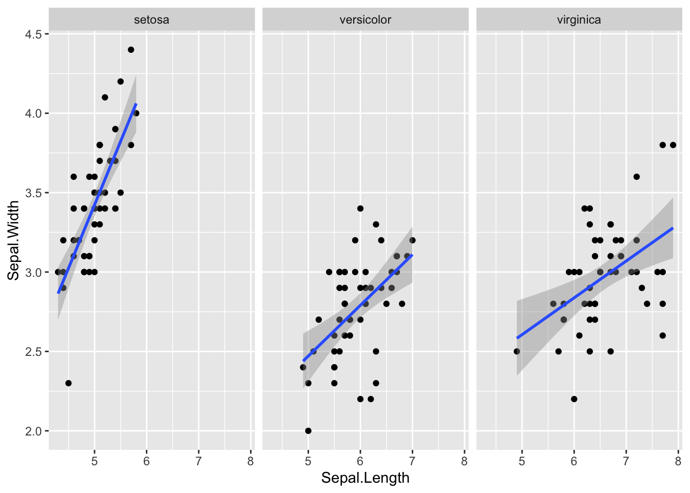
2.1.6 Koordinatlar
ggplot(iris, aes(x=Sepal.Length, y = Sepal.Width)) +
  geom_point() +
  facet_grid(~Species) +
  stat_smooth(method='lm') +
  scale_y_continuous("Kalinlik(cm)", limits = c(2,8))
#> `geom_smooth()` using formula = 'y ~ x'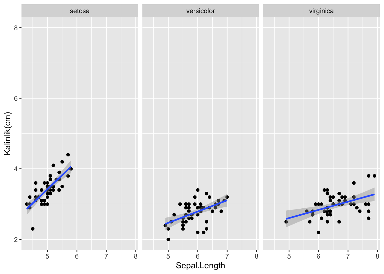
2.1.7 Temalar
ggplot(iris, aes(x=Sepal.Length, y = Sepal.Width)) +
  geom_point() +
  facet_grid(~Species) +
  stat_smooth(method='lm') +
  scale_y_continuous("Kalinlik(cm)") +
  theme_bw()
#> `geom_smooth()` using formula = 'y ~ x'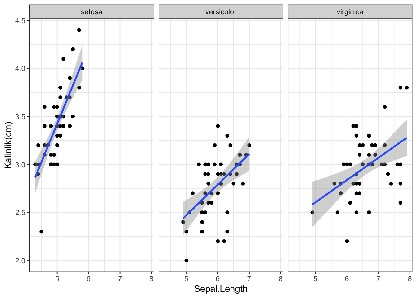
2.2 Grafik tipleri
ggplot2 kütüphanesinde katmanlar ayrı ayrı saklanabilir.
| wt | mpg | |
|---|---|---|
| Mazda RX4 | 2.620 | 21.0 |
| Mazda RX4 Wag | 2.875 | 21.0 |
| Datsun 710 | 2.320 | 22.8 |
| Hornet 4 Drive | 3.215 | 21.4 |
| Hornet Sportabout | 3.440 | 18.7 |
| Valiant | 3.460 | 18.1 |
p1 +
  labs(title = "Grafik başlığı",x = "x ekseni",y = "y ekseni")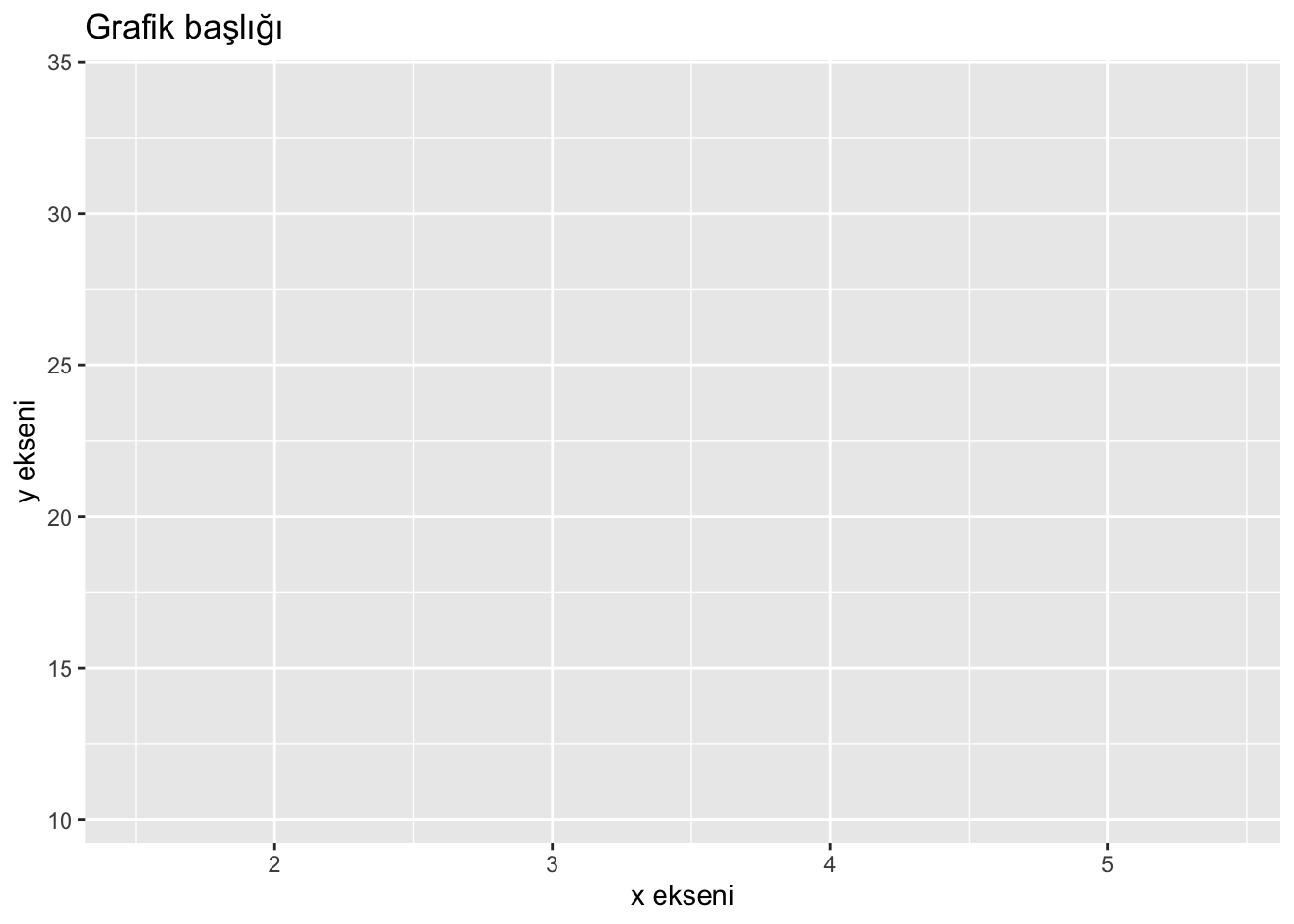
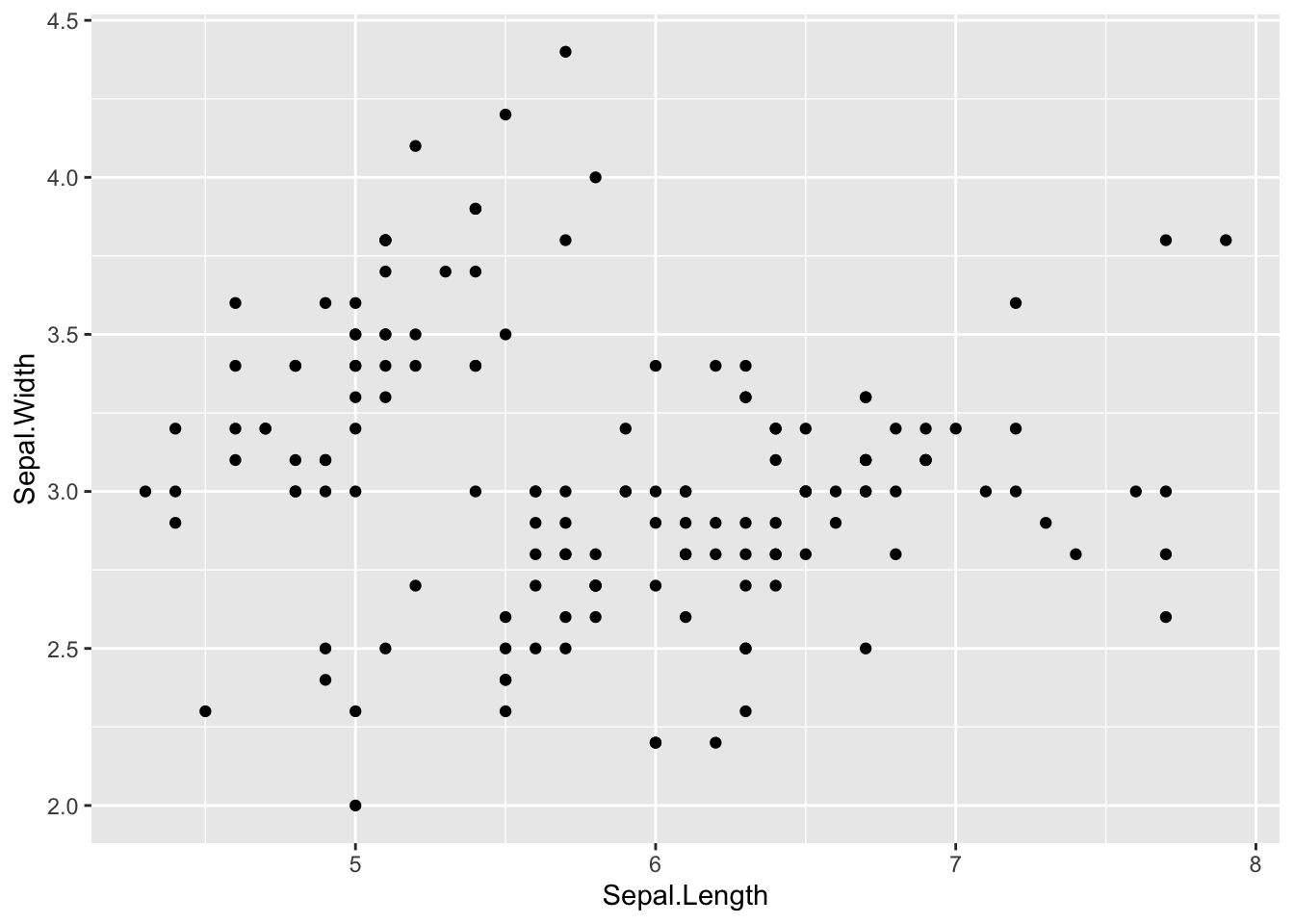
2.2.1 Serpilme diyagramı
İki sürekli değişken arasındaki ilişiyi görselleştirmek için kullanılır.
p1 + geom_point()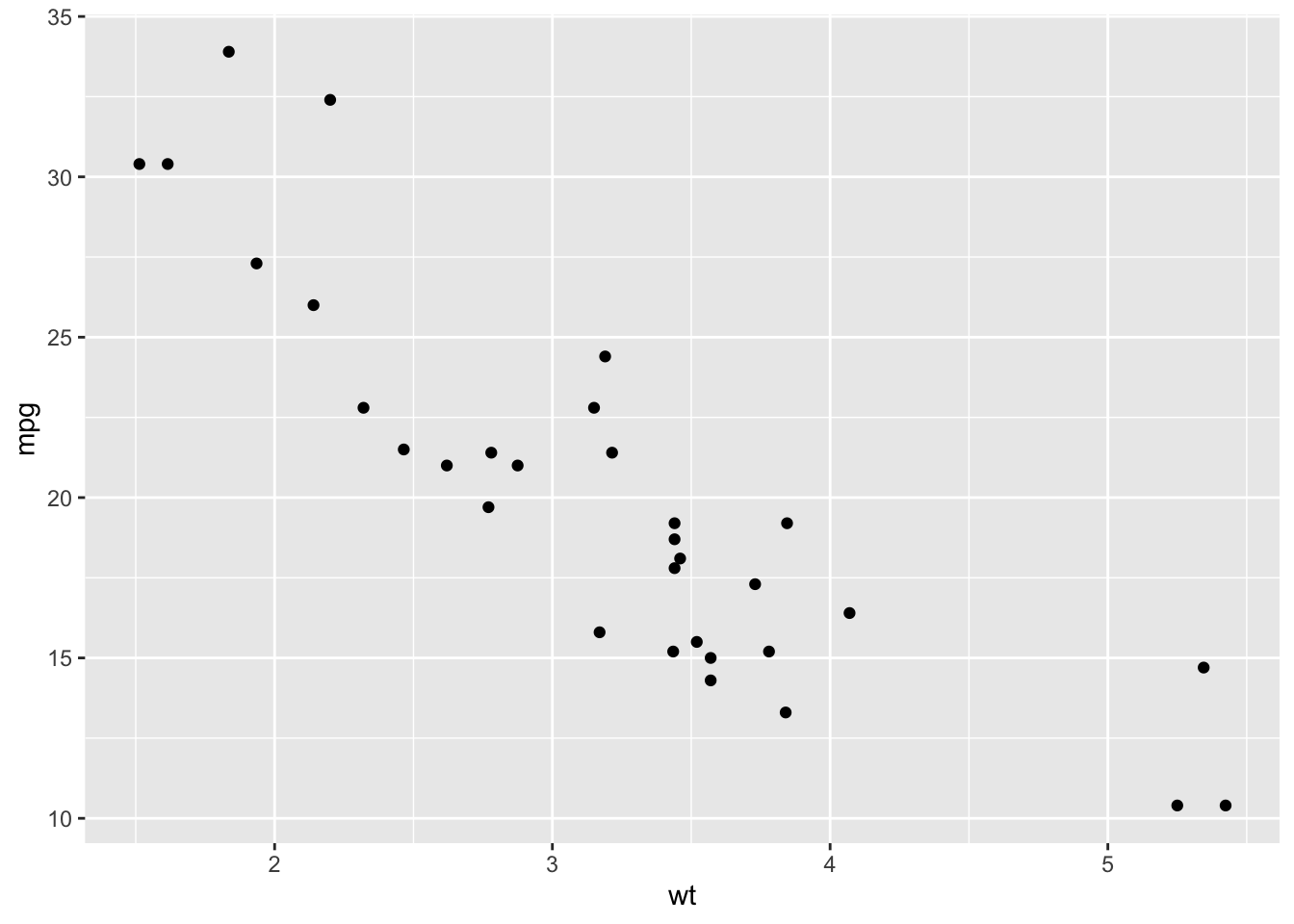
2.2.2 Histogram
Bir aralık ölçeğinde ölçülen kesikli veya sürekli verileri görselleştirmek için kullanılır.
ggplot(mtcars, aes(mpg)) +
  geom_histogram()
#> `stat_bin()` using `bins = 30`. Pick better value with
#> `binwidth`.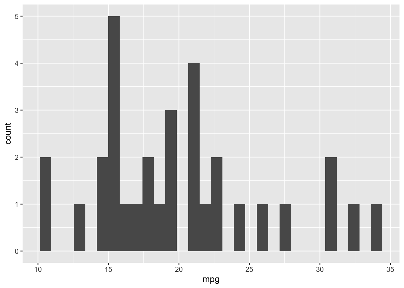
Grupların genişliği bindwith argümanı ile değiştirilebilir(dafult değeri 30)
ggplot(mtcars, aes(mpg)) +
  geom_histogram(aes(y = ..density..))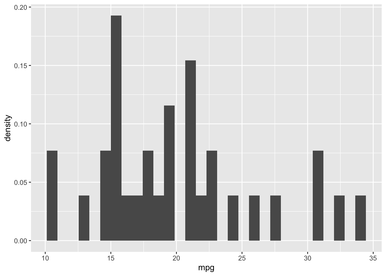
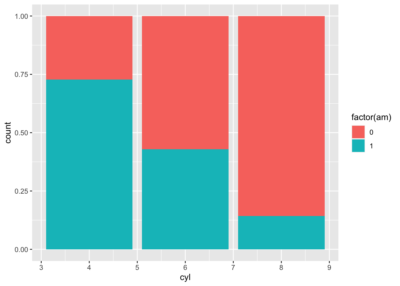
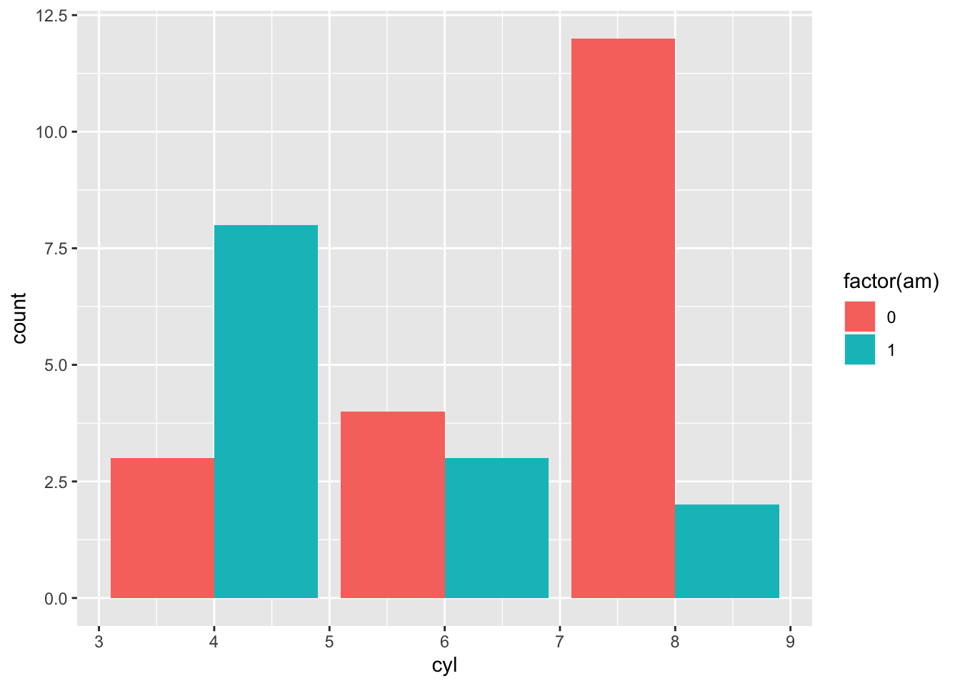
2.2.3 Bar grafiği
Kategorik değişkenlerin görselleştirilmesinde kullanılır.
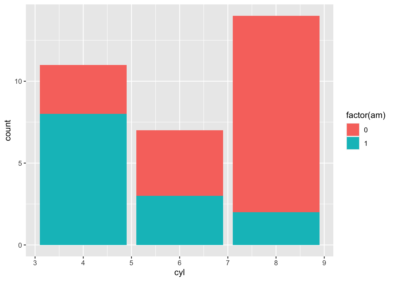
ggplot2 veri tiplerine duyarlıdır!
ggplot(mtcars, aes(x = as.factor(cyl), fill = factor(am))) +
  geom_bar(position = "stack") +
  coord_flip()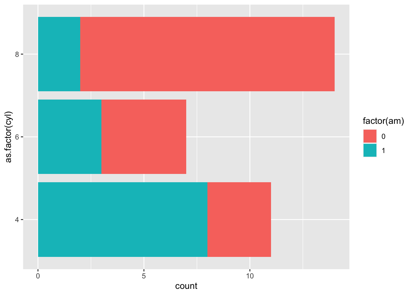
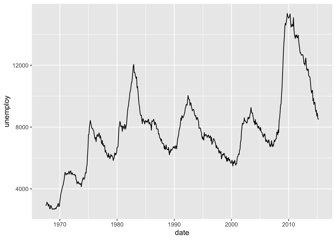
2.2.4 Çizgi grafiği
| date | pce | pop | psavert | uempmed | unemploy |
|---|---|---|---|---|---|
| 1967-07-01 | 506.7 | 198712 | 12.6 | 4.5 | 2944 |
| 1967-08-01 | 509.8 | 198911 | 12.6 | 4.7 | 2945 |
| 1967-09-01 | 515.6 | 199113 | 11.9 | 4.6 | 2958 |
| 1967-10-01 | 512.2 | 199311 | 12.9 | 4.9 | 3143 |
| 1967-11-01 | 517.4 | 199498 | 12.8 | 4.7 | 3066 |
| 1967-12-01 | 525.1 | 199657 | 11.8 | 4.8 | 3018 |
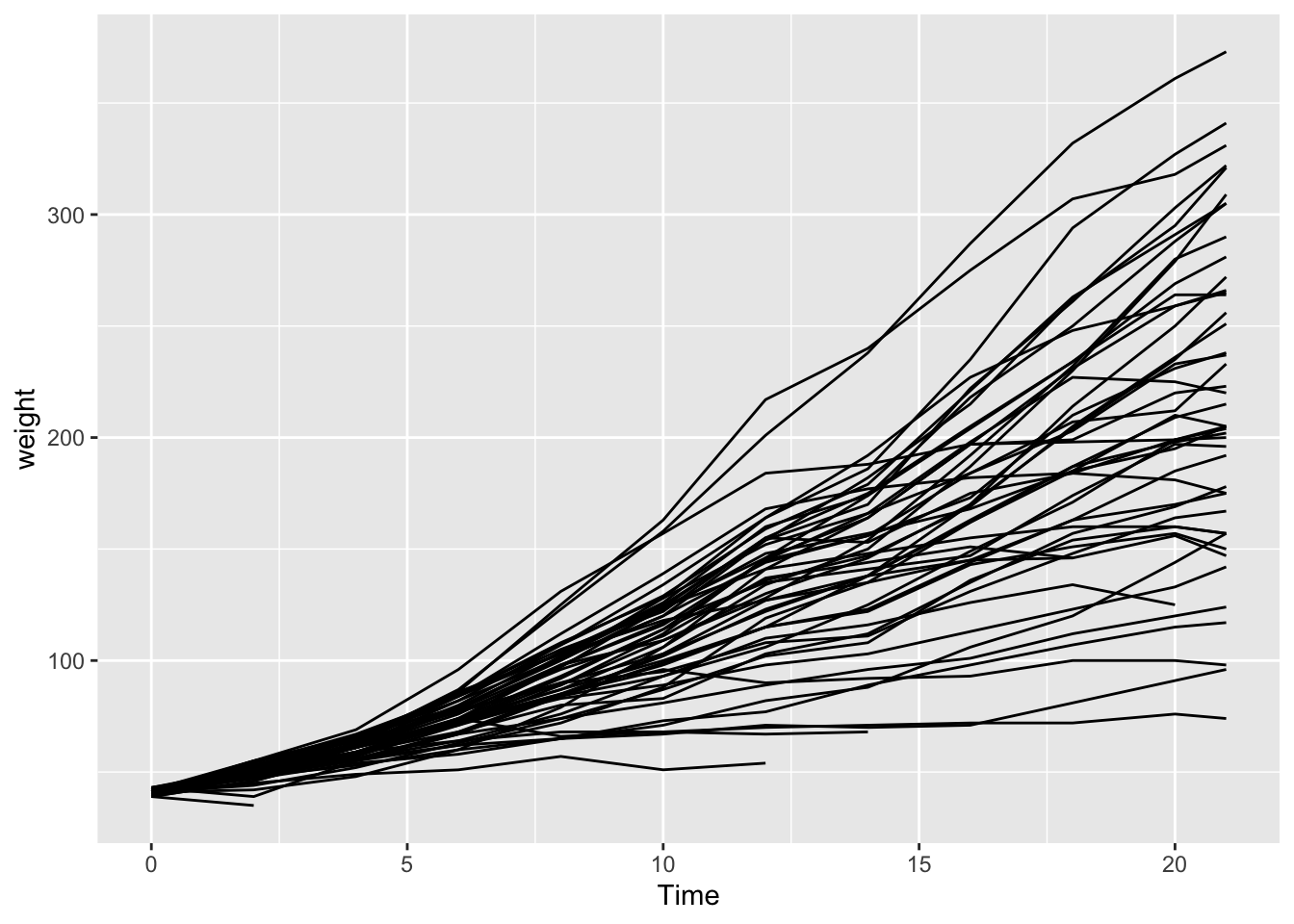
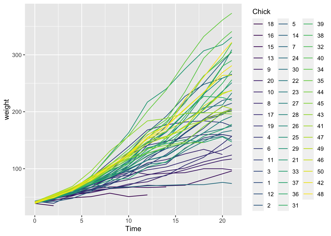
| weight | Time | Chick | Diet |
|---|---|---|---|
| 42 | 0 | 1 | 1 |
| 51 | 2 | 1 | 1 |
| 59 | 4 | 1 | 1 |
| 64 | 6 | 1 | 1 |
| 76 | 8 | 1 | 1 |
| 93 | 10 | 1 | 1 |
2.2.5 Dağılım Grafiği
ChickWeight %>%
  ggplot( aes(x=weight)) +
    geom_density(fill="#69b3a5", color="#e9ecef", alpha=0.8)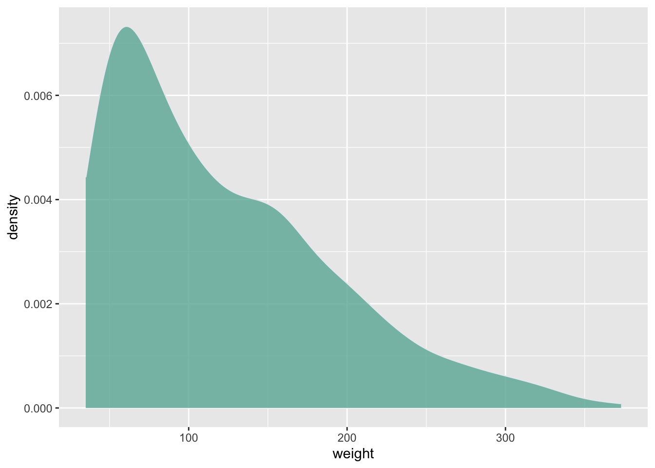
2.2.6 Kutu grafiği
data <- data.frame(
  name=c( rep("A",500), rep("B",500), rep("B",500), rep("C",20), rep('D', 100)  ),
  value=c( rnorm(500, 10, 5), rnorm(500, 13, 1), rnorm(500, 18, 1), rnorm(20, 25, 4), rnorm(100, 12, 1) )
)
data %>%
ggplot( aes(x=name, y=value, fill=name)) +
    geom_boxplot() +
    geom_jitter(color="black", size=0.4, alpha=0.9)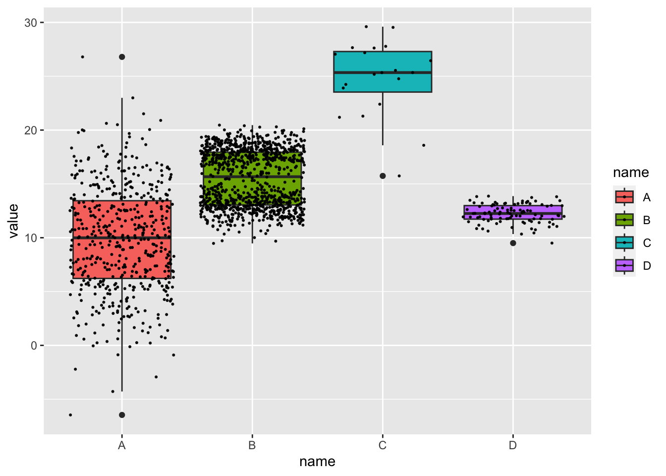
2.3 esquisse Paketi
esquisse paketi, verileri ggplot2 paketi ile görselleştirerek etkileşimli olarak keşfetmenizi sağlar.
# install.packages("esquisse")
library(esquisse)
# esquisser()
# install.packages("palmerpenguins")
# esquisse::esquisser(palmerpenguins::penguins)
2.3.1 Örnek
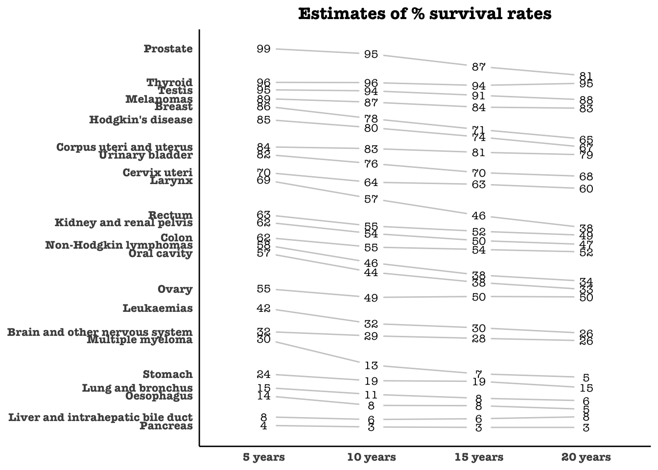
ggplot2 ile komplike grafikler yapılabilir
# Kaynak: https://r-statistics.co/Top50-Ggplot2-Visualizations-MasterList-R-Code.html
library(dplyr)
theme_set(theme_classic())
source_df <- read.csv("https://raw.githubusercontent.com/jkeirstead/r-slopegraph/master/cancer_survival_rates.csv")

# Define functions. Source: https://github.com/jkeirstead/r-slopegraph
tufte_sort <- function(df, x="year", y="value", group="group", method="tufte", min.space=0.05) {
    ## First rename the columns for consistency
    ids <- match(c(x, y, group), names(df))
    df <- df[,ids]
    names(df) <- c("x", "y", "group")

    ## Expand grid to ensure every combination has a defined value
    tmp <- expand.grid(x=unique(df$x), group=unique(df$group))
    tmp <- merge(df, tmp, all.y=TRUE)
    df <- mutate(tmp, y=ifelse(is.na(y), 0, y))

    ## Cast into a matrix shape and arrange by first column
    require(reshape2)
    tmp <- dcast(df, group ~ x, value.var="y")
    ord <- order(tmp[,2])
    tmp <- tmp[ord,]

    min.space <- min.space*diff(range(tmp[,-1]))
    yshift <- numeric(nrow(tmp))
    ## Start at "bottom" row
    ## Repeat for rest of the rows until you hit the top
    for (i in 2:nrow(tmp)) {
        ## Shift subsequent row up by equal space so gap between
        ## two entries is >= minimum
        mat <- as.matrix(tmp[(i-1):i, -1])
        d.min <- min(diff(mat))
        yshift[i] <- ifelse(d.min < min.space, min.space - d.min, 0)
    }


    tmp <- cbind(tmp, yshift=cumsum(yshift))

    scale <- 1
    tmp <- melt(tmp, id=c("group", "yshift"), variable.name="x", value.name="y")
    ## Store these gaps in a separate variable so that they can be scaled ypos = a*yshift + y

    tmp <- transform(tmp, ypos=y + scale*yshift)
    return(tmp)

}

plot_slopegraph <- function(df) {
    ylabs <- subset(df, x==head(x,1))$group
    yvals <- subset(df, x==head(x,1))$ypos
    fontSize <- 3
    gg <- ggplot(df,aes(x=x,y=ypos)) +
        geom_line(aes(group=group),colour="grey80") +
        geom_point(colour="white",size=8) +
        geom_text(aes(label=y), size=fontSize, family="American Typewriter") +
        scale_y_continuous(name="", breaks=yvals, labels=ylabs)
    return(gg)
}

## Prepare data
df <- tufte_sort(source_df,
                 x="year",
                 y="value",
                 group="group",
                 method="tufte",
                 min.space=0.05)
#> Loading required package: reshape2
#>
#> Attaching package: 'reshape2'
#> The following object is masked from 'package:tidyr':
#>
#>     smiths

df <- transform(df,
                x=factor(x, levels=c(5,10,15,20),
                            labels=c("5 years","10 years","15 years","20 years")),
                y=round(y))

## Plot
plot_slopegraph(df) + labs(title="Estimates of % survival rates") +
                      theme(axis.title=element_blank(),
                            axis.ticks = element_blank(),
                            plot.title = element_text(hjust=0.5,
                                                      family = "American Typewriter",
                                                      face="bold"),
                            axis.text = element_text(family = "American Typewriter",
                                                     face="bold"))