Chapter 13 ggplot2 Recap
13.1 Description
The ggplot2() library has become the go-to graphics package within R. It is so popular because of the short time to learn and the beautiful publication quality visualisations that can be generated.
13.1.0.1 How does it do this?
It does this by incorporating a common syntax across all charts which is based on the “grammar of graphics” principles by Leland Wilkinson (hence the gg in ggplot2). This gives the user the versatility to use a single set of commands to generate all possible charts.
It also helps that visual properties in ggplot charts are layered one on top of the other using separate modular code components. A ggplot2 user can focus on maximising the visual quality of charts by tweaking existing individual sections of code rather than do a complete rewrite.
For example in Base R, if you want to see how your results look as a bar chart as opposed to a scatter chart, then you need to write a whole new set of commands. ggplot2 is designed to remove this hassle.
13.1.0.2 How to get good with ggplot2?
It takes about 1h and 5h to be competent with the qplot and ggplot commands. There is a great R Graphics Cookbook which gets you up the learning curve with the least pain possible. It can be found on Amazon or via google.1
The book is around 400 pages long. It splits broadly into three sections. The first deals with creating the standard chart types (bar charts, histograms, scatter plots..). The second shows you how to customise appearance (annotations, axes, legends…). The final section contains more advanced features such as facet plotting and outputting for presentations. Almost all the chapters are self-contained and you can jump-in on the page most relevant to you!
13.2 Motivational examples


13.3 Example
13.3.0.1 Syntax
The key theoretical elements in the ggplot() syntax are given below. You will see these words sprinkled around in every ggplot2 command:
data, ie. a data-frame. These contain the variables to be visualised
geoms, eg. points or curves. These are the geometric objects which we want to draw to represent the data.
aesthetics,eg. x or y coordinates. These are the attributes of the geoms which are needed to draw the object.
mappings. These link variables in the data to aethetic attributes.
scales eg. continuous or discrete. These define how the values of variables in the data should be mapped to values of the aesthetic in the chart.
guides, eg. tick marks or axis labels. These tell the user how to map between the visual space in the chart to the data space.
13.3.0.2 Code Part 1
Here is an example of how mapping between data and charts is done in ggplot.
The code starts with a basic ggplot() expression:
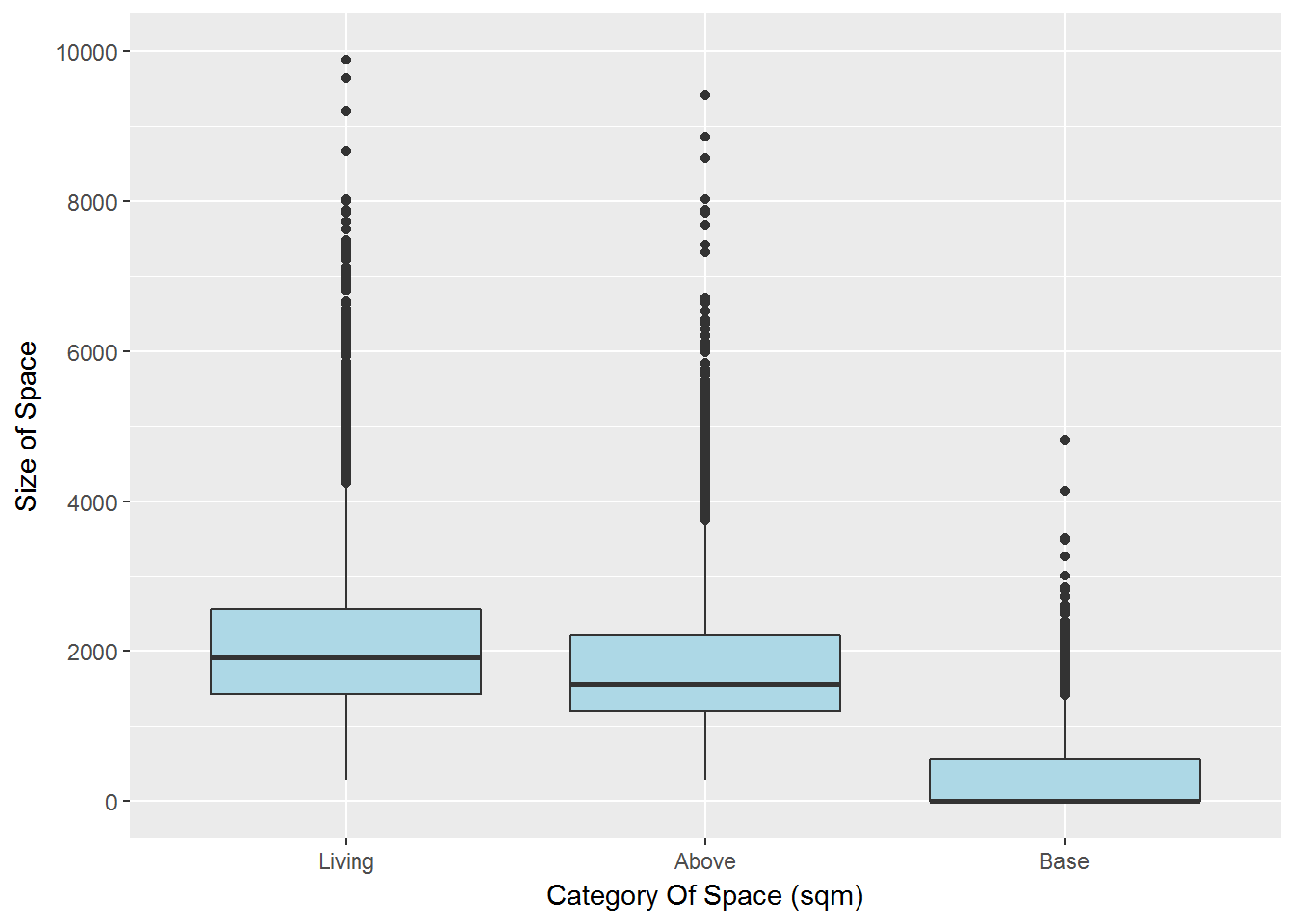
plot8<-ggplot(data=size_data,aes(x=Category,y=Space))We create a ggplot object using the dataframe, size_data. We also create default aesthetic mappings within the aes() command:
x=Categoryassigns the Variable Category to the aesthetic attribute xy=Spaceassigns the variable Space to the aesthetic attribute y
We then assign our ggplot object to a variable plot8 for later use.
13.3.0.3 Code Part 2
The next thing to do is to instruct ggplot which geometric object to draw in the chart. We choose to draw a boxplot using the geom_boxplot() command:
plot8<-plot8+
        geom_boxplot(fill="lightblue")+
        scale_y_continuous(limits=c(0,10000),breaks=seq(0,10000,2000))+
        labs(x="Category Of Space (sqm)",y="Size of Space")
Additionally, using the + sign we add scale and guide commands:
scale_y_continuous()extends the default mapping from data to the y co-ordinate to accept a wider range of valueslabs()adds visual guides to indicate what each axis means
13.3.0.4 Code Part 3
Finally we run the chart
plot8
13.4 Conclusions
13.4.0.1 Key Advantages
Quick to produce publication quality individual charts
Theme property ensures consistent look and feel across all charts
Able to handle large datasets albeit not always at light speed
“Statbin” plotting options to present results on large datasets
Simple syntax reduces learning time and can be applied to a huge variety of charts
13.4.0.2 Disadvantages
ggplot()requires the data to be in a data frameNot straightforward to produce lattices/grids of charts, though facet plots can provide a get out of jail card
Common language does limit flexibility when producing something highly customised
the R Graphics Cookbook by Winston Chang↩