4 Correlation Appendix (MATH HEAVY)
In statistics, when we say “correlation” most likely we are referring to a numerical calculation meant to objectively measure the strength of a relationship between two or more variables.
4.1 Linear Correlation
First lets start with an example…
4.1.1 Pressure Data
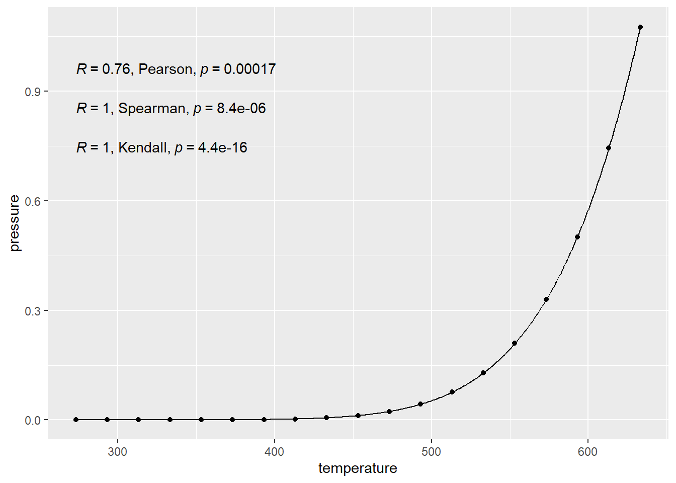
This example is using data from measuring pressure in a closed system when temperature is changed.
pressureis vapor pressure of mercury (ironically measured in mm Hg).temperatureis the temperature in \(C\).
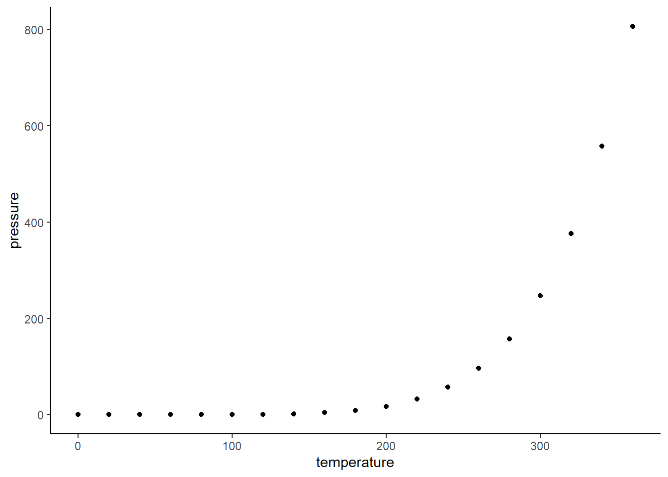
The gist here is that there is basically a 100% exact cause and effect relationship here. The points follow an exact equation. They have perfect “correlation” so a calculation should reflect that, right?
4.1.2 True Pressure Equation
\[ p = 10^{\left( \displaystyle{A} - \dfrac{B}{C+T} \right)} \]
- \(p\) is pressure.
- \(A\), \(B\), and \(C\) are constants based on the temperature scale, pressure scale, and element/molecule.
- \(T\) is the temperature.
The NIST (science rules organization or something) reports the constants for mercury when pressured is measured in bar and temperature is measured in Kelvin (K)
- \(A = 4.85767\)
- \(B = 3007.129\)
- \(C = -10.001\)
I’ll do some converting in the background to line up our data with the units from the NIST.
4.1.3 Using the Equation
Next, let’s plot it.
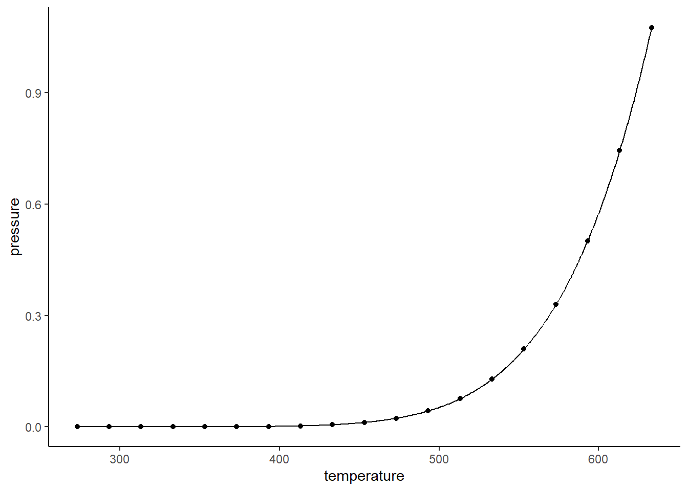
Yes, the points match that curve EXACTLY.
Correlation is 100%. But in statistics we like formulas to validate the things we say out of what sometimes resemble mouths or other modes of communication. So what formula do we use…
4.1.4 Pearson Correlation
There are many measures of correlation out there.
The most common one is denoted by the \(r\) (sometimes \(\rho\) (rho)). This is what is typically being referred to when the word “correlation” is used.
- \(r\) measures only the strength of the linearity of the relationship.
- If that scatter plot don’t look linear, don’t use \(r\)
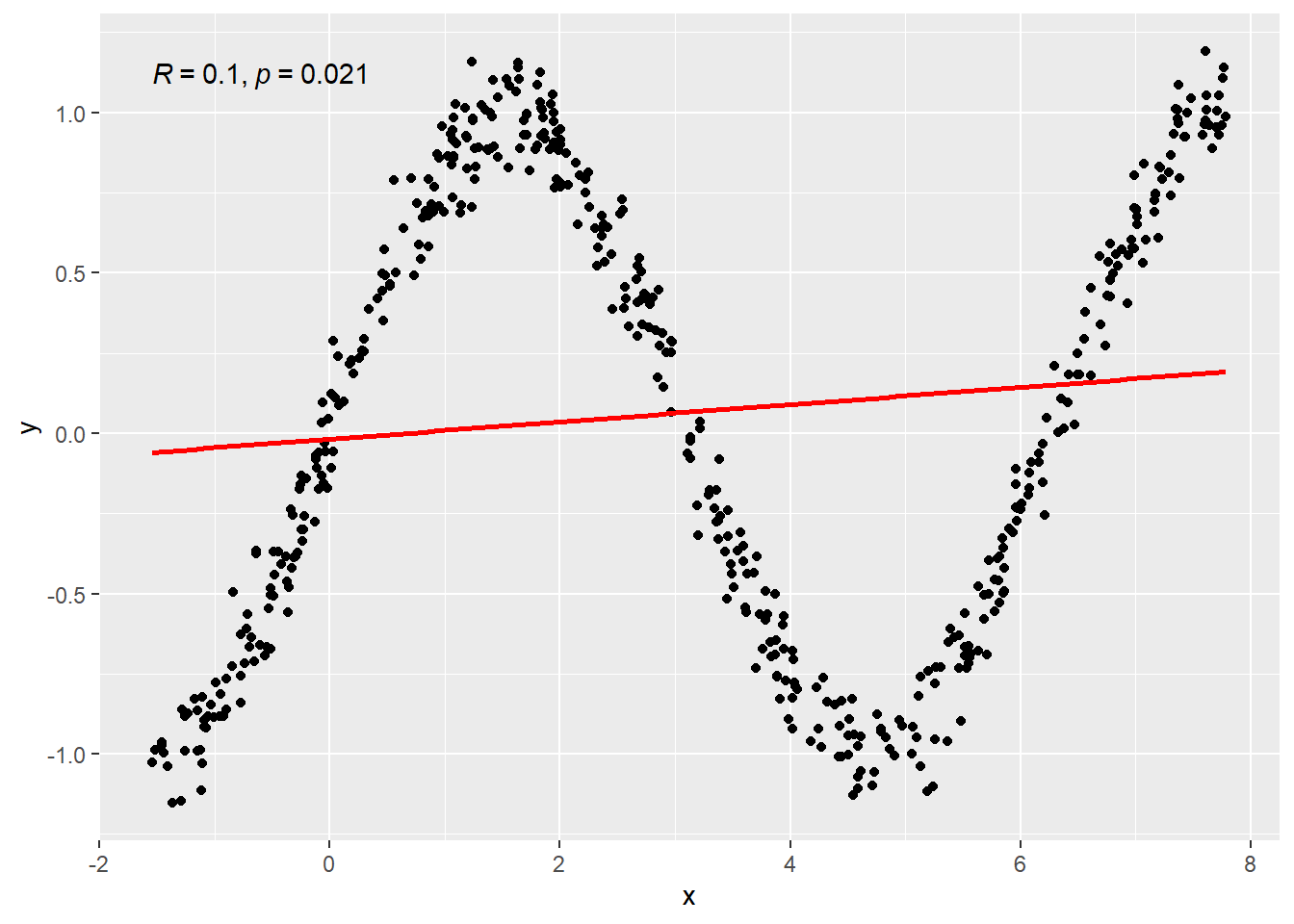
Here’s two plots below. Both were created using 100 randomly generated points.
- On the left, the randomly generated points were created using the formula \(y = x\) and then some randomness was thrown in because that’s what happens in real life. Randomness messes things up.
- On the right the formula relating \(y\) and \(x\) is \(y = \sin(x)\), then some randomness (much less) is thrown in again.
First plot shows linear relationship so \(r\) is a good measure of the relationship. \(r = 0.8764811\) which implies a fairly strong linear relation relative to the amount of randomness.
Second plot shows an oscilating/non-linear relationship so \(r\) is a bad measure of the relationship especially because this is a pattern where the ups and downs cancel eachother out. \(r = -0.2592476\) which implies no reliable linear relation. However, hopefully it is quite clear that a viable relation between \(x\) and \(y\) exist.
4.1.4.1 Math behind \(r\)
\(r\) here is the Pearson product-moment correlation. In probability theory the formula is like this. Really… it doesn’t fucking matter unless you like the fun math stuffs of probability.
Pearson product-moment correlation:
\[ \rho = \frac{Cov(X,Y)}{\sqrt{Var(X)\cdot Var(Y)}} \]
\(\rho\) represents what the “true” correlation between two
\(\rho\) estimate \[ r = \frac{\sum_{i=1}^n {\left(X_i - \bar{X}\right)\left(Y_i - \bar{Y}\right)} }{ \sqrt{\sum_{i=1}^n {\left(X_i - \bar{X}\right)^2}\sum_{i=1}^n{\left(Y_i - \bar{Y}\right)^2}}} \]
4.1.4.2 Pearson Correlation for Pressure Data
## [1] 0.7577923This number isn’t 1, even though the relationship between the two is PERFECT. However it is not perfectly LINEAR.
4.1.4.3 Pearson Is A Linear Measure
This \(r\) value only measures how well the data follow a LINE. So if there isn’t a linear relationship, \(r\) won’t capture all the information about the relationship. The value for \(r\) in the pressure data is given in the top right corner of the graph here. Notice that it is a capital R. This is because of “notation forking” in math, i.e., someone using a different symbol for the same thing. This wouldn’t be so bad except for the fact that academics who make this kind of shit are egotistical shits and think their idea is better. Which was first, \(r\), or \(R\)? I don’t know. I use \(r\), whatever.
The plotted line is basically what \(r\) is checking the data against.
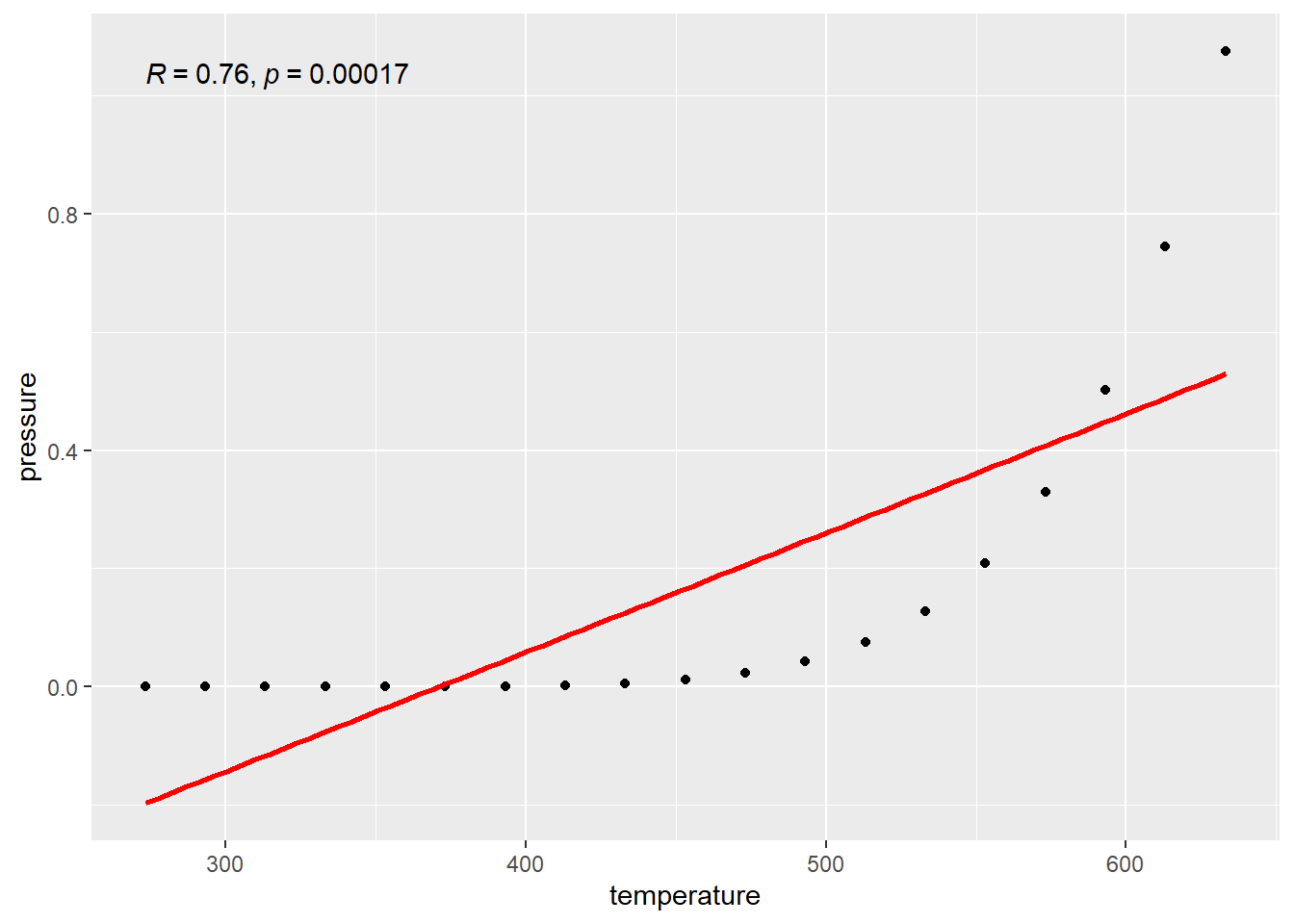 \(r\) is not equal to 1 because the data do not follow a line.
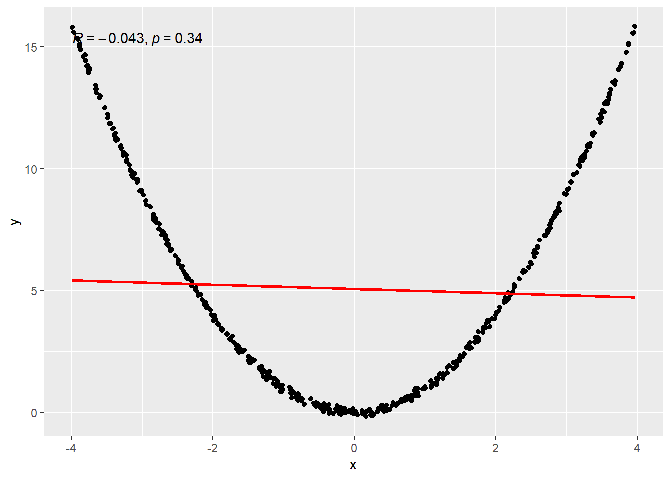
4.1.4.4 Zero Linear Relation Examples
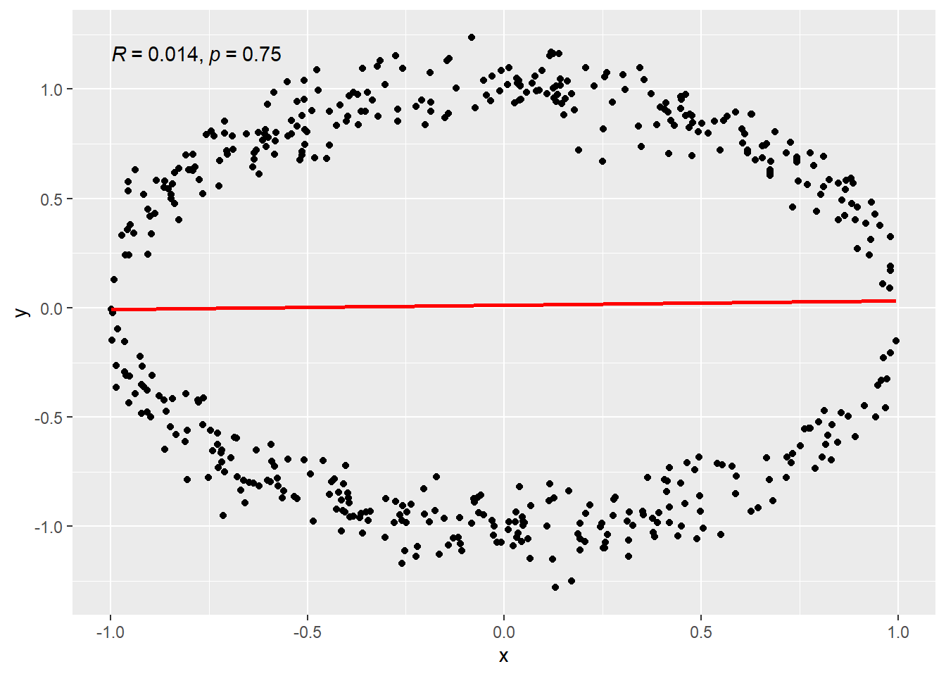
- Data falling on a circle. This is a “non-functional” relatioship. The mathematical definition of a function stipulates only one value of \(f(x)\) is the outcome for a value of \(x\). On a circle, two values are possible for an input value of \(x\), except the leftmost and rightmost points of the circle. (Remember that horizontal line rule?)
- Data from a sine wave.
- Data from a quadratic function.
4.1.4.5 Circle
4.1.4.6 Sine Wave
4.1.4.7 Quadratic
4.2 Kendall’s \(\tau\)
Another common measure of correlation is called Kendall’s \(\tau\) (Tau)
Theorettically, its formula looks like this. \[ \tau = 2 P\left[(X_i-X_j)(Y_i-Y_j) > 0\right] - 1 \]
The idea is to measure how likely it is that an increase in an \(x\) variable occurs with an increase in a \(y\) variable
- Concordance: An increase in the \(x\) variable occurs with an increase of the \(y\) variable.
- Discordance: An increase in the \(x\) variable occurs with a decrease of the \(y\) variable.
- If \(\tau\) is zero, there were an equal number of concordances and discordances, so basically there isn’t distinctive pattern in increases and decreases of \(y\).
- If \(\tau\) is positive, then \(\tau\) is the proportion of times that concordances happened more often than discordances which indicates that in general,i.e., increases in \(x\) are associated with increases in \(y\).
- If \(\tau\) i negative, then \(|\tau|\) (absolute value) tells us the proportion of times that discordances happen more often than concordances, i.e., increases in \(x\) are associated with decreases in \(y\).
When we actually calculate \(\tau\) from data, it can look like this.
\[\hat{\tau} = \frac{2}{n(n-1)}\sum_{i<j} sgn\left(x_i - x_j\right)sgn\left(y_i - y_j\right)\] \[ sgn(x) = \begin{cases}1, \quad x > 0\\ -1, \quad x < 0\\ 0, \quad x = 0\end{cases} \]
There are modifications to this formula to account for some special case situations, but that’s the simplest form.
We take our data of \(n\) observations. Essentially, we look at all possible pairs of observations \((x_i, y_i)\) and \((x_j, y_j)\). There are \(N = n(n-1)\) pairs possible.
- \(n_c\) is the number of concordant pairs.
- \(n_d\) is the number of disconcordant pairs.
Then
\[ \hat{\tau} = \frac{n_c - n_d}{N}\]
4.2.1 Pearson, Kendall?
Pearson is for linear data. Try guessing it! http://guessthecorrelation.com/.
Kendall is for Monotonic relations.
Honestly though, I prefer Kendall. Kendall directly gives you information about the number.
It tells how often concordance happens more (or less) often than discordance. The Pearson coefficient is just some abtract, unitless number buried under squares and square roots, accumulating dust from a century ago.
4.2.2 Examples: Monoticity, Cars.
Here is an example of a monotonic relationship between the city gas mileage and MSRP.
It’s a non-linear relationship. (to me at least)
What do our correlation coefficients have to say?
##
## 	Pearson's product-moment correlation
##
## data:  CMPG and MSRP
## t = -10.548, df = 412, p-value < 2.2e-16
## alternative hypothesis: true correlation is not equal to 0
## 95 percent confidence interval:
##  -0.5337846 -0.3817163
## sample estimates:
##        cor
## -0.4611296
##
## Kendall's rank correlation tau
##
## data: CMPG and MSRP
## z = -15.337, p-value < 2.2e-16
## alternative hypothesis: true tau is not equal to 0
## sample estimates:
## tau
## -0.5252607Kendall’s tau is reported to be -0.5253 and Pearson is -0.4611. Since tau is a higher magnitude, it indicates a stronger relationship. The interpretation of tau would say that there is 52.53% more discordance (decreasingness) than concordance (increasingness) in the relationship.
So there is definitely a relationship. By a lot of stanardards, this might be considered a moderately strong relationship. Depends on who you ask. Whatever. BUT WHY DOES IT EXIST? Sure we use that rule in a dumb way and say well it doesn’t matter since correlation does not equal causation. However, HOW ARE THESE TO CONNECTED?! Possibly higher mileage cars require more engineering and more expensive parts leading to higher prices. If we just ignore the relation we don’t learn anything but if we investigate it, we can learn so much more DESPITE a lack of causation.
Correlation may not equal causation but it sure as means SOMETHING is going on. We can use correlation to find the real cause (if such a thing were to exist)!
4.2.3 Diamonds
Here’s another data set! it’s about tasty diamonds. They have a real good crunch to them. Lets see how price relates to carat (mass) of a diamond.
This one is a bit funky. It’s kind of linear, kind of not, and just messy.
What do our correlations have to say?
##
## 	Pearson's product-moment correlation
##
## data:  carat and price
## t = 78.47, df = 998, p-value < 2.2e-16
## alternative hypothesis: true correlation is not equal to 0
## 95 percent confidence interval:
##  0.9184733 0.9358231
## sample estimates:
##       cor
## 0.9276471
##
## Kendall's rank correlation tau
##
## data: carat and price
## z = 39.235, p-value < 2.2e-16
## alternative hypothesis: true tau is not equal to 0
## sample estimates:
## tau
## 0.8361151Pearson is actually quite high, this indicates that there is a strong linear component in modeling the data if you were to use a linear combination of functions to estimate it. However there is so much dispersion on the right side, I don’t think we should really call the relationship strong.
Kendall’s tau is a bit smaller which indicates a much higher proportion of increasing over decreasing.
There’s more to this data. But probably it’s pretty clear that yeah we should expect some sort of cause and effect relationship between diamonds. Take two diamonds identically in everyway except for one is bigger. Which one would cost more in general?
Just for the hell of it, let’s separate out diamonds by their clarity levels.
Basically, going from I1 to IF clarity in the list means going from least to most clear, i.e., that quality of the diamonds increases as you go down the legend list. This accounts for some of the spread in the diamonds prices.
This is just part of the data BTW. We could pull out the whole dataset… but that actually breaks my computer when making these graphs.
So tell you what. Let look at just where the data is nicest, that looks to be at 1 carat and below which is like 75% of the data anyway..
The groupings follow the same pattern with some crossover. It depends… everytime I compile this document, I am randomly subsampling from the full dataset.
I guess I could show you what the regression lines look like when using the full dataset. There would be 2000 points to display, and in an html widget graph, that is kind of intense for computers. So just the lines!
That’s a bit wonky…
Let’s try with just the 1 carat or below diamonds again.
That’s a bit nicer. Whatever. Have a nice day.