3 Visualizaciones
Cargamos paquetes
library(tidyverse)
library(gganimate)
library(gifski)
library(bookdown)
library(rmarkdown)
library(purrr)
library(lubridate)
library(stringr)
library(knitr)
#library(xts)
#library(zoo)
library(gridExtra)
#library(fpp2)
#library(RcppRoll)
#library(kableExtra)
options(knitr.table.format = "html")
Cargamos los datos
air_data_2 <- readRDS("data_rds/air_data_2.rds")Echamos un vistazo a las variables
glimpse(air_data_2)## Observations: 775,328
## Variables: 31
## $ station <fct> 1, 1, 1, 1, 1, 1, 1, 1, 1, 1, 1, 1, 1, 1, 1, 1, ...
## $ station_name <fct> Estación Avenida Constitución, Estación Avenida ...
## $ latitude <dbl> 43.52981, 43.52981, 43.52981, 43.52981, 43.52981...
## $ longitude <dbl> -5.673428, -5.673428, -5.673428, -5.673428, -5.6...
## $ date_time_utc <dttm> 2000-01-01 00:00:00, 2000-01-01 01:00:00, 2000-...
## $ SO2 <dbl> 23, 29, 40, 50, 39, 39, 40, 43, 38, 39, 48, 66, ...
## $ NO <dbl> 89, 73, 53, 46, 35, 26, 27, 37, 30, 32, 33, 35, ...
## $ NO2 <dbl> 65, 60, 57, 53, 50, 49, 51, 48, 46, 39, 36, 39, ...
## $ CO <dbl> 1.97, 1.61, 1.13, 1.06, 0.95, 0.82, 0.83, 0.88, ...
## $ PM10 <dbl> 53, 63, 56, 58, 50, 50, 57, 53, 40, 53, 54, 52, ...
## $ O3 <dbl> 9, 8, 7, 5, 6, 7, 7, 4, 5, 6, 10, 9, 11, 9, 18, ...
## $ wd <dbl> 245, 222, 228, 239, 244, 218, 240, 248, 244, 235...
## $ ws <dbl> 0.34, 1.06, 0.71, 0.84, 0.89, 0.71, 0.80, 1.11, ...
## $ TMP <dbl> 5.7, 5.4, 5.3, 5.1, 4.6, 4.6, 4.5, 4.1, 3.8, 3.8...
## $ HR <dbl> 76, 73, 72, 71, 72, 69, 68, 69, 70, 70, 64, 59, ...
## $ PRB <dbl> 1026, 1025, 1025, 1025, 1024, 1024, 1024, 1026, ...
## $ RS <dbl> 33, 33, 33, 33, 33, 33, 33, 33, 35, 112, 171, 36...
## $ LL <dbl> 0, 0, 0, 0, 0, 0, 0, 0, 0, 0, 0, 0, 0, 0, 0, 0, ...
## $ BEN <dbl> NA, NA, NA, NA, NA, NA, NA, NA, NA, NA, NA, NA, ...
## $ TOL <dbl> NA, NA, NA, NA, NA, NA, NA, NA, NA, NA, NA, NA, ...
## $ MXIL <dbl> NA, NA, NA, NA, NA, NA, NA, NA, NA, NA, NA, NA, ...
## $ PM25 <dbl> NA, NA, NA, NA, NA, NA, NA, NA, NA, NA, NA, NA, ...
## $ station_alias <fct> Constitucion, Constitucion, Constitucion, Consti...
## $ year <dbl> 2000, 2000, 2000, 2000, 2000, 2000, 2000, 2000, ...
## $ month <dbl> 1, 1, 1, 1, 1, 1, 1, 1, 1, 1, 1, 1, 1, 1, 1, 1, ...
## $ date <date> 2000-01-01, 2000-01-01, 2000-01-01, 2000-01-01,...
## $ week_day <dbl> 6, 6, 6, 6, 6, 6, 6, 6, 6, 6, 6, 6, 6, 6, 6, 6, ...
## $ hour <int> 0, 1, 2, 3, 4, 5, 6, 7, 8, 9, 10, 11, 12, 13, 14...
## $ holiday_type <chr> NA, NA, NA, NA, NA, NA, NA, NA, NA, NA, NA, NA, ...
## $ no_lab_days <chr> NA, NA, NA, NA, NA, NA, NA, NA, NA, NA, NA, NA, ...
## $ wd_code <fct> WS, SW, SW, WS, WS, SW, WS, WS, WS, SW, SW, SW, ...Obtenemos las medias anuales de todos los contaminantes por estación y las plasmamos en un gráfico para observar sus evoluciones
# Calculamos las medias anuales
year_avgs <- air_data_2 %>% select(station_alias, date_time_utc, PM10, PM25, SO2, NO2, NO, O3, BEN, CO, MXIL, TOL) %>%
  group_by(station_alias, year = year(date_time_utc)) %>%
  summarise_all(funs(mean(., na.rm = TRUE))) %>%
  select(-date_time_utc) # We drop this variable


# Convertimos los resultados a formato largo

year_avgs_long <- gather(year_avgs, contaminante, value, 3:length(year_avgs)) %>%
                    filter(!(grepl('Constit', station_alias)
                             & year == '2006' &
                               contaminante %in% c('BEN', 'MXIL', 'TOL'))) %>%
                                # We filter this data because is only completed in 0.01%
                    filter(!(grepl('Constit', station_alias) &
                              year == '2008' & contaminante == 'PM25'))
                                # We filter this data because is only completed in 0.02%

# Finalmente representamos los indicadores generados en una tabla de gráficos

ggplot(year_avgs_long, aes(x = year, y = value)) +
  geom_line() +
  facet_grid(contaminante~station_alias,scales="free_y") +
   theme(axis.text = element_text(size = 6))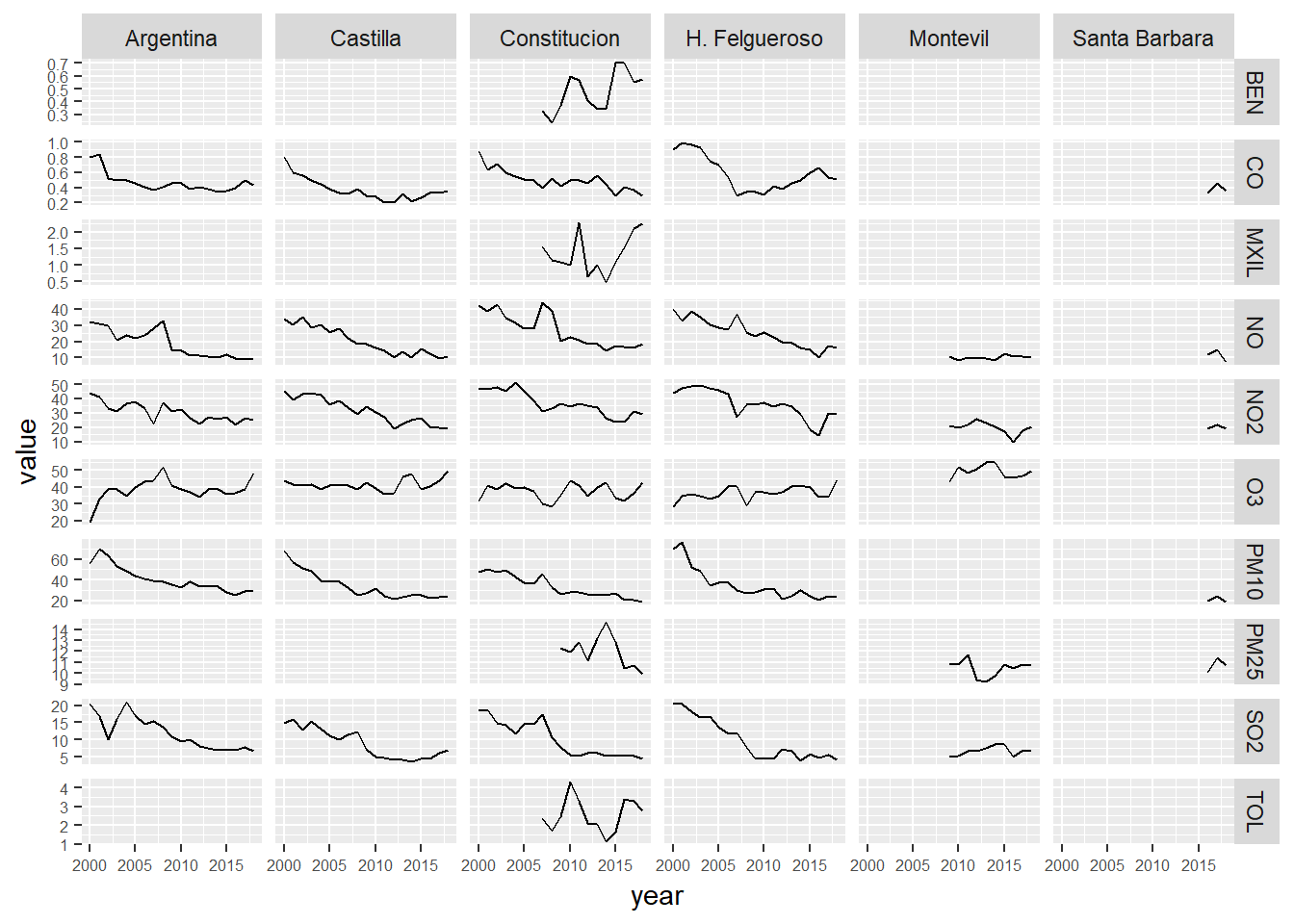
Nos quedamos sólo con el contaminante PM10
year_avgs_long_pm10 <- year_avgs_long %>% filter(contaminante == "PM10",
                                                 station_alias != "Montevil")

ggplot(year_avgs_long_pm10, aes(x = year, y = value)) +
  geom_line() +
  facet_grid(contaminante~station_alias,scales="free_y") +
   theme(axis.text = element_text(size = 6)) + ylim(0, 100)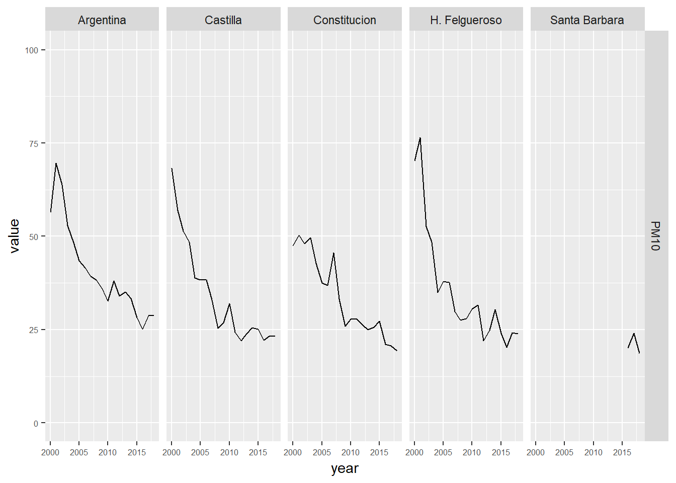
ggplot(year_avgs_long_pm10, aes(x = year, y = value, group = station_alias, color = station_alias)) +
  geom_line()  +
  ylim(0, 100)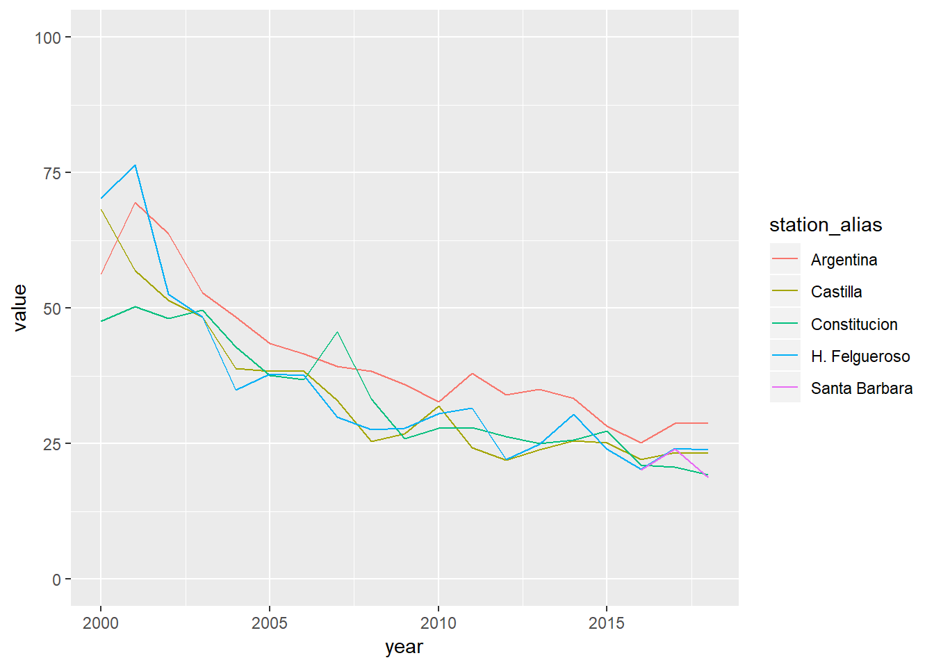
La estación Argentina es la que presenta peores valores de PM10 a lo largo del tiempo. Echamos un vistazo a su evolución a través de la función ‘summary’. Para ello vamos a comparar dos histogramas, uno con las frecuencias promedio horarios de PM10 de los primeros 5 años de la serie y otro con las correspondientes a los últimos 5 años.
pm10_argentina_2000_2004 <- air_data_2 %>%
                           select(date,
                                   station_alias,
                                    PM10) %>%
                           filter(year(date) < "2005",
                                  station_alias == "Argentina")

pm10_argentina_2014_2018 <- air_data_2 %>%
                           select(date,
                                   station_alias,
                                    PM10) %>%
                           filter(year(date) > "2013",
                                  station_alias == "Argentina")


summary(pm10_argentina_2000_2004$PM10)
## Min. 1st Qu. Median Mean 3rd Qu. Max. NA's
## 0.00 39.00 53.00 58.13 72.00 986.00 922summary(pm10_argentina_2014_2018$PM10)## Min. 1st Qu. Median Mean 3rd Qu. Max. NA's
## 0.00 16.00 24.00 28.84 35.00 522.00 330Como vemos en los resultados, la evolución ha sido muy importante. Durante el periodo 2000-2004 el 75% de los promedios horarios se situaban por encima de 39 µg/m³. Mientras, en los últimos 5 años, el 75% de los promedios están por debajo de 35 µg/m³.
Vamos a comparar los histogramas de frecuencias de promedios horarios de PM10 en la estación Argentina en dos periodos, los primeros 5 años de la serie 2000-2004 contra los 5 últimos años.
graph_1 <- ggplot(pm10_argentina_2000_2004, aes(x = `PM10`)) +
                    geom_histogram() +
                           xlim(0, 300) +
                           labs(title = "Distribución promedios horarios PM10 estación Argentina - (2000-2004)")


graph_2 <- ggplot(pm10_argentina_2014_2018, aes(x = `PM10`)) +
                    geom_histogram() +
                           xlim(0, 300) +
                          labs(title = "Distribución promedios horarios PM10 estación Argentina - (2014-2018)")

grid.arrange(graph_1,
             graph_2,
ncol = 1) 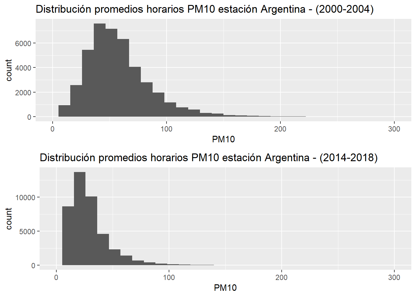
pm10_argentina <- air_data_2 %>%
                           select(date_time_utc,
                                  station_alias,
                                  PM10) %>%
                           filter(station_alias == "Argentina",
                                  PM10 != "NA")

pm10_argentina_ranges <- pm10_argentina %>%
                         mutate(rangos = if_else(PM10 <= 20, "<=20 µg/m³",
                                         if_else(PM10 > 20 & PM10 <= 40, "(20-40] µg/m³", ">40 µg/m³")))

pm10_argentina_ranges$rangos <- factor(pm10_argentina_ranges$rangos, levels = c("<=20 µg/m³", "(20-40] µg/m³", ">40 µg/m³"))

pm10_argentina_ranges_conteo <- pm10_argentina_ranges %>%
                                group_by(year = year(date_time_utc), rangos) %>%
                                summarise(n = n()) %>%
                                ungroup() %>%
                                group_by(year) %>%
                                mutate(n_total_year = sum(n),
                                       prop_year = n / n_total_year)

graph_3 <- ggplot(pm10_argentina_ranges_conteo, aes(x = rangos, y = prop_year, fill = rangos)) +
                  geom_col() +
                  facet_grid(. ~year) +
                  scale_color_manual(values = c("<=20 µg/m³" = "green", "(20-40] µg/m³" = "orange", ">40 µg/m³" = "red"),
aesthetics = c("colour", "fill"))graph_4 <- ggplot(pm10_argentina_ranges_conteo, aes(x = rangos, y = prop_year, fill = rangos, label = rangos)) +
geom_col(show.legend = FALSE) +
geom_text(vjust=-0.5, size = 7, face = "bold", color = "grey")+
scale_color_manual(values = c("<=20 µg/m³" = "green", "(20-40] µg/m³" = "orange", ">40 µg/m³" = "red"),
aesthetics = c("colour", "fill")) +
ggtitle("Evolución PM10 - Estación Argentina (Gijón)") +
ylab("% rangos PM10 - Promedios horarios") +
xlab("Rangos de niveles de PM10-Promedios horarios") +
theme(axis.text=element_text(size=12),
axis.title=element_text(size=16,face="bold", color = "grey"),
plot.title=element_text(size = 20, face="bold", color = "grey"),
plot.subtitle = element_text(size = 40, face="bold", color = "grey"),
axis.text.x=element_blank(),
axis.ticks.x = element_blank(),
panel.grid.major = element_blank(),
panel.grid.minor = element_blank(),
panel.background = element_blank()) +
scale_y_continuous(labels = scales::percent)
graph_4
Los porcentajes en el eje Y sale mal, pero por lo que sea al animarlo aparece correctamente. Así que lo dejamos así.
pm10_Argentina_2000_2018_anim <- graph_4 + transition_time(as.integer(year)) +
  labs(title = "Evolución PM10 estación Argentina (Gijón)",
        subtitle = "Año: {frame_time}")

pm10_Argentina_2000_2018_anim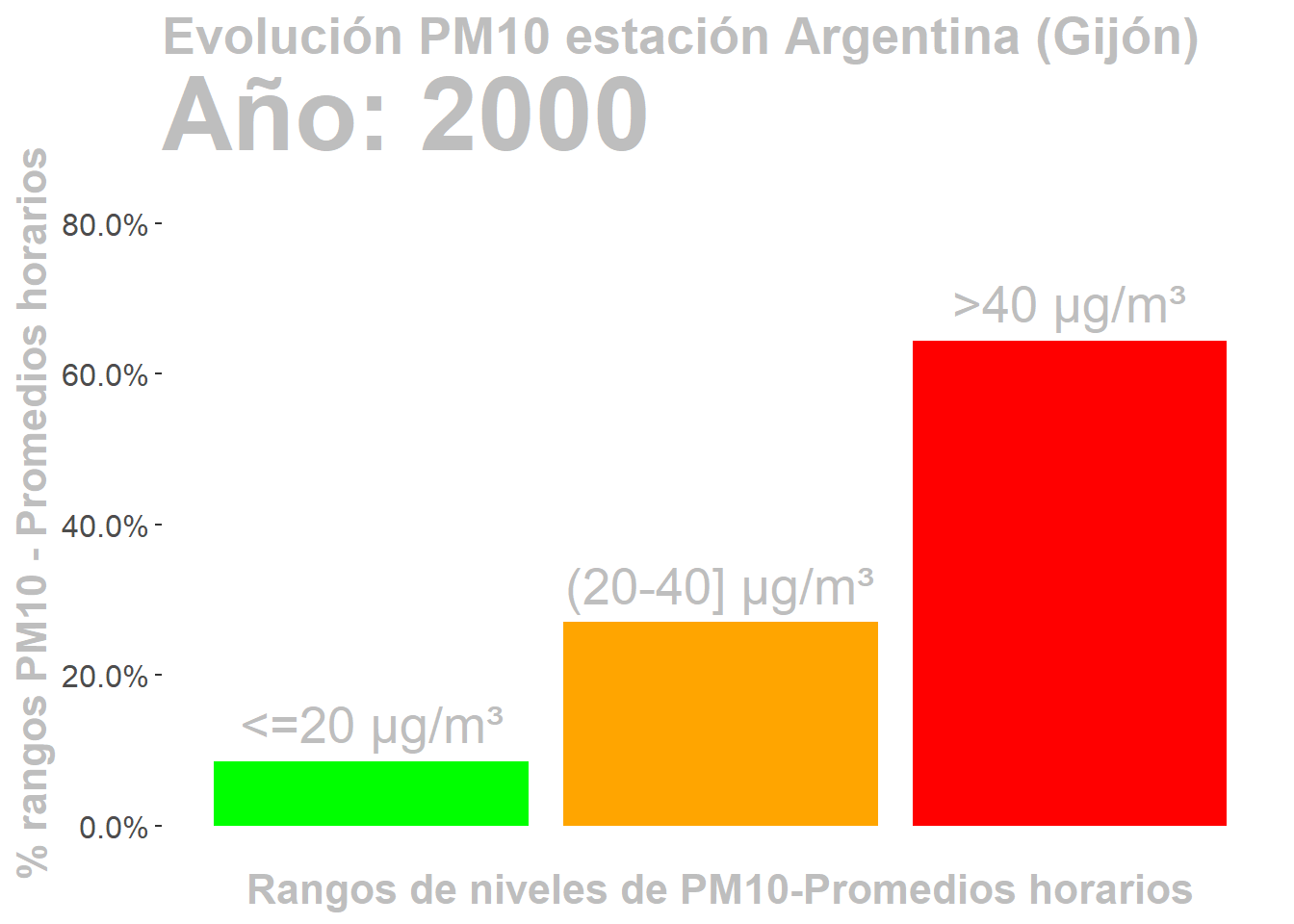
anim_save("pm10_Argentina_2000_2018.gif", pm10_Argentina_2000_2018_anim)