Chapter 1 Empirical Modeling
In this brief introductory chapter, we will try and set some scope conditions on what we’re doing. We will be bogged down with symbols and theorems soon enough, but it’s important to first consider the nature of the enterprise. That said, many scientists believe they need philosophy of science just as much as birds need ornithology (which is to say, they don’t), so don’t let yourself open too many cans of worms.
1.1 A Day in the Life
So what is it that social scientists do all day? Good question—let me know if you find out.1 But seriously, we spend an inordinate amount of time looking at data. Data that look like this:2
# R allows for packages to enhance its base functionality
library(tidyverse)
# read in the data (not shown)
# show the data
dat
## # A tibble: 6,570 x 9
## cyear ccode year onset lpop lgdp polity2 lmtnest ethfrac
## <fctr> <int> <int> <int> <dbl> <dbl> <int> <dbl> <dbl>
## 1 002_1945 2 1945 0 11.85630 33.91633 10 3.214868 0.3569501
## 2 002_1946 2 1946 0 11.86313 33.92000 10 3.214868 0.3569501
## 3 002_1947 2 1947 0 11.86859 33.96733 10 3.214868 0.3569501
## 4 002_1948 2 1948 0 11.88673 33.99740 10 3.214868 0.3569501
## 5 002_1949 2 1949 0 11.90488 33.96920 10 3.214868 0.3569501
## 6 002_1950 2 1950 0 11.93343 34.05634 10 3.214868 0.3569501
## 7 002_1951 2 1951 0 11.95118 34.09403 10 3.214868 0.3569501
## 8 002_1952 2 1952 0 11.96862 34.09018 10 3.214868 0.3569501
## 9 002_1953 2 1953 0 11.98589 34.11478 10 3.214868 0.3569501
## 10 002_1954 2 1954 0 12.00274 34.09184 10 3.214868 0.3569501
## # ... with 6,560 more rowsThese data, here part of a named R object called dat, are from a well-known paper by Fearon and Laitin (2003). The central question of the paper is: why do civil wars happen? To help answer the question, Fearon and Laitin gathered data on every country for every year from 1945-1999. So, each row of this data set is a country in a year—the USA in 1945, the USA in 1946…along with Canada 1945, Canada 1946…. We call these country-years. These data feature 6570 such country-years.
Inside the data, we have the following columns:
cyear, which identifies the country-year using the following two variables:ccode, or “country code.” Each country is assigned its own number; here2is the USA;year, which is kind of self-explanatory;
onsetis a variable coded0if no civil war begins in that country-year and coded1if one does;3lpopis the natural logarithm of the country’s population in that year;lgdpis the natural logarithm of the country’s gross domestic product in that year;polity2is the country’s Polity Score, which provides a measure of how democratic it is (-10is fully authoritarian, and10is fully democratic);lmtnestis a measure of how mountainous the terrain in the country is; andethfracis a measure of the ethnic fragmentation in this country.
So, we enter into the analysis thinking…what? We suspect that whether or not a country experiences a civil war depends on its population, its wealth, its domestic institutions, the mountainousness of its terrain, and its ethnic fractionalization, right? And our task is to learn about the nature of this dependence?
1.1.1 Look at the Data!
How would we do that? Well, we might begin just by looking at the dependent variable, onset, which we think depends—oh, such a clever name for a variable!—on the other variables, which we will call “independent.”
# invoke the ggplot function to create a histogram of the dependent variable
# with the geom_histogram() function
ggplot(dat, aes(x = factor(onset))) +
  geom_histogram(stat = "count")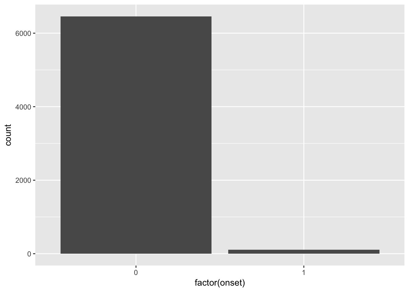
OK, so we’ve already learned a little something: civil war onsets are really, really rare! The vast majority of the country-years have no civil war onsets. What is the breakdown?
# use the summary() function on a factored version of the onset variable
# to determine the frequency of each class.
summary(factor(dat$onset))
## 0 1
## 6459 111Thus, only 1.69 percent of the observations feature an onset.
1.1.2 Linking X and Y
Now what? Now we suspect that, say, bigger countries are more likely to have a civil war. Is that true? Let’s find out! Again, we might want to start by visualizing:
# again invoke ggplot, this time putting lpop on the x axis and onset on the
# y-axis, this time using geom_jitter() to case the data into the space.
# vertical jittering (adding little random bits) allows you to see the data
# better.

set.seed(90210) # needed to make the jittering replicable
ggplot(dat, aes(x = lpop, y = factor(onset))) +
  geom_jitter(height = 0.25, width = 0)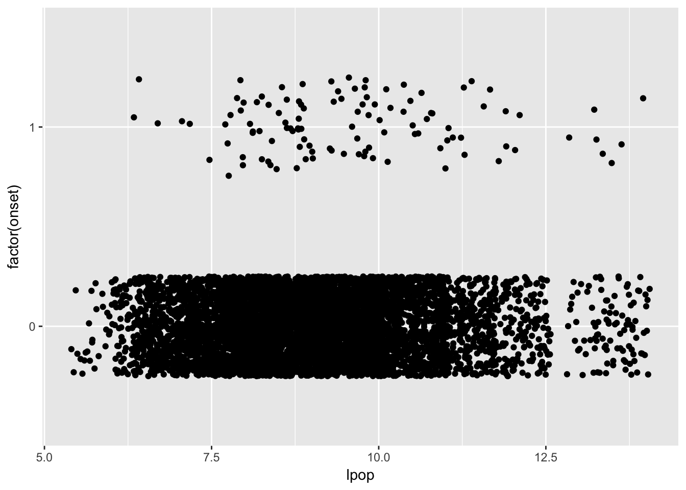
It’s a little hard to tell, but it might be the case that bigger countries are experiencing more onsets. The relationship certainly isn’t perfect: many large countries don’t experience onsets, and several small countries do.
What might we do to check? Why, maybe we should check to see whether countries with onsets are, on average, larger than those without them?
filter(dat, onset == 0) %>%             # subset data; no onset, then...
  summarise(meanPop = mean(lpop))       # ...get the average lpop value.
## # A tibble: 1 x 1
## meanPop
## <dbl>
## 1 9.058066filter(dat, onset == 1) %>% # subset data; onset, then...
summarise(meanPop = mean(lpop)) # ...get the average lpop value.## # A tibble: 1 x 1
## meanPop
## <dbl>
## 1 9.61516Lo and behold, it does appear that the populations in the country-years with onsets are higher than those in the country-years without onsets. But how do we know if this is a meaningful difference? More foundationally: how would we know a meaningful difference if we saw one? I don’t think there’s a graph that can answer that question—we will have to think harder about this.
1.1.3 Adding Some Complexity
But, like, we don’t think civil war onset depends only on population, right? Like, we probably think that richer countries experience fewer civil wars. Could we try to add this into our existing graphic?
set.seed(90210) # needed to make the jittering replicable
# this makes the dots' color a function of its GDP
ggplot(dat, aes(x = lpop, y = factor(onset))) +
  geom_jitter(height = 0.25, width = 0, aes(colour = lgdp))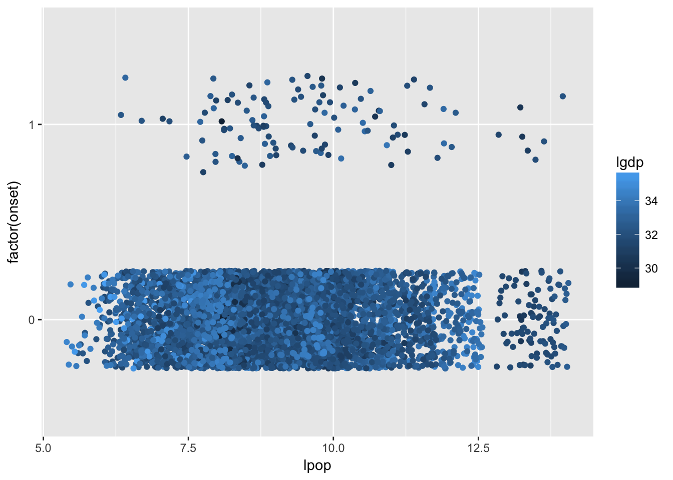
Note that countries with higher per capita GDP are lighter, while ones with lower per capita GDP are darker. And, in general it seems to be the case that the onset dots are darker than the non-onset dots. Again, the relationship is far from perfect: there are dark dots without onsets, and there are light dots with onsets.
1.1.4 The World is Really Complicated
But, we’ve only looked at two variables’ effect on onset: population and wealth. It’s already getting complicated to think about the relationships in question. But what about democracy, and mountainous terrain, and institutions? And what about the kajillion other predictors we could think up?4
# useful package for visualizations
library(GGally)
# coming command needs us to re-code the DV
dat$onset <- factor(dat$onset)
# make a big two-way plot
ggpairs(select(dat, -cyear, -ccode, -year),
        aes(colour = onset, alpha = 0.4))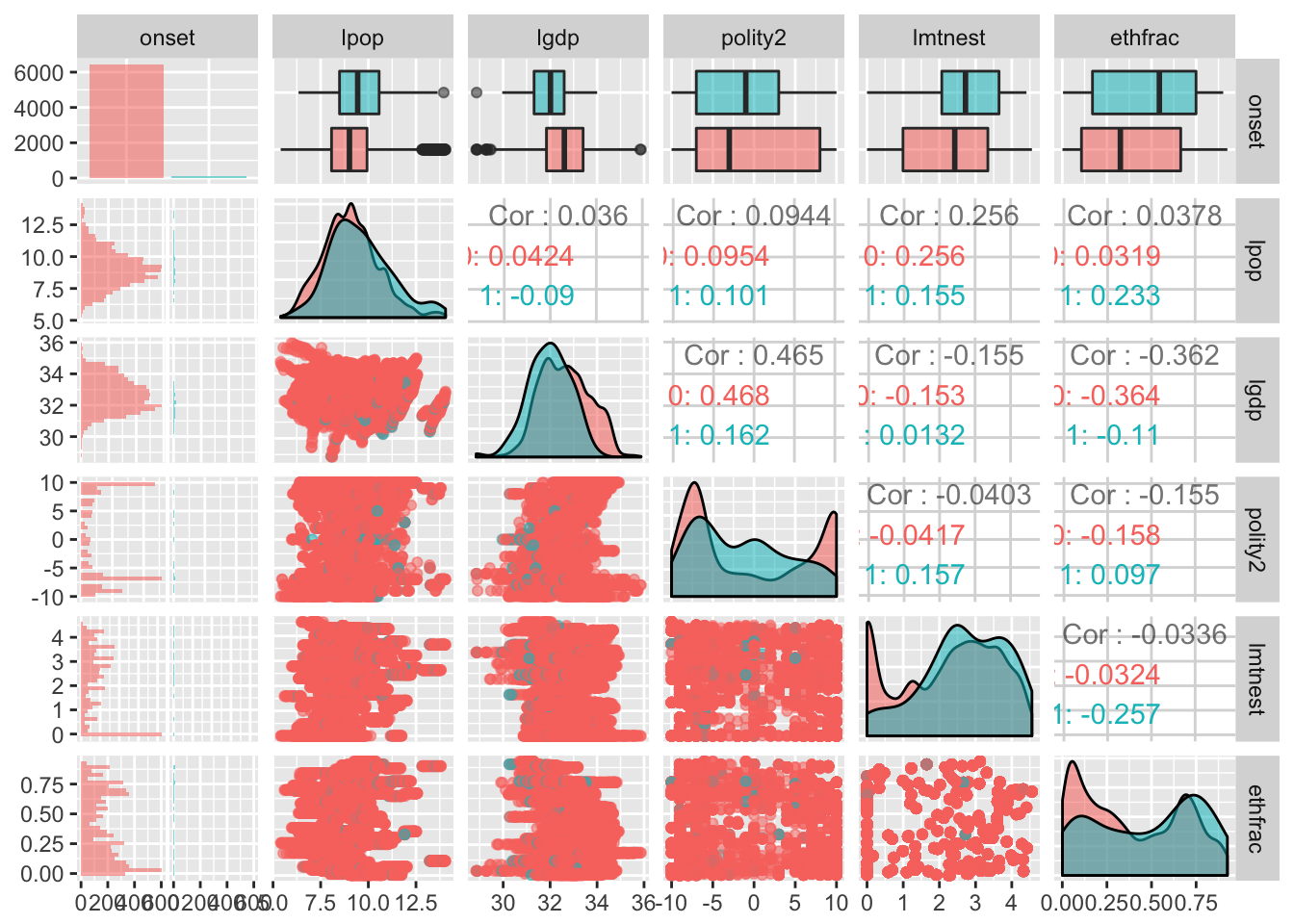
Here we are looking at several pieces of information: we see two way scatterplots like we were doing before, along with comparisons of the distribution of each respective independent variable for onsets and non-onsets, and we’re also getting some information about the relationships between these independent variables in the forms of correlation coefficients, and we’re also getting some visualizations of the actual distributions themselves. My lord. This got complicated in a hurry. I have no idea where civil wars come from I just wanted to look at the data and I only had like five variables I wanted to use and it’s all so confusing there is no way physics data is this messy right maybe I should have gone to law school I just want to curl up in a ball right now.
As social scientists, we use probability and statistics to make some sense of the messy world we live in.
1.2 Defining Goals
Let’s engage in the foolish quest to summarise our goals in a single definition.
What, you didn’t really think we’d be able to get it all in while also using intuitive language, did you? More plainly, the primary objective of empirical modeling is to provide an adequate description of certain types of observable phenomena in the form of statistical models.
As best as I can tell, there are three parts to this definition:
- Parsimonious description;
- Observable stochastic phenomena; and
- Statistical models.
“Parsimonious description” is both straightforward and not straightforward. You will learn that what counts as parsimonious for one scholar counts as decidedly un-parsimonious for another. It is one of those things where you will develop your own subjective tastes, and those tastes will largely be developed through reading, reflection, influence from advisors and peers, and your substantive area of expertise.
It should be noted here that the data should never be ignored. We will quickly be building very abstract apparati—but these are apparati meant to better understand the data. In the social sciences, we are most often concerned with observational data over which the analyst (or nature) had no control. With such data, the modeling task is often iterative and recursive. Conversely, with experimental data, the modeling enterprise is a little more straightforward. As a general rule, there seem to be two (methodological) ways to succeed in quantitative political science: (1) get really clean data—like experimental data—and perform simple statistics on them; or (2) get messy data—like observational data—and then learn how to model the heck out of it.5
Before getting too far afield on parsimony and scholarly taste, let’s turn our attention to the more technical aspects of the definition of empirical modeling.
1.2.1 Stochastic Phenomena
What do we mean by a stochastic phenomenon?
Wait, what’s a chance regularity pattern? That’s a bit of a philosophical question, but there are three forms. It will be easier if we introduce these forms by way of an intuitive example.
Imagine an experiment where you throw two dice and count the total dots. Unless you are an infinitely good crap-shooter, the outcome of any trial of this experiment cannot be known with any certainty. We can, however, state with precision what the possible outcomes are:
\[ S = \left\{2, 3, 4, 5, 6, 7, 8, 9, 10, 11, 12 \right\}.\] But we also know that this in no ways implies that each of these eleven outcomes are equally likely. (After all, if it did, it would be harder for the house to make money!) Let’s address the question of likelihood via brute force.
# make a vector with possible outcomes of one die
oneDie <- c(1, 2, 3, 4, 5, 6)  # could also have just said 1:6
# make a data frame with all possible combinations of two dice
twoDice <- expand.grid(die1 = oneDie,
                       die2 = oneDie)
# get the sum
twoDice$total <- twoDice$die1 + twoDice$die2
# sort by sum
twoDice <- twoDice %>%      # take twoDice, and then...
  arrange(total)            # ...sort by the variable "total"
twoDice
## die1 die2 total
## 1 1 1 2
## 2 2 1 3
## 3 1 2 3
## 4 3 1 4
## 5 2 2 4
## 6 1 3 4
## 7 4 1 5
## 8 3 2 5
## 9 2 3 5
## 10 1 4 5
## 11 5 1 6
## 12 4 2 6
## 13 3 3 6
## 14 2 4 6
## 15 1 5 6
## 16 6 1 7
## 17 5 2 7
## 18 4 3 7
## 19 3 4 7
## 20 2 5 7
## 21 1 6 7
## 22 6 2 8
## 23 5 3 8
## 24 4 4 8
## 25 3 5 8
## 26 2 6 8
## 27 6 3 9
## 28 5 4 9
## 29 4 5 9
## 30 3 6 9
## 31 6 4 10
## 32 5 5 10
## 33 4 6 10
## 34 6 5 11
## 35 5 6 11
## 36 6 6 12Here I have arrayed all 36 possible outcomes of our dice-rolling experiment. You will note that there is only one way to roll a 2, and likewise that there is only one way to roll a 12. Let’s look at how often each total comes up:
twoDice %>%                   # take twoDice, and then...
  group_by(total) %>%         # ...group it by the total, and then...
  summarise(numWays = n())    # ...tell how often each total appears.
## # A tibble: 11 x 2
## total numWays
## <dbl> <int>
## 1 2 1
## 2 3 2
## 3 4 3
## 4 5 4
## 5 6 5
## 6 7 6
## 7 8 5
## 8 9 4
## 9 10 3
## 10 11 2
## 11 12 1So, there are four ways to roll a 5, and there are two ways to roll a 10, and so on. Were we to roll our two die many times, the outcomes of the experiment will begin to form a stable pattern, called a distribution, that reflects this regularity.
But don’t just take my word for it. Let’s see how that distribution comes together! To do so, we will do a Monte Carlo simulation.
# useful package for doing the same thing many times in a loop
library(foreach)

# let me show you one "roll" of two dice using the sample() function
foo <- sample(x = 1:6,              # thing to be sampled from; die sides
              size = 2,             # take two samples (roll two dice)
              replace = TRUE)       # each time, use all six sides
# 1 by 2 vector of die rolls
foo
## [1] 6 6# sum of the rolls
sum(foo)## [1] 12# determine how many times you want to run the simulation
n <- 5000 # five thousand
# allows replicability
set.seed(12345)
# run it many times
rolls <- foreach (i = 1:n, # repeat this for observations 1 through n,
# indexing each repetition by i
.combine = c # concatenate all rolls into one vector
) %do%
{
# roll two dice, just as before
foo <- sample(x = 1:6,
size = 2,
replace = TRUE)
# spit out the sum of the rolls
return(sum(foo))
}
# make a quick histogram of the results
qplot(factor(rolls))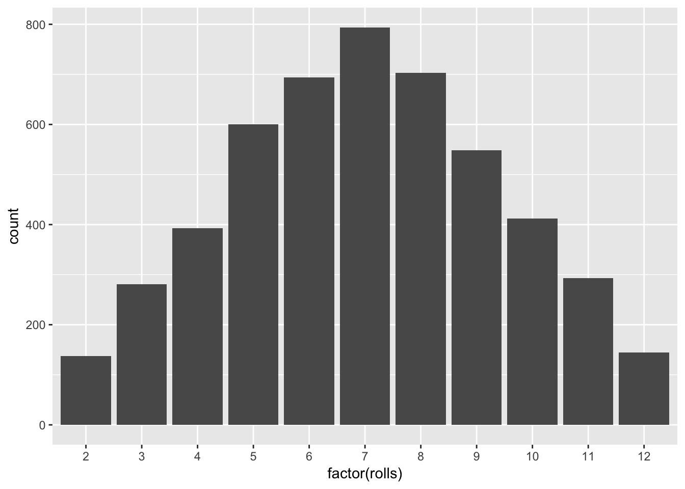
Here we are able to see that there does exist an emergent distribution from repeated trials of our experiment. And, the distribution is one form of a chance regularity pattern.
Implicit in the previous analysis was that the first 4,999 rolls didn’t influence what happened on the 5,000th roll. That is, even though we may have learned something about the dice’s underylying probabilistic structure, it remains that we couldn’t use the previous rolls to help us guess the outcome of the 5,000th roll. That is, if roll 4,999 happens to yield a 4, that doesn’t mean that roll 5,000 is any more or less likely to yield a 4 as well. When this is the case, we say the chance regularity pattern of independence is present. To visualize that, let’s look at how the rolls played out over time.
# make a data frame with a variable for the iteration number and another
# for the rolled total
burnDat <- data.frame(iteration = 1:n,
                      roll = rolls)

# graph
ggplot(burnDat, aes(x = iteration, y = roll)) +
geom_line() 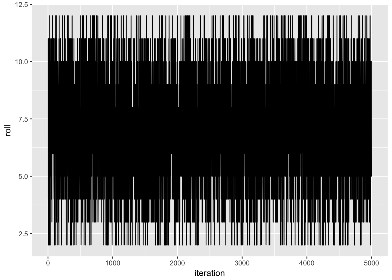
It doesn’t seem as if any dependencies kick in.
Finally, as we continue to roll our two dice over and over again, we wonder what happens to the average and variation around the average. If it is the case that these two features stay constant past some number of rolls, we say the chance regularity pattern of homogeneity obtains. Otherwise, our pattern is heterogeneous. To get a sense from our dice-throwing experiment, I will add a running average, running 95th percentile, and running 5th percentile
burnDat <- burnDat %>%
  mutate(runningMean = NA,       # making empty variables to serve as "bins"
         runningUB   = NA,
         runningLB   = NA)

for (i in 1:nrow(burnDat))
{

  burnDat$runningMean[i] <- mean(burnDat$roll[1:i])
  burnDat$runningUB[i]   <- quantile(burnDat$roll[1:i], prob = 0.95)
  burnDat$runningLB[i]   <- quantile(burnDat$roll[1:i], prob = 0.05)

}

# graph and add these cumulative statistics
ggplot(burnDat, aes(x = iteration, y = roll)) +
  geom_line() +
  geom_hline(yintercept = 7, colour = "white", linetype = 2) +
  geom_line(aes(y = runningMean), colour = "red") +
  geom_line(aes(y = runningUB), colour = "green") +
  geom_line(aes(y = runningLB), colour = "green")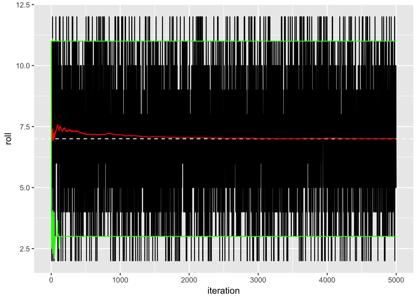
Here I have added a white dashed line at the theoretical “expected value” of seven (we will learn how to determine this in the coming weeks), along with a red line showing the cumulative mean over time and two green lines giving the cumulative 5-95 interval over time. The running average starts out a little bit higher than expected, but eventually it converges to the theoretical expectation; the upper and lower bounds are very stable over time. Accordingly, we would refer to this as homogenous.
To summarise, we have three forms of chance regularity patterns:
- Distribution: after many trials, do the outcomes form a stable pattern?
- Dependence: in any sequence of trials, does the outcome of any one trial influence that of any other?
- Heterogeneity: do the probabilities associated with the outcomes remain identical for all trials?
Let’s consider what these look like on “real” data. Let’s look at, say, the GDP for the USA over the timeframe of the Fearon and Laitin data.
usaGDP <- dat %>%              # take the original data, and then...
  filter(ccode == 2) %>%       # ...subset for the USA, and then...
  select(year, lgdp)           # ...pull out the year and GDP variables.
usaGDP
## # A tibble: 55 x 2
## year lgdp
## <dbl> <dbl>
## 1 1945 33.91633
## 2 1946 33.92000
## 3 1947 33.96733
## 4 1948 33.99740
## 5 1949 33.96920
## 6 1950 34.05634
## 7 1951 34.09403
## 8 1952 34.09018
## 9 1953 34.11478
## 10 1954 34.09184
## # ... with 45 more rowsLet’s begin with looking at whether the GDP data form some kind of stable-looking distribution:
# plot the distribution using a kernel density
ggplot(usaGDP, aes(x = lgdp)) +
  geom_histogram() +
  geom_density()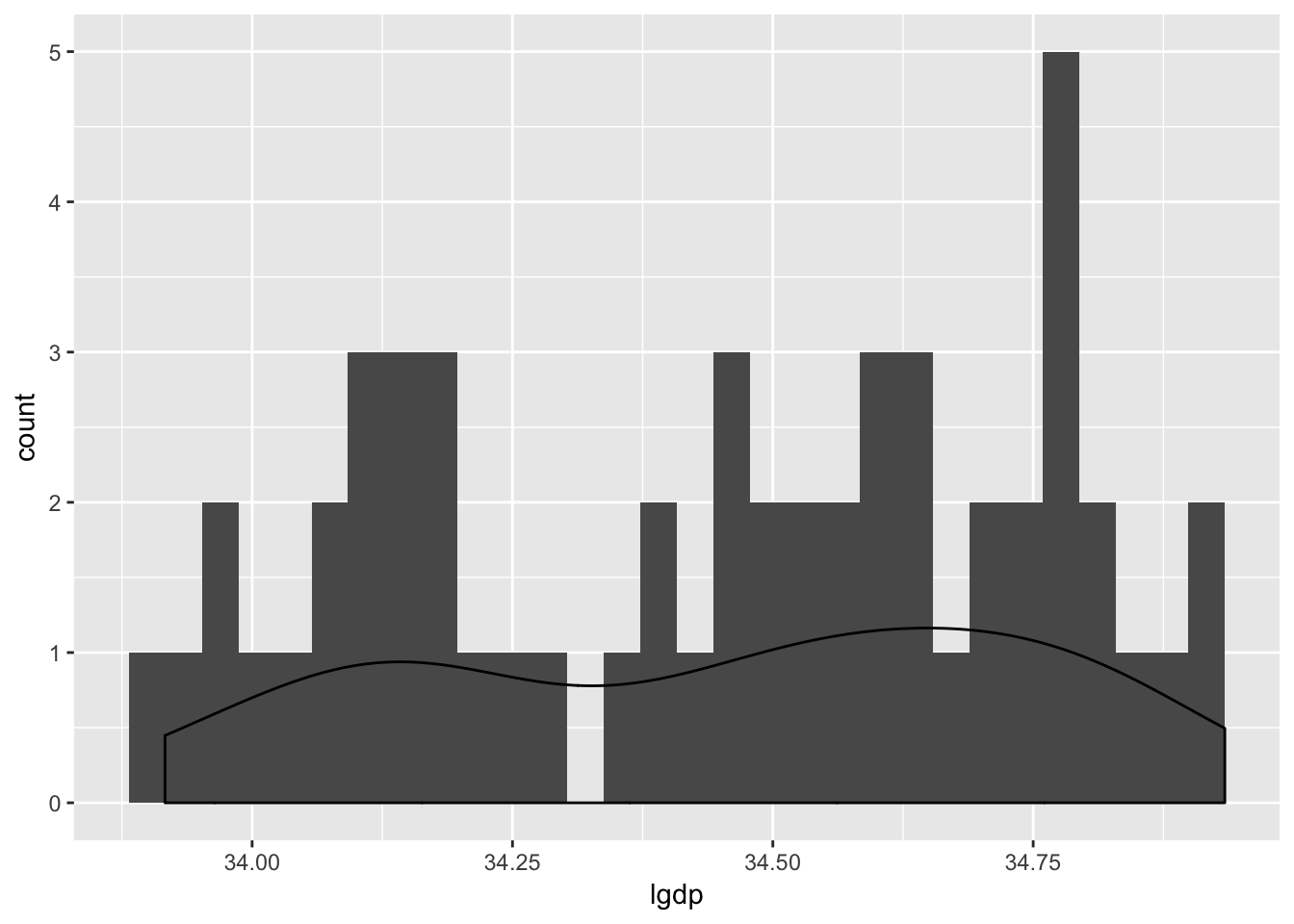
Woof. It’s really hard to tell whether these data take on any kind of discernible pattern! How about whether or not they appear to be independent?
# plot the GDP over time
ggplot(usaGDP, aes(x = year, y = lgdp)) +
  geom_point() +
  geom_line()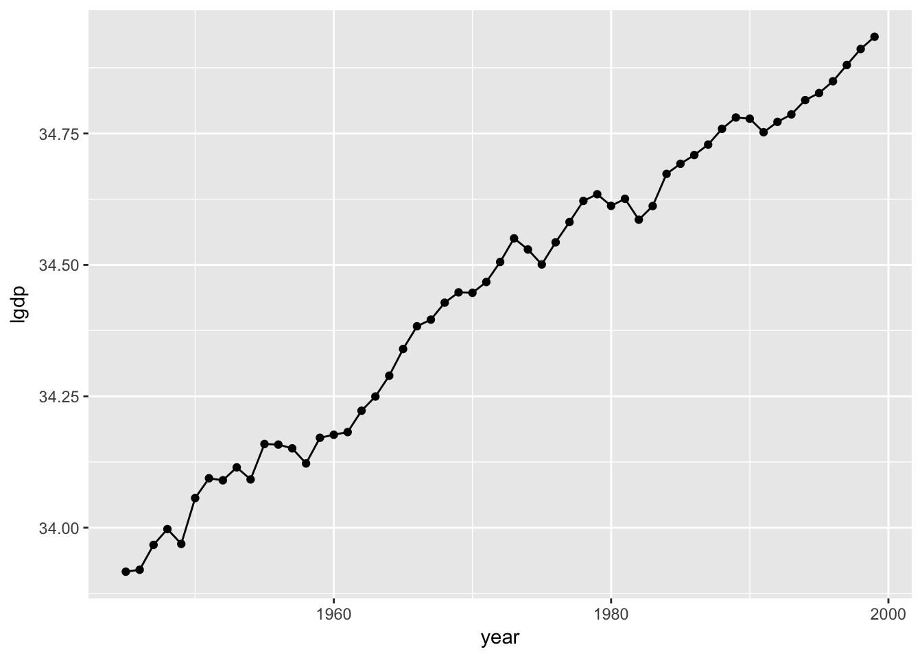
As you might expect, if you know something about this year’s GDP, then you can make a better guess about next year’s GDP than you’d be able to do with the distribution alone. That is, these observations are not independent from one another. This, in turn, means that the mean isn’t going to be homogenous like in our dice-tossing simulation:
# calculate a running mean
usaGDP$runningMean <- NA
for(i in 1:nrow(usaGDP)) usaGDP$runningMean[i] <- mean(usaGDP$lgdp[1:i])

# plot the GDP over time
ggplot(usaGDP, aes(x = year, y = lgdp)) +
  geom_point() +
  geom_line() +
  geom_line(aes(x = year, y = runningMean), colour = "red") +
  stat_smooth(method = "loess", colour = "green")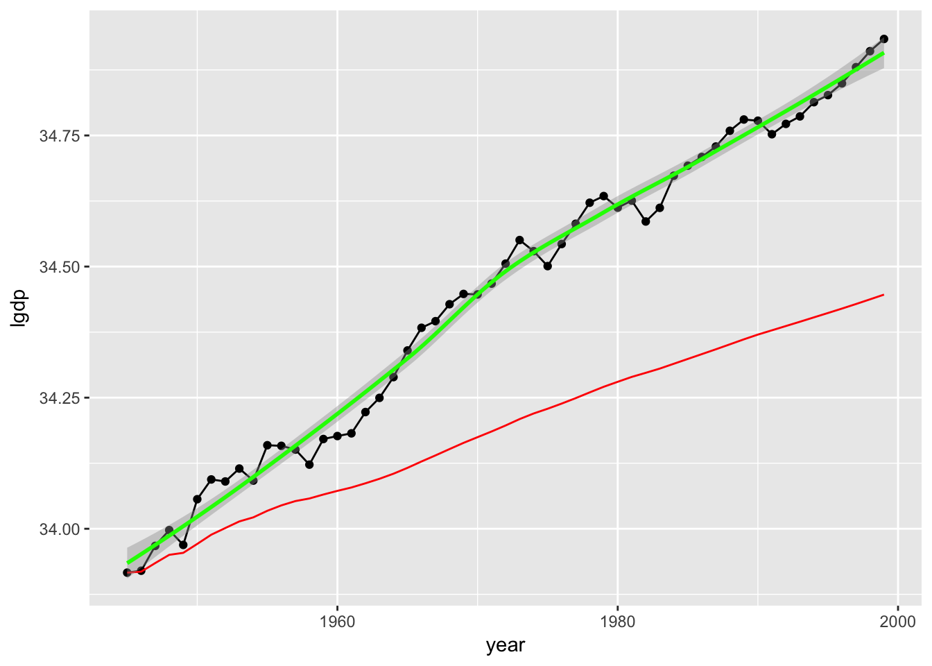
Here I have added the cumulative mean in red and a running moving-average smoother in green. Again, it looks like the key aspects of the variable—its centrality, its variation, and so on—remain stable over observations. This is a heterogenous distribution.
These three dimensions of stochastic phenomena—distribution, dependence, and homogeneity—play a key role in empirical modeling. To see how, we will now turn our attention to the second aspect of empirical modeling: statistical models.
1.2.2 Statistical Models
What do we mean by a statistical model?
Statistical models specify a situation, a mechanism, or a process in terms of a particular probabilistic structure.
We will see in the coming lectures that both “compatible” and (especially) “probabilistic” are loaded terms. In broad brushstrokes, the application of statistical models covers two dimensions:
- The recognition of relevant chance regularity patterns in the data; and
- The capture of these patterns via appropriate statistical models.
In case it is not obvious, we will be modeling complicated political phenomena in ways that uses statistical models to reduce them to something as simple as the chance regularity pattern observed in a coin toss. We will do so by imposing particular probabilistic structures upon the relevant data and assessing the subsequent statistical ramifications of that structure and its interaction with the data. So, instead of talking about the data themselves, we will talk about models of data. To a lesser degree, these models will proxy for the proposed mechanisms with varying success.
It should be noted that there is no controversy about whether or not probability and statistical models are of use in understanding games of chance like rolling dice, where the mechanism is understood from the outset. There is controversy about whether or not probability and statistical models are of use in understanding the social world around us, where there is no such knowledge of the mechanism in question—and, indeed, no such mechanism may exist. That is, it might not be the case that the Almighty6 has some coin with “Civil War!” on one side and “No Civil War!” on the other side, and that this coin changes depending on whether a country is rich or poor or big or small or democratic or autocratic or whatever, thus making our job to figure things out about the nature of the ethereal coin.7
1.2.3 Assumptions and Goals in Empirical Modeling
You’ve probably noticed how many times I have used the words “assume” or “impose” or “structure.” As with any model—formal or informal, empirical or theoretical—assumptions provide a necessary foundation. This, in turn, raises questions as to whether the assumptions that undergird our empirical models are true, or merely useful. Thoughts on the subject generally fall into one of two camps.
- Realists hold that theories aim to describe what the world is really like. Science, in this view, enables us to discover new truths about the world and to explain phenomena. Realists believe the objects mentioned in theories (quarks, production functions, the cost of war, voters’ preferences…) exist independently of the analyst’s enquiry.
- Conversely, instrumentalists contend that theories are instruments (surprise, surprise!) designed to relate one set of observable states of affairs to others. Theoretical constructs are not judged in terms of truth or falsity but rather in terms of their usefulness as instruments. The primary goal of science, in this view, is to develop models that enable us to make reliable and useful predictions.
Anybody familiar with Neil deGrasse Tyson has some understanding of the realist viewpoint, which is probably more intuitive for just about anybody. However, the instrumentalist view is important in the social sciences, where models are necessarily abstractions from reality that do not represent literal truth. Famously, no less a scholar than Milton Friedman argued that models should be judged entirely on their predictive ability and not at all on the reality of their assumptions:
“The relevant question to ask about the ‘assumptions’ of a theory is not whether they are descriptively `realistic,’ for they never are, but whether they are sufficiently good approximations for the purpose at hand. And this question can be answered by only seeing whether the theory works, which means whether it yields sufficiently accurate predictions.”
— Friedman (1953)
This is about of instrumentalist of a claim as one can imagine.8
The balance between realism and instrumentalism often boils down to the balance between explanation and prediction. In general, normal political science proceeds through explanation and thus through realism. Consequently, much of our time is spent attempting to justify the underlying assumptions of a model, for if these assumptions are not met, then the literal truth promised by the modeler fails to obtain. However, prediction has become more important of late, particularly thanks to developments in computing (and the rise of new statistical problems that focus on prediction like spam-filtering). And, good prediction often necessitates the relaxation of our shared understanding of parsimony, which raises other concerns of a more practical nature—like how you can convey a predictive model’s often-voluminous results easily to an interested reader.
1.3 Statistical Adequacy
One relatively agnostic way to think about models and inference is through the notion of statistical adequacy. Under this view, the main goal of empirical modeling is the adequate description of observable phenomena through statistical models.
What makes an analysis adequate? For starters, a necessary condition for adequacy is that the relevant probabilistic assumptions be explicitly stated, else there is nothing to evaluate adequacy on. We will therefore pay very close attention to these assumptions as they are made, along with ways to state them precisely.
To give you a sense of what I mean, let me work with an example. I will now scrape Baseball Reference to see how many runs have been scored in all the games this year.
library(rvest)      # for scraping
library(lubridate)  # easier date functions
library(data.table) # generalized data frame
library(dtplyr)     # DT and dplyr jive
library(stringr)    # easy strings

# date-cleaning functions
cleanDate <- function (rawDate)
{

  foo <- str_split(rawDate, " ")[[1]][2:3]
  foo <- paste0(foo[2], tolower(foo[1]), "2017")
  bar <- as.Date(foo, "%d%b%Y")
  return(bar)

}

  vecDate <- function (dateVec)
    foreach (i = 1:length(dateVec), .combine = c) %do% cleanDate(dateVec[i])

  # prepare to scrape
  teams <- c("BOS", "NYY", "TBR", "BAL", "TOR", "CLE", "KCR", "MIN",
             "DET", "CHW", "HOU", "SEA", "LAA", "TEX", "OAK", "WSN", "ATL",
             "NYM", "MIA", "PHI", "MIL", "CHC", "STL", "CIN", "LAD", "ARI",
             "COL", "SDP", "SFG")
  teams <- c("PIT", sort(teams))

  url1 <- "https://www.baseball-reference.com/teams/"
  url2 <- "/2017-schedule-scores.shtml"

  # make bins
  splits <- vector(mode = "list")
  future <- vector(mode = "list")
  standings <- vector(mode = "list")

  for (i in teams)
  {

      datums <- read_html(paste0(url1, i, url2)) %>%
        html_nodes('#team_schedule.sortable.stats_table') %>%
        html_table(header = TRUE) %>%
        .[[1]] %>%
        tbl_dt()

      names(datums) <- c("gameNumber", "date", "linkToBox", "homeTeam",
                         "away", "awayTeam", "wl", "homeRuns", "awayRuns",
                         "innings", "winLoss", "rank", "gamesBack",
                         "winningPitcher", "losingPitcher", "savePitcher",
                         "time", "dn", "attendance", "streak")
      datums <- filter(datums, date != "Date")
      datums <- dplyr::select(datums, date, homeTeam, away, awayTeam,
                              homeRuns, awayRuns)

      teamWins <- datums %>%
        mutate(date = as.Date(vecDate(date), origin = "1970-01-01")) %>%
        filter(date < Sys.Date()) %>%
        filter(as.numeric(homeRuns) > as.numeric(awayRuns)) %>%
        nrow()
      teamLosses <- datums %>%
        mutate(date = as.Date(vecDate(date), origin = "1970-01-01")) %>%
        filter(date < Sys.Date()) %>%
        filter(as.numeric(homeRuns) < as.numeric(awayRuns)) %>%
        nrow()
      standings[[i]] <- data.frame(team = i,
                                   wins = teamWins,
                                   losses = teamLosses)

      datums <- filter(datums, away != "@") %>%
        dplyr::select(-away) %>%
        mutate(date = as.Date(vecDate(date), origin = "1970-01-01"))

      playedGames <- filter(datums, date < Sys.Date()) %>%
        mutate(homeRuns = as.numeric(homeRuns),
               awayRuns = as.numeric(awayRuns))
      futureGames <- filter(datums, date >= Sys.Date()) %>%
        dplyr::select(date, homeTeam, awayTeam)
      future[[i]] <- futureGames

      tsplits <- foreach (j = 1:nrow(playedGames),
                          .combine = rbind.data.frame) %do%
      {

        foo <- data.frame(runsScored   = playedGames$homeRuns[j],
                          hitting      = playedGames$homeTeam[j],
                          pitching     = playedGames$awayTeam[j],
                          park         = playedGames$homeTeam[j])
        bar <- data.frame(runsScored   = playedGames$awayRuns[j],
                          hitting      = playedGames$awayTeam[j],
                          pitching     = playedGames$homeTeam[j],
                          park         = playedGames$homeTeam[j])
        rbind.data.frame(foo, bar)

      }
      splits[[i]] <- tbl_dt(tsplits)

   }

  rm(bar, datums, foo, futureGames, playedGames, tsplits, i, j, url1, url2)
  datums <- rbindlist(splits) %>%
    tbl_dt() %>%
    mutate(hitting  = factor(hitting, levels = teams),
           pitching = factor(pitching, levels = teams),
           park     = factor(park, levels = teams))
  future <- rbindlist(future) %>%
    tbl_dt()
  standings <- rbindlist(standings) %>%
    as.data.frame()
Whew! That took a second. But, what we end up with is the following:
datums## Source: local data table [2,938 x 4]
##
## # A tibble: 2,938 x 4
## runsScored hitting pitching park
## <dbl> <fctr> <fctr> <fctr>
## 1 5 PIT ATL PIT
## 2 4 ATL PIT PIT
## 3 6 PIT ATL PIT
## 4 4 ATL PIT PIT
## 5 6 PIT ATL PIT
## 6 5 ATL PIT PIT
## 7 1 PIT CIN PIT
## 8 7 CIN PIT PIT
## 9 2 PIT CIN PIT
## 10 6 CIN PIT PIT
## # ... with 2,928 more rowsSo, we have a variable, runsScored, that tells us how many runs the hitting team scored against the pitching team while playing at the team in park’s stadium. Suppose I believe, a priori, that runsScored follows a particular distribution—say, a Normal distribution. We’ll learn that Normal distributions are pinned down by the means and variances, so let me see what the means and variances are:
meanRuns <- mean(datums$runsScored)
varRuns <- var(datums$runsScored)
meanRuns
## [1] 4.669163varRuns## [1] 10.20852So, our data have a sample mean of 4.6691627 and a variance of 10.208521. Let’s consider what the Normal distribution looks like with those parameters.
set.seed(90210)
normalDraws <- rnorm(n = 100000,
                     mean = meanRuns,
                     sd = sqrt(varRuns))
qplot(normalDraws, geom = "density")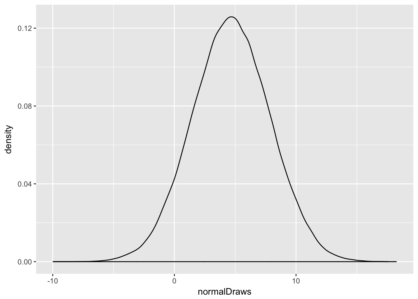
There it is—your lovely, symmetric, bell-shaped beauty. It’s got a range from around -10 to about 20. Elegant, beautiful, well-understood. Behold: the Normal.
How about the real data?
ggplot(datums, aes(x = factor(runsScored))) +
  geom_histogram(stat = "count")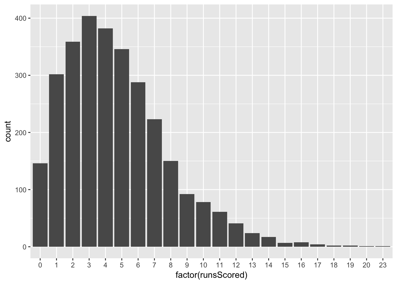
Wait. These don’t look like the Normal that we just looked at. For starters, a baseball team can’t score negative runs, nor can it score anything other than natural numbers (zero, one, two…). The Normal distribution covers negative numbers, and non-integer numbers, and all kinds of other problems! And this distribution isn’t symmetric—it’s skewed! What were we thinking?! This model isn’t at all statistically adequate!
Right? Well, the answer to that question depends. You will find that you often have need to provide simple, or interpretable, answers to questions. In such cases, the Normal distribution might be a perfectly fine first and last cut. There are other times—for example, when you need a good prediction but don’t care about being able to convey anything substantive—when you need a complex answer, or at least one that does a deeper job of tapping into life’s natural complexity. In such circumstances, you would probably want to try another distribution.
1.4 Some Premature Pointers
To drive some of the above home, let’s do some distilling:
- For all of the notation and the bluster to be delivered in the sequel, a statistical model is just a set of internally-compatible probabilistic assumptions regarding distribution, dependence, and homogeneity; we will put more meat on these bones—in particular, we will split statistical models into component probability and sampling models—but that remains the gist of it.
- I hope it hasn’t been lost on you guys from the above that graphical techniques and data visualization ought to play a big role in your task as empirical modelers. You should look at the data. You should seek to understand it so that you can make the best possible assumptions en route to arriving at an adequate statistical model.
- Statistical systematic information in the observed data must be coded in a language free from any theoretical concepts from political science. Do not allow the observed data to be coached by the theory to be appraised.
- Again, I can’t say it enough: let the data guide you. The specification of statistical models is guided primarily by the nature and structure of the observed data.
- We should not proceed to statistical inference without first determining the adequacy of the underling statistical model. Inferences drawn from inadequate models are useless.
- A point that will be of use in your design class: you should never assume that a given operationalization and measurement—that is, the act of assigning numbers to theoretical concepts—does its job perfectly. That is, the available data might not measure the abstract thing that you have in mind.
- No theory can salvage an improperly specified model; likewise, no statistical argument can salvage bad data.
- In general, your success as an empirical modeler boils down to your ability to synthesize statistical models with theoretical understanding, without paying short shrift to either.
- Know your data. Know where they come from, who collected them, what they cover, what precisely each variable measures, and how they related to various theoretical concepts. Have a sense of how accurate the data are (or how accurate the literature takes them to be).
- That said, understand well that data cannot determine the form and probabilistic structure of the appropriate statistical model.
- Finally, a word of humility is in order. It is often said that we ought to let the data speak for themselves. And, that sounds like a relatively humble claim, right? But it fails to acknowledge something even scarier: beyond simple descriptive statistics, we are not capable of doing so. We do not assess our theoretical models with data; we assess them with models of data. (This is unless it happens to be the case that one has developed a theory of a sample and thus can use descriptive statistics to assess those claims…but that seems like a waste of time.) Never lose sight that we are developing a relatively sophisticated apparatus here, and that this apparatus is a model subject to the usual criticisms thereof. I’ll leave those conversations to your scope course.
1.5 An Apology
I have strived to keep today’s lecture concete with some real data examples. This will be an attempt I maintain throughout the semester, though it is not a strength of mine. That said, the next few lectures feature material that doesn’t lend itself to this too much, so expect some very arid days ahead.
Probability Spaces
Fearon, James D., and David D. Laitin. 2003. “Ethnicity, Insurgency, and Civil War.” American Political Science Review 97 (1): 75–90.
Friedman, Milton. 1953. “The Methodology of Positive Economics.” In Essays in Positive Economics, edited by Milton Friedman, 3–43. University of Chicago Press.
Tip your waitress! Try the veal! I’ll be here all semester!↩
I will apologize now for using data examples from my own work. These are from a paper I’ve been working on a while, which you can read here.↩
We call such variables “dummy” variables, or “binary” variables.↩
In this paper, I ended up using something like one hundred predictors for a slightly different dependent variable: whether or not a country intervenes in another country’s civil war. And still, I can think of other ones to include!↩
Neither of these are substitutes for having good ideas, asking good questions, writing well, understanding a literature…↩
I often make mention of the Almighty when talking about probabilistic things. This is not a theological statement. I do not care to tell you my thoughts on the existence of the kind of being central to most religions, nor do I care to know your thoughts. This isn’t to say you don’t have wonderful and interesting things to say on the subject; I just don’t want to go there. I invoke the Almighty as a rhetorical device for some unseen entity that “tosses coins” for stochastic phenomena—an analytic target for our empirical models, even if it’s an unknowable target. The eccentric mathematician Paul Erdos doubted the existence of such a being, but used such a being—often labeled the Supreme Fascist—as a device: the being had a book of all of the most beautiful proofs, and when Erdos saw a beautiful proof, he would declare “This one’s from The Book!” More relevant to our purposes, Albert Einstein’s conception of a divine being was entirely deterministic: in discussing some epistemological questions within quantum mechanics, he declared that “God does not play dice with the universe.” Erdos, characteristically witty, replied that “God may not play dice with the universe, but something strange is going on with the prime numbers.”↩
I am dialing the drama up here, but really, when you think about it, it’s a similar leap of faith to say “oh hey there’s some Process that governs how these data get created, and we will call it something sterile like a Data Generating Process.” The existence and knowability of such a process is a hallmark of the positivist school of the philosophy of science. As a preview of coming attractions: this is the dominant set of beliefs in the discipline, so you should take my ramblings for what they’re worth.↩
A quick point on the dimensions over which assumptions are evaluated. One such dimension is “realism,” which here means whether or not the assumptions seem to be satisfied. A second, and related, assumption is the “strength” or “weakness” of an assumption, which talks more to how reasonable it is that the assumptions are met across contexts. “Weak” assumptions are those that imply “stronger” ones. For example, I might need to assume that a distribution has a mean (and no, not all distributions have means, as the Cauchy distribution reminds us), which is relatively weak. It would be stronger to assume that a distribution is Normal. All Normal distributions have means, but not all distributions with means are Normal. In general, weak assumptions are better from a theoretical standpoint, even if their “better”-ness isn’t because they’re met more frequently. Really, this boils down to Occam’s Razor, or more fundamentally the principle of simplicity. It is good to establish conclusions while using a minimum of premises.↩