Chapter 1 Lecture 01
In this lecture we will have the introduction, which includes, definition of statistics, collection and classification of data, formation of frequency distribution.
1.1 Origin of the word “Statistics”
The term statistics was derived from the Neo-Latin word statisticum collegium meaning “council of state” and the Italian word statista meaning “statesman” or “politician”.
A German word Statistik, got the meaning “collection and classification of data” generally in the early 19th century. This word was first introduced by Gottfried Achenwall (1749). Statistik was originally designated as a term for analysis of data about the state (data used by government or other administrative bodies). The term Statistik was introduced into English in 1791 by Sir John Sinclair when he published the first of 21 volumes titled “Statistical Account of Scotland” (Ball 2004). The first book to have ‘Statistics’ in its title was “Contributions to Vital Statistics” (1845) by Francis GP Neison, actuary1 to the Medical Invalid and General Life Office.
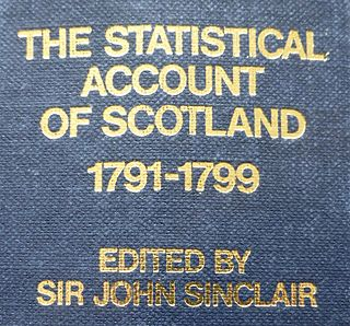
Figure 1.1: Statistical Account of Scotland by Sir John Sinclair (1791)
1.2 Statistics and Mathematics
need to write
1.3 Definition of Statistics
Statistics is the science which deals with the
Collection of data
Organization of data or Classification of data
Presentation of data
Analysis of data
Interpretation of data
Two main branches of statistics are:
Descriptive statistics, which deals with summarizing data from a sample using indexes such as the mean or standard deviation etc.
Inferential statistics, use a random sample of data taken from a population to describe and make inferences about the population parameters.
1.4 Data
Data can be defined as individual pieces of factual information recorded and used for the purpose of analysis. It is the raw information from which inferences are drawn using the science “STATISTICS”.
Example for data
No. of farmers in a block.
The rainfall over a period of time.
Area under paddy crop in a state.
1.5 Use and limitations of statistics
Functions of statistics: Statistics simplifies complexity, presents facts in a definite form, helps in formulation of suitable policies, facilitates comparison and helps in forecasting. Valid results and conclusion are obtained in research experiments using proper statistical tools.
Uses of statistics: Statistics has pervaded almost all spheres of human activities. Statistics is useful in the administration, Industry, business, economics, research workers, banking,insurance companies etc.
Limitations of Statistics
Statistical theories can be applied only when there is variability in the experimental material.
Statistics deals with only aggregates or groups and not with individual objects.
Statistical results are not exact.
Statistics are often misused.
1.6 Population and Sample
Consider the following example.Suppose we wish to study the body masses of all students of College of Agriculture, Vellayani. It will take us a long time to measure the body masses of all students of the college and so we may select 20 of the students and measure their body masses (in kg). Suppose we obtain the measurements like this
49 56 48 61 59 43 58 52 64 71 57 52 63 58 51 47 57 46 53 59
In this study, we are interested in the body masses of all students of College of Agriculture, Vellayani. The set of body masses of all students of College of Agriculture, Vellayani is called the population of this study. The set of 20 body masses, W = {49, 56,48, …, 53, 59}, is a sample from this population.
1.6.1 Population
A population is the set of all objects we wish to study
1.6.2 Sample
A sample is part of the population we study to learn about the population.
1.7 Variables and constants
1.7.1 Variables
Any type of observation which can take different values for different people, or different values at different times, or places, is called a variable. The following are examples of variables:
* family size, number of hospital beds, number of schools in a country, etc.
* height, mass, blood pressure, temperature, blood glucose level, etc.
Broadly speaking, there are two types of variables – quantitative and qualitative (or categorical) variables
1.7.2 Constants
Constants are characteristics that have values that do not change. Examples of constants are: pi (π) = the ratio of the circumference of a circle to its diameter (𝝅 = 3.14159...) and e, the base of the natural or (Napierian) logarithms (e=2.71828).
Types of variables
Quantitative variables
A quantitative variable is one that can take numerical values. The variables in (a) and (b), above, are examples of quantitative variables. Quantitative variables may be characterized further as to whether they are discrete or continuous
Discrete variables
The variables in (a), above, can be counted. These are examples of discrete variables. Variables that can only take on a finite number of values are called "discrete variables." Any variable phrased as “the number of …”, is discrete, because it is possible to list its possible values {0,1, …}. Any variable with a finite number of possible values is discrete. The following example illustrates the point. The number of daily admissions to a hospital is a discrete variable since it can be represented by a whole number, such as 0, 1, 2 or 3. The number of daily admissions on a given day cannot be a number such as 1.8, 3.96 or 5.33.
Continuous variables
The variables in (b), above, can be measured. These are examples of continuous variables. A continuous variable does not possess the gaps or interruptions characteristic of a discrete variable. A continuous variable can assume any value within a specific relevant interval of values assumed by the variable. Notice that age is continuous since an individual does not age in discrete jumps. Weight can be measured as 35.5, 35.8 kg etc so, it is a continuous variable.
Categorical variables
A variable is called categorical when the measurement scale is a set of categories. For example, marital status, with categories (single, married, widowed), is categorical. Whether employed (yes, no), religious affiliation (Protestant, Catholic, Jewish, Muslim, others, none), colours etc. Categorical variables are often called qualitative. It can be seen that categorical variables can neither be measured nor counted.
Levels of measurement and measurement scales
Variables can further be classified according to the following four levels of measurement: nominal, ordinal, interval and ratio.
Nominal scale: This scale of measure applies to qualitative variables only. On the nominal scale, no order is required. For example, gender is nominal, blood group is nominal, and marital status is also nominal. We cannot perform arithmetic operations on data measured on the nominal scale.
Ordinal scale: This scale also applies to qualitative data. On the ordinal scale, order is necessary. This means that one category is lower than the next one or vice versa. For example, Grades are ordinal, as excellent is higher than very good, which in turn is higher than good, and so on. It should be noted that, in the ordinal scale, differences between category values have no meaning.
Interval scale: This scale of measurement applies to quantitative data only. In this scale, the zero point does not indicate a total absence of the quantity being measured. An example of such a scale is temperature on the Celsius or Fahrenheit scale. Suppose the minimum temperatures of 3 cities, A, B and C, on a particular day were 00C, 200C and 100C, respectively. It is clear that we can find the differences between these temperatures. For example, city B is 200C hotter than city A. However, we cannot say that city A has no temperature. Moreover, we cannot say that city B is twice as hot as city C, just because city B is 200C and city C is 100C. The reason is that, in the interval scale, the ratio between two numbers is not meaningful.
Ratio scale: This scale of measurement also applies to quantitative data only and has all the properties of the interval scale. In addition to these properties, the ratio scale has a meaningful zero starting point and a meaningful ratio between 2 numbers. An example of variables measured on the ratio scale, is weight. A weighing scale that reads 0 kg gives an indication that there is absolutely no weight on it. So the zero starting point is meaningful. If Ram weighs 40 kg and Laxman weighs 20 kg, then Ram weighs twice as Laxman. Another example of a variable measured on the ratio scale is temperature measured on the Kelvin scale. This has a true zero point.

Capture.JPG
Collection of Data
The first step in any enquiry (investigation) is the collection of data. The data may be collected for the whole population or for a sample only. It is mostly collected on a sample basis. Collecting data is very difficult job. The enumerator or investigator is the well trained individual who collects the statistical data. The respondents are the persons from whom the information is collected.
Types of Data
There are two types (sources) for the collection of data:
\(1\) Primary Data (2) Secondary Data
Primary Data
Primary data are the first hand information which is collected, compiled and published by organizations for some purpose. They are the most original data in character and have not undergone any sort of statistical treatment.
Example: Population census reports are primary data because these are collected, complied and published by the population census organization.
Secondary Data
The secondary data are the second hand information which is already collected by an organization for some purpose and are available for the present study. Secondary data are not pure in character and have undergone some treatment at least once.
Example: An economic survey of England is secondary data because the data are collected by more than one organization like the Bureau of Statistics, Board of Revenue, banks, etc.
Methods of Collecting Primary Data
Primary data are collected using the following methods:
Personal Investigation: The researcher conducts the survey him/herself and collects data from it. The data collected in this way are usually accurate and reliable. This method of collecting data is only applicable in case of small research projects.
Through Investigation: Trained investigators are employed to collect the data. These investigators contact the individuals and fill in questionnaires after asking for the required information. Most organizations utilize this method.
Collection through Questionnaire: Researchers get the data from local representations or agents that are based upon their own experience. This method is quick but gives only a rough estimate.
Through the Telephone: Researchers get information from individuals through the telephone. This method is quick and gives accurate information.
Methods of Collecting Secondary Data
Secondary data are collected by the following methods:
Official: e.g. publications from the Statistical Division, Ministry of Finance, the Federal Bureaus of Statistics, Ministries of Food, Agriculture, Industry, Labor, etc.
Semi-Official: e.g. State Bank, Railway Board, Central Cotton Committee, Boards of Economic Enquiry, etc.
Publication of Trade Associations, Chambers of Commerce, etc.
Technical and Trade Journals and Newspapers.
Research Organizations such as universities and other institutions.
Difference Between Primary and Secondary Data
The difference between primary and secondary data is only a change of hand. Primary data are the first hand information which is directly collected form one source. They are the most original in character and have not undergone any sort of statistical treatment, while secondary data are obtained from other sources or agencies. They are not pure in character and have undergone some treatment at least once.
Frequency distribution
Table shows the number of children per family for 54 families selected from a town in India. The data, presented in this form in which it was collected, is called raw data.
hhgvhg.JPG
It can be seen that, the minimum and the maximum numbers of children per family are 0 and 4, respectively. Apart from these numbers, it is impossible, without further careful study, to extract any exact information from the data. But by breaking down the data into the form below

asda.JPG
Now certain features of the data become apparent. For instance, it can easily be seen that, most of the 54 families selected have two children because number of houses having 2 children is 18. This information cannot easily be obtained from the raw data.
The above table is called a frequency table or a frequency distribution. It is so called because it gives the frequency or number of times each observation occurs. Thus, by finding the frequency of each observation, a more intelligible picture is obtained.
The steps for constructing a frequency distribution may be summarized as follows:
List all values of the variable in ascending order of magnitude.
Form a tally column, that is, for each value in the data, record a stroke in the tally column next to that value. In the tally, each fifth stroke is made across the first four. This makes it easy to count the entries and enter the frequency of each observation.
Check that the frequencies sum to the total number of observations
Grouped frequency distribution
Data below gives the body masses of 22 patients, measured to the nearest kilogram.

sdf.JPG
It can be seen that the minimum and the maximum body masses are 42 kg and 83 kg, respectively. A frequency distribution giving every body mass between 42 kg and 83 kg would be very long and would not be very informative. The problem is to overcome by grouping the data into classes. If we choose the classes 41 – 49, 50 – 58, 59 – 67, 68 – 76 and 77 – 85, we obtain the frequency distribution given below:

adsd.JPG
Above table gives the frequency of each group or class; it is therefore called a grouped frequency table or a grouped frequency distribution. Using this grouped frequency distribution, it is easier to obtain information about the data than using the raw data. For instance, it can be seen that 17 of the 22 patients have body masses between 50 kg and 76 kg (both inclusive). This information cannot easily be obtained from the raw data.
It should be noted that, even though above table is concise, some information is lost. For example, the grouped frequency distribution does not give us the exact body masses of the patients. Thus the individual body masses of the patients are lost in our effort to obtain an overall picture.
We now define the terms that are used in grouped frequency tables.
(i) Class limits
The intervals into which the observations are put are called class intervals. The end points of the class intervals are called class limits. For example, the class interval 41 – 49, has lower class limit 41 and upper class limit 49.
(ii) Class boundaries
The raw data in the above example were recorded to the nearest kilogram. Thus, a body mass of 49.5kg would have been recorded as 50 kg, a body mass of 58.4 kg would have been recorded as 58 kg, while a body mass of 58.5 kg would have been recorded as 59 kg. It can therefore be seen that, the class interval 50 – 58, consists of measurements greater than or equal to 49.5 kg and less than 58.5 kg. The numbers 49.5 and 58.5 are called the lower and upper boundaries of the class interval 50 – 58. The class boundaries of the other class intervals are given below:

dfgds.JPG
Note:
Notice that the lower class boundary of the ith class interval is the mean of the lower class limit of the class interval and the upper class limit of the (i-1)th class interval (i = 2, 3, 4, …). For example, in the table above the lower class boundaries of the second and the fourth class intervals are (50 + 49) /2 = 49.5 and (68 + 67)/2 = 67.5, respectively.
It can also be seen that the upper class boundary of the ith class interval is the mean of the upper class limit of the class interval and the lower class limit of the (i+1)th class interval (i = 1, 2, 3, … ). Thus, in the above table the upper class boundary of the fourth class interval is (76 + 77)/2 = 76.5.
(iii) Class mark
The mid-point of a class interval is called the class mark or class mid-point of the class interval. It is the average of the upper and lower class limits of the class interval. It is also the average of the upper and lower class boundaries of the class interval. For example, in the table, the class mark of the third class interval was found as follows: class mark =(59+67) /2 = (58.5 + 67.5)/2= 63.
(iv) Class width
The difference between the upper and lower class boundaries of a class interval is called the class width of the class interval. Class widths of class intervals can also be found by subtracting two consecutive lower class limits, or by subtracting two consecutive upper class limits.
Note:
The width of the ith class interval is the numerical difference between the upper class limits of the ith and the ( i-1)th class intervals (i = 2, 3, …). It is also the numerical difference between the lower class limits of the ith and the (i+1) th class intervals (i = 1, 2, …)
In grouped frequency table above the width of the first class interval is |41-50| = 9. This is the numerical difference between the lower class limits of the first and the second class intervals. The width of the second class interval is |50-59|= 9. This is the numerical difference between the lower class limits of the second and the third class intervals. It is also equal to |58-49| the numerical, difference between the upper class limits of the first and the second class intervals.
Construction of frequency distribution table
1.8 Step 1. Decide how many classes you wish to use.
1.9
1.10 Step 2. Determine the class width
1.11
1.12 Step 3. Set up the individual class limits
1.13
1.14 Step 4. Tally the items into the classes
1.15
1.16 Step 5. Count the number of items in each class
Consider the example
An agricultural student measured the lengths of leaves on an oak tree (to the nearest cm). Measurements on 38 leaves are as follows
9,16,13,7,8,4,18,10,17,18,9,12,5,9,9,16,1,8,17,1,10,5,9,11,15,6,14,9,1,12,5,16,4,16,8,15,14,17
Step 1. Decide how many classes you wish to use.
H.A. Sturges provides a formula for determining the approximation number of classes. \(\mathbf{k = 1 + 3.322}\mathbf{\log}\mathbf{N}\). Number of classes should be greater than calculated k
In our example N=38, so k=1+3.322×log(38) = 1+3.322×1.5797 = 6.24 = approx 7
So the approximated number of classes should be not less than 6.24 i.e.\(\ k^{'}\) =7
Step 2. Determine the class width
Generally, the class width should be the same size for all classes. C = | max − min|/ k
Class width \(C^{'}\)should be greater than calculated C
For this example, C = | 18− 1|/6.24 = 2.72, so approximately class width\(C^{'} =\) 3 (Note that k used here is the calculated value using Struges formula not the approximated)
Step 3. Set up the individual class limits
We need to find the lower limit only
\[L = min - \frac{C^{'} \times k^{'} - (max - min)}{2}\]
where C and k here are final approximated class width and number of classes respectively
in our example \(L = 1 - \frac{3 \times 7 - (18 - 1)}{2}\)=1-2=-1; since there is no negative values in data = 0
| Class | Frequency |
|---|---|
| 0-3 | 3 |
| 3-6 | 5 |
| 6-9 | 5 |
| 9-12 | 9 |
| 12-15 | 5 |
| 15-18 | 9 |
| 18-21 | 2 |
Even though the student only measured in whole numbers, the data is continuous, so "4 cm" means the actual value could have been anywhere from 3.5 cm to 4.5 cm.
Cumulative frequency
In many situations, we are not interested in the number of observations in a given class interval, but in the number of observations which are less than (or greater than) a specified value. For example, in the above table, it can be seen that 3 leaves have length less than 3.5 cm and 9 leaves (i.e. 3 + 6) have length less than 6.5 cm. These frequencies are called cumulative frequencies. A table of such cumulative frequencies is called a cumulative frequency table or cumulative frequency distribution.
Cumulative frequency is defined as a running total of frequencies. Cumulative frequency can also defined as the sum of all previous frequencies up to the current point. Notice that the last cumulative frequency is equal to the sum of all the frequencies.
Two types of cumulative frequencies are Less than cumulative frequency and Greater than cumulative frequency. Less than cumulative frequency (LCF) is the number of values less than a specified value. Greater than cumulative frequency (GCF) is the number of observations greater than a specified value.
The specified value for LCF in the case of grouped frequency distribution will be upper limits and for GCF will be the lower limits of the classes. LCF’s are obtained by adding frequencies in the successive classes and GCF are obtained by subtracting the successive class frequencies from the total frequency
Relative frequency
It is sometimes useful to know the proportion, rather than the number, of values falling within a particular class interval. We obtain this information by dividing the frequency of the particular class interval by the total number of observations. Relative frequency of a class is the frequency of class / total observation. Relative frequencies all add up to 1
| Class | Frequency | Less than Cumulative Frequency | Greater than Cumulative Frequency | Relative Frequency |
|---|---|---|---|---|
| 0.5 – 3.5 | 3 | 3 | 38 | 0.078947 |
| 3.5 – 6.5 | 6 | 9 | 35 | 0.157895 |
| 6.5 – 9.5 | 10 | 19 | 29 | 0.263158 |
| 9.5 – 12.5 | 5 | 24 | 19 | 0.131579 |
| 12.5 – 15.5 | 5 | 29 | 14 | 0.131579 |
| 15.5 – 18.5 | 9 | 38 | 9 | 0.236842 |
Graphical representation of data
We found that information given in a frequency distribution is easier to interpret than raw data. Information given in a frequency distribution in a tabular form is easier to grasp if presented graphically. Many types of diagrams are used in statistics, depending on the nature of the data and the purpose for which the diagram is intended.
Histogram
A histogram consists of rectangles with:
Bases on a horizontal axis, centres at the class marks, and lengths equal to the class widths,
Areas proportional to class frequencies.
Note: If the class intervals are of equal size, then the heights of the rectangles are proportional to the class frequencies and it is then customary to take the heights of the rectangles numerically equal to the class frequencies. If the class intervals are of different widths, then the heights of the rectangles are proportional to\(\frac{\text{Class\ Frequency}}{\text{Class\ Width}}\). This ratio is called frequency density.
Table below shows the frequency distribution of the body masses of 50 AIDS patients. Draw a Histogram.
| Mass | 30 – 39 | 40 – 49 | 50 – 59 | 60 – 69 | 70 – 79 | 80 – 89 |
|---|---|---|---|---|---|---|
| Frequency | 3 | 6 | 17 | 13 | 8 | 3 |

meta-chart (1).png
Cumulative frequency curve (Ogive)
A graph obtained by plotting a cumulative frequency against the class boundary and joining the points by a smooth curve, is called a cumulative frequency curve. It is also called as Ogive. Two types of ogive are there, Less Than Type Cumulative Frequency Curve (Less than Ogive) and Greater Than Type Cumulative Frequency Curve (Greater than Ogive).
Less Than Type Cumulative Frequency Curve (Less than Ogive): Here we use the upper limit of the classes and the less than cumulative frequency to plot the curve. Let us see for the example of the body masses of 50 AIDS patients.
| Upper limit | 39 | 49 | 59 | 69 | 79 | 89 |
|---|---|---|---|---|---|---|
| Less than Cumulative frequency | 3 | 9 | 26 | 39 | 47 | 50 |

fdgd.JPG
Greater Than Type Cumulative Frequency Curve (Greater than Ogive). Here we use the lower limit of the classes and the Greater than cumulative frequency to plot the curve.
| Lower Limit | 30 | 40 | 50 | 60 | 70 | 80 |
|---|---|---|---|---|---|---|
| Greater than Cumulative frequency | 50 | 47 | 41 | 24 | 11 | 3 |

fdgd.JPG
Intersection of both ogives gives the median
Frequency polygon
A grouped frequency table can also be represented by a frequency polygon, which is a special kind of line graph. To construct a frequency polygon, we plot a graph of class frequencies against the corresponding class mid-points and join successive points with straight lines.
| Class Midpoints | 34.5 | 44.5 | 54.5 | 64.5 | 74.5 | 84.5 |
|---|---|---|---|---|---|---|
| Frequencies | 3 | 6 | 17 | 13 | 8 | 3 |

fdgd.JPG
Frequency polygon is also obtained by joining the midpoints of a histogram as shown below

meta-chart (1).png
Stem-and-leaf plot
A stem-and-leaf plot is a graphical device that is useful for representing a relatively small set of data which takes numerical values. To construct a stem-and-leaf plot, we partition each measurement into two parts. The first part is called the stem, and the second part is called the leaf. Here each numerical value is divided into two parts: The leading digits become the stem the trailing digits become the leaf. One advantage of the stem-and-leaf display over a frequency distribution is that we retain the value of each observation. Another is the distribution of the data within each groups is clear.
A stem-and-leaf plot conveys similar information as a histogram. Turned on its side, it has the same shape as the histogram. In fact, since the stem-and-leaf plot shows each observation,
it displays information that is lost in a histogram. A properly constructed stem-and-leaf plot, like a histogram, provides information regarding the range of the data set, shows the location of the highest concentration of measurements, and reveals the presence or absence of symmetry.
Consider the example
10,15,22,25,28,23,29,31,36,45,48
Stem and leaf plot will look like
| 1 | 0 5 |
|---|---|
| 2 | 2 3 5 8 9 |
| 3 | 1 6 |
| 4 | 5 8 |
Bar chart
A bar chart is a diagram consisting of a series of horizontal or vertical bars of equal width. The bars represent various categories of the data. There are three types of bar charts, and these are simple bar charts, component bar charts and grouped bar charts.
(i) Simple bar chart
In a simple bar chart, the height (or length) of each bar is equal to the frequency it represents. For example data below shows the production of timber in five districts of kerala in a certain year.
| Alappuzha | 600 |
|---|---|
| Kannur | 900 |
| Trissur | 1800 |
| Ernakulam | 1500 |
| Wayanad | 2400 |

meta-chart (1).png
Component bar chart
In a component bar chart, the bar for each category is subdivided into component parts; hence its name. Component bar charts are therefore used to show the division of items into components. This is illustrated in the following example.
Example shows the distribution of sales of agricultural produce from a Farm in 1995, 1996 and 1997.

Capture.JPG

hgh.JPG
The component bar chart shows the changes of each component over the years as well as the comparison of the total sales between different years.
Grouped bar chart
For a grouped bar chart, the components are grouped together and drawn side by side. We illustrate this with the above example.

dfgdg.JPG
Pie Charts
A pie chart is a circular graph divided into sectors, each sector representing a different value or category. The angle of each sector of a pie chart is proportional to the value of the part of the data it represents. The bar chart is more precise than the pie chart for visual comparison of categories with similar relative frequencies.
Steps for constructing a pie chart
\(1\) Find the sum of the category values.
\(2\) Calculate the angle of the sector for each category, using the following formula
Angle of the sector for category A = \(\frac{\text{value\ of\ category\ A}}{\text{sum\ of\ category\ values}} \times 360\)
\(3\) Construct a circle and mark the centre.
\(4\) Use a protractor to divide the circle into sectors, using the angles obtained in step 2.
\(5\) Label each sector clearly.
See the example:
A housewife spent the following sums of money on buying ingredients for a family Christmas cake.
| Ingredients | Price | Angle |
|---|---|---|
| Flour | 24 | (24/240)×360= 36 |
| Margarine | 96 | 144 |
| Sugar | 18 | 27 |
| Eggs | 60 | 90 |
| Baking powder | 12 | 18 |
| Miscellaneous | 30 | 45 |
| Total | 240 | 360 |

hhhh.JPG
***********************************************************
actuary: A person who compiles and analyses statistics and uses them to calculate insurance risks and premiums.↩︎